CLIENT
FOR

AWARDS SEASON ADVERTISING AND MARKETING
CONCEPT, LAYOUT, TYPOGRAPHY, PHOTO MANIPULATION AND COMPOSITING
PROJECT DATES | 2023-2025

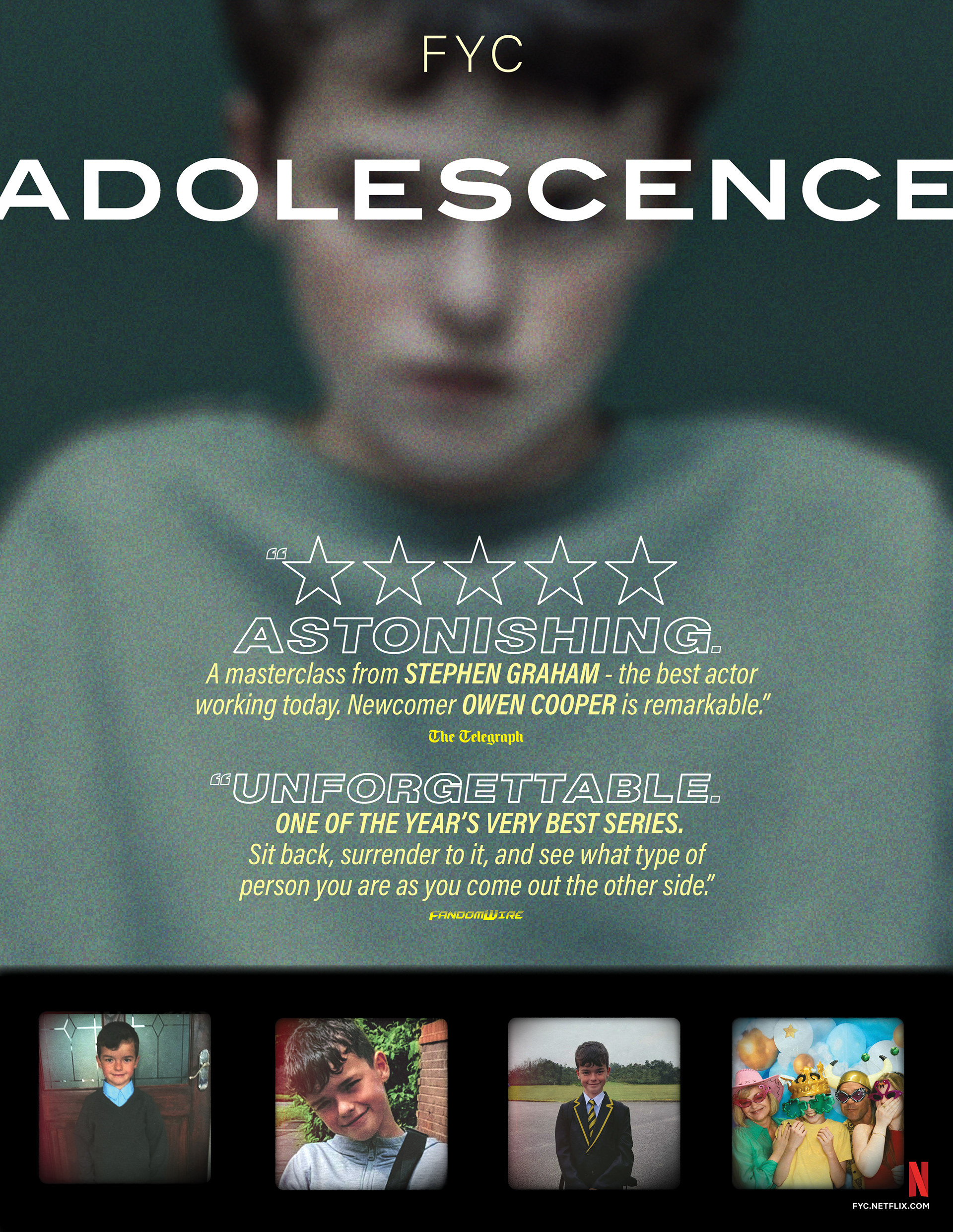
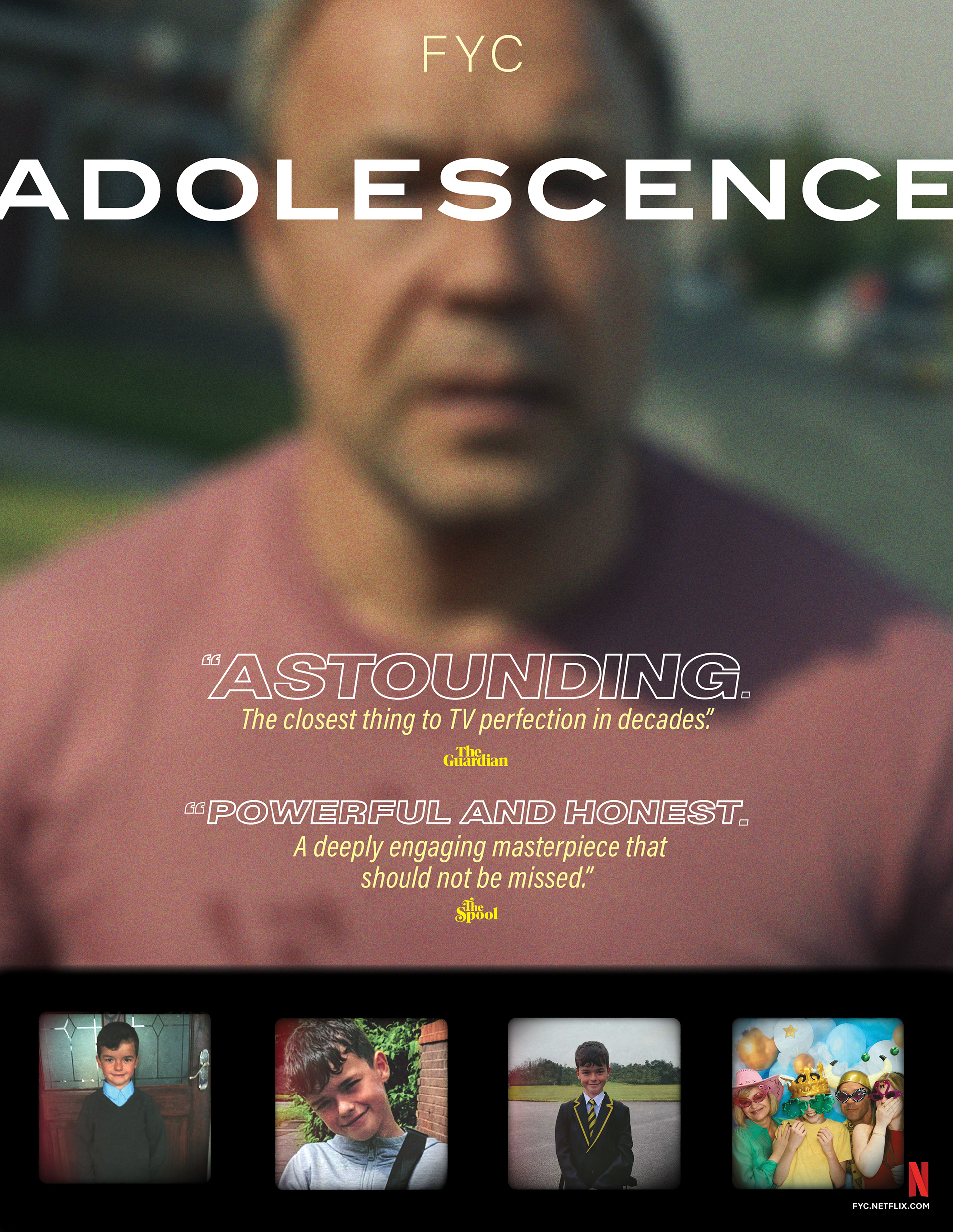
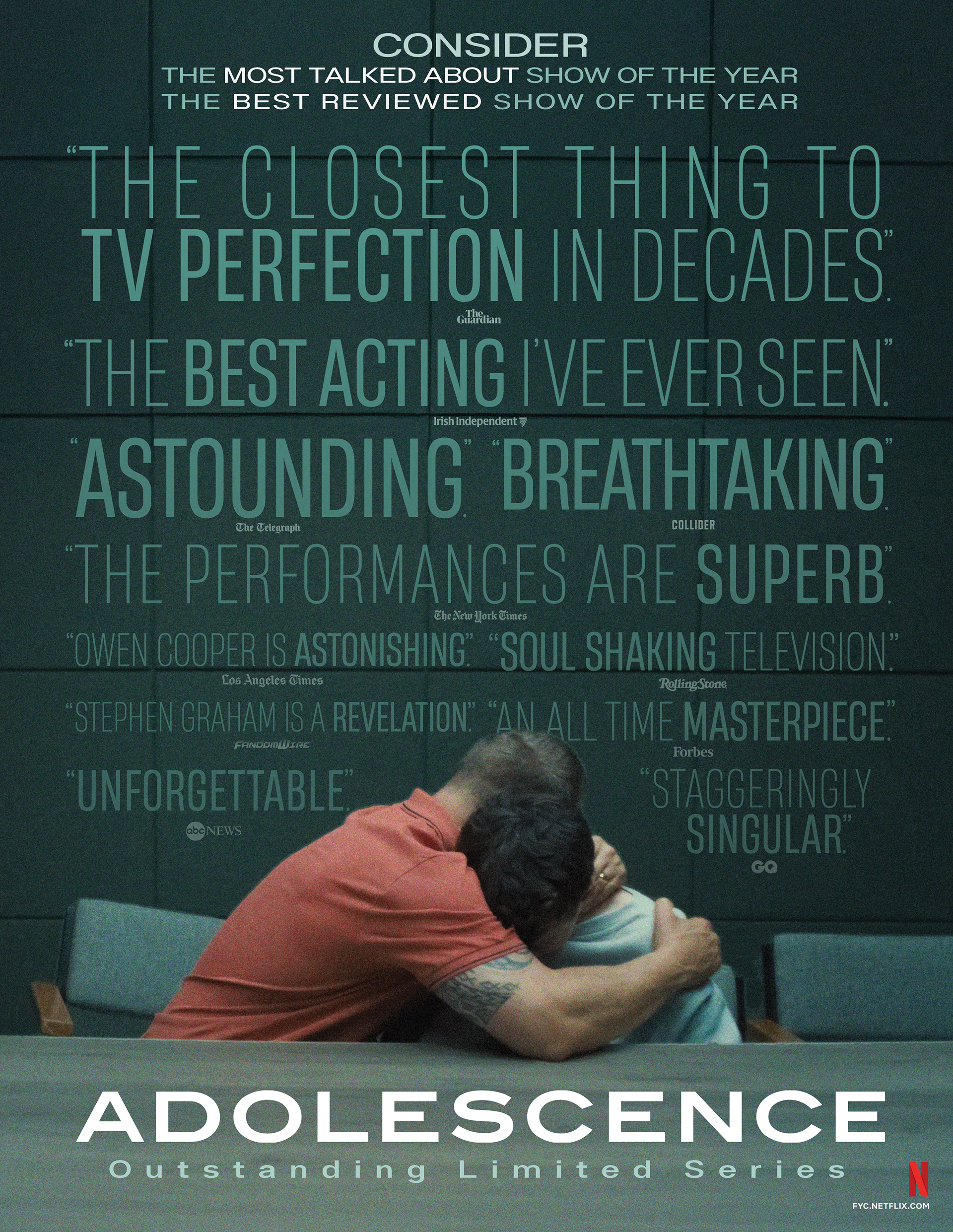
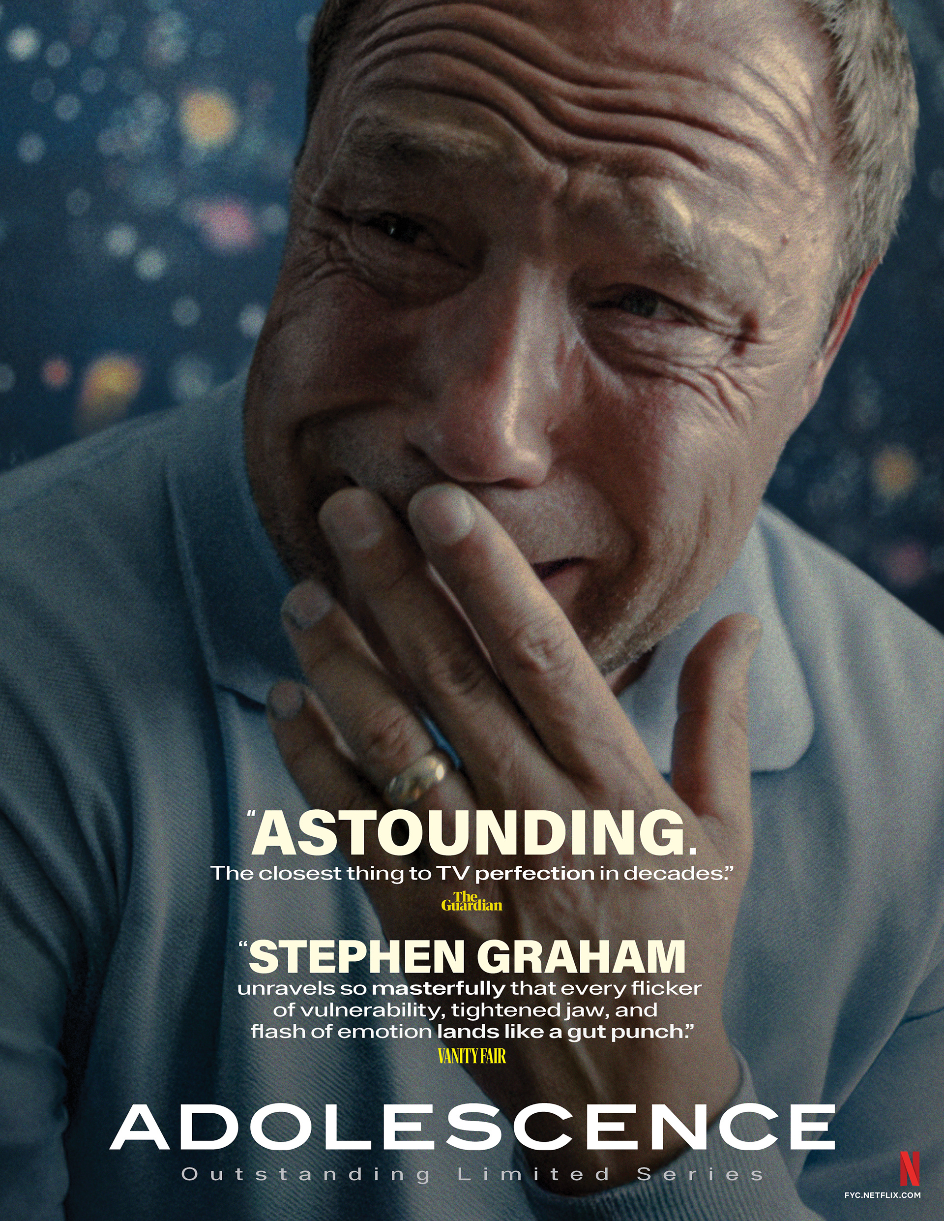
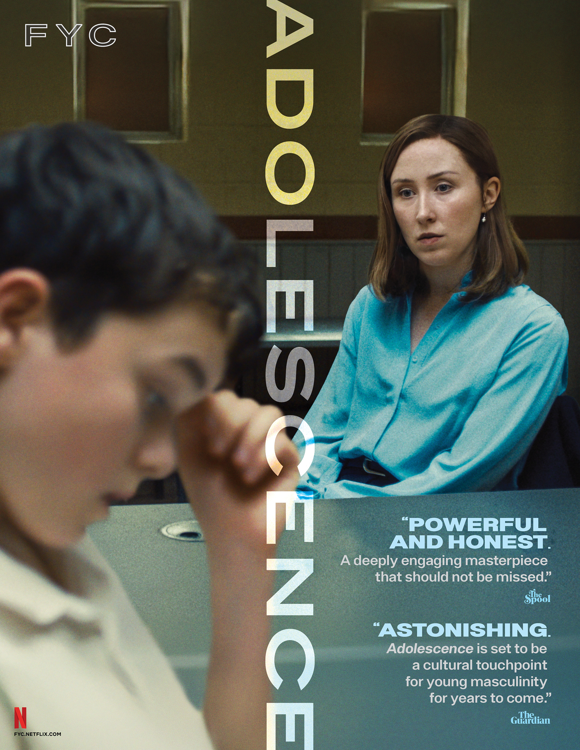
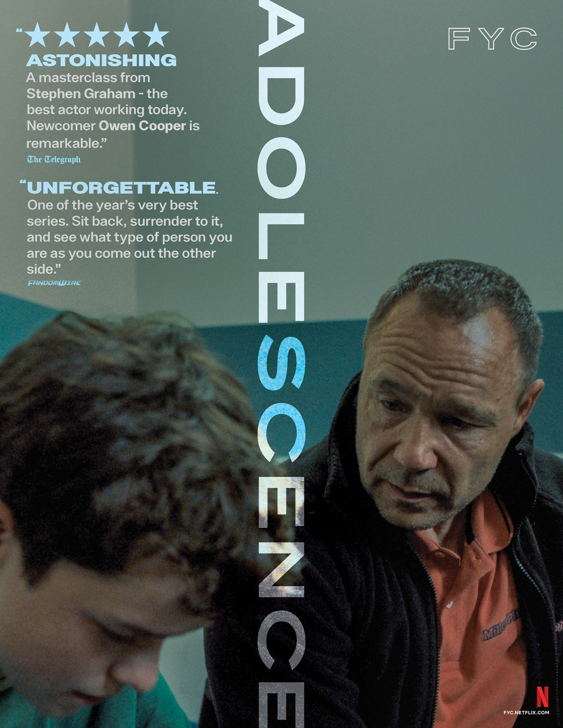
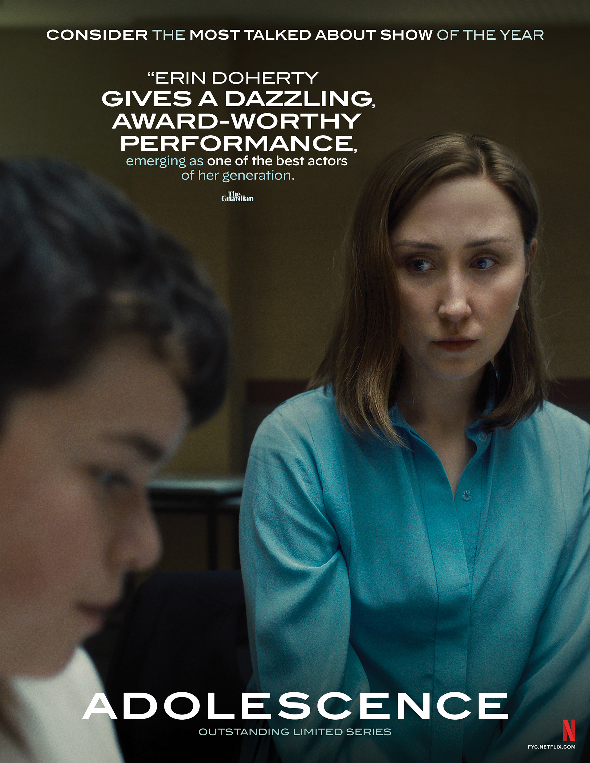
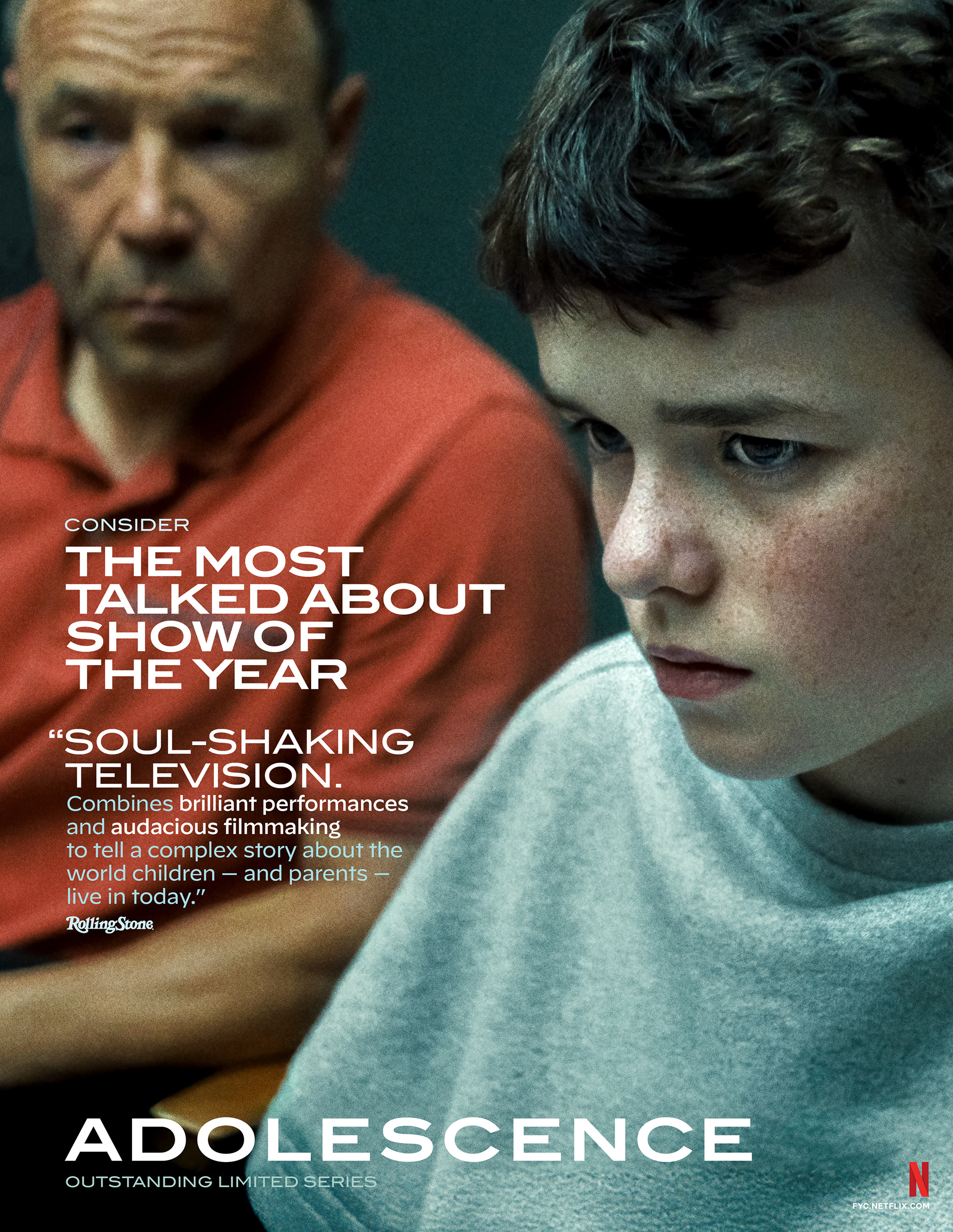
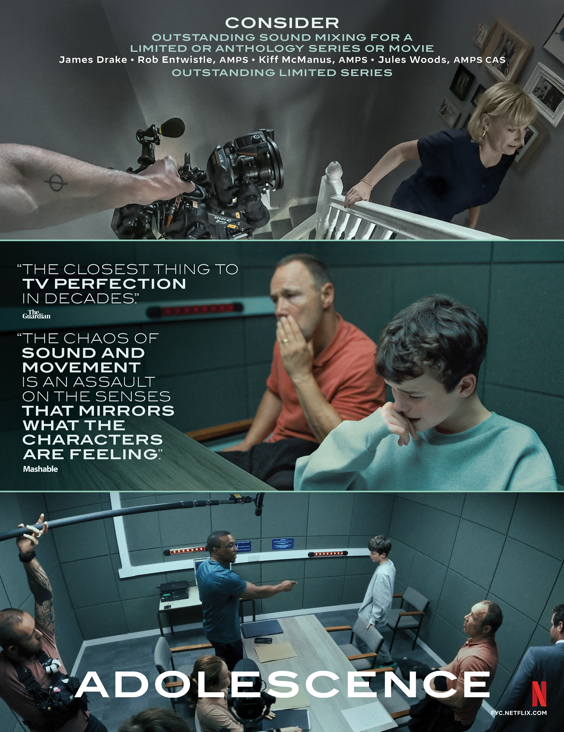
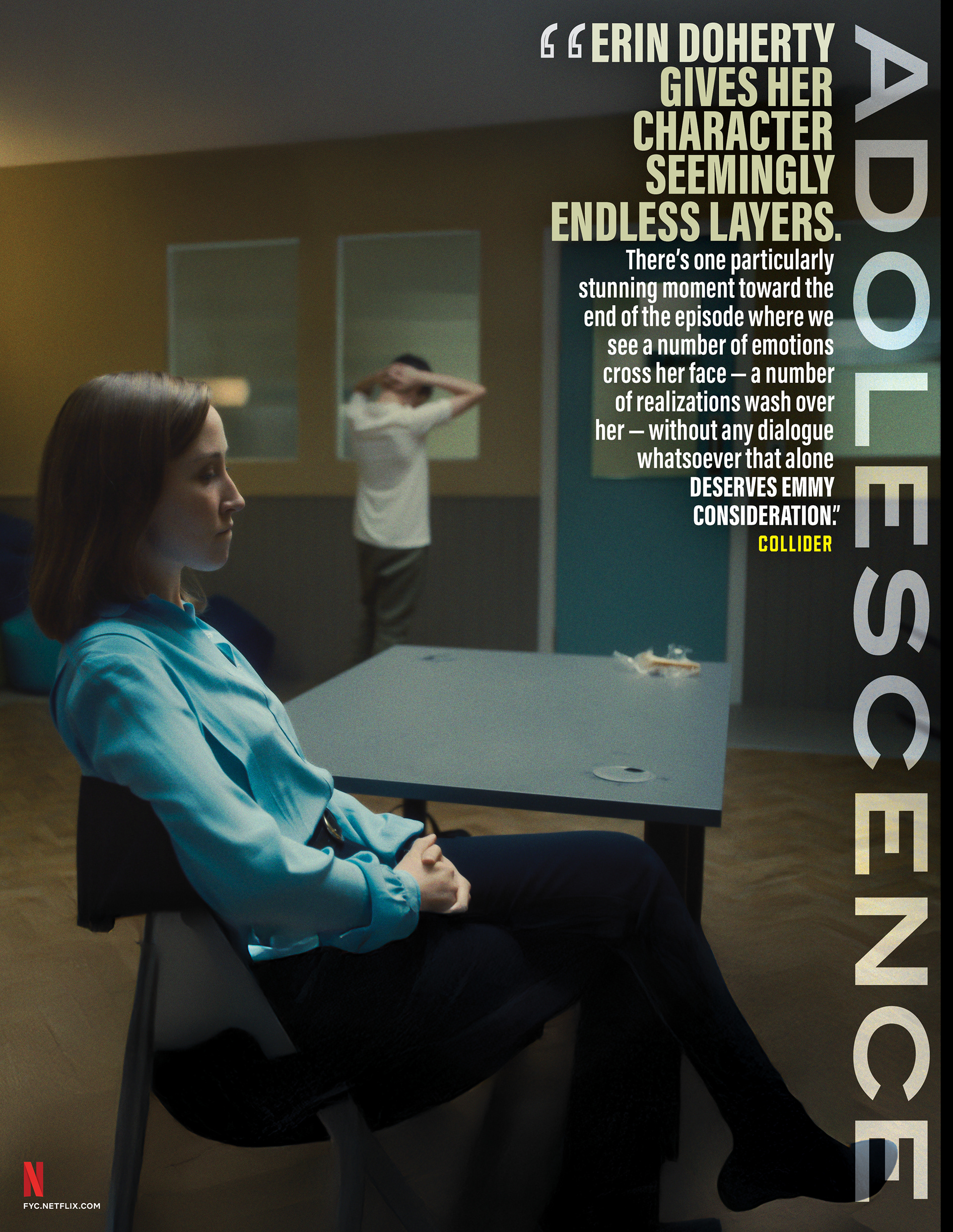
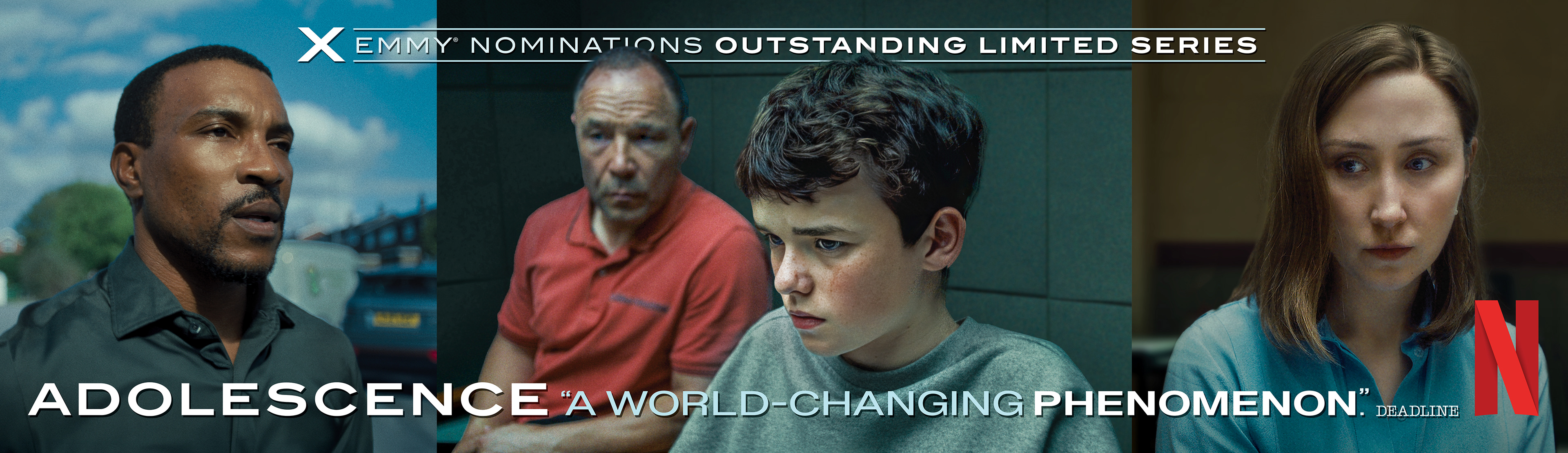
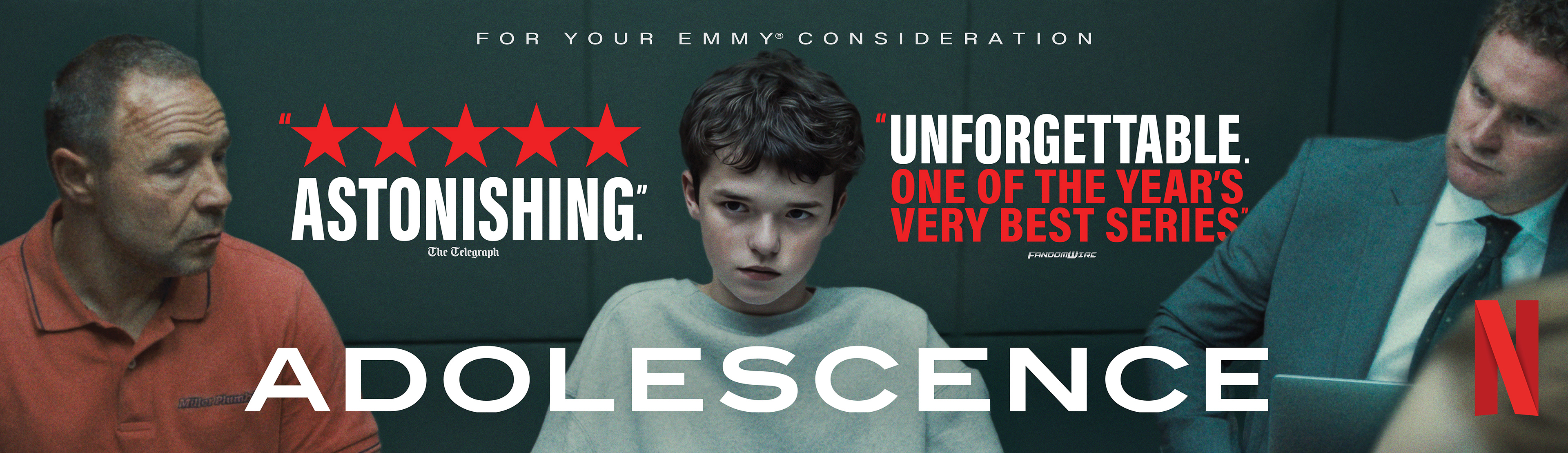
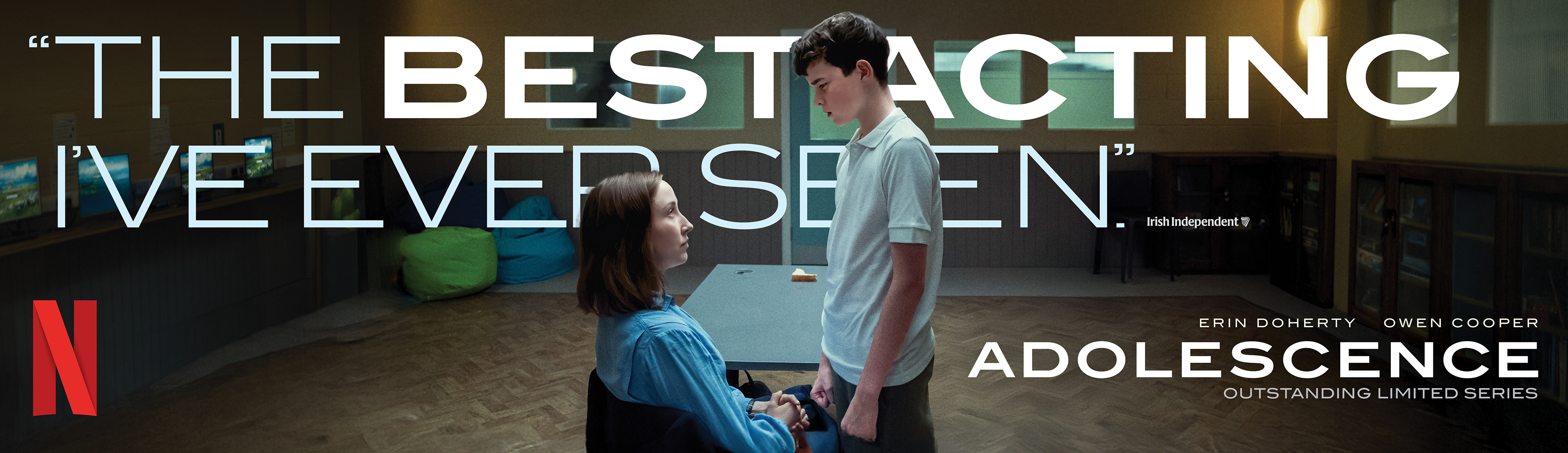
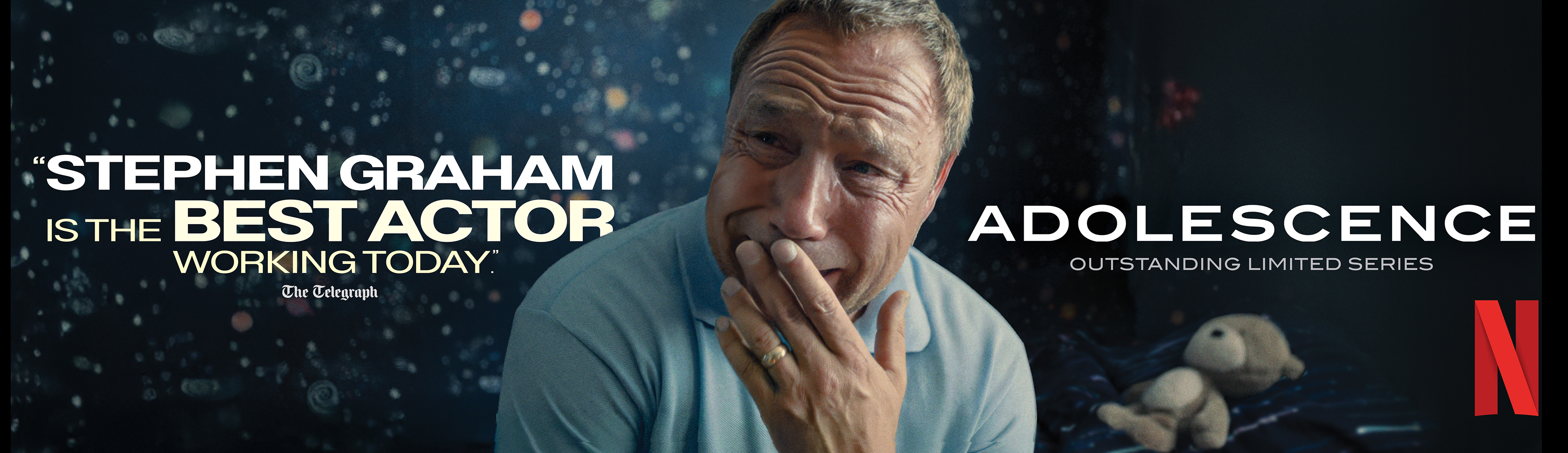
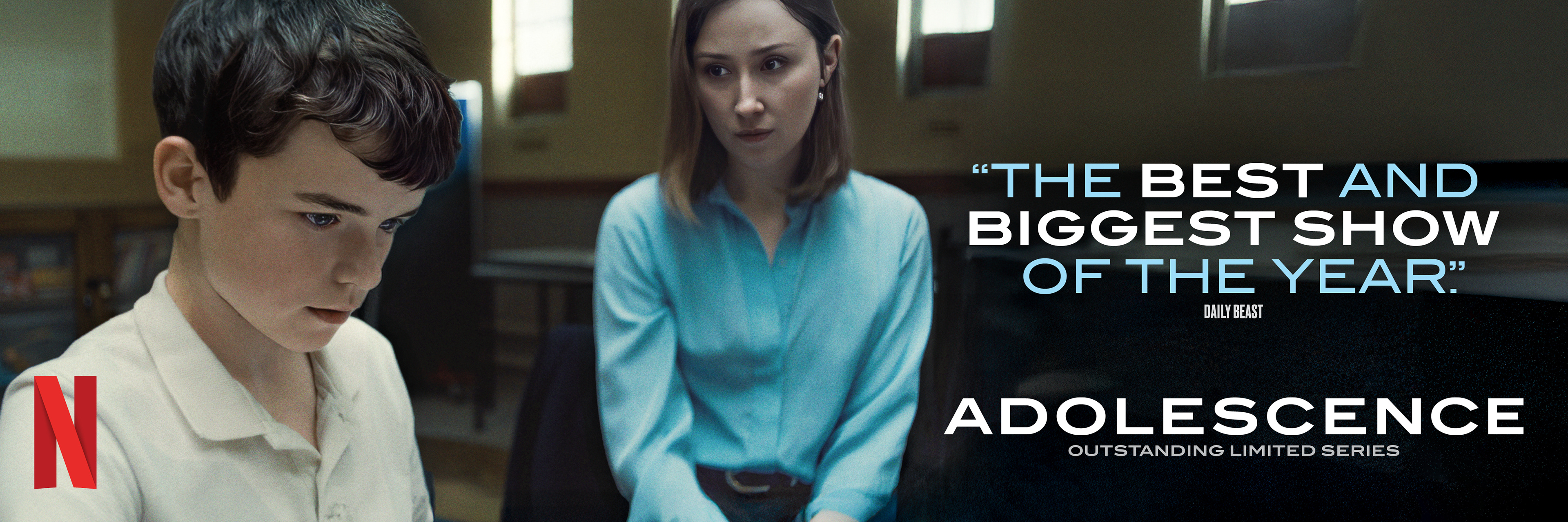
25 Nominations | 7 Wins | 13 Primetime Emmy® Nominations
BRIEF
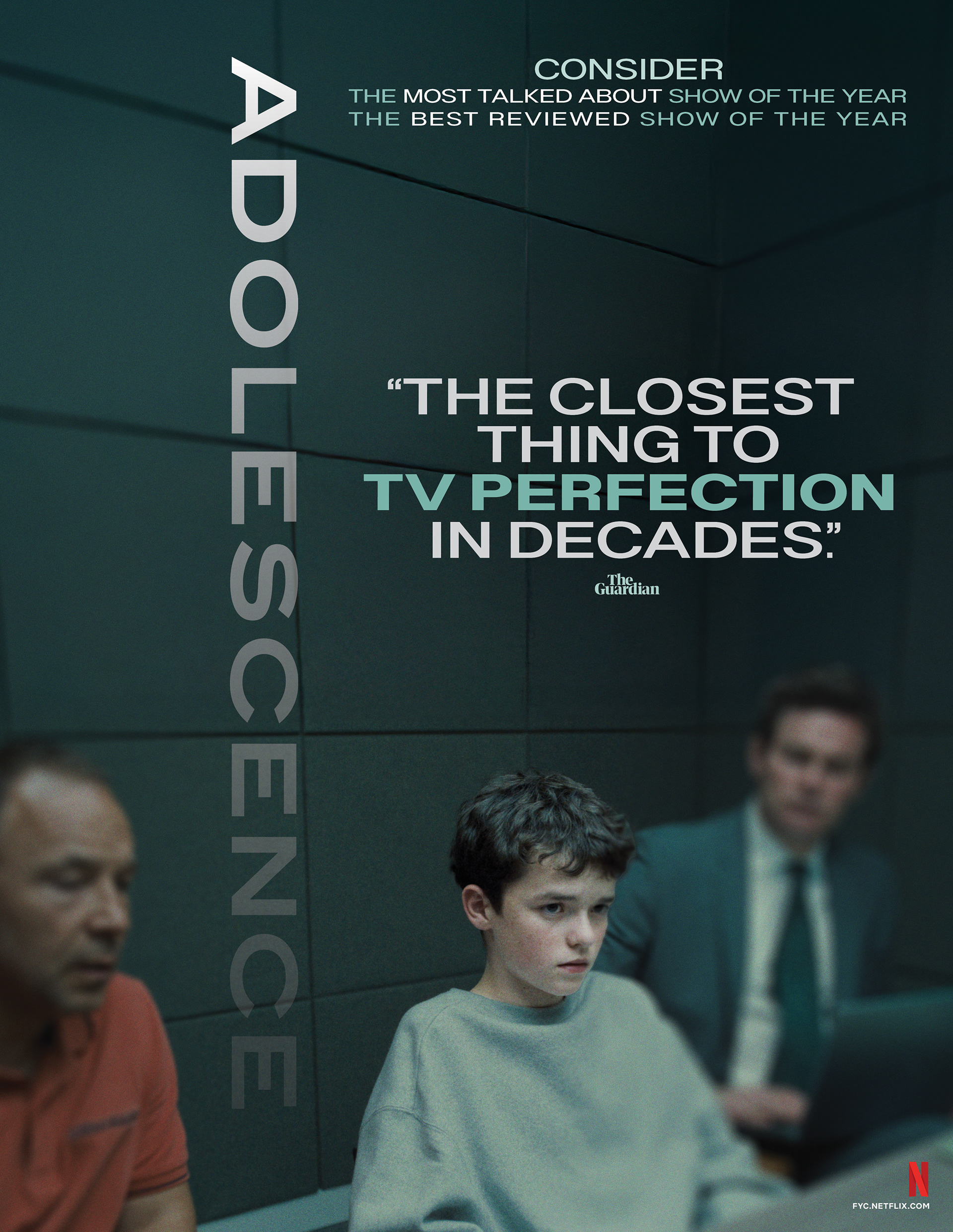
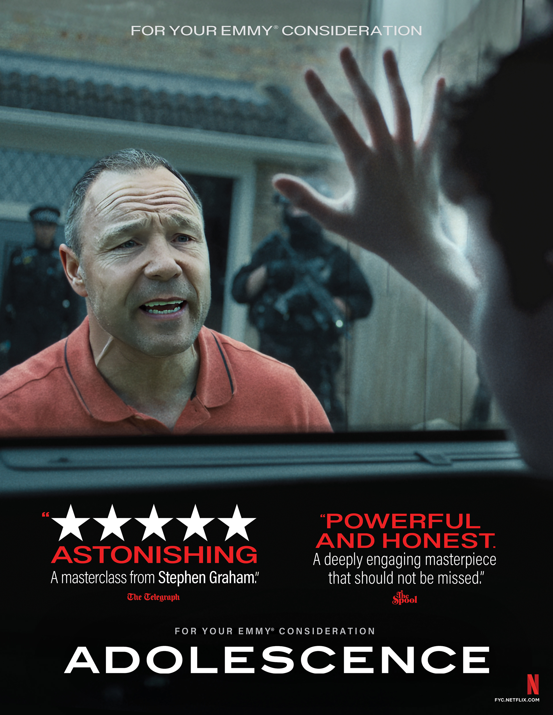
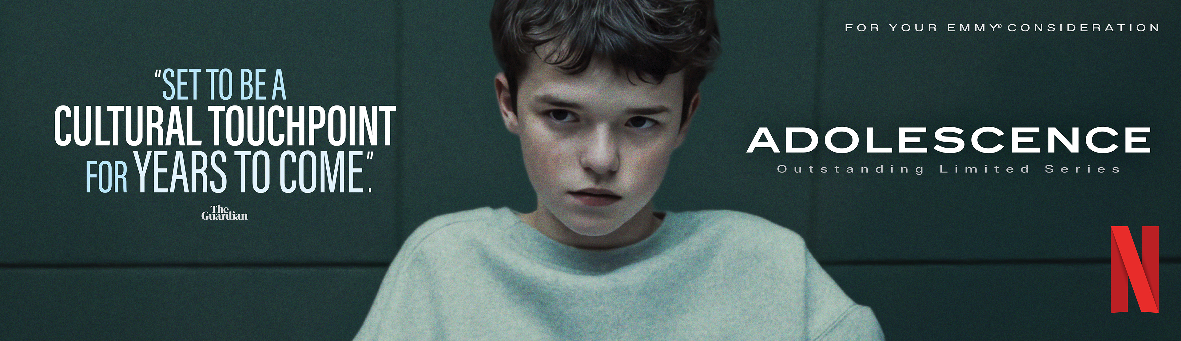
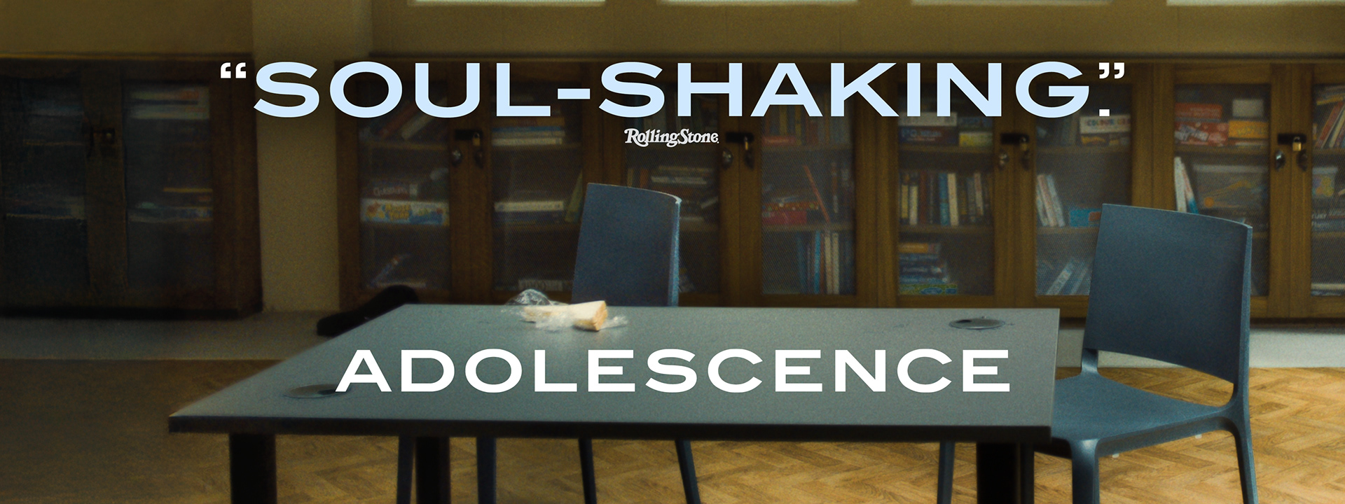
Netflix required an awards ecosystem for Adolescence mirroring its raw intensity. The challenge was translating the film’s gritty emotional weight into cohesive print and digital voter touchpoints.
STRATEGY
I utilized a clinical teal palette and claustrophobic framing to reflect the film’s tension. The system prioritized raw character portraits to highlight powerhouse performances across all media.
Industry Trade Print
Out Of Home Advertising

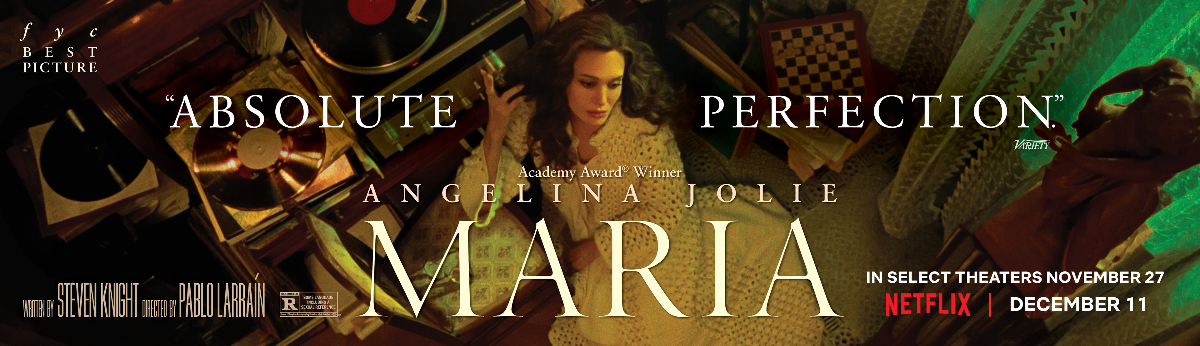
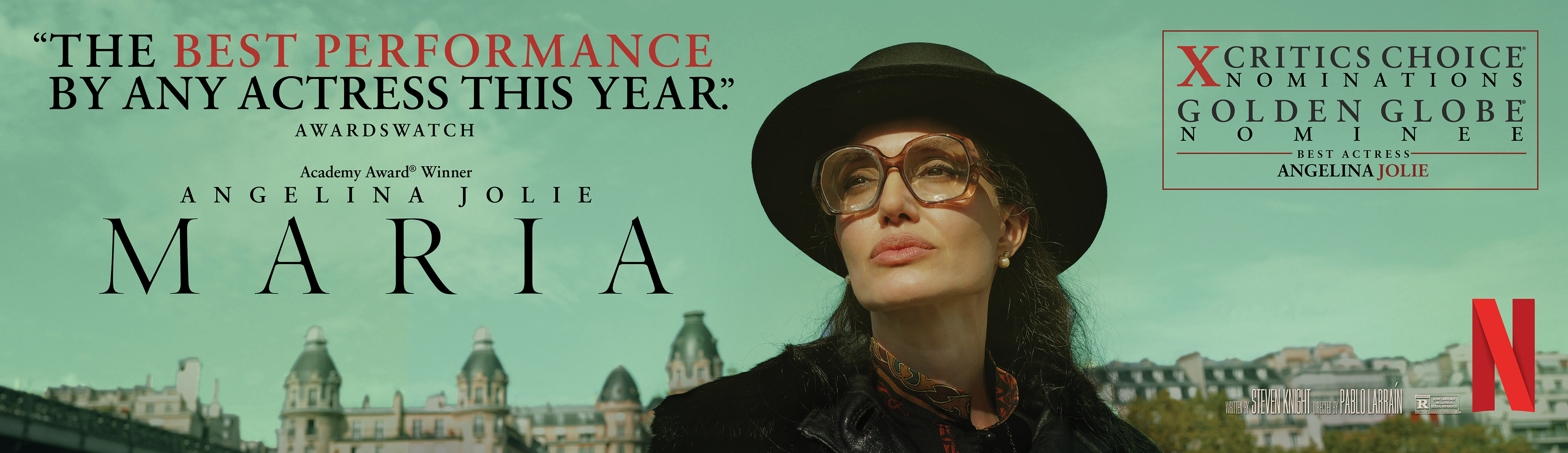
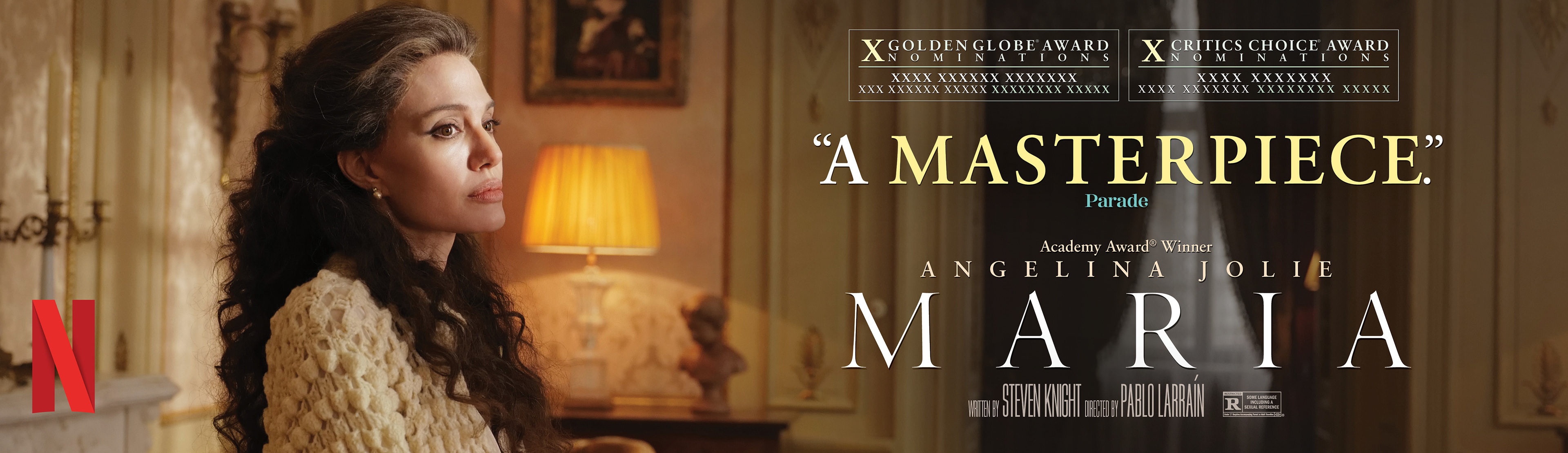
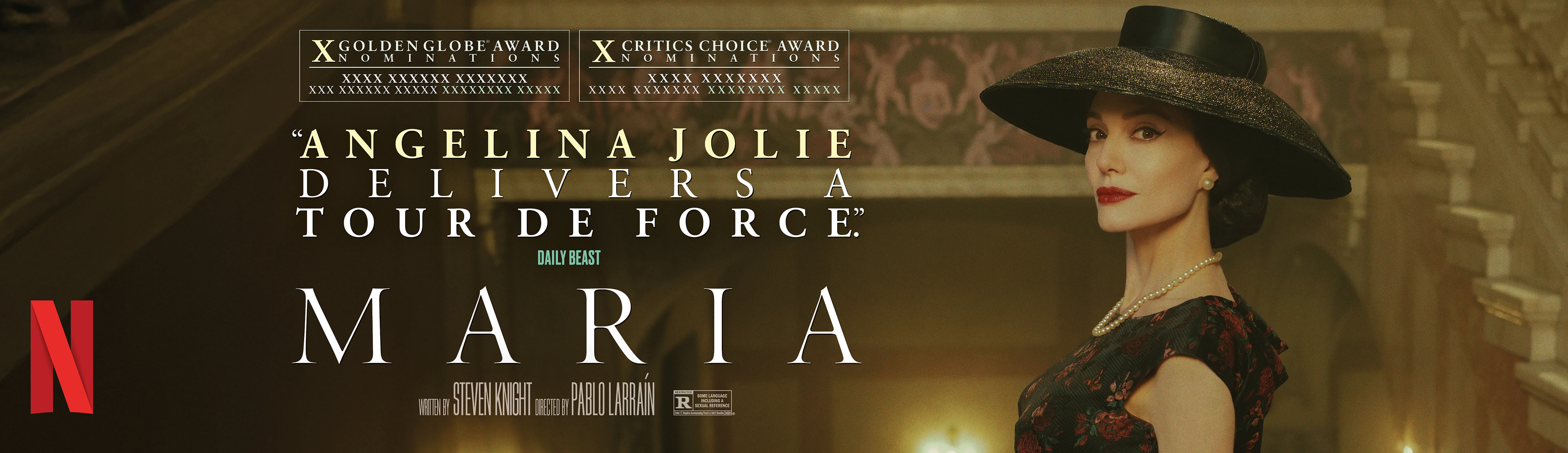
22 Nominations | 4 Wins
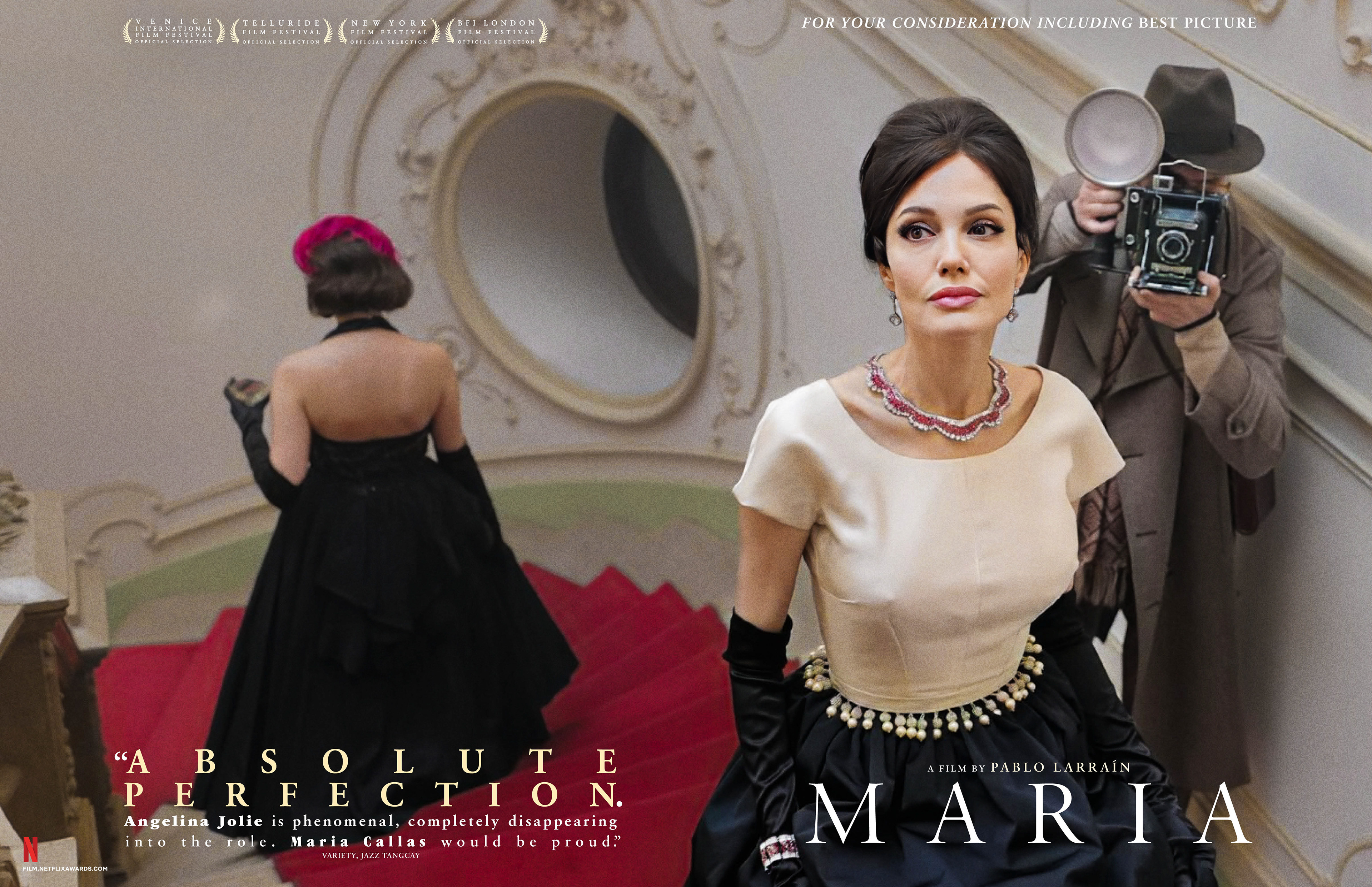
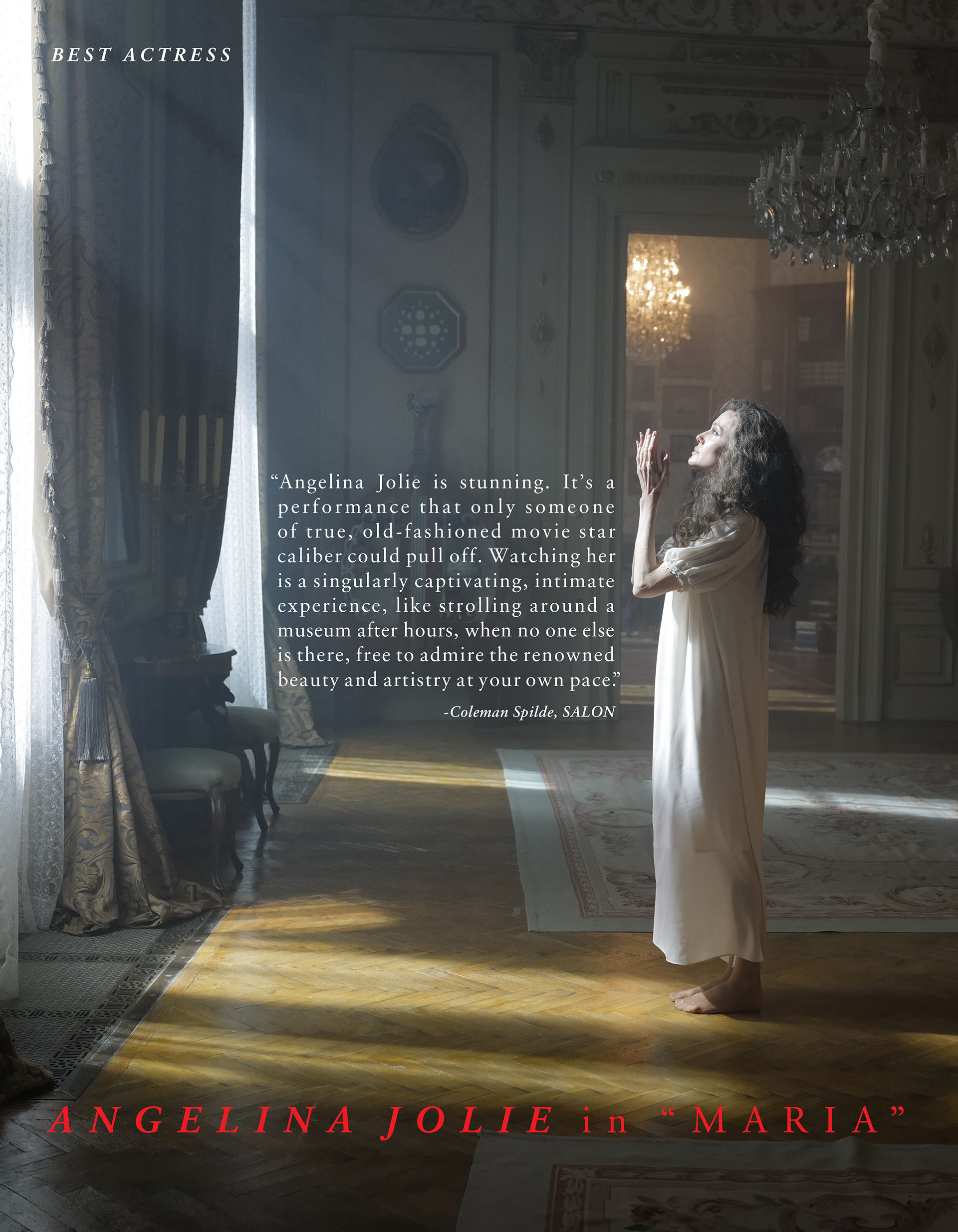
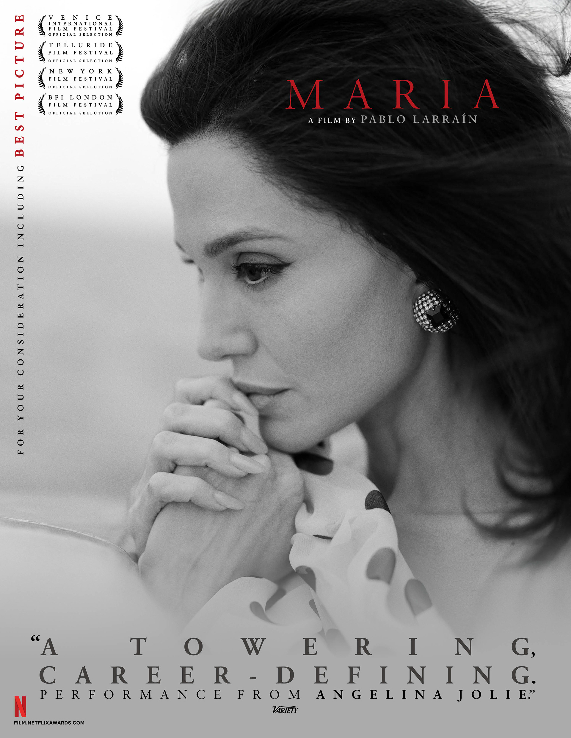
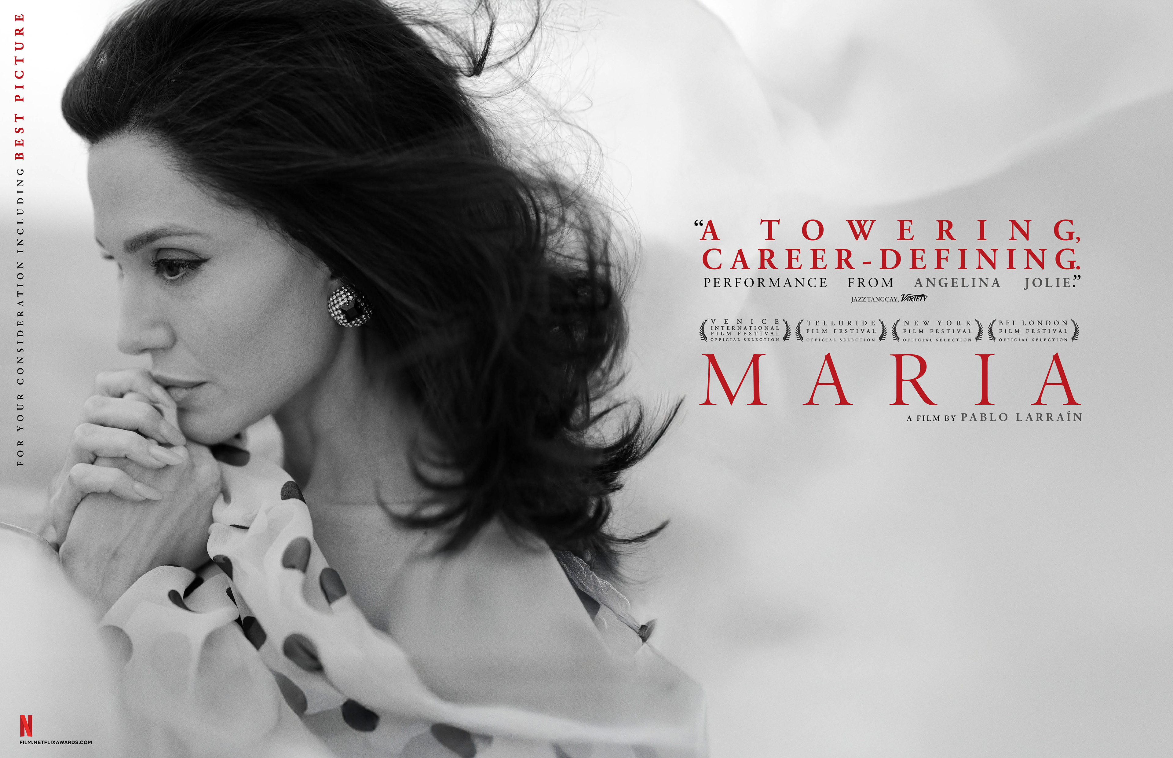
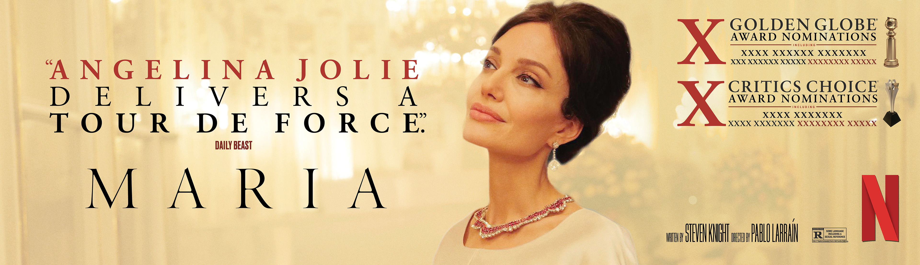
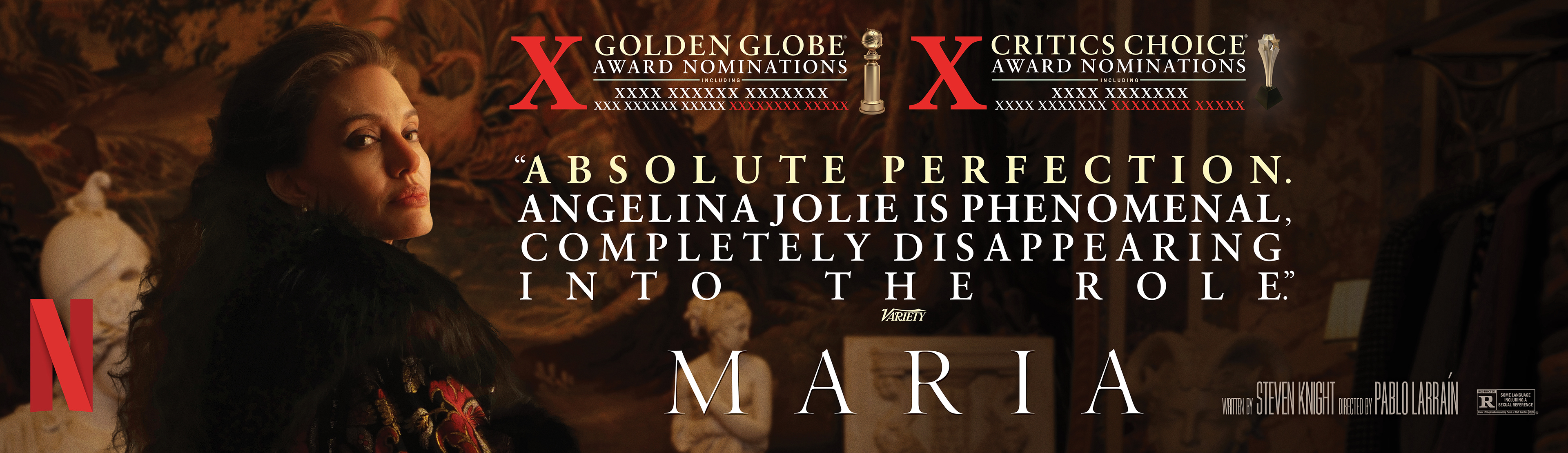
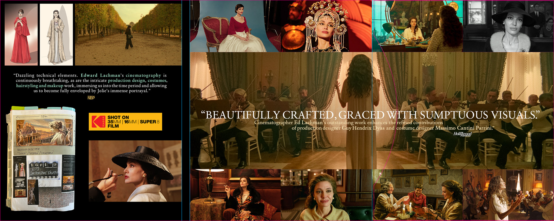
BRIEF
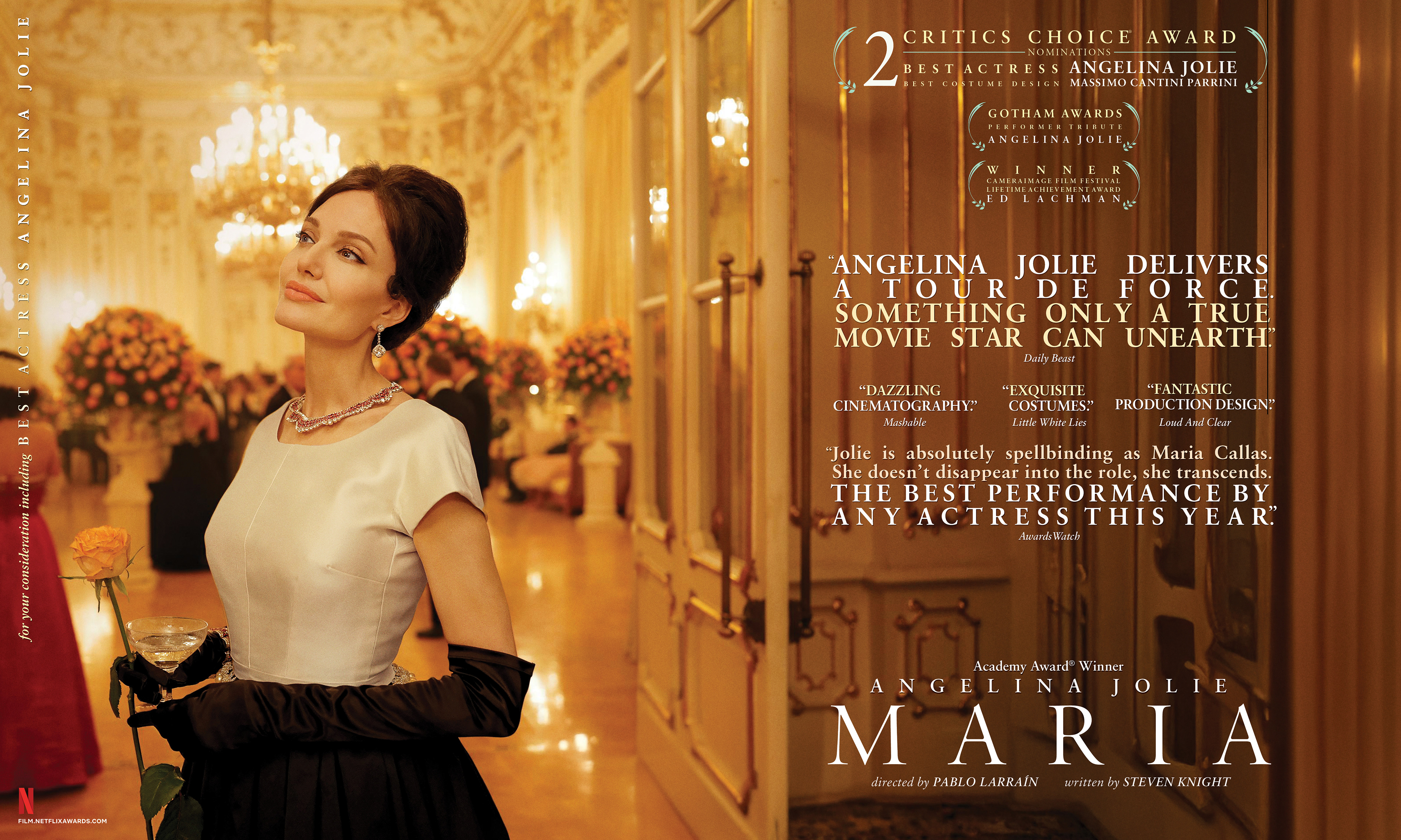
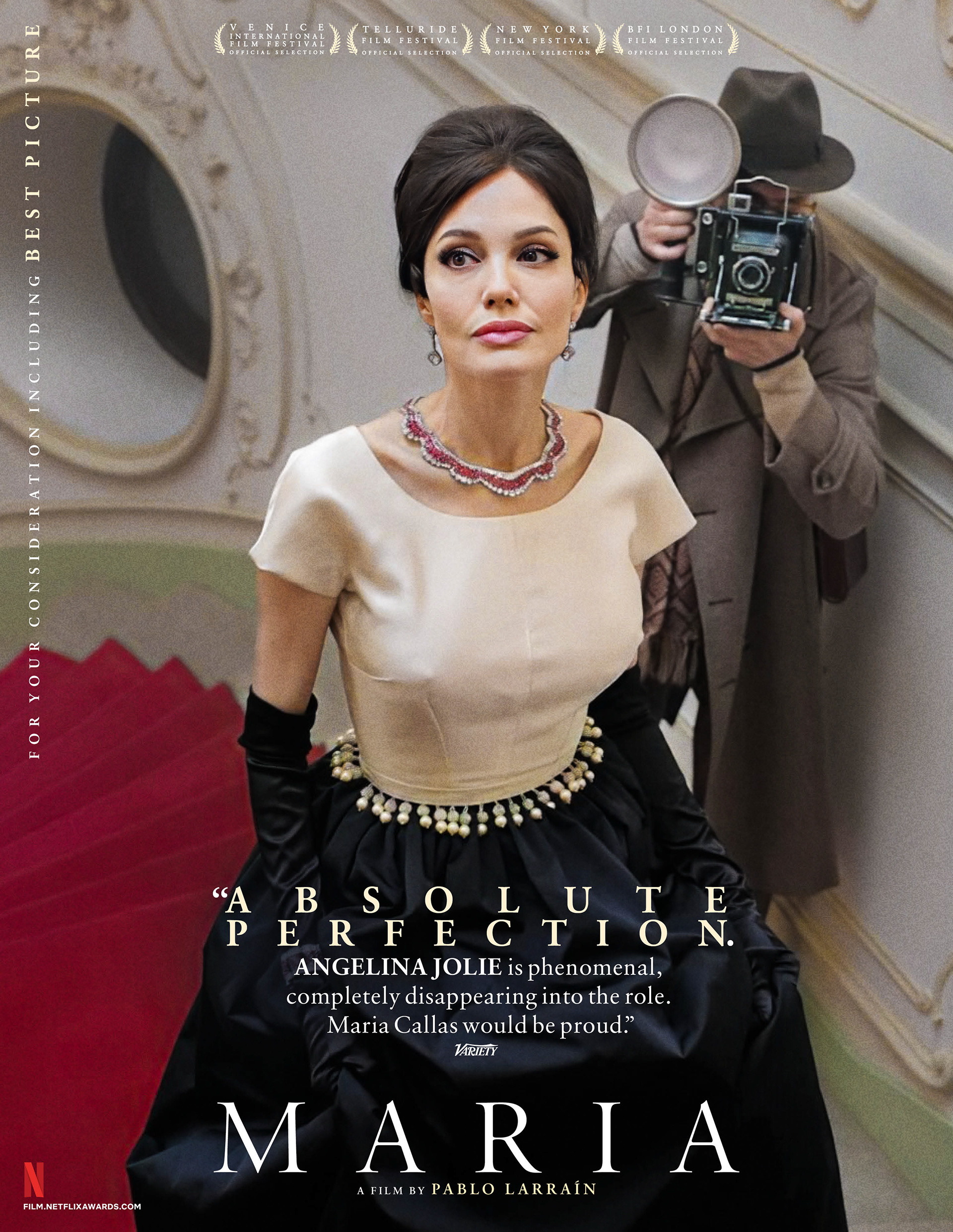
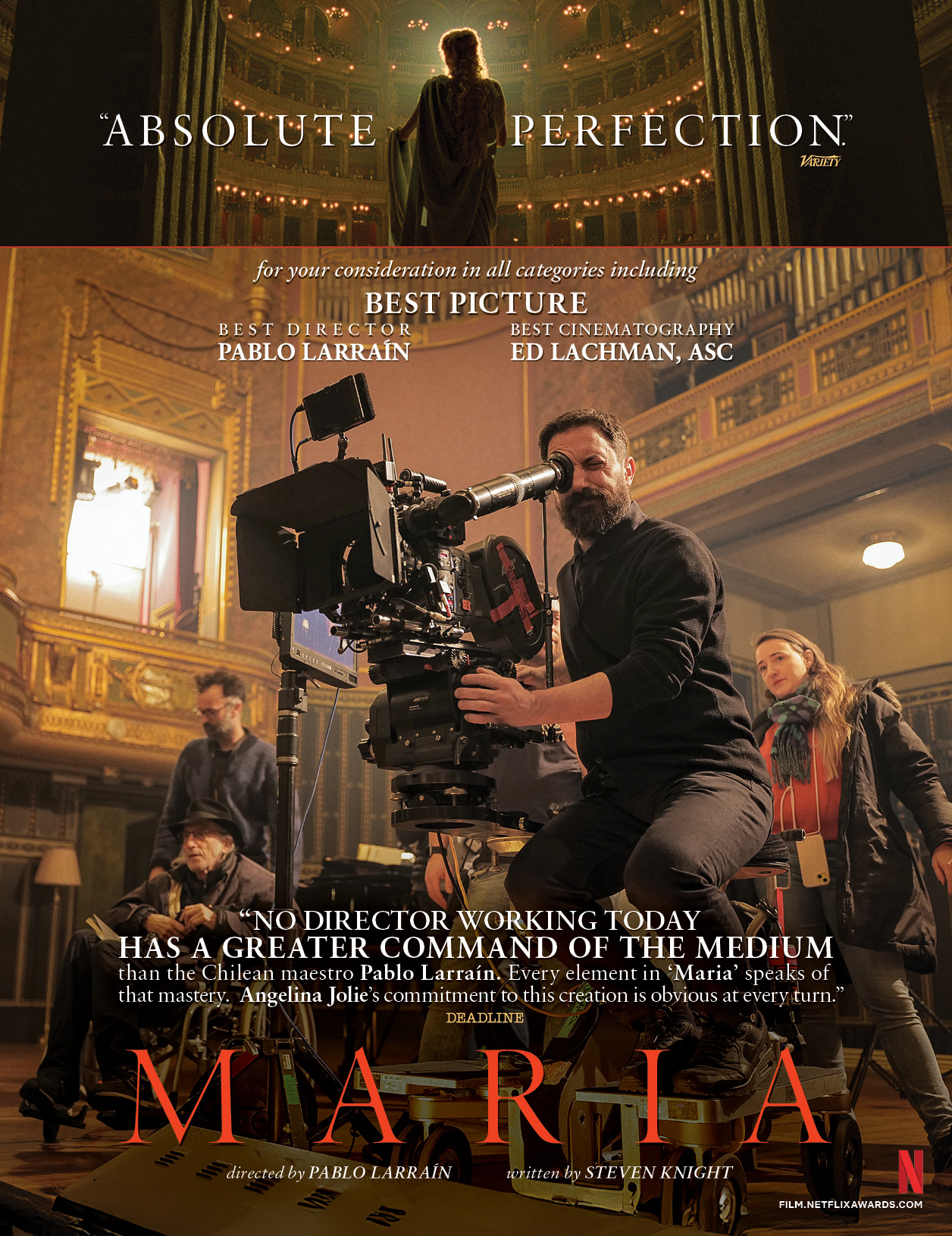
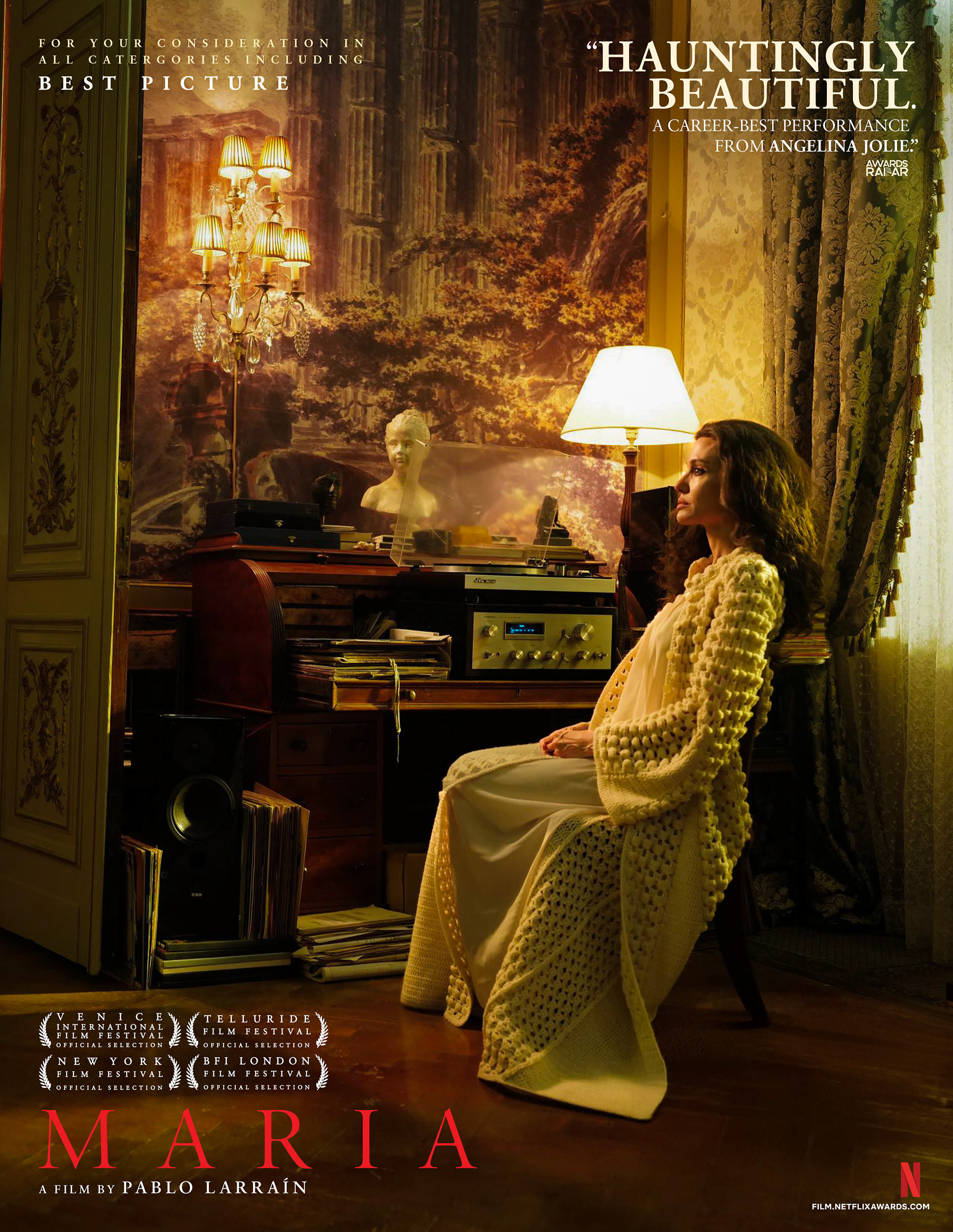
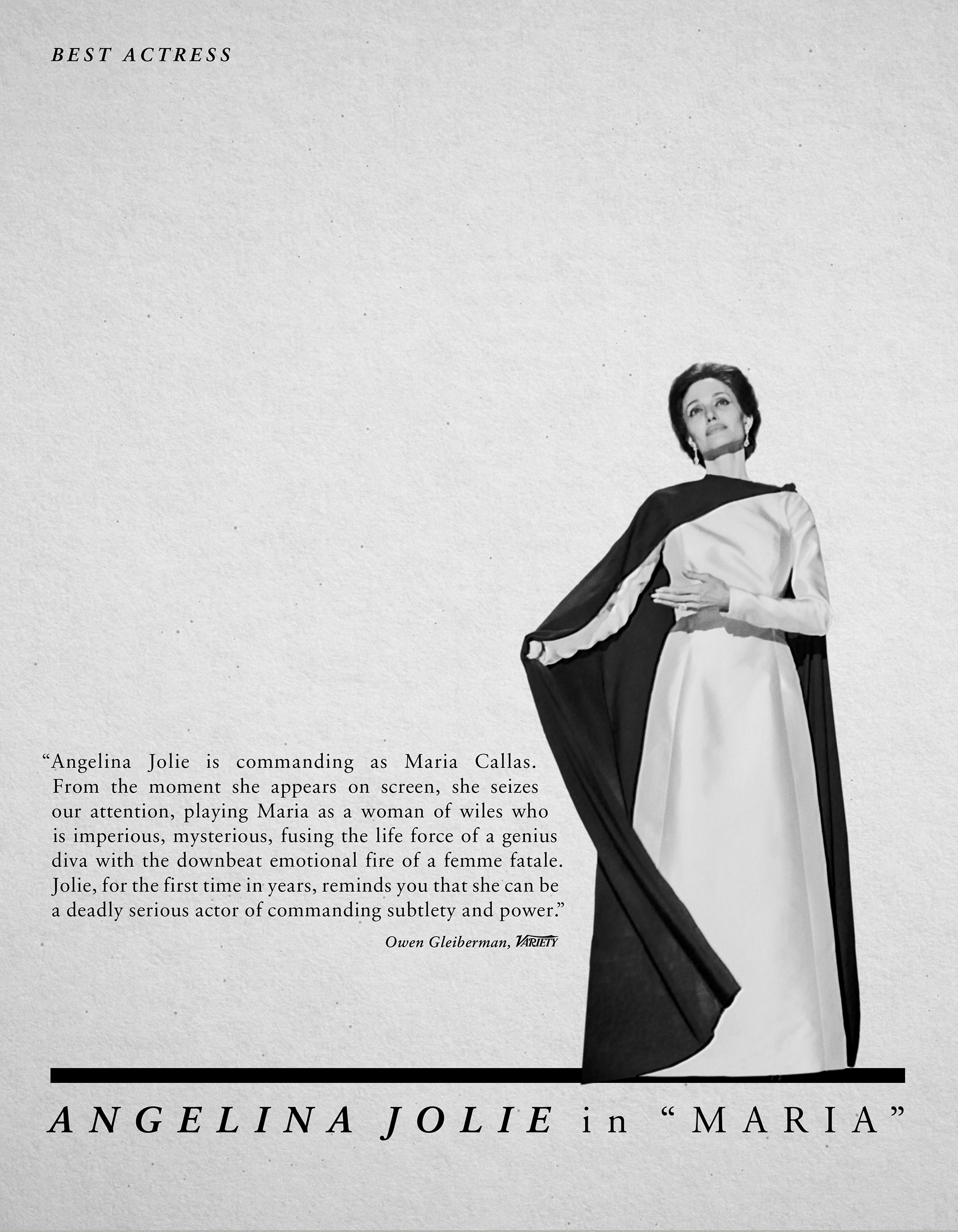
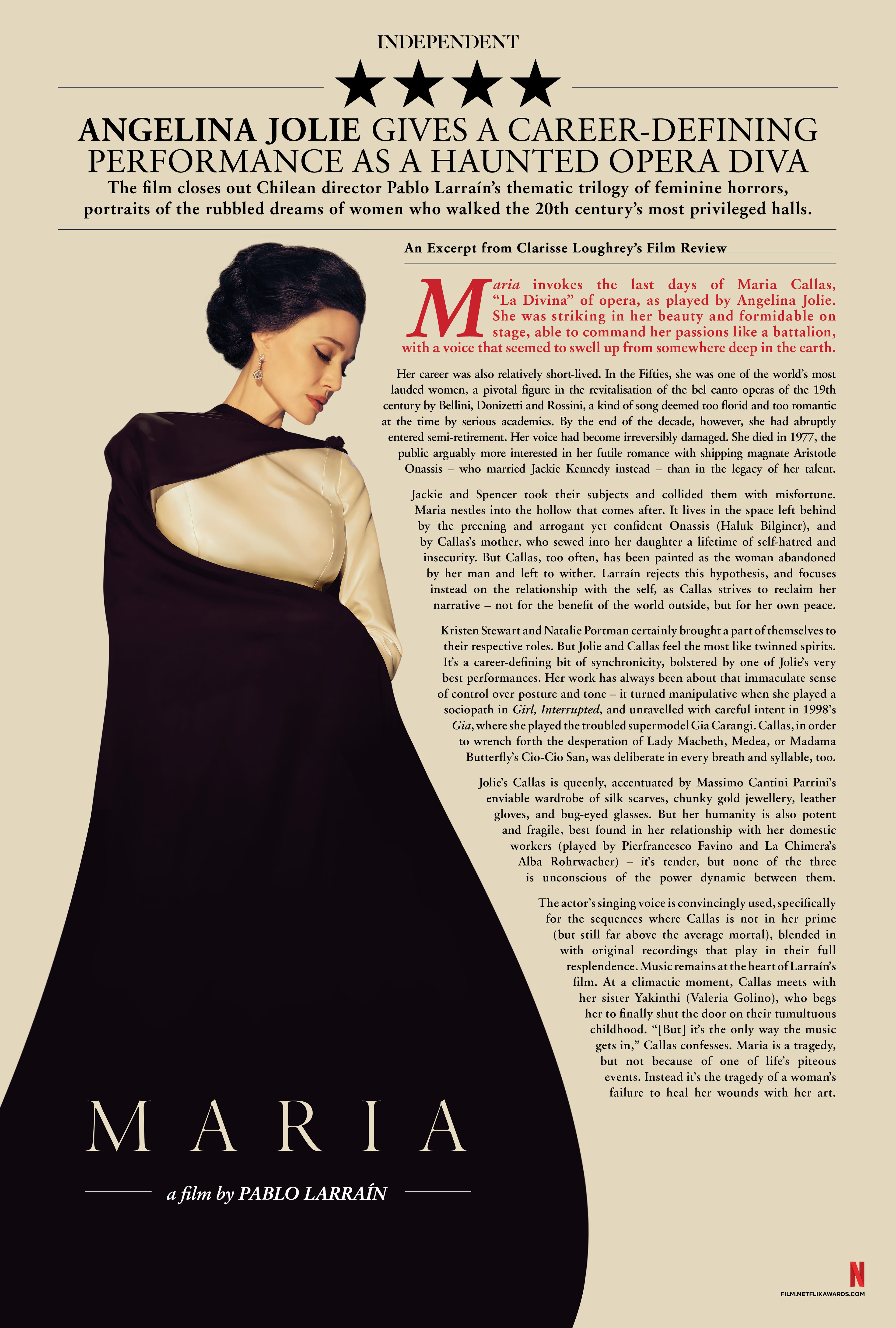
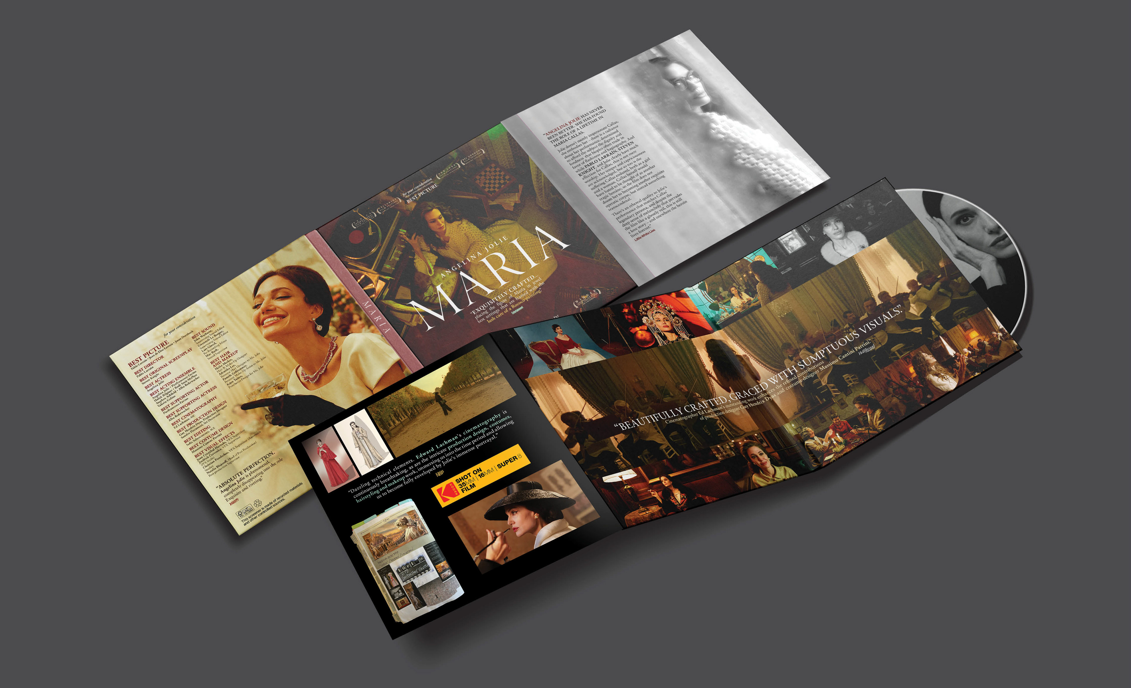
Design a multi-platform awards ecosystem for the Netflix feature film Maria to secure Academy Award and BAFTA nominations. The objective was to translate the film’s operatic scale and the tragic elegance of Maria Callas’s final days into a cohesive suite of high-end voter touchpoints, including specialized screener packaging, theatrical trade ads, and large-format outdoor advertising.
STRATEGY
I utilized a prestige editorial aesthetic that mirrors the film’s cinematic textures and historical setting. Prioritizing evocative portraiture and sophisticated serif typography, I created a sense of timelessness that highlighted the gravity of the central performance. This cohesive system ensured a premium, "event-level" feel across all media, from tactile screener booklets to massive out-of-home displays.
Industry Trade Print
Theater Review Board
Awards DVD Screener Packaging
Out Of Home Advertising
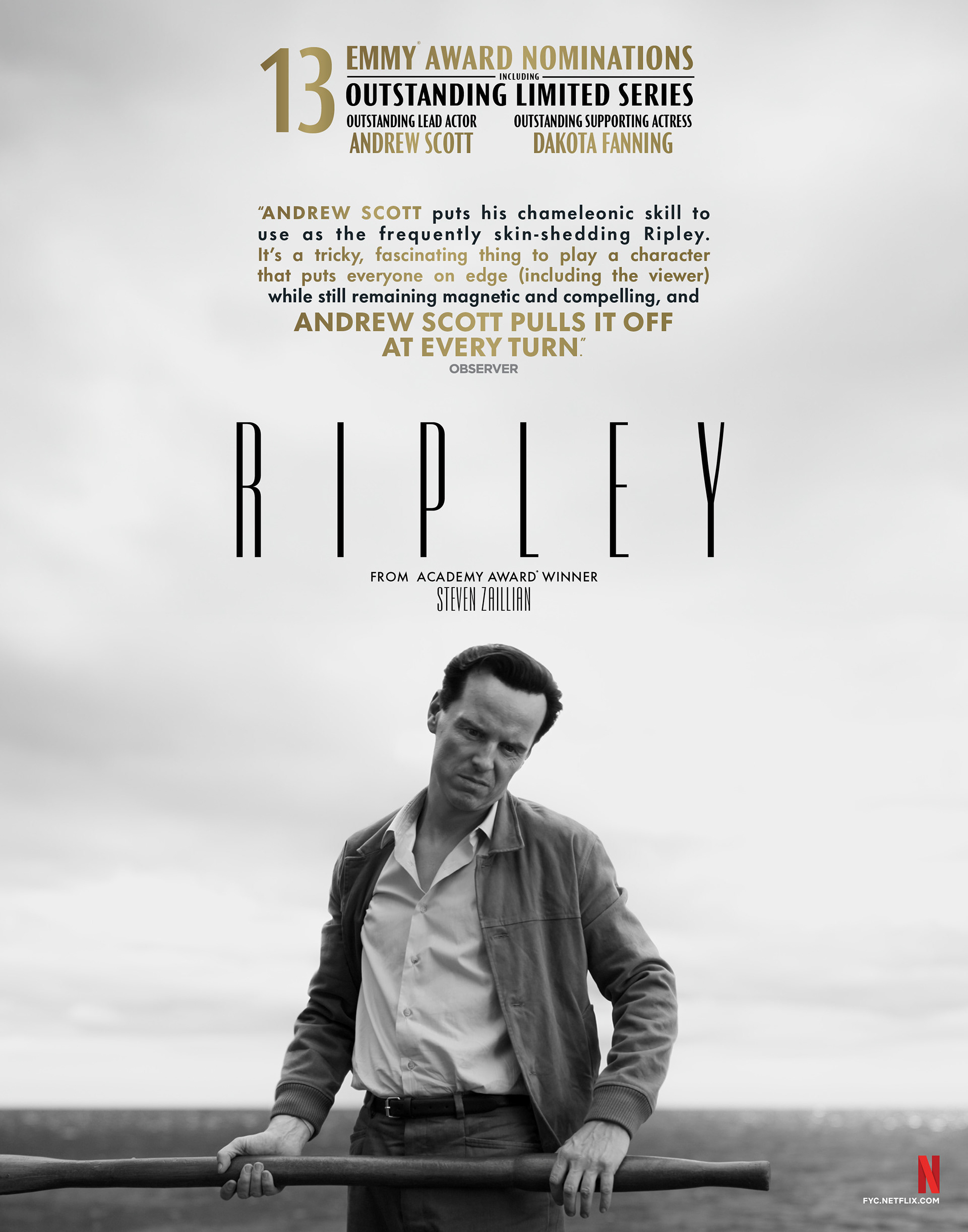
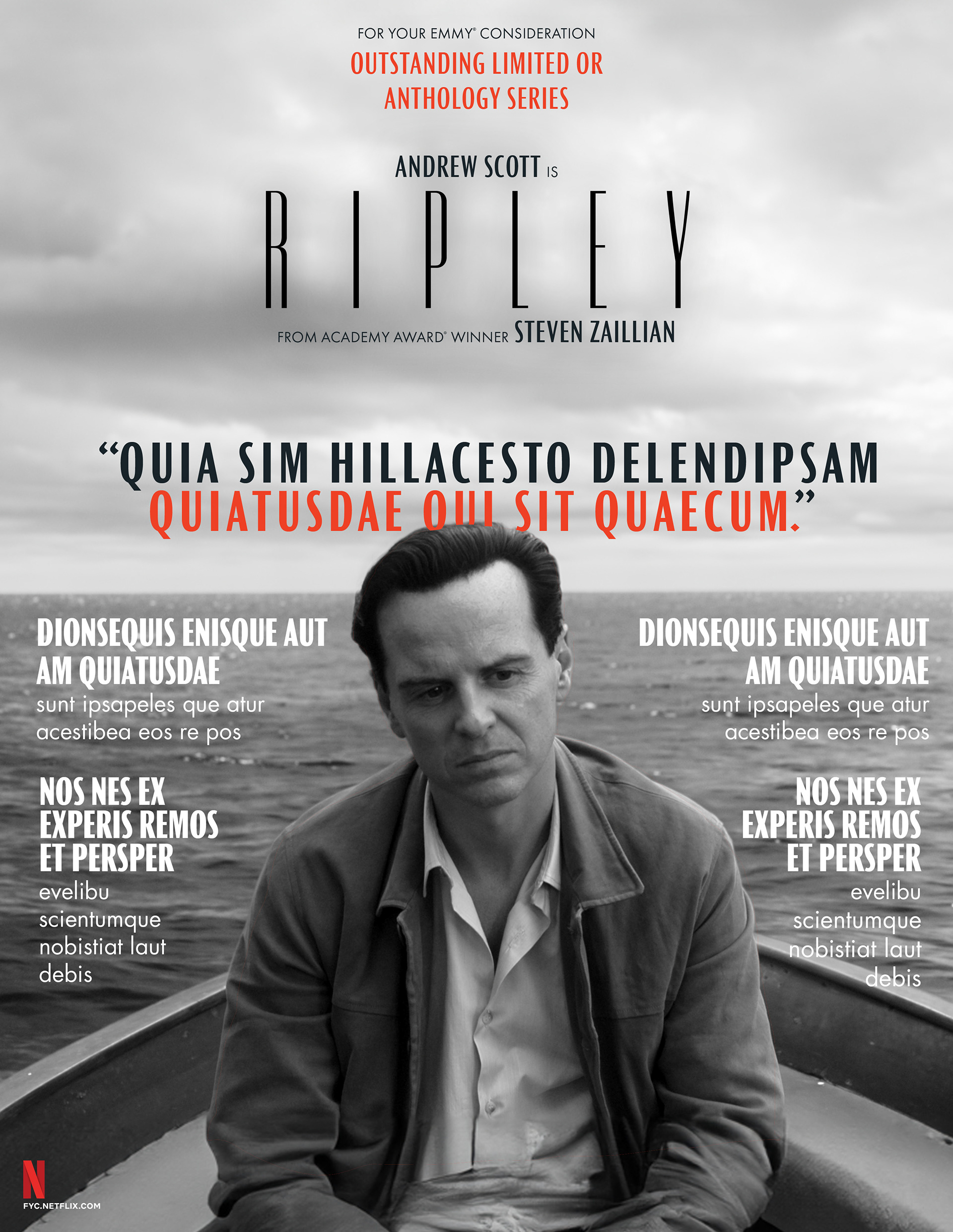
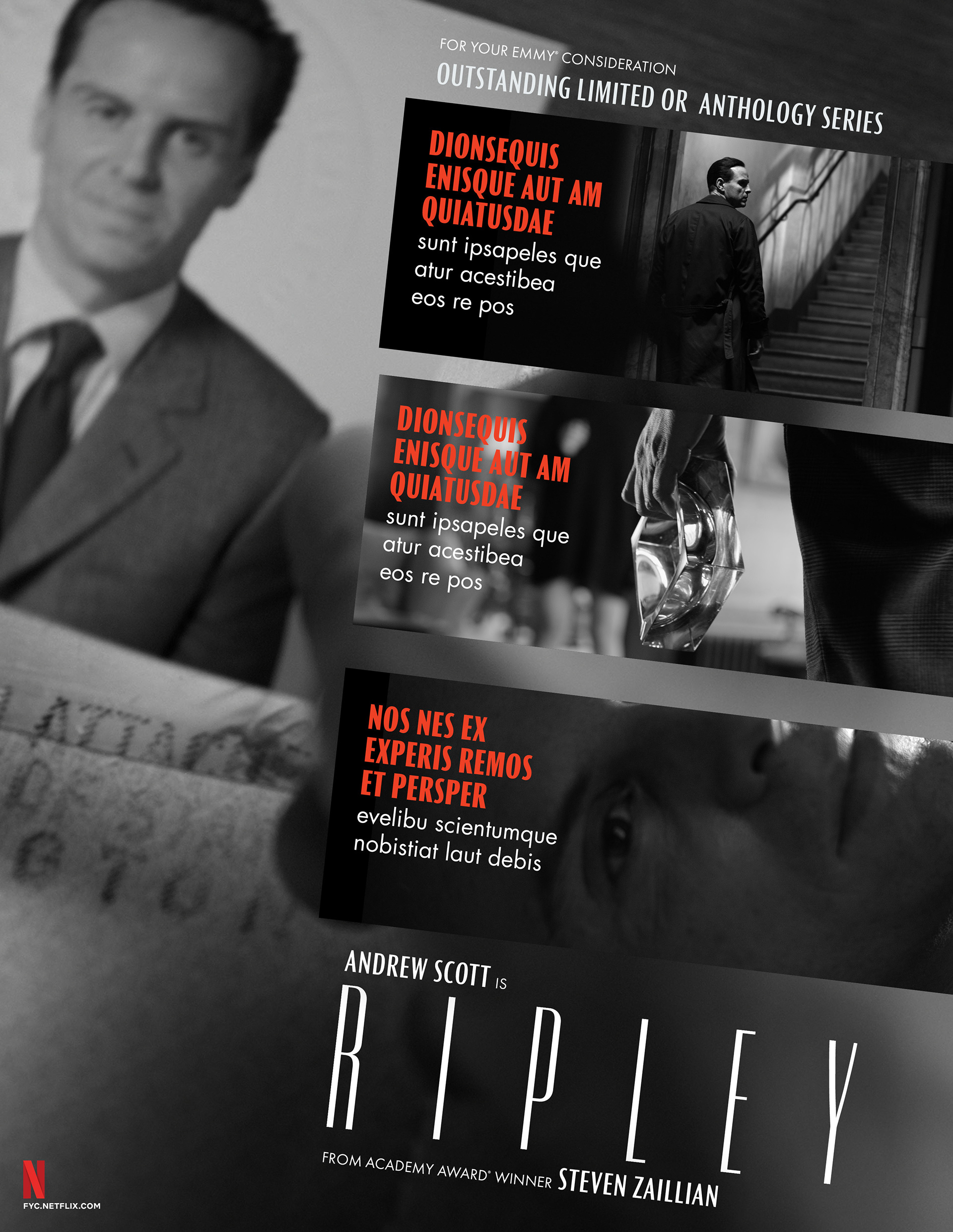
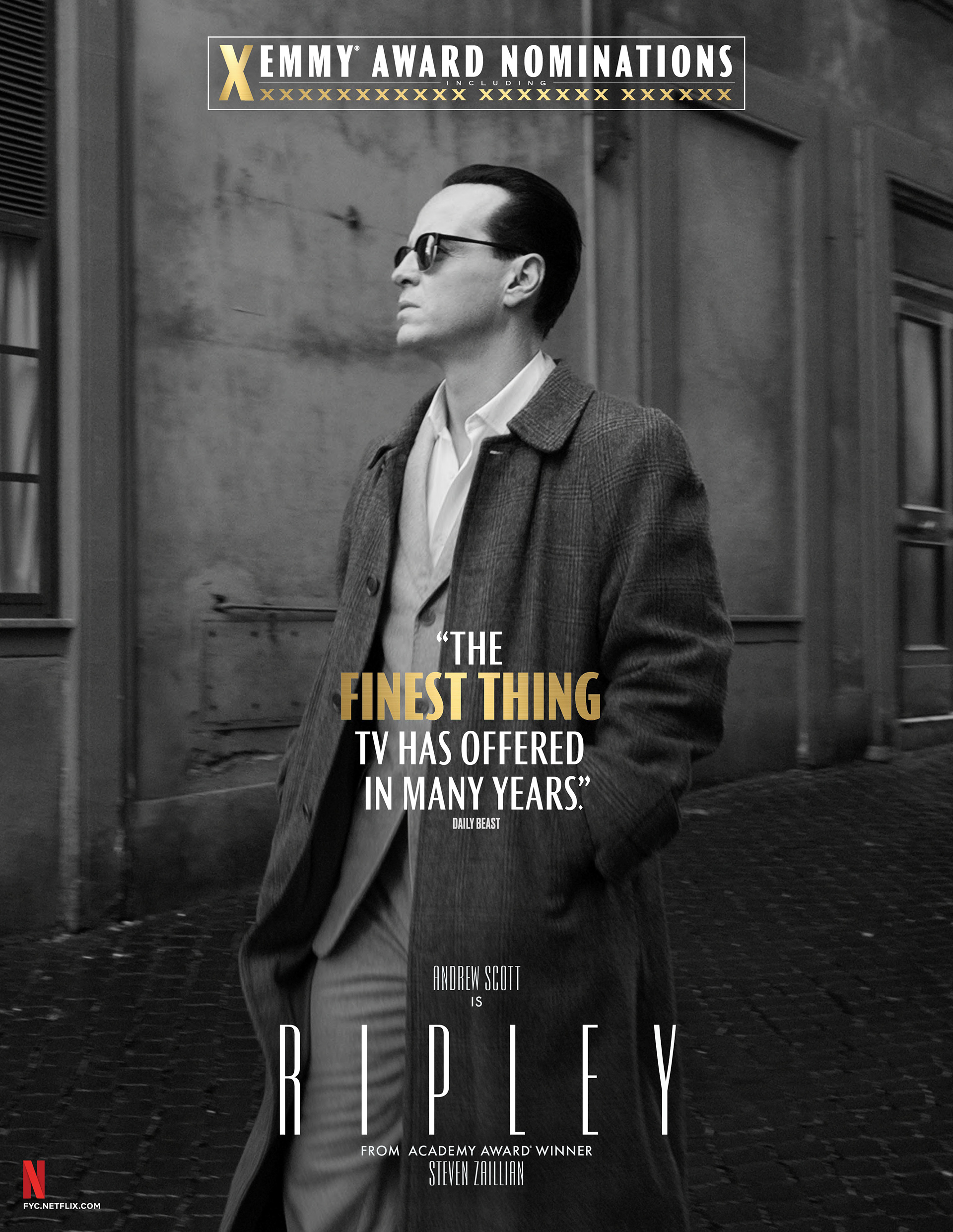
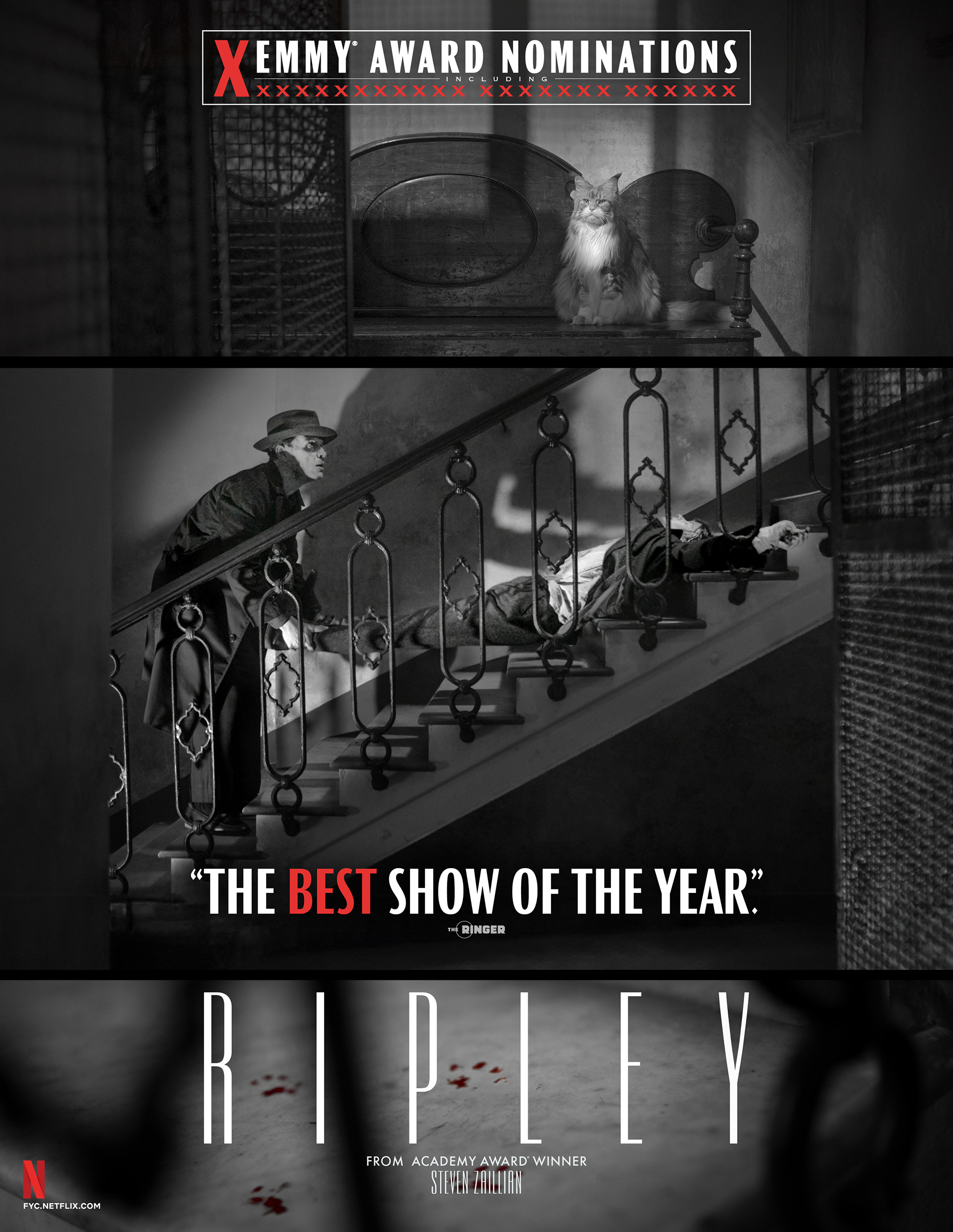
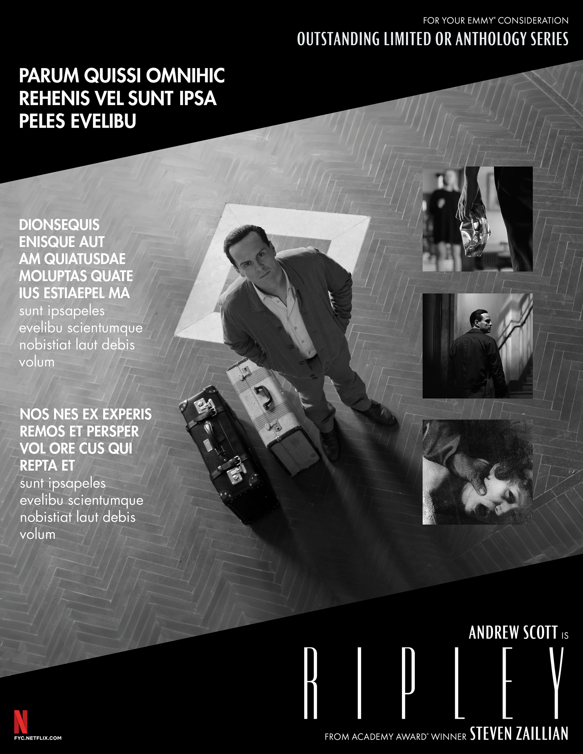
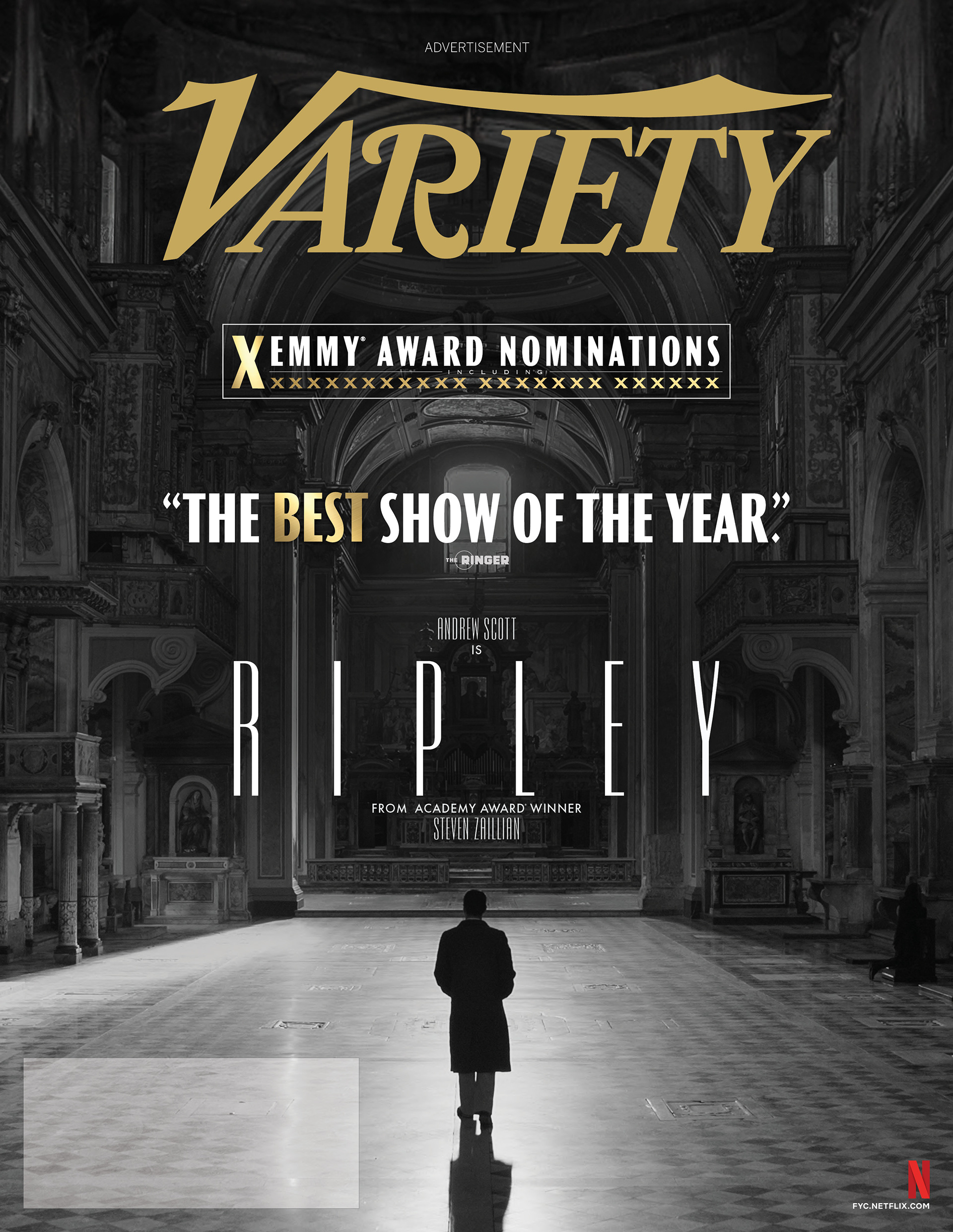
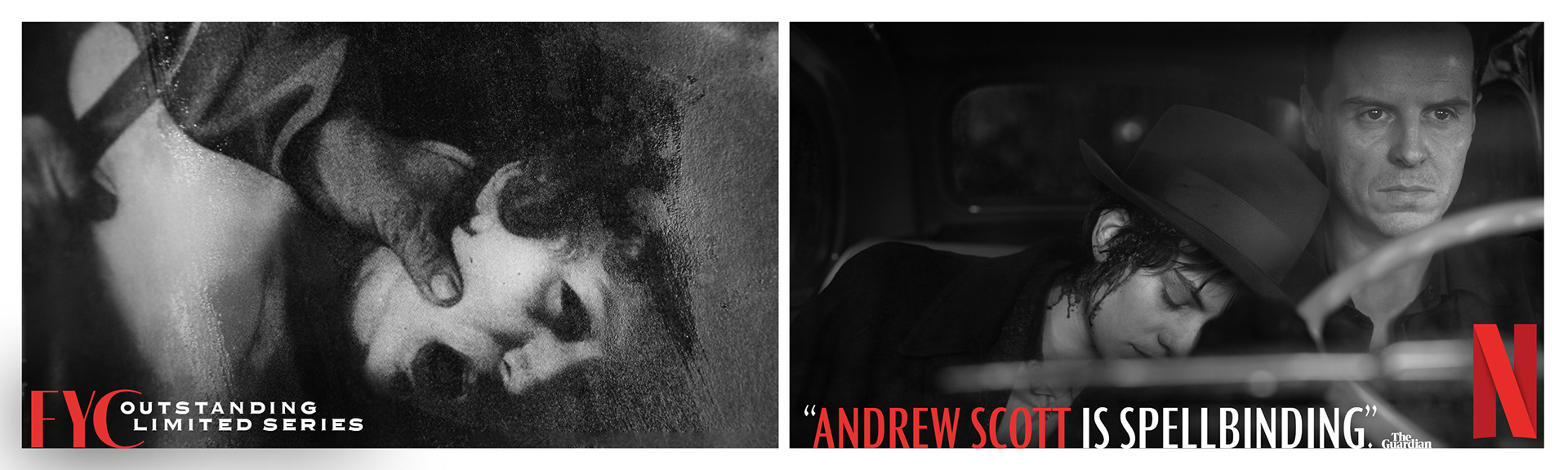
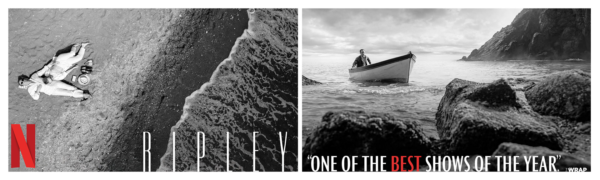
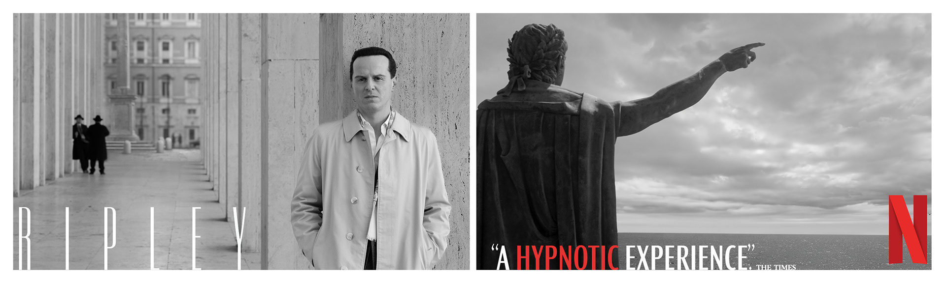
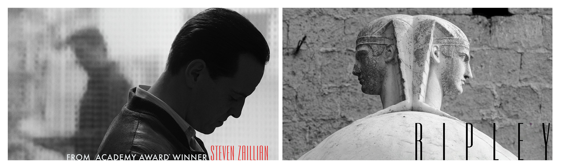
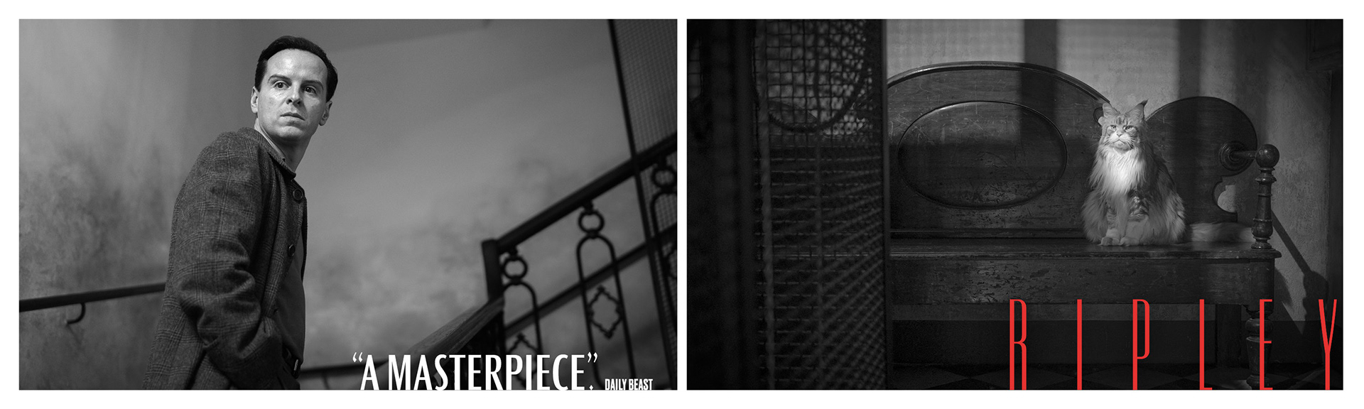
54 Nominations | 12 Wins | 4 Primetime Emmy® Wins
BRIEF
Netflix required a campaign for Ripley mirroring its stunning monochrome cinematography. The goal was translating high-contrast noir visuals into prestigious voter materials.
STRATEGY
I designed a stark black-and-white identity using dramatic lighting and architectural geometry. The visuals evoke the show’s suspenseful, Hitchcockian atmosphere across print and digital.
Industry Trade Print
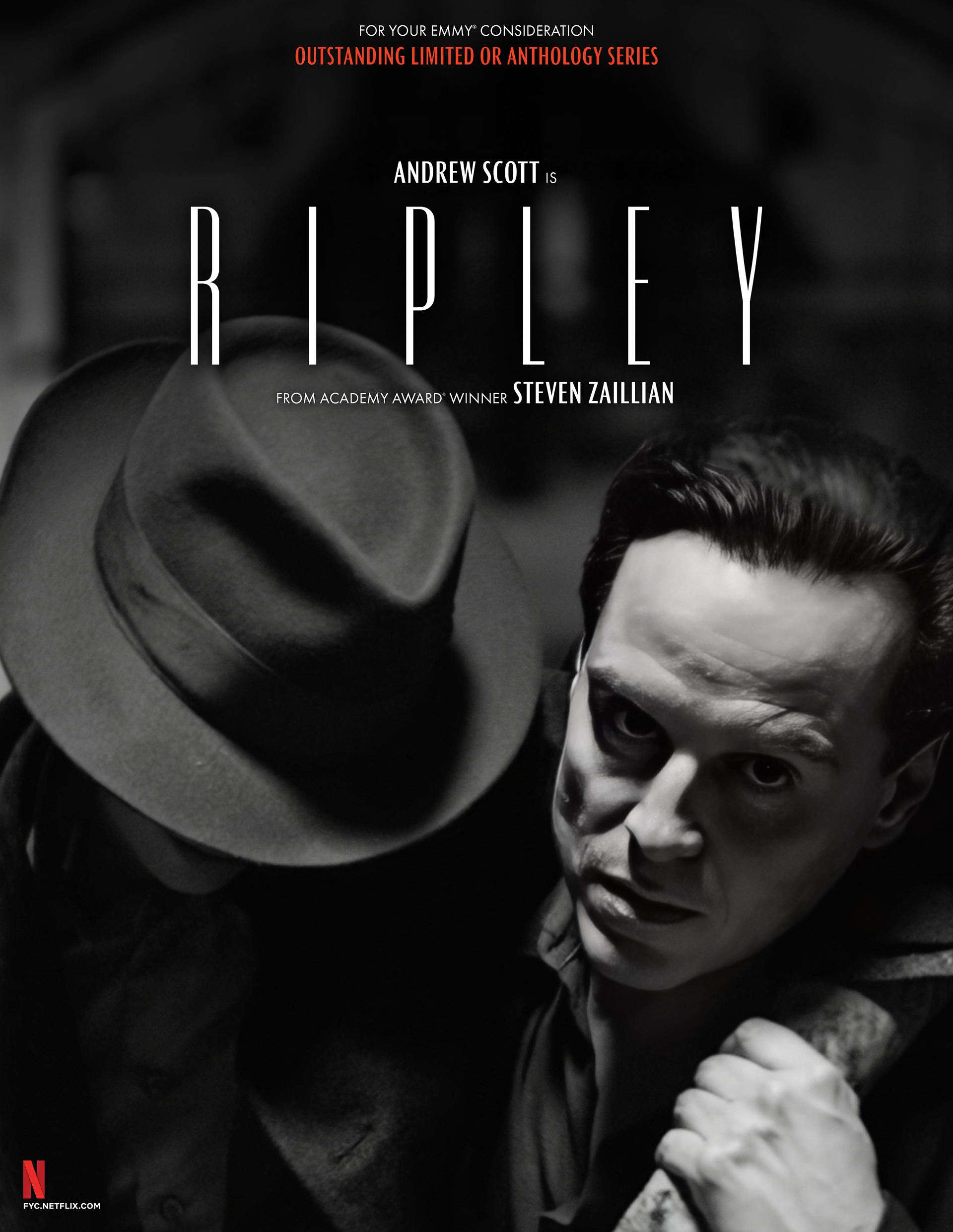
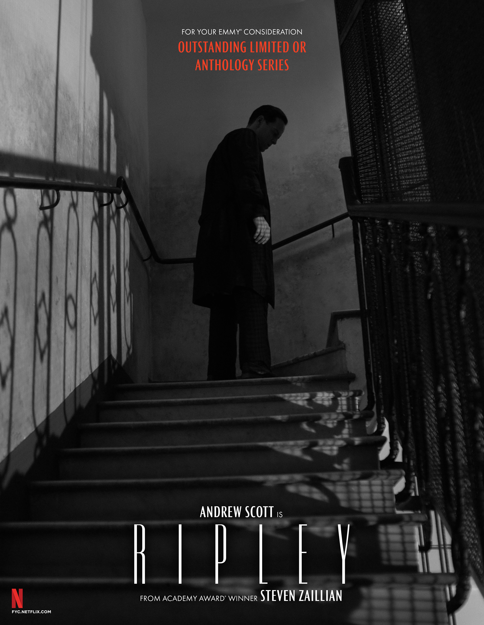
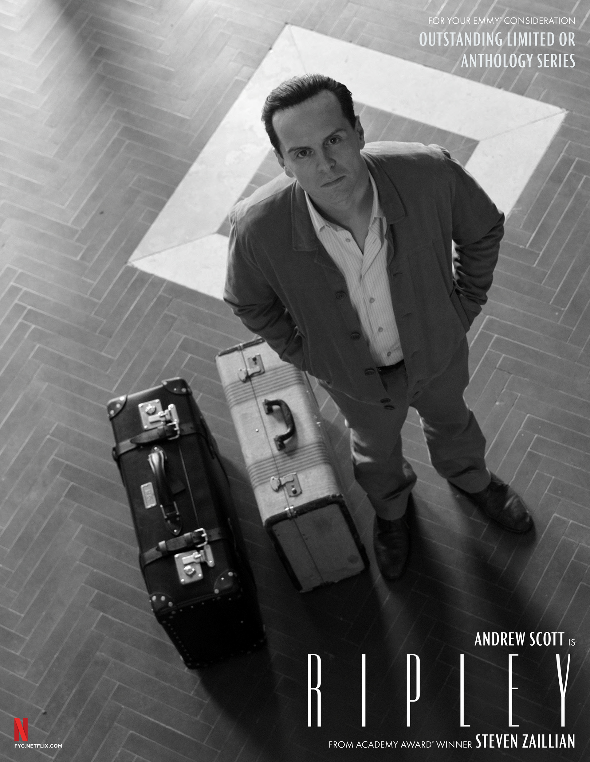
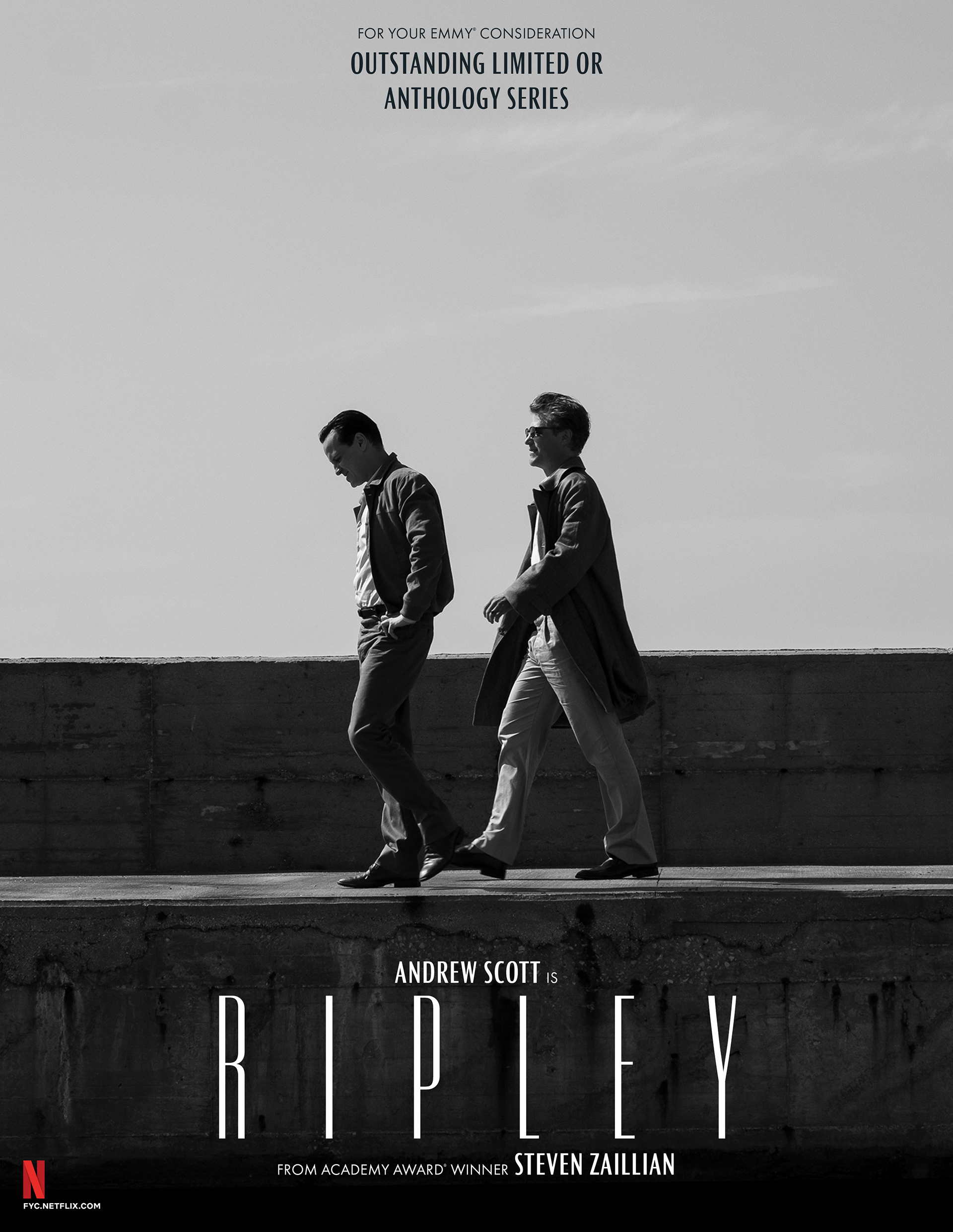
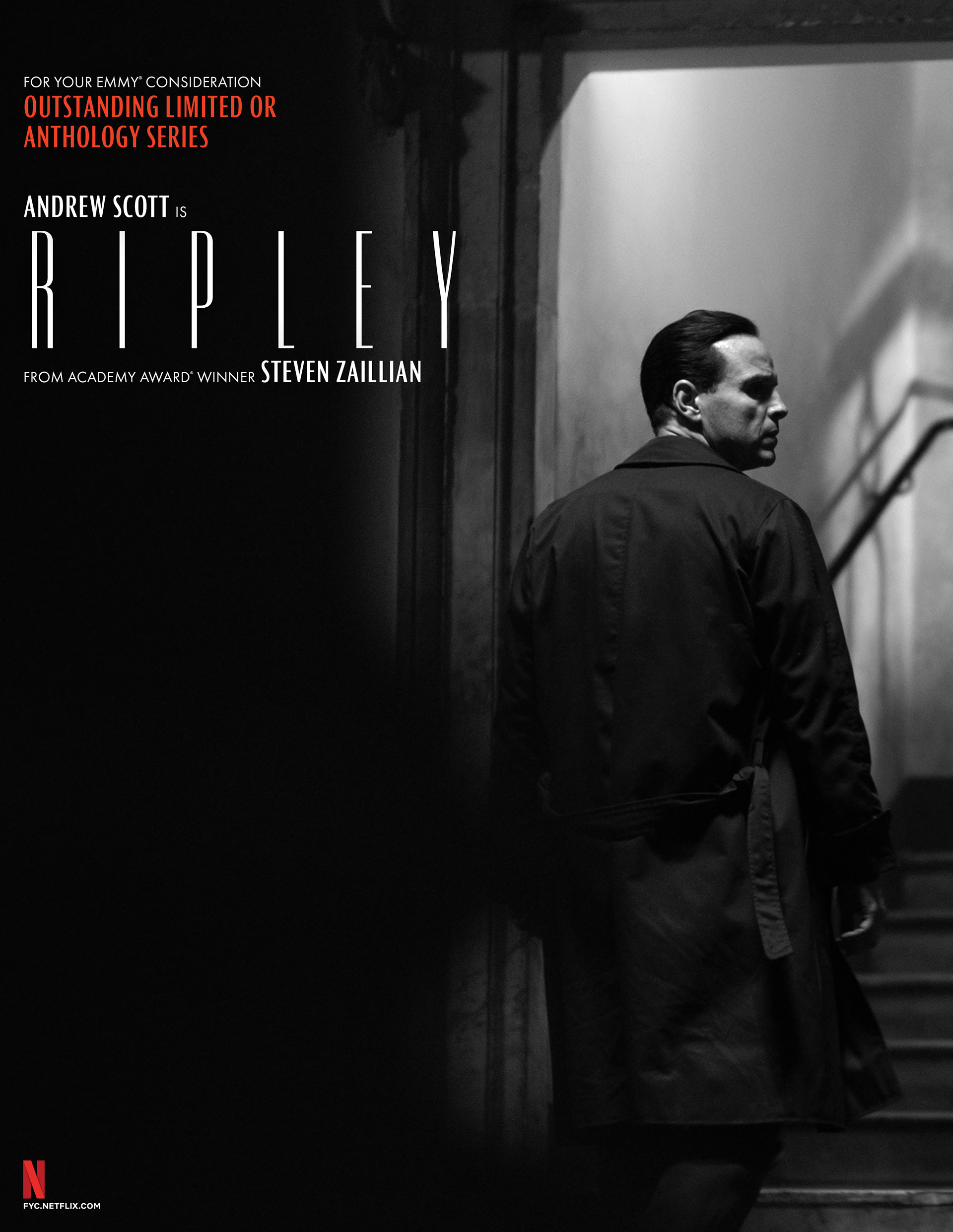
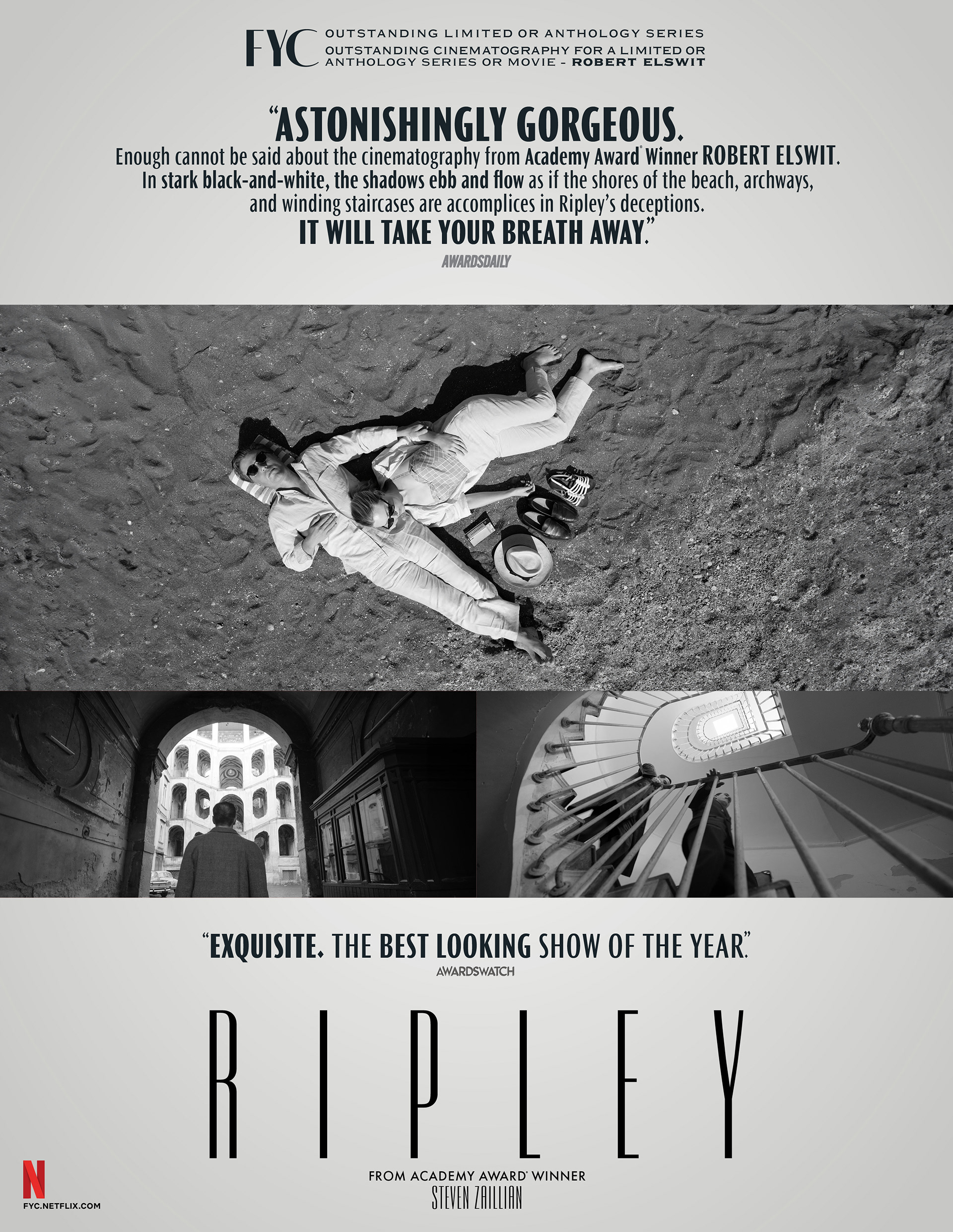
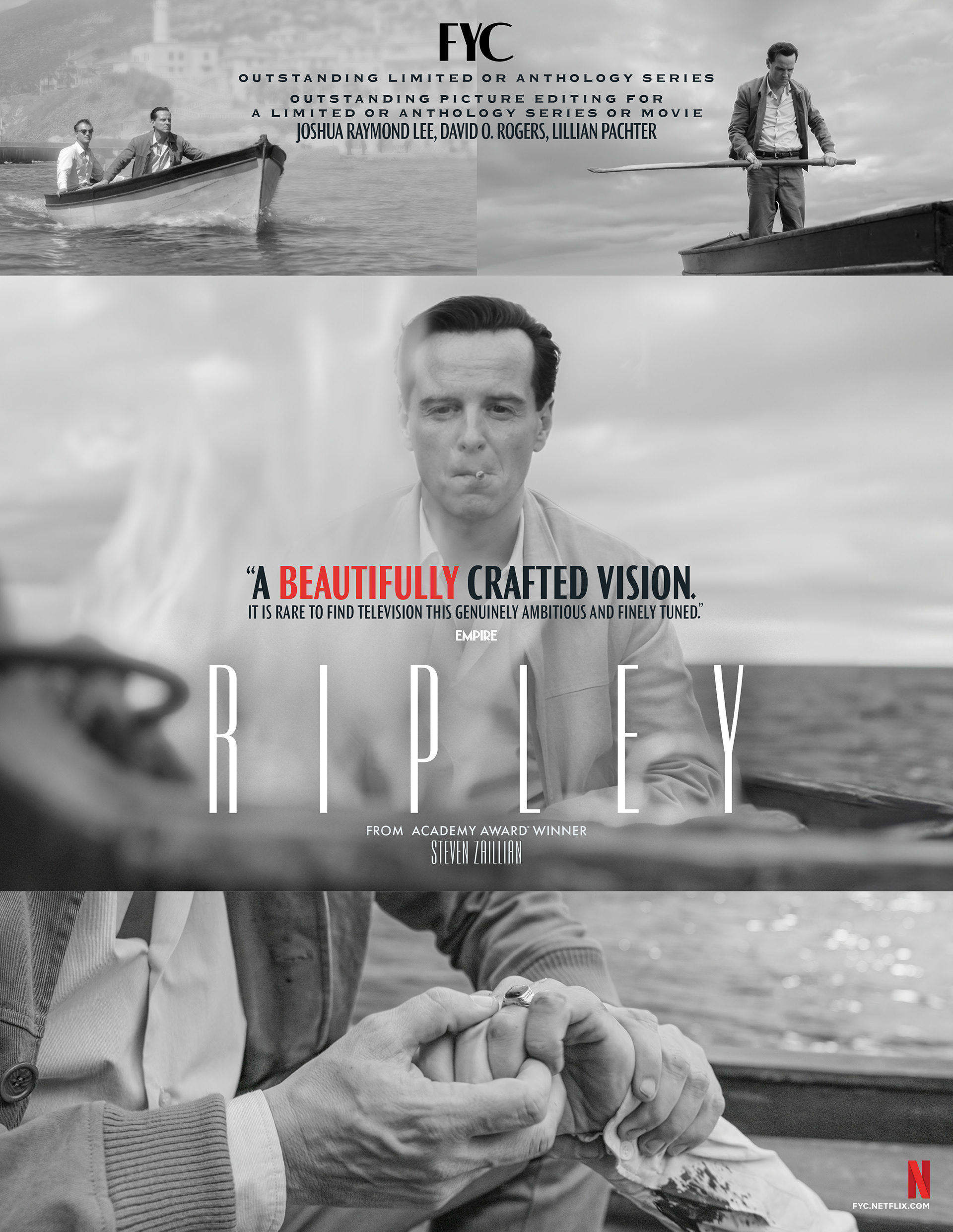
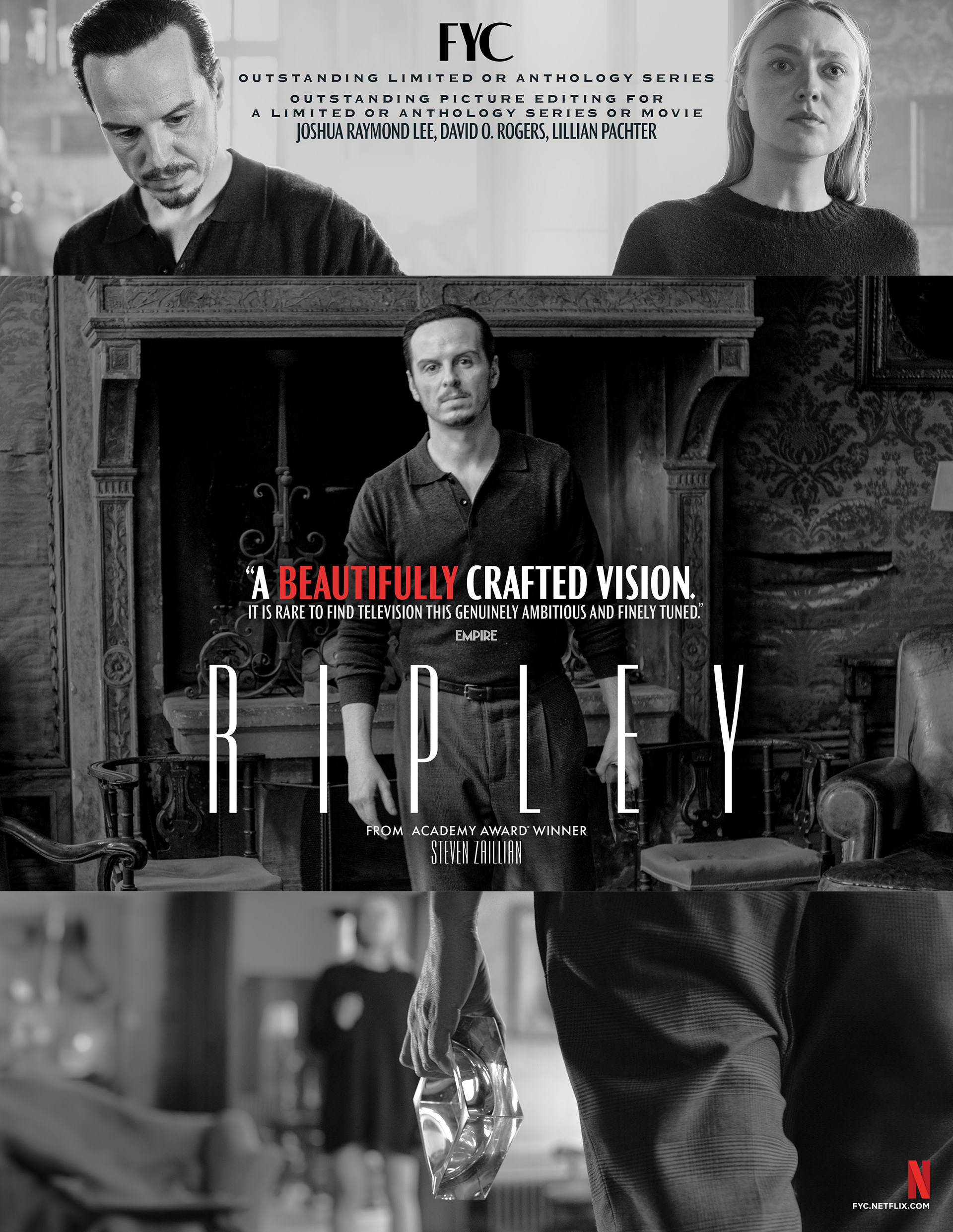
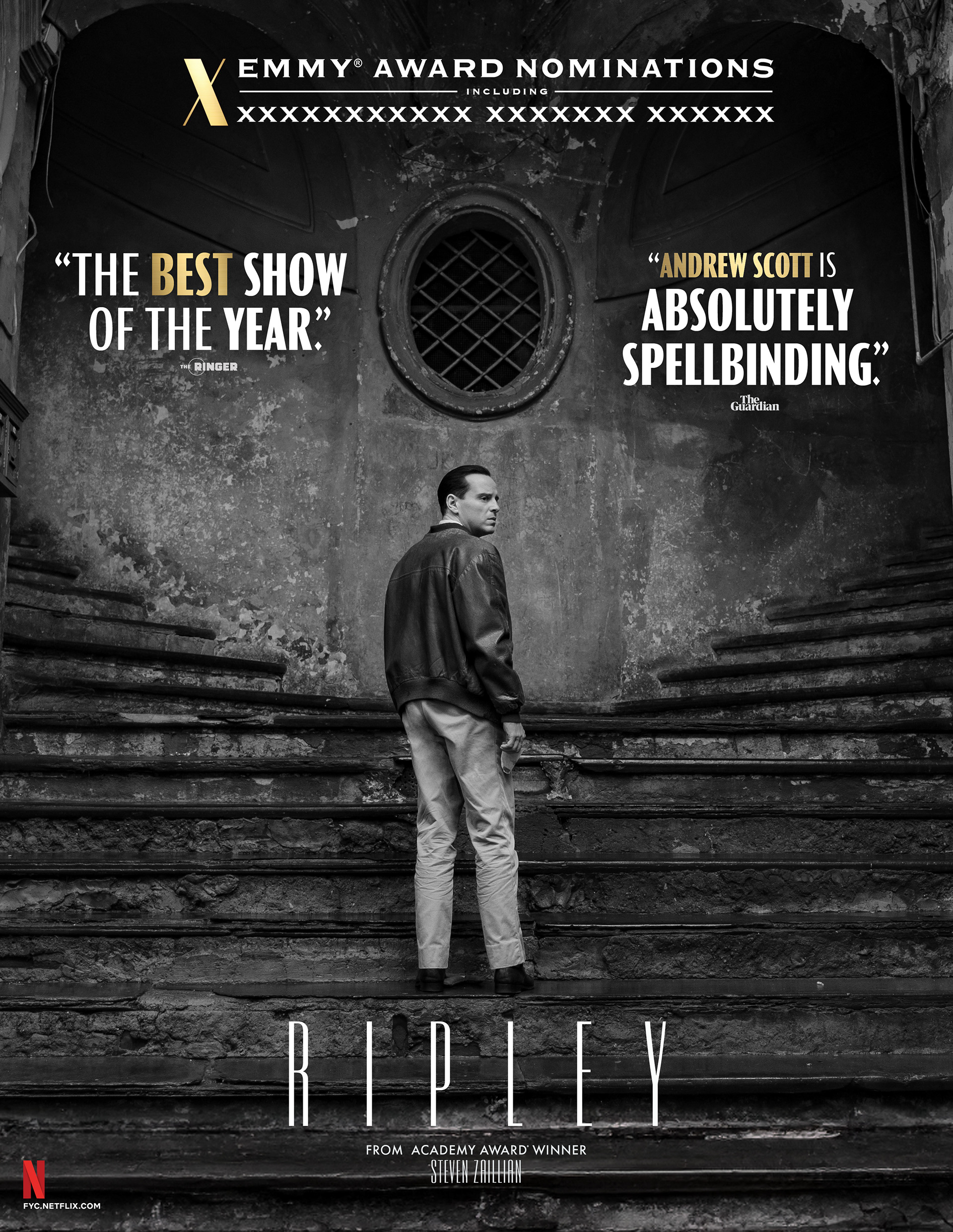
Out of Home Advertising – Wildposting Barricades
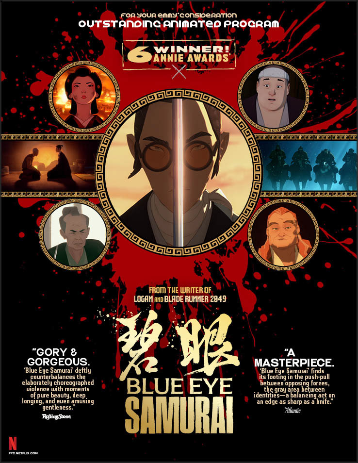
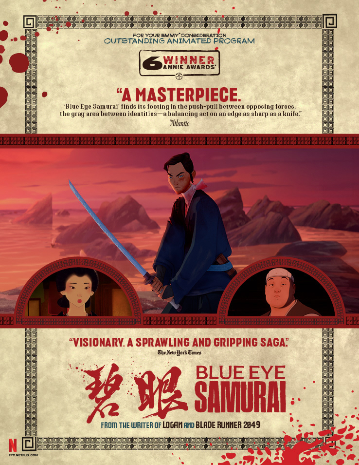
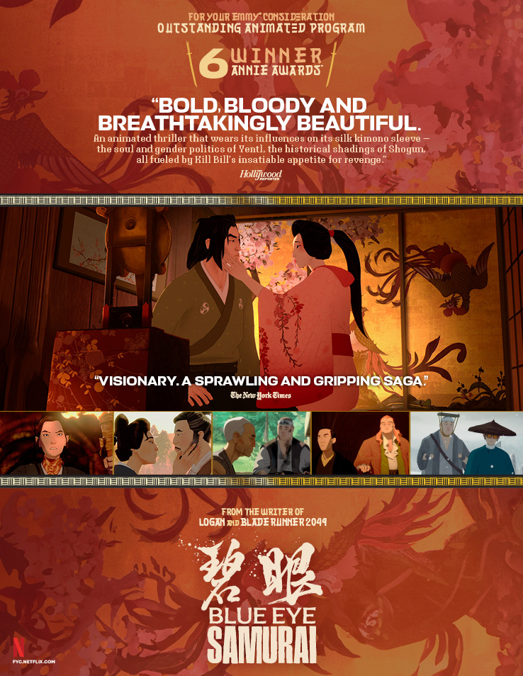
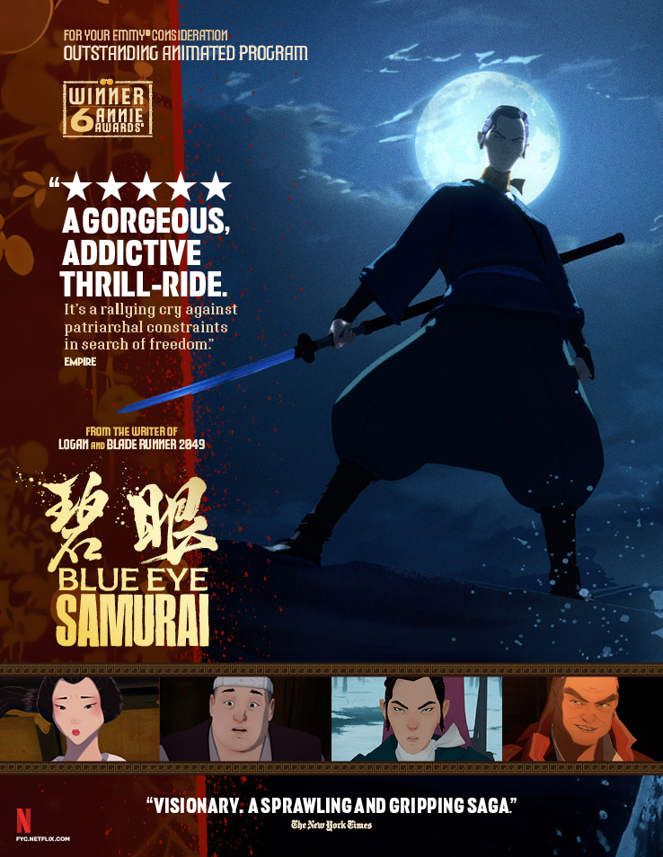
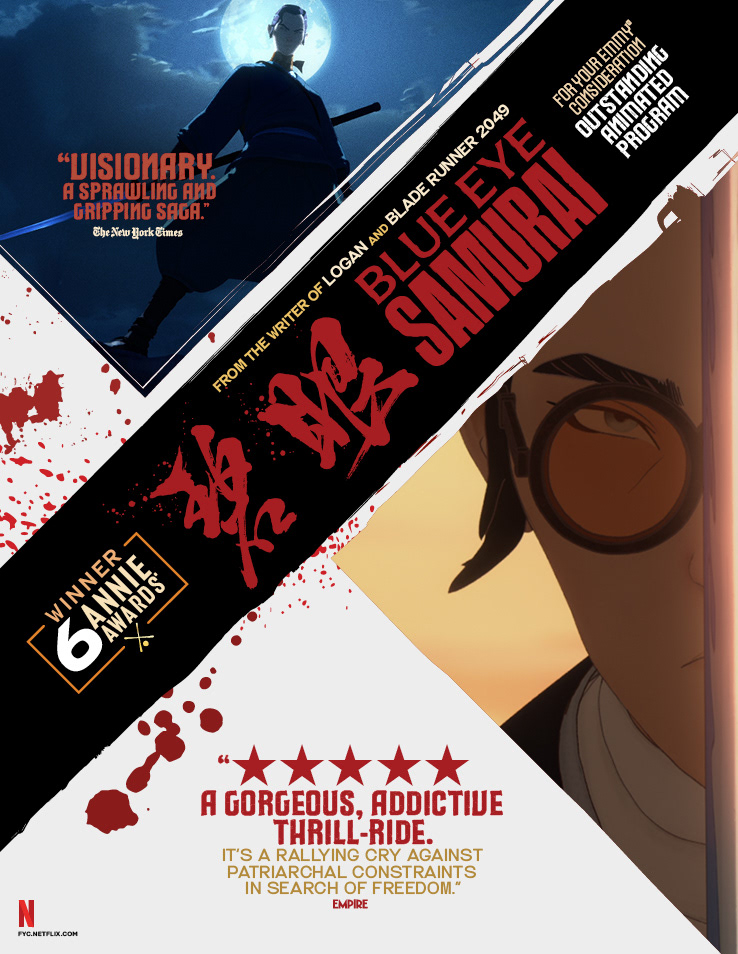
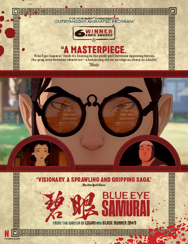
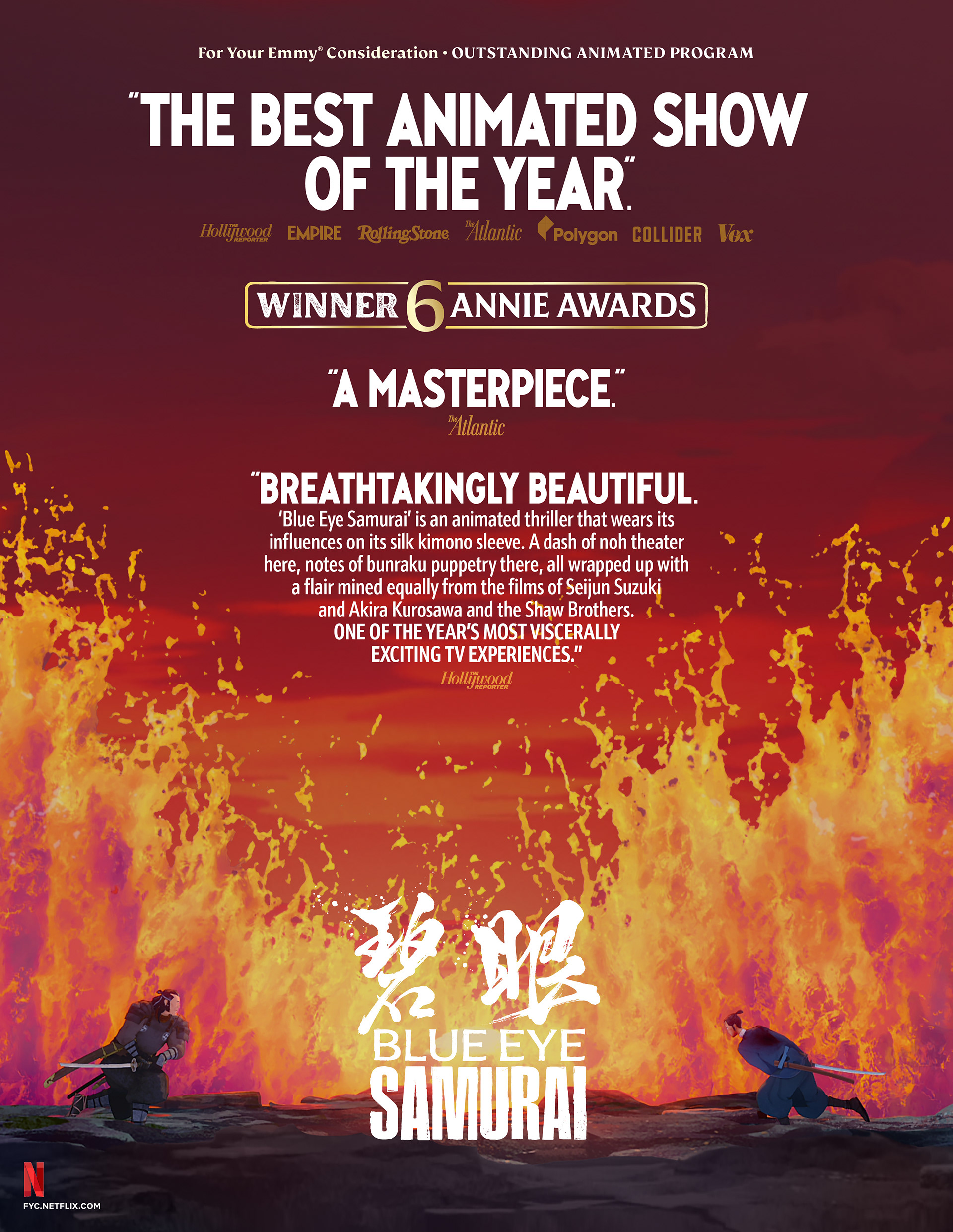
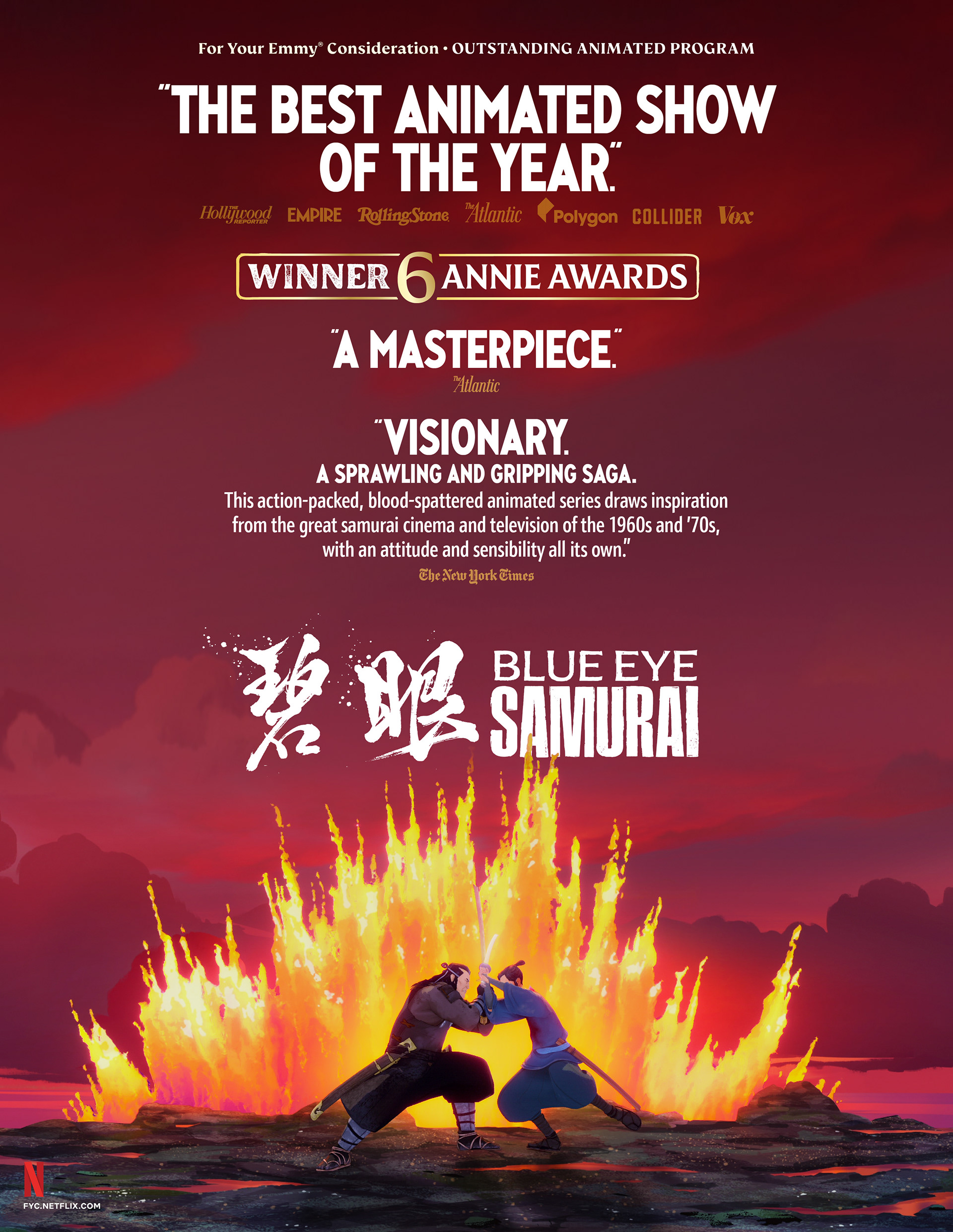
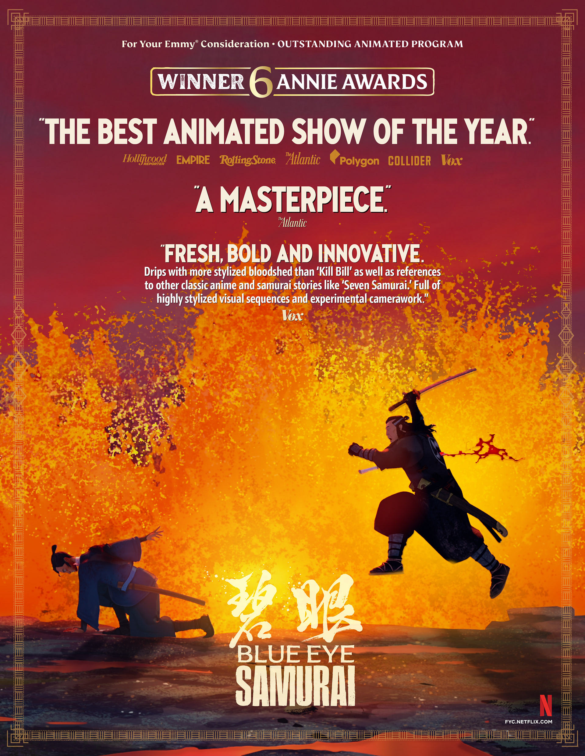
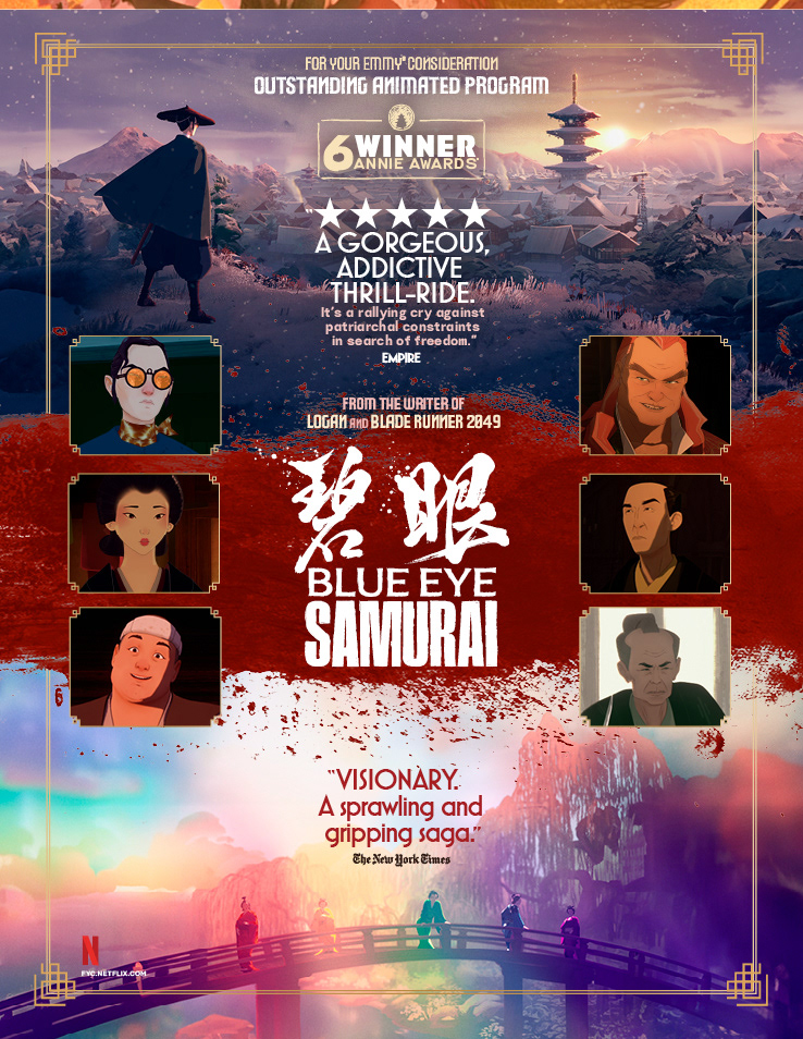
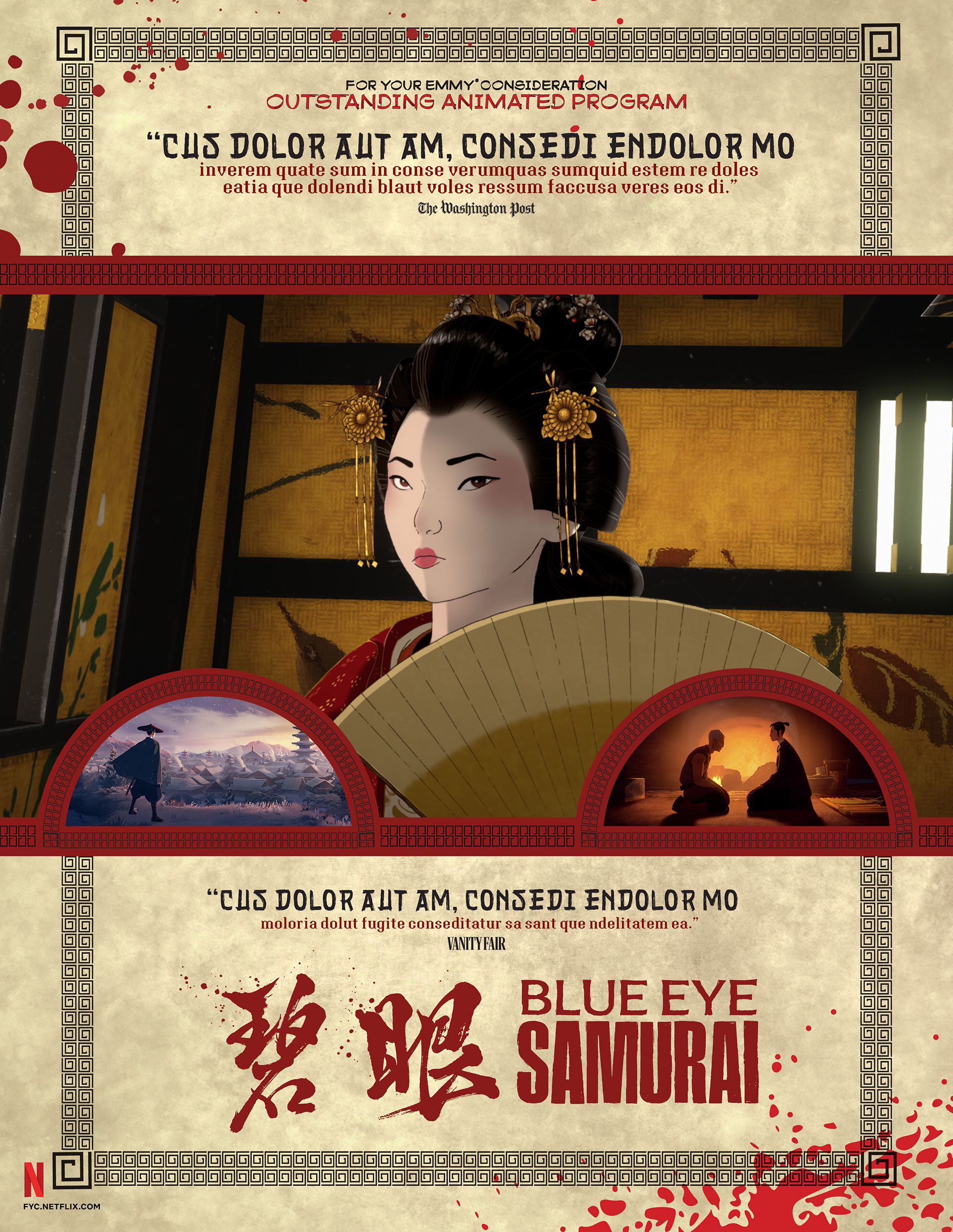
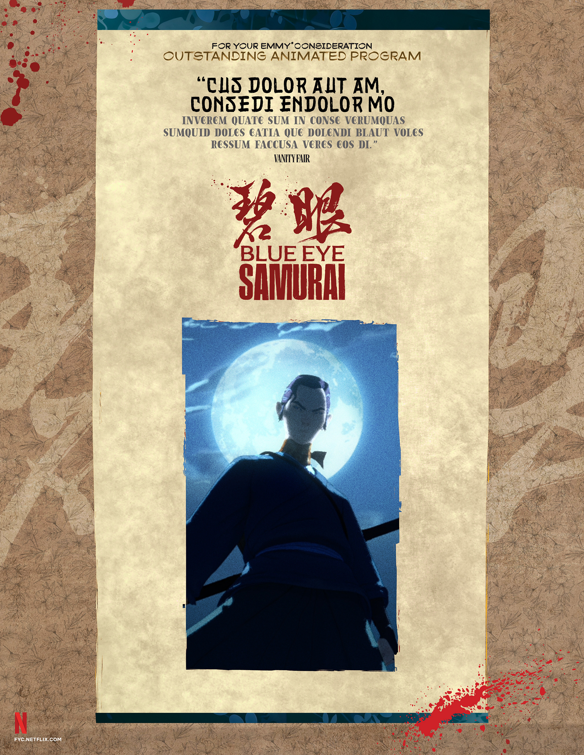
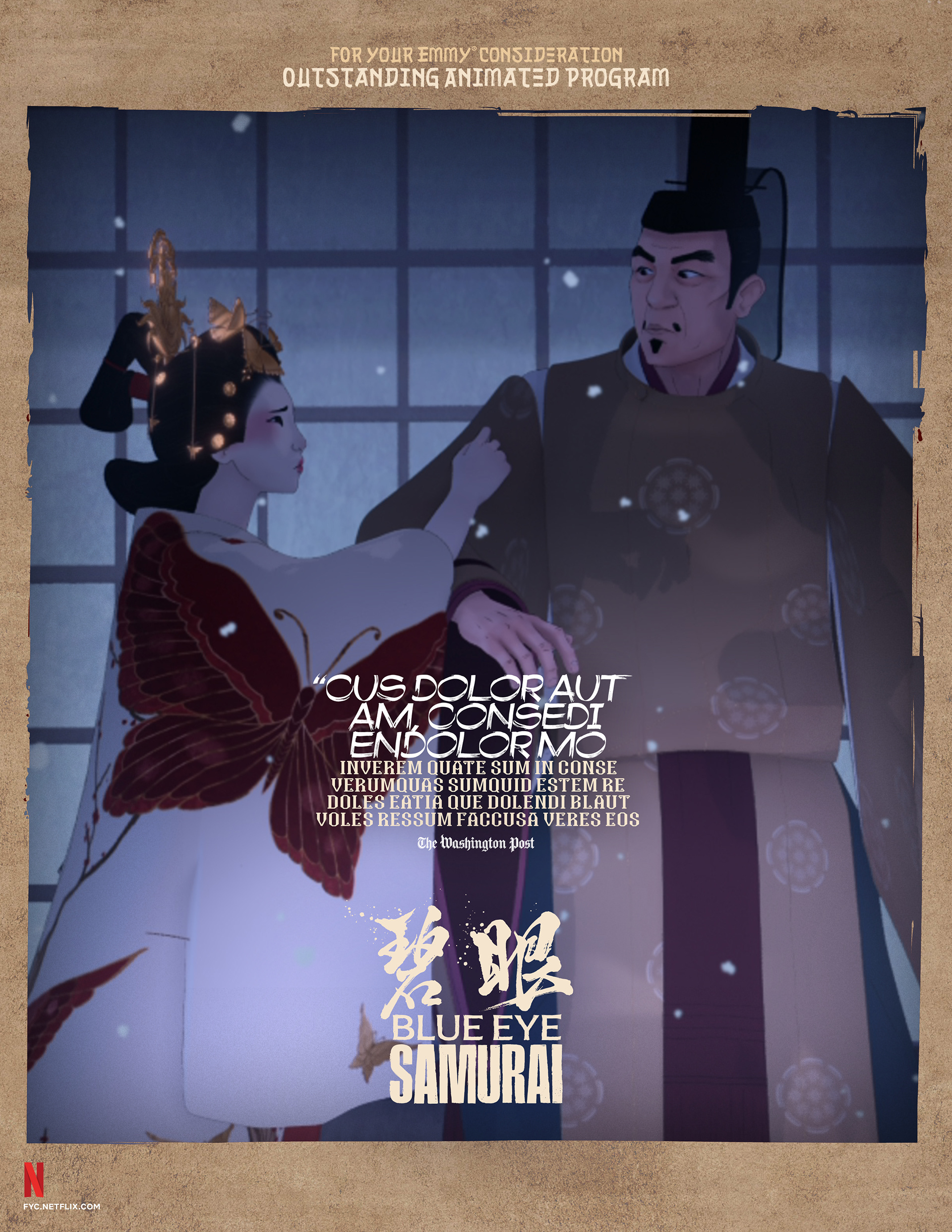
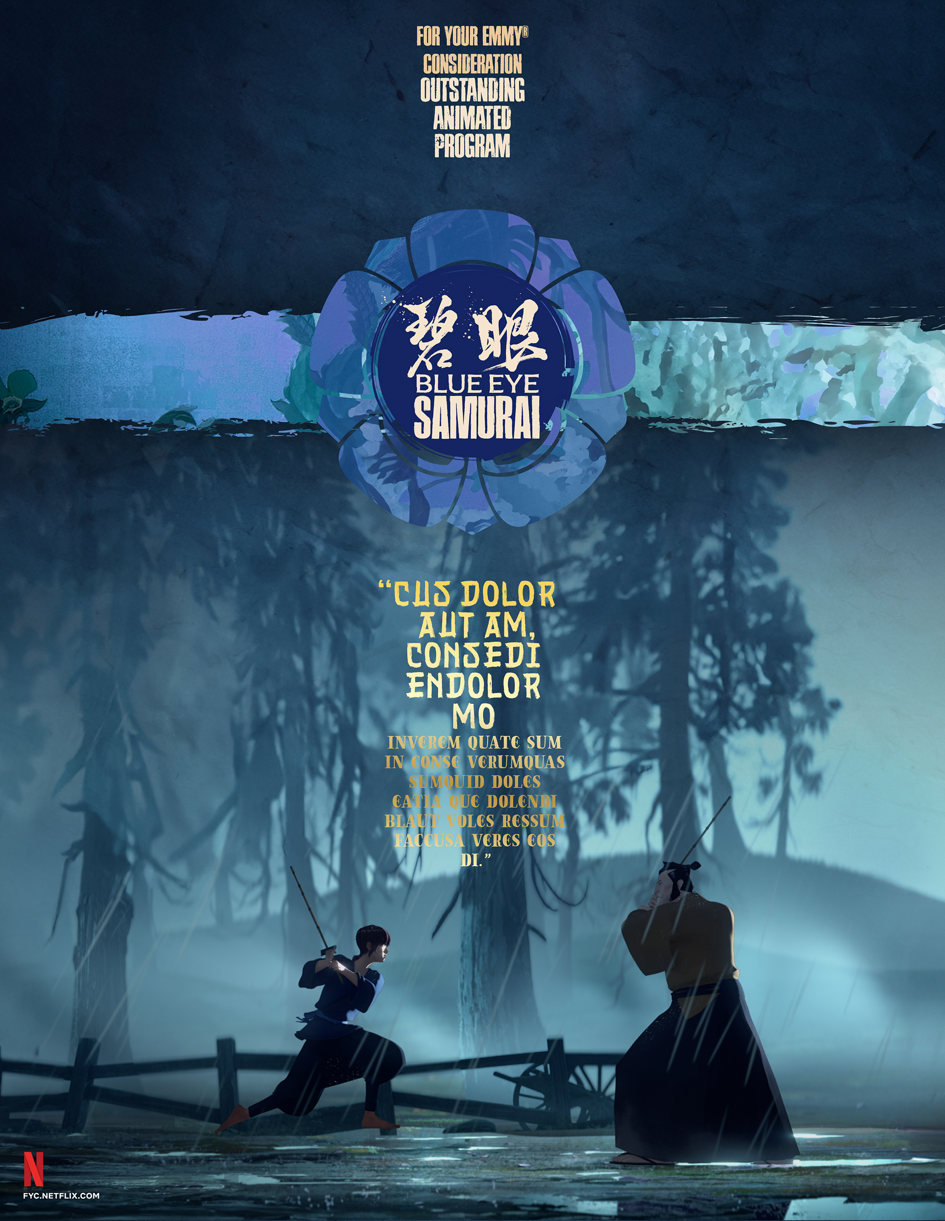
16 Nominations | 12 Wins | 5 Primetime Emmy® Wins
BRIEF
The agency sought to position Blue Eye Samurai as an animation masterpiece. The challenge was capturing its visceral violence and painterly beauty for voters.
STRATEGY
I developed a kinetic identity contrasting fiery oranges with icy blues. The design leverages striking silhouettes and parchment textures to highlight the series’ unique artistry.
Industry Trade Print

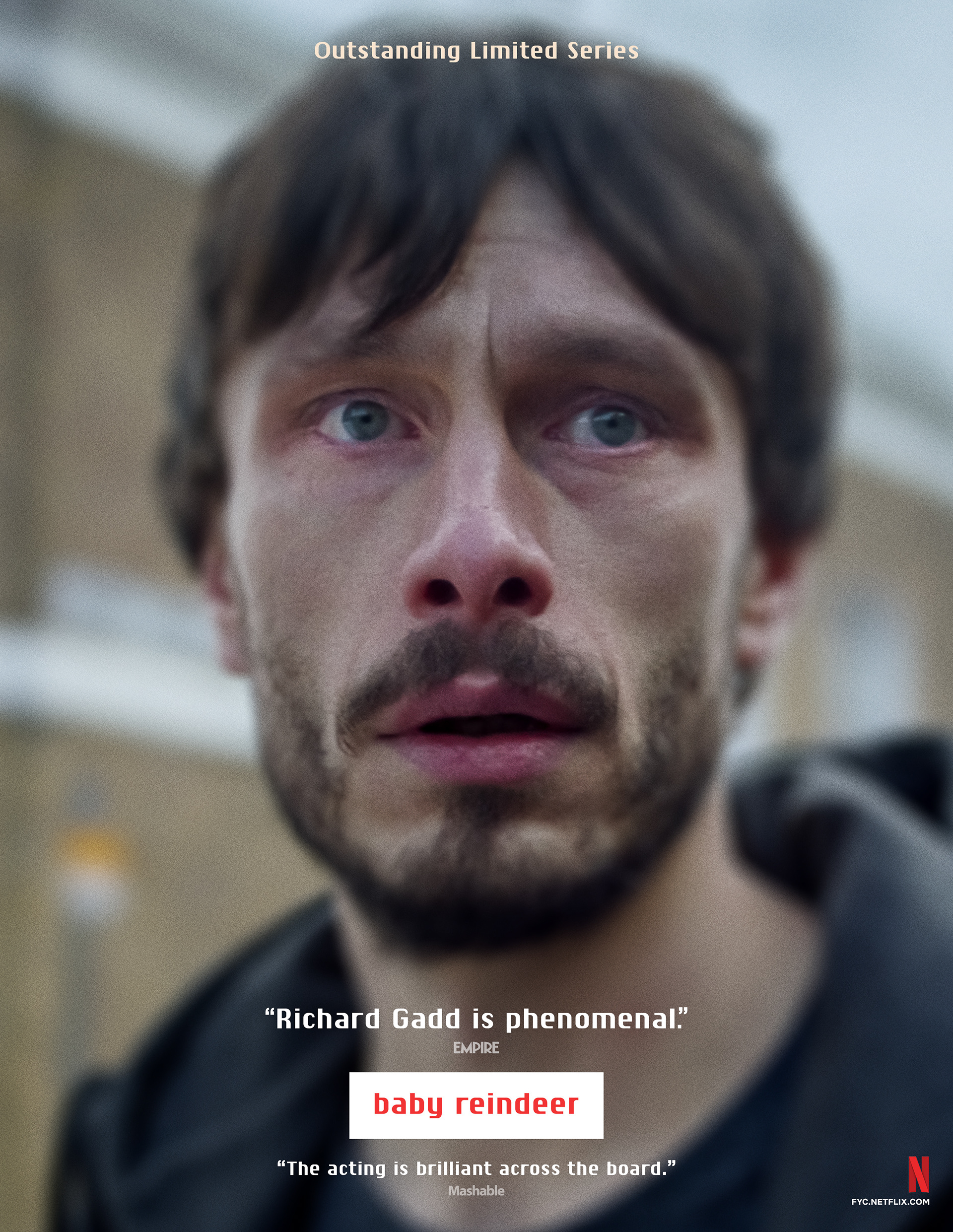
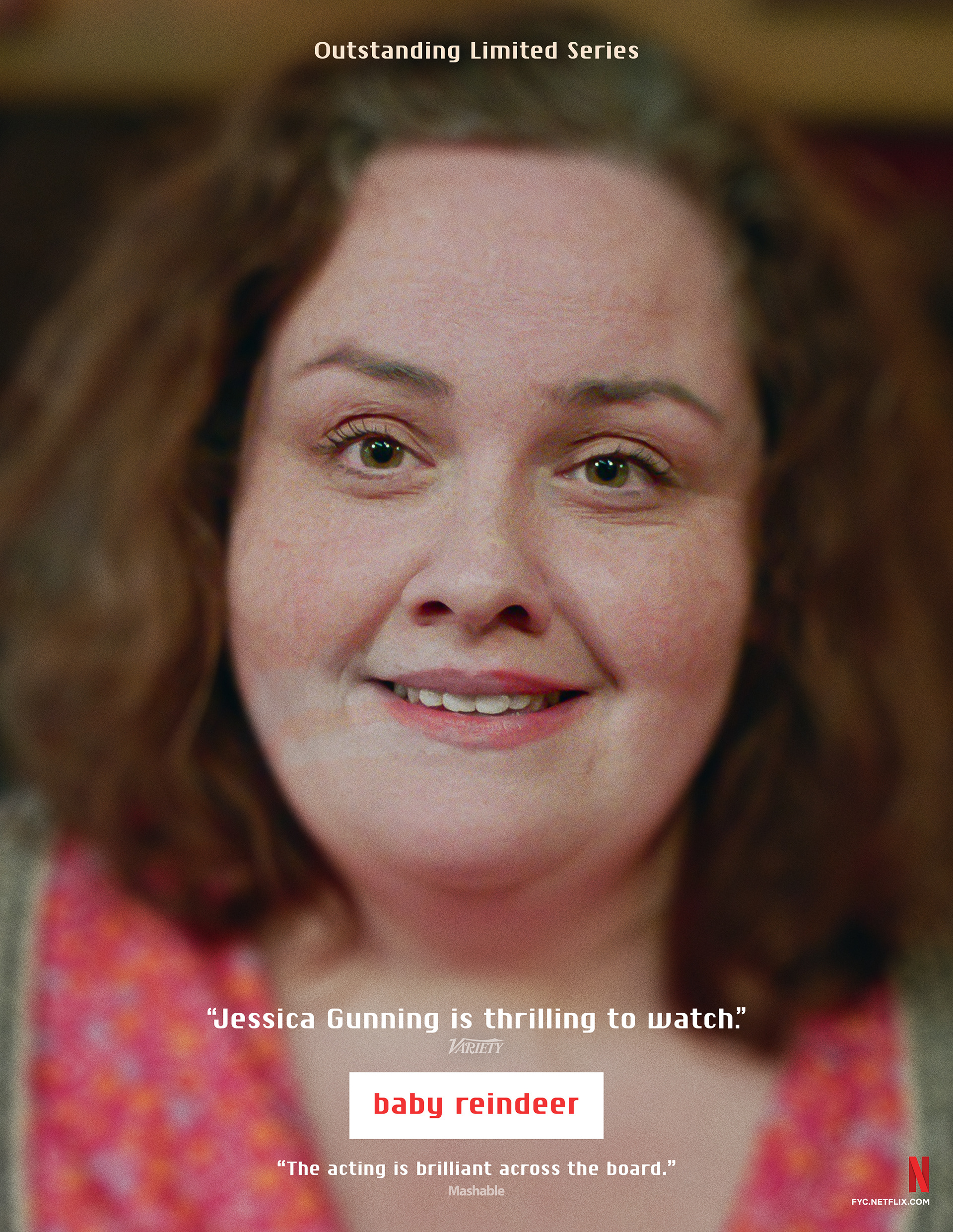
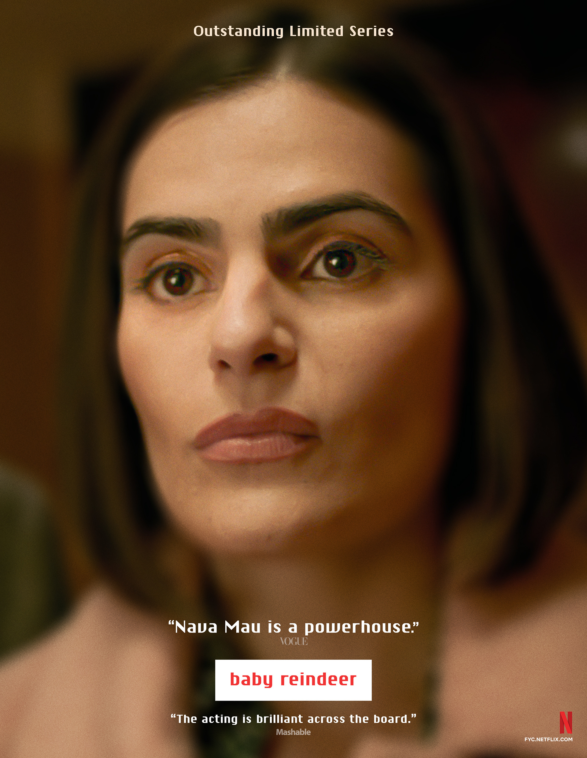
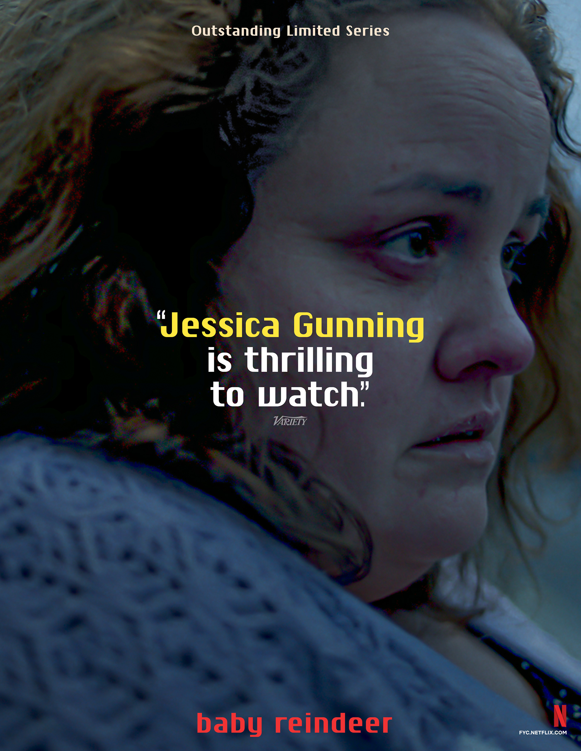
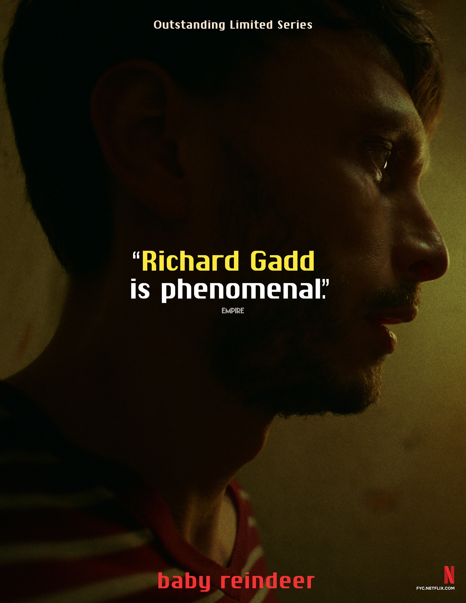
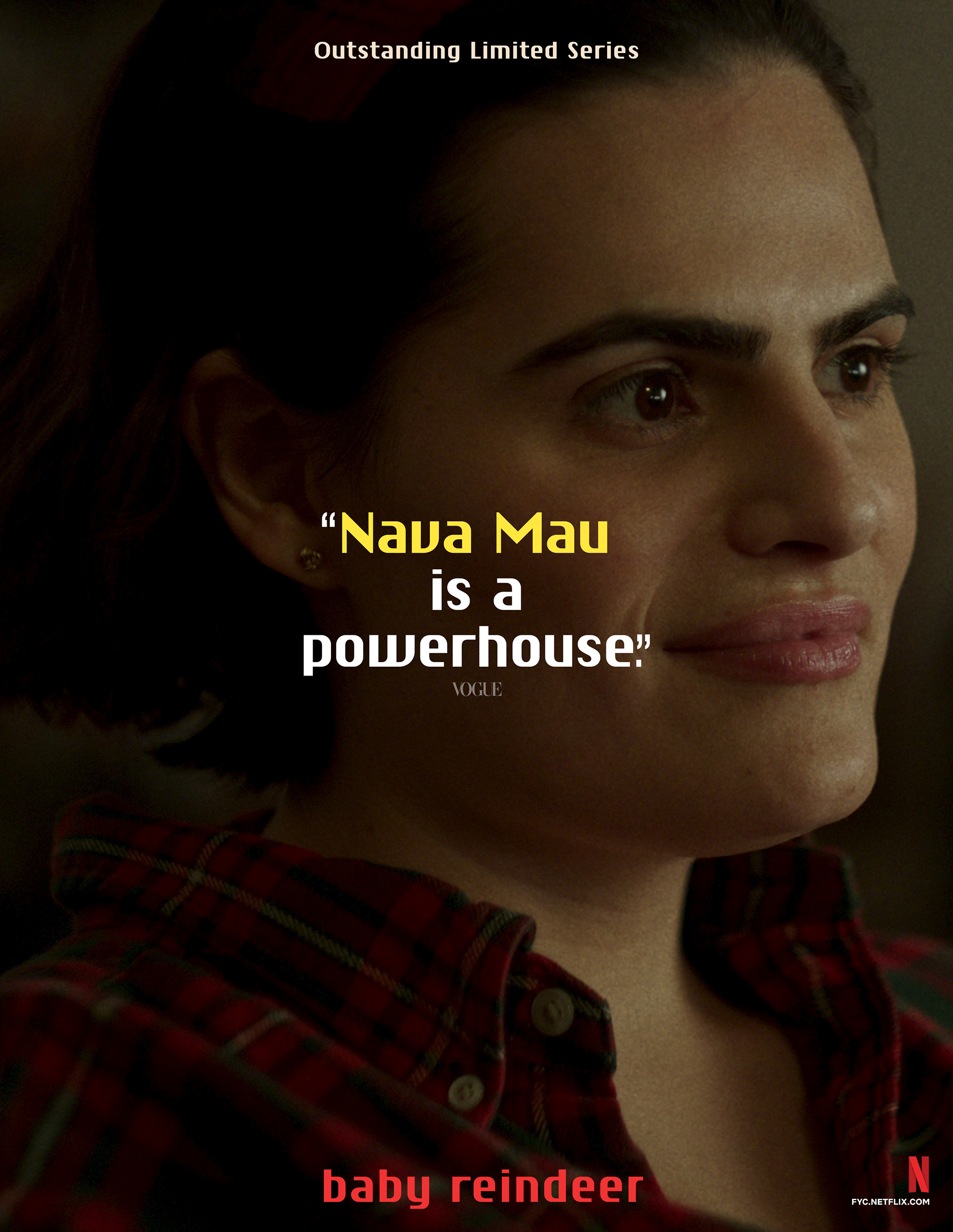
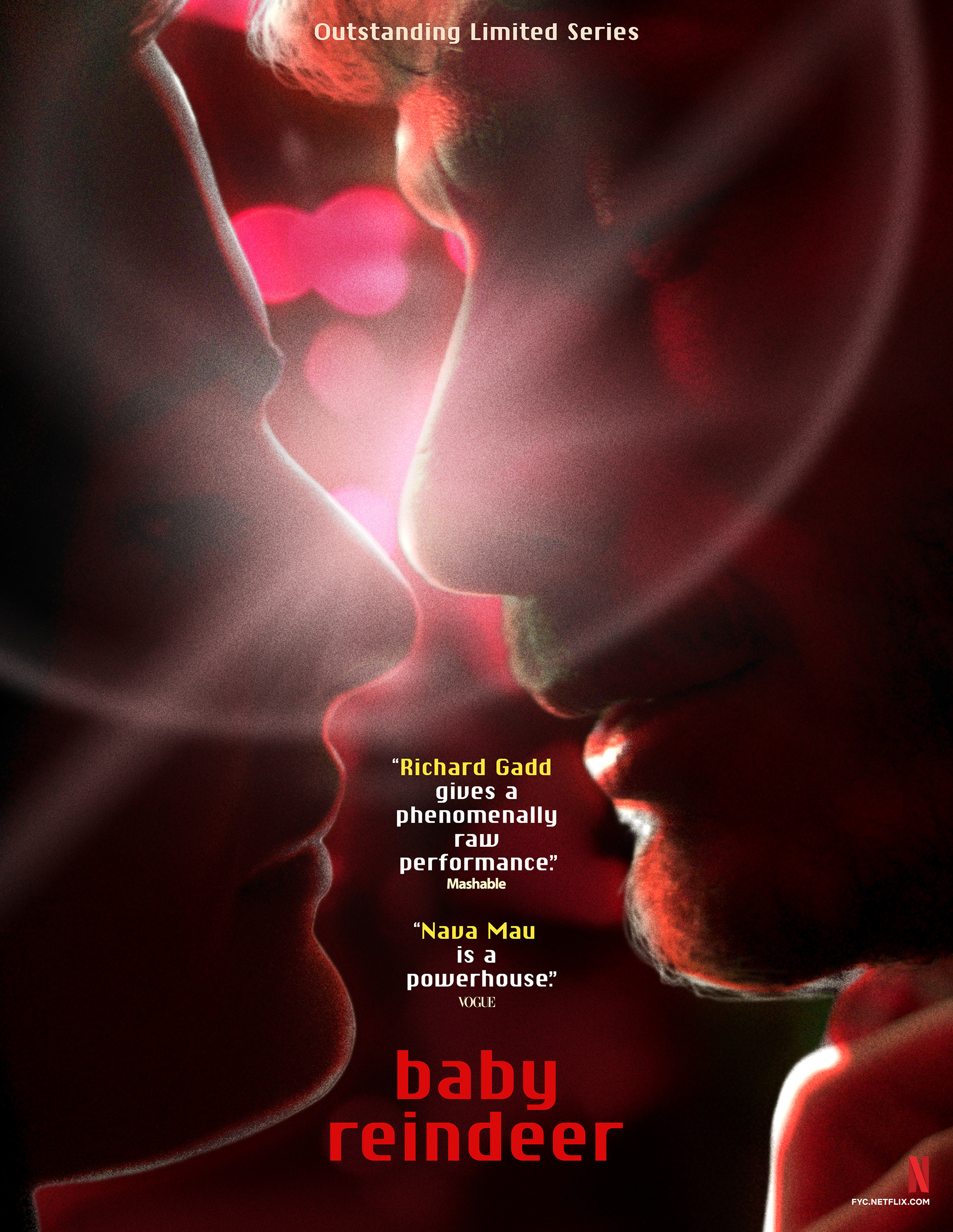
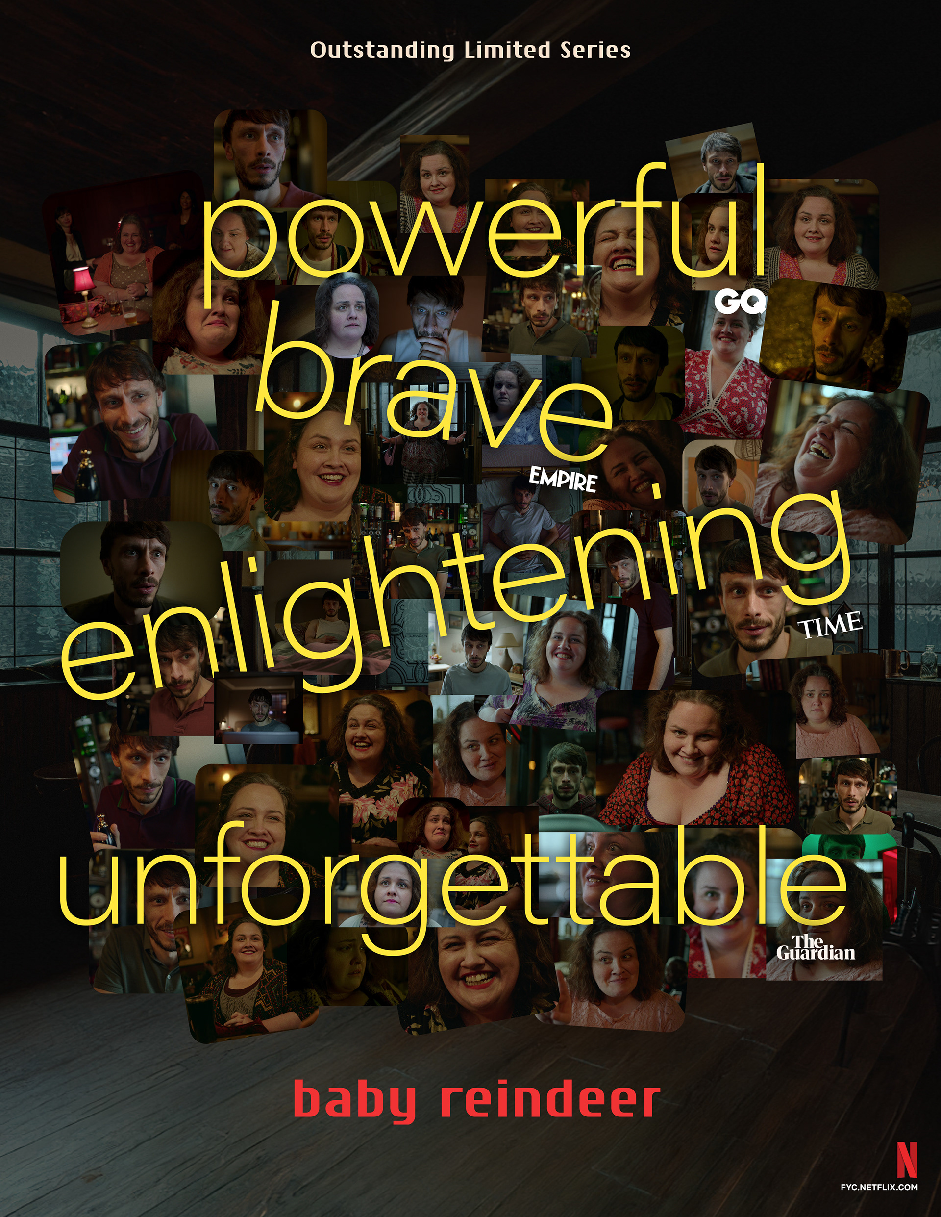
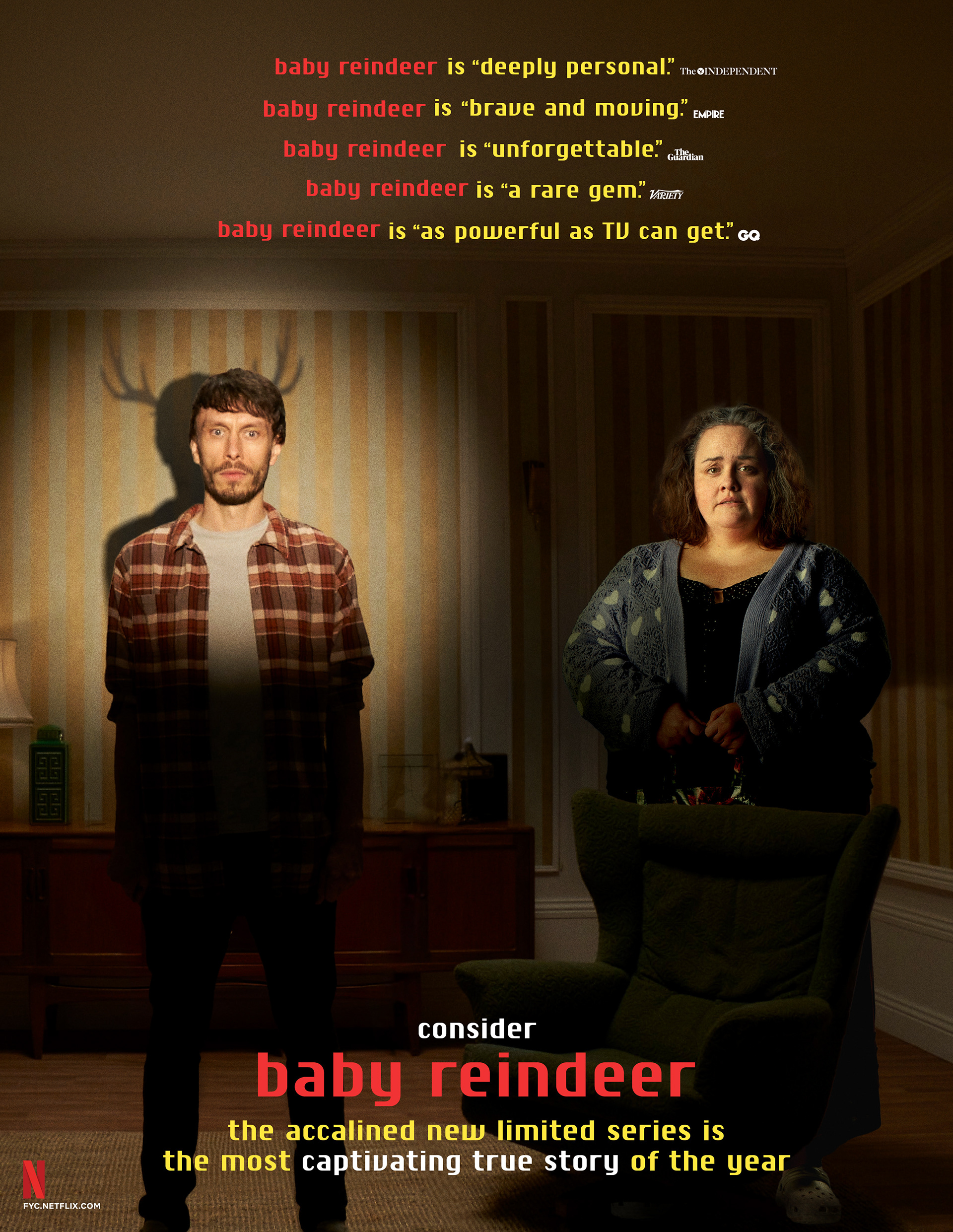
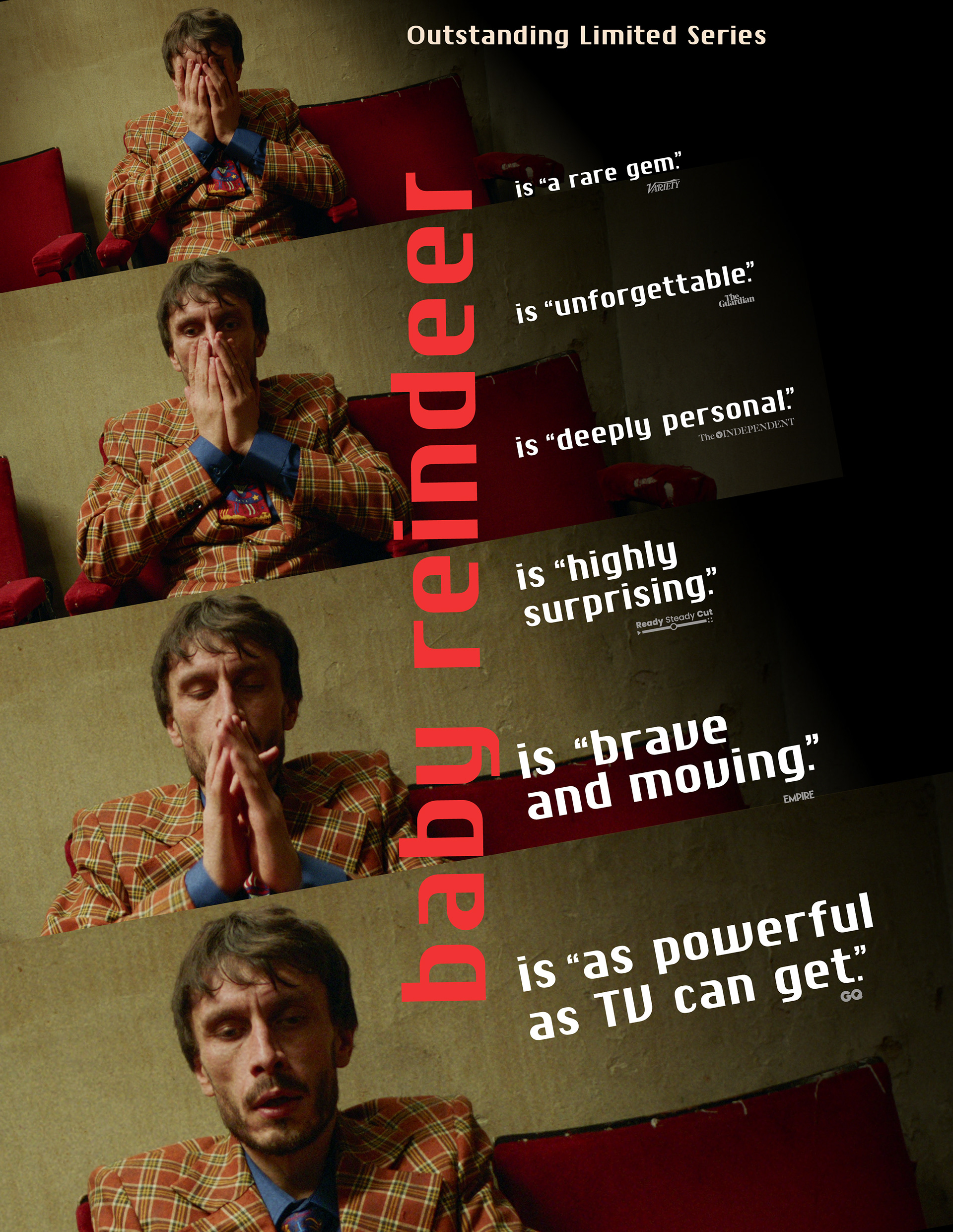
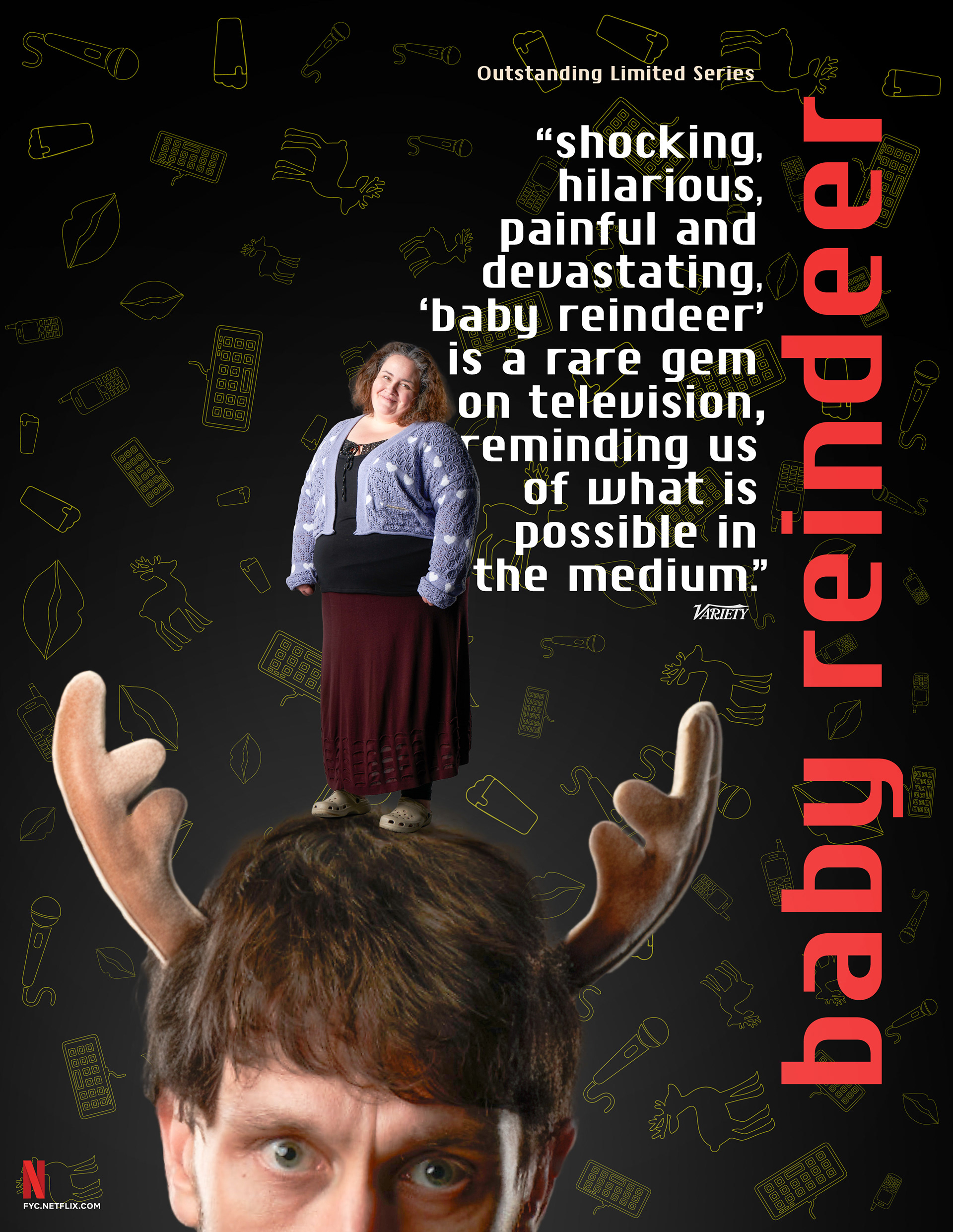
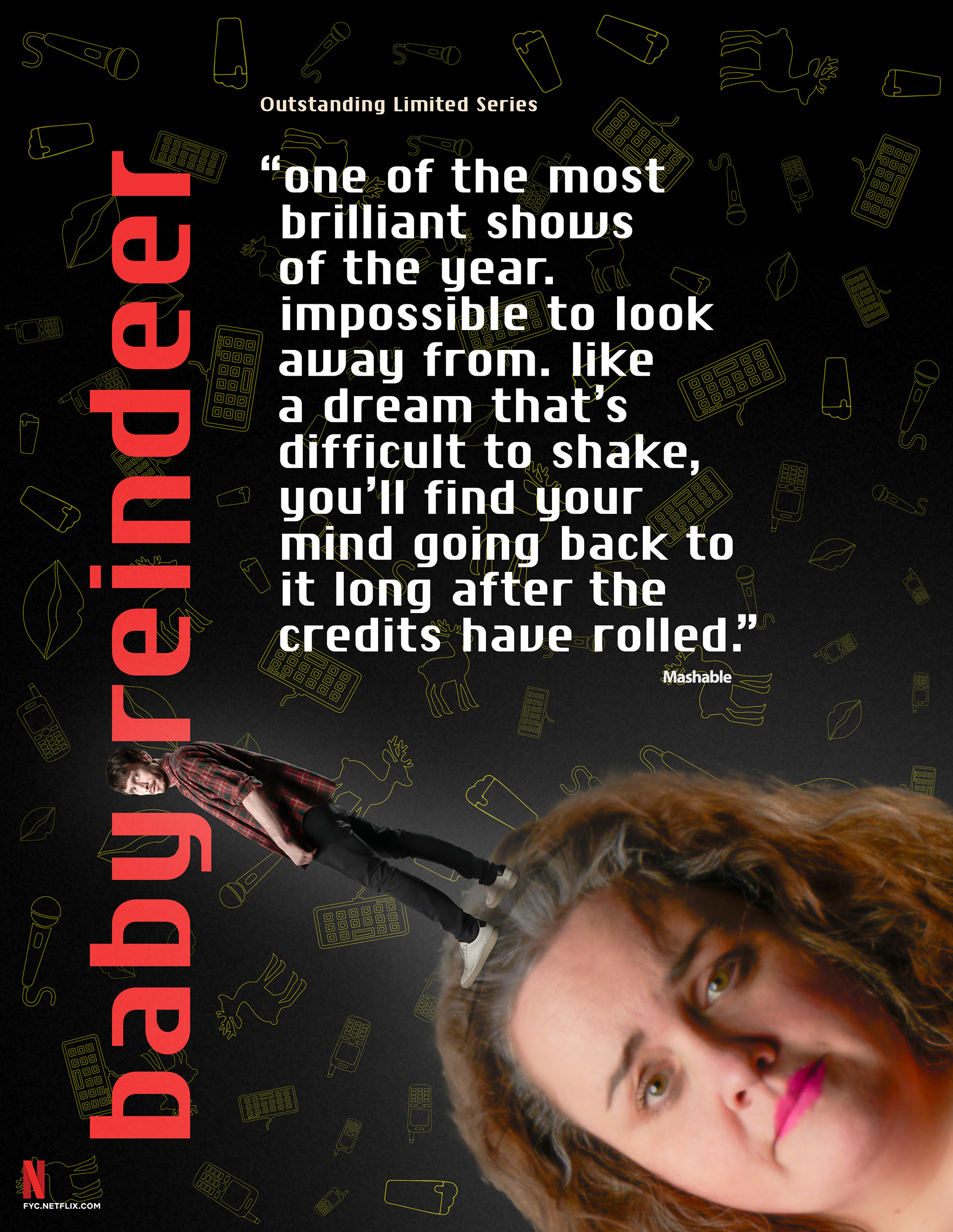
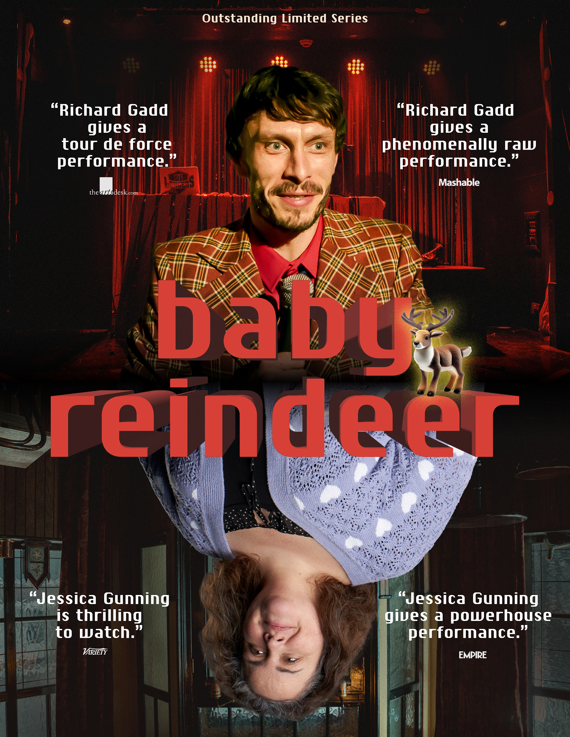
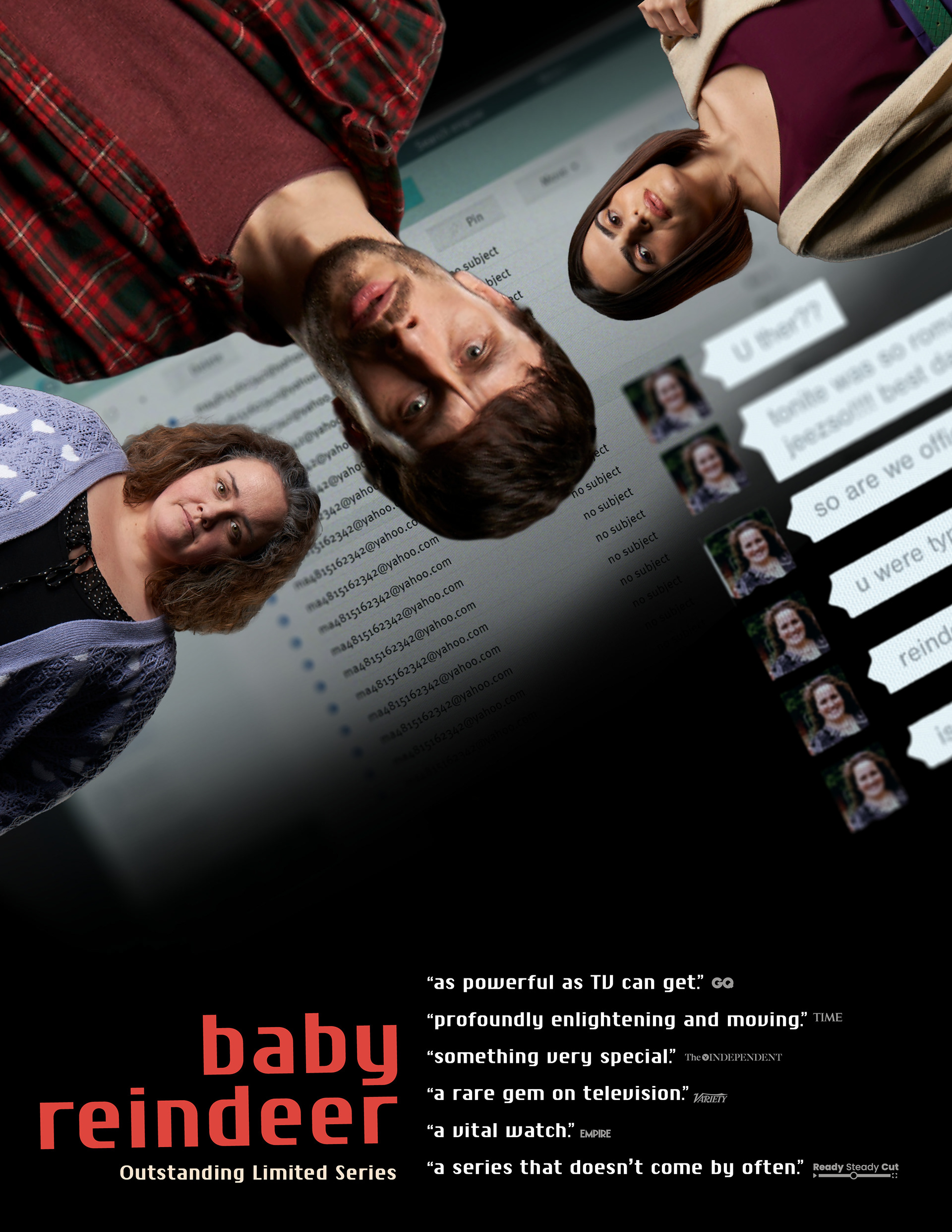
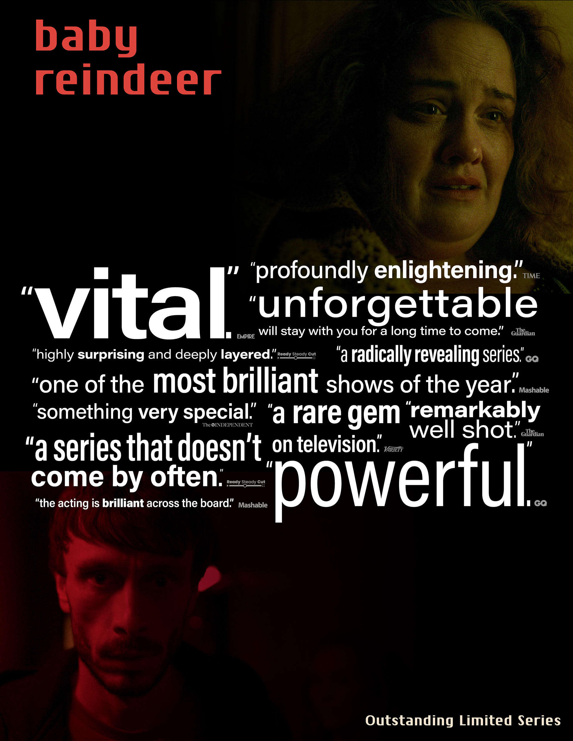
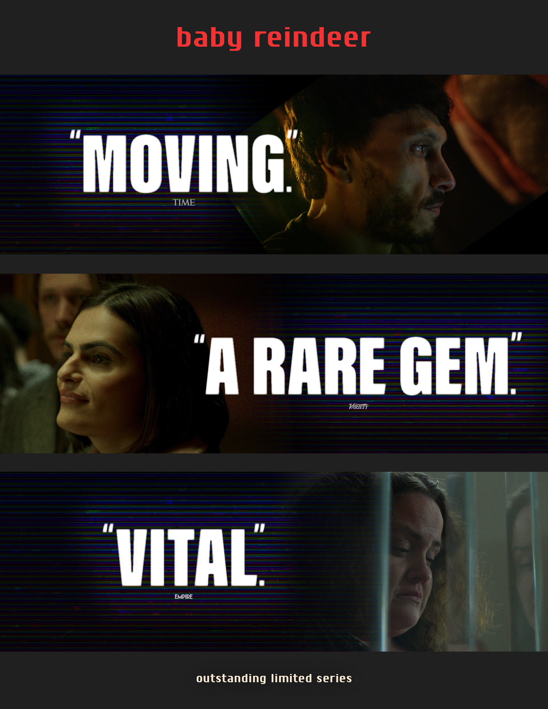
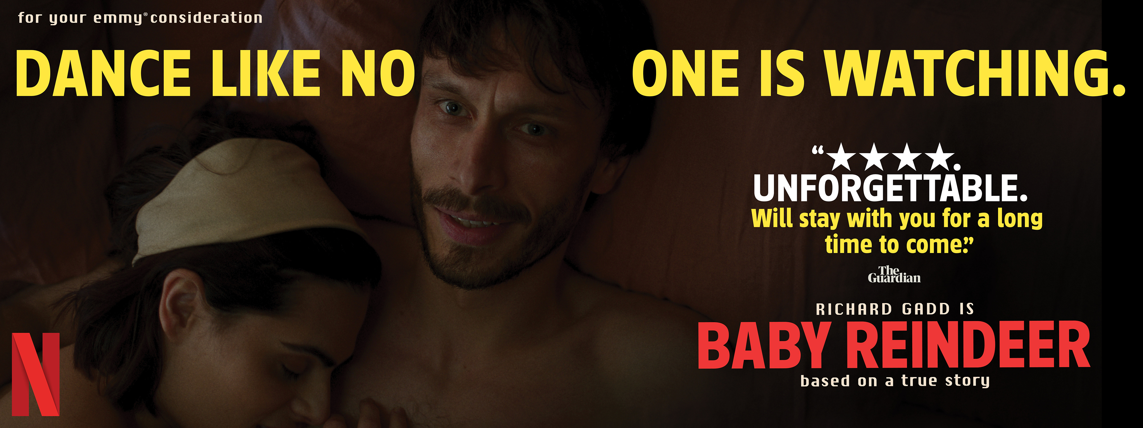
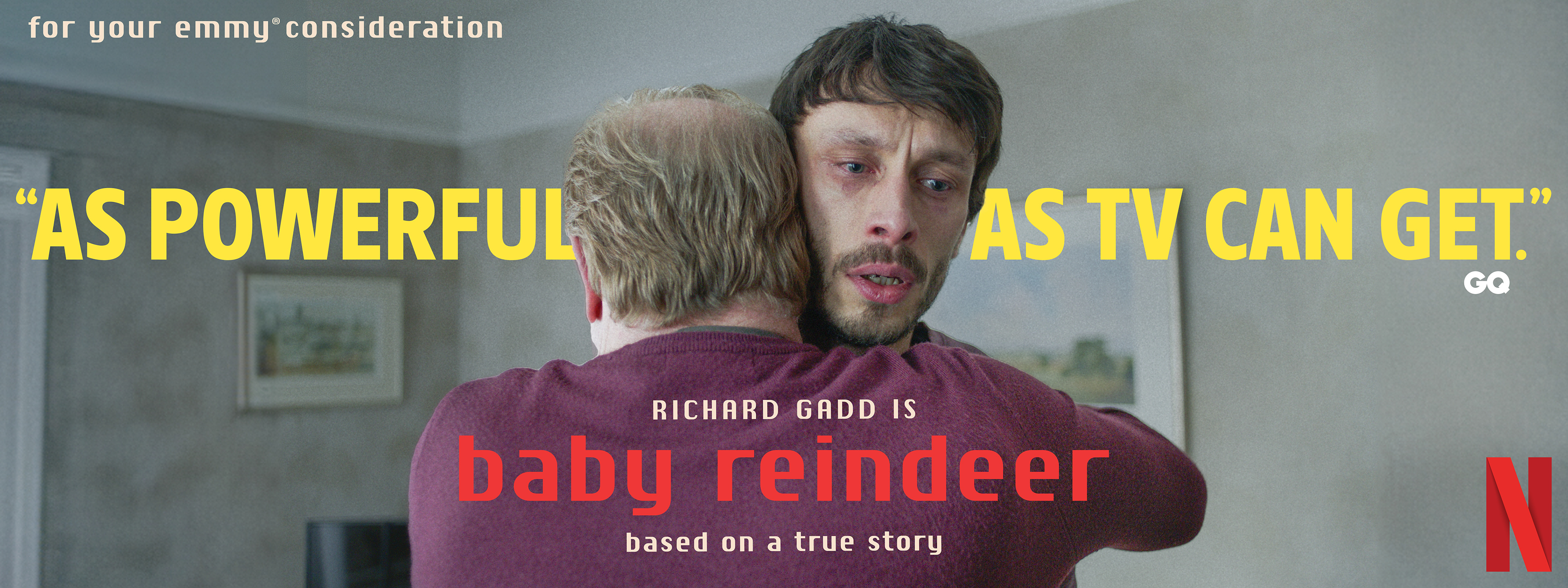
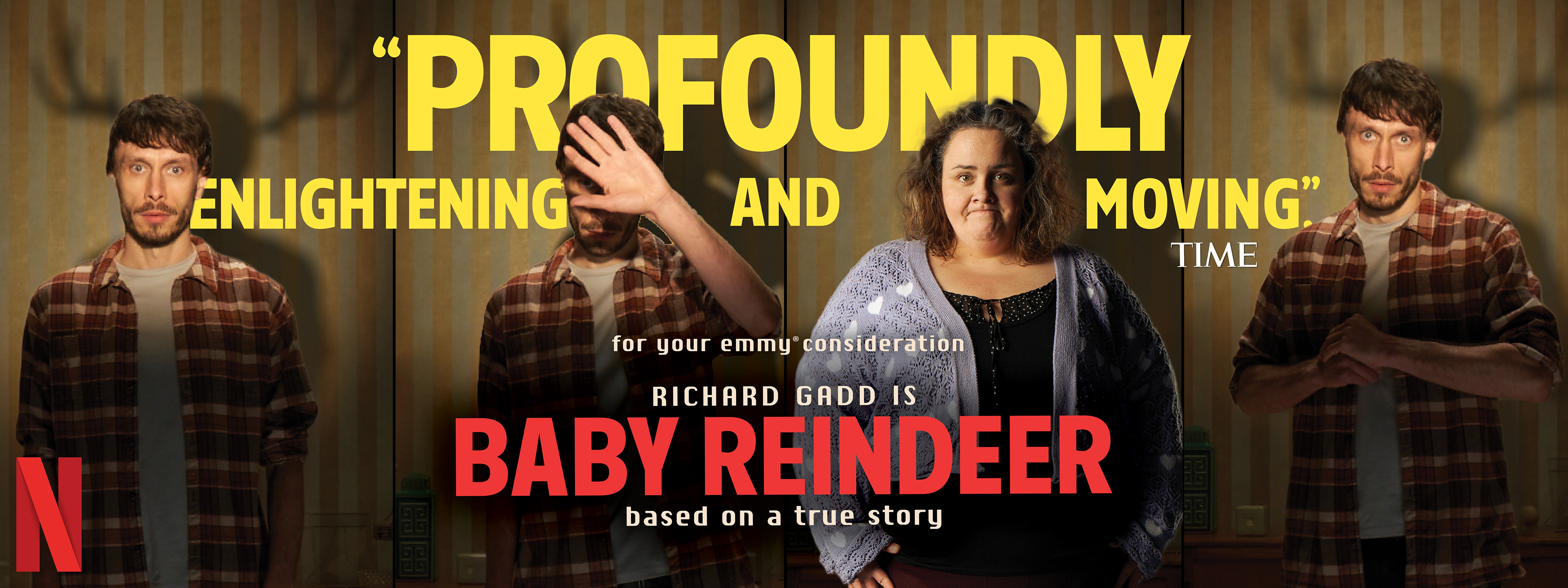
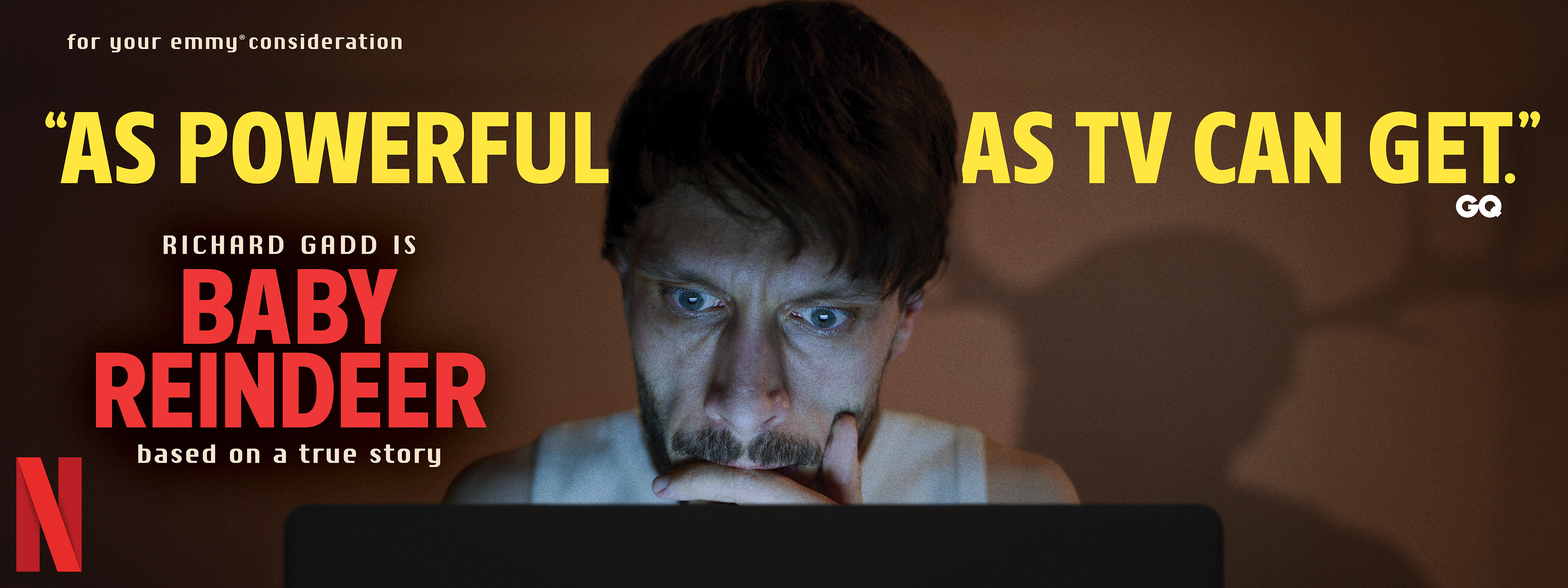
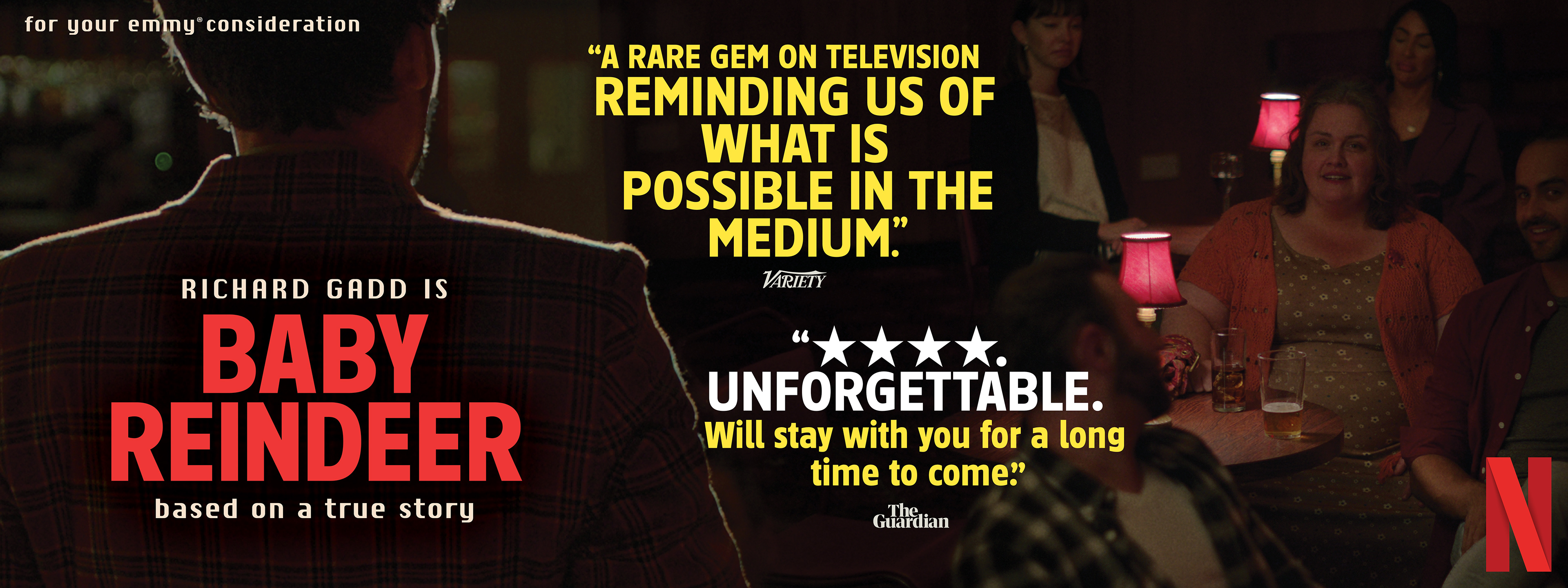
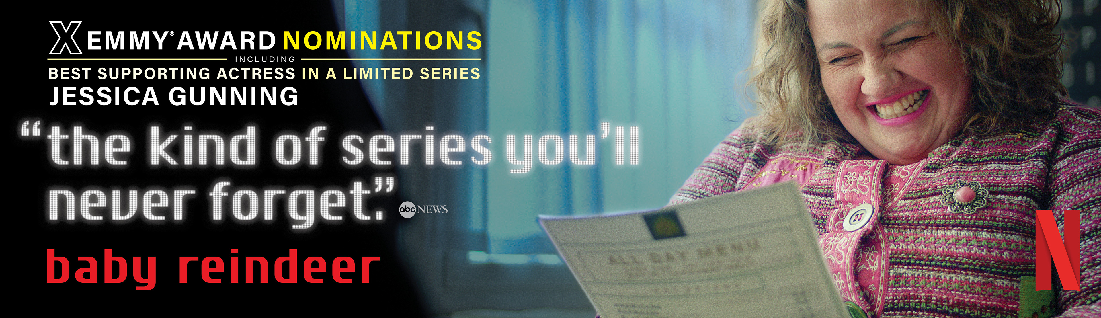
59 Nominations | 24 Wins | 6 Primetime Emmy® Wins
BRIEF
Netflix required a campaign for Baby Reindeer capturing its suffocating psychological intensity. The challenge was visualizing the chaotic dynamic between stalker and victim for voters.
STRATEGY
I developed a claustrophobic identity using extreme close-ups and erratic, stacked typography. This manic aesthetic creates a visceral sense of unease mirroring the protagonist’s unraveling.
Industry Trade Print
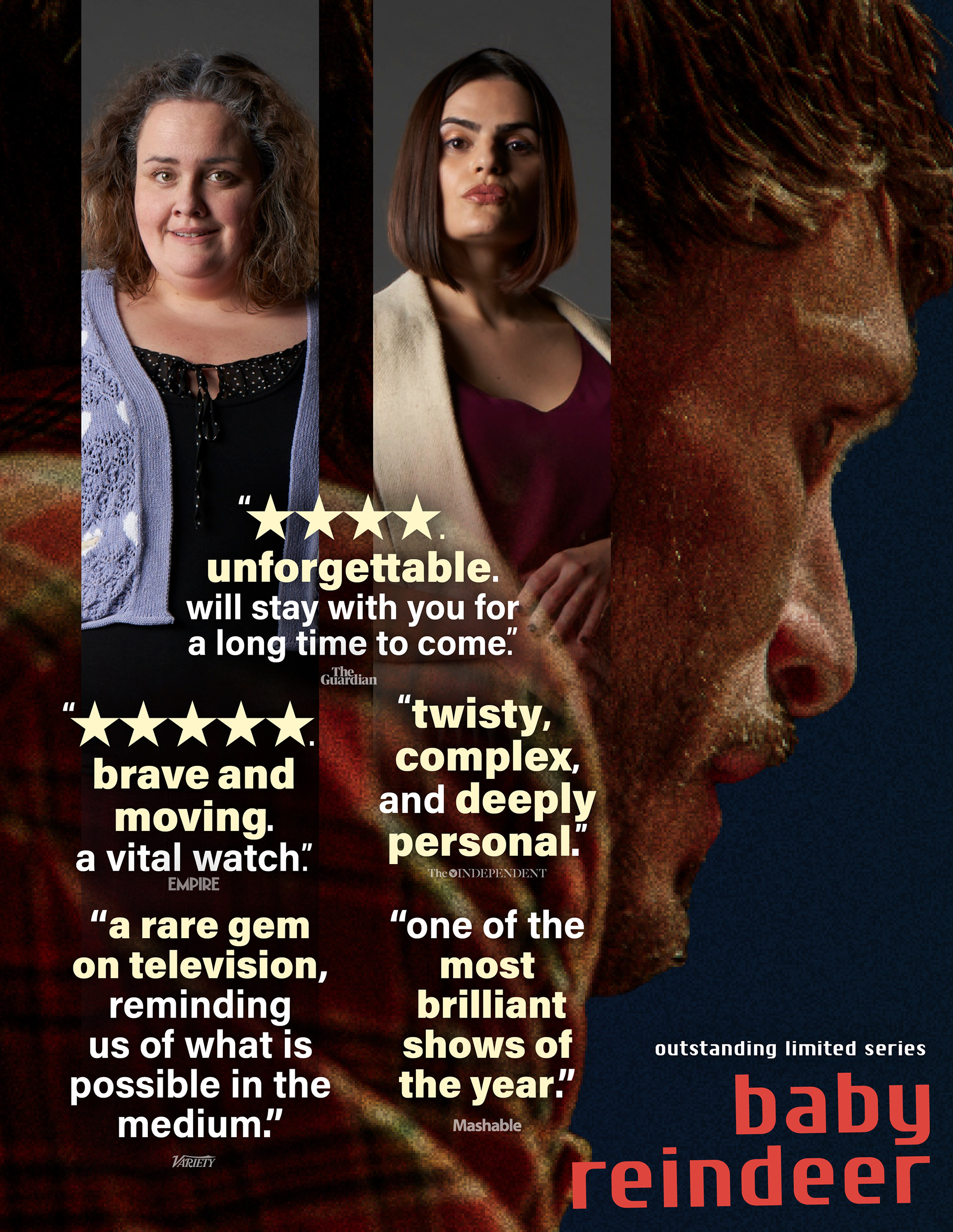
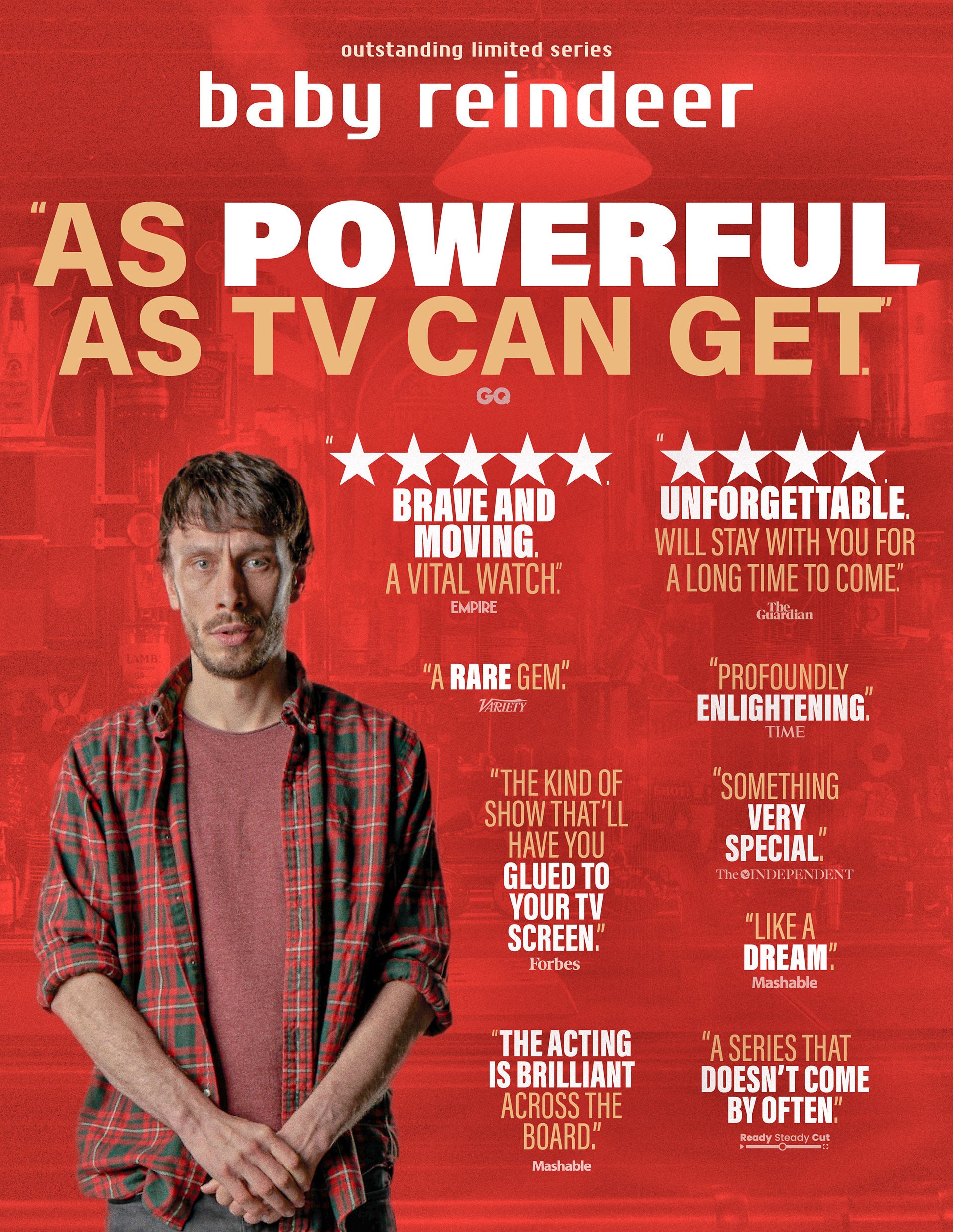
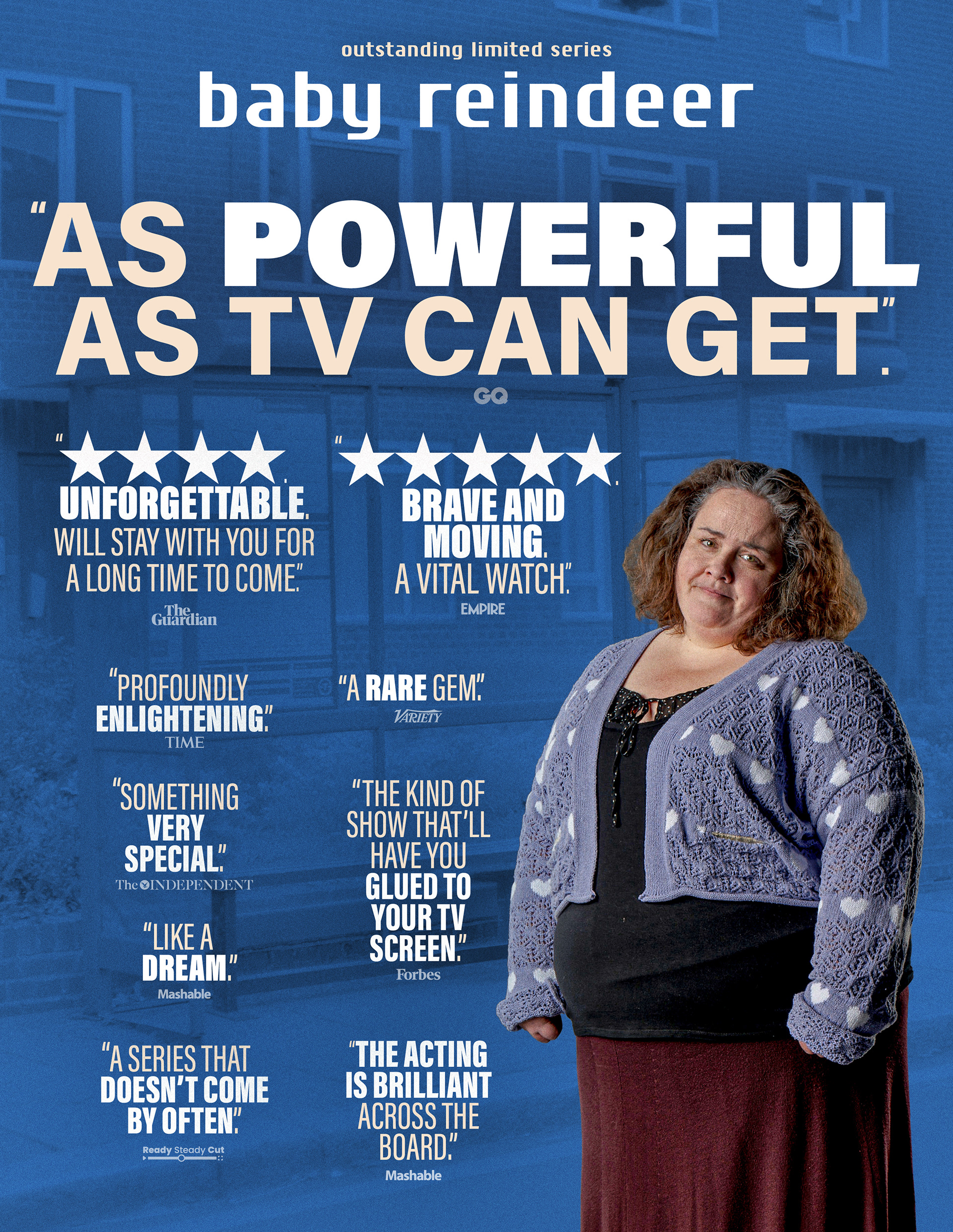
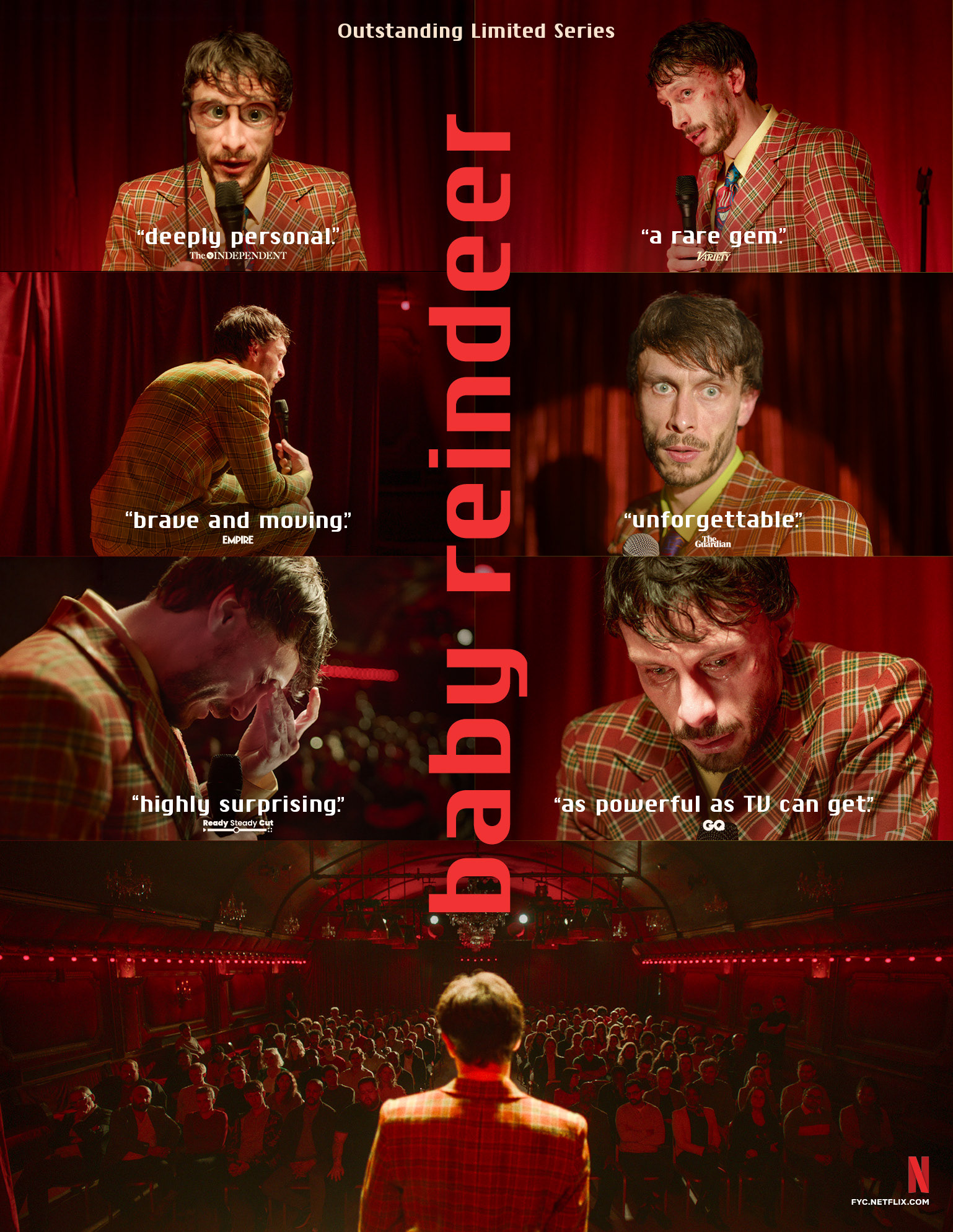
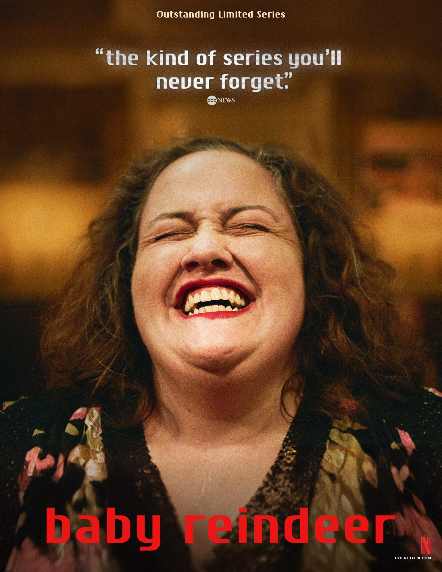
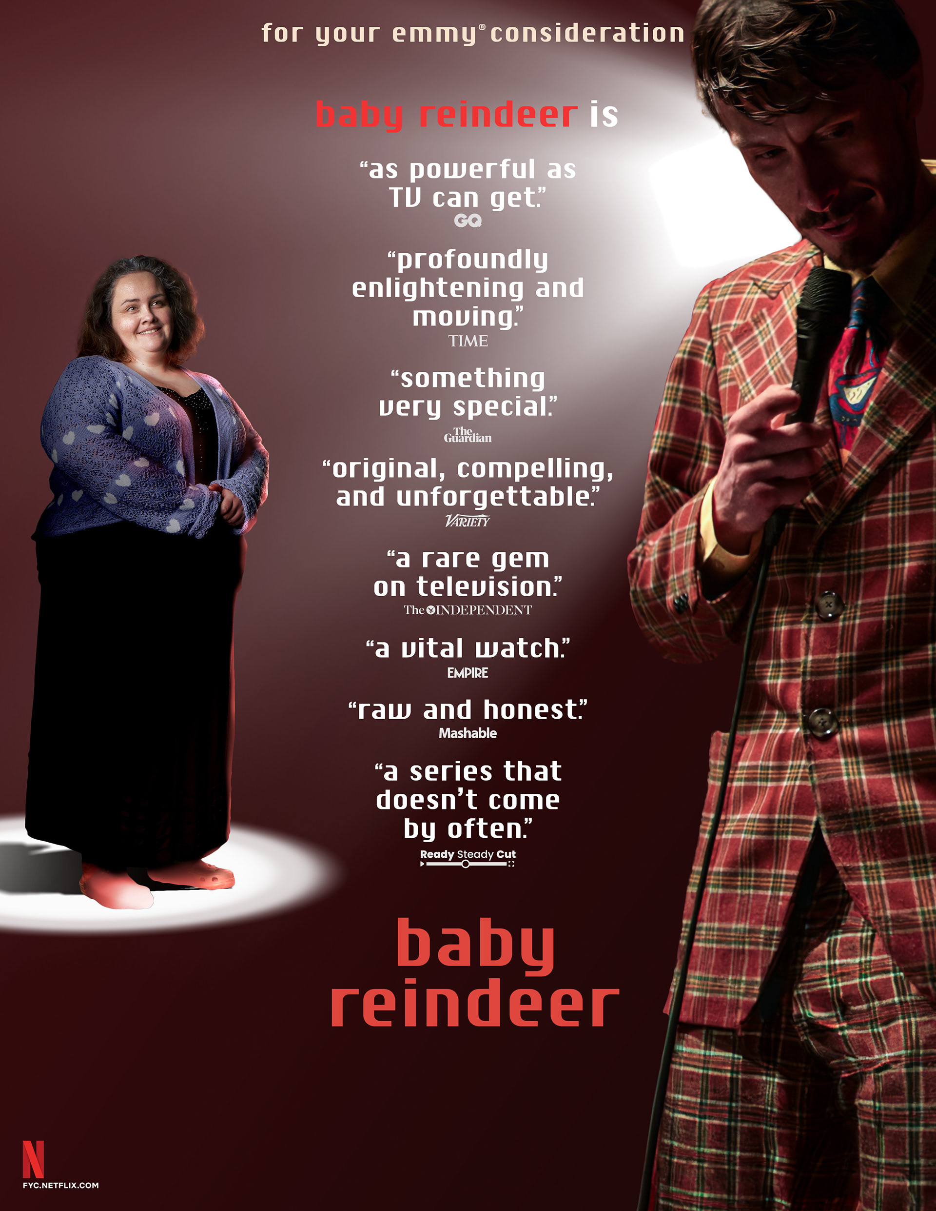
Out of Home Advertising – Wildposting Barricades

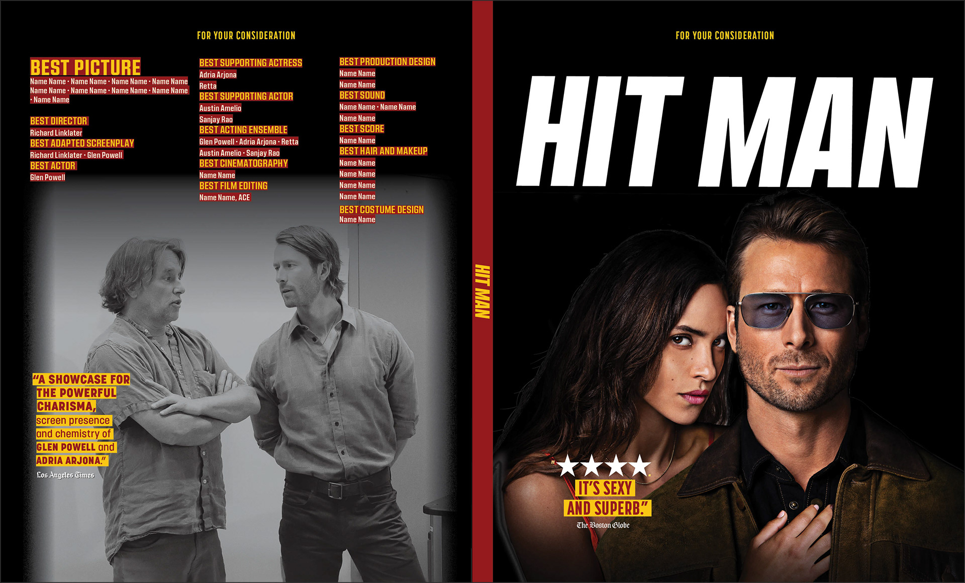
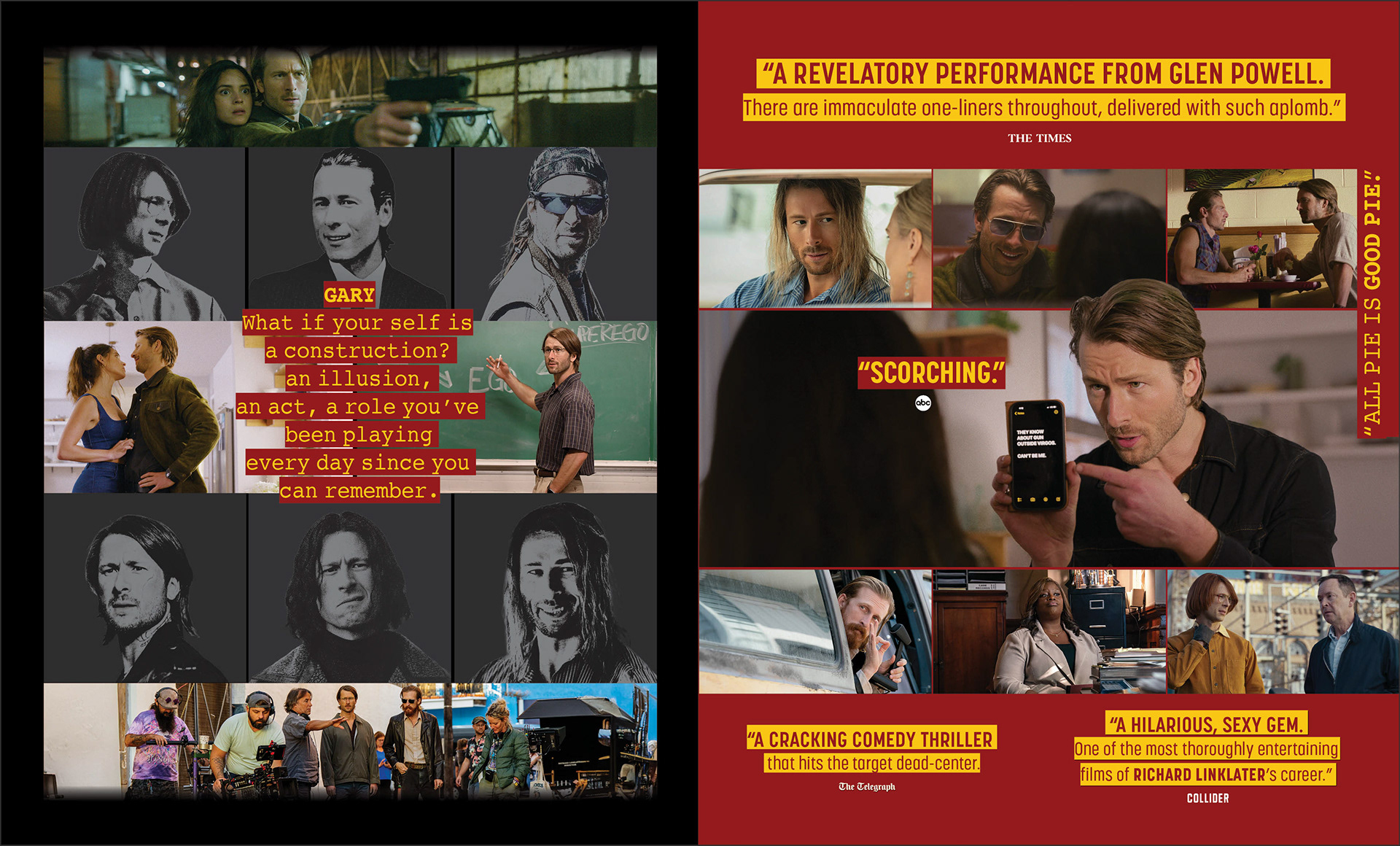
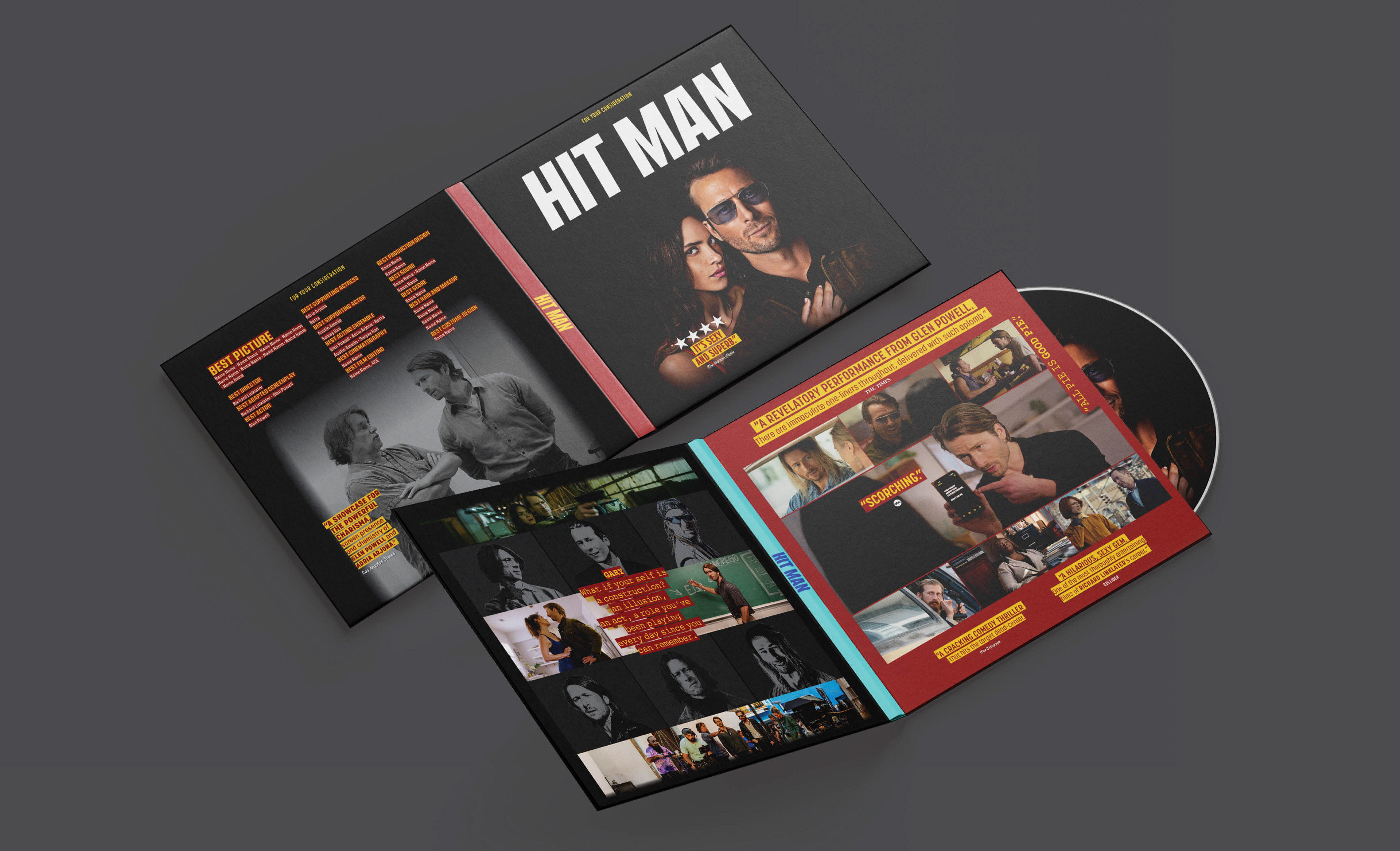
14 Nominations | 1 Win
BRIEF
Netflix required a campaign for Hit Man balancing rom-com charm with thriller stakes. The challenge was showcasing the protagonist’s many disguises without confusing the audience.
STRATEGY
I designed a vibrant identity using bold yellow typography and character collages. This “chameleon” concept highlights Glen Powell’s versatility across print, social, and merchandise.
Industry Trade Print
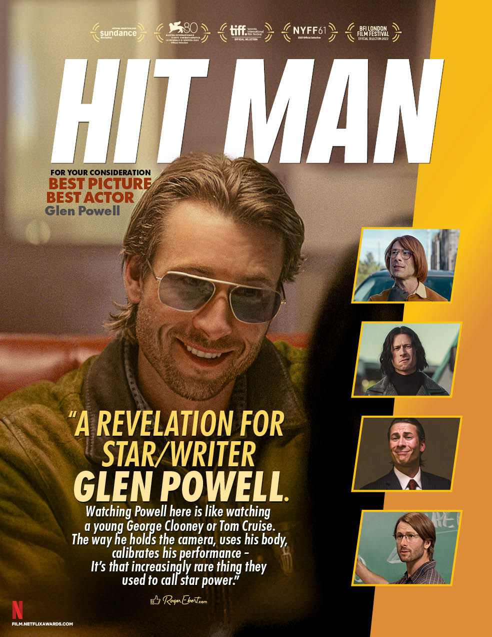
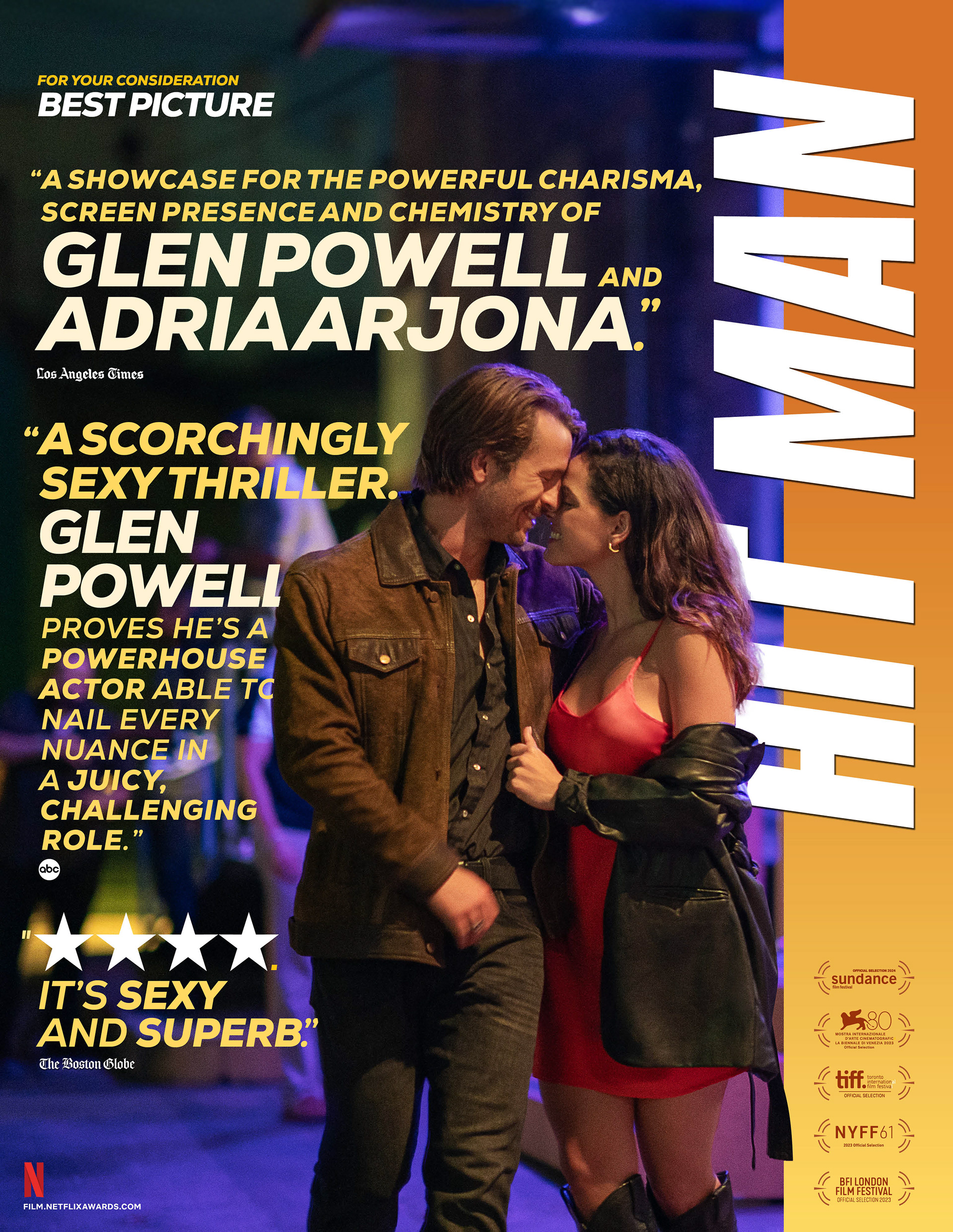
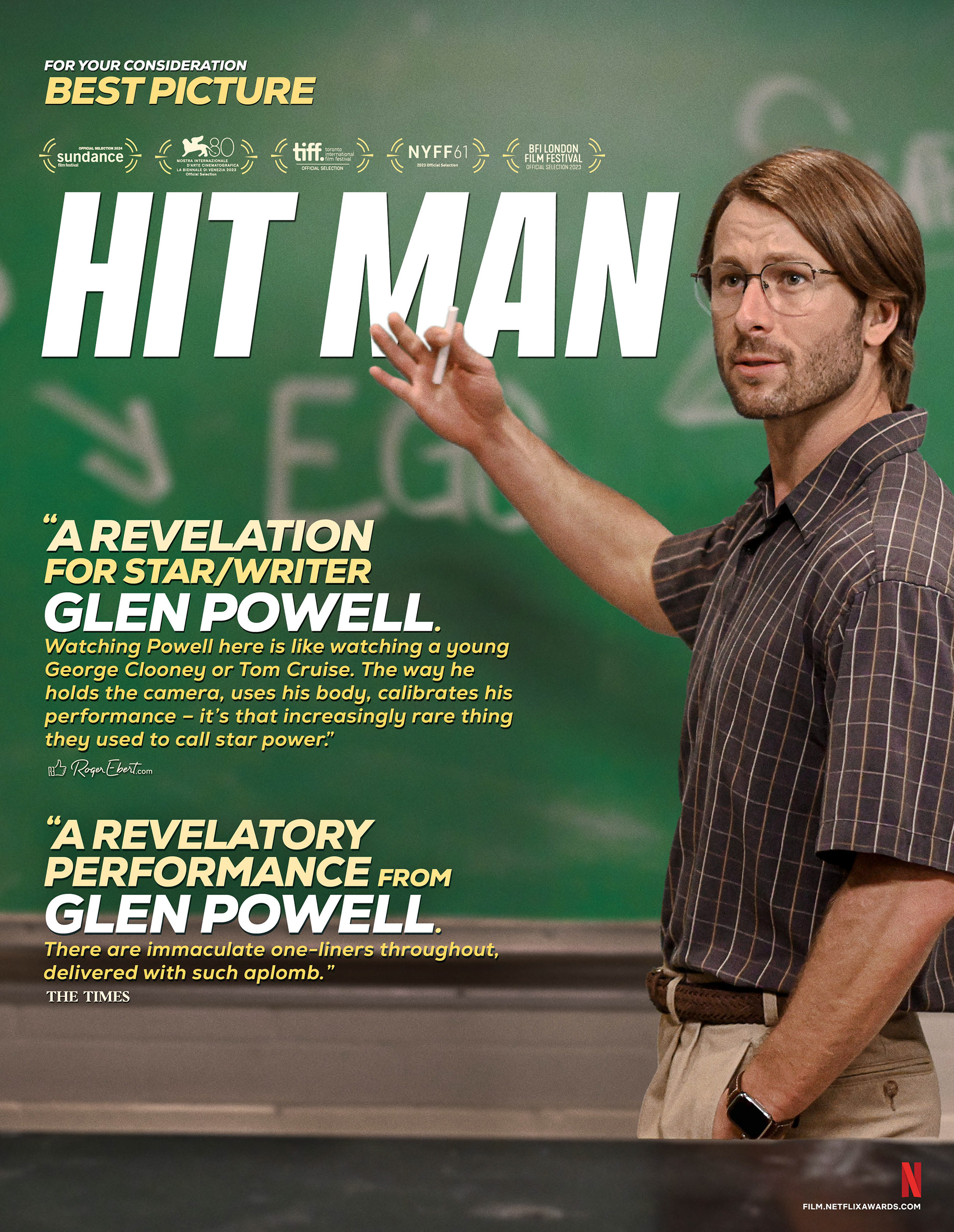
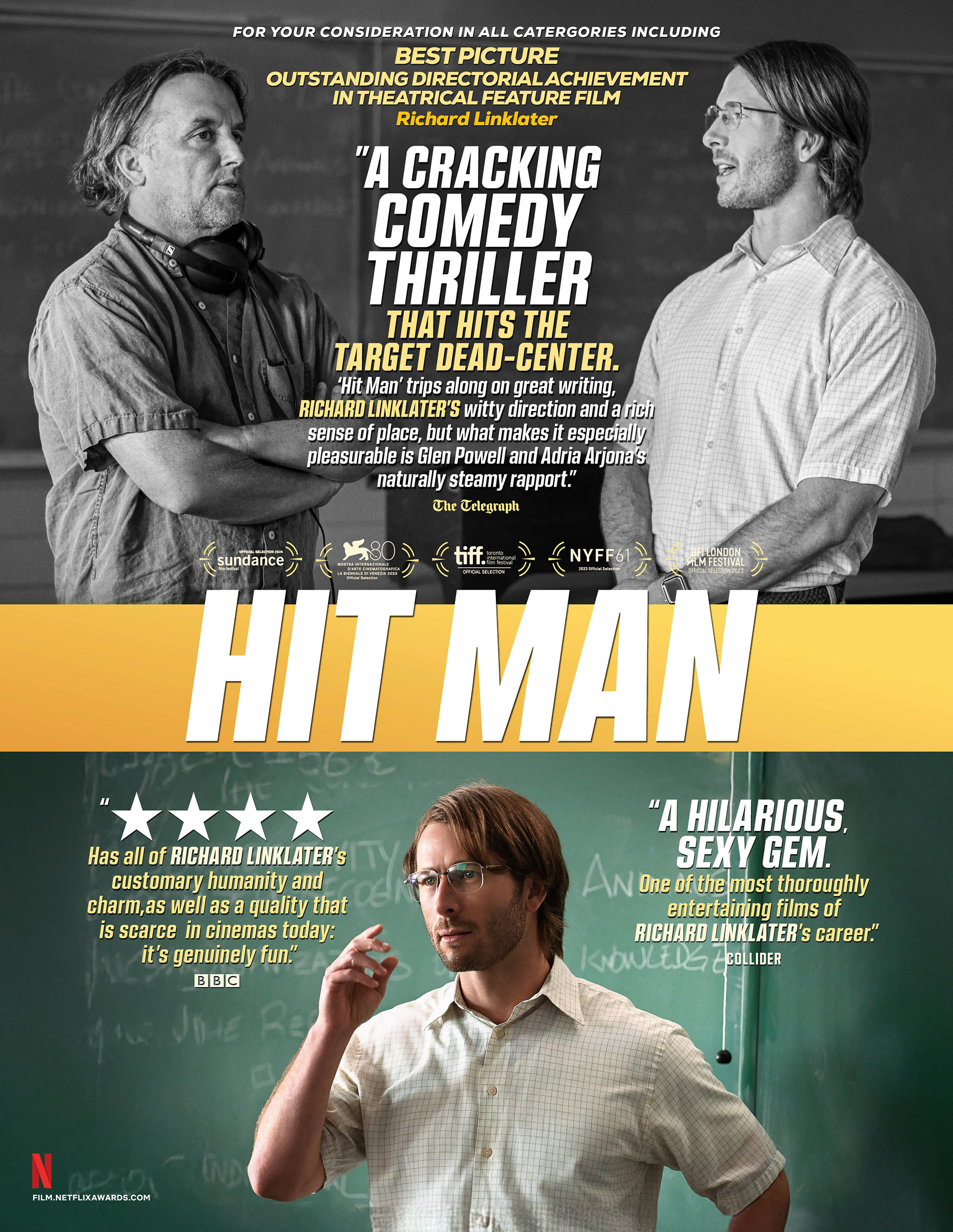
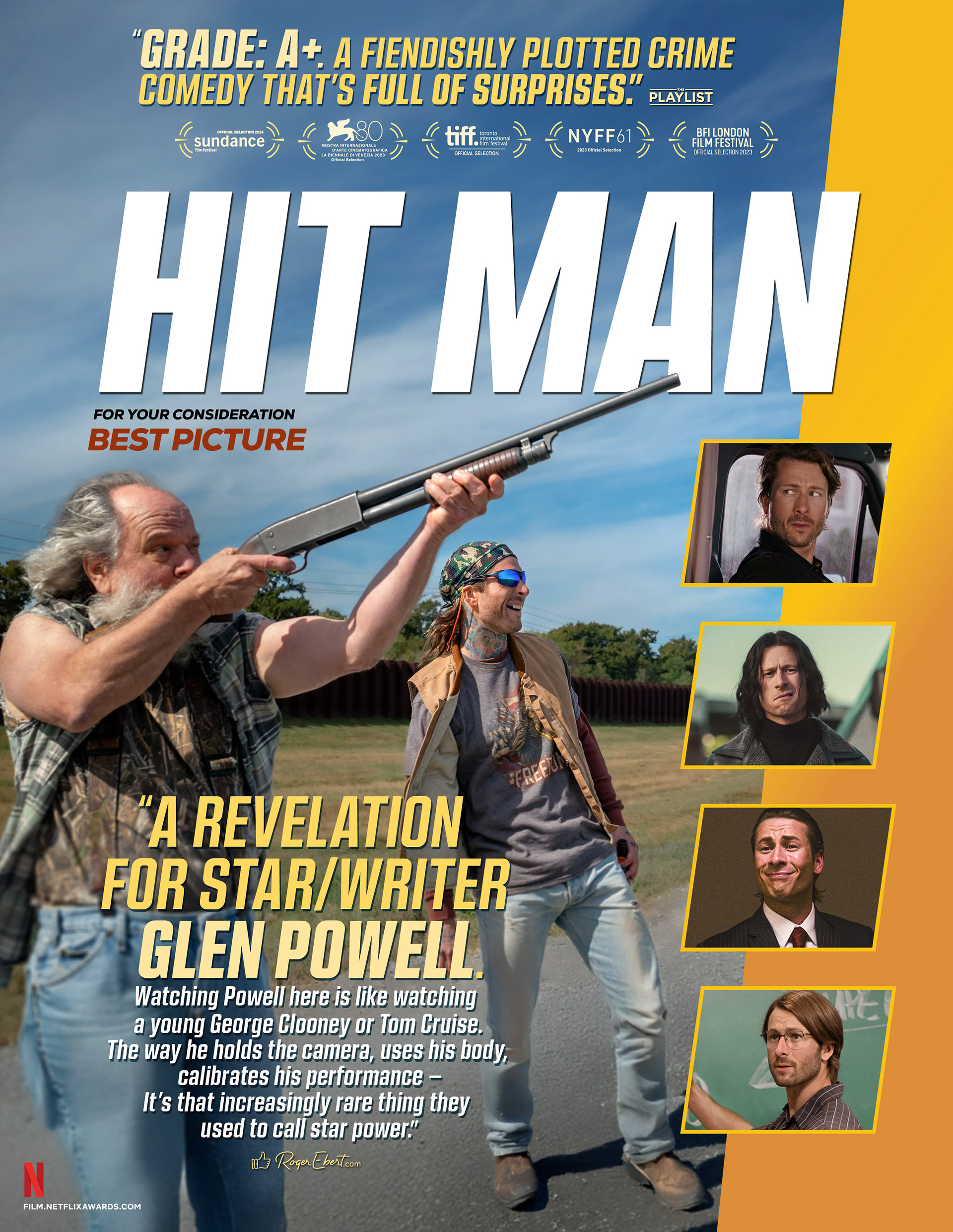
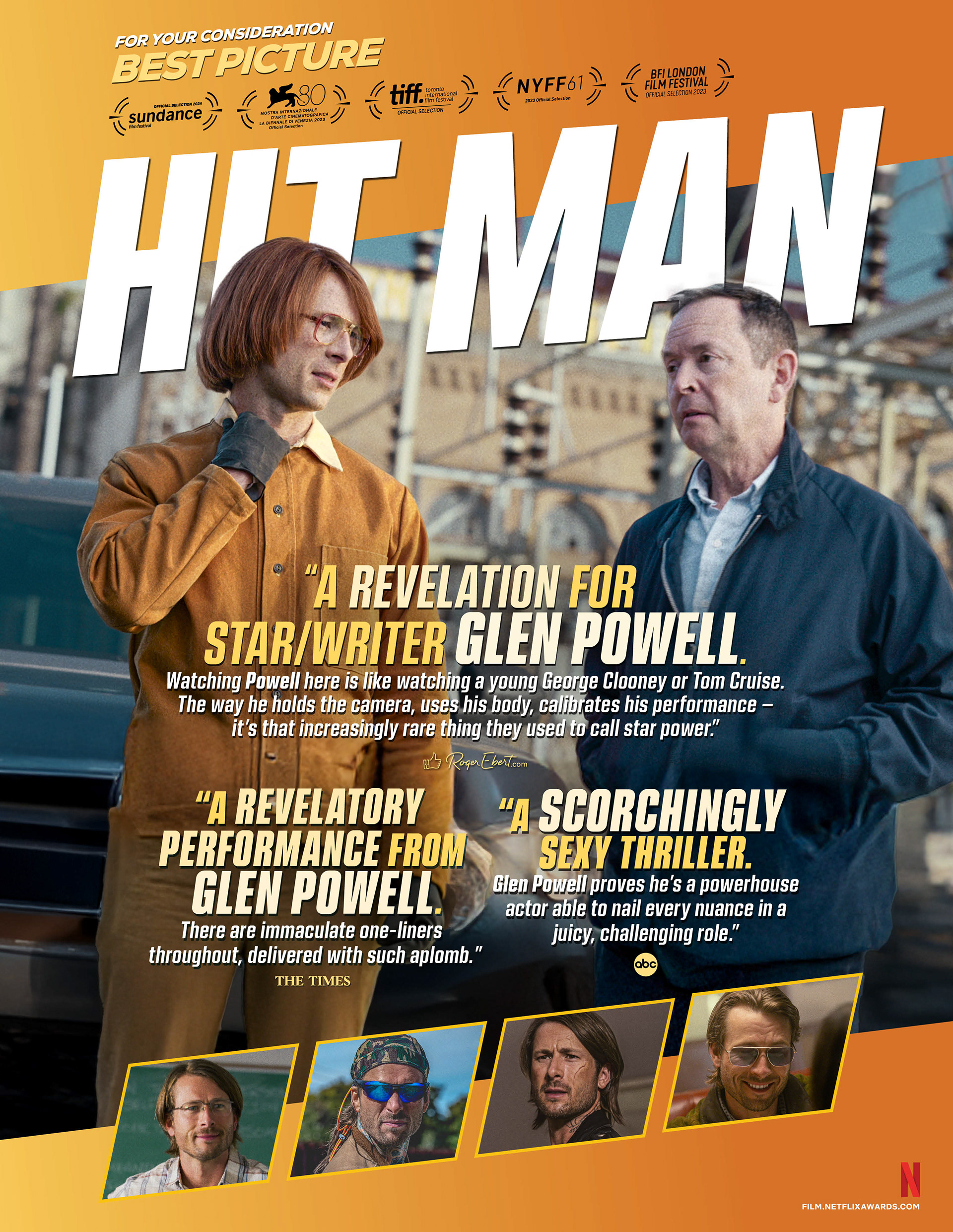
Out Of Home Advertising
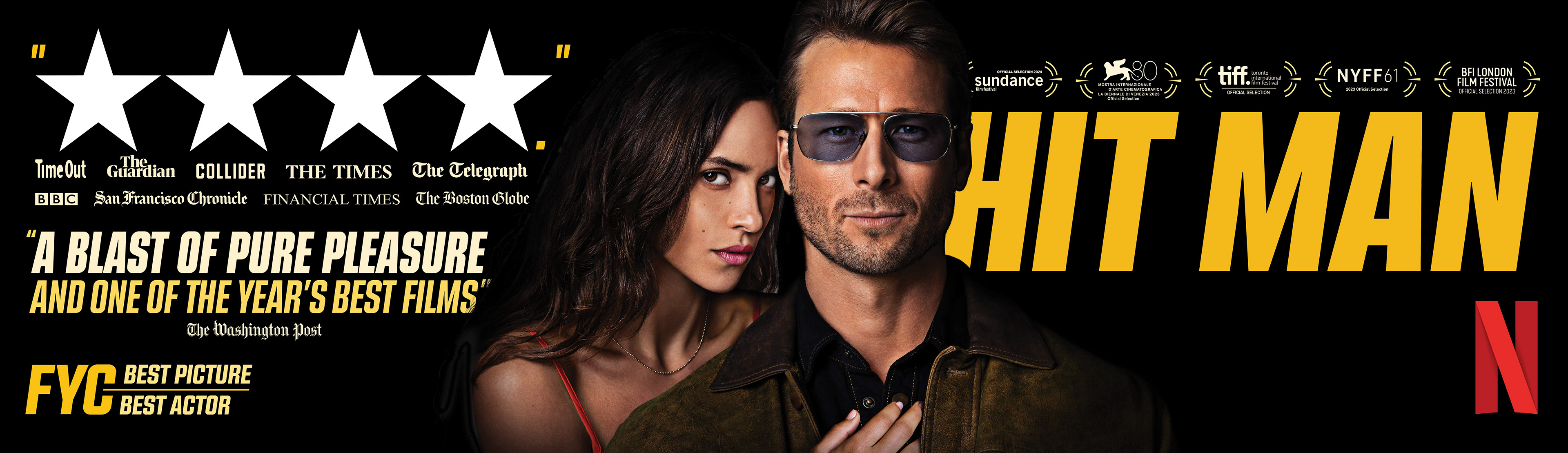
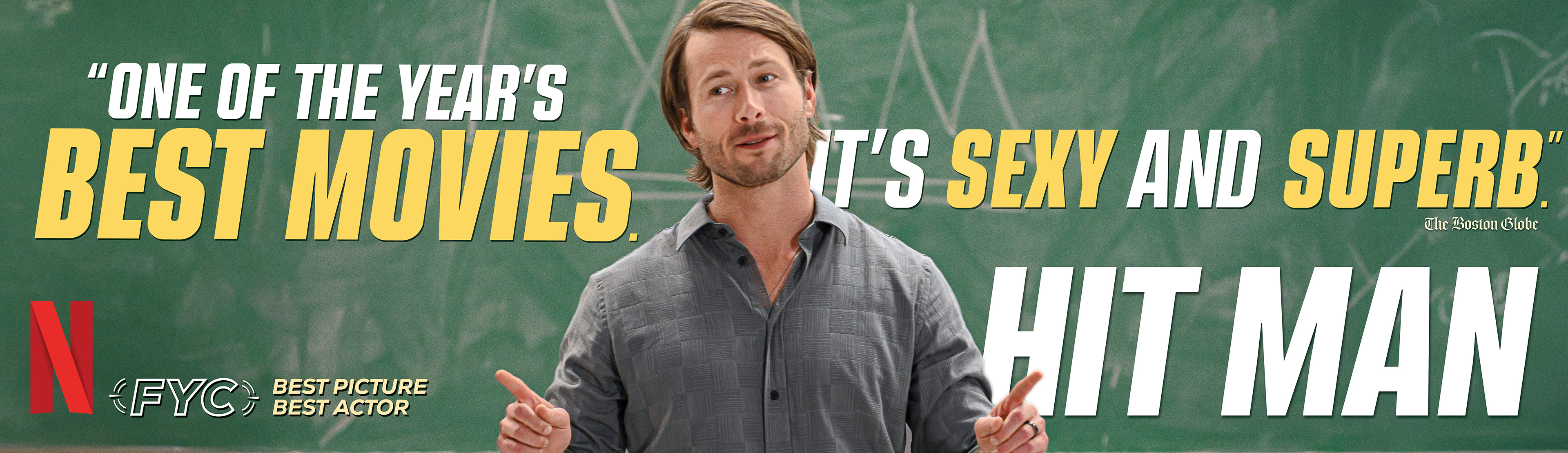
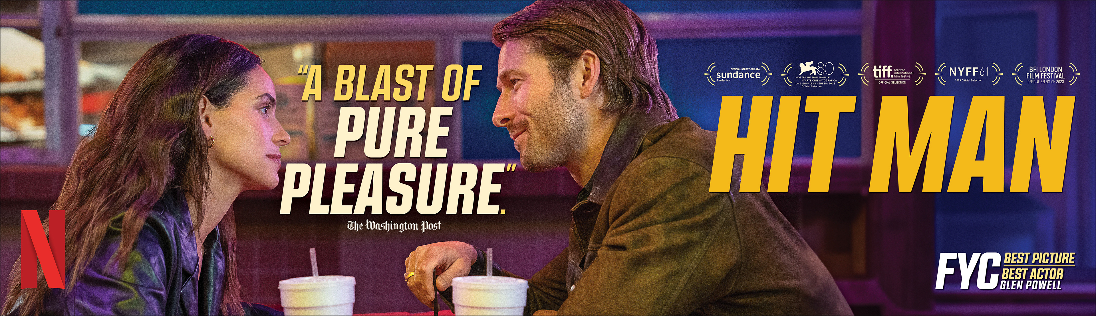
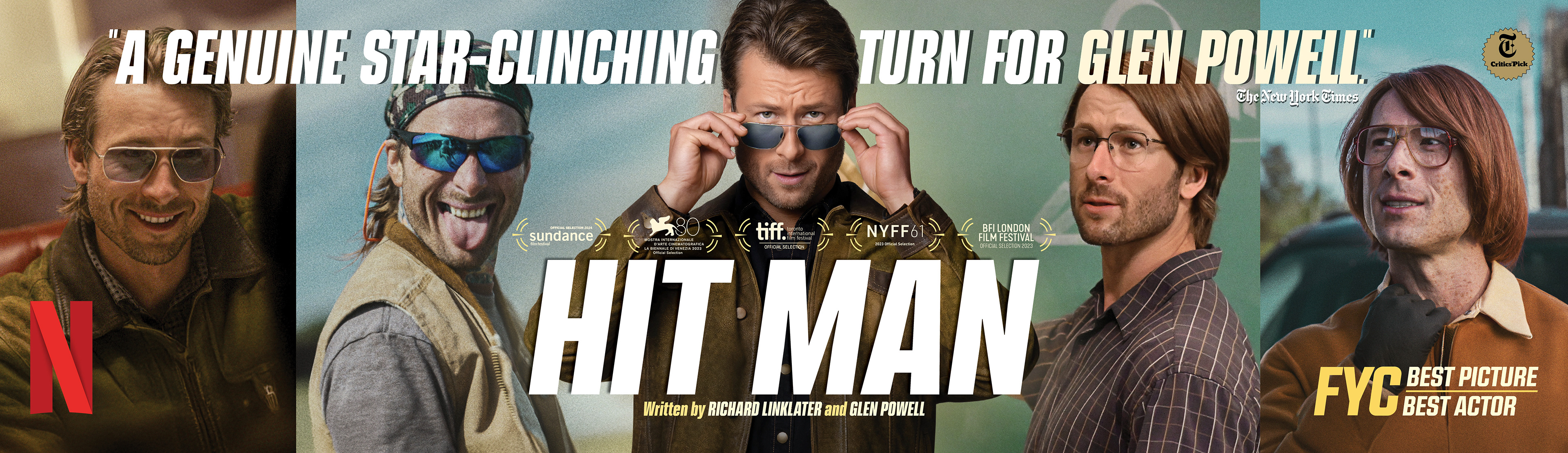
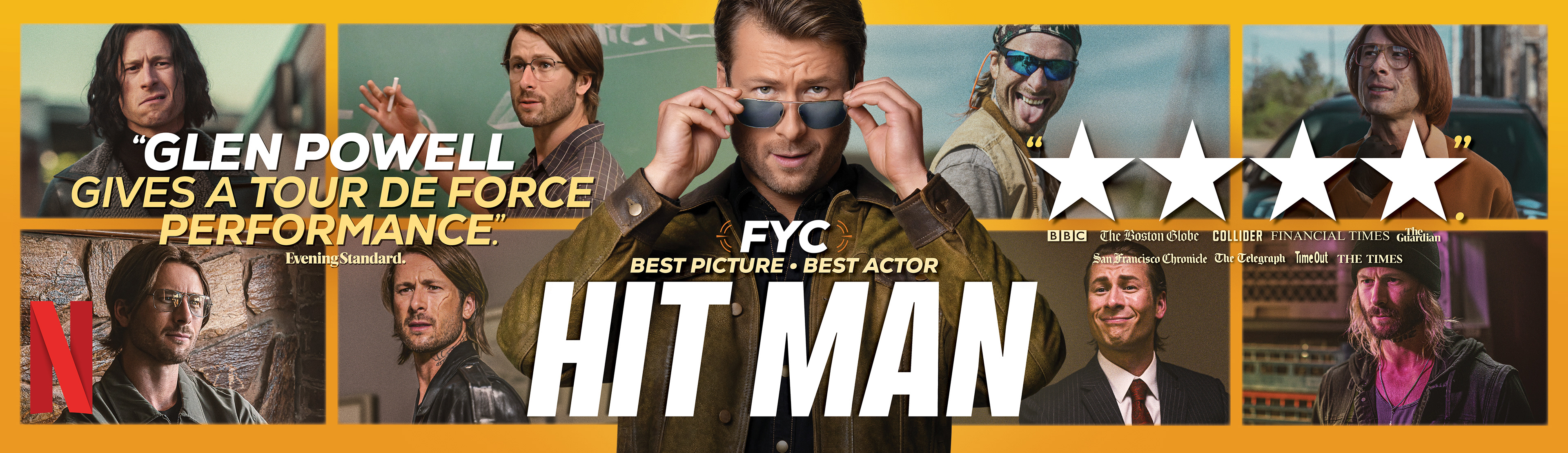
Promotional Custom Collage T-Shirts
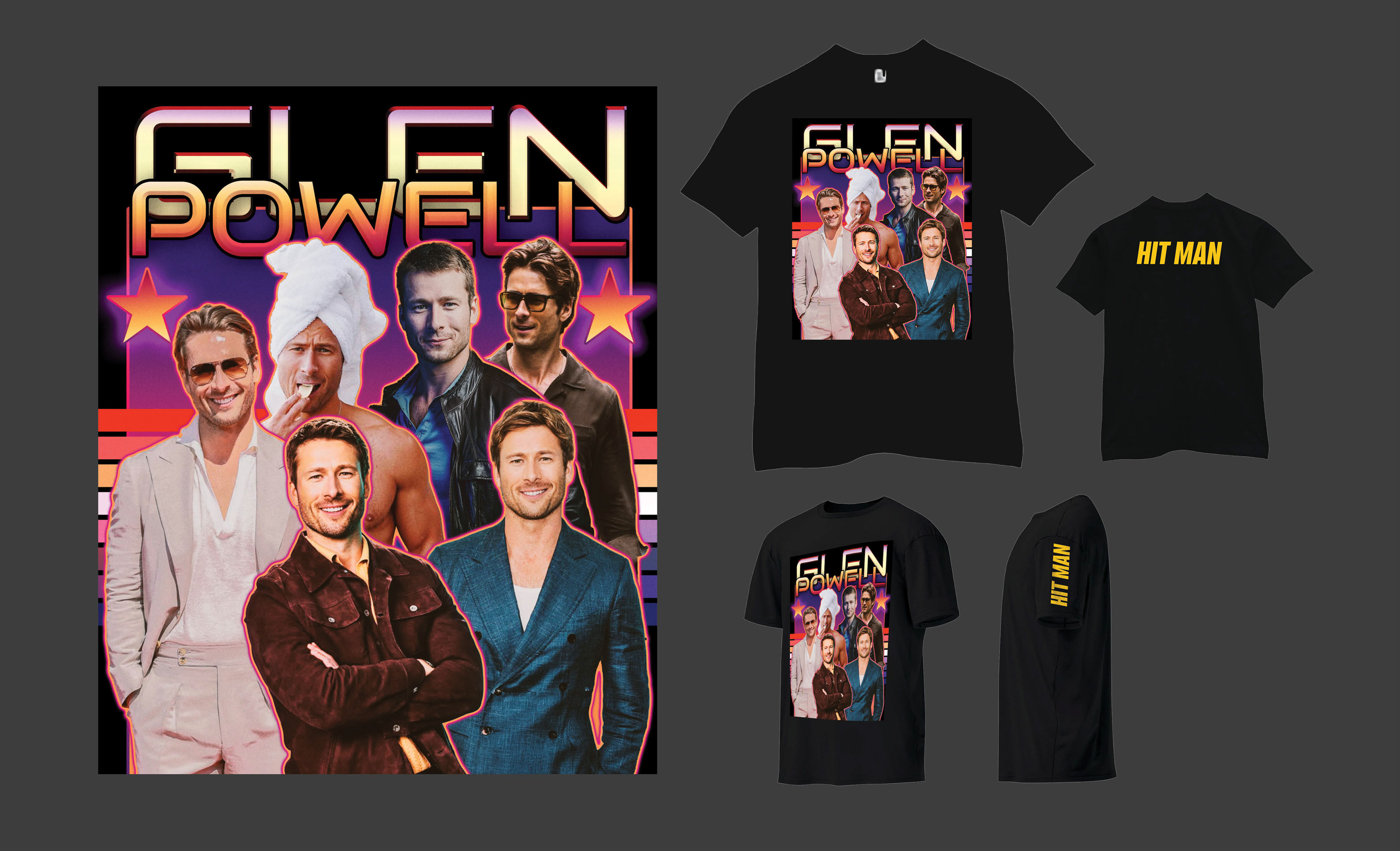
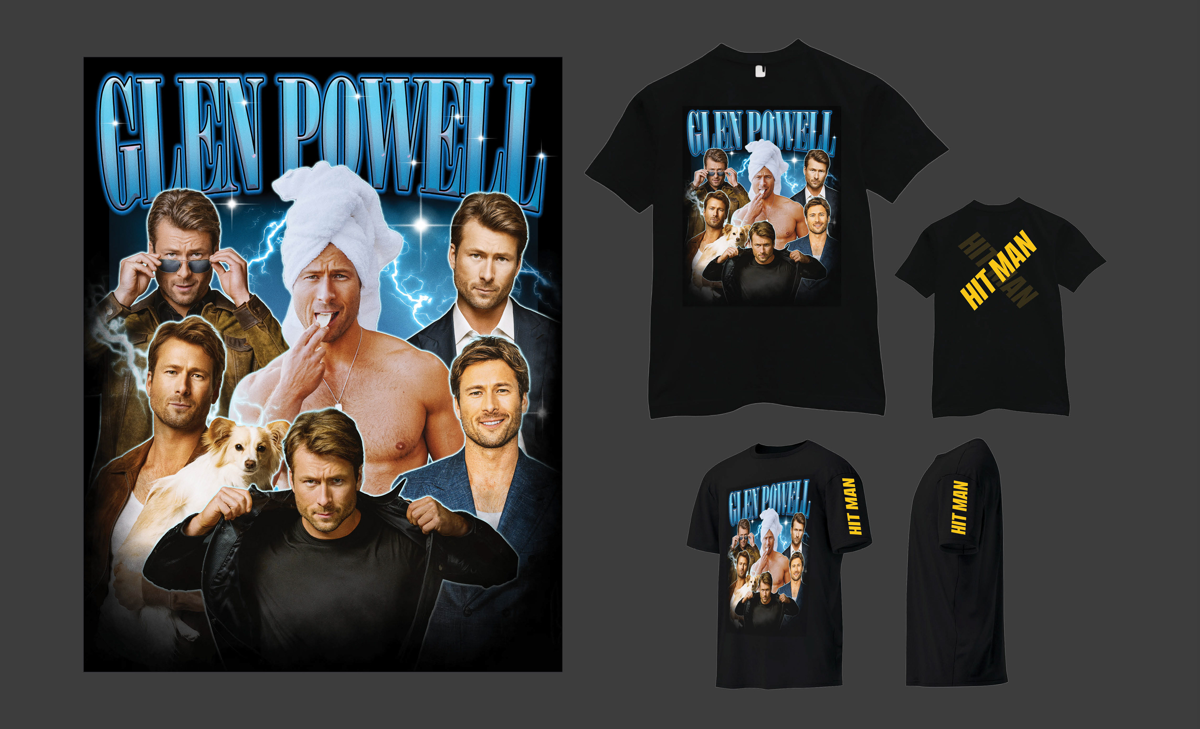
Awards DVD Screener Packaging
Cover
Inside
CLIENT

BRANDING PROMOTION
E-BLAST
E-BLAST
CONCEPT, LAYOUT, TYPOGRAPHY, PHOTO ILLUSTRATION, COMPOSITING AND FINISHING
PROJECT DATE | 2025
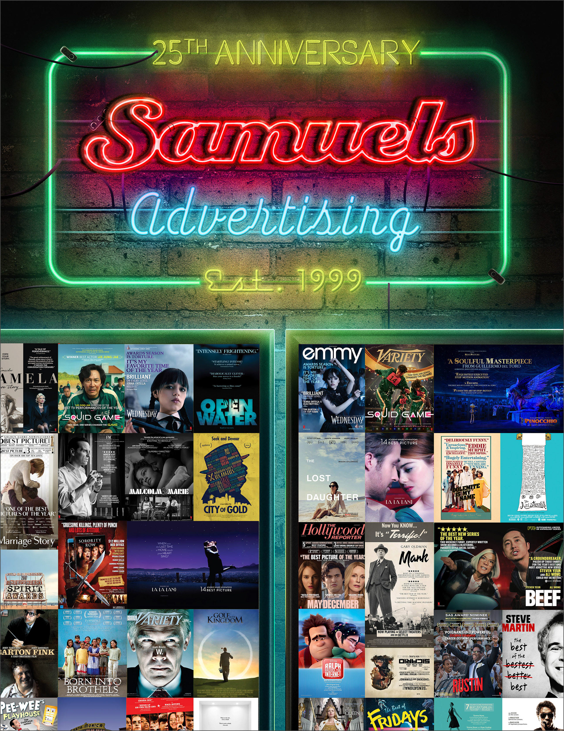
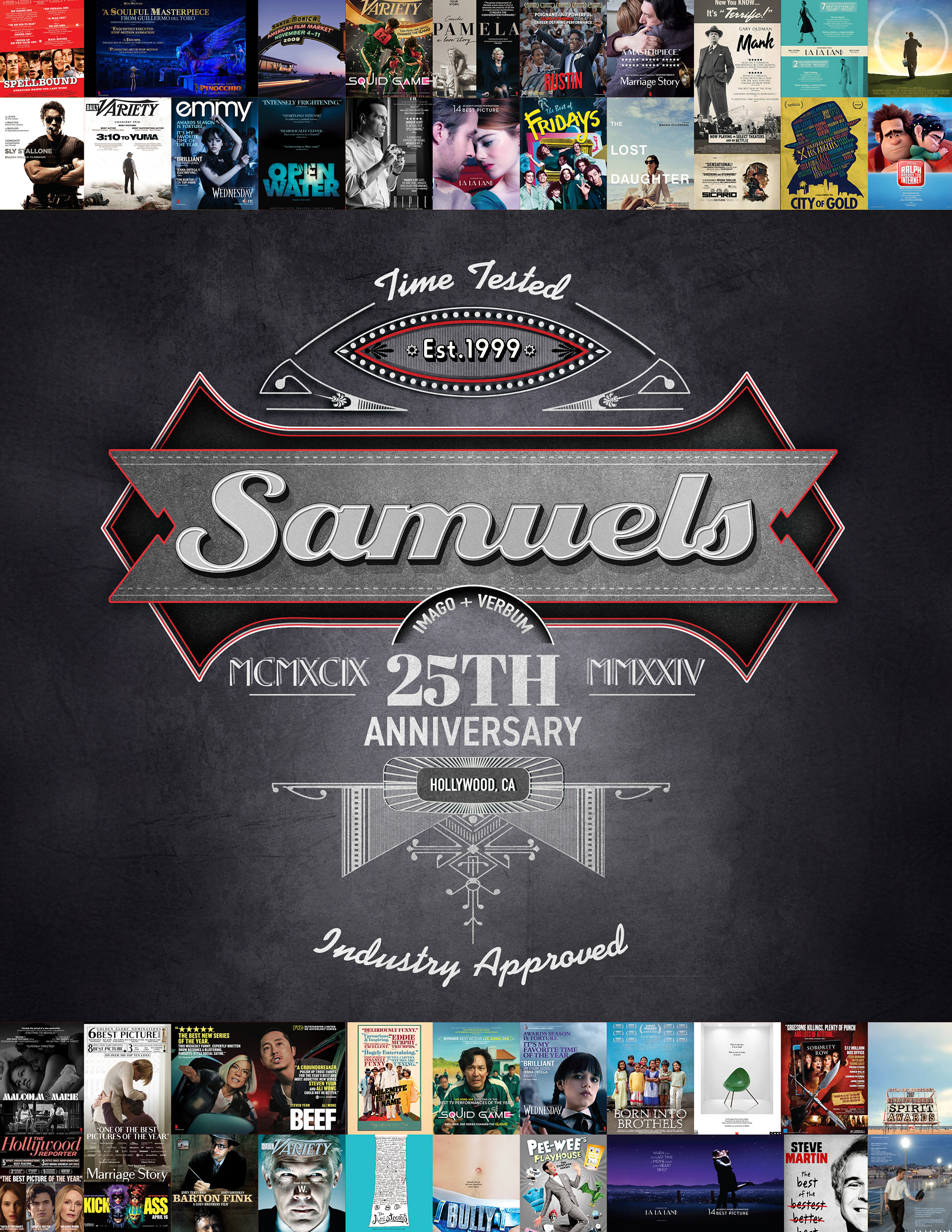
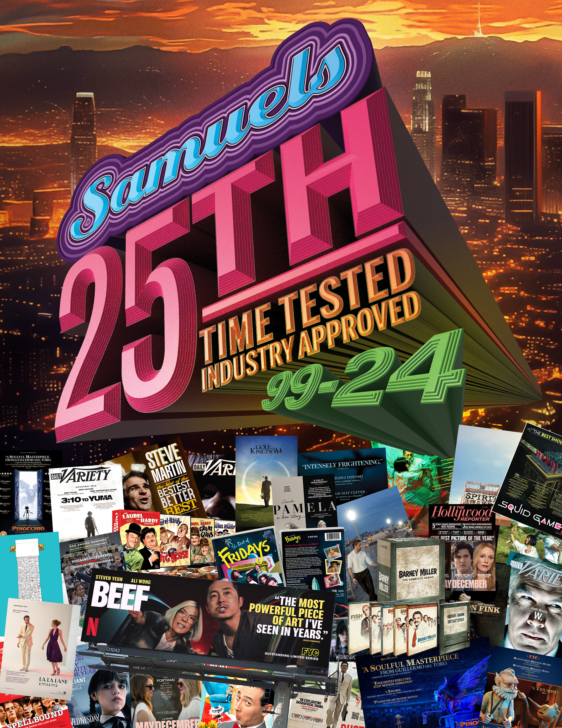
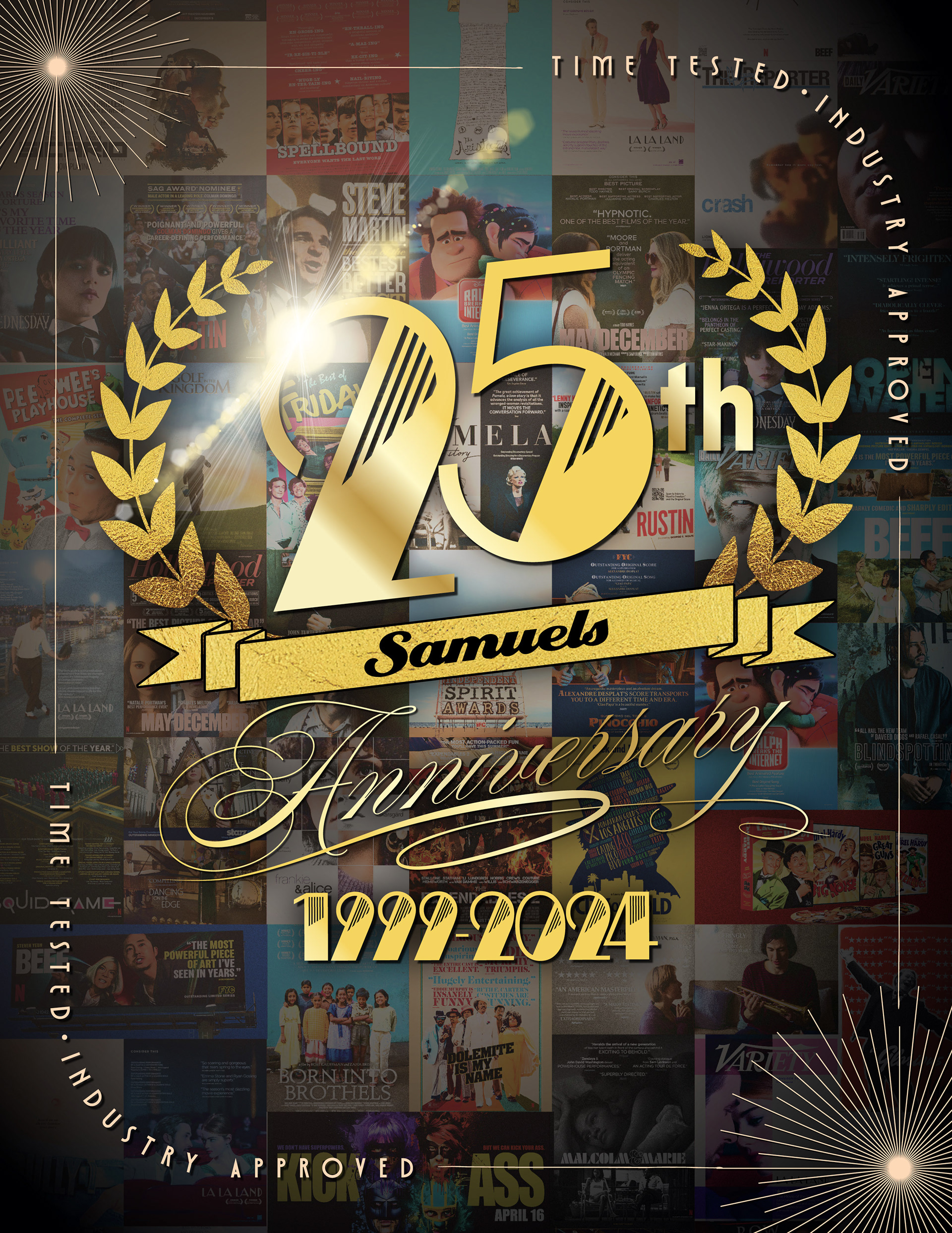
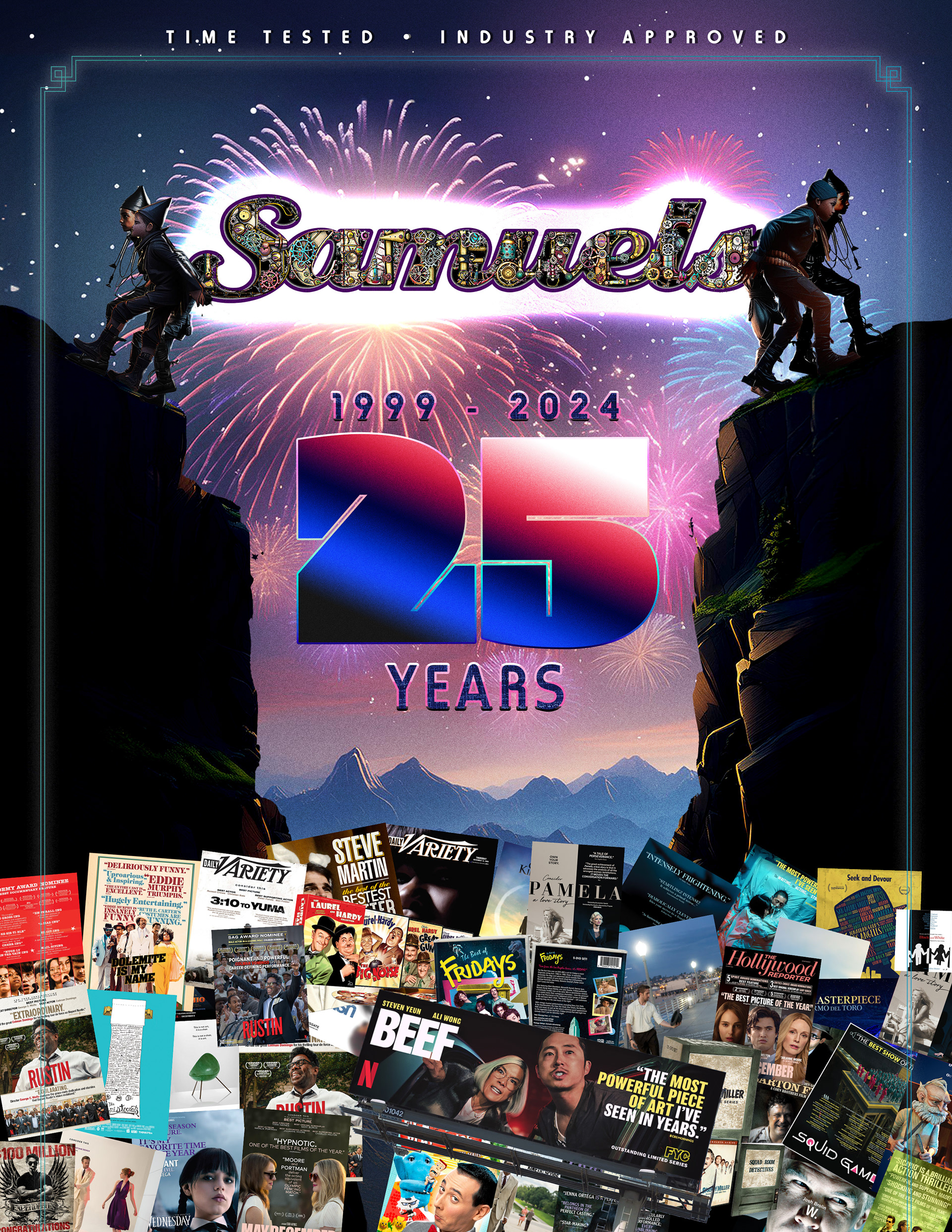
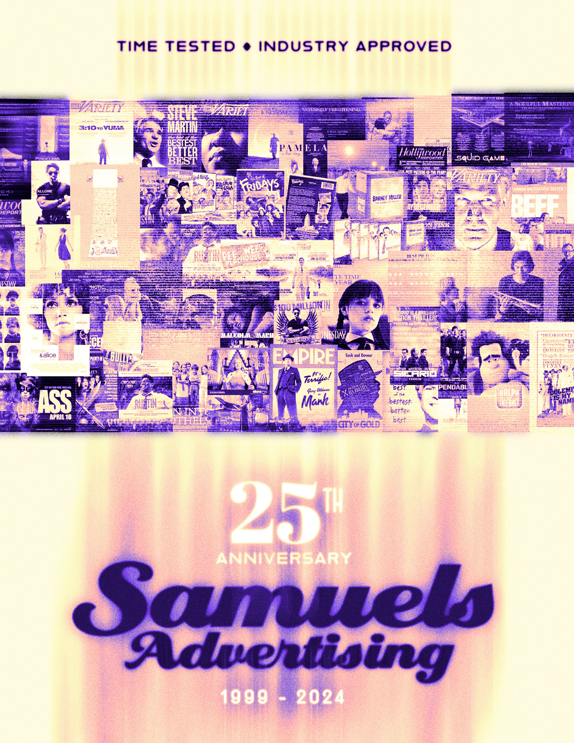
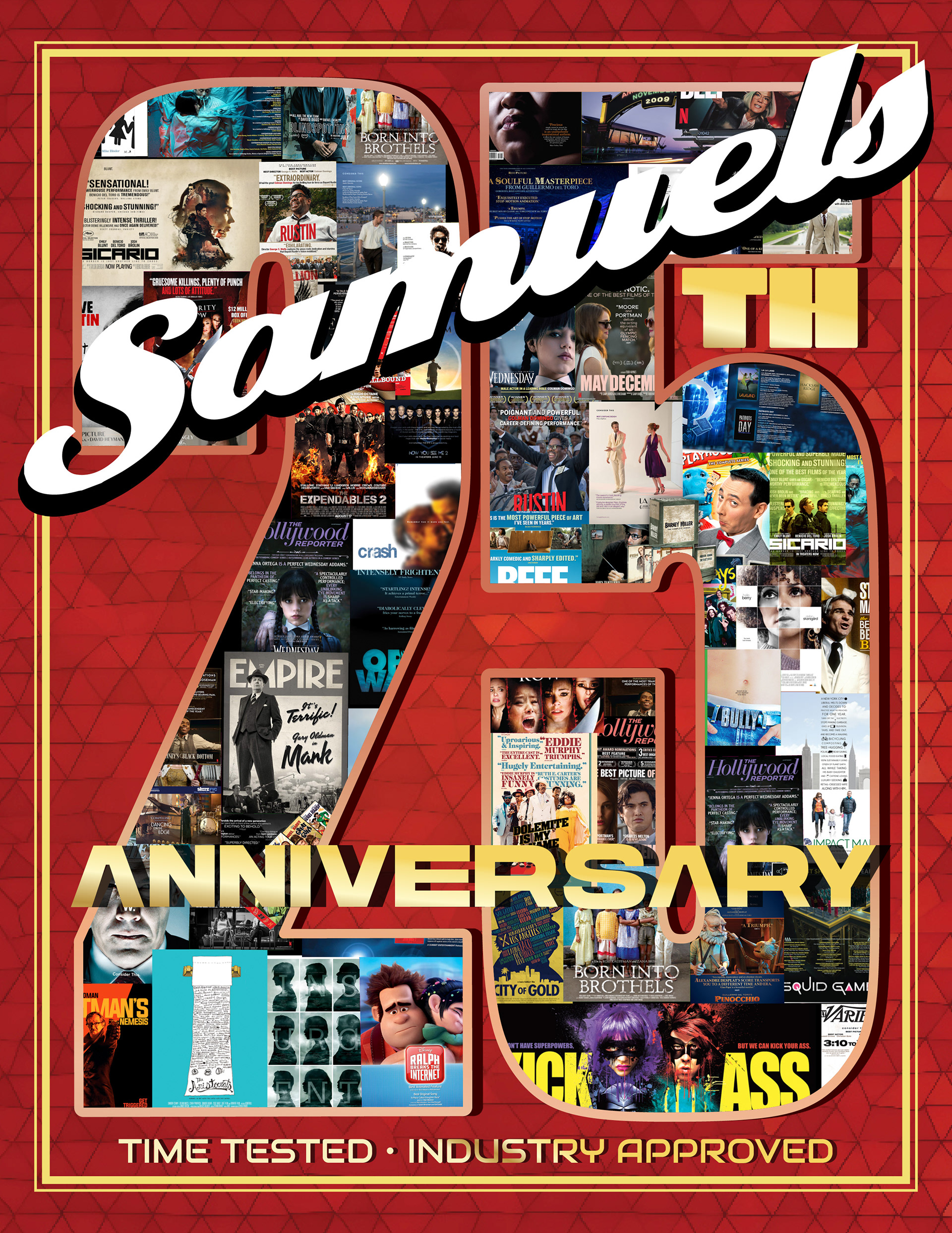
BRIEF
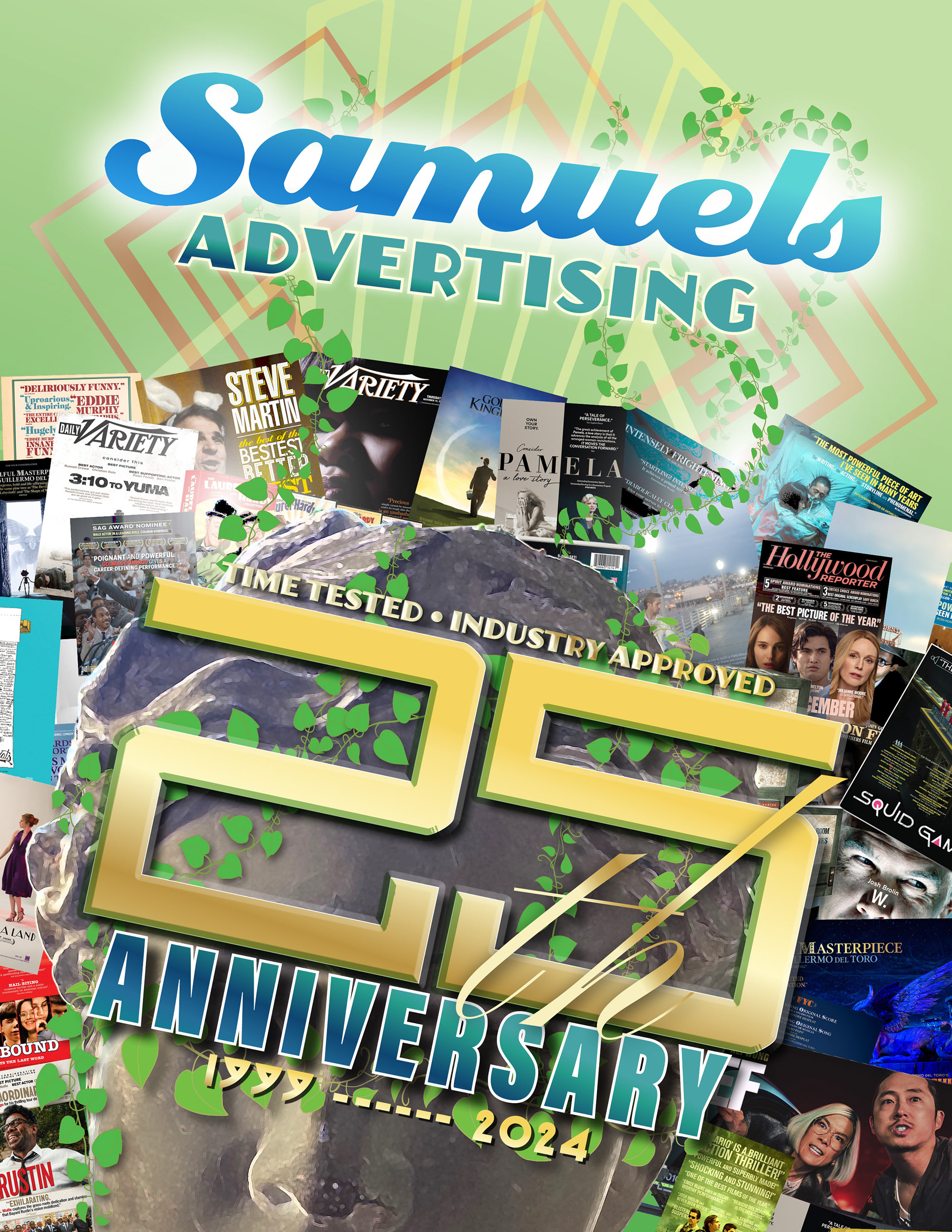
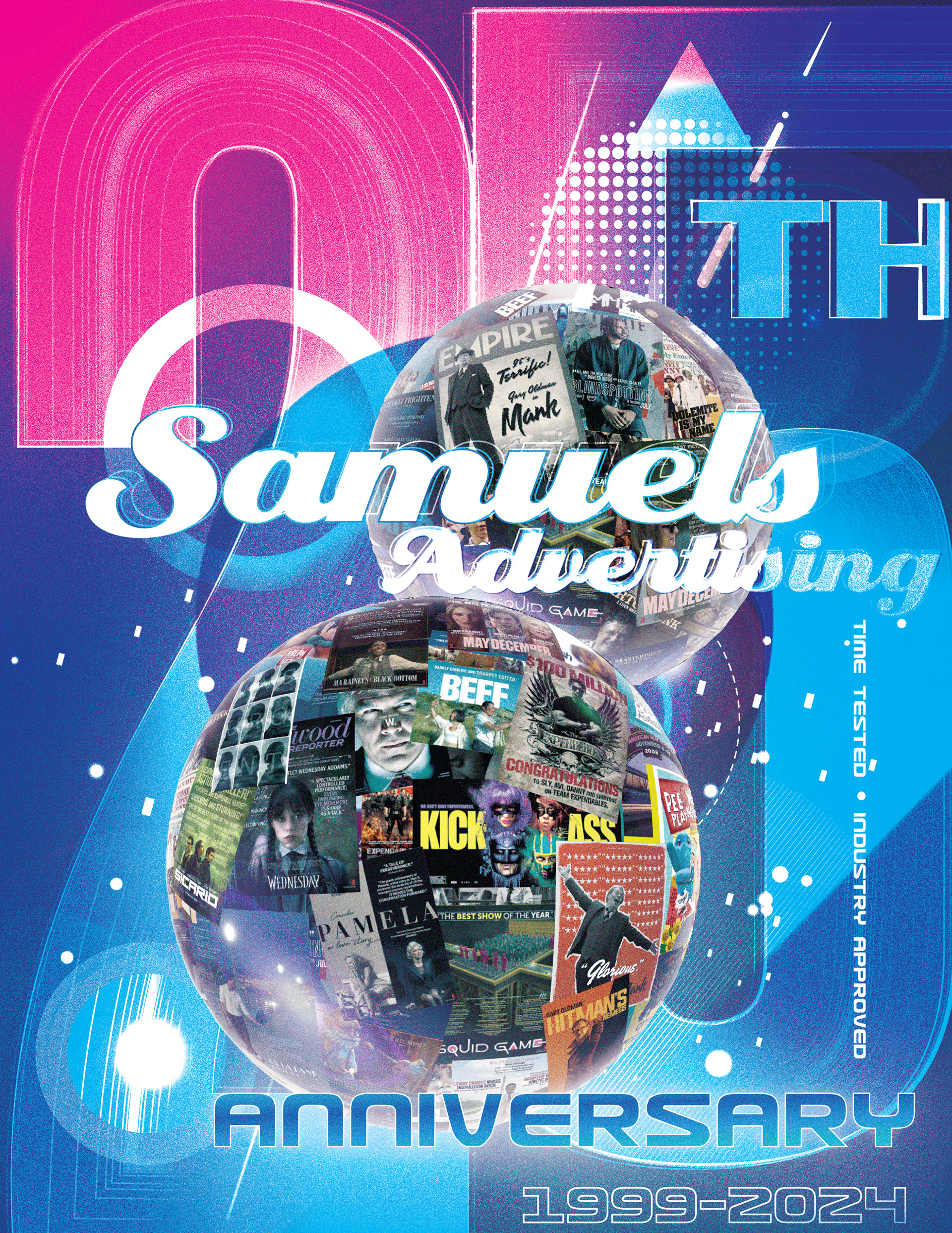
Design a celebratory visual campaign for Samuels Advertising’s 25th Anniversary to honor their legacy as a premier agency for awards season marketing. The objective was to create a nostalgic yet premium aesthetic that showcases their extensive portfolio of Academy Award and Emmy-winning campaigns while reinforcing their industry dominance since 1999.
STRATEGY
I centered the design around a classic neon marquee aesthetic to evoke the glamour of Hollywood and the “silver screen”. The composition features a collage of their most iconic movie and TV posters, framed by glowing neon signage. This juxtaposition of retro cinematic style with a modern portfolio montage bridges their historic roots with their current industry relevance. For the digital campaign, I expanded this into a motion graphics asset, animating the neon flicker and environmental elements to bring the “silver screen” nostalgia to life for online audiences.
CLIENT
ANIMATED ADVERTISEMENT
MOTION GRAPHICS ANIMATION
PROJECT DATE | 2022
BRIEF
Develop a series of punchy motion graphics for a new media buying startup, True Measure Media, for use on YouTube and LinkedIn. The objective was to clearly and quickly communicate their disruptive model: eliminating traditional agency layers and costs to offer clients a direct, efficient, and significantly more affordable media buying solution.
STRATEGY
I used a clean, high-contrast blue and black color scheme to convey professionalism and clarity. The animation strategy relied on kinetic typography to emphasize key value propositions like “No Middleman” and a “75% Reduction in Service Fees”. Visual metaphors like interlocking gears and connecting nodes were used to illustrate efficiency and the creation of a dedicated, integrated media buying team.
CLIENT
Film KEY ART
ONE SHEET POSTER
ONE SHEET POSTER
CONCEPT, LAYOUT, TYPOGRAPHY, PHOTO ILLUSTRATION,
COMPOSITING AND FINISHING
COMPOSITING AND FINISHING
Project DATE | | 2019
BRIEF
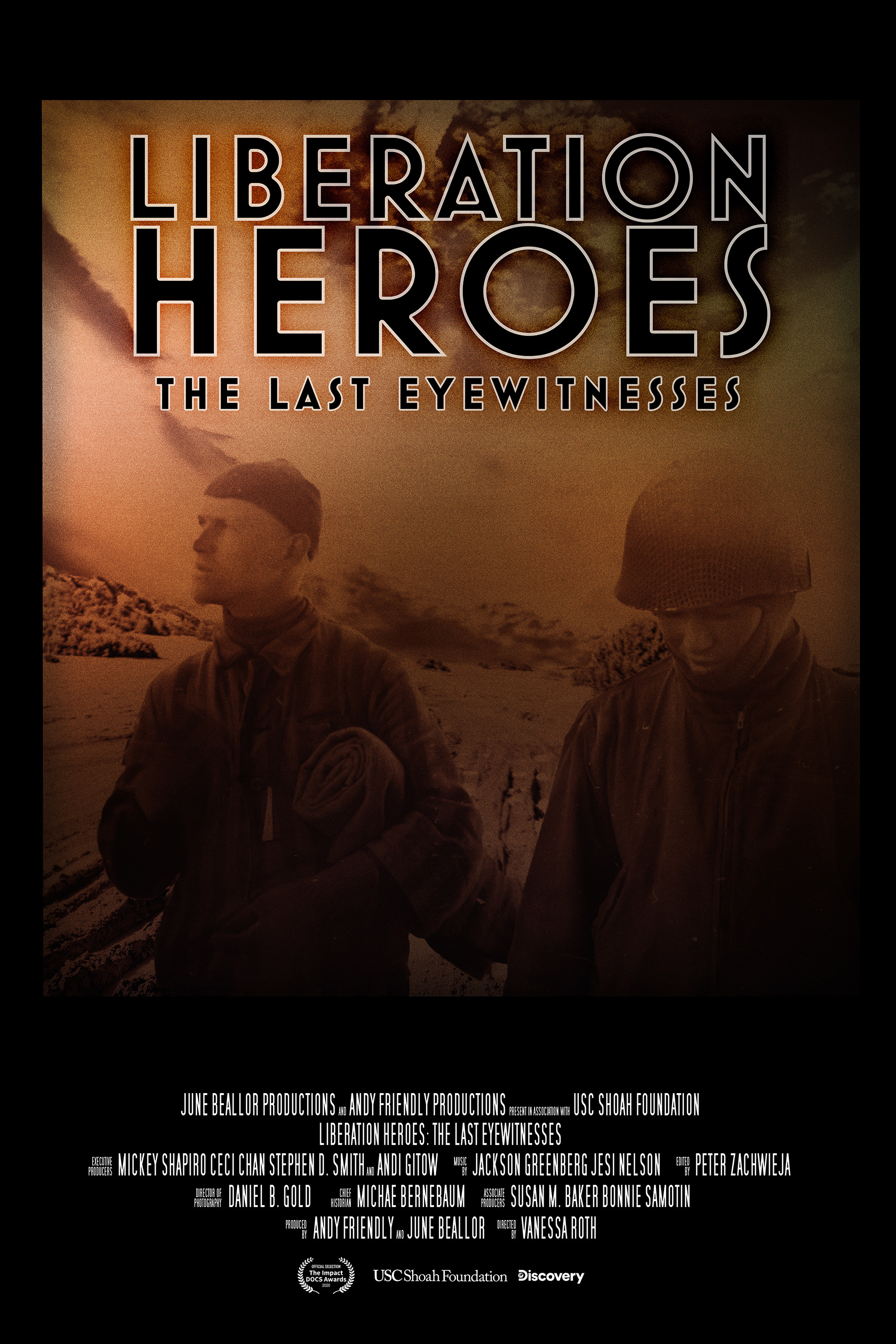
Develop the key art and promotional one-sheet for the documentary Liberation Heroes: The Last Eyewitnesses. The objective was to create a definitive visual identity that honors the gravity of WWII history while capturing the profound emotional weight of the veterans’ firsthand testimonies for a modern audience.
STRATEGY
I utilized emotive photo compositing and atmospheric finishing to bridge the gap between archival history and cinematic storytelling. My process involved exploring a diverse range of conceptual directions, from stark, high-contrast silhouettes and collage-based “war room” aesthetics to intimate close-ups. This iterative approach ensured the final design—centered on the poignant “witness” of a veteran—delivered maximum emotional impact and historical authority.
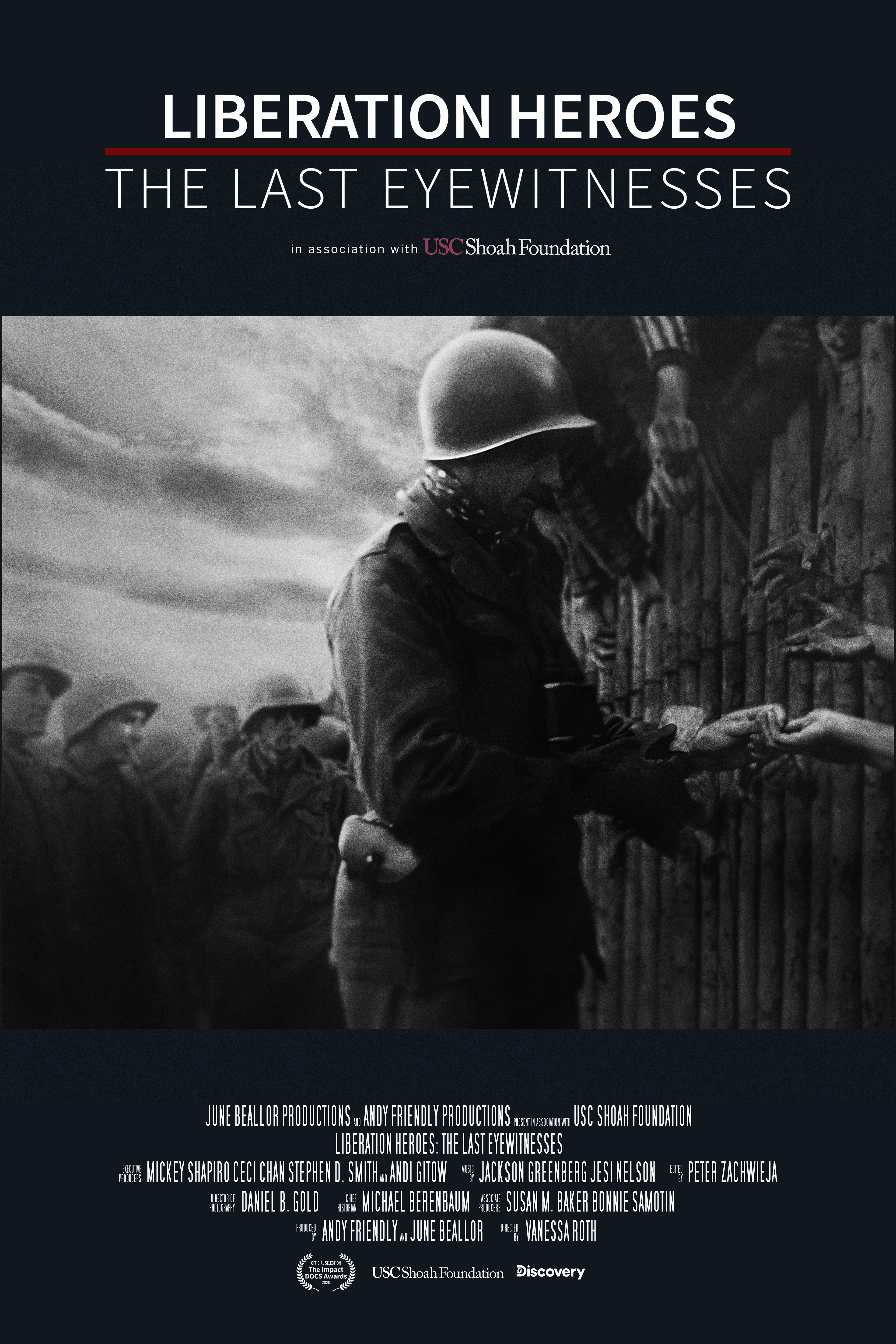
Final Design
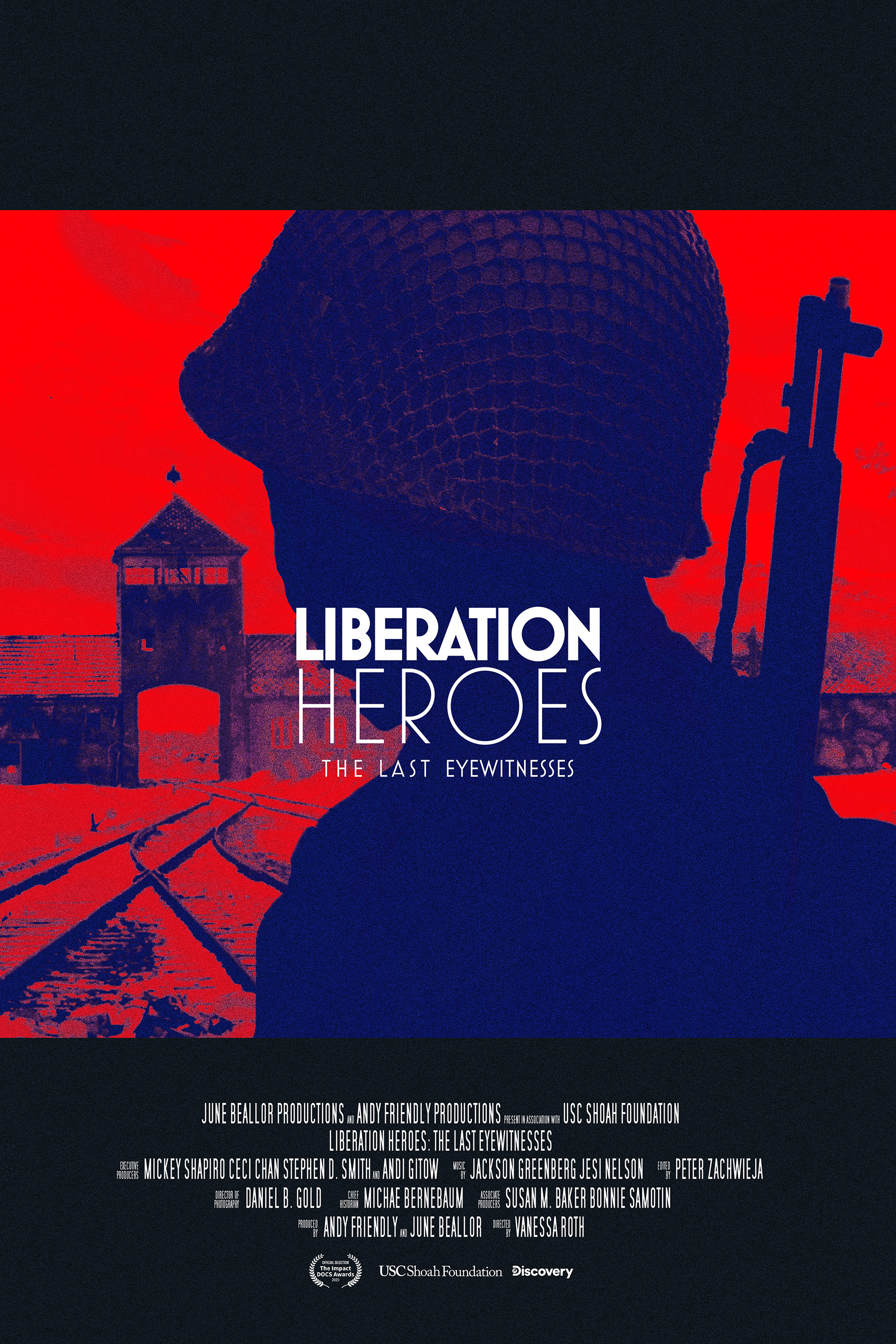
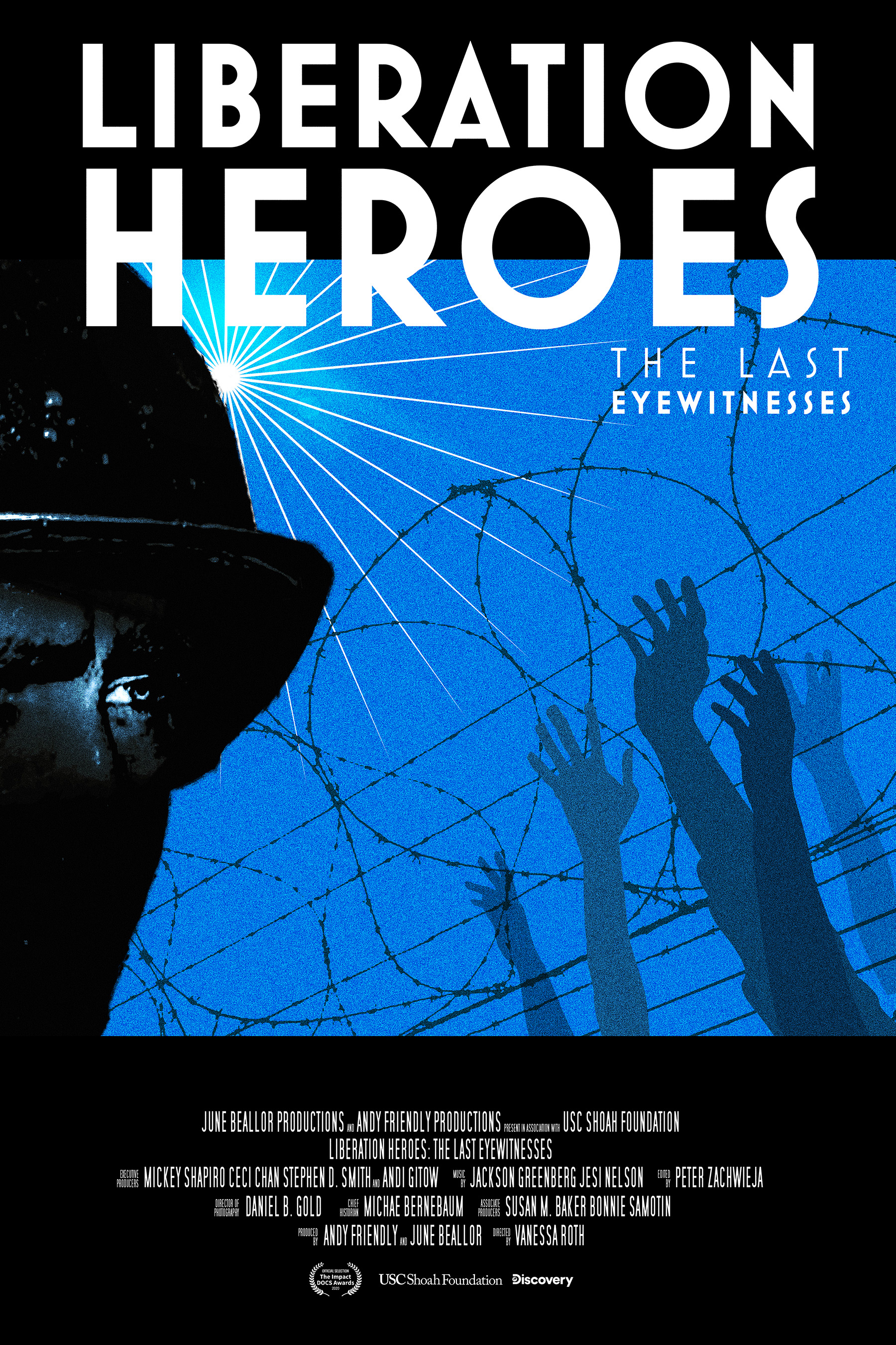
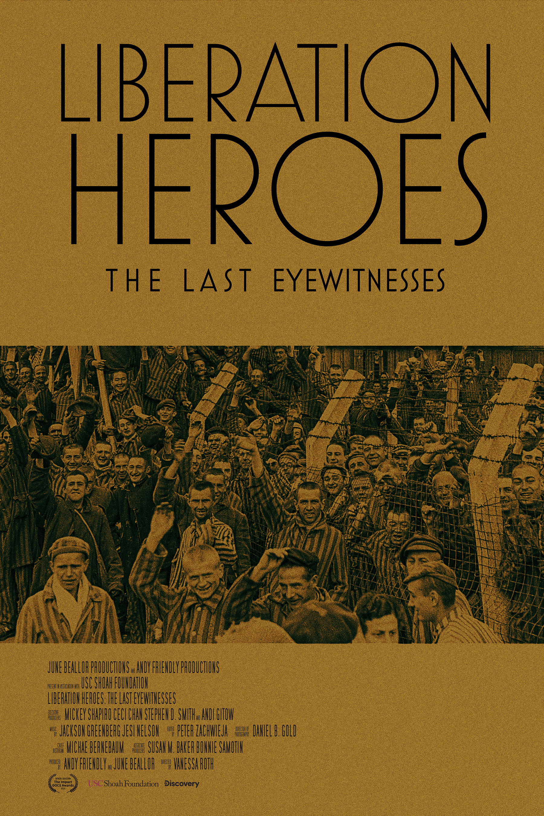
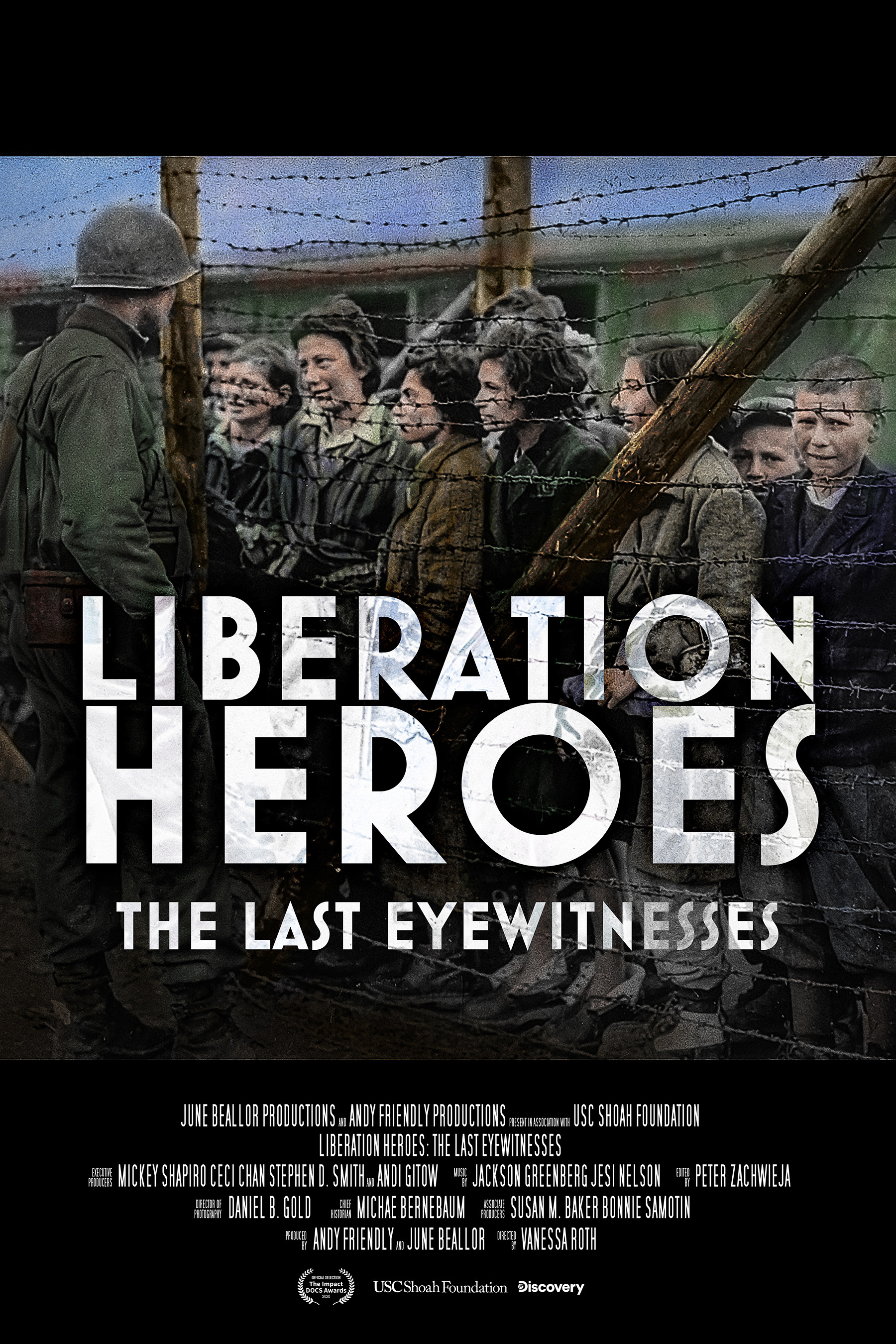
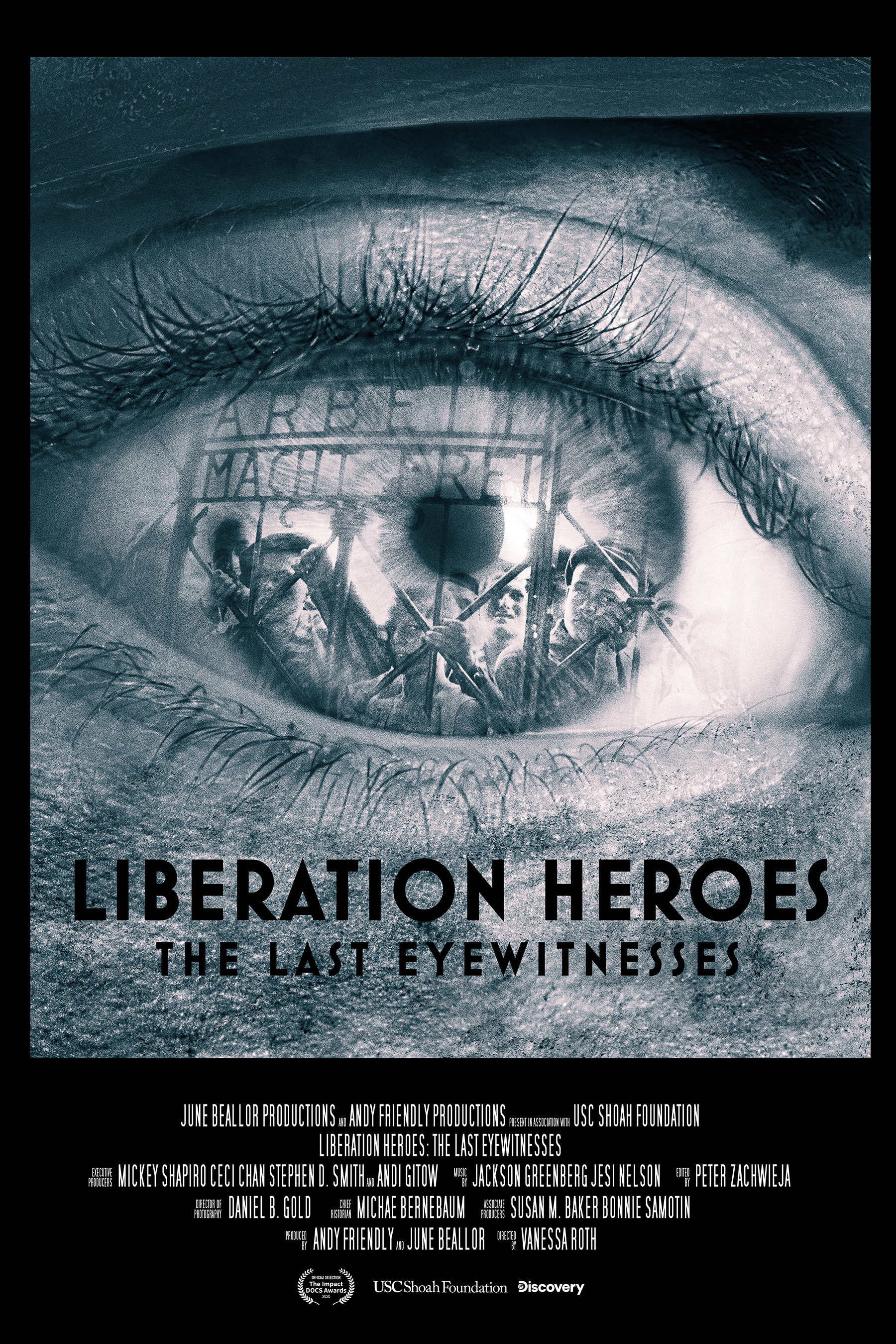

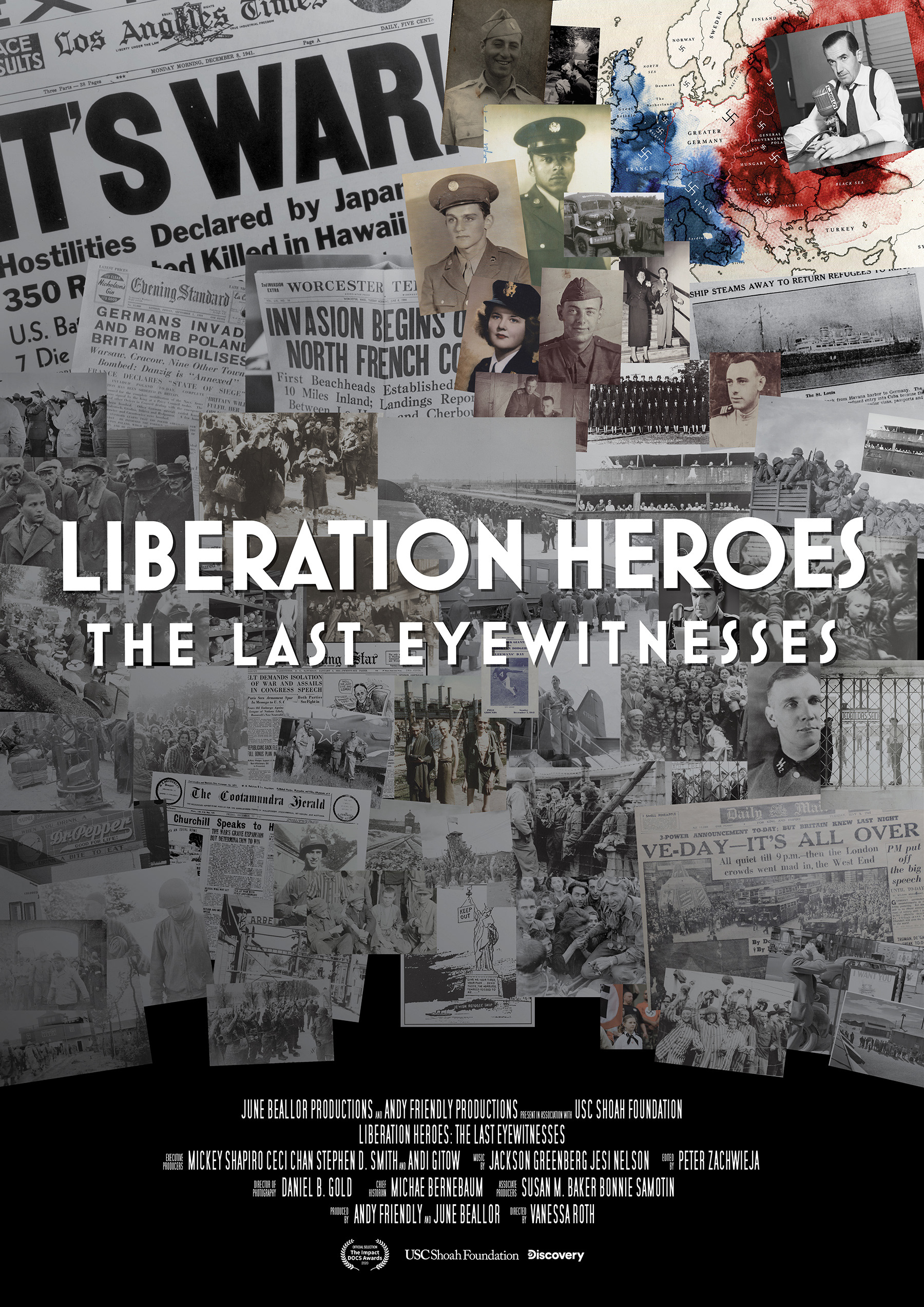
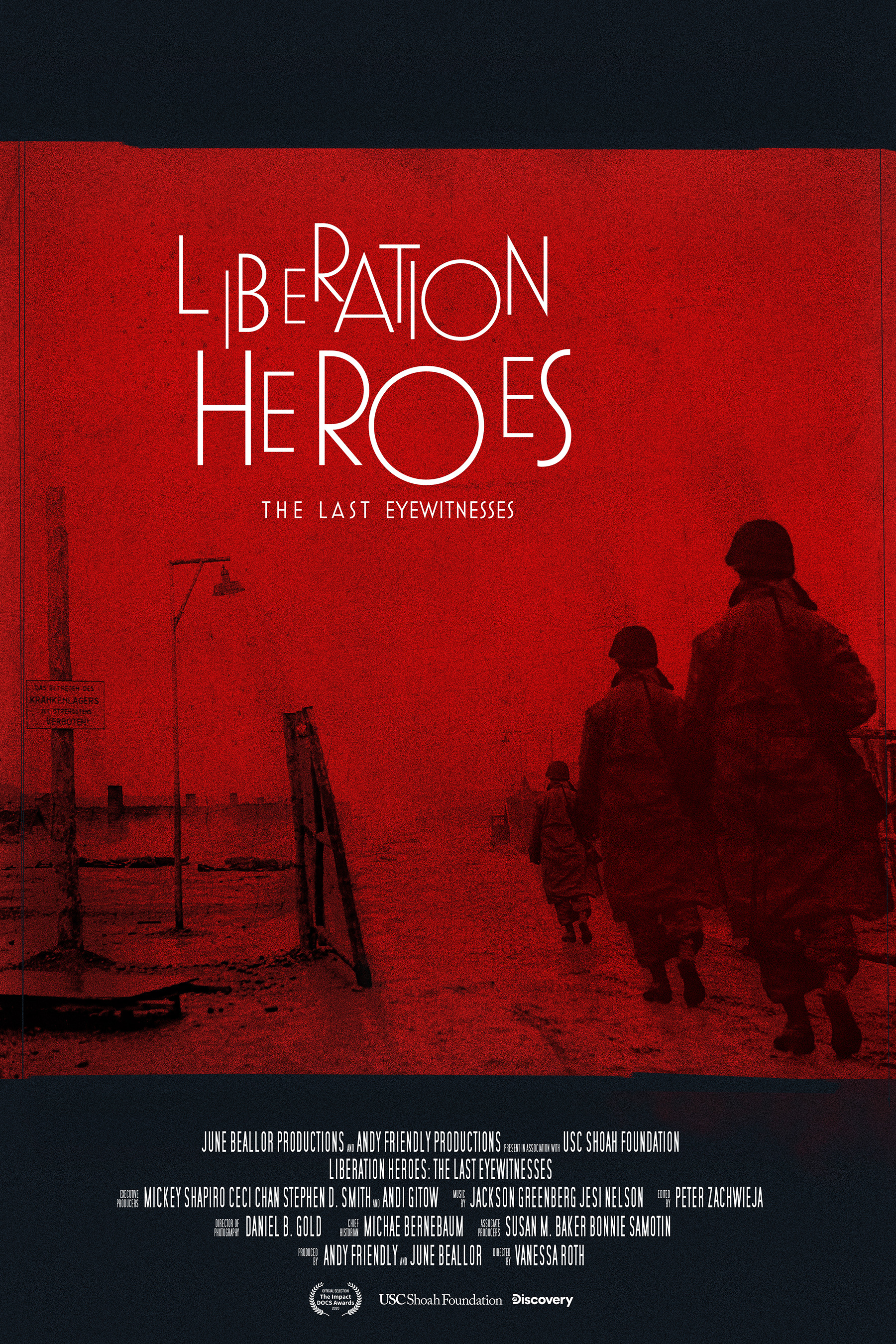

Concept Sketches
CLIENT

www.medialuna.biz
Film KEY ART
ONE SHEET POSTER
ONE SHEET POSTER
CONCEPT, LAYOUT, TYPOGRAPHY, PHOTO ILLUSTRATION,
COMPOSITING AND FINISHING
COMPOSITING AND FINISHING
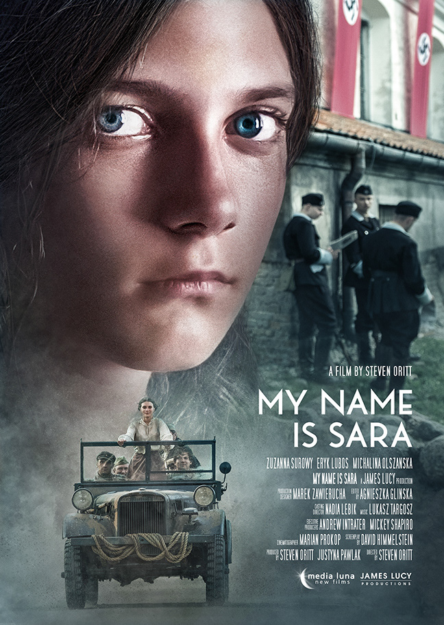
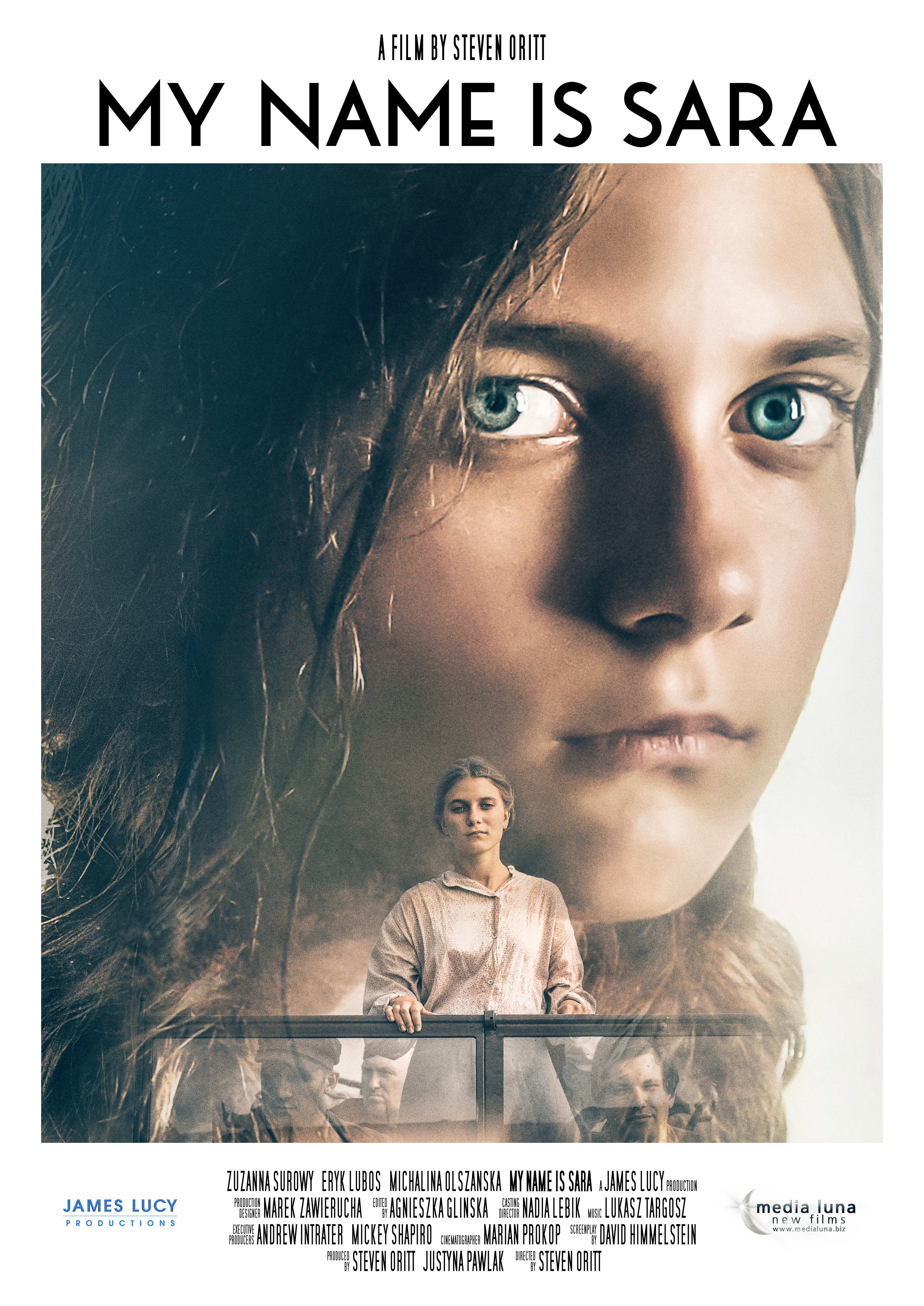
Project DATE | | 2019
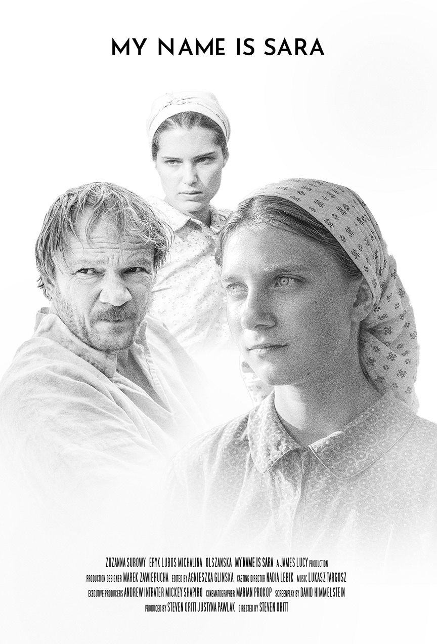
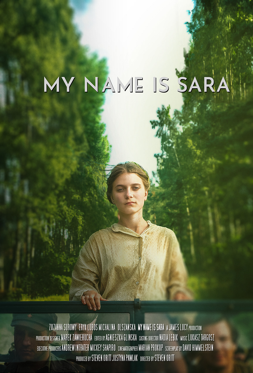
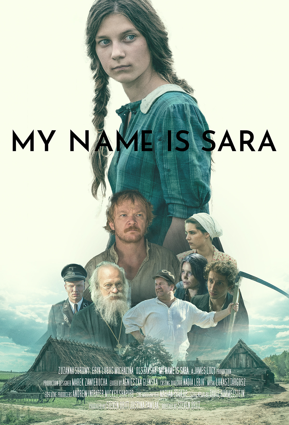
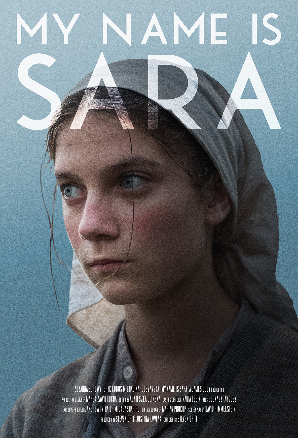
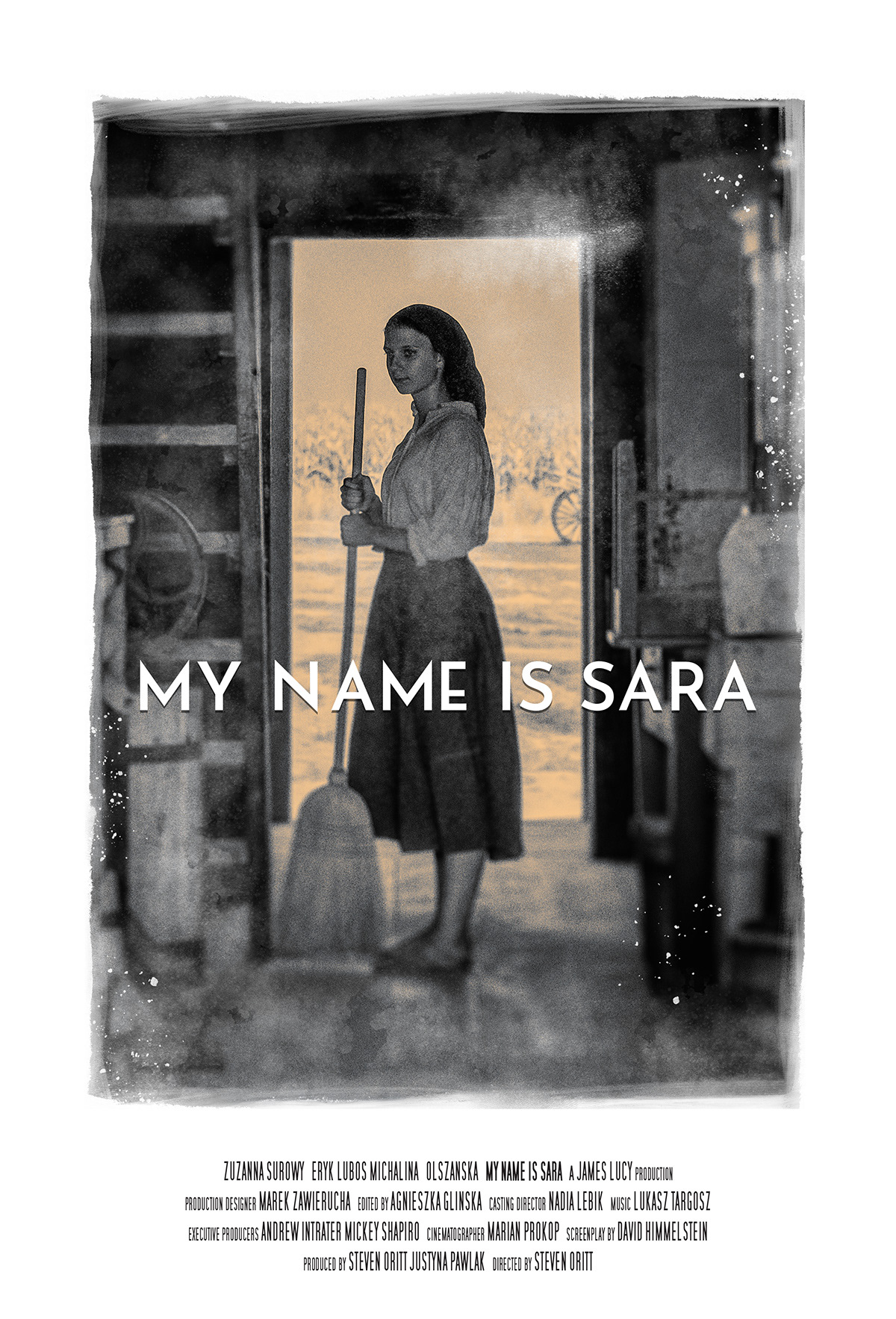
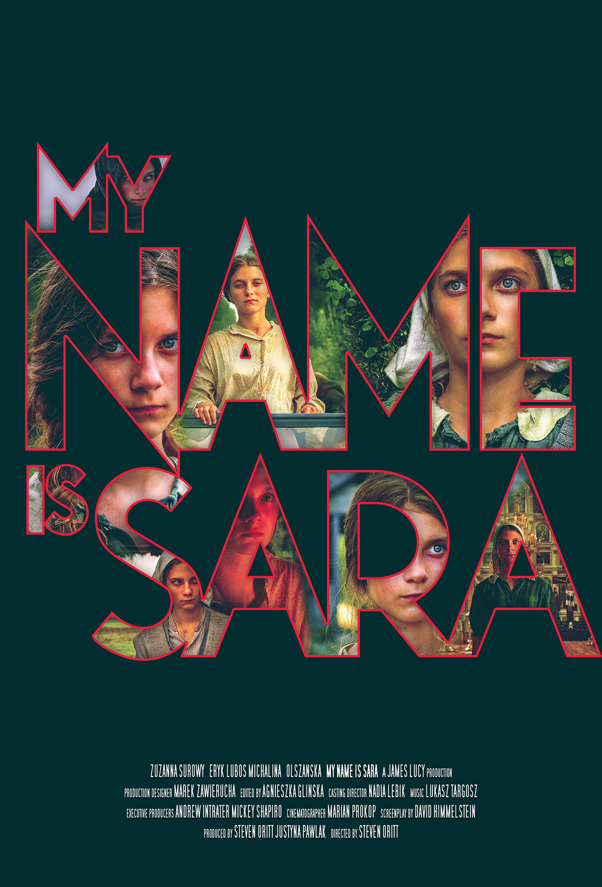
BRIEF
Design the key art and theatrical one-sheet for My Name Is Sara, a feature film based on the true story of a young Jewish girl hiding in plain sight in Nazi-occupied Poland. The objective was to create a hauntingly beautiful visual identity that emphasizes the protagonist’s vulnerability and strength, enticing a global cinema audience while honoring the historical weight of the narrative.
STRATEGY
I utilized high-fidelity photo illustration and compositing to create a focal point on Sara’s intense, watchful gaze—a literal representation of the film’s themes of visibility and survival. As seen in the concept sketches, my process involved extensive stylistic iteration, ranging from folk-art-inspired motifs and brooding forest landscapes to stark, high-contrast portraiture. This allowed me to test various emotional beats—fear, isolation, and defiance—before landing on the final “big head” composition that creates an immediate, visceral connection between the viewer and the protagonist.
Final Designs
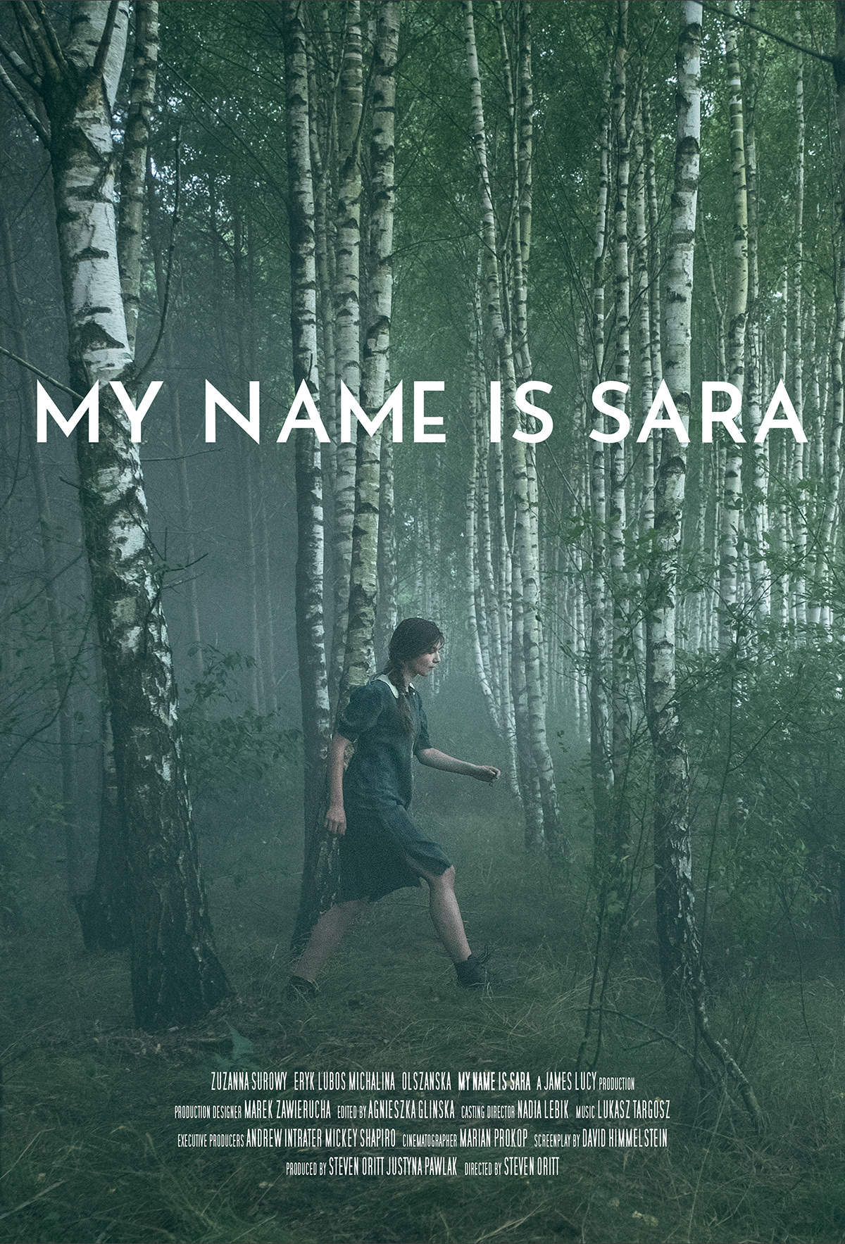
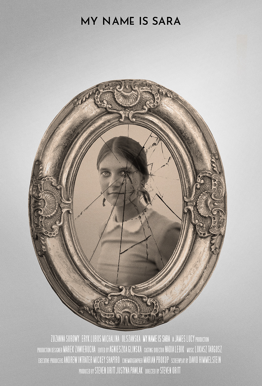
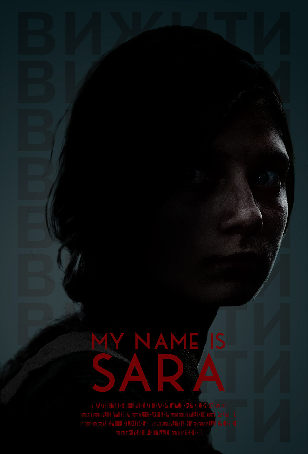
Concept Sketches
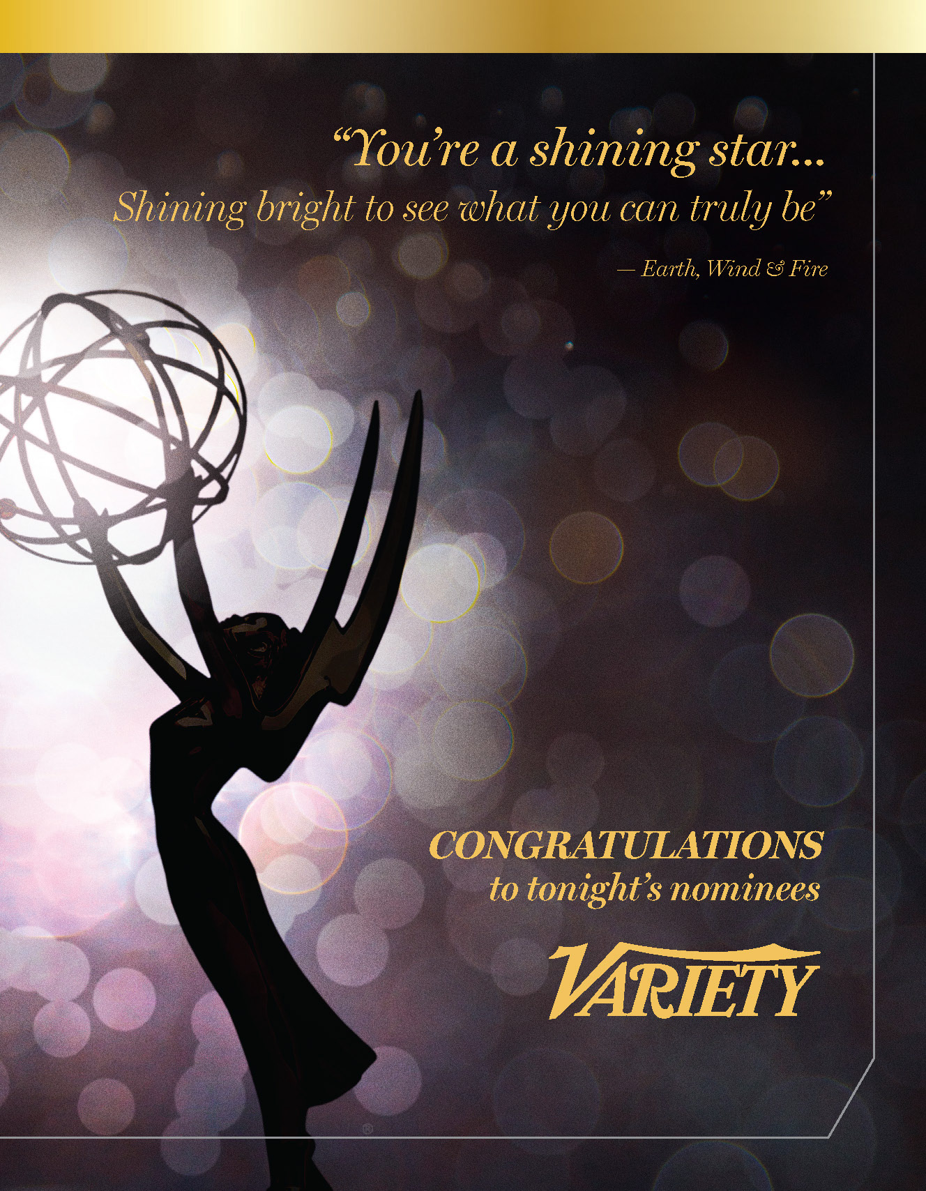
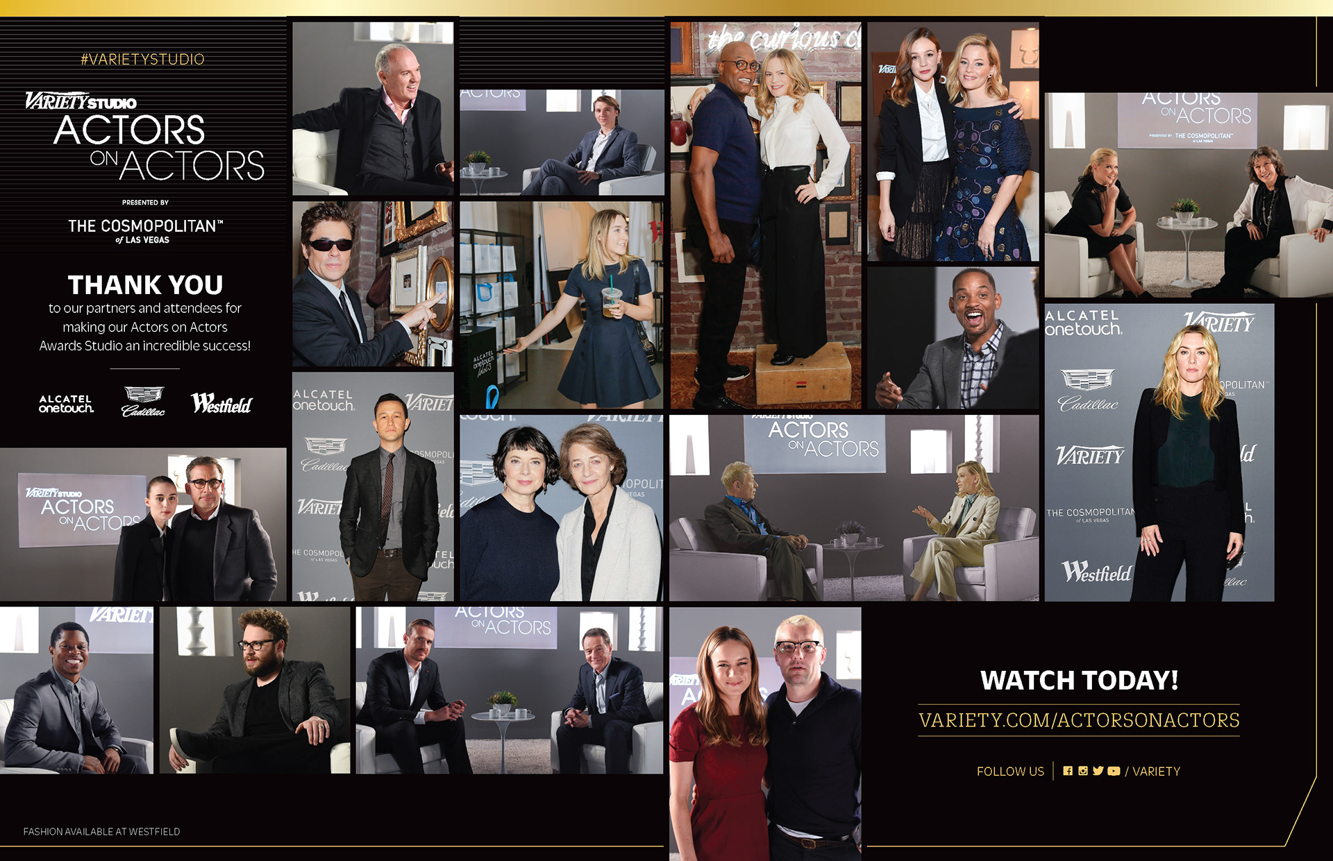
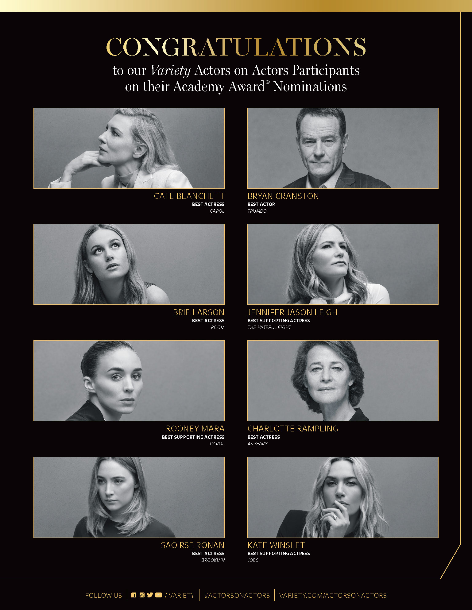
CLIENT


AWARD SEASON CONGRATULATIONS
CONCEPT, LAYOUT, AND TYPOGRAPHY
Project DATE | 2017
BRIEF
Design a series of high-profile “Congratulations” advertisements for Variety magazine to honor Emmy and Academy Award nominees. The objective was to create premium, full-page layouts that celebrate industry excellence while maintaining Variety’s status as the authoritative voice in entertainment trade media.
STRATEGY
I employed a luxury-first design language, utilizing a refined black and gold palette, elegant serif typography, and cinematic “bokeh” lighting effects. By balancing high-contrast portraiture with generous negative space, I ensured the ads felt celebratory and exclusive, effectively bridging the gap between corporate trade marketing and high-end editorial glamour.
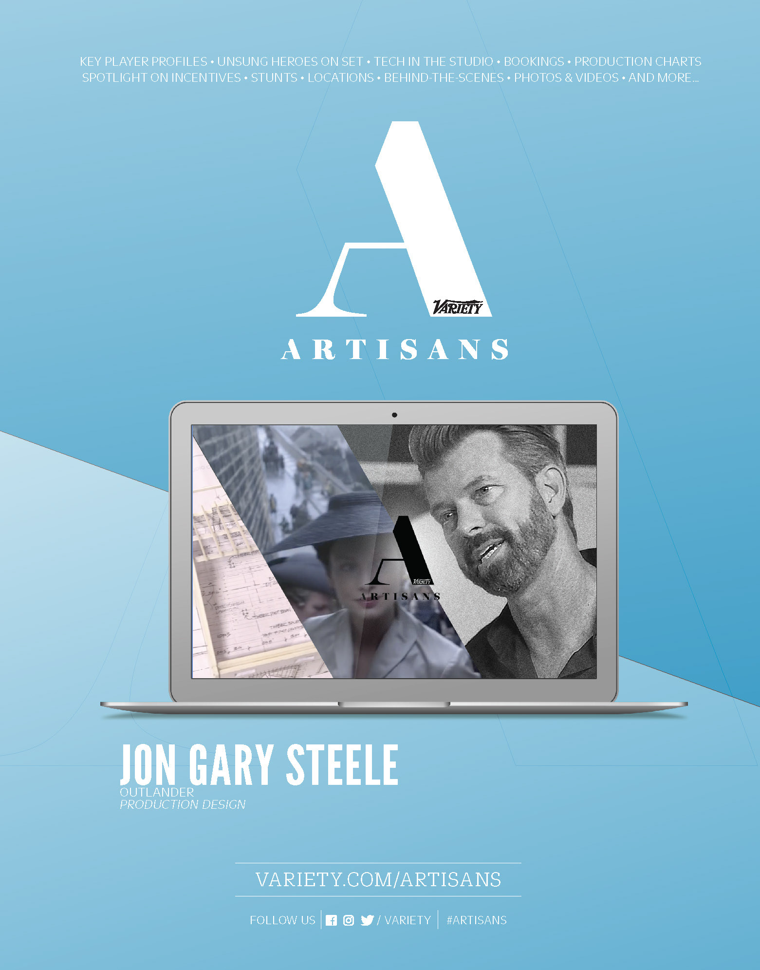
CLIENT


BRAND AWARENESS CAMPAIGN
CONCEPT, LAYOUT, AND TYPOGRAPHY
Project DATE | 2017
BRIEF
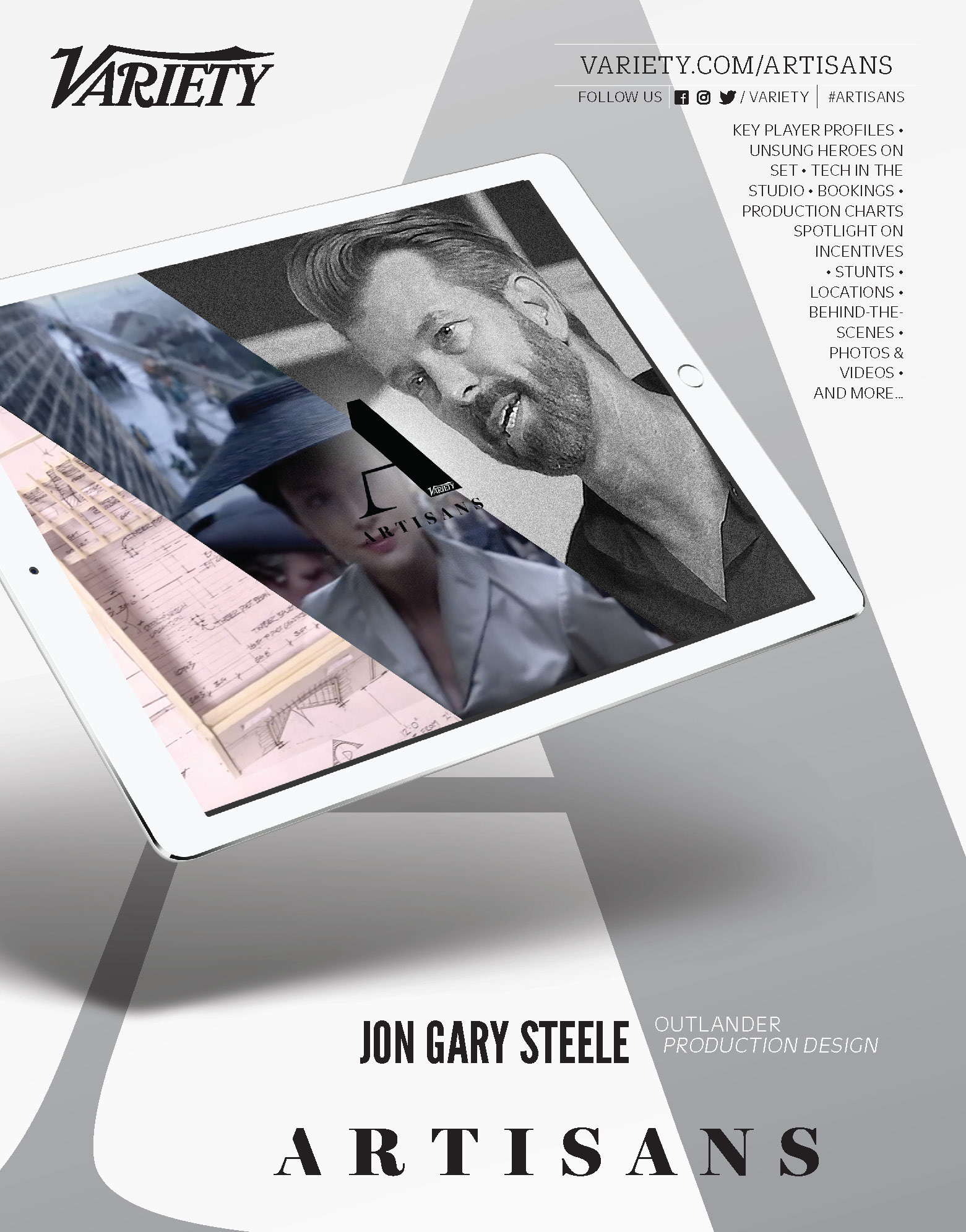
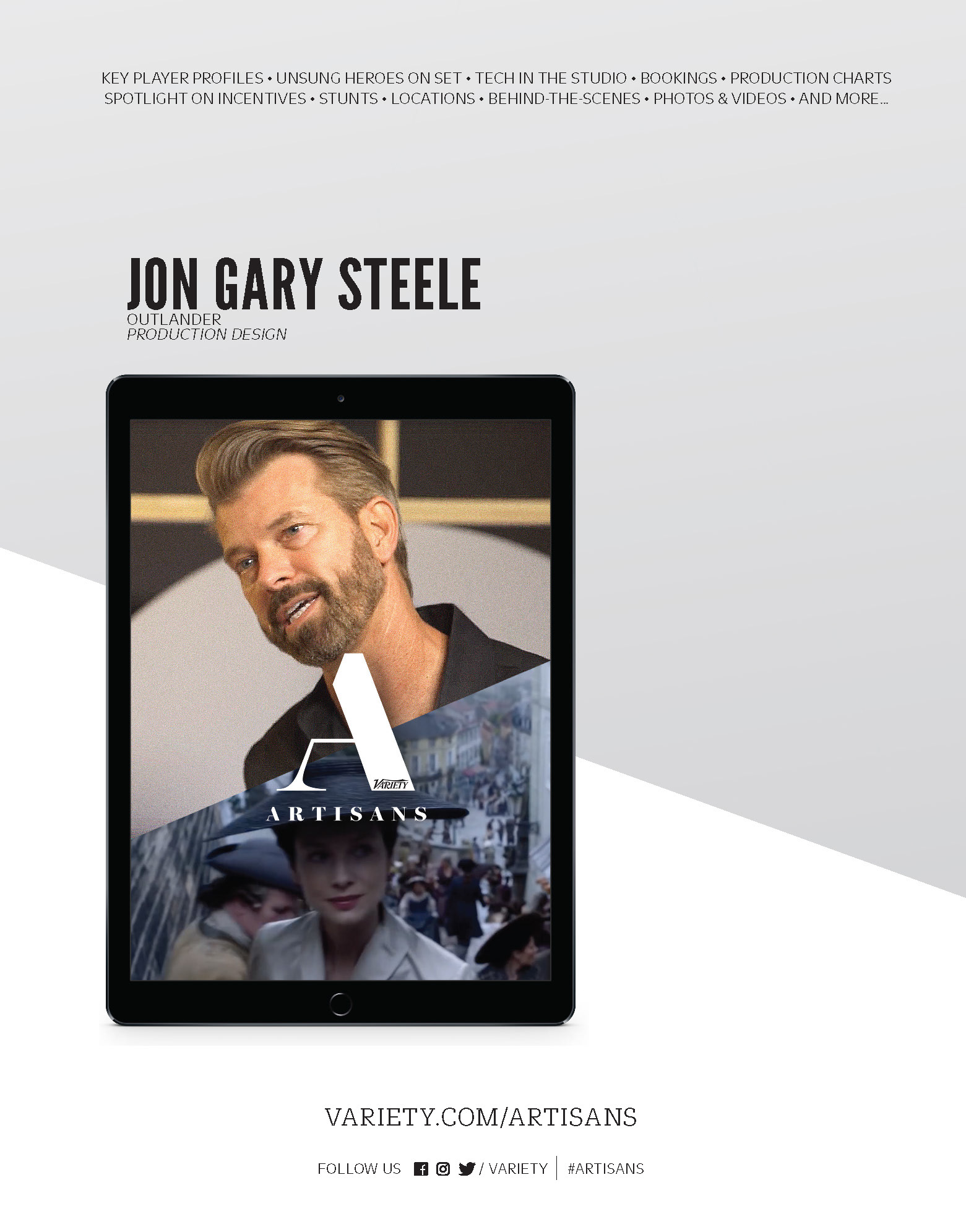
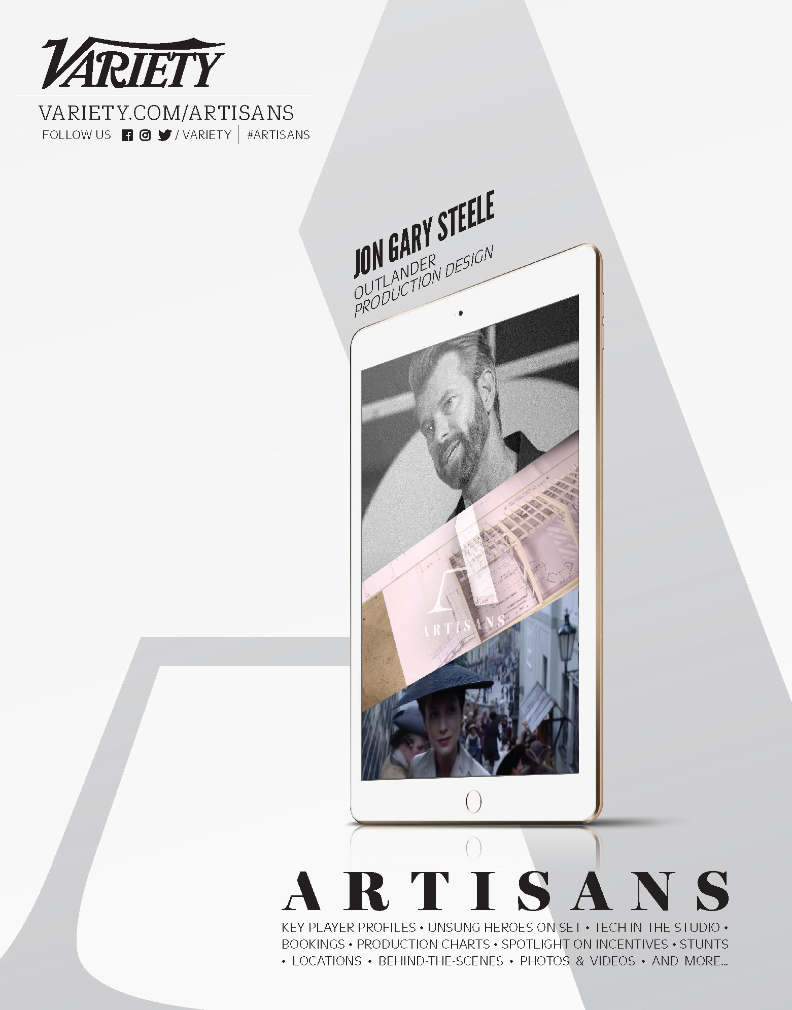
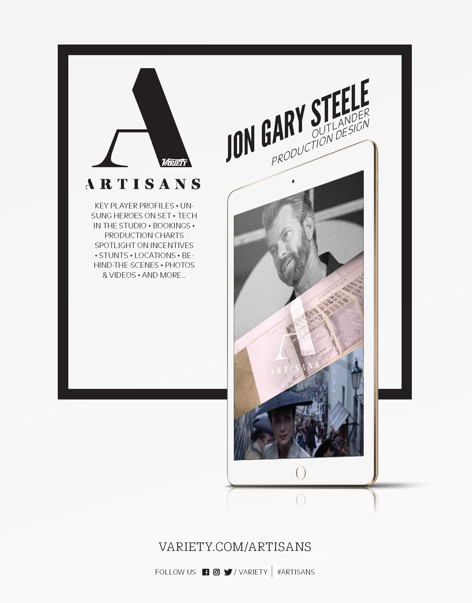
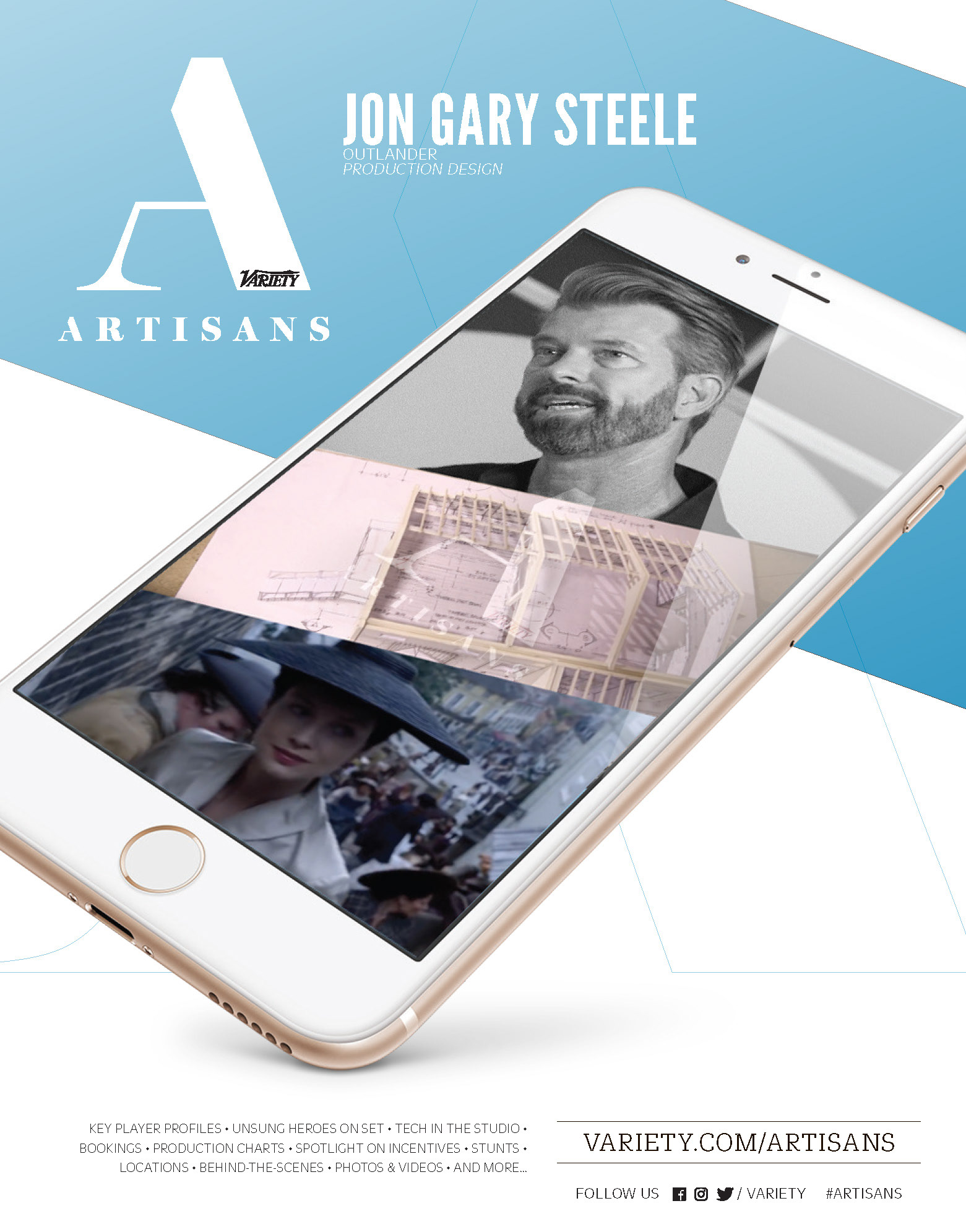
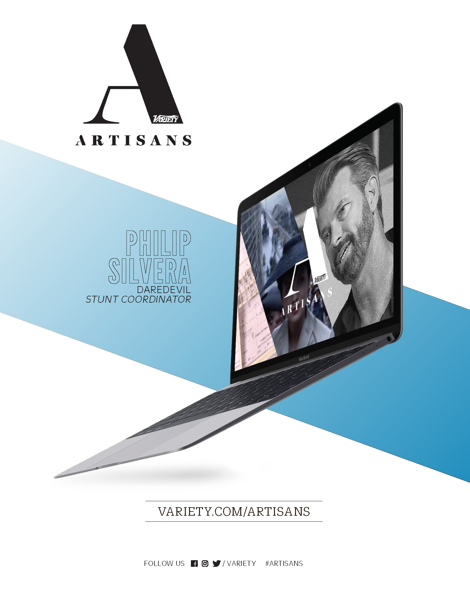
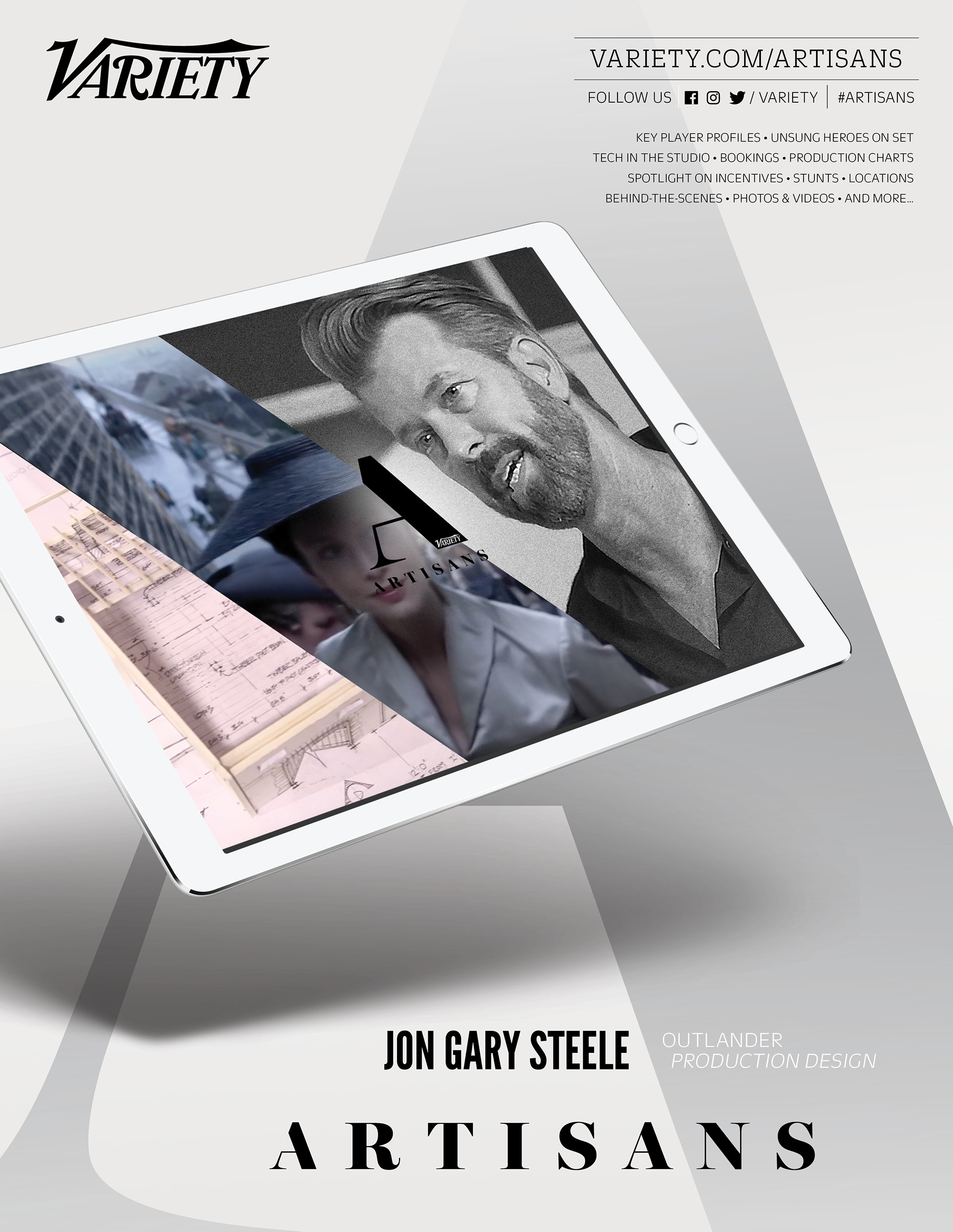
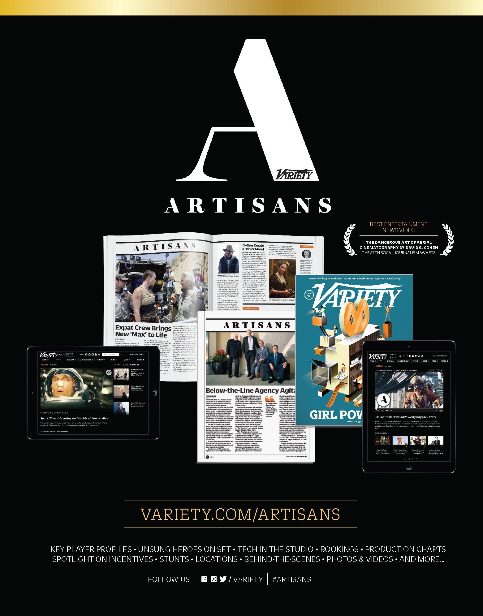
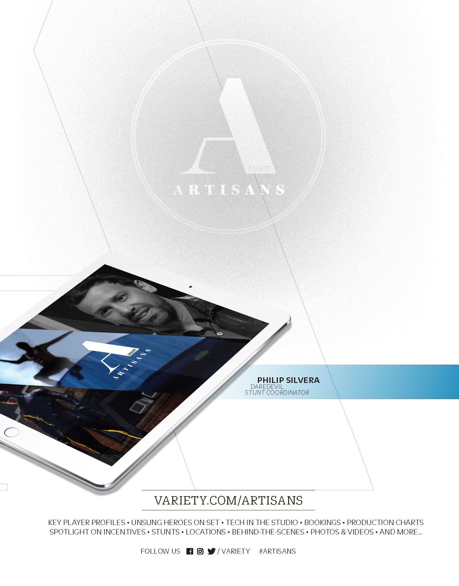
Develop a cohesive brand awareness campaign for Variety Artisans, an editorial series highlighting the creative masters behind film and television. The objective was to create a cross-platform visual identity for both print and digital layouts that celebrates the craft of production while reinforcing Variety’s position as a premium industry resource.
STRATEGY
I utilized a minimalist, high-tech aesthetic by featuring digital device mockups to emphasize Variety’s modern accessibility. By pairing sophisticated typography with large-scale, desaturated imagery of renowned production designers like Jon Gary Steele, I created a prestige editorial feel that highlights the individual “artisan” while maintaining a consistent, recognizable brand architecture across various ad formats.
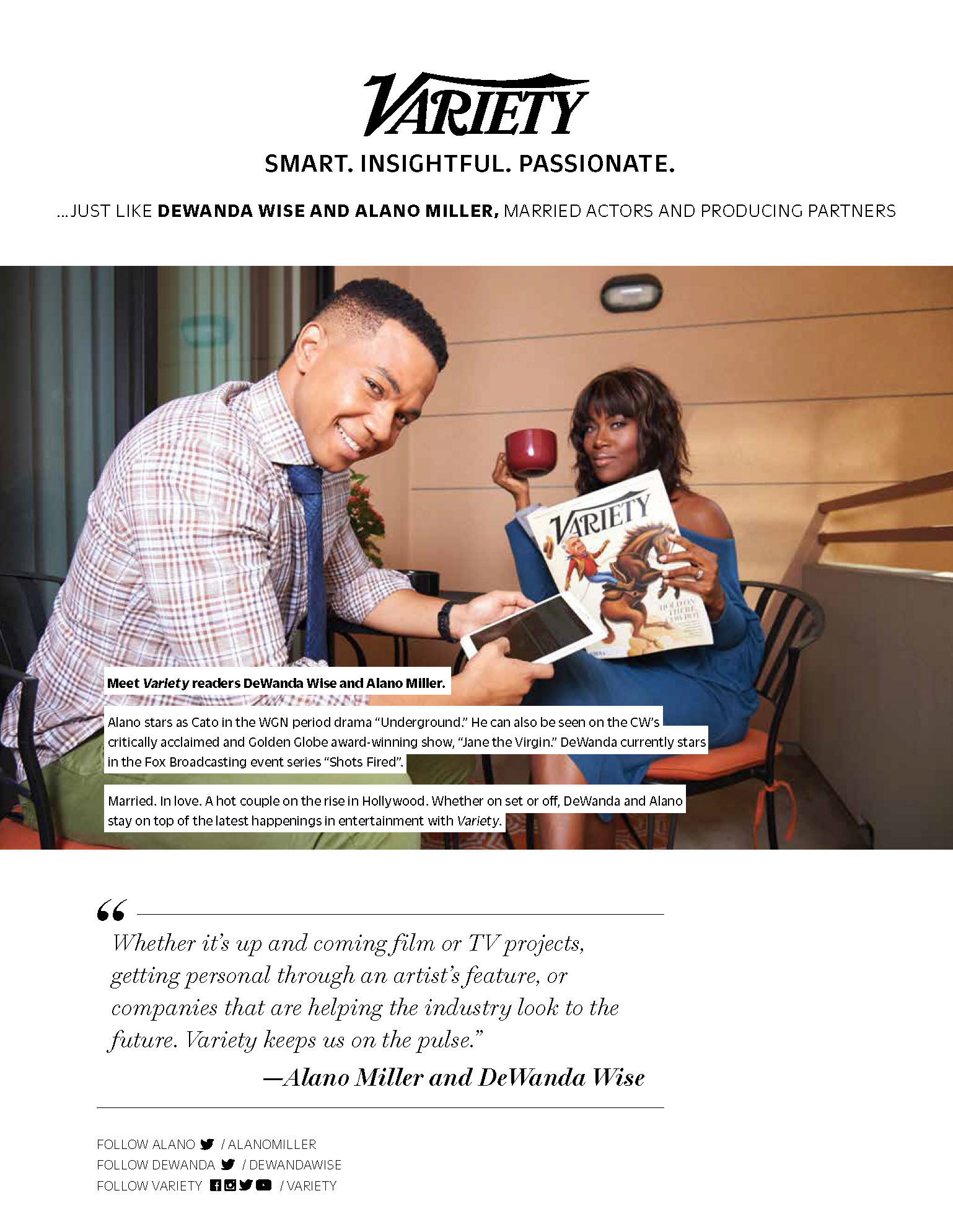
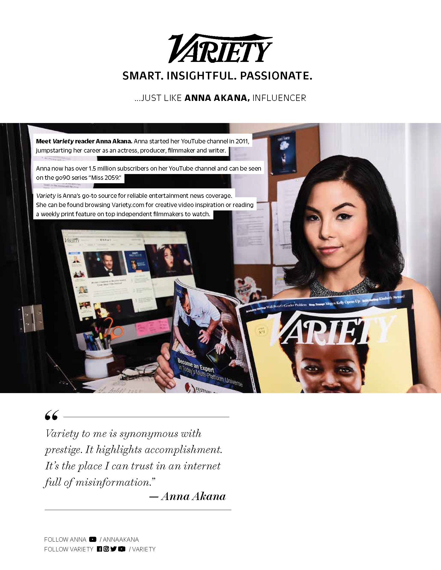
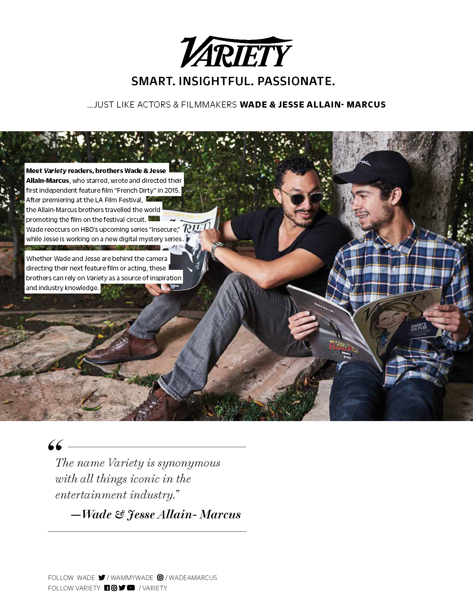
CLIENT


brAND AWARENESS
MARKETING CAMPAIGNS
MARKETING CAMPAIGNS
CONCEPT, LAYOUT, AND TYPOGRAPHY
Project DATE | 2017


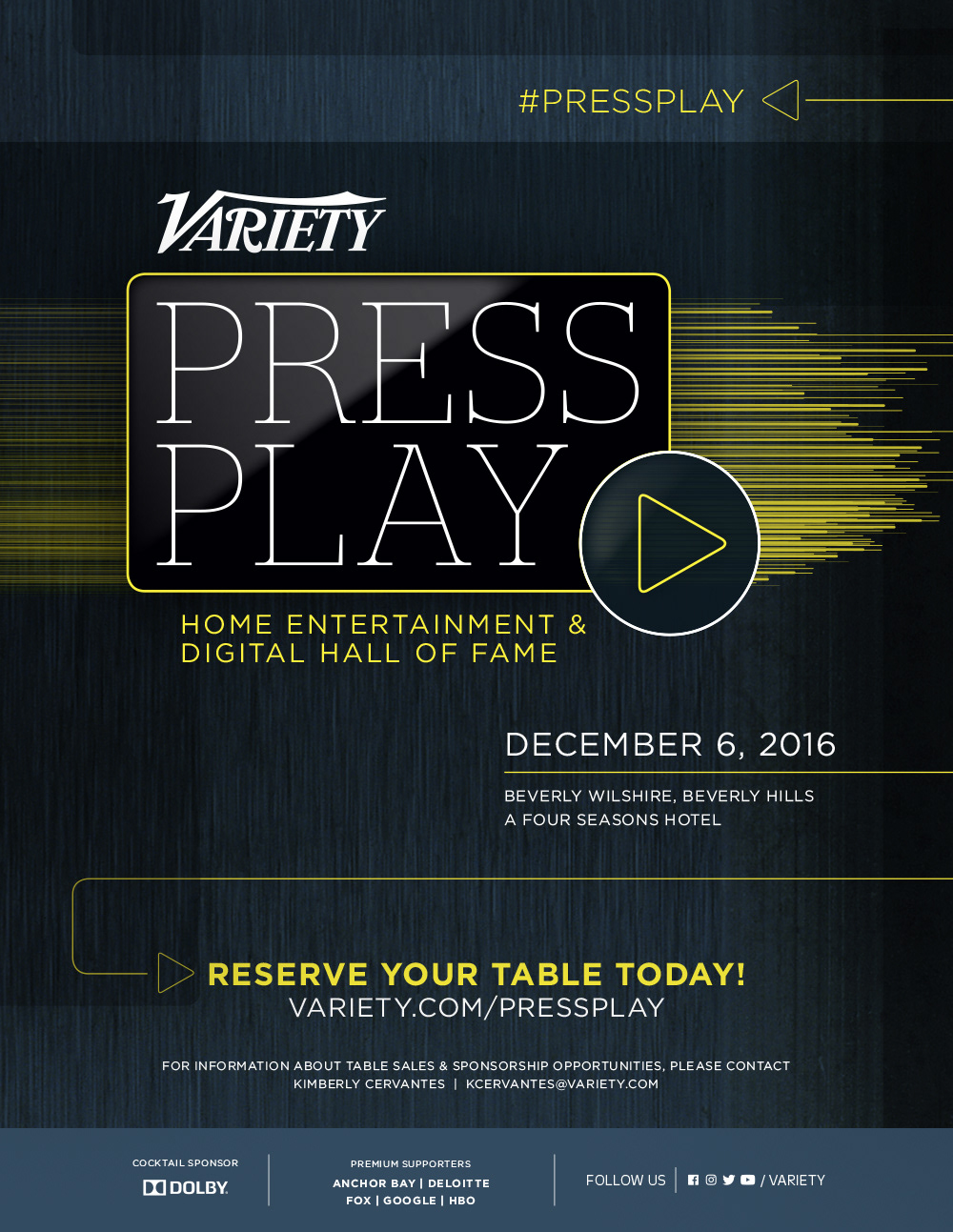
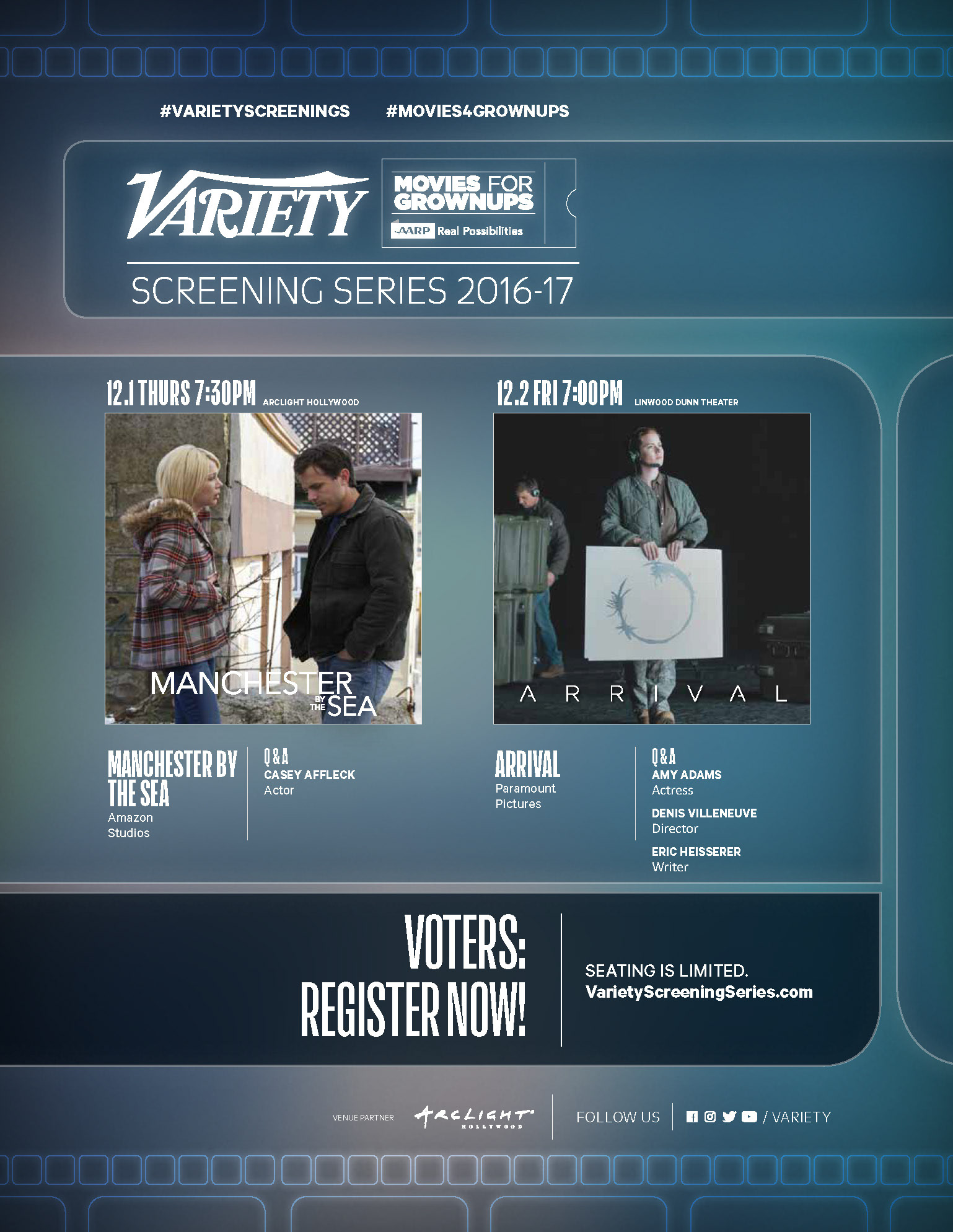
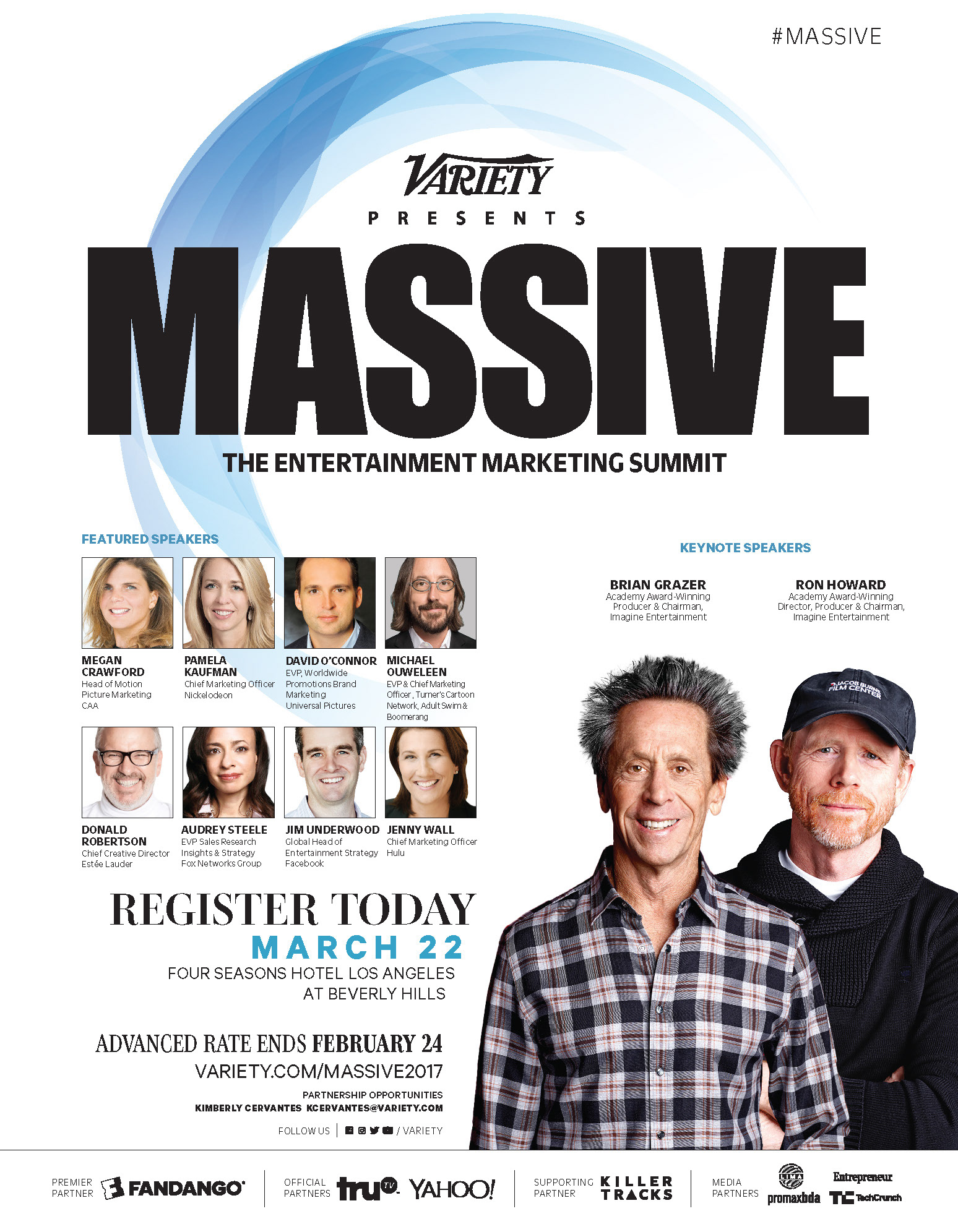
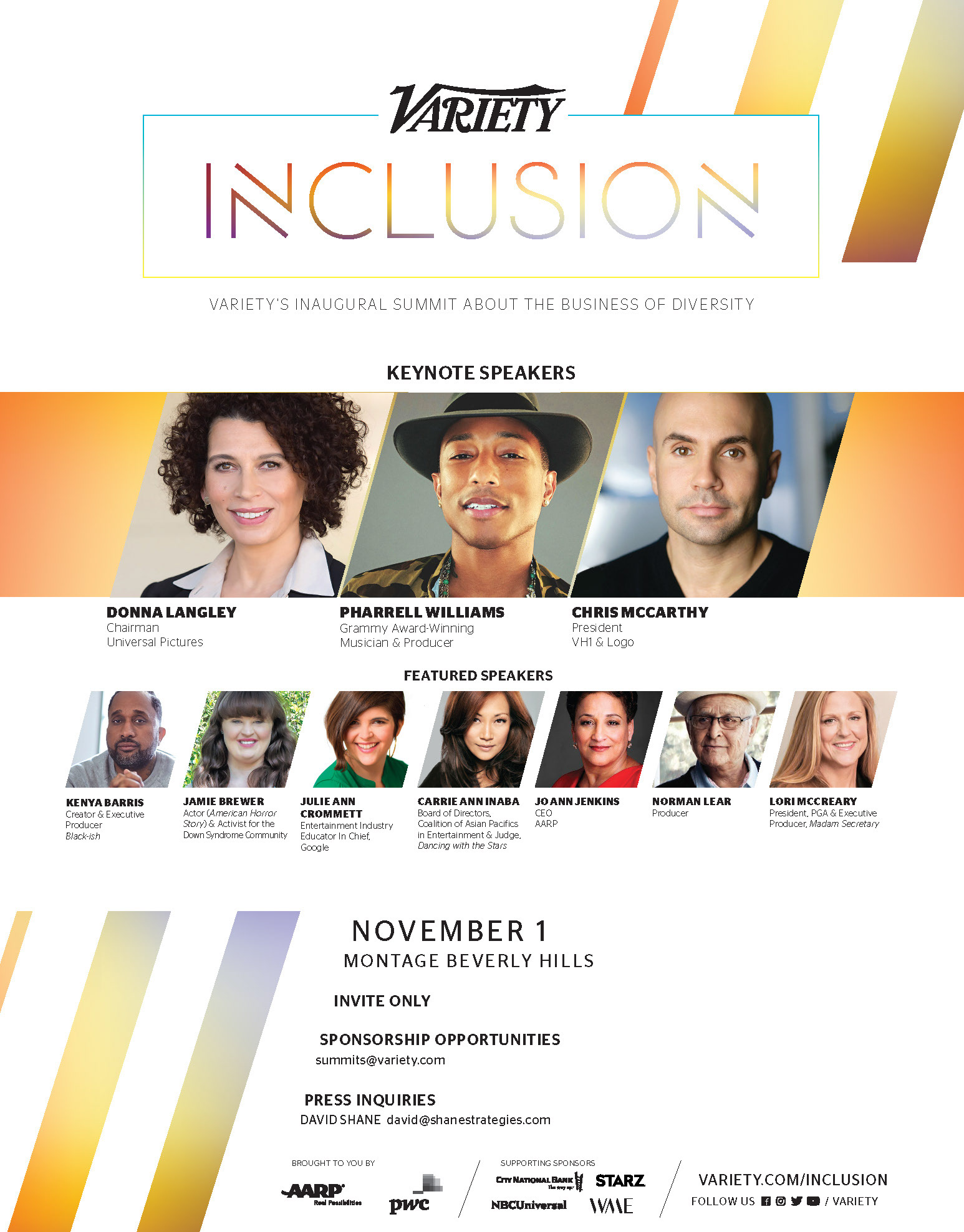
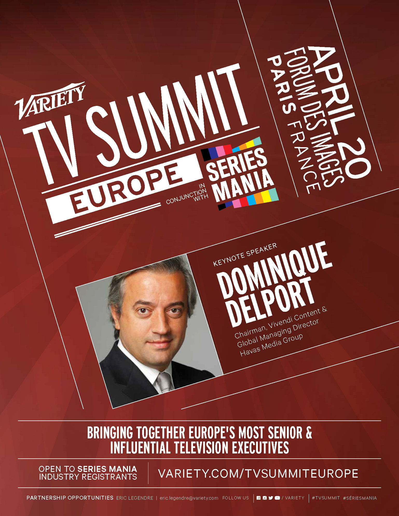
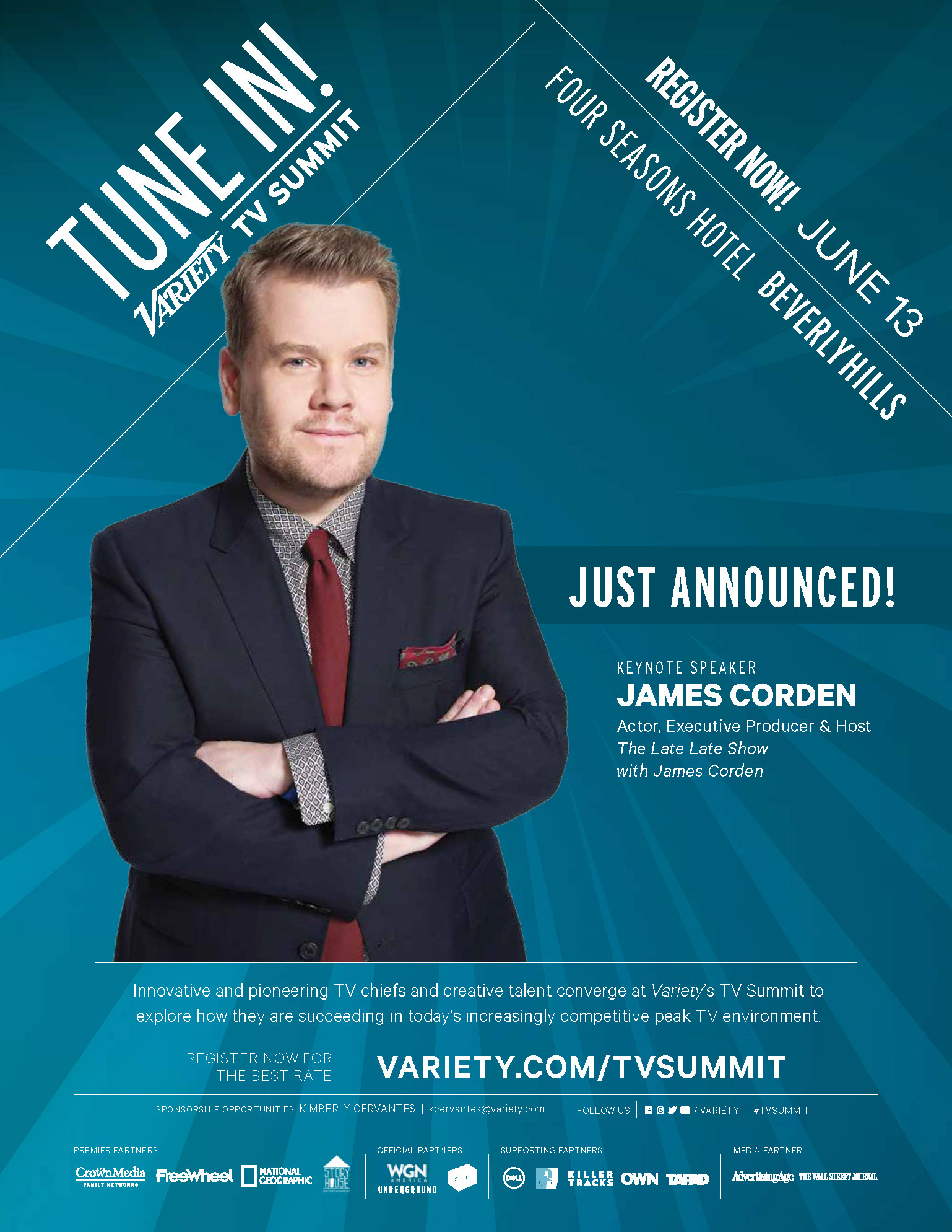
SUMMITS and CONFERENCES
MARKETING CAMPAIGNS
MARKETING CAMPAIGNS
CONCEPT, LAYOUT, AND TYPOGRAPHY
Project DATE | 2016-2017
CLIENT


BRAND AWARENESS CAMPAIGN
CONCEPT, LAYOUT, AND TYPOGRAPHY
Project DATE | 2017
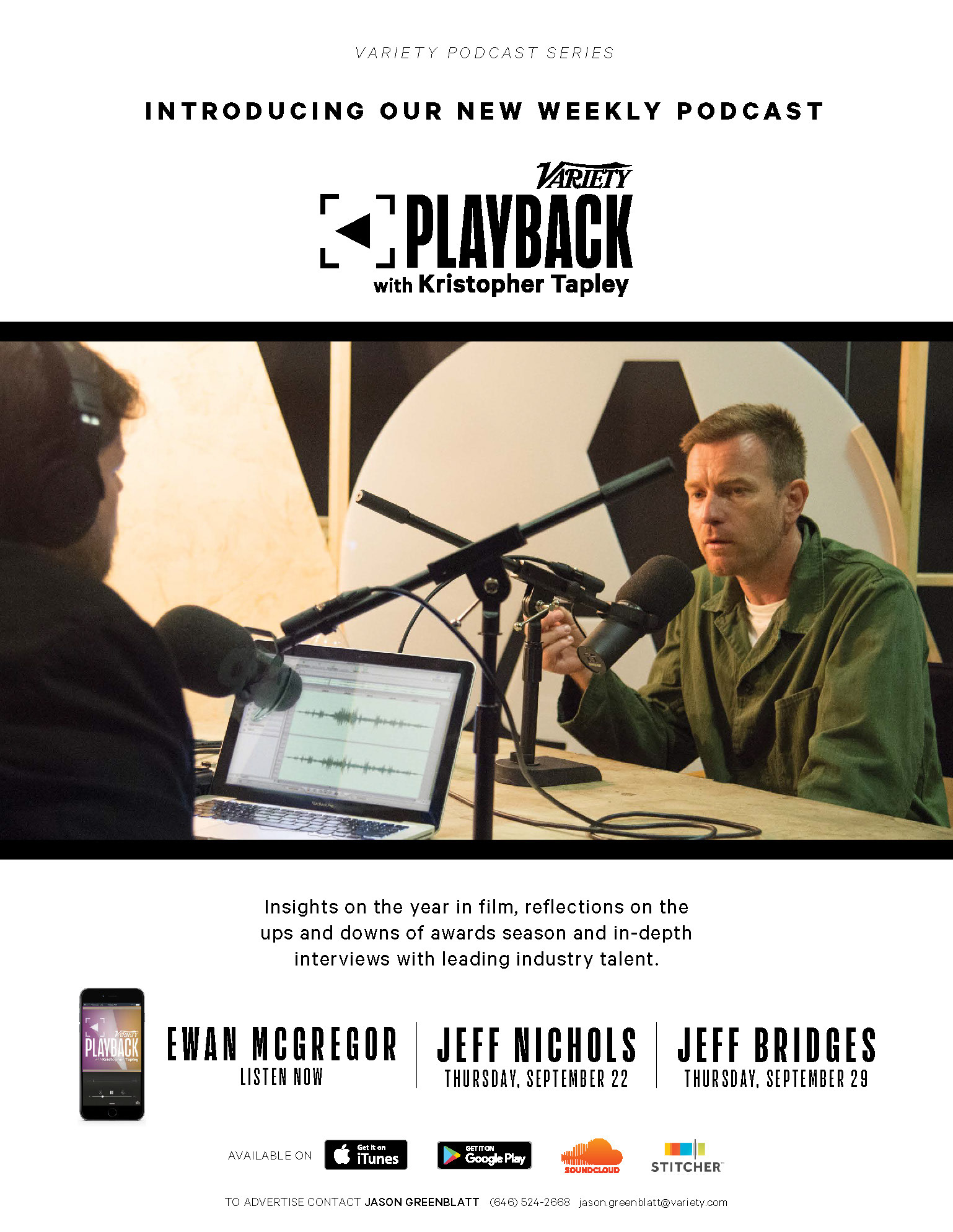
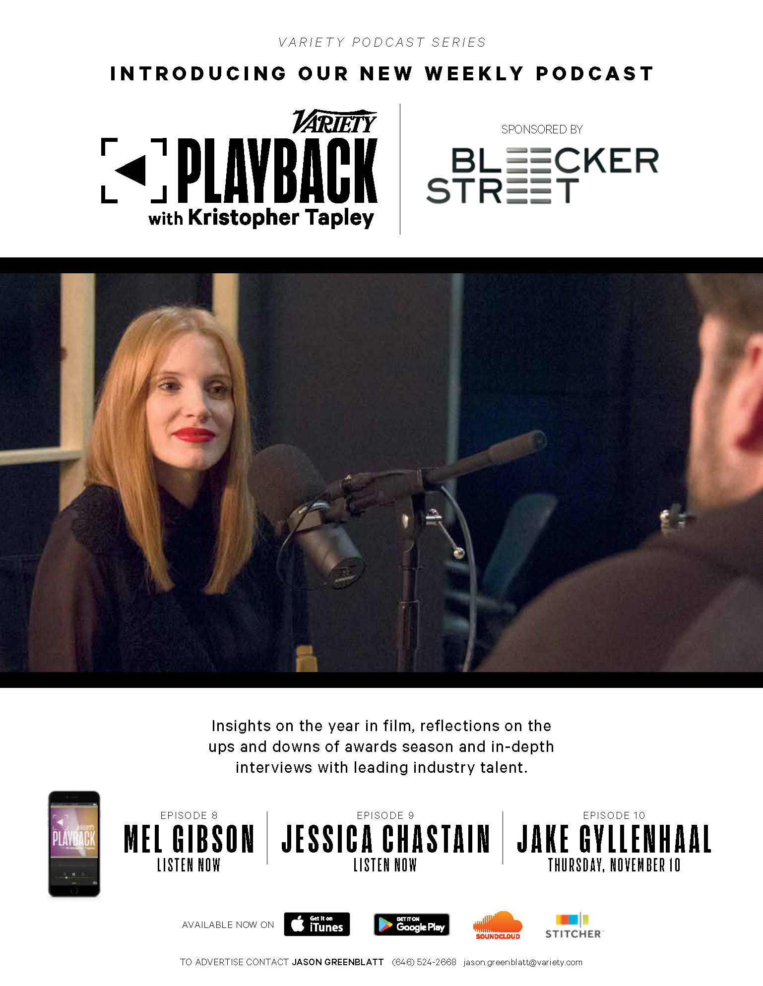
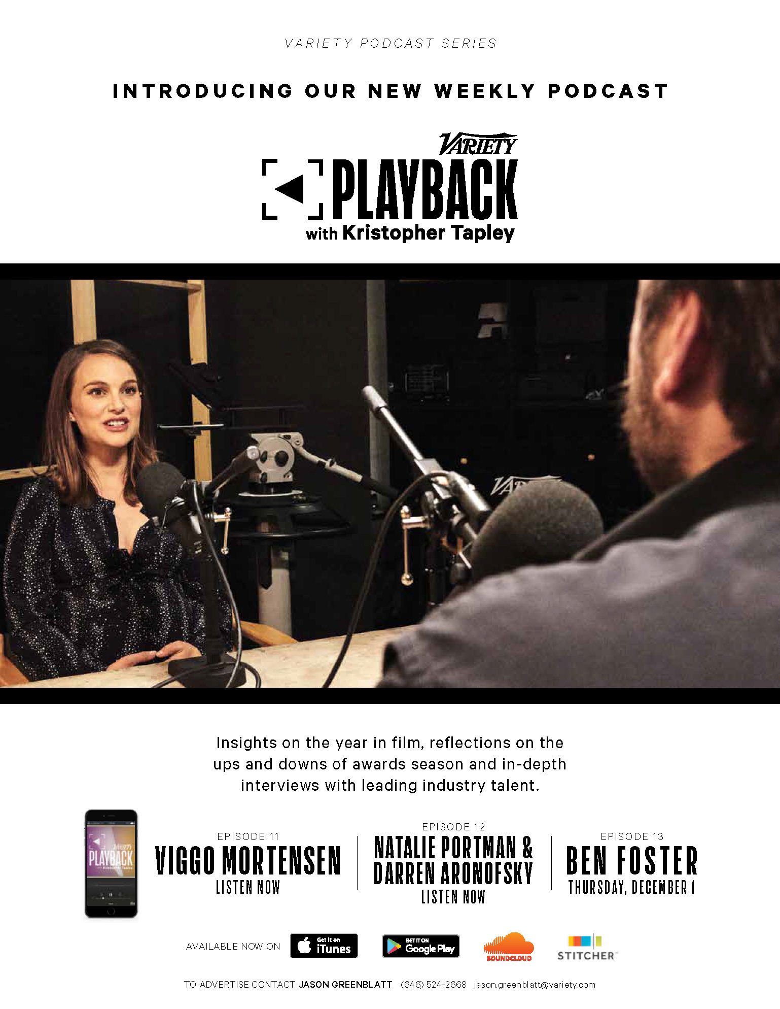
CLIENT


PODCAST LAUNCH
MARKETING CAMPAIGNS
CONCEPT, LAYOUT, AND TYPOGRAPHY
Project DATE | 2017
CLIENT


www.hollywoodreporter.com