CLIENT

Helping Bring The Iconic Brand Into The Home
NEW BRAND LAUNCH
CONCEPT, LAYOUT, TYPOGRAPHY, PHOTO ILLUSTRATION, COMPOSITING AND FINISHING
PROJECT DATE | 2020
BRIEF
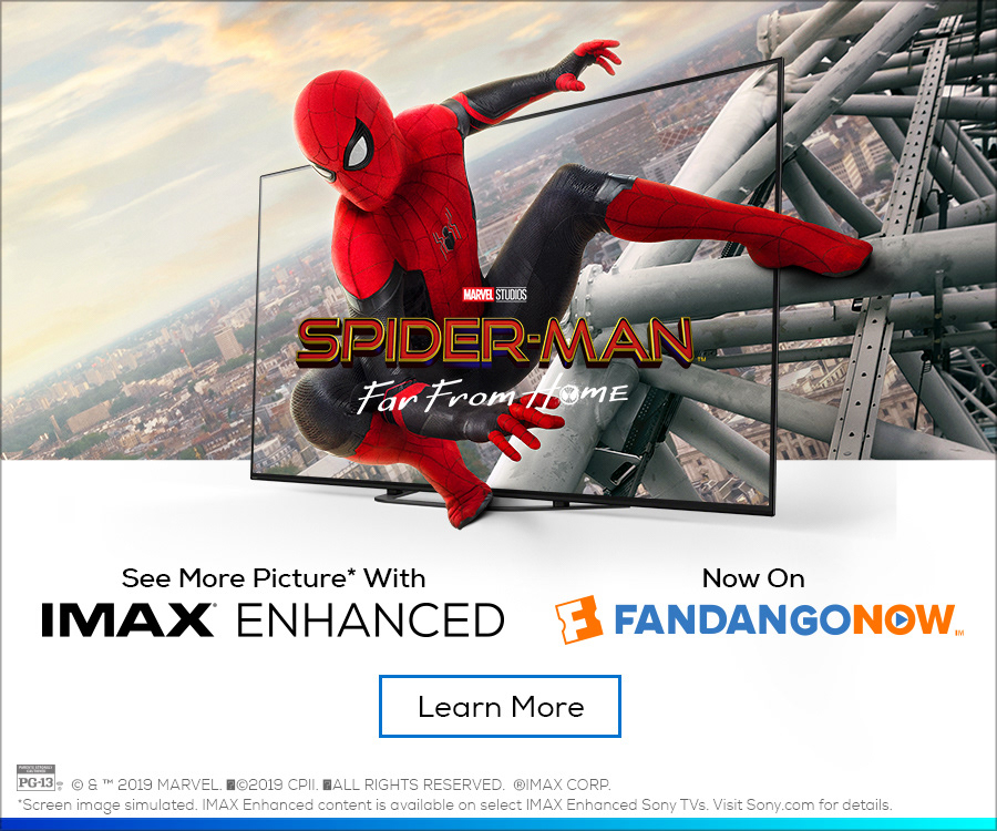
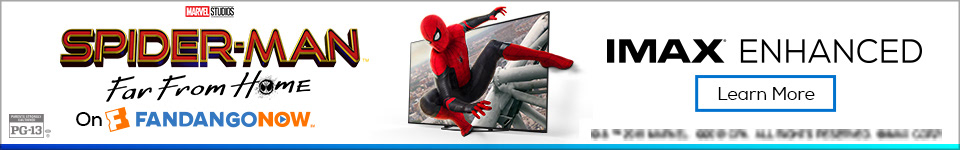
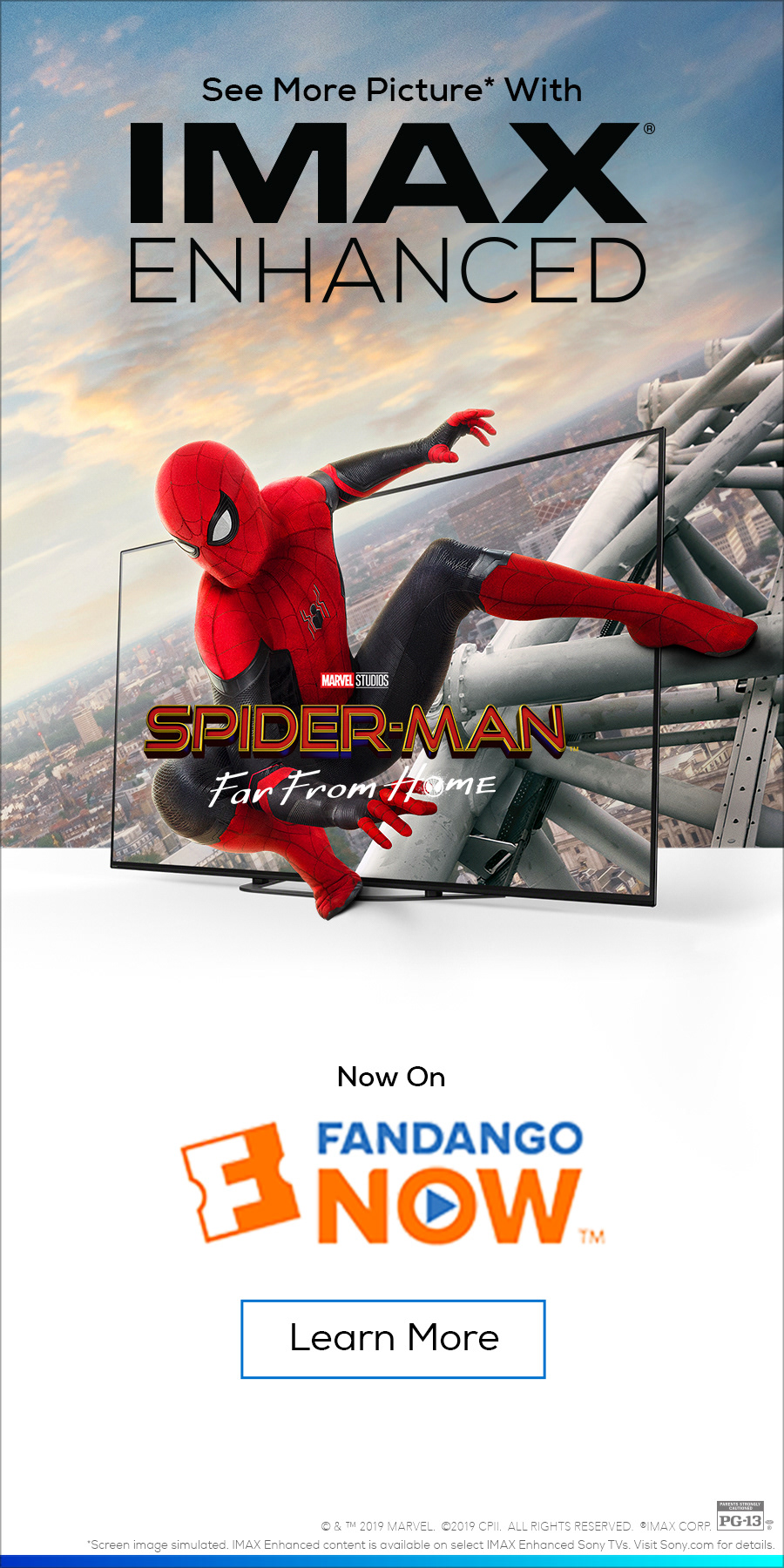
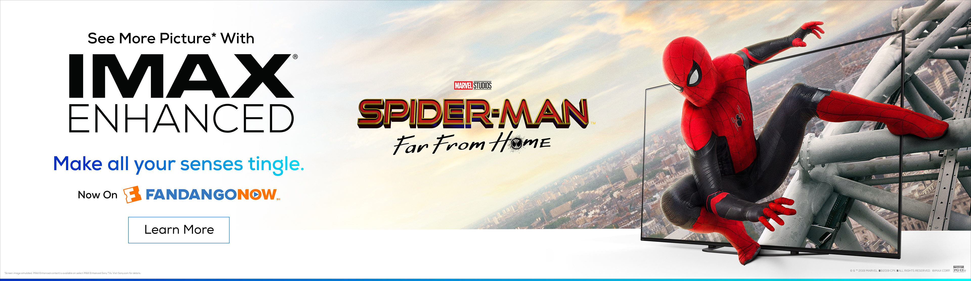
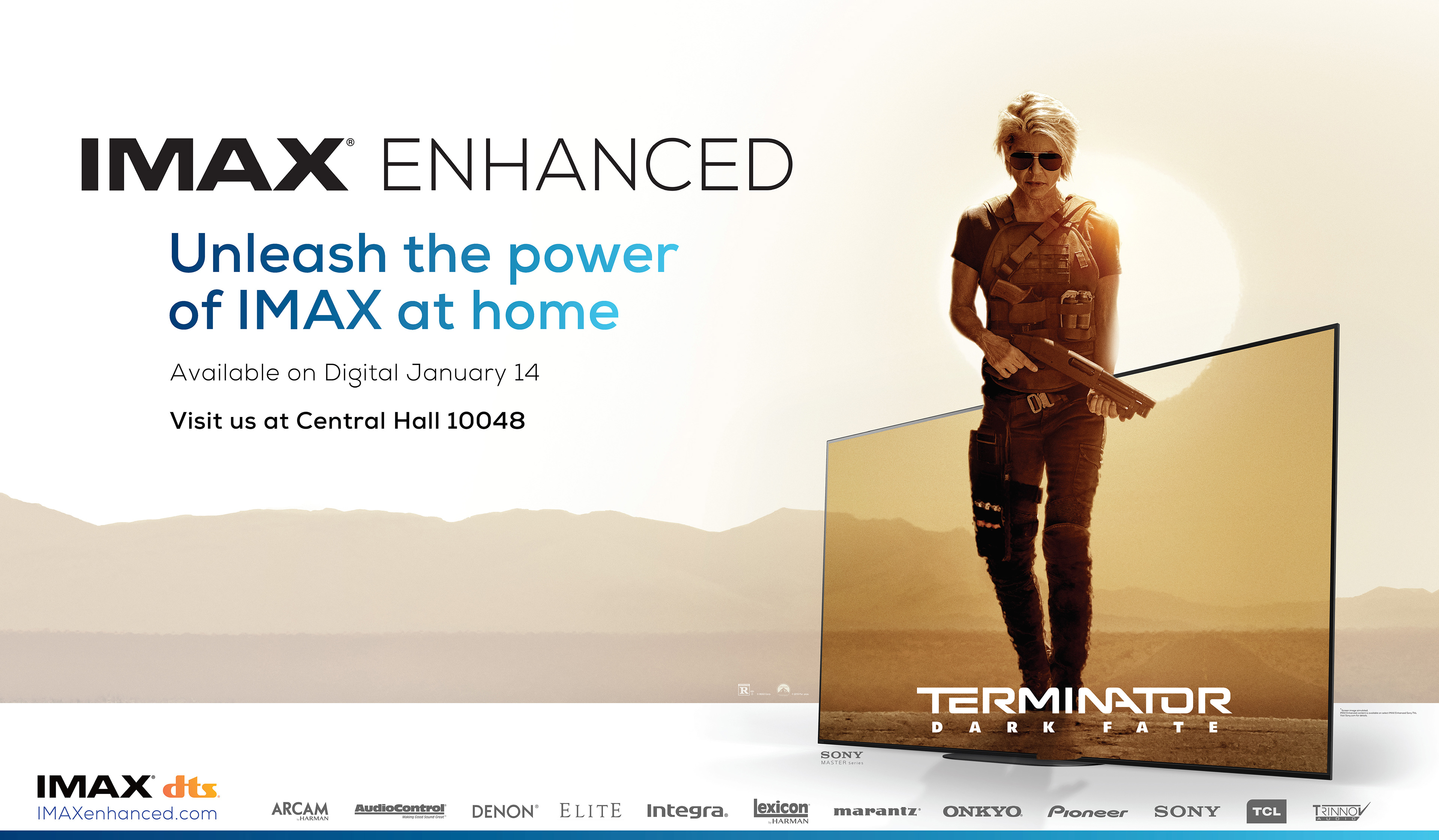
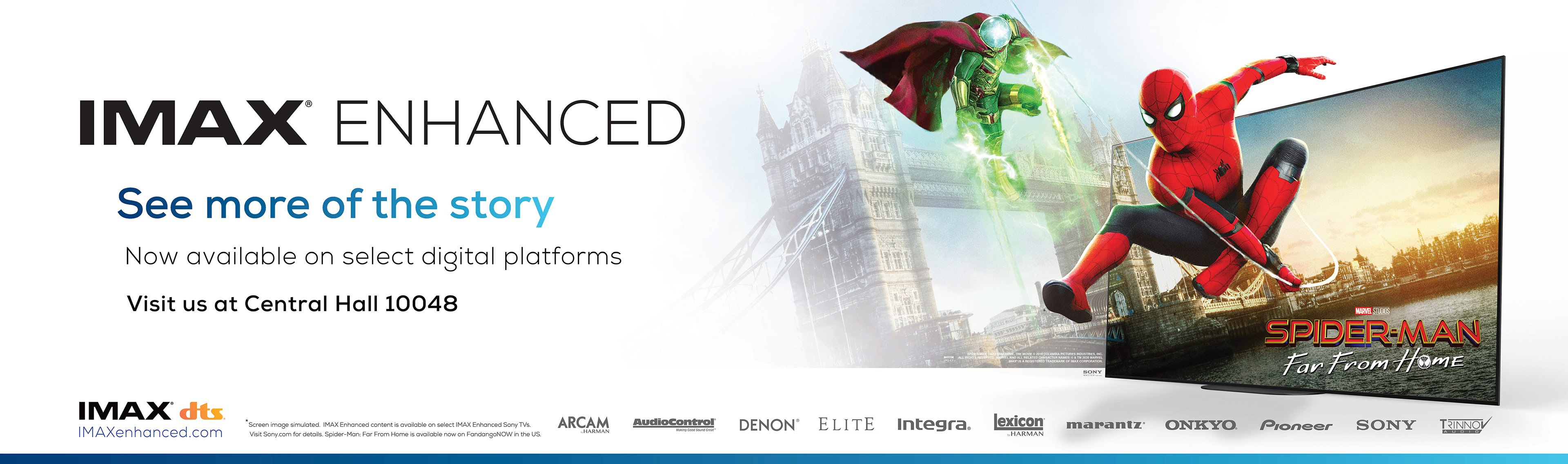
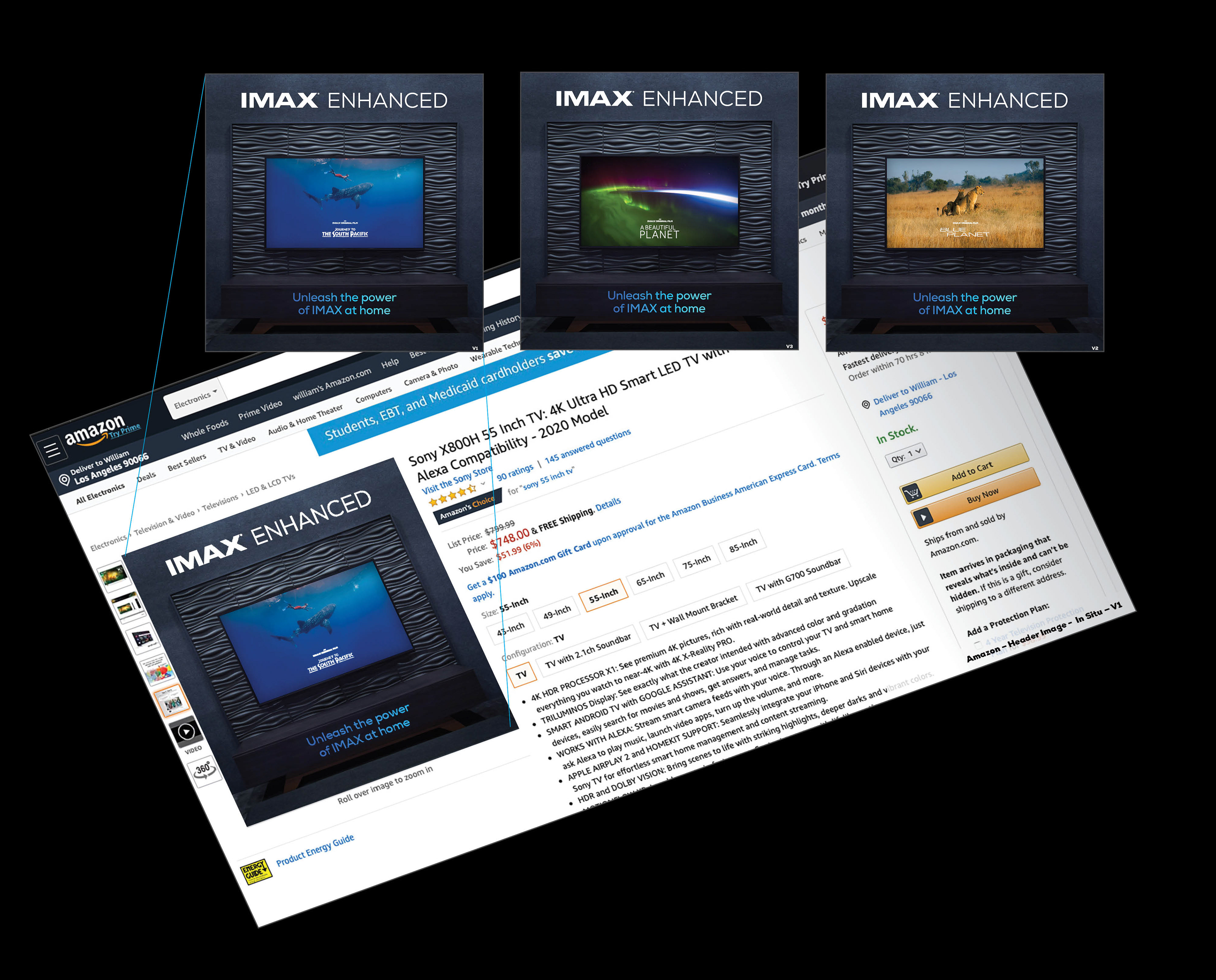
IMAX required a global launch identity for “IMAX Enhanced,” a new ecosystem bringing theatrical quality to home entertainment. The objective was to architect a unified visual language that seamlessly connected diverse hardware partners like Sony with content platforms like Amazon, ensuring the brand felt premium across web, print, and events.
STRATEGY
As Lead Creative, I directed a sleek, high-tech visual strategy designed to bridge the gap between cinema and consumer electronics. I authored a comprehensive brand style guide to enforce consistency across the product website, digital campaigns, and massive trade show activations like CES, successfully positioning the sub-brand as the gold standard for home viewing.
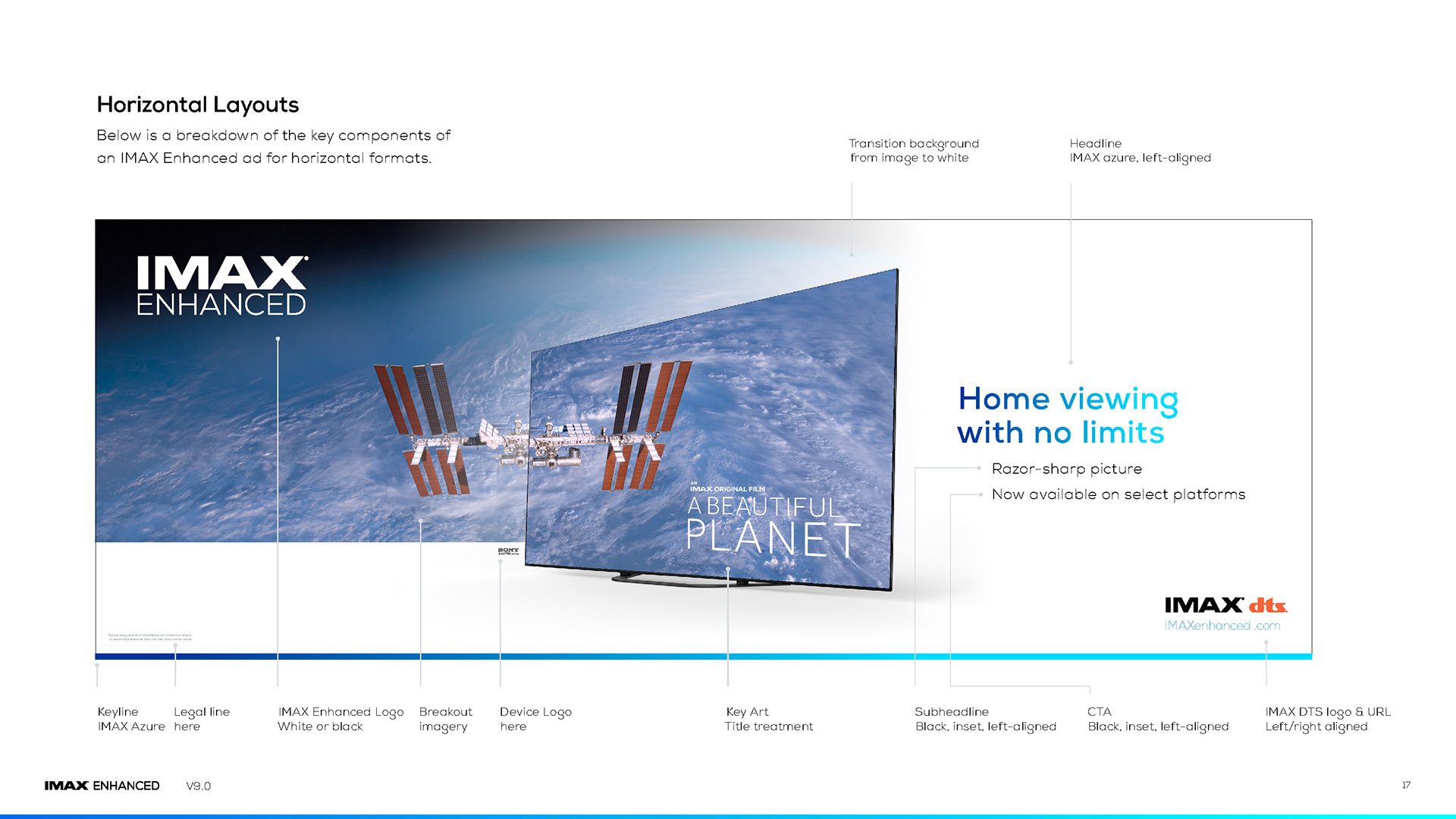
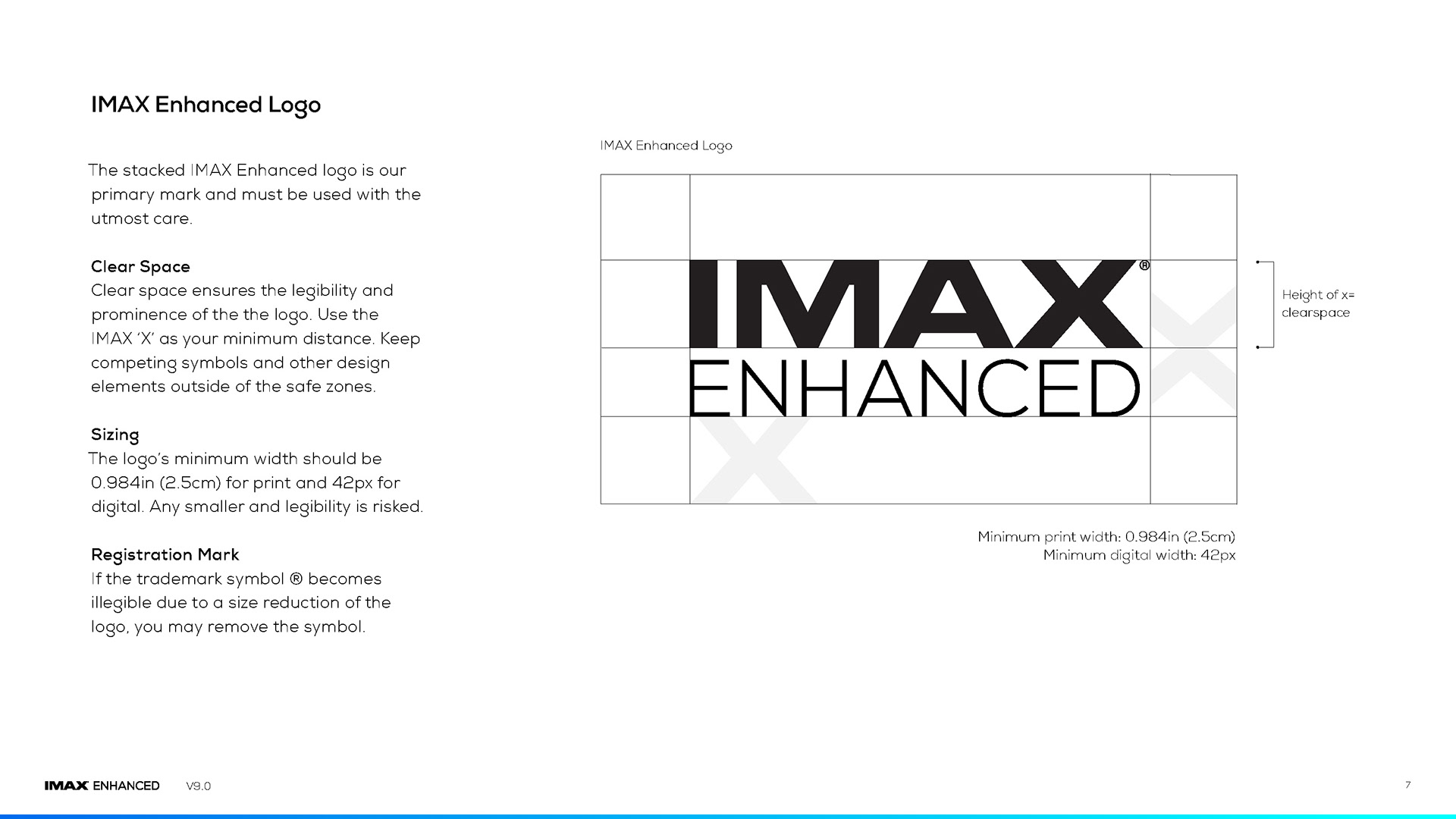
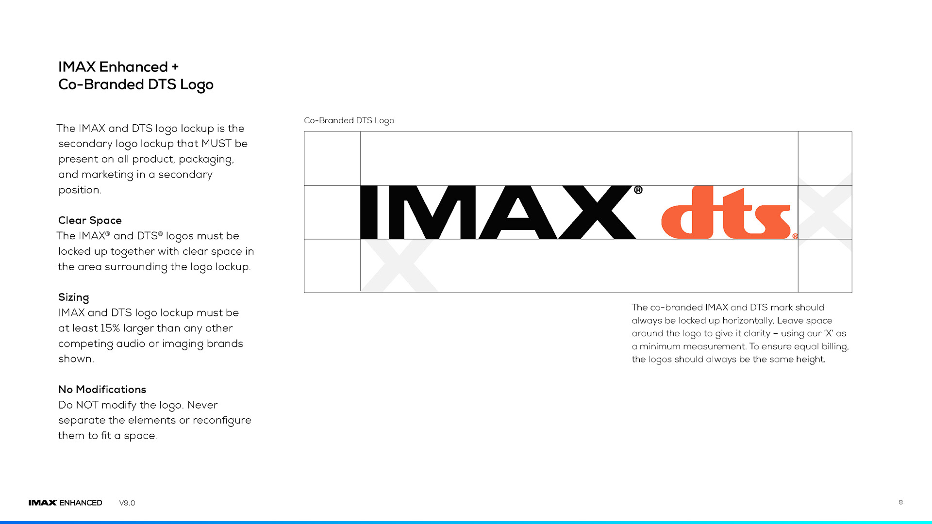
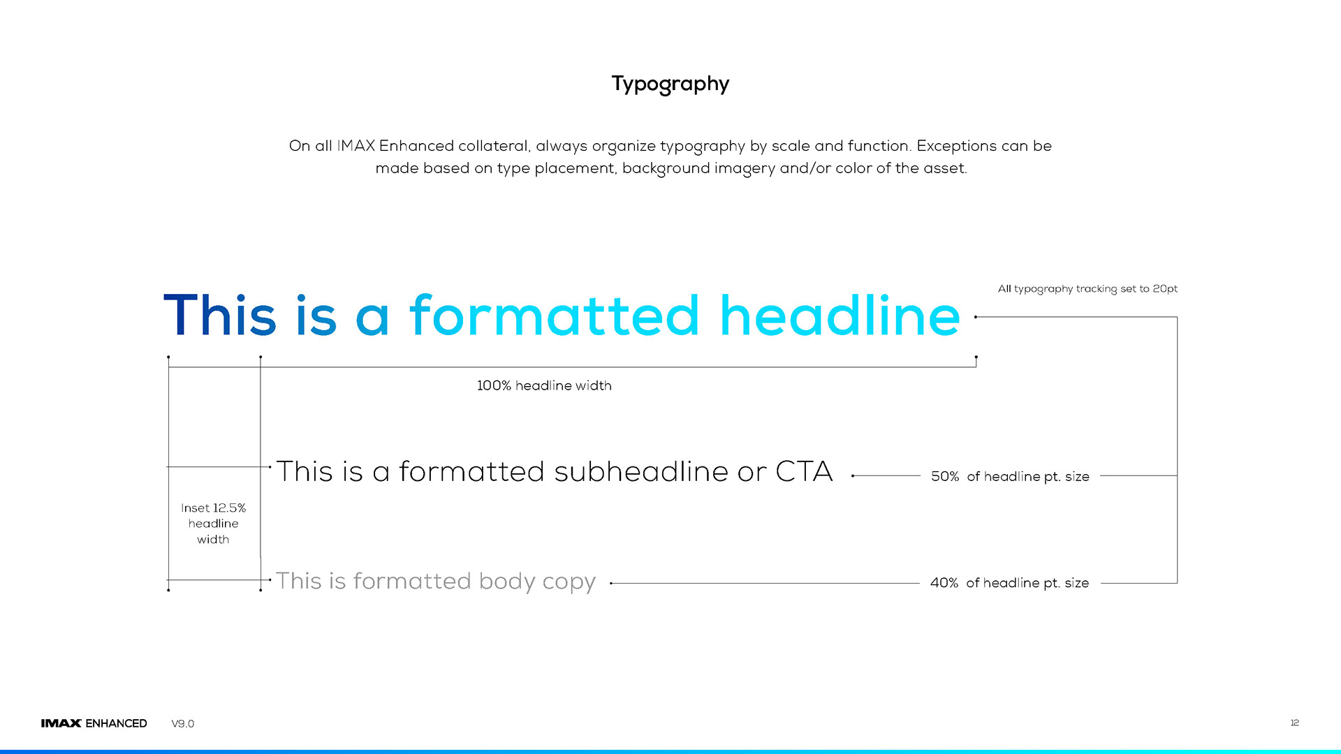
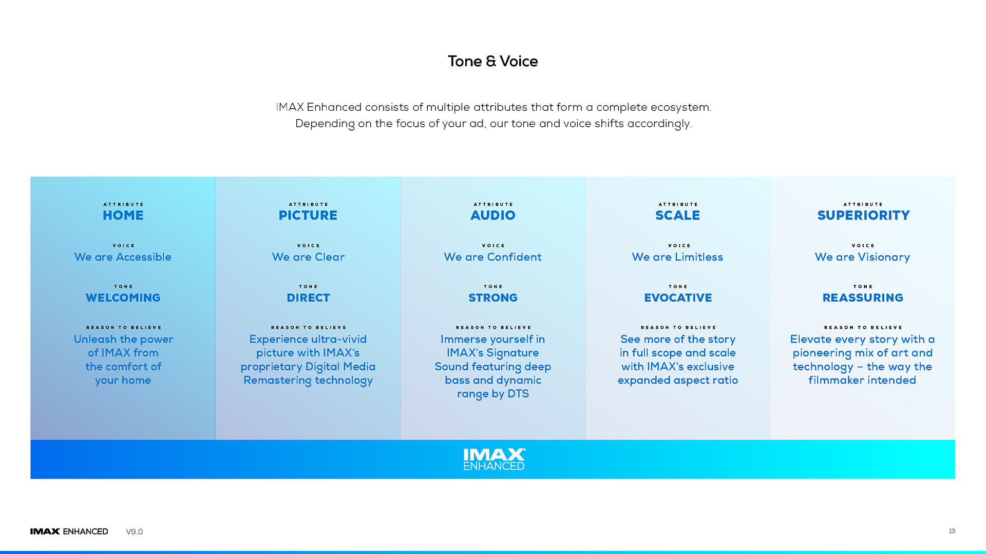
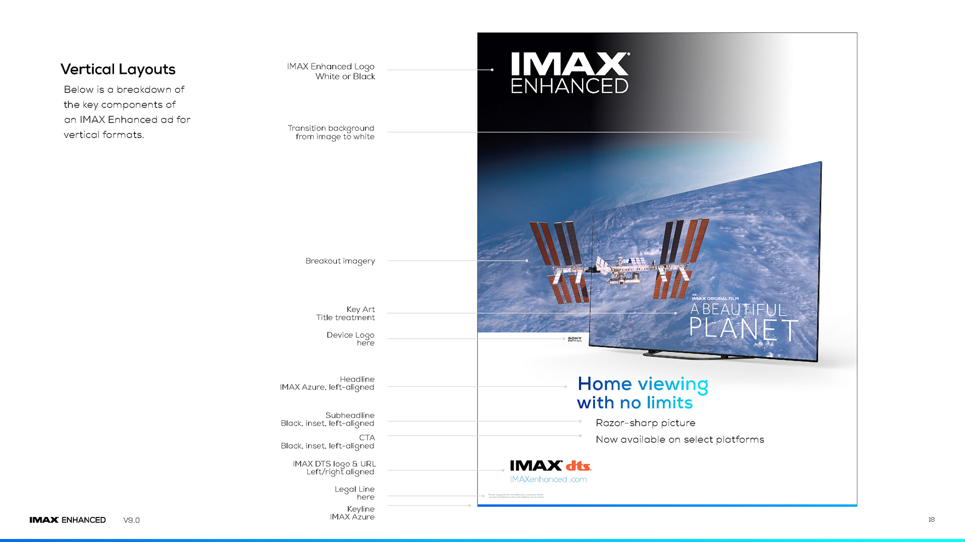
Brand Styleguidelines

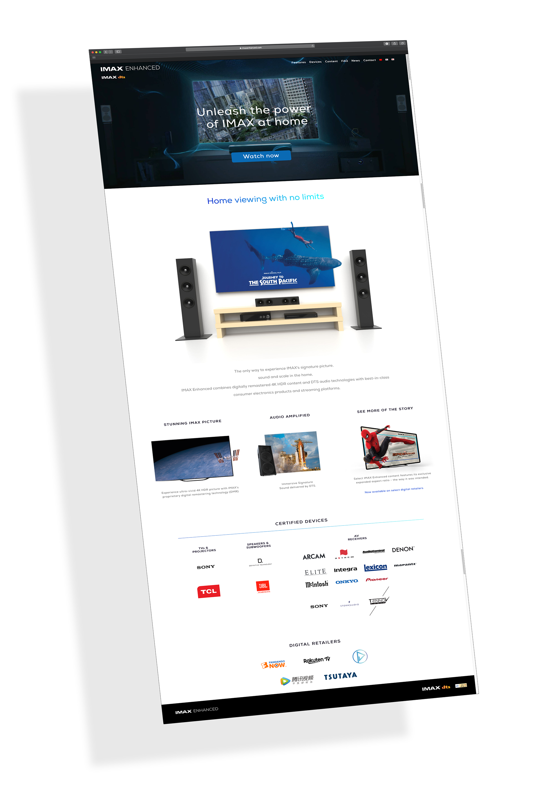
Launch Website
Partner Brochure
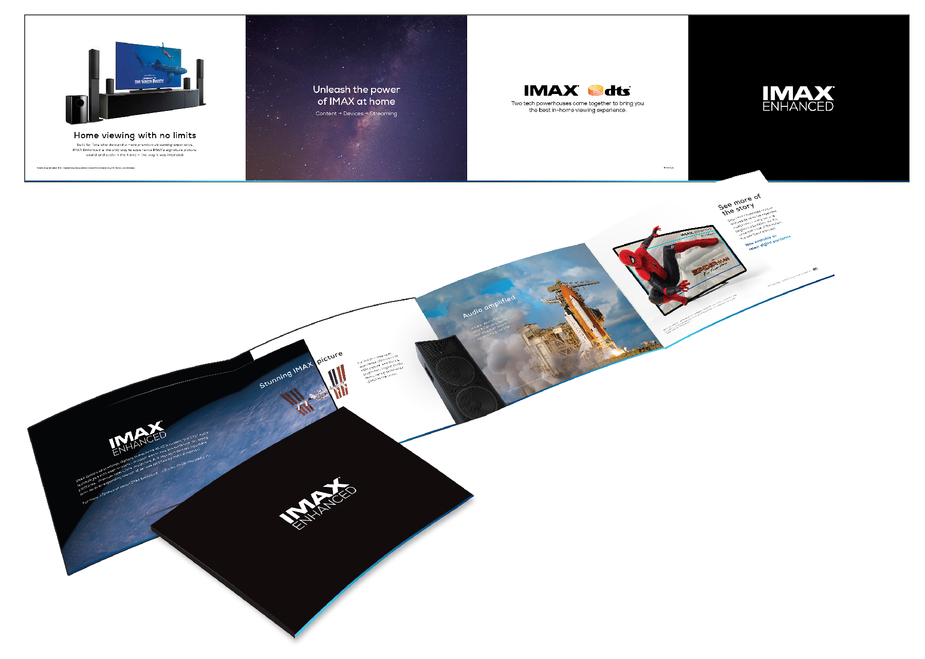


Large Format Hall Banners


Web Banners For

CLIENT

BRANDED CONFERENCE CASE STUDY
Identity, Marketing, and Exhibition
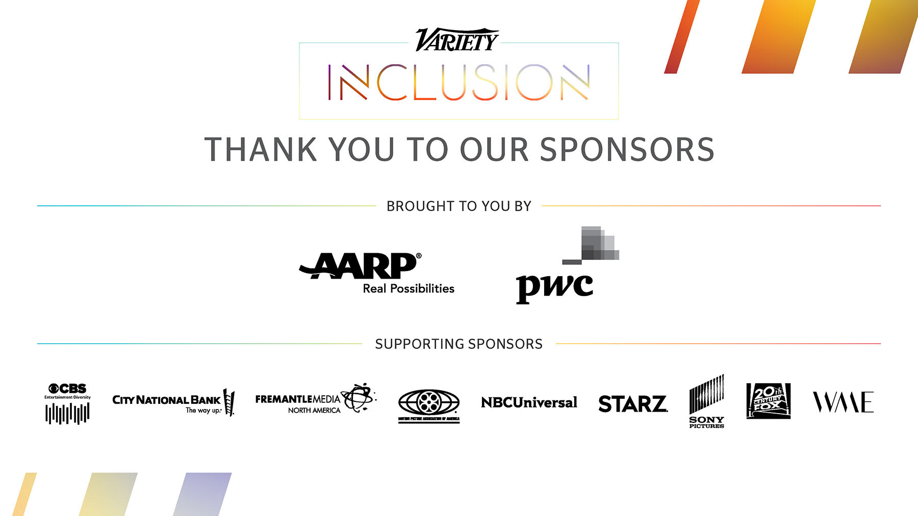
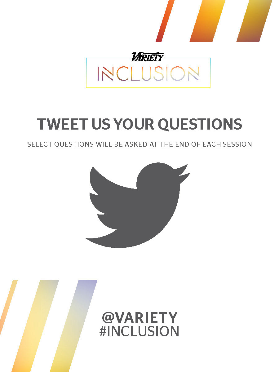
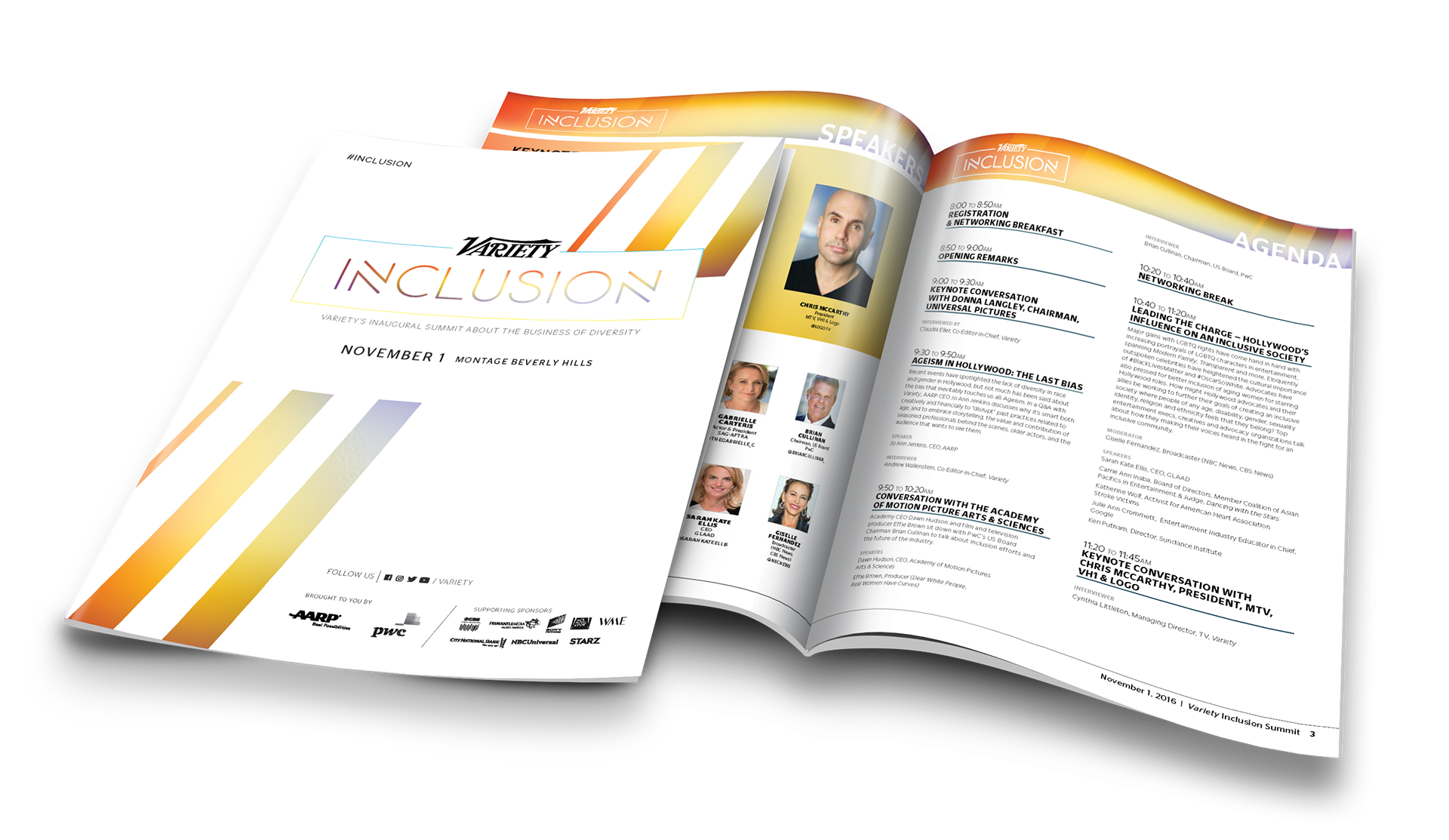
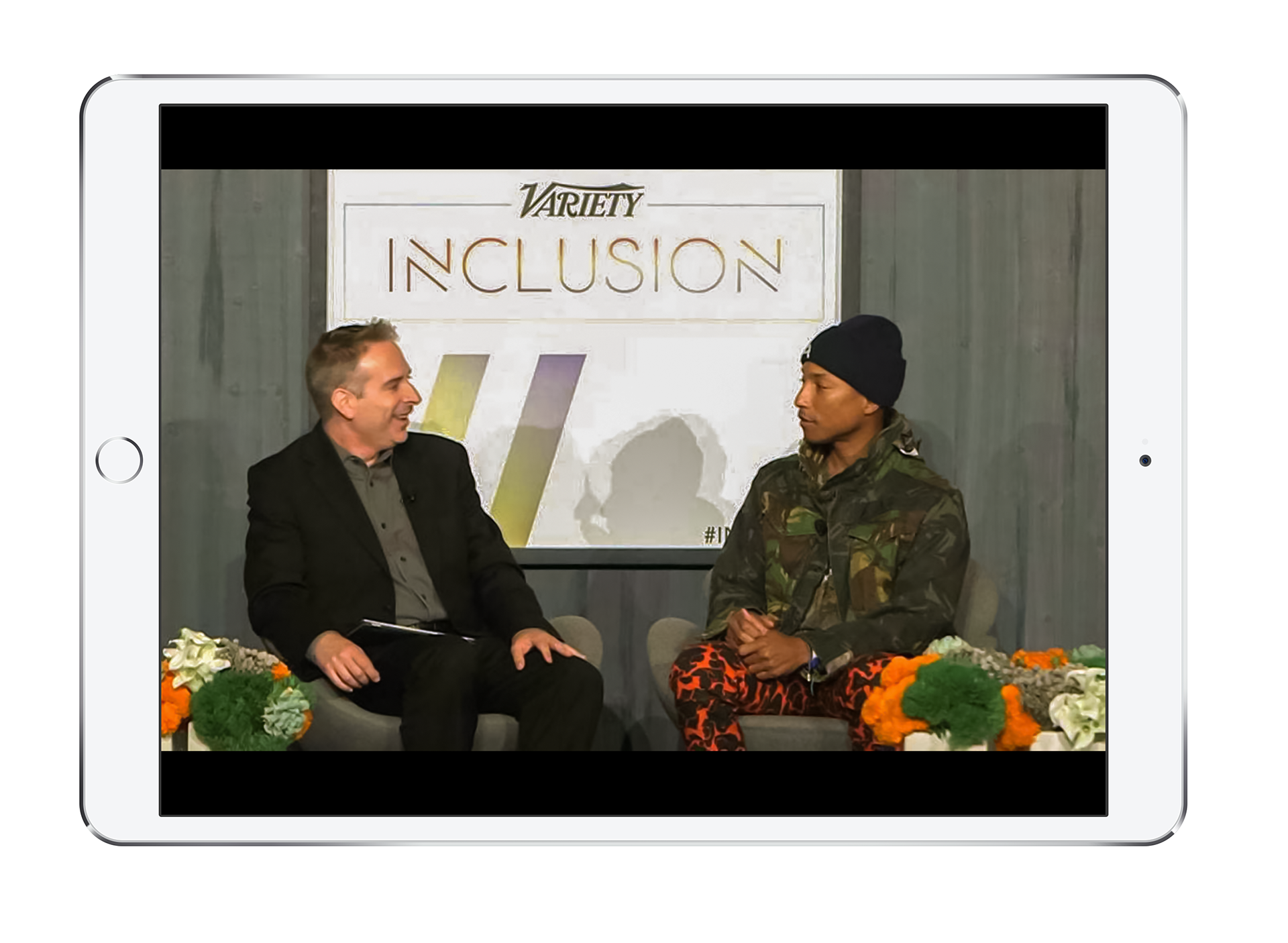
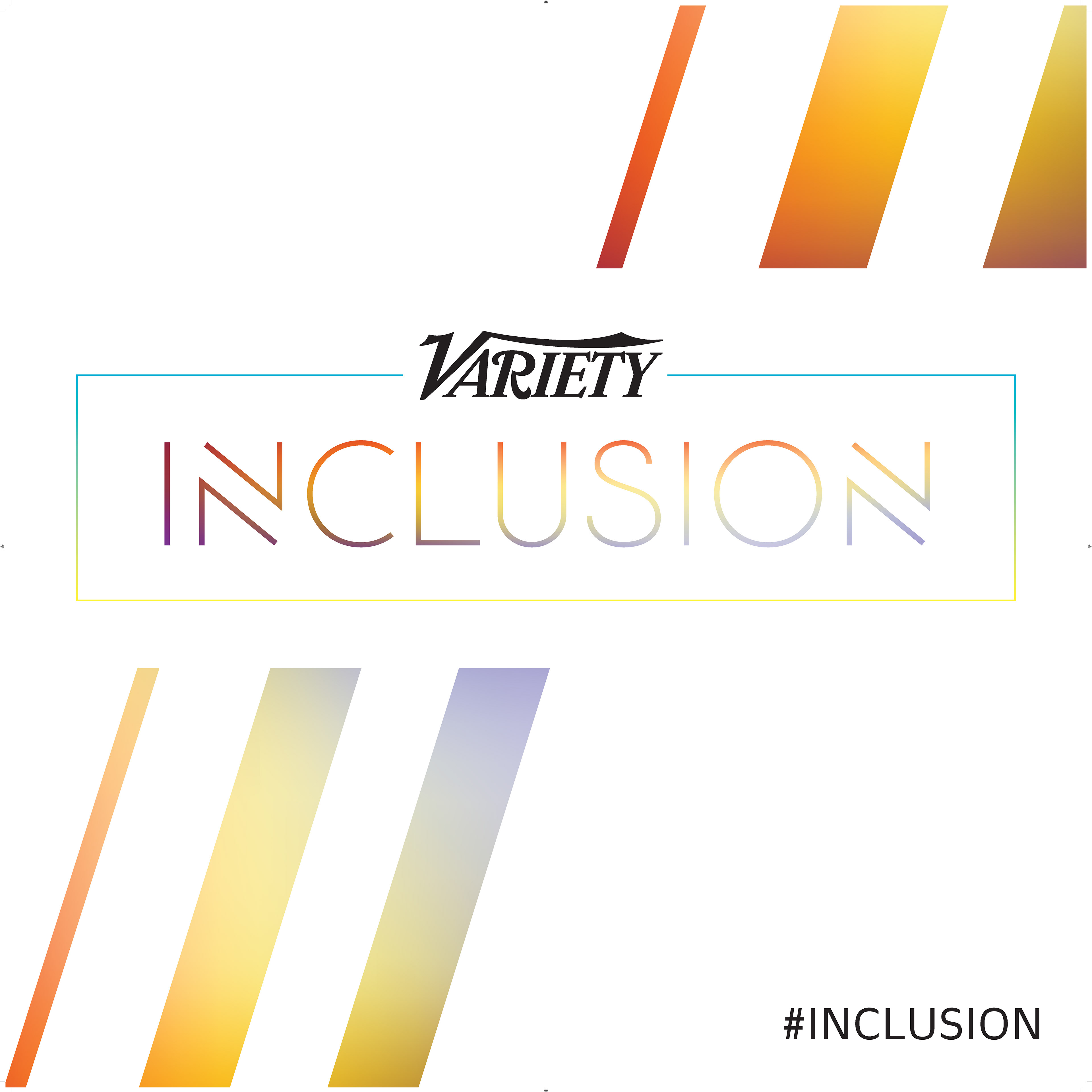
BRIEF
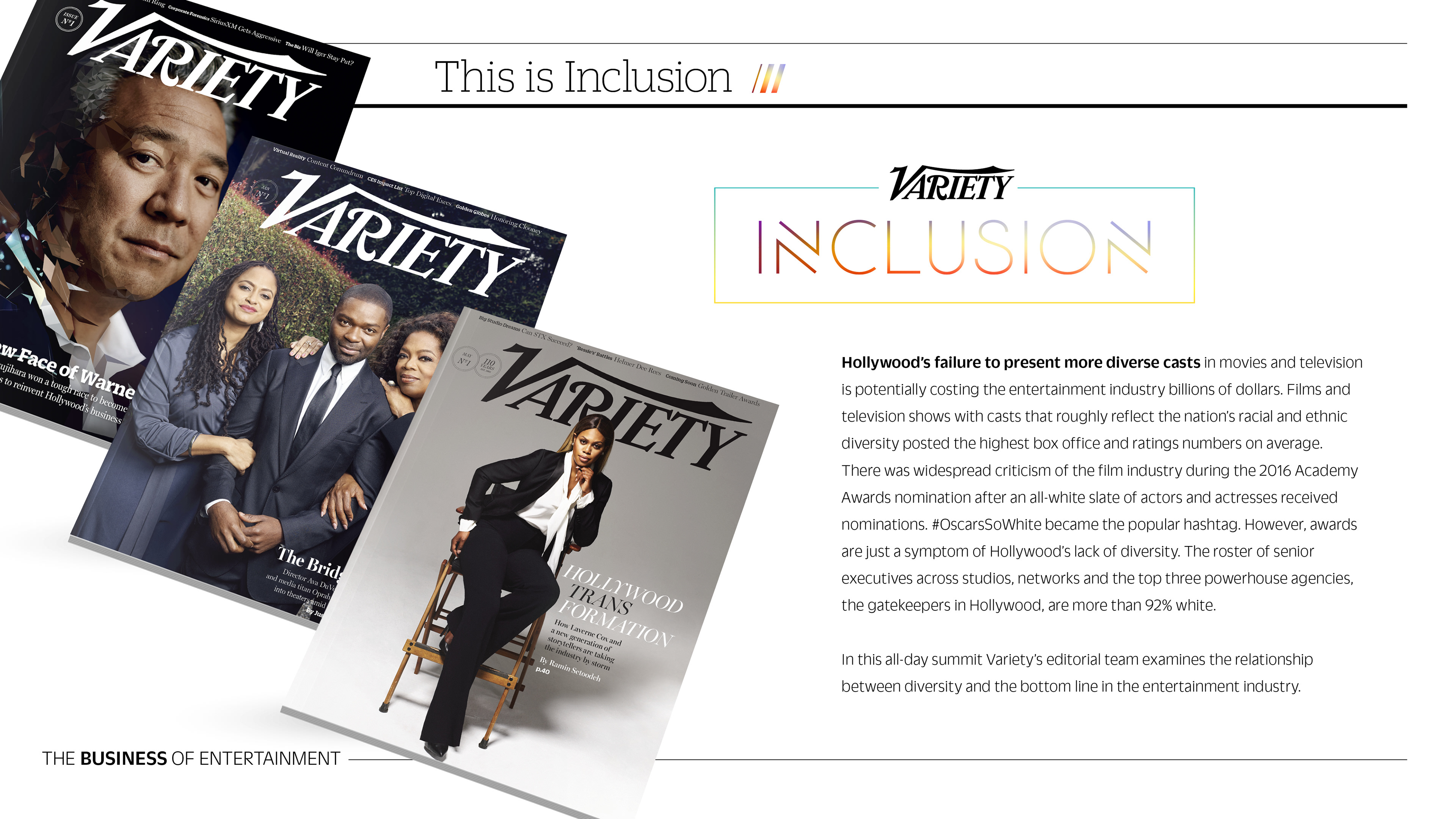
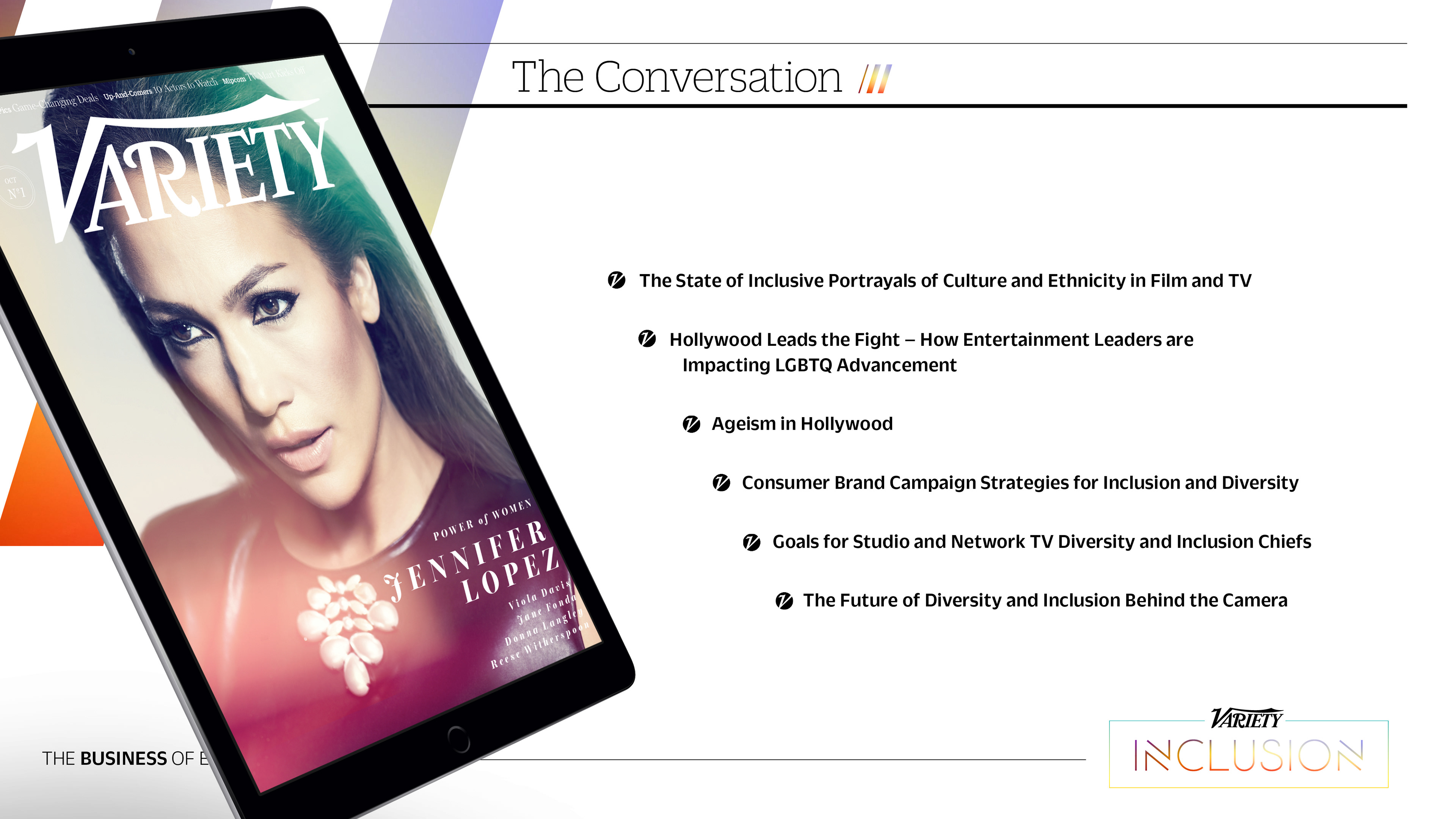
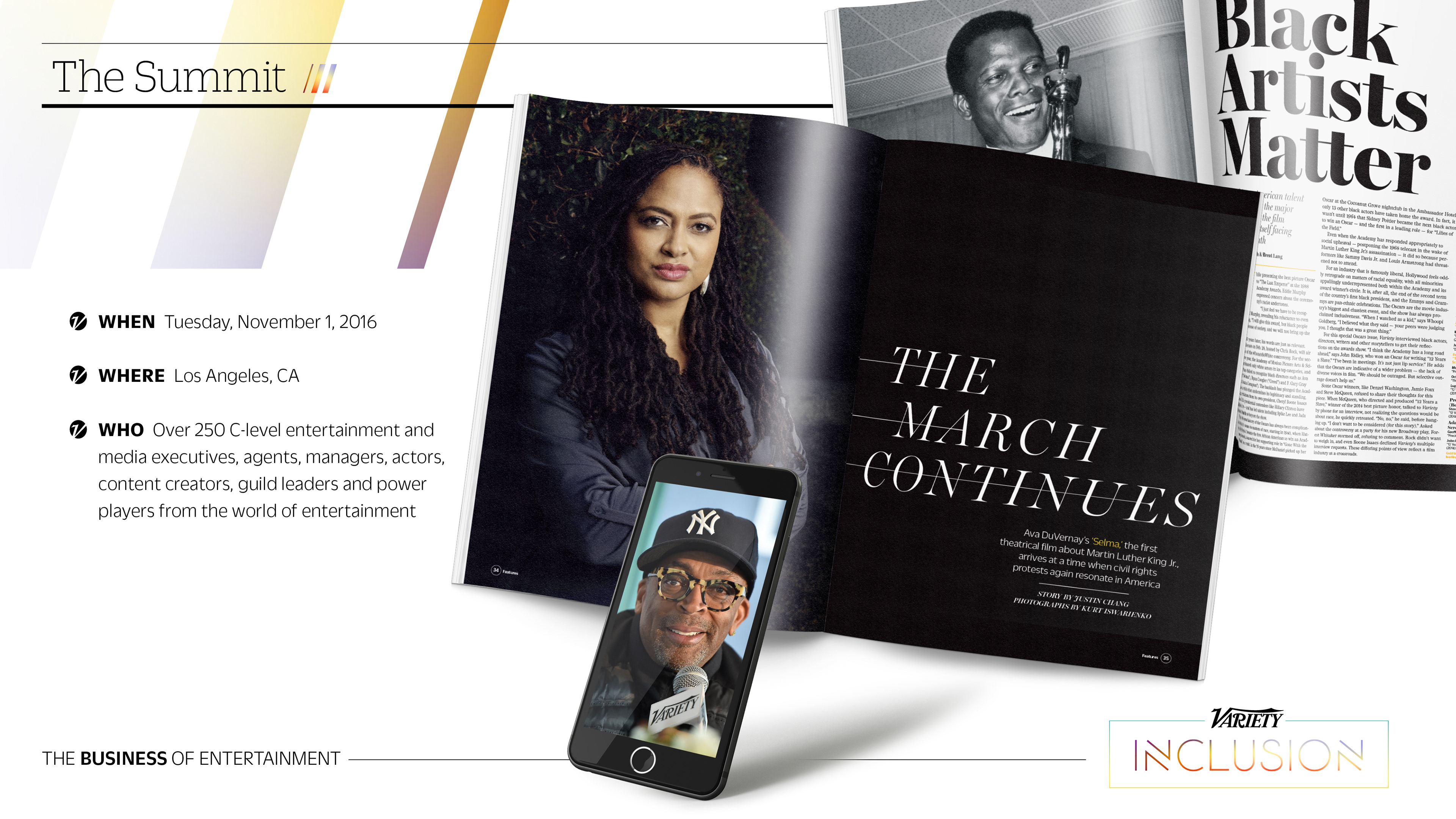
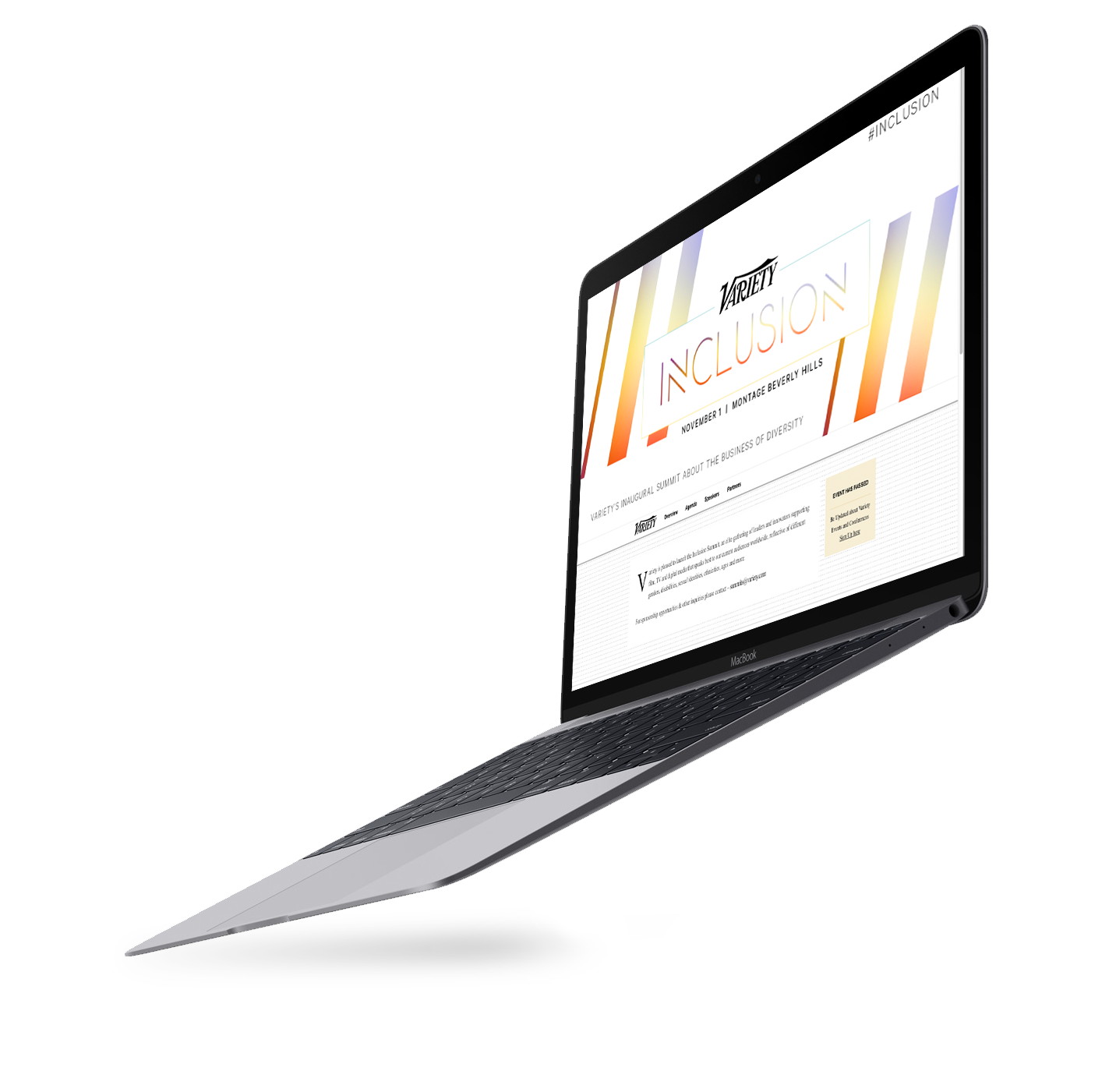
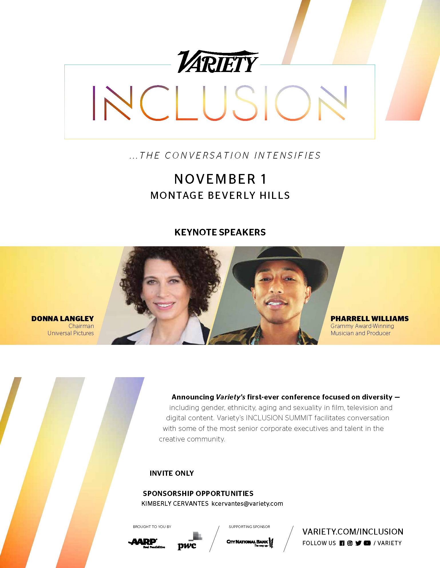
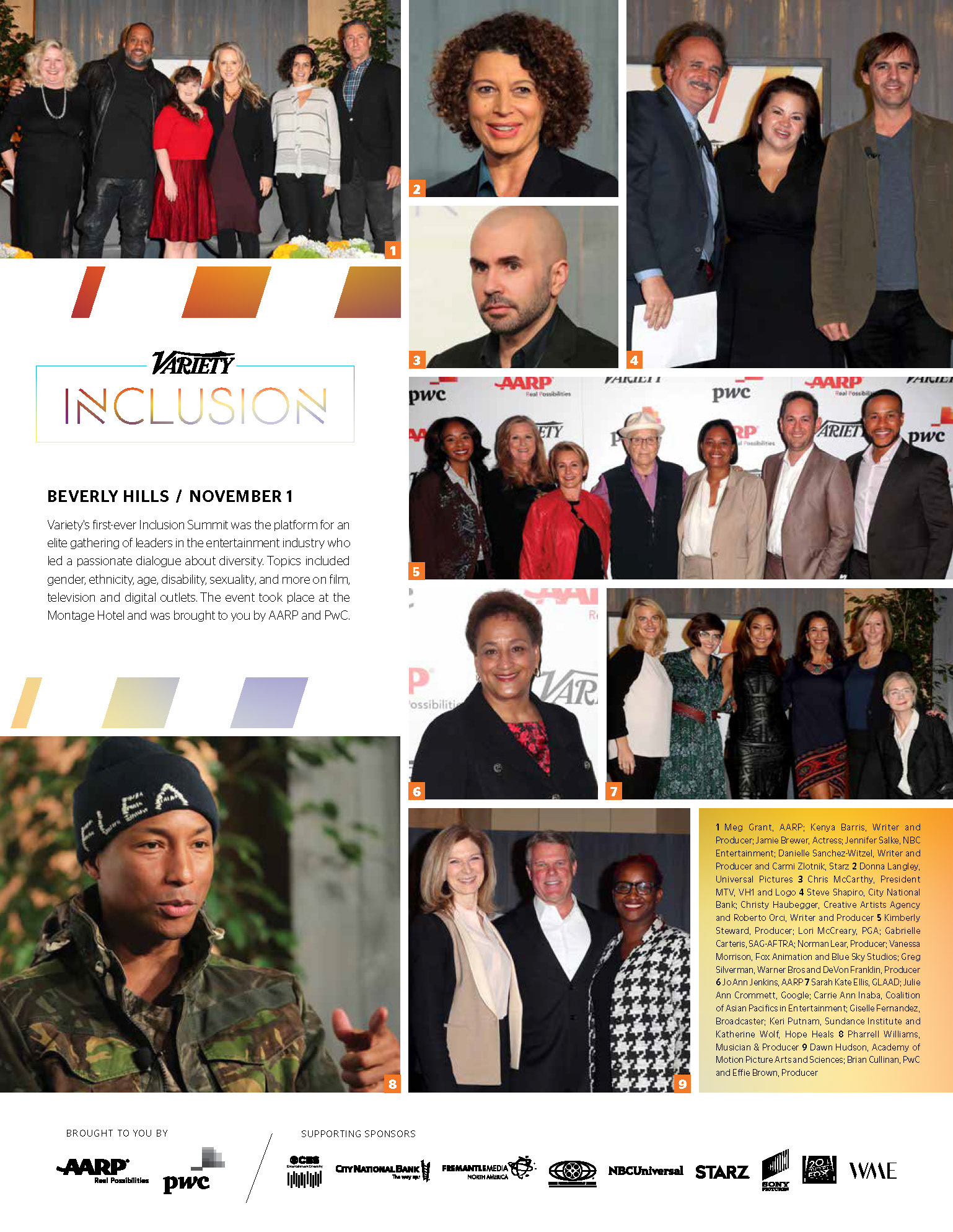
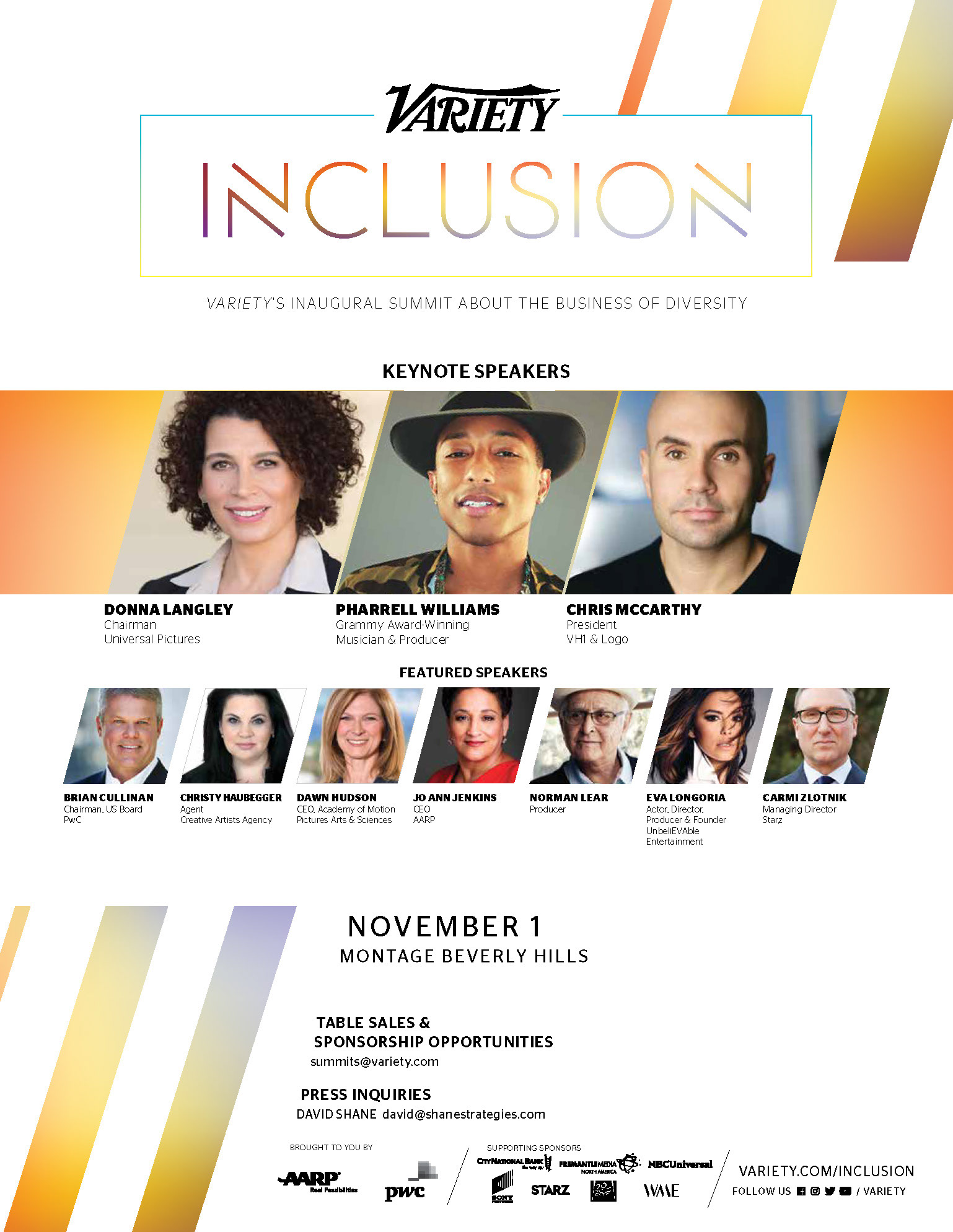
Develop a comprehensive visual identity and cross-platform branding system for Variety’s 2017 Inclusion Summit. The objective was to create a prestigious and modern brand language that could scale seamlessly across the event’s entire lifecycle—from initial digital marketing and print advertisements to environmental wayfinding and large-format stage backdrops.
STRATEGY
I implemented a vertical branding strategy to maintain a “single source of truth” for the visual identity across vastly different scales. By designing a flexible typographic system and a distinctive gradient-slash motif, I ensured the brand remained instantly recognizable whether viewed on a mobile device, a full-page magazine spread, or a 20-foot event banner. This approach prioritized compositional adaptability, allowing the branding to wrap around physical architecture and digital interfaces with equal impact, ultimately creating a unified and immersive environment for the summit’s attendees.


Sponsor Informational Presentation

Attendee and Sponsor Website

Print Advertisements

Event Invitation
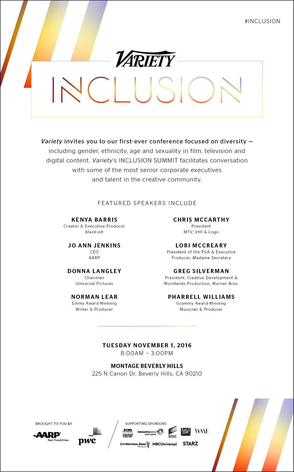

Table Cards
Thank You Slide & Social Centerpiece
Thank You Slide
Social Centerpiece

Event Program

CLIENT


NEW BRAND INITIATIVE
LOGO DESIGN CONCEPTS
LOGO DESIGN CONCEPTS
CONCEPT DESIGN, LAYOUT, AND ILLUSTRATION
PROJECT DATE | 2021
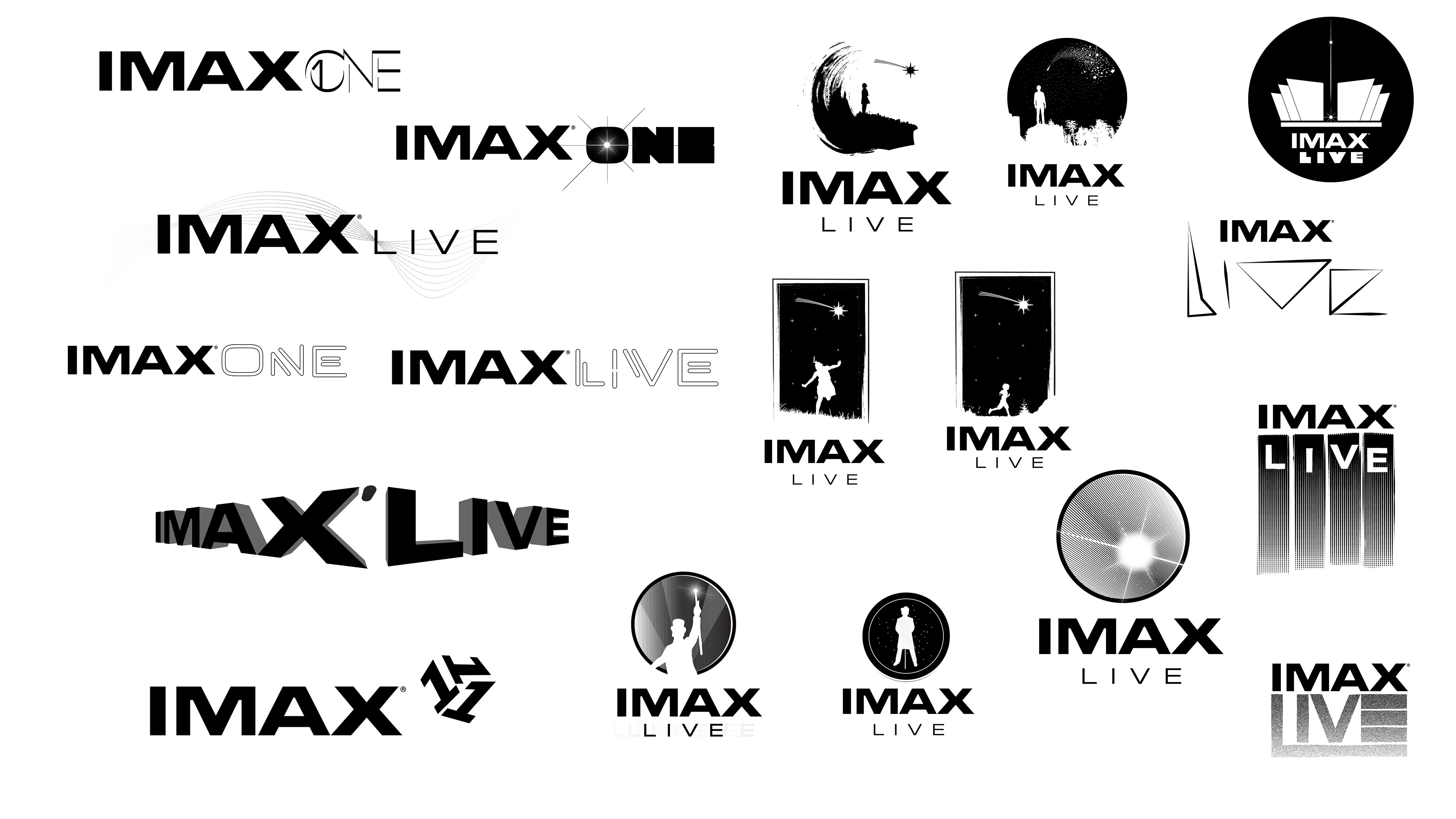
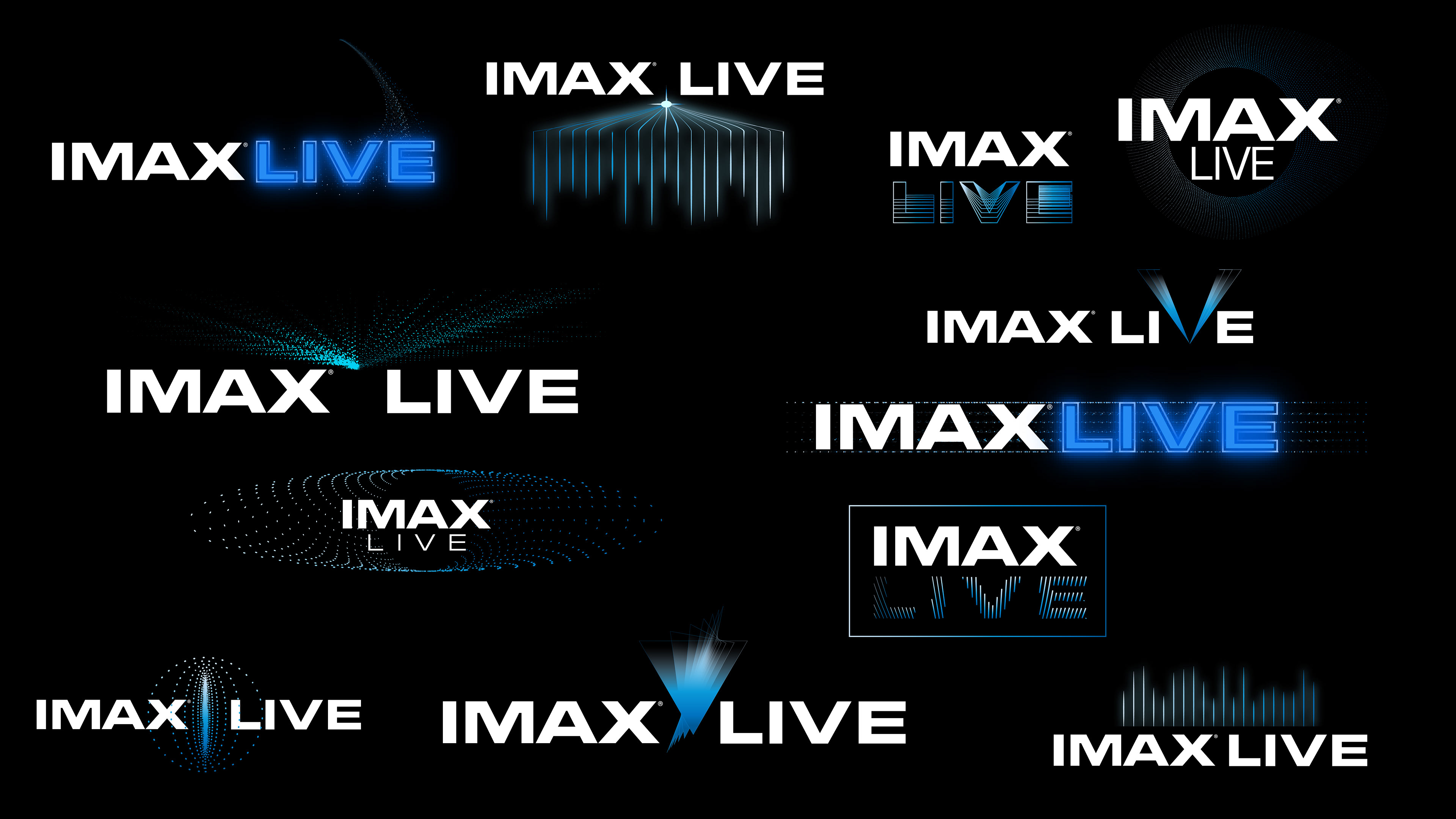
BRIEF
Create a distinct logo system for “IMAX Live,” a new sub-brand dedicated to simulcasting concerts in theaters. The objective was to fuse the established prestige of the IMAX master brand with the vibrancy of live entertainment, visually communicating a new era of immersive, real-time cinema.
STRATEGY
I explored visual metaphors that bridge cinema and live performance, utilizing motifs like sound waves, equalizer bars, and broadcast signals. By integrating these kinetic elements with the iconic IMAX typography and electric blue palette, the concepts aim to visualize the fusion of superior PROJECTion technology with the pulse of live entertainment.
CLIENT

cashmeresound.com

T-SHIRT DESIGNS
CONCEPT, TYPOGRAPHY, AND HAND DRAWN ILLUSTRATION
CONCEPT, TYPOGRAPHY, AND HAND DRAWN ILLUSTRATION
Project DATE | 2023
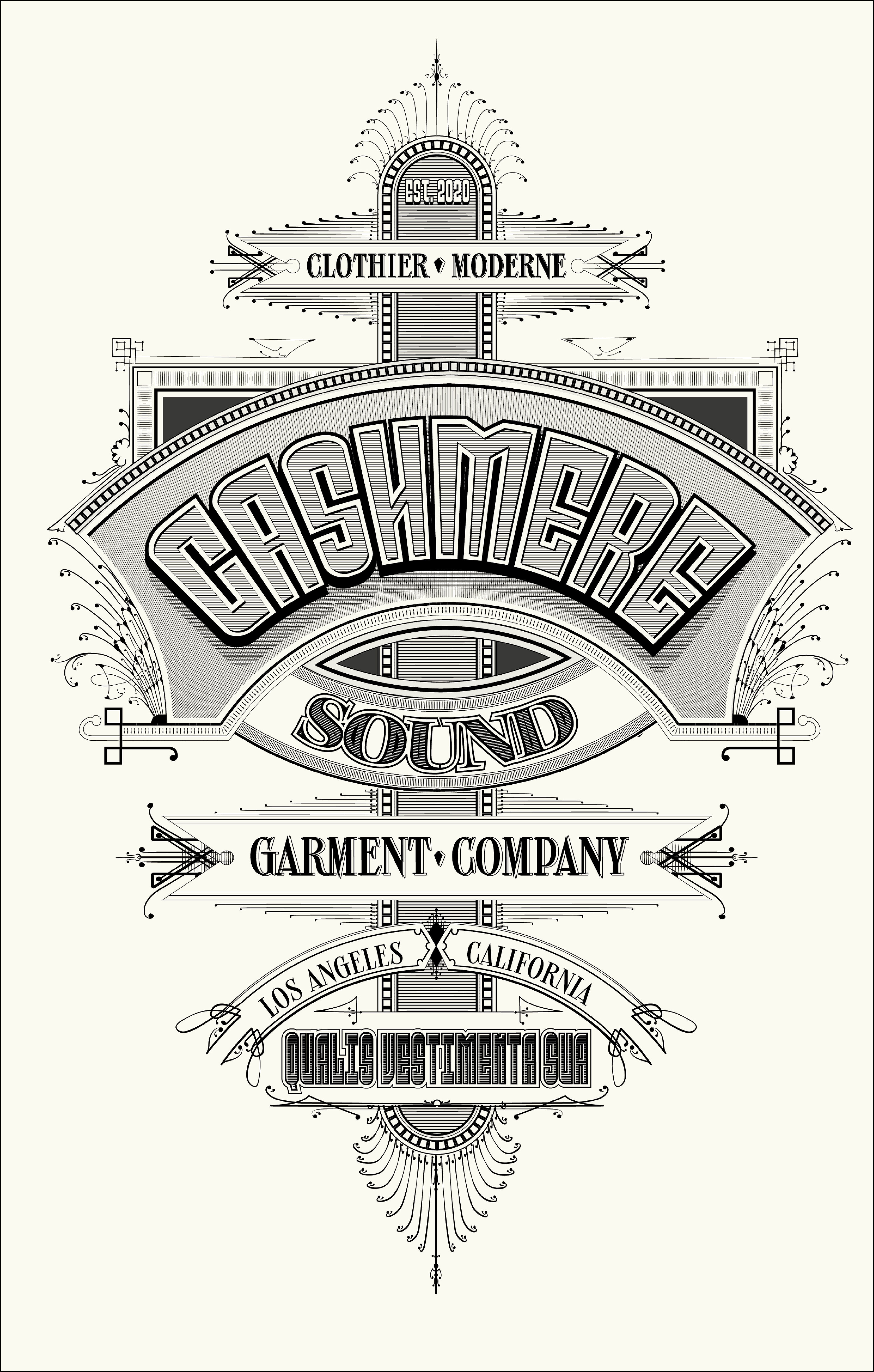
BRIEF
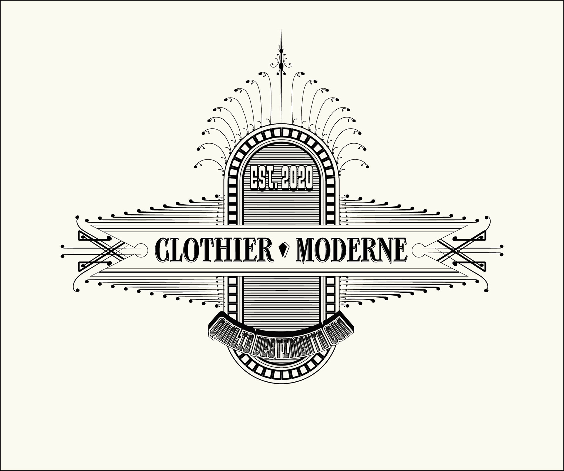
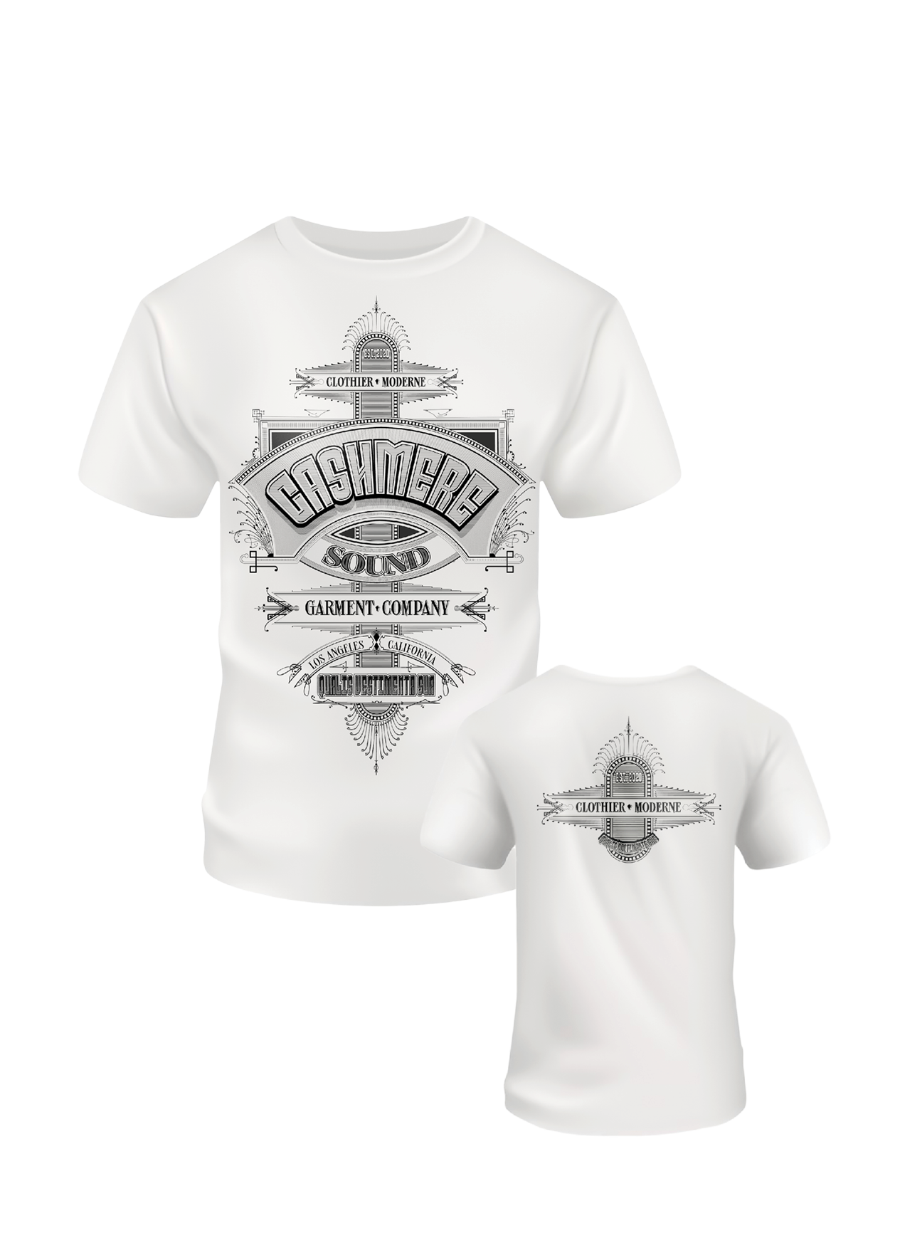
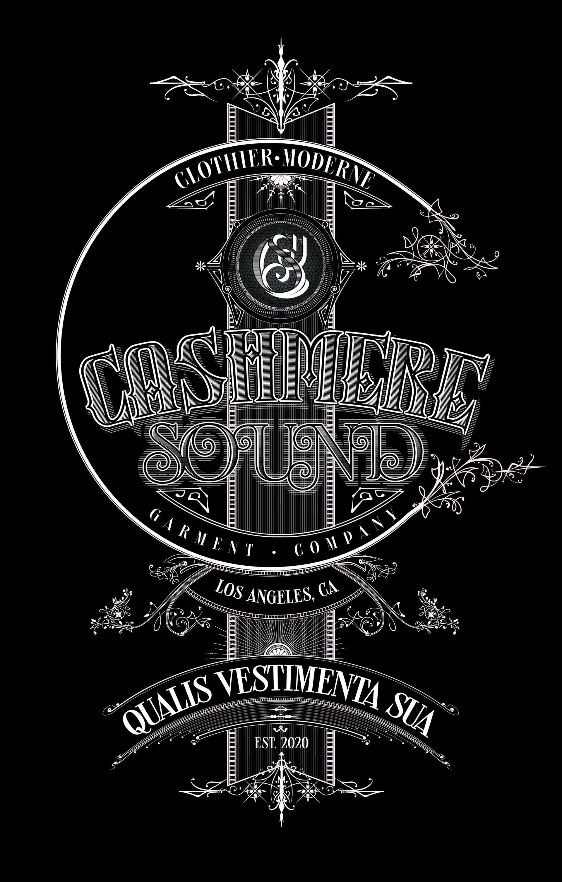
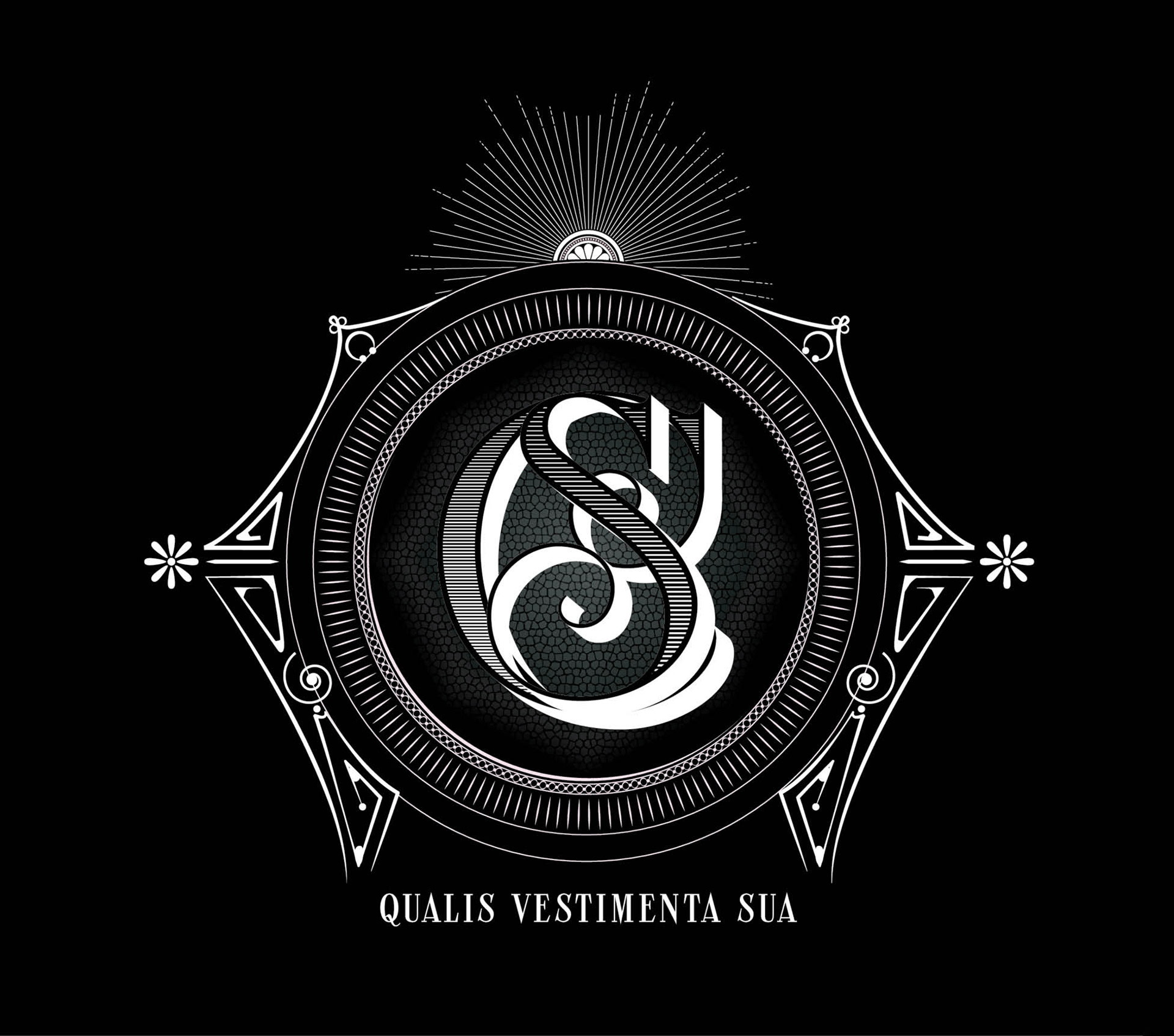
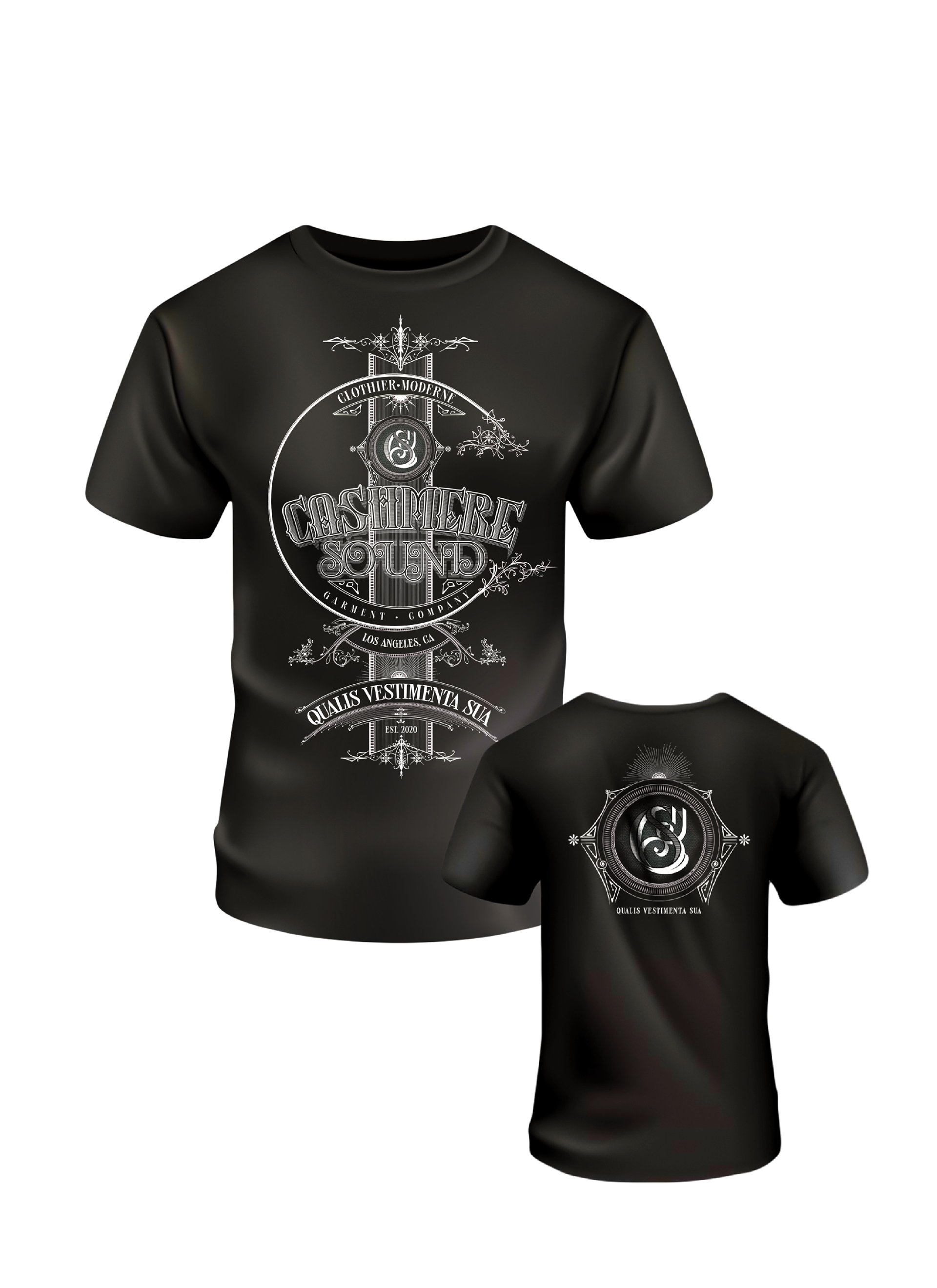
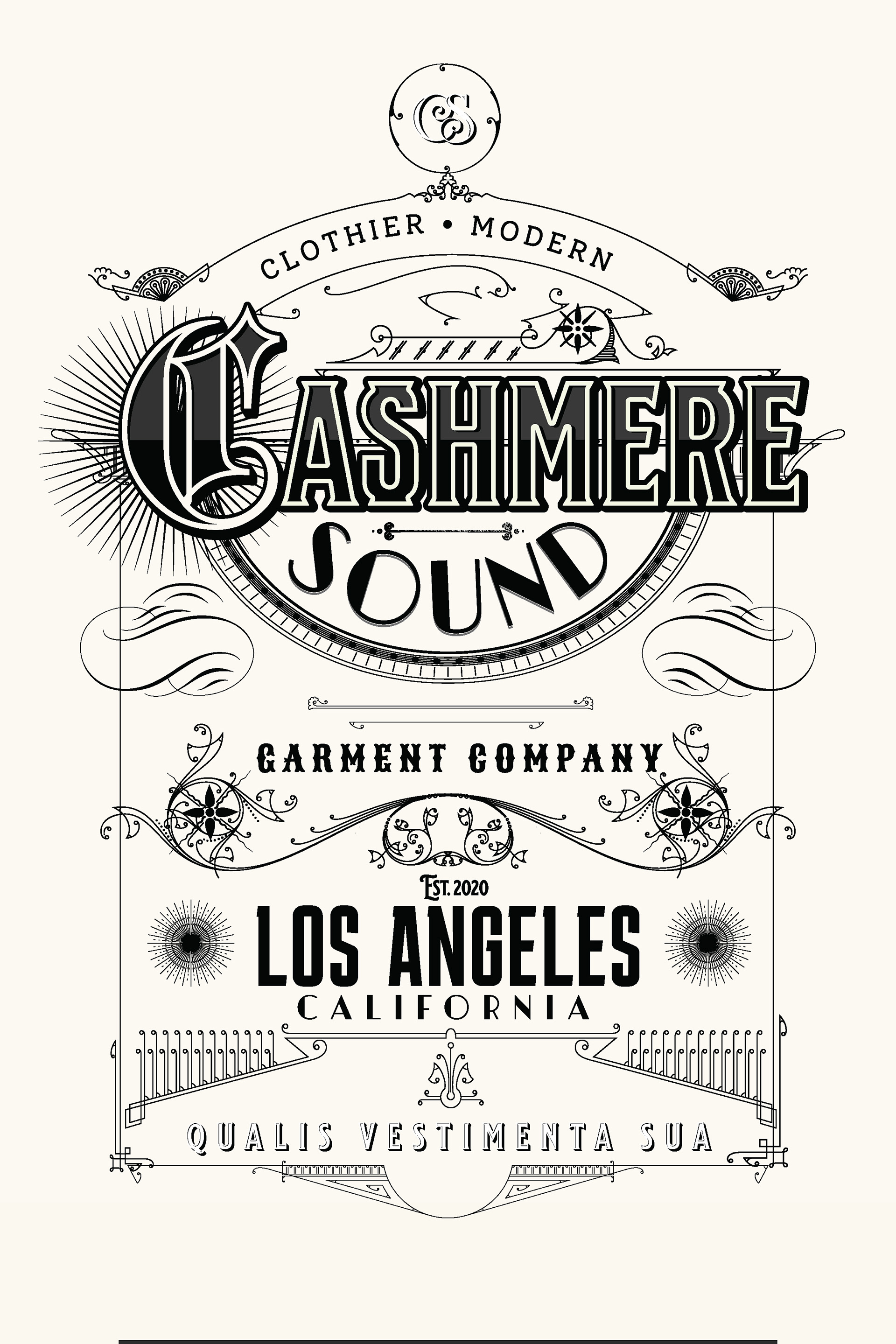
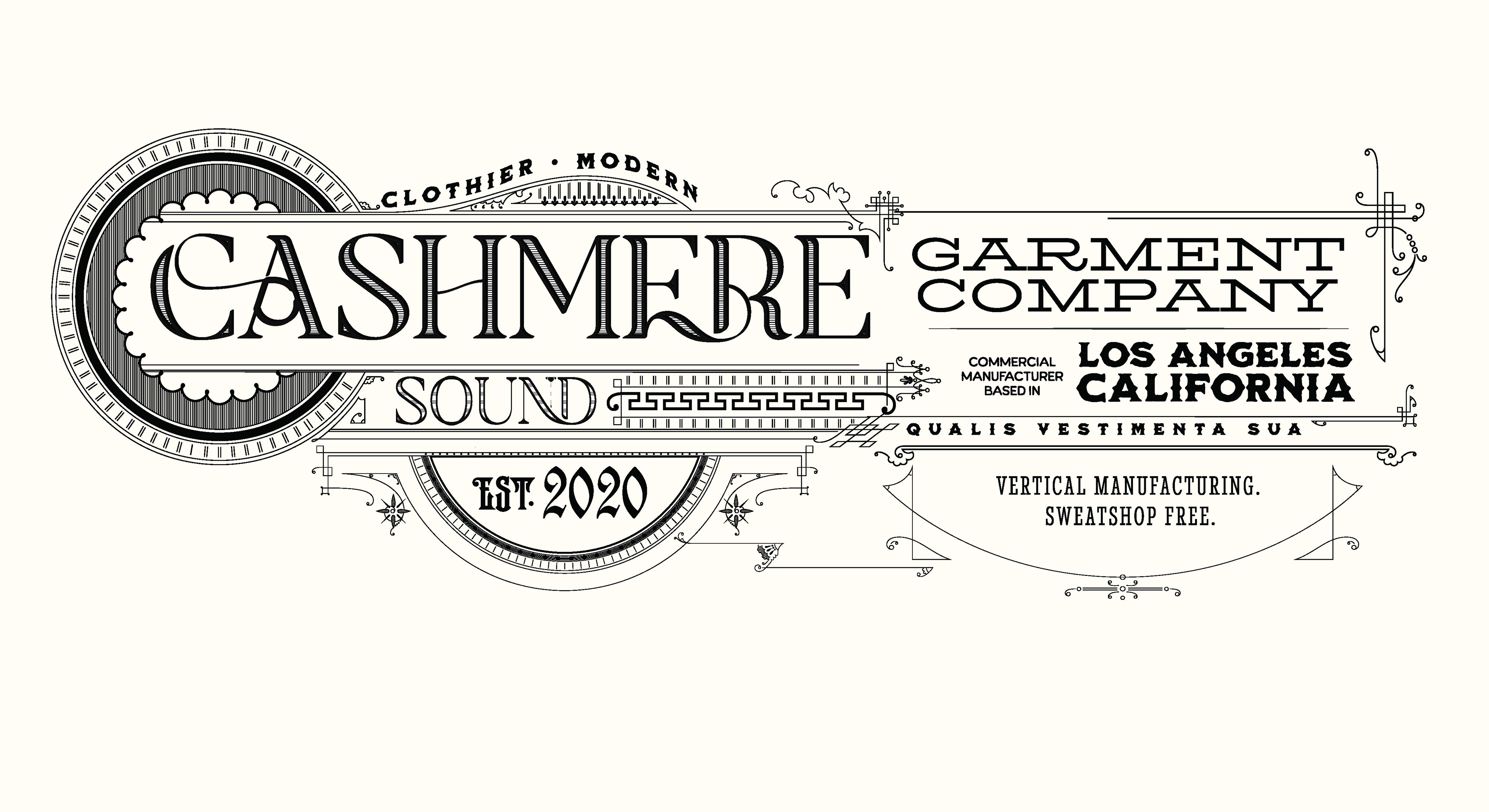
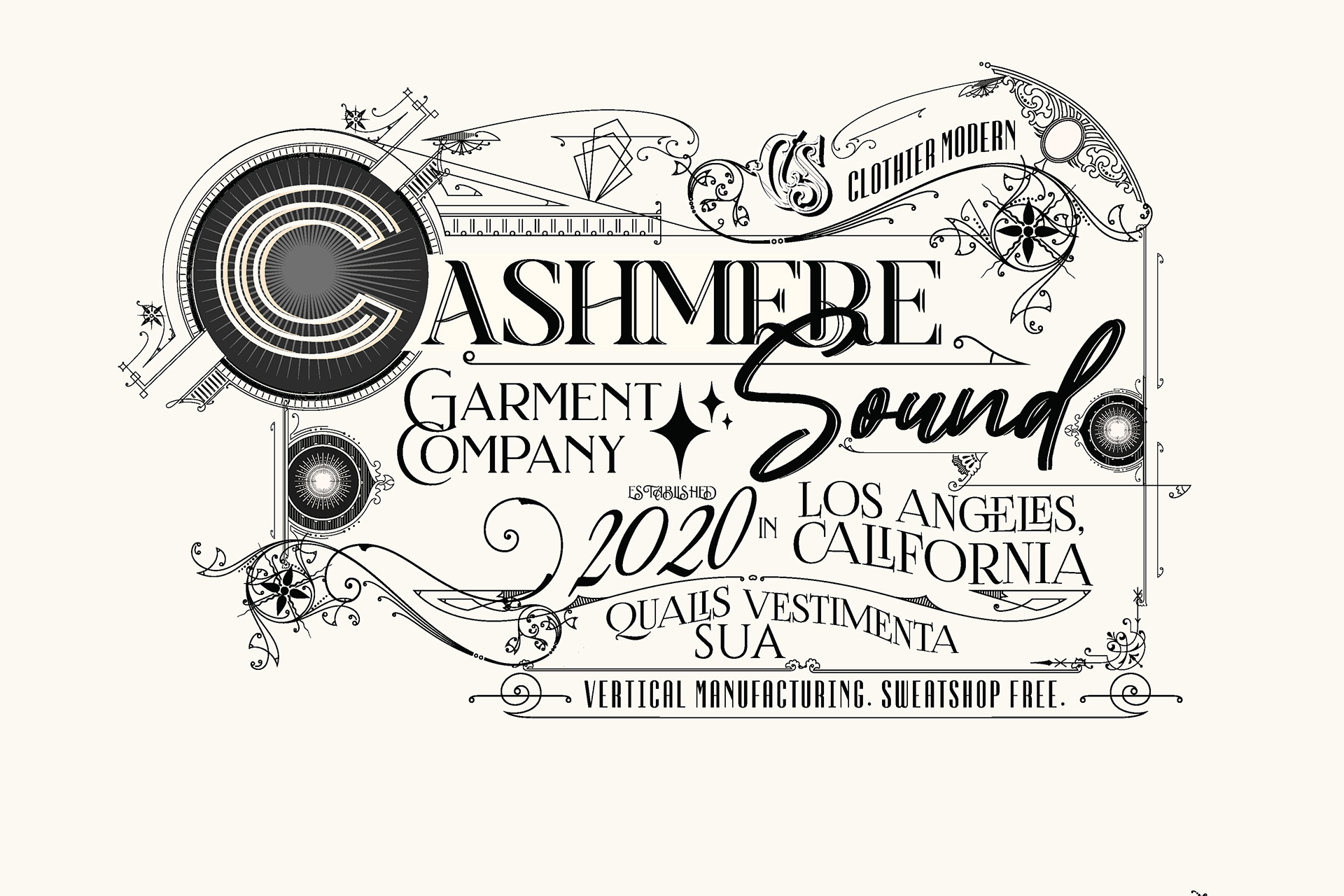
Redefine the concept of “retro” for Cashmere, a premium T-shirt brand seeking a distinct visual edge. The objective was to move away from overused vintage clichés and develop a sophisticated, highly detailed illustration system that feels both archival and cutting-edge, suitable for high-end apparel and brand collateral.
STRATEGY
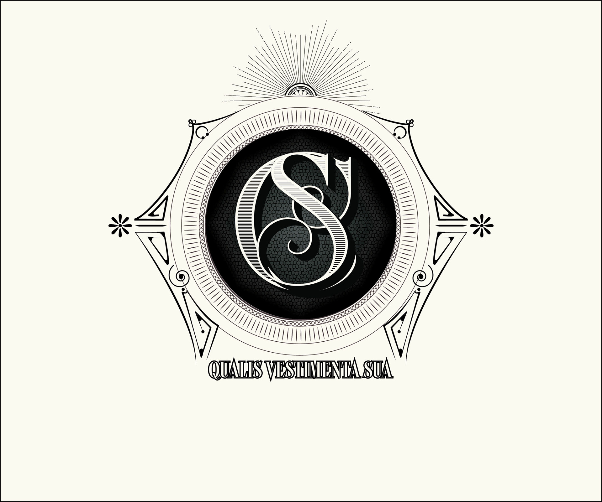
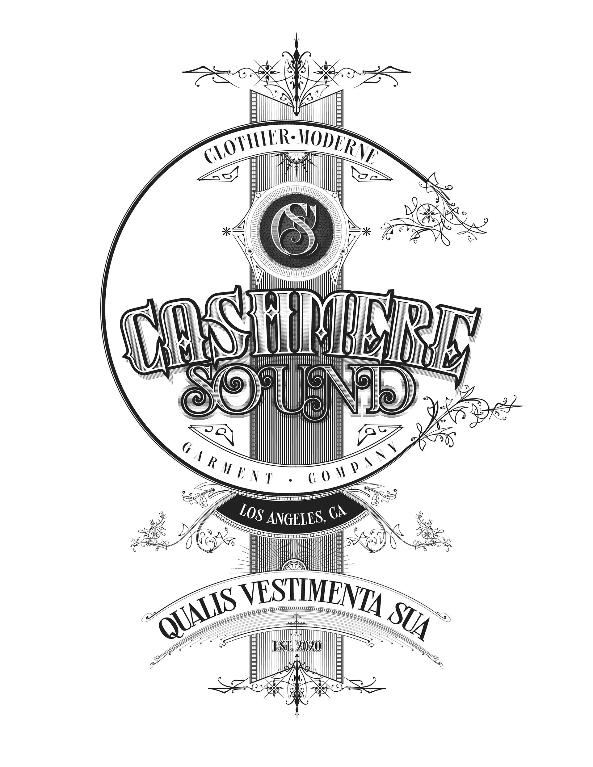
I conducted a deep dive into the ornate typography and architectural borders of Sanborn Map Company designs from the early 20th century. To achieve this level of historical authenticity, every element of the intricate linework was drawn by my hand in Adobe Illustrator. This level of extreme detail and density was intentional; by layering complex, hand-rendered flourishes and custom type, I created a visual “gravity” that demands closer inspection. This ensures the designs possess a unique, artisanal character that allows the wearer to truly stand out in a crowd of standard, mass-produced graphics.
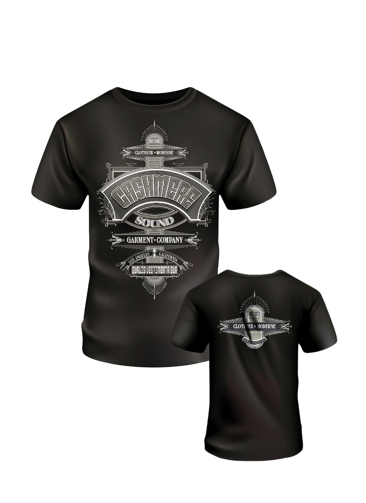
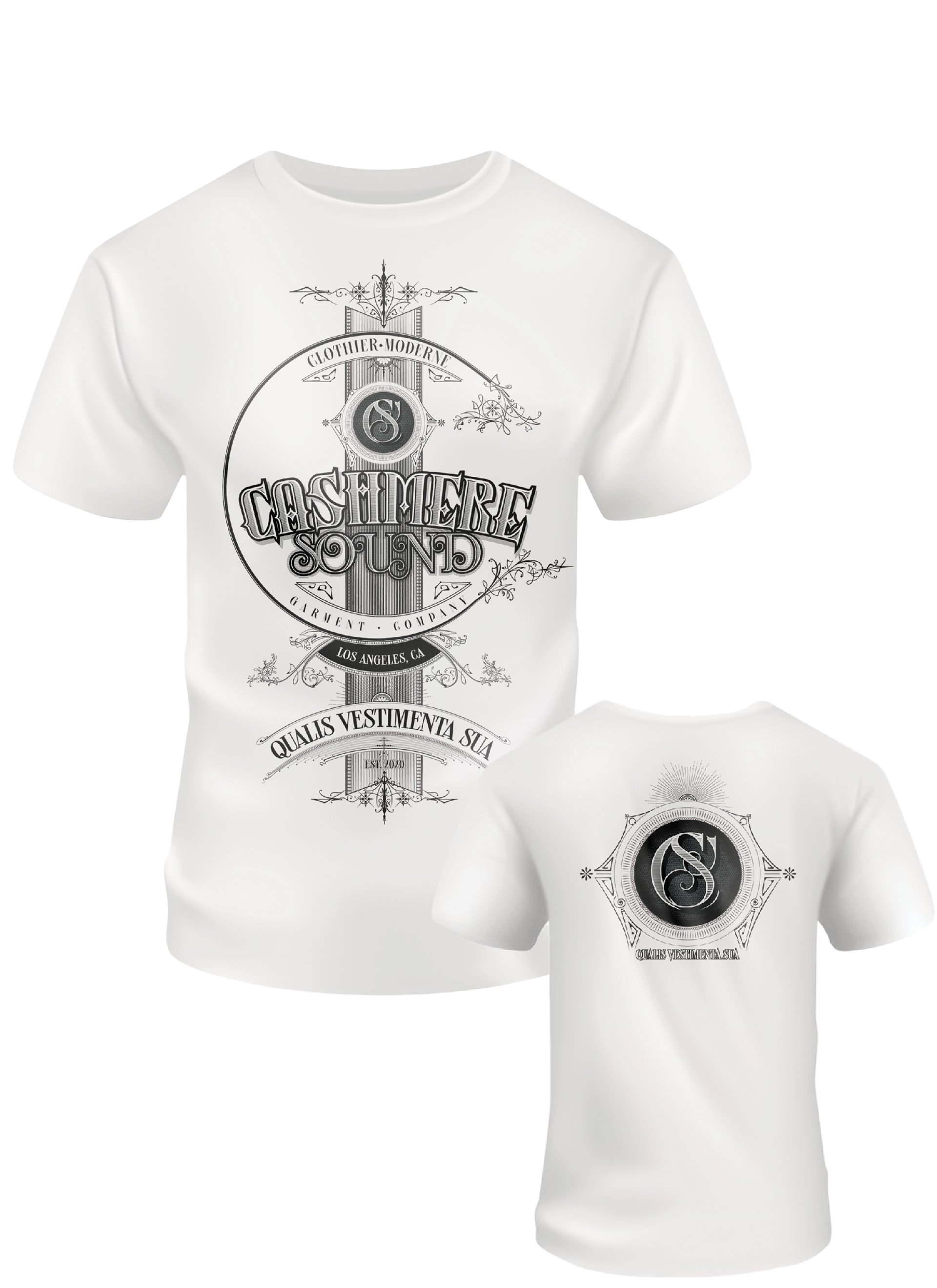
Concept 1
Light Theme – Front
Light Theme – Back
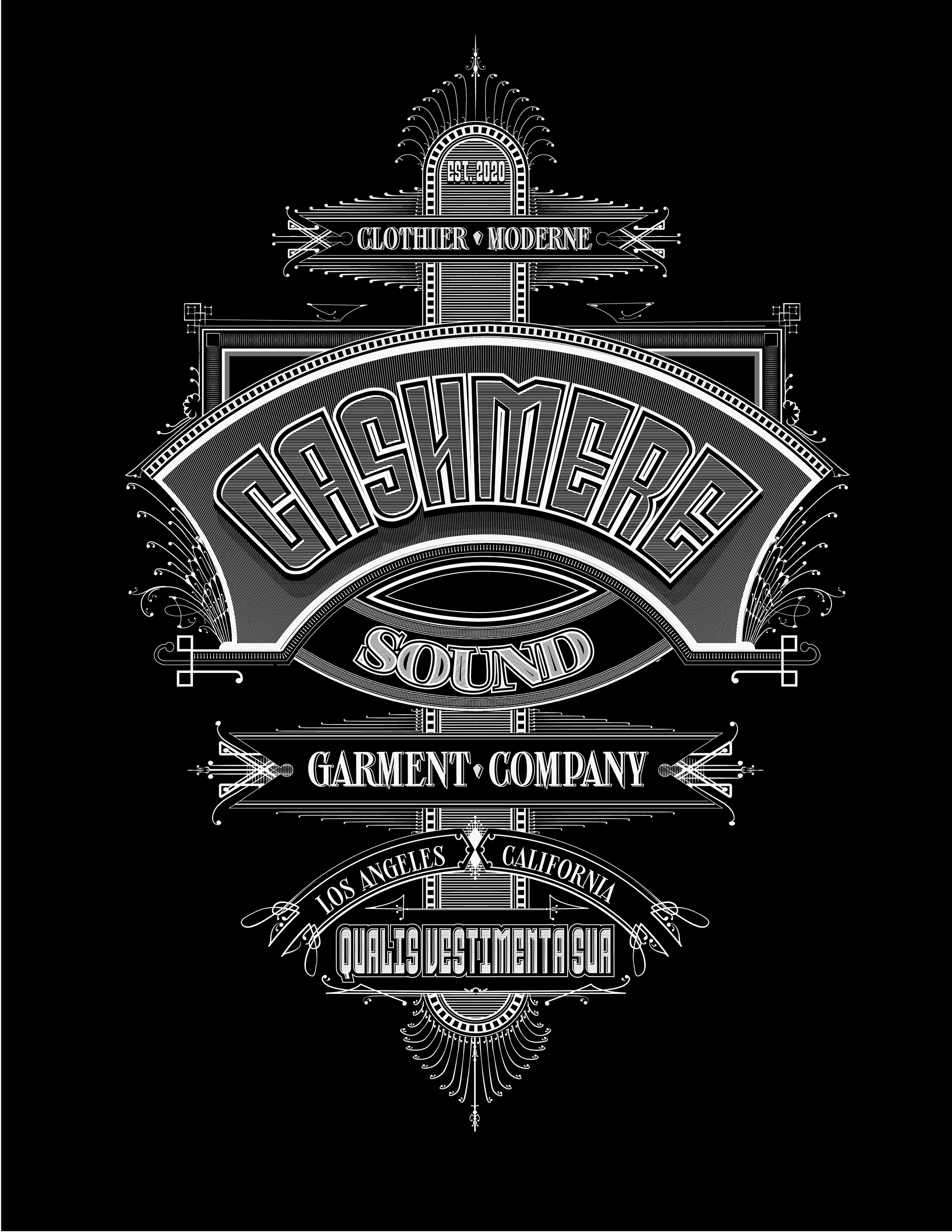
Dark Theme – Front
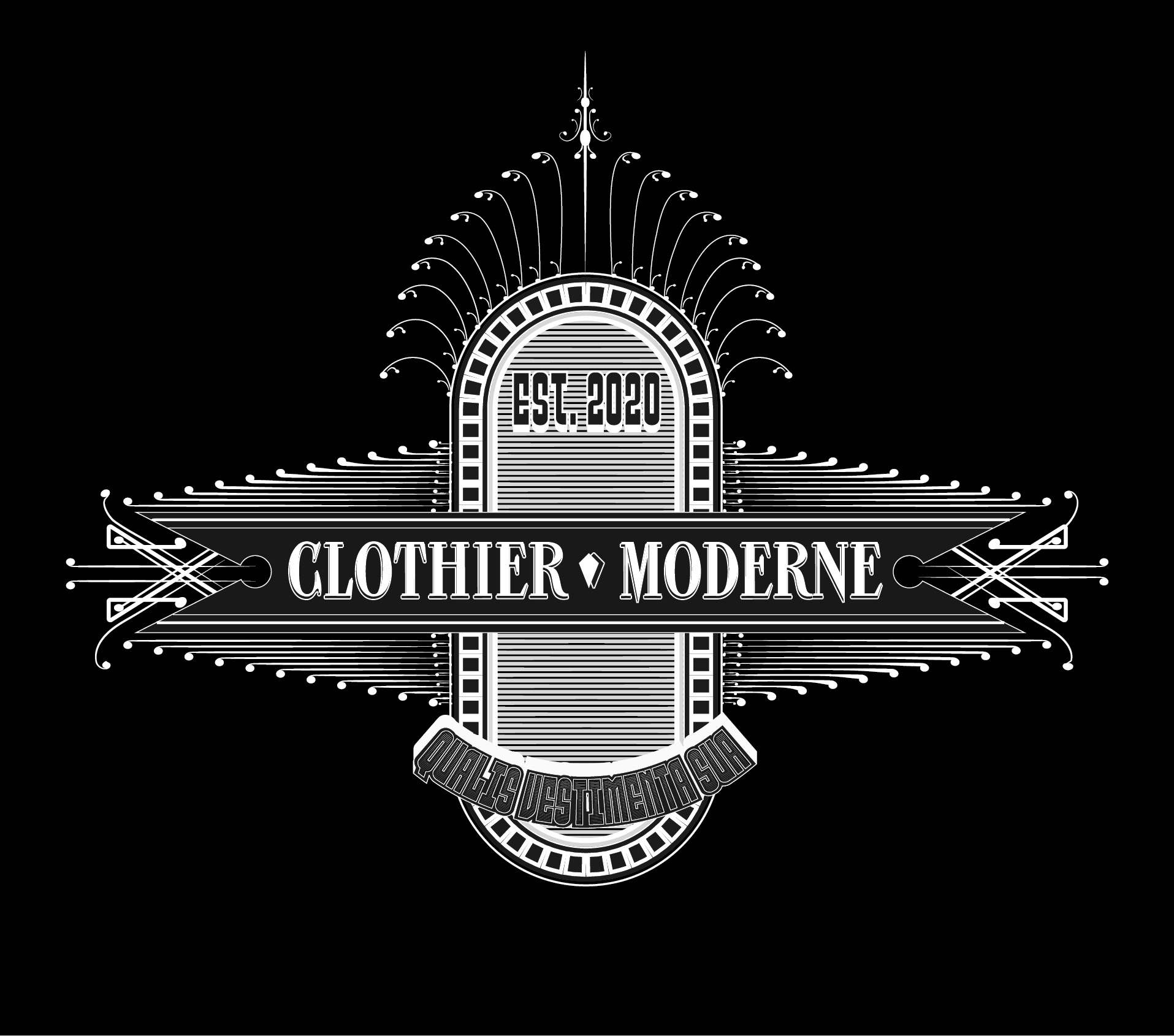
Dark Theme – Back
CONCEPT 2
Supplemental Concepts 3-6
CLIENT

LOGO DESIGN
CONCEPT, LAYOUT, TYPOGRAPHY, AND ILLUSTRATION
PROJECT DATE | 2024
BRIEF
The String Revolution, a Grammy-winning trio, required a brand identity reflecting their ability to generate a massive, full-band sound using only three guitars. The objective was to distill their virtuosity and eclectic blend of rock and jazz into a single, iconic mark suitable for global merchandising and digital platforms.
STRATEGY
I began by sketching a wide array of motifs, from vintage badges and guitar picks to abstract soundwaves, to find the right visual tone. The final solution strips away the noise, integrating three interconnected guitar silhouettes directly into custom typography to symbolize the trio’s seamless, unified performance style.
FINAL DESIGN
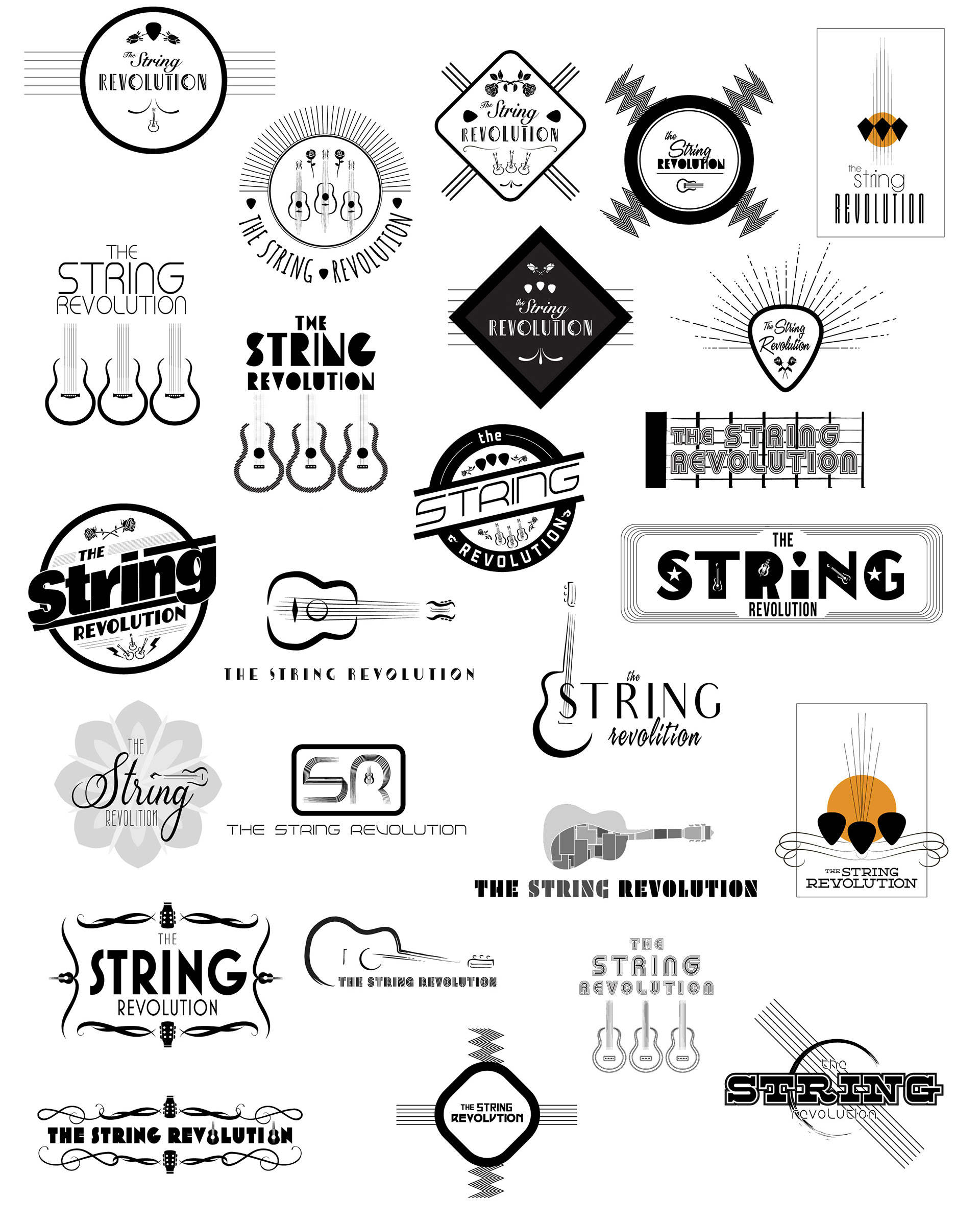
CONCEPT SKETCHES
CLIENT
NYC RESTAURANT

BRANDING, LOGO AND
PRESENTATION DECK DESIGN
PRESENTATION DECK DESIGN
CONCEPT, LAYOUT, TYPOGRAPHY
PROJECT DATE | 2020
BRIEF
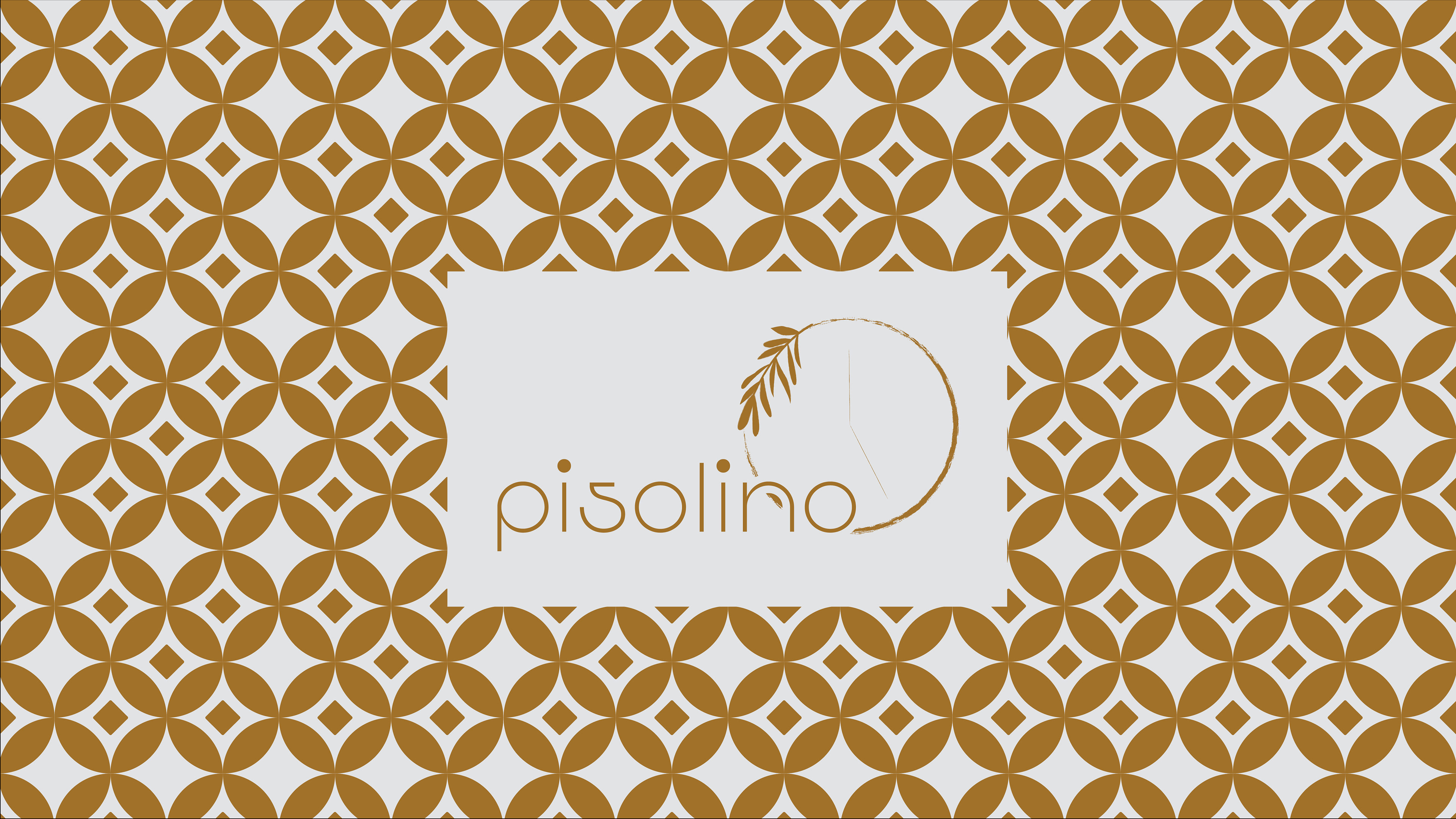
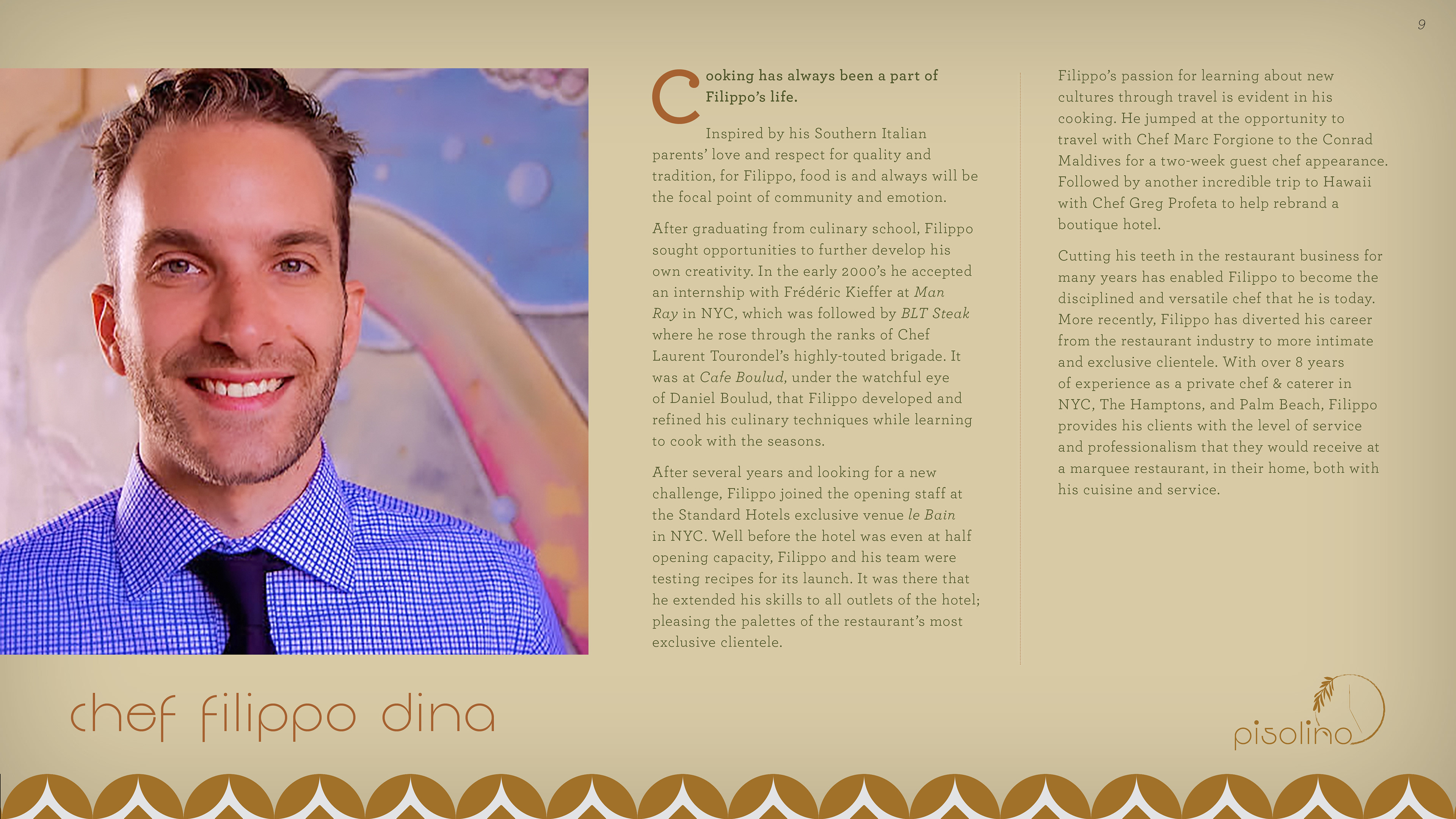
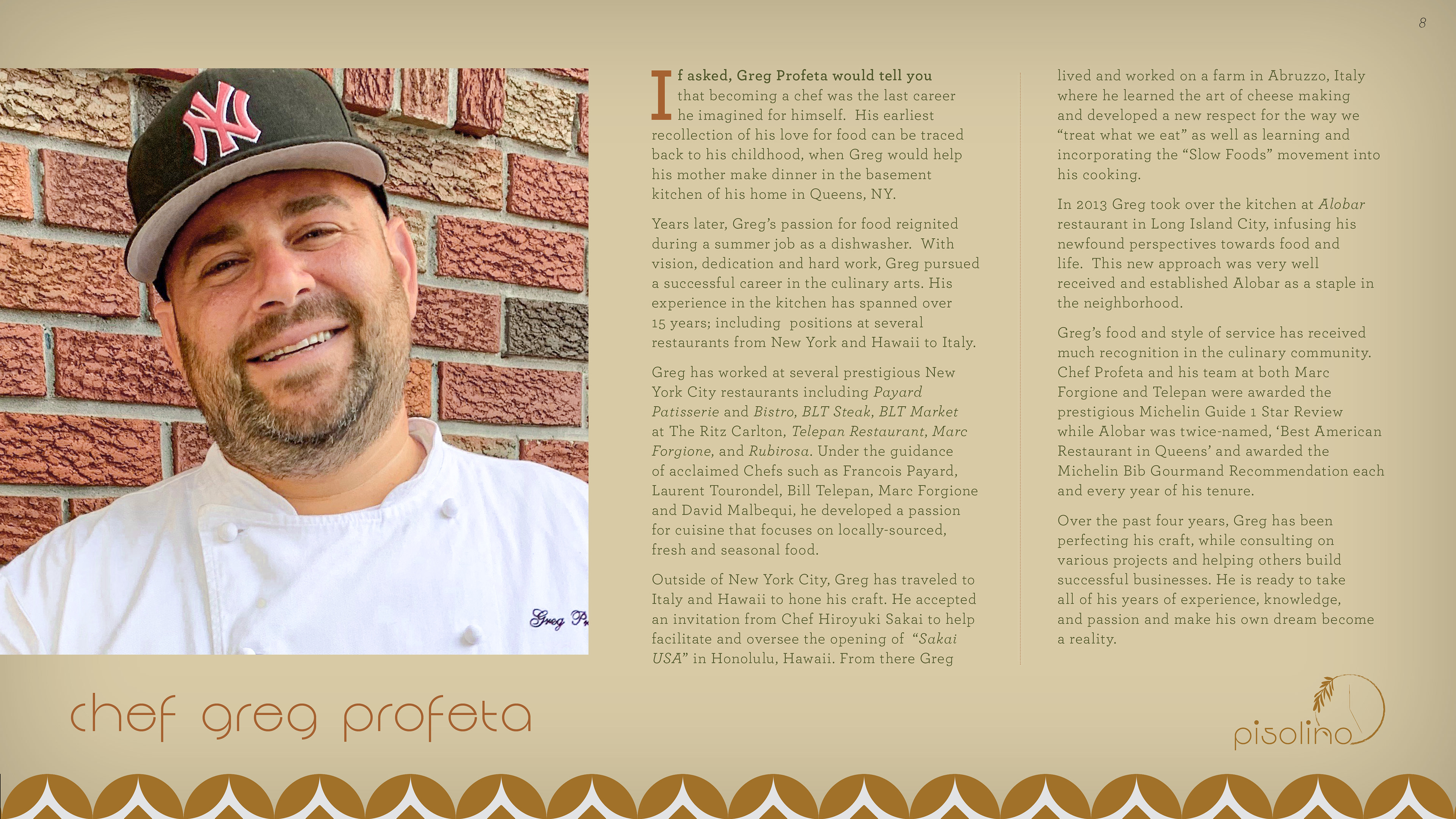
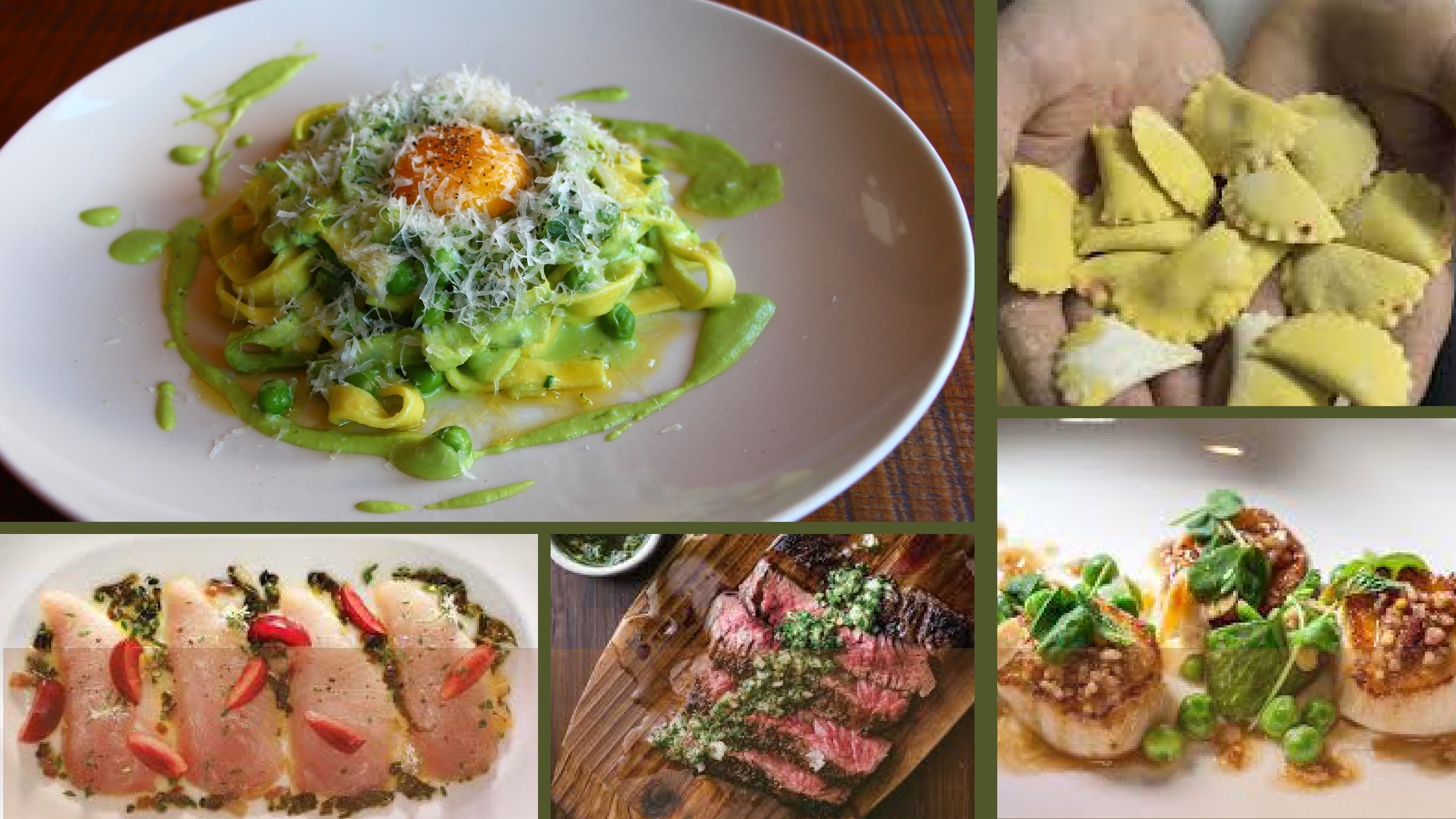
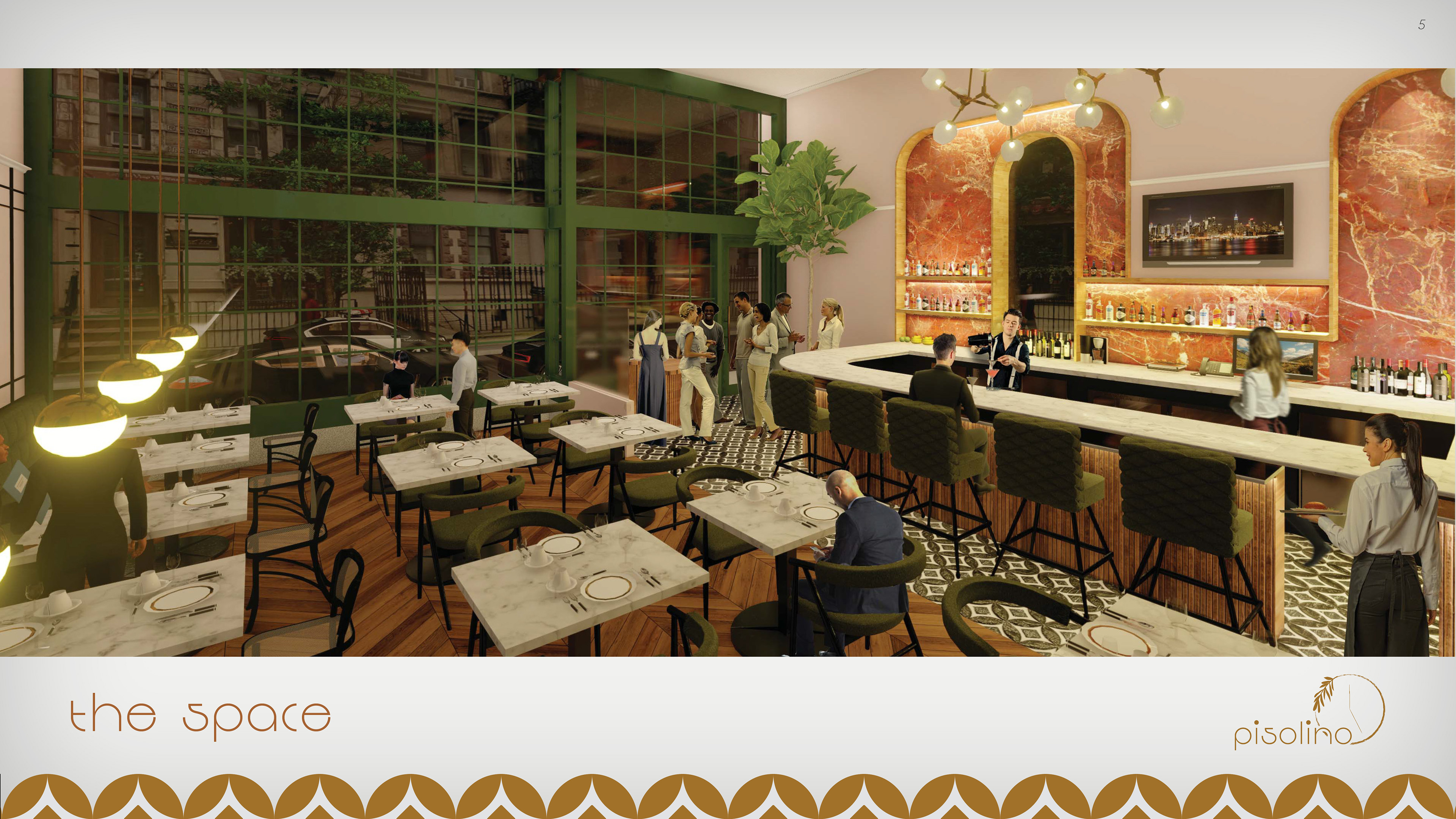
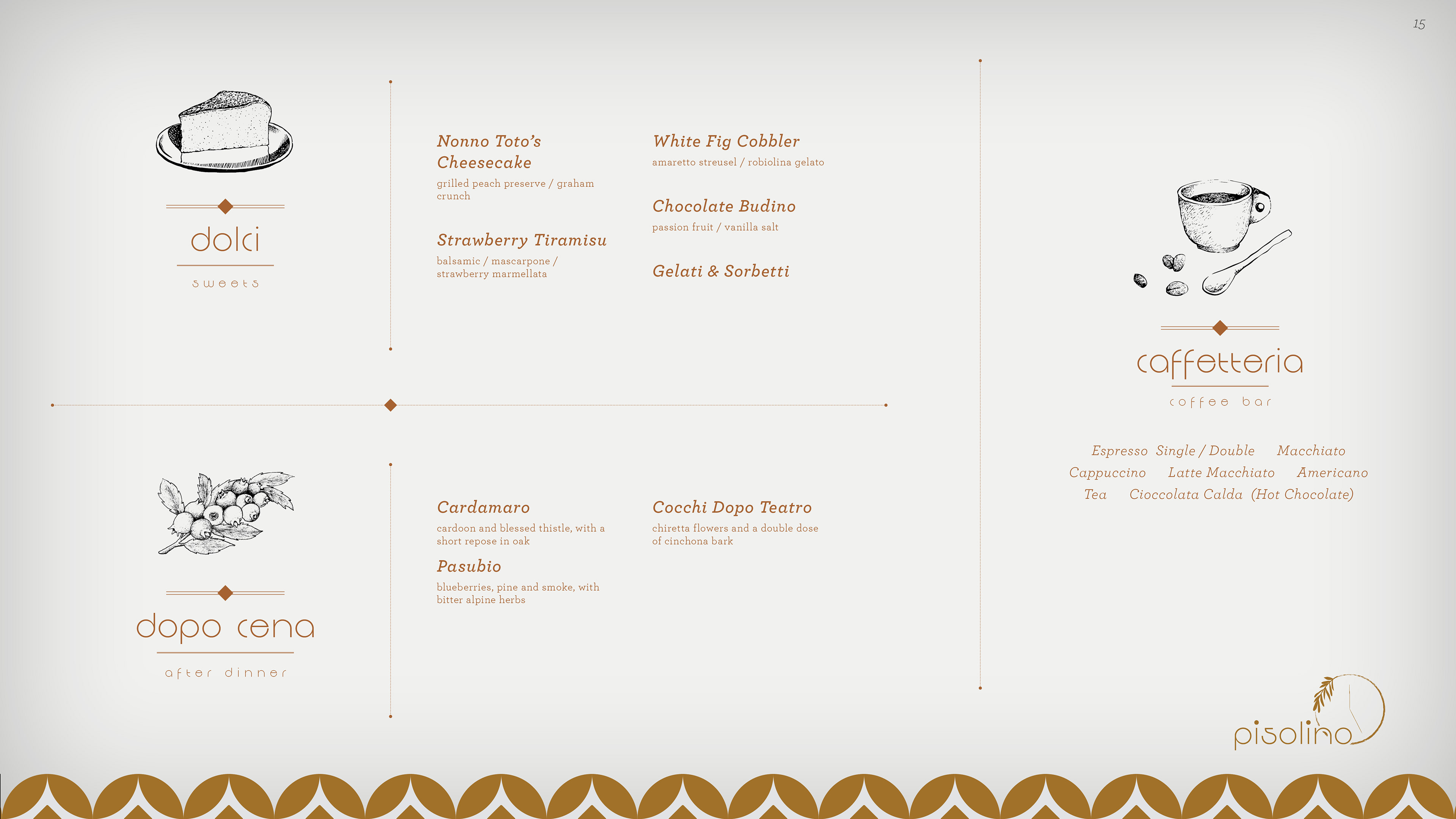
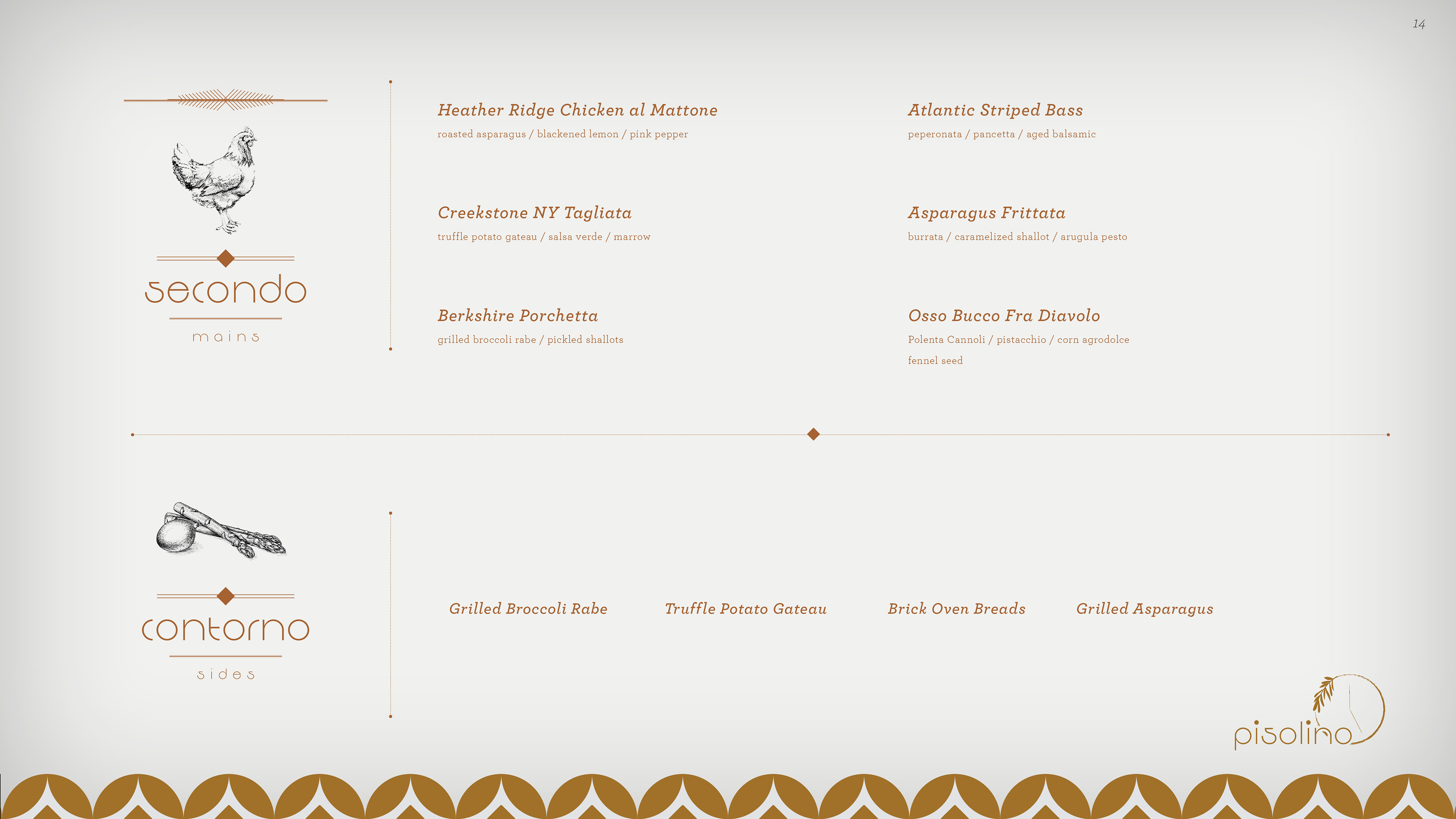
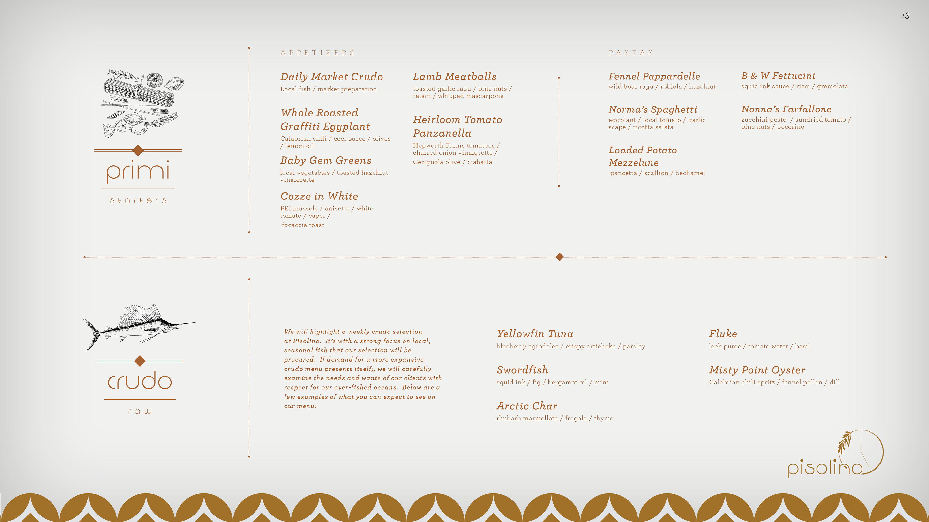
Create a cohesive brand identity and investor pitch deck for Pisolino, a new upscale Italian concept in NYC’s West Village. The goal was to secure funding by visually translating the restaurant’s culinary vision—authentic ingredients and rustic elegance—into a persuasive presentation highlighting the chef’s pedigree and guest experience.
STRATEGY
I designed a sophisticated aesthetic rooted in Italian tradition, featuring a custom geometric tile pattern and a warm ochre color palette. The layout balances high-end food photography with clean typography to evoke an atmosphere of refined hospitality, helping investors visualize the brand’s premium market potential.
CLIENT

Email Design
EVENT CALENDAR
CONCEPT, LAYOUT AND TYPOGRAPHY
Project DATE | 2018
CLIENT
www.americancannabisreport.com

Email Design
Weekly Newsletter
CONCEPT, LAYOUT AND TYPOGRAPHY
Project DATE | 2018