CLIENT

VENUE PARTNER DATA SHEET
BUSINESS TO BUSINESS COLLATERAL
BUSINESS TO BUSINESS COLLATERAL
CONCEPT, LAYOUT, AND TYPOGRAPHY
PROJECT DATE | 2025
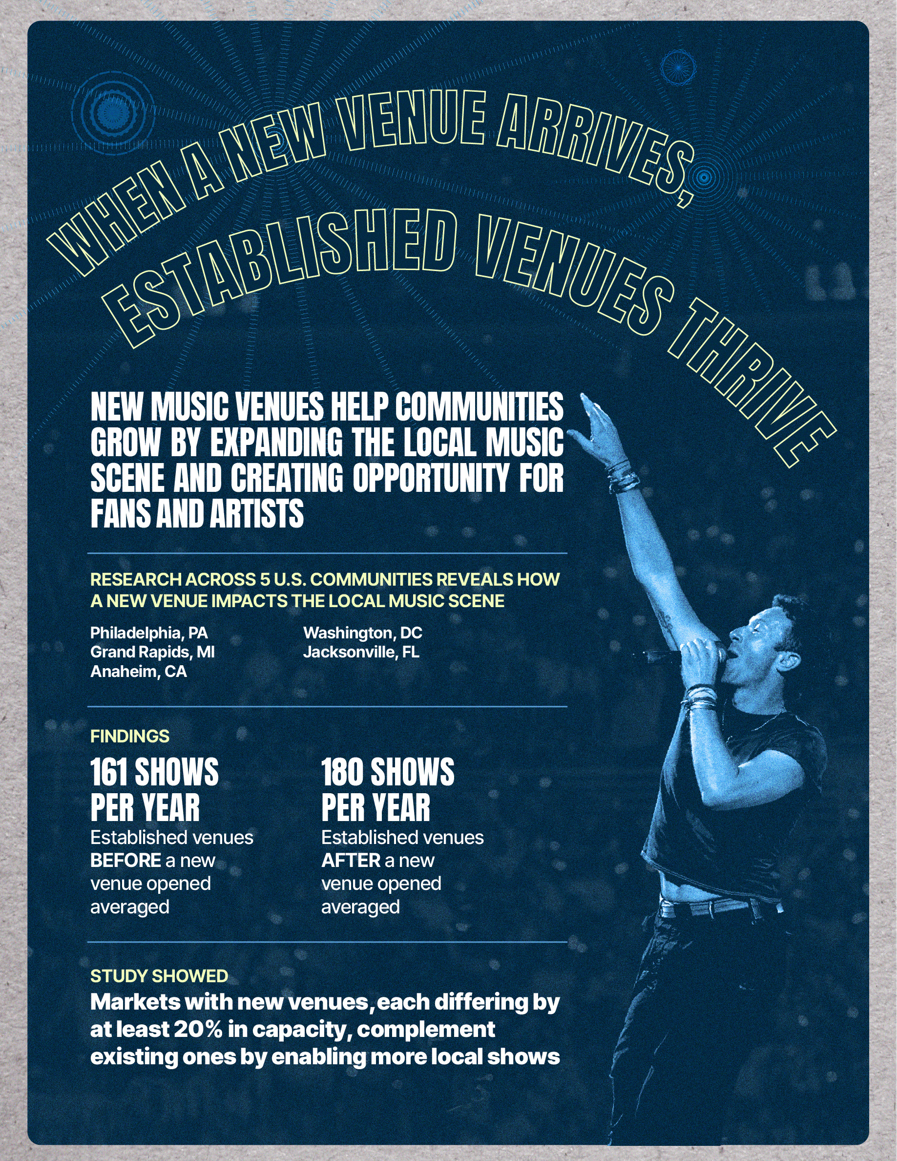
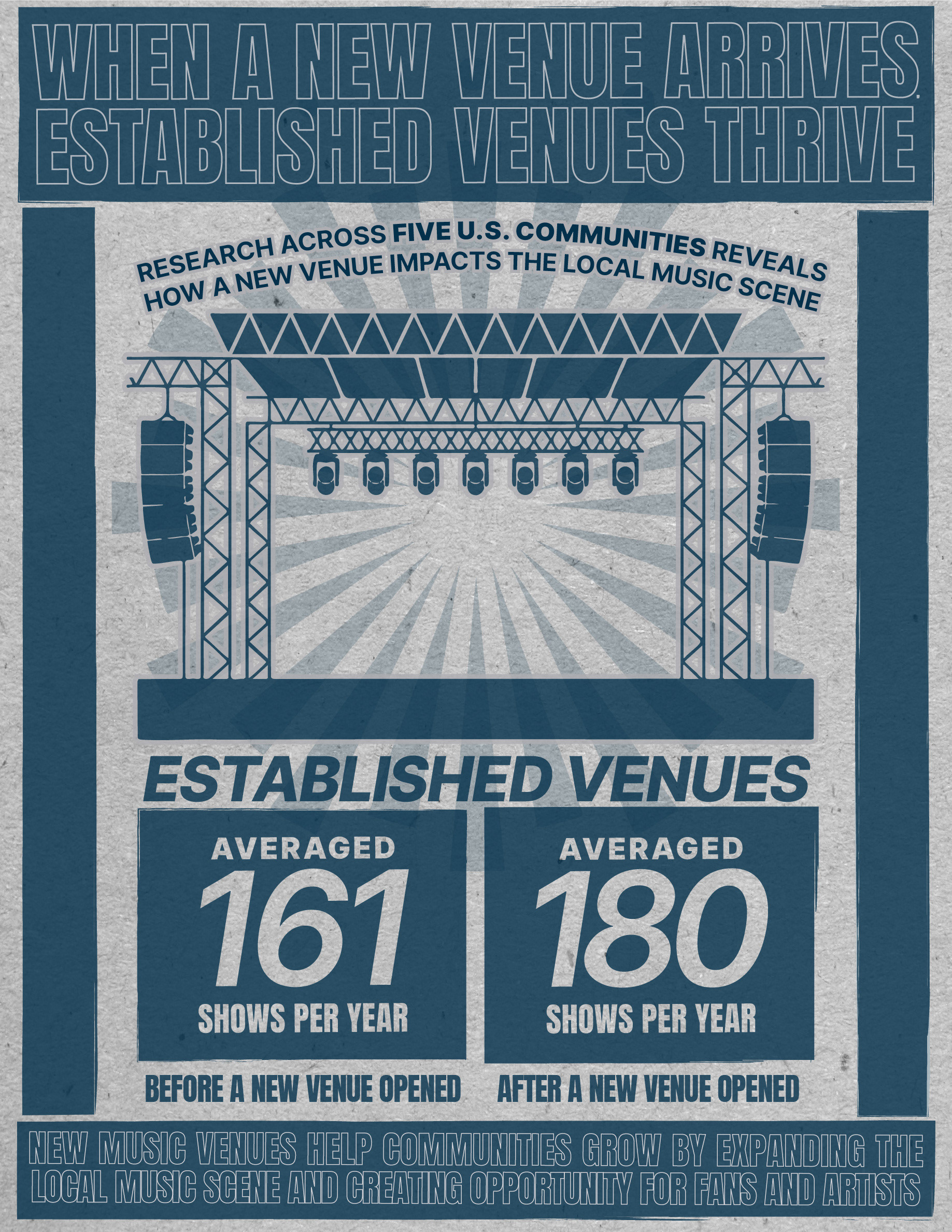
BRIEF
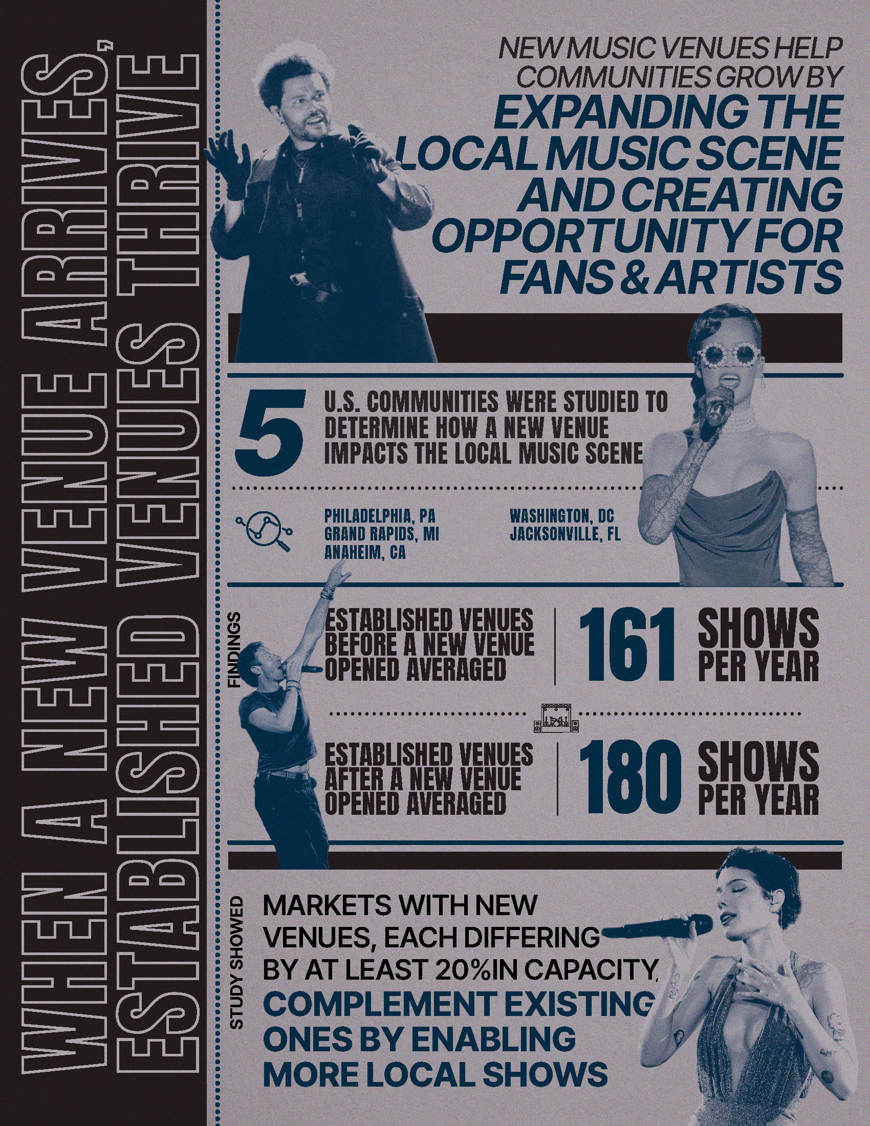
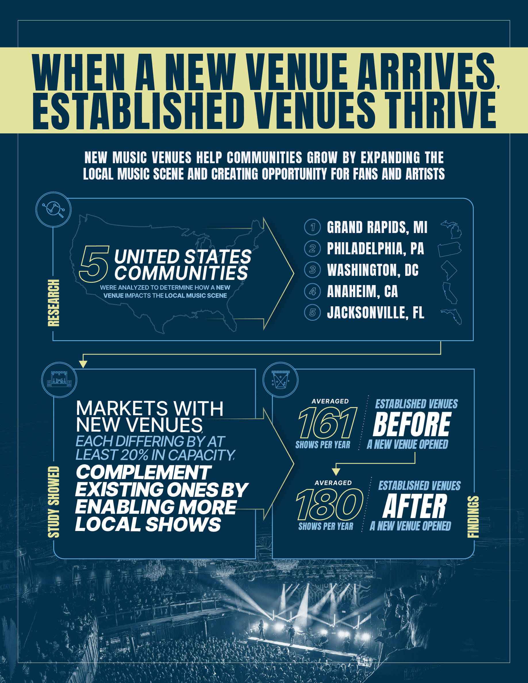
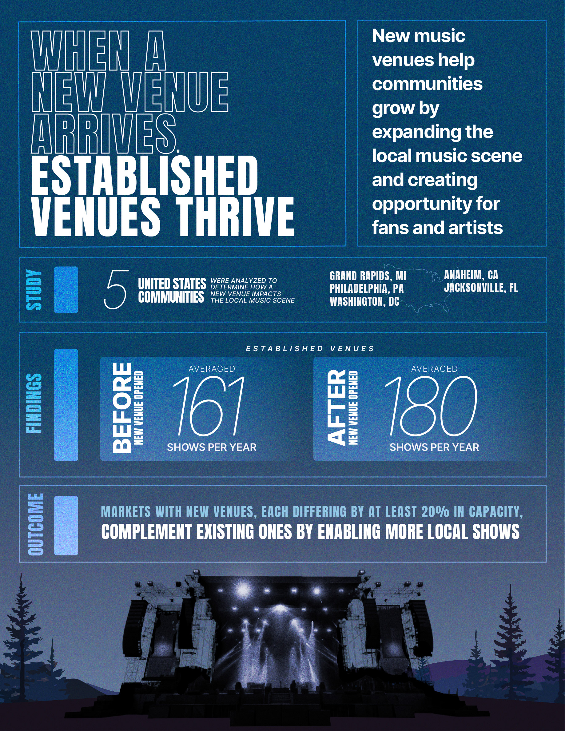
The live music industry battles a cynical myth: that big, new venues destroy scrappy local clubs. This “David vs. Goliath” narrative makes city planners nervous. Live Nation needed to shatter this misconception with hard data from five markets. The challenge was translating a dense impact study into a visual narrative proving the counter-intuitive truth: big stages actually create more opportunities for small ones.
STRATEGY
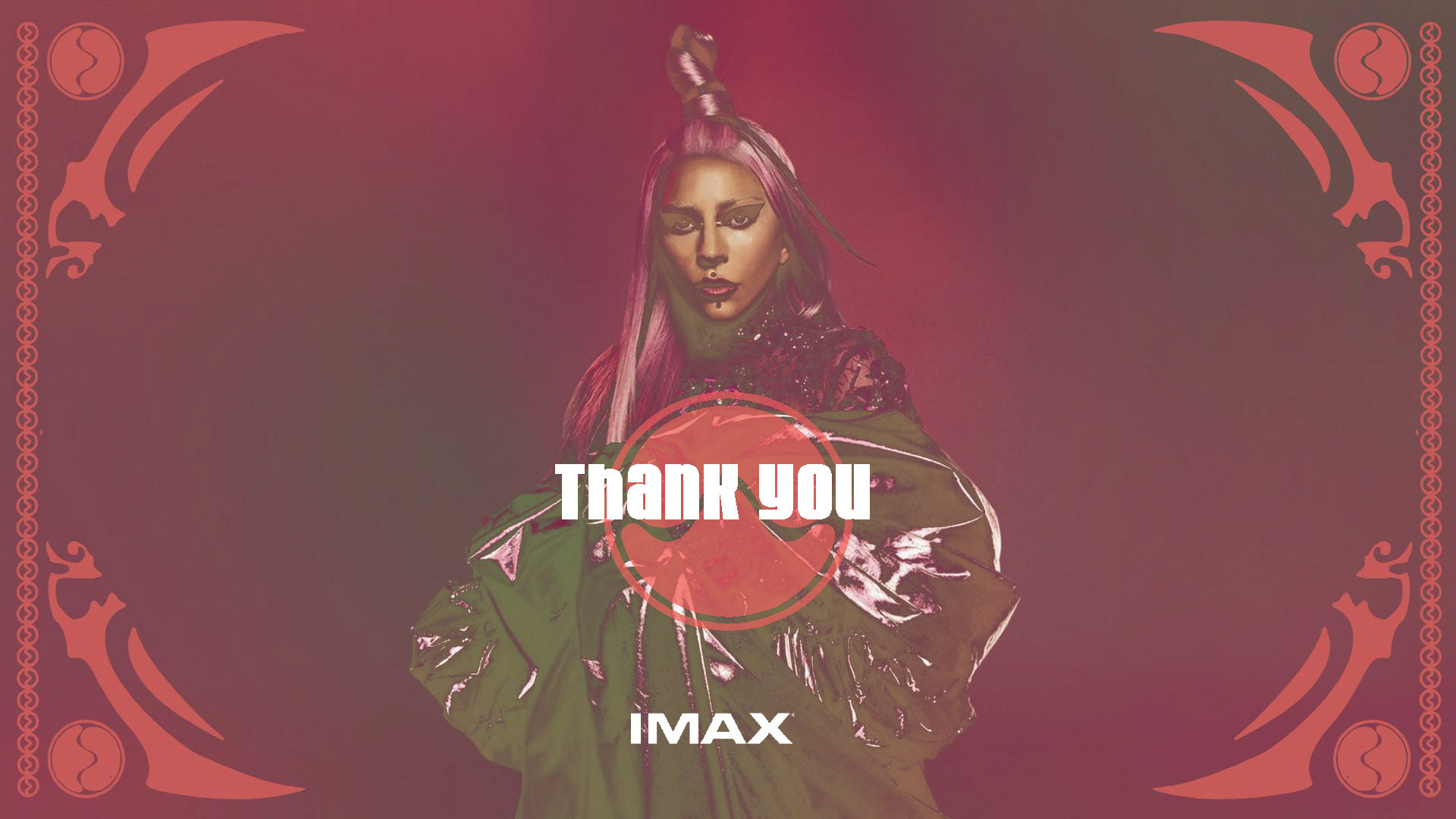
I developed a visual spectrum ranging from visceral to analytical. One direction captures the grit and soul of the front row through texture and type, while the other utilizes clean grids for corporate authority. This flexible system ensures the data resonates with every stakeholder, from fans to city officials, proving a new venue is an amplifier, not a threat.
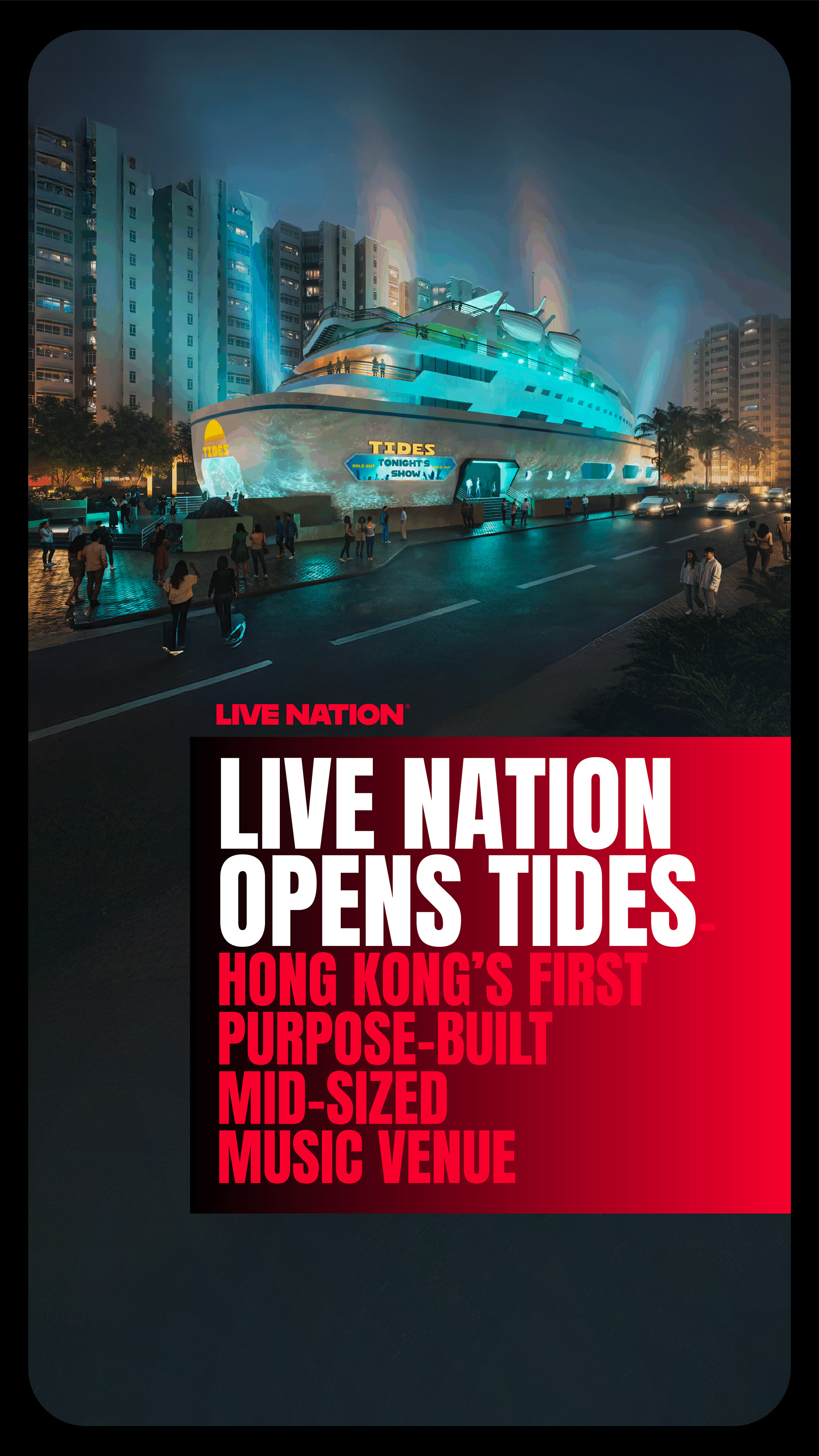
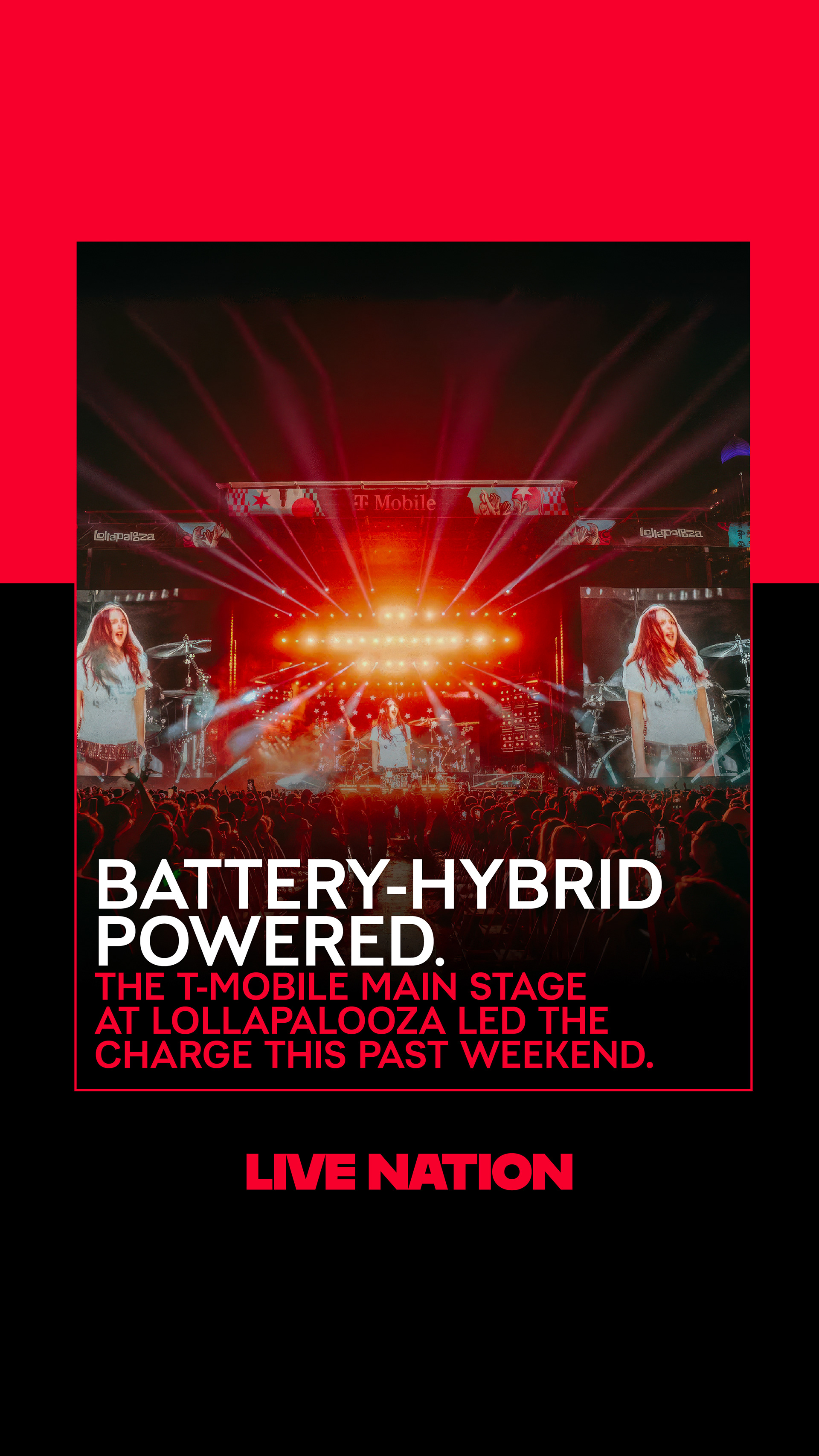
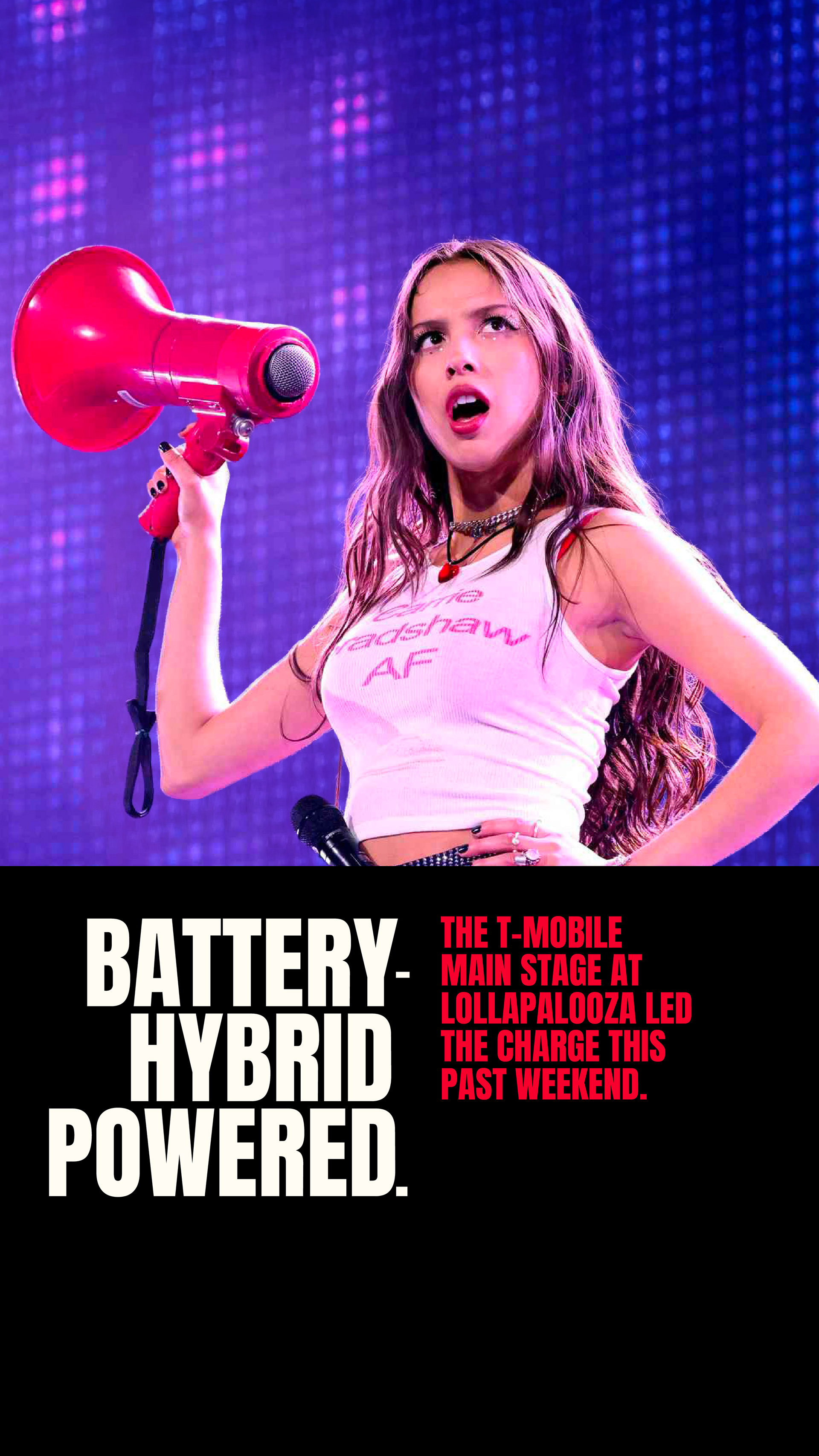
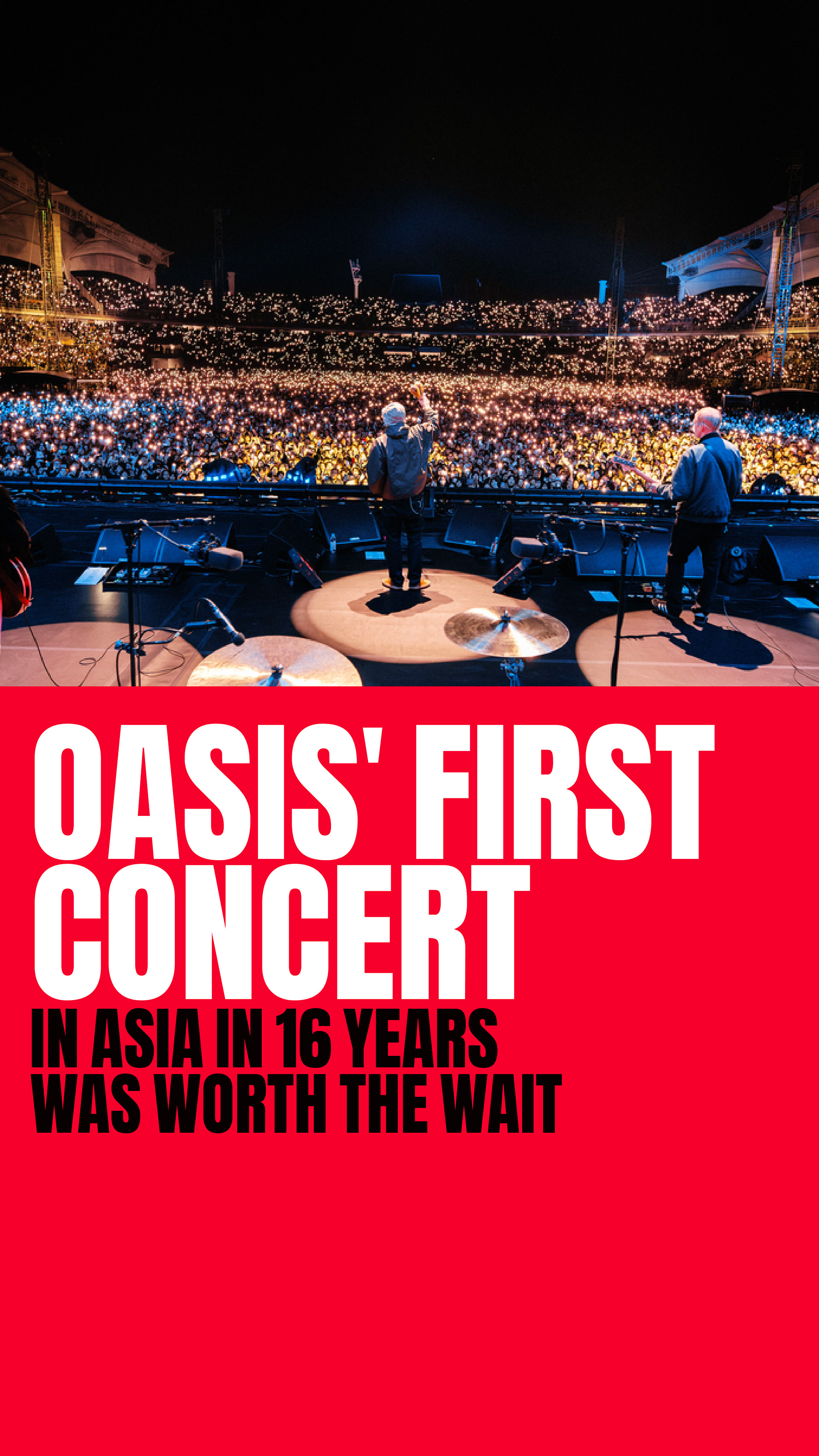
CLIENT

SOCIAL MEDIA TEMPLATES
CONCEPT, LAYOUT, AND TYPOGRAPHY
PROJECT DATE | 2025
BRIEF
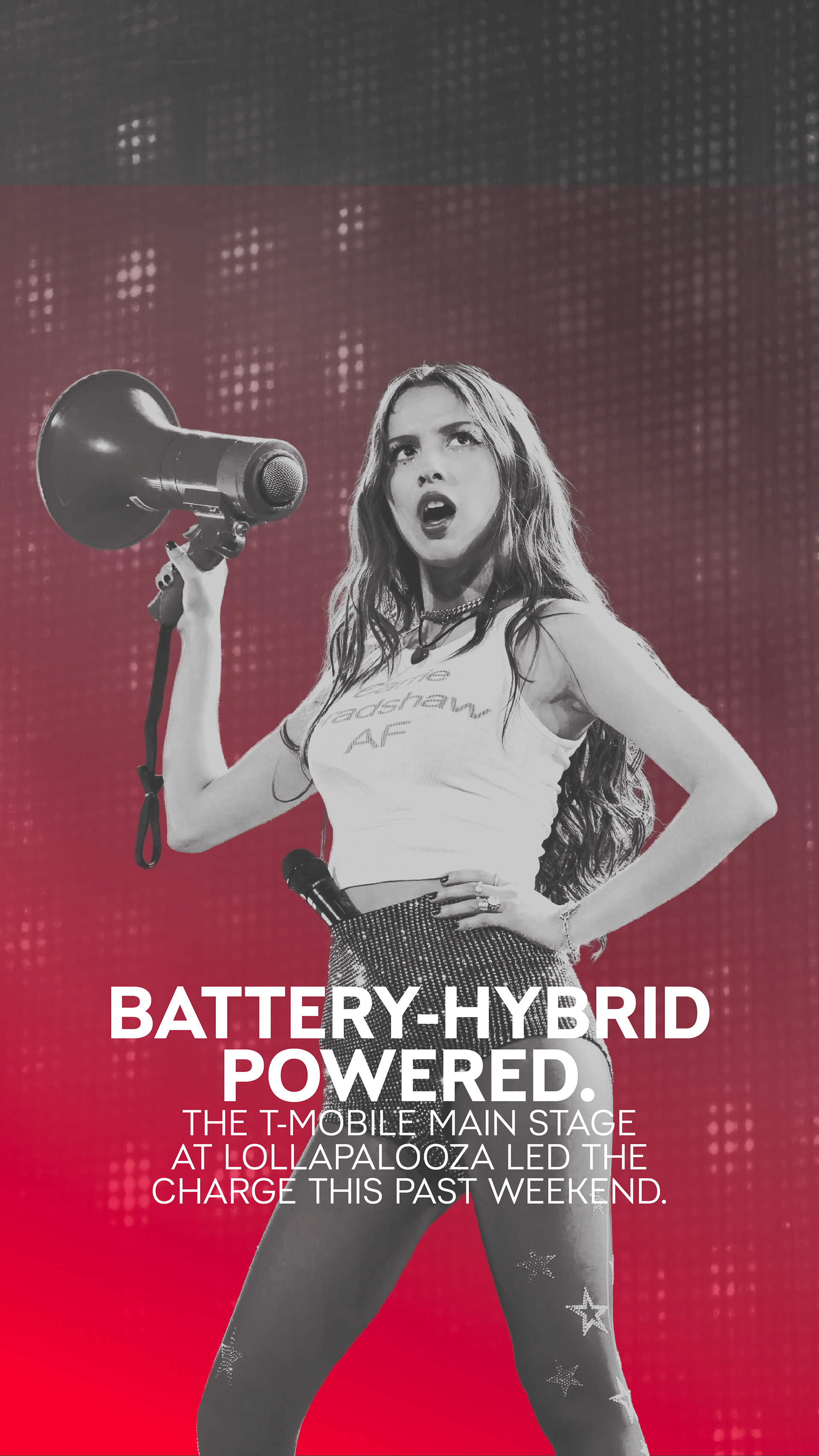
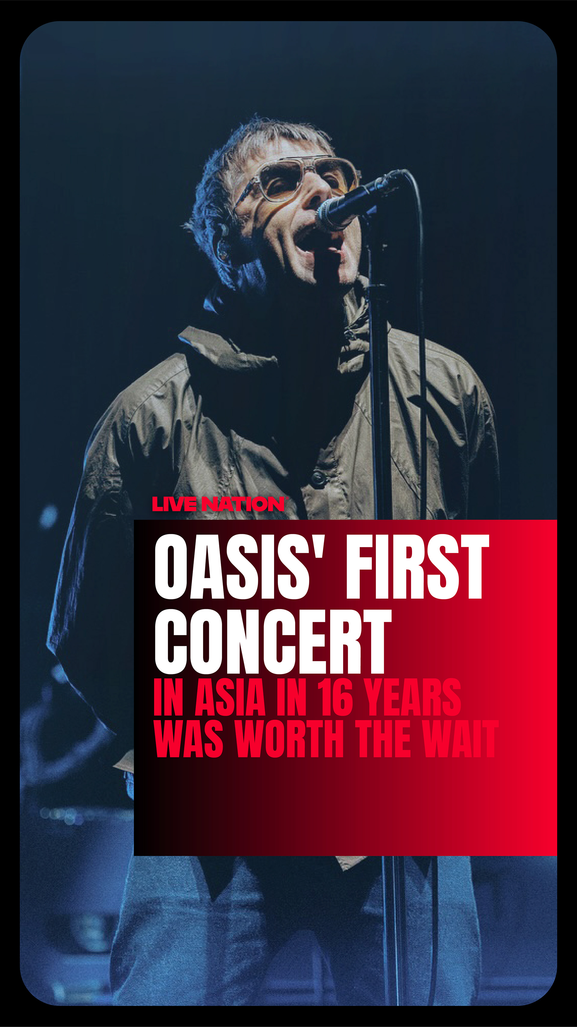
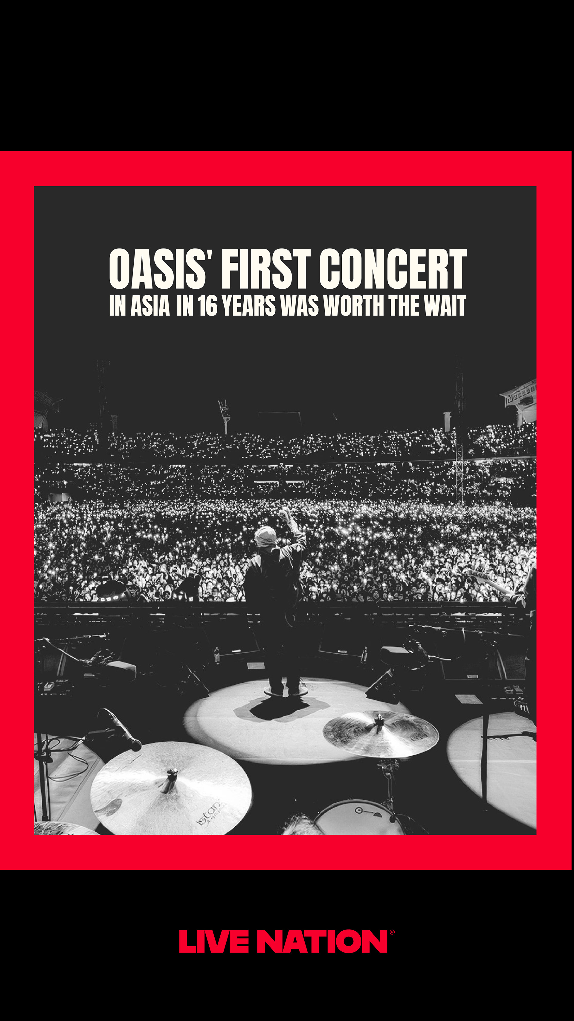
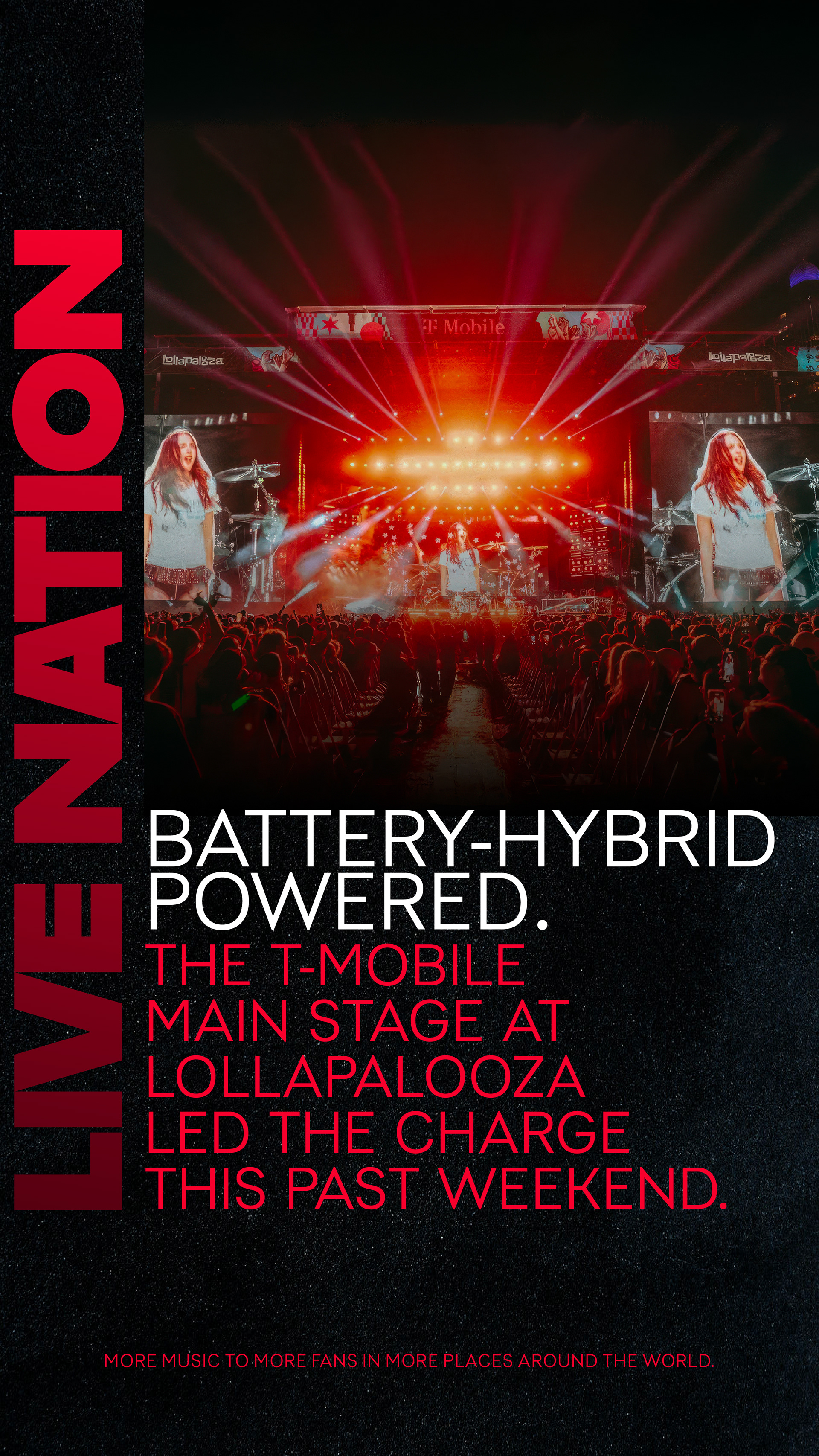
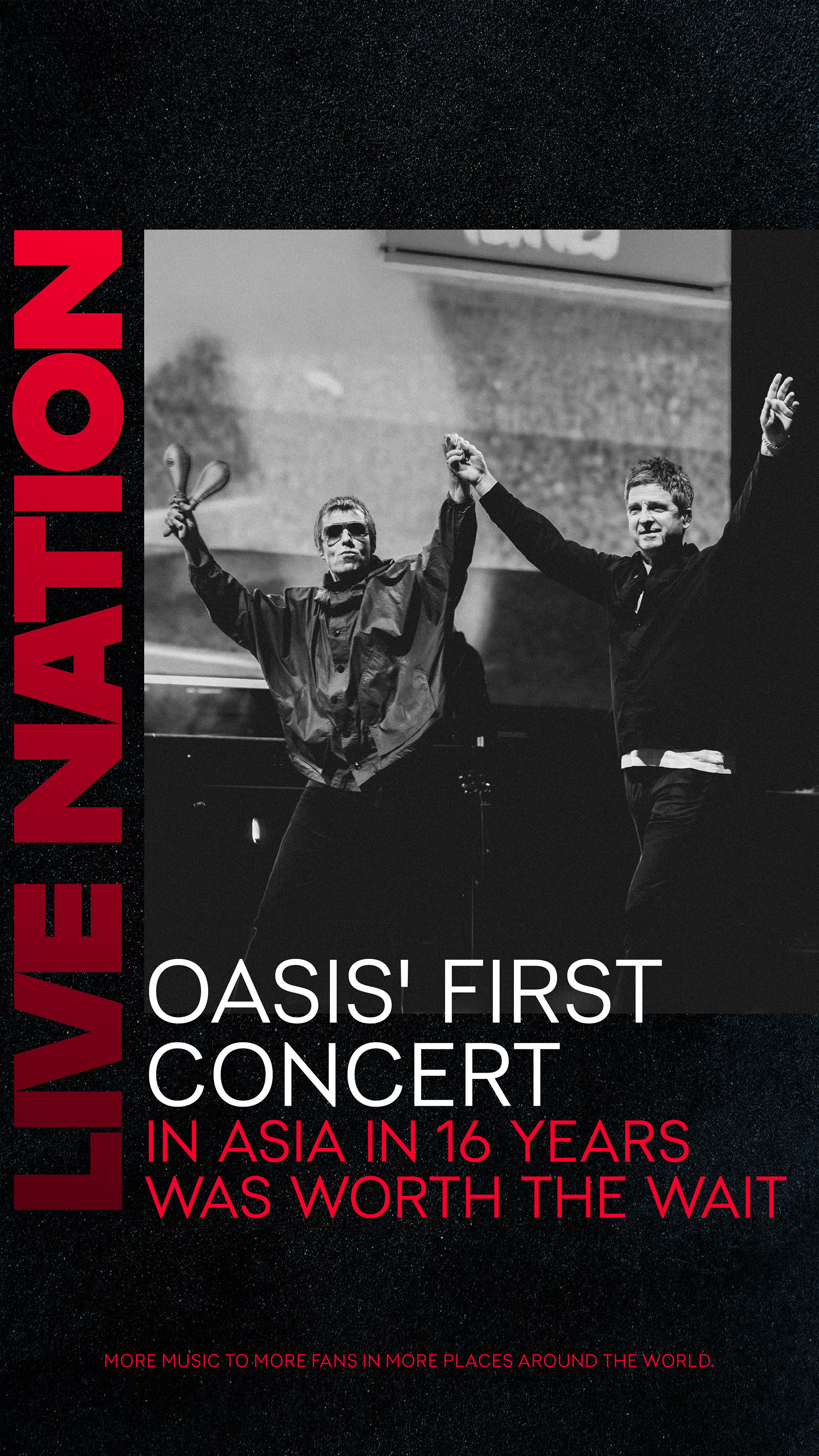
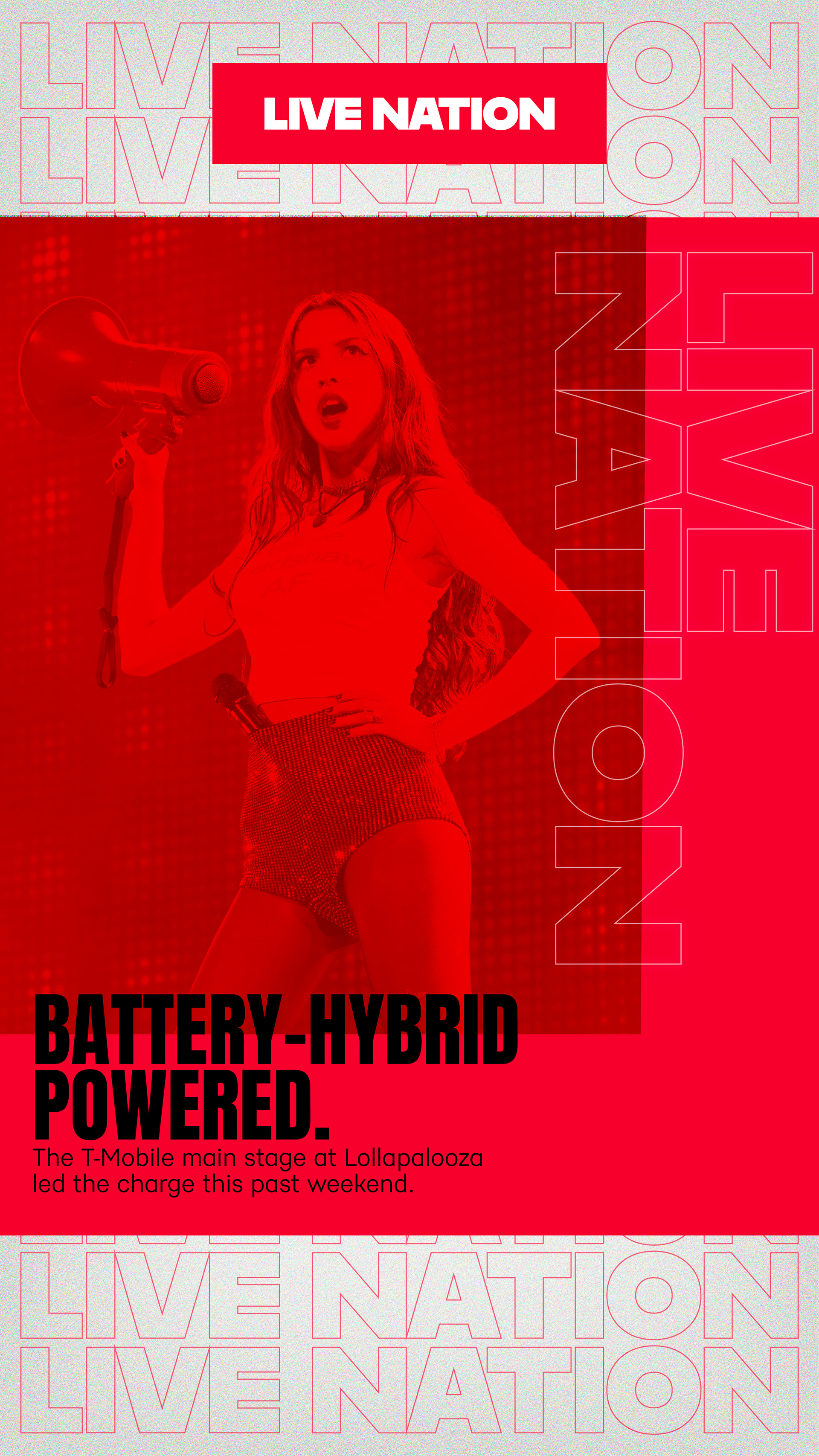
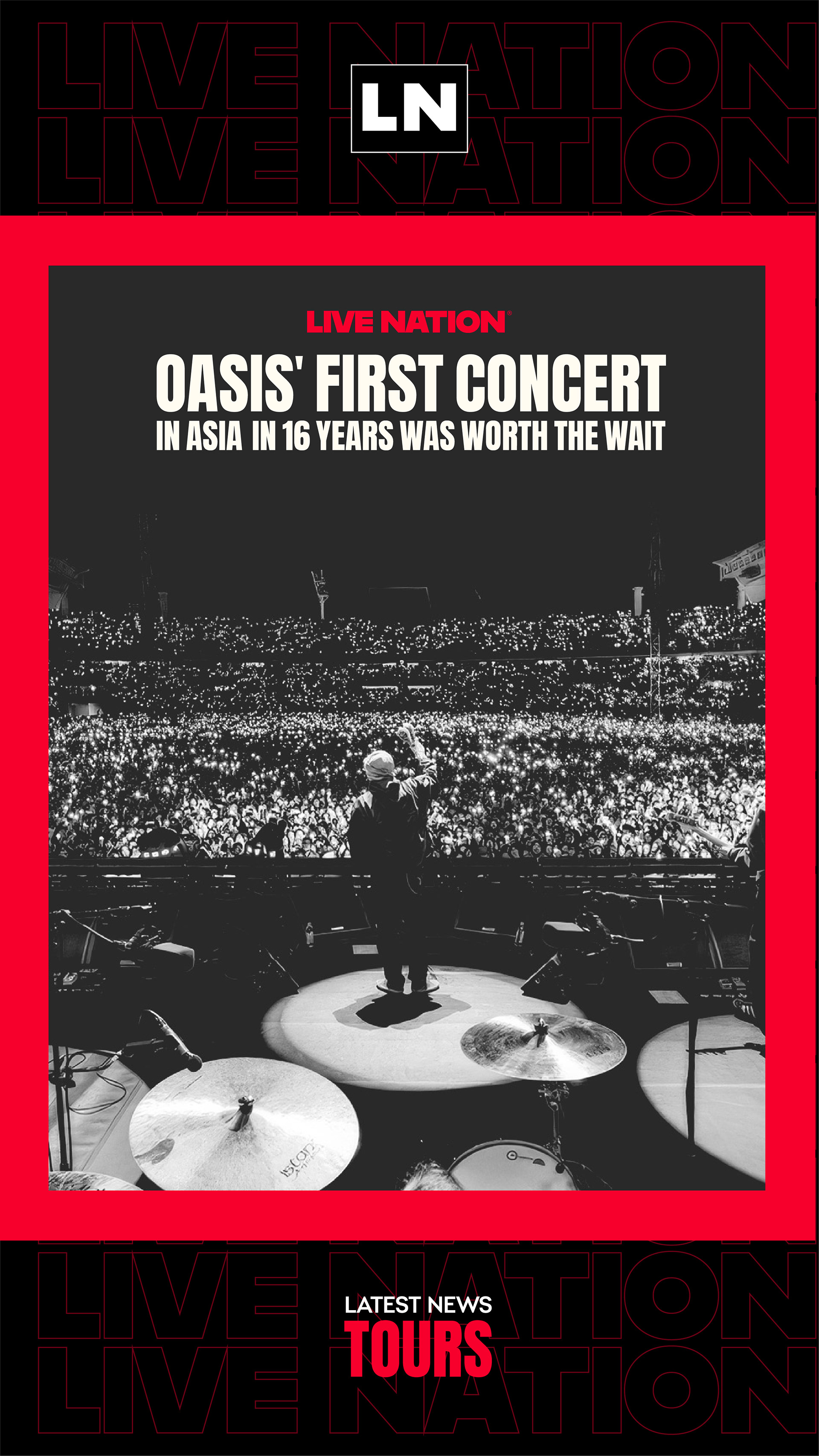
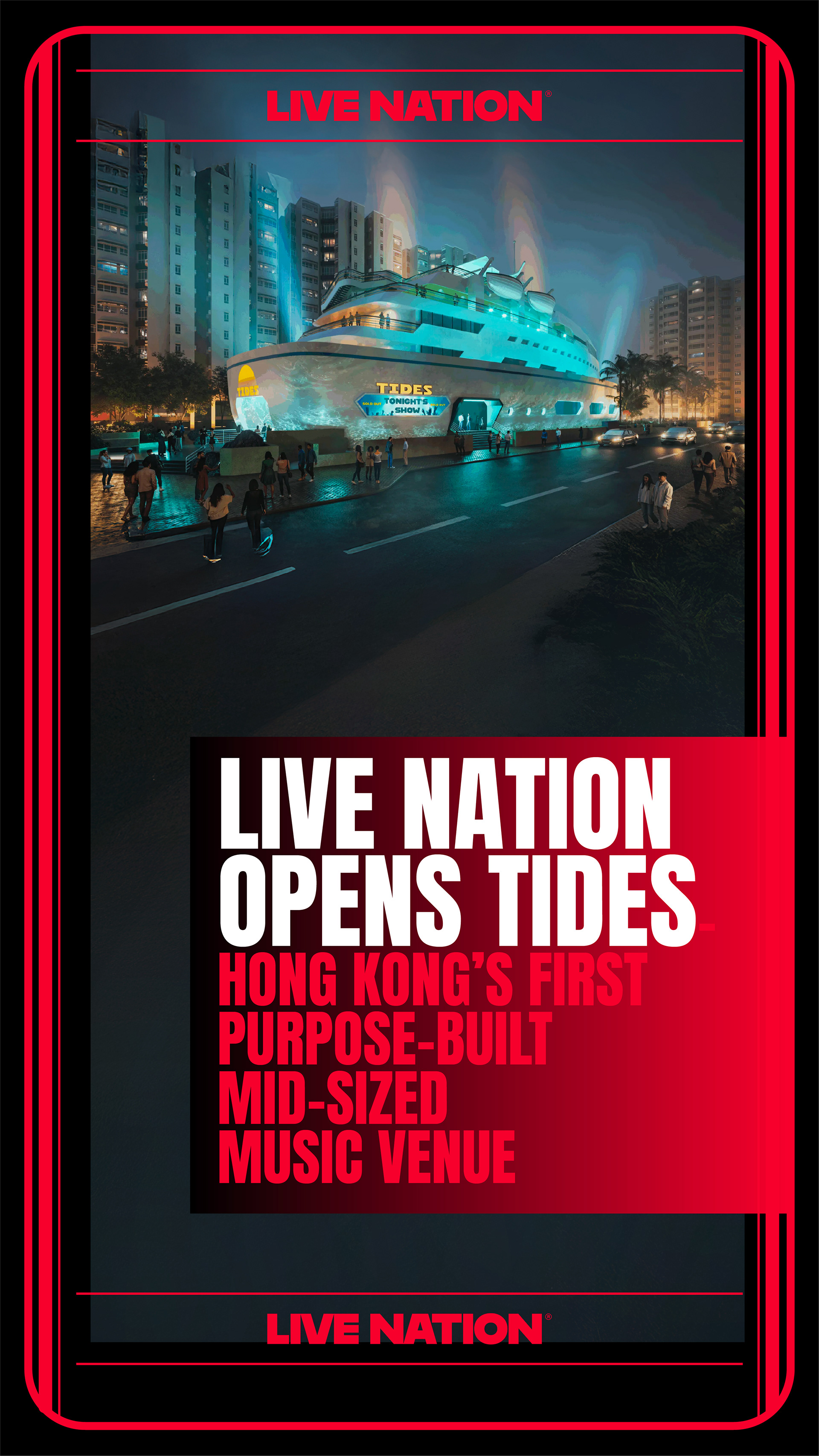
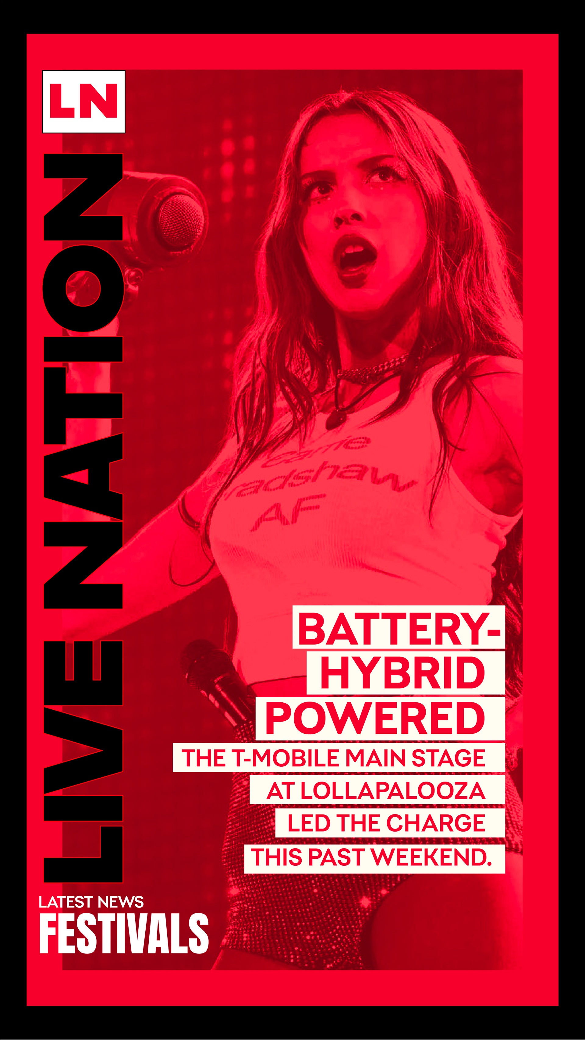
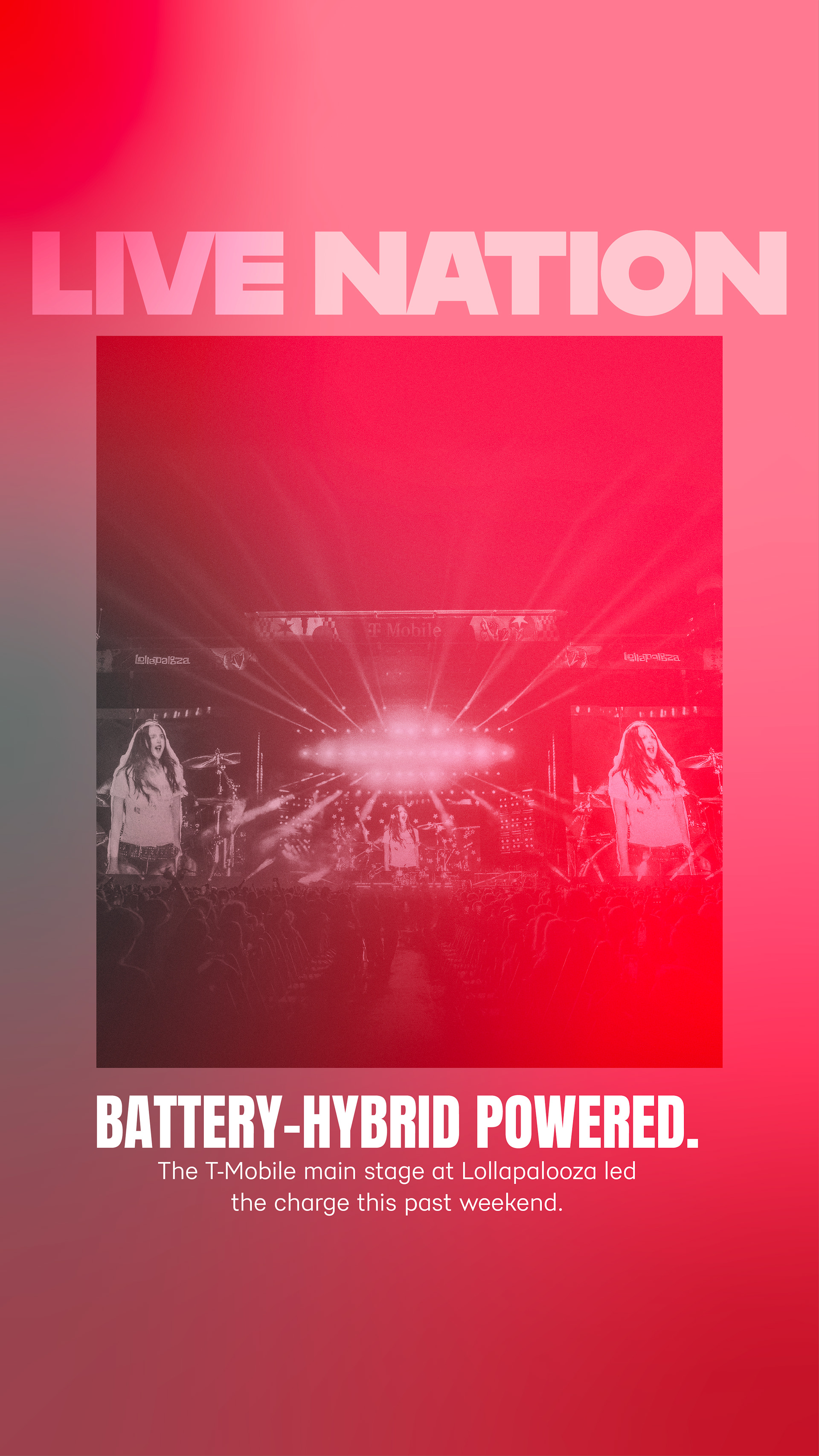
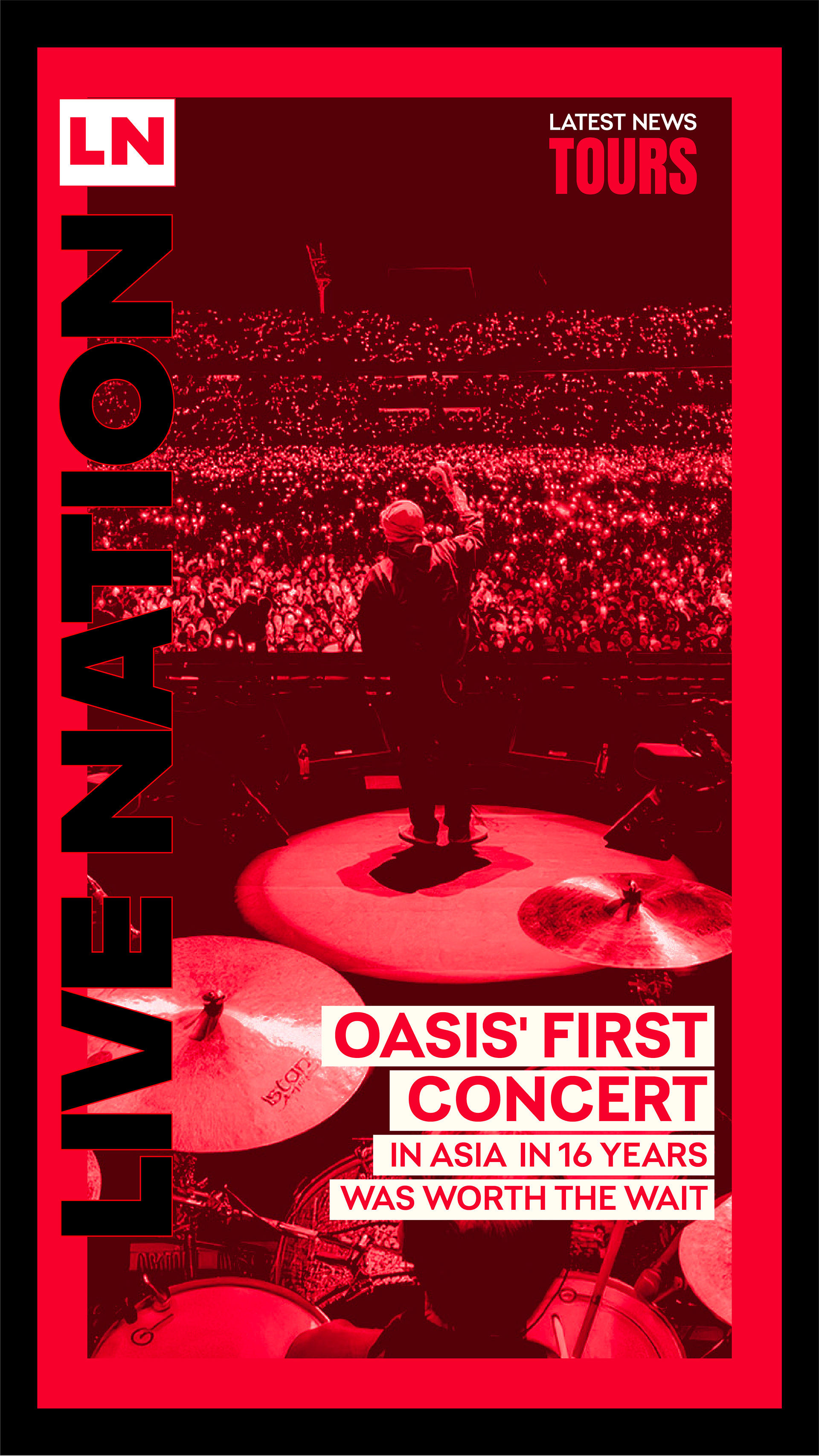
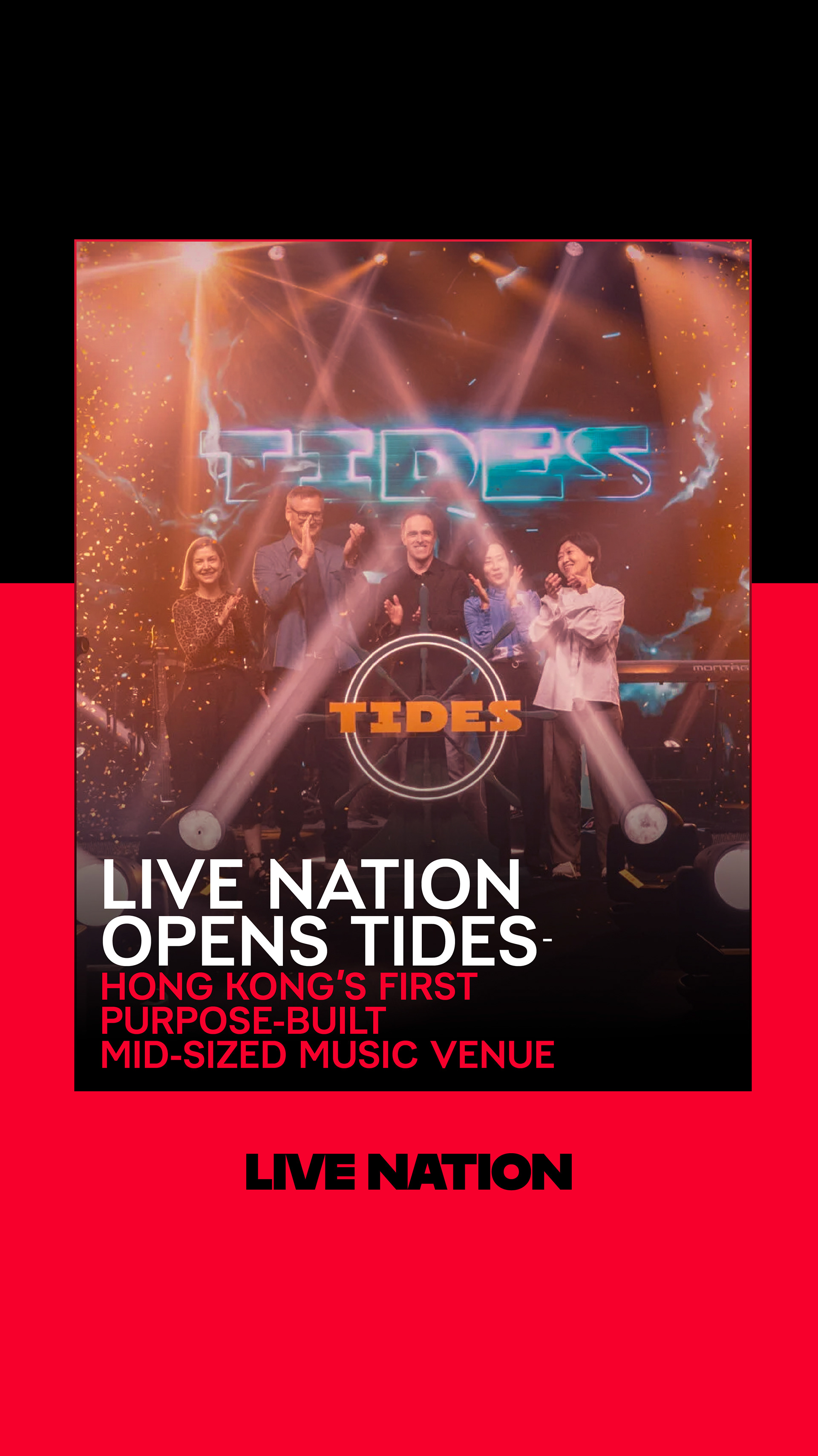
Live Nation’s CEO needed a social presence that matched the electrifying energy of the world’s biggest stages. The objective was to move beyond generic corporate updates and establish a “social-first” visual language. The challenge was creating a cohesive template system for Instagram Stories, X, and Threads that balanced executive authority with the raw, high-contrast aesthetic of live music culture.
STRATEGY
I engineered a high-octane visual identity utilizing a bold red, black, and white palette to cut through the noise of social feeds. The design leverages gritty textures and heavy typography to reflect the brand’s sonic roots. Functionally, I built organized Photoshop templates with strict 4:5 safe zones, ensuring seamless adaptability across vertical formats like Instagram and Threads without losing impact.

CLIENT
FOR

AWARDS SEASON ADVERTISING AND MARKETING
CONCEPT, LAYOUT, TYPOGRAPHY, PHOTO MANIPULATION AND COMPOSITING
PROJECT DATES | 2023-2025

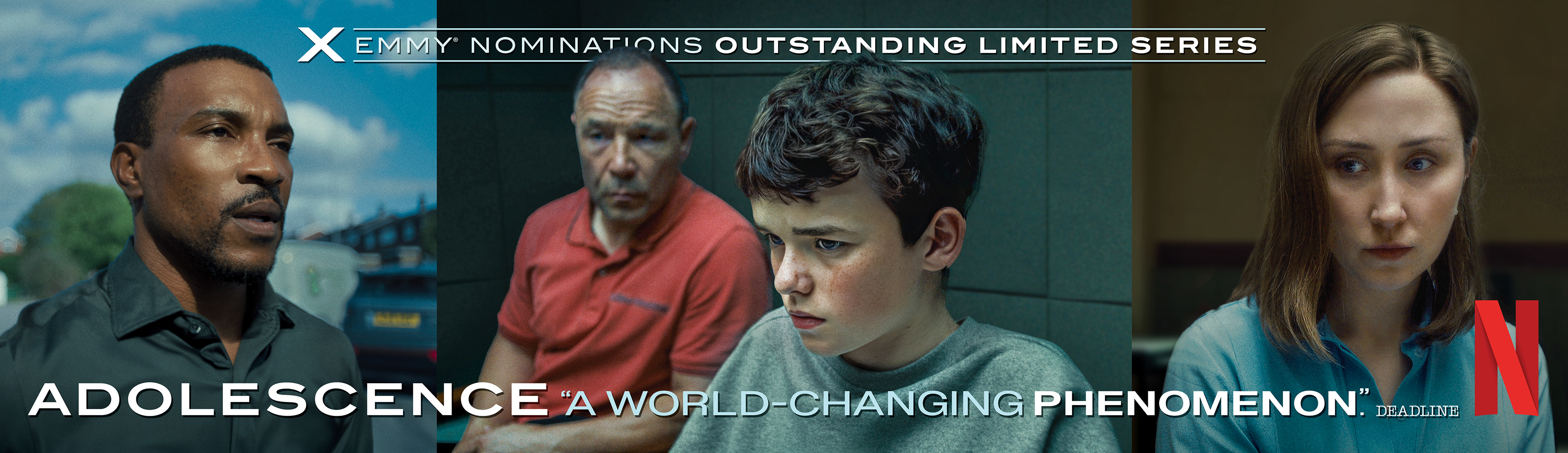
25 Nominations | 7 Wins | 13 Primetime Emmy® Nominations
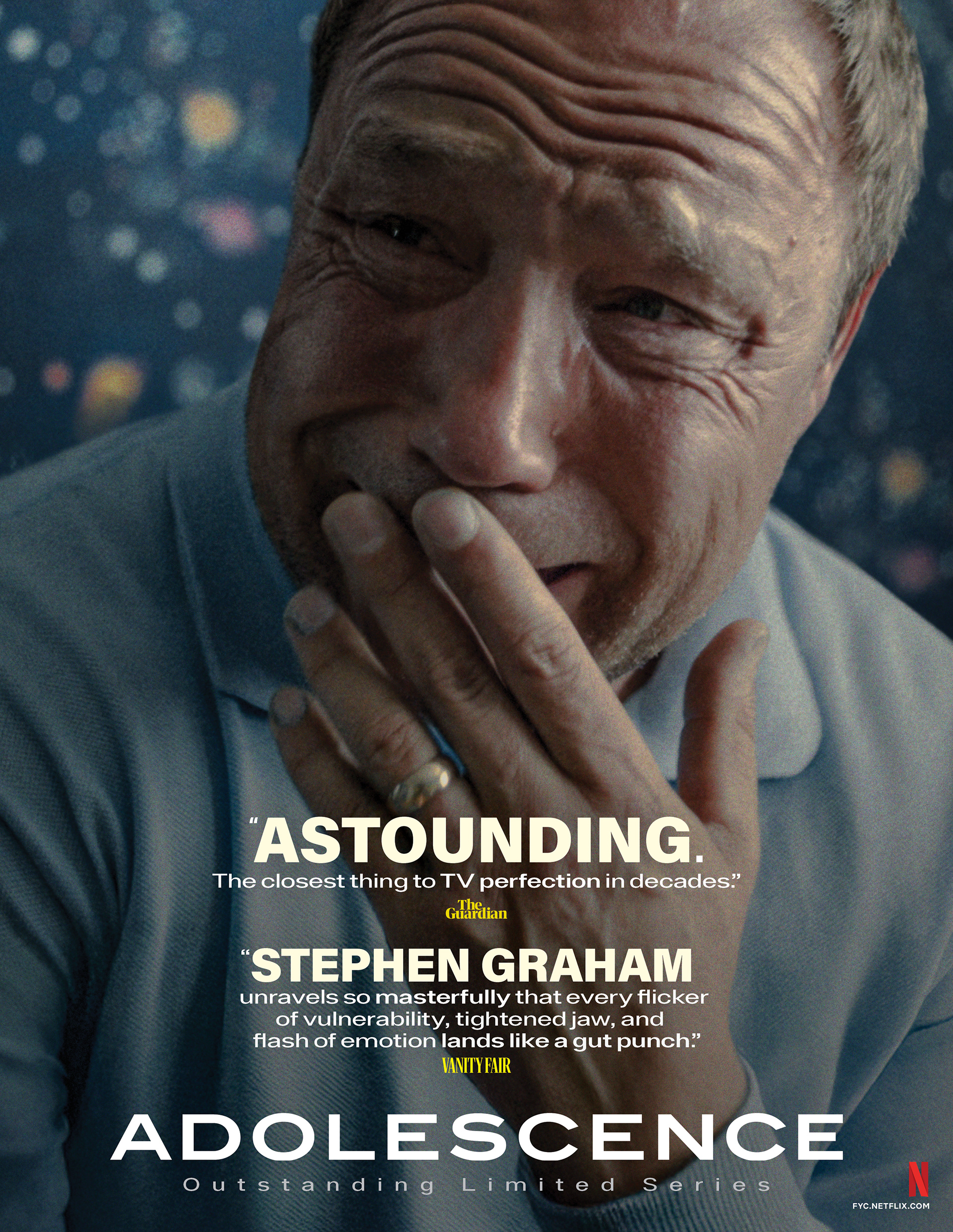
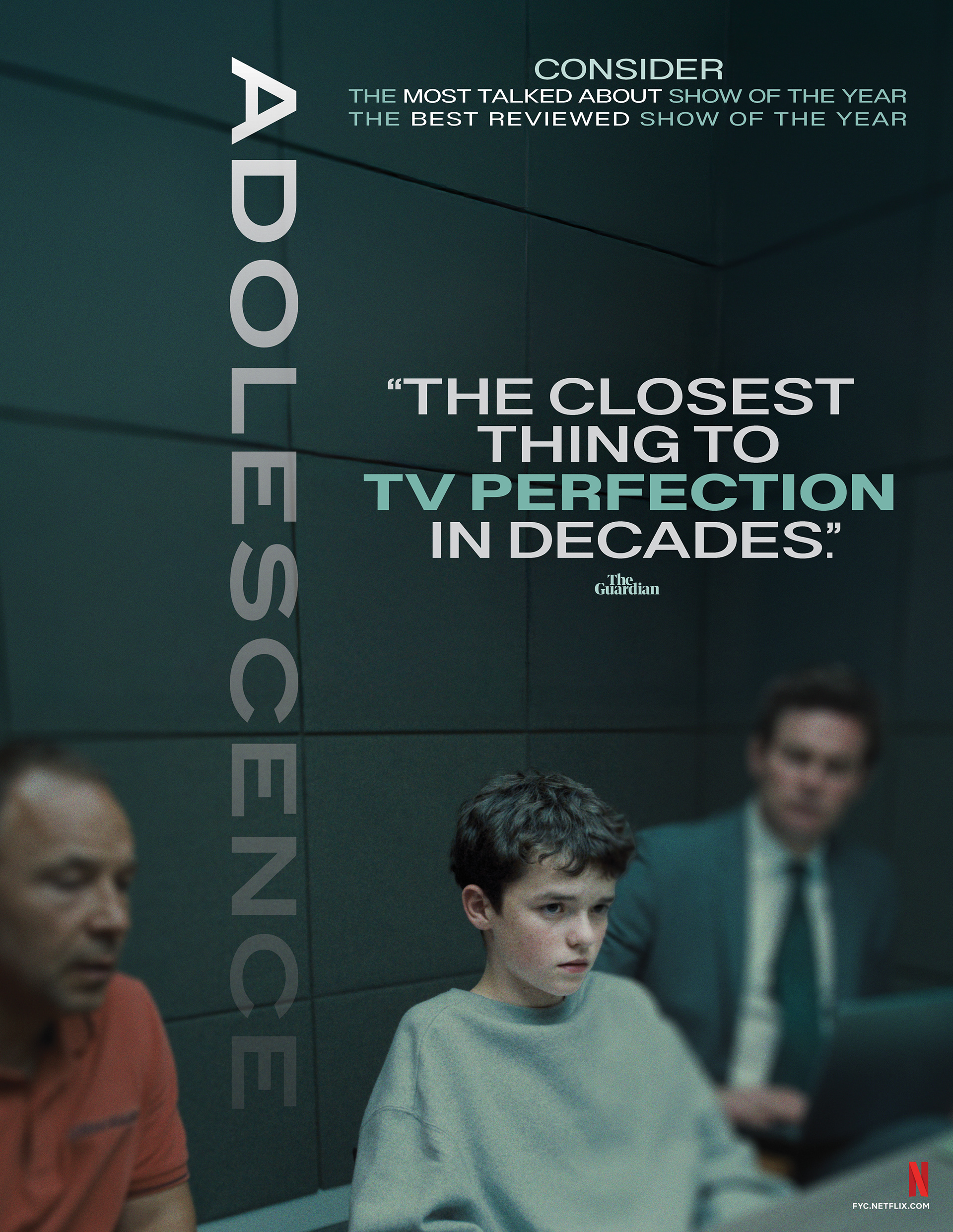
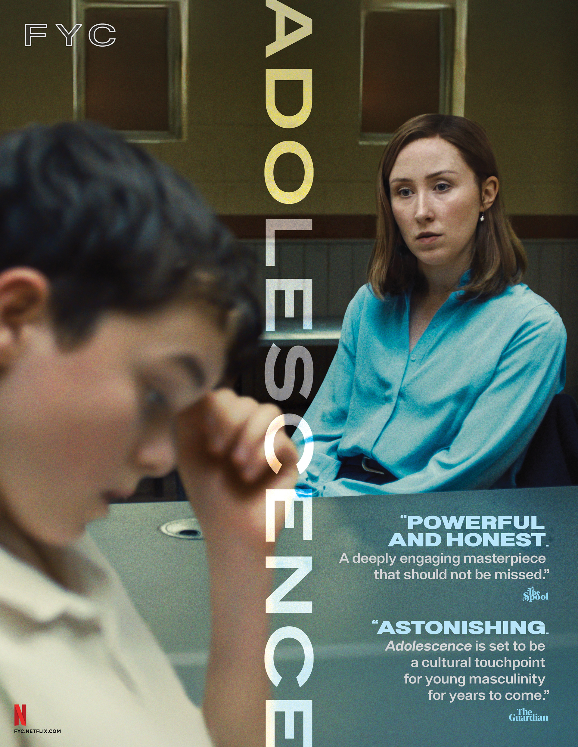
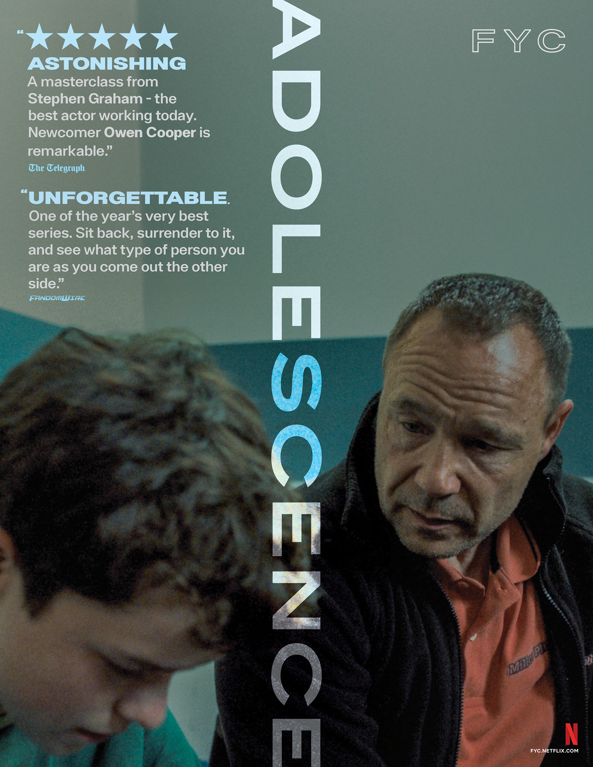
BRIEF
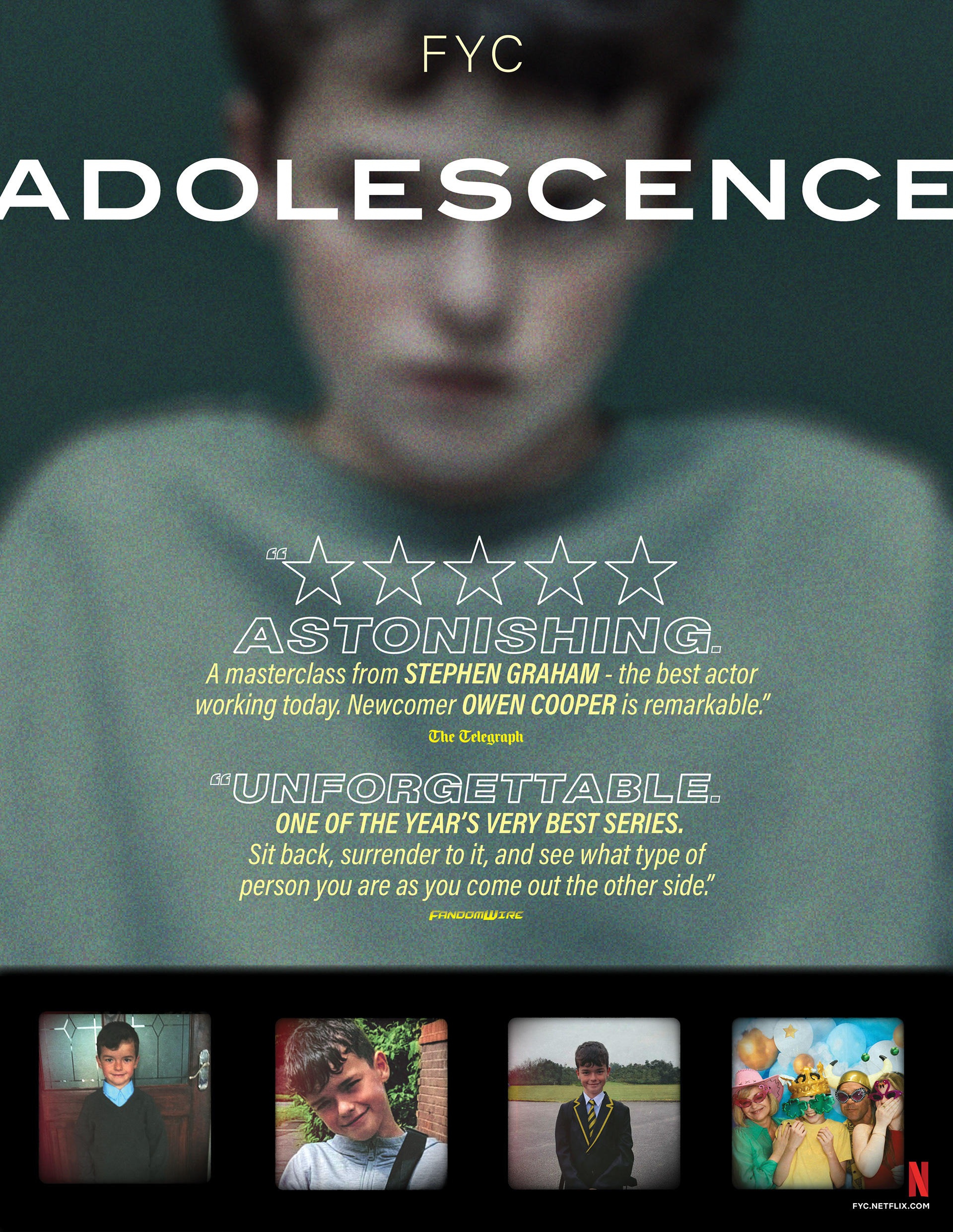
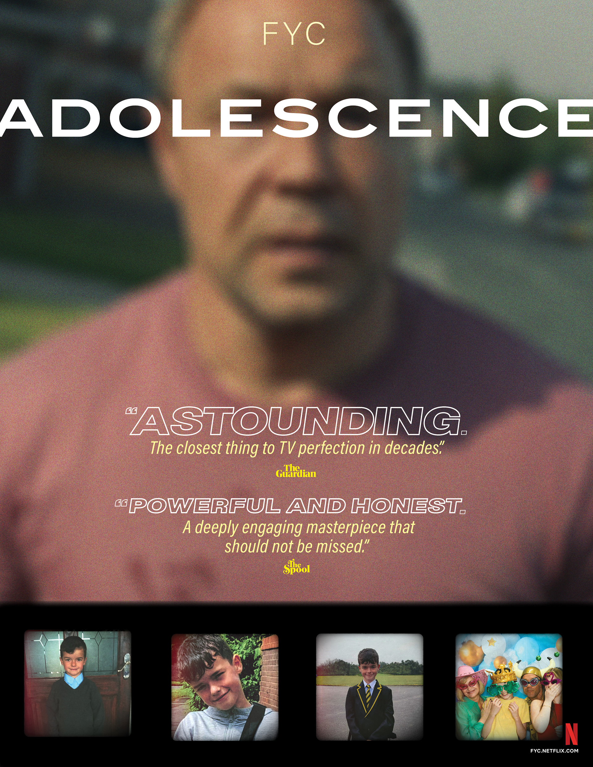
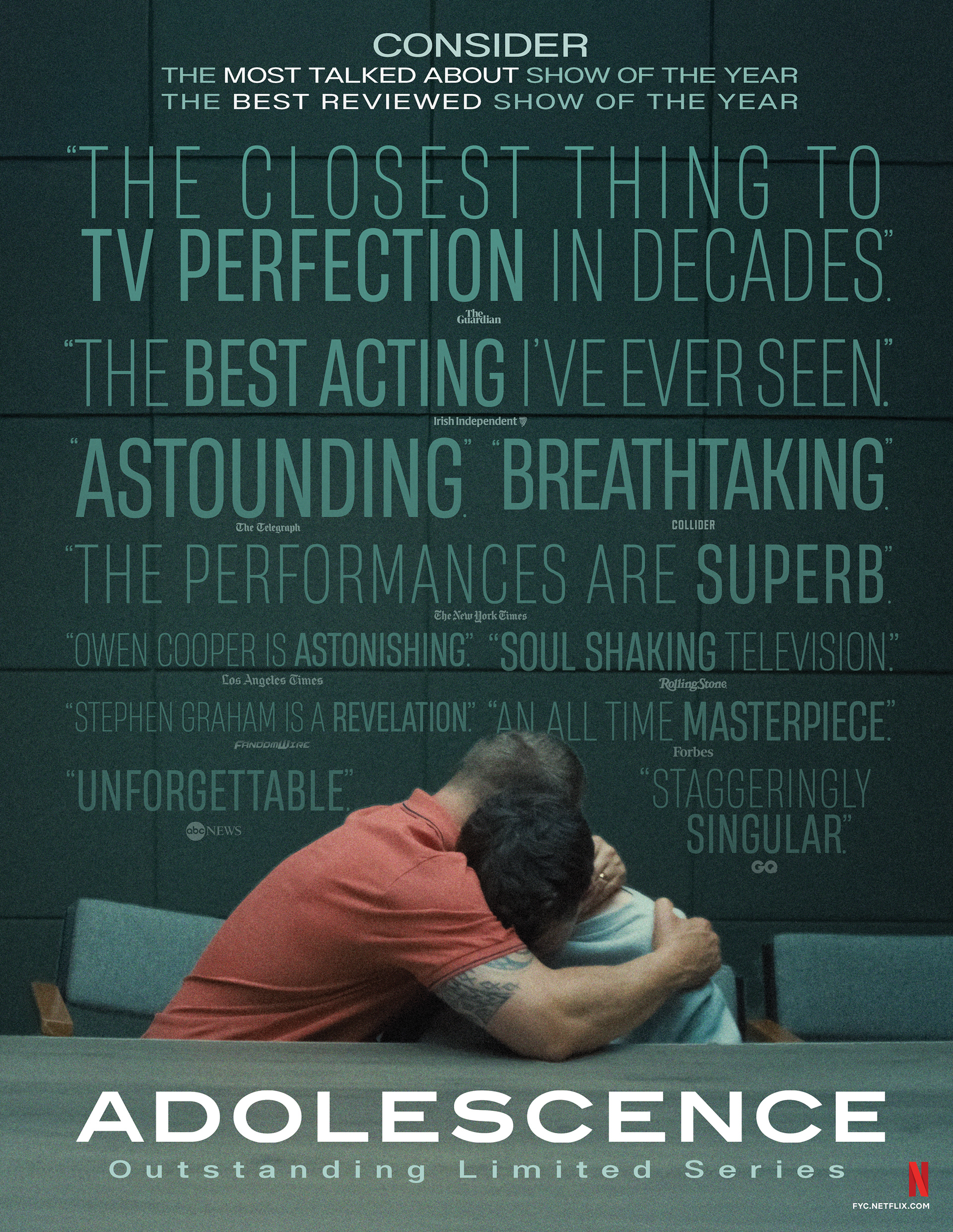
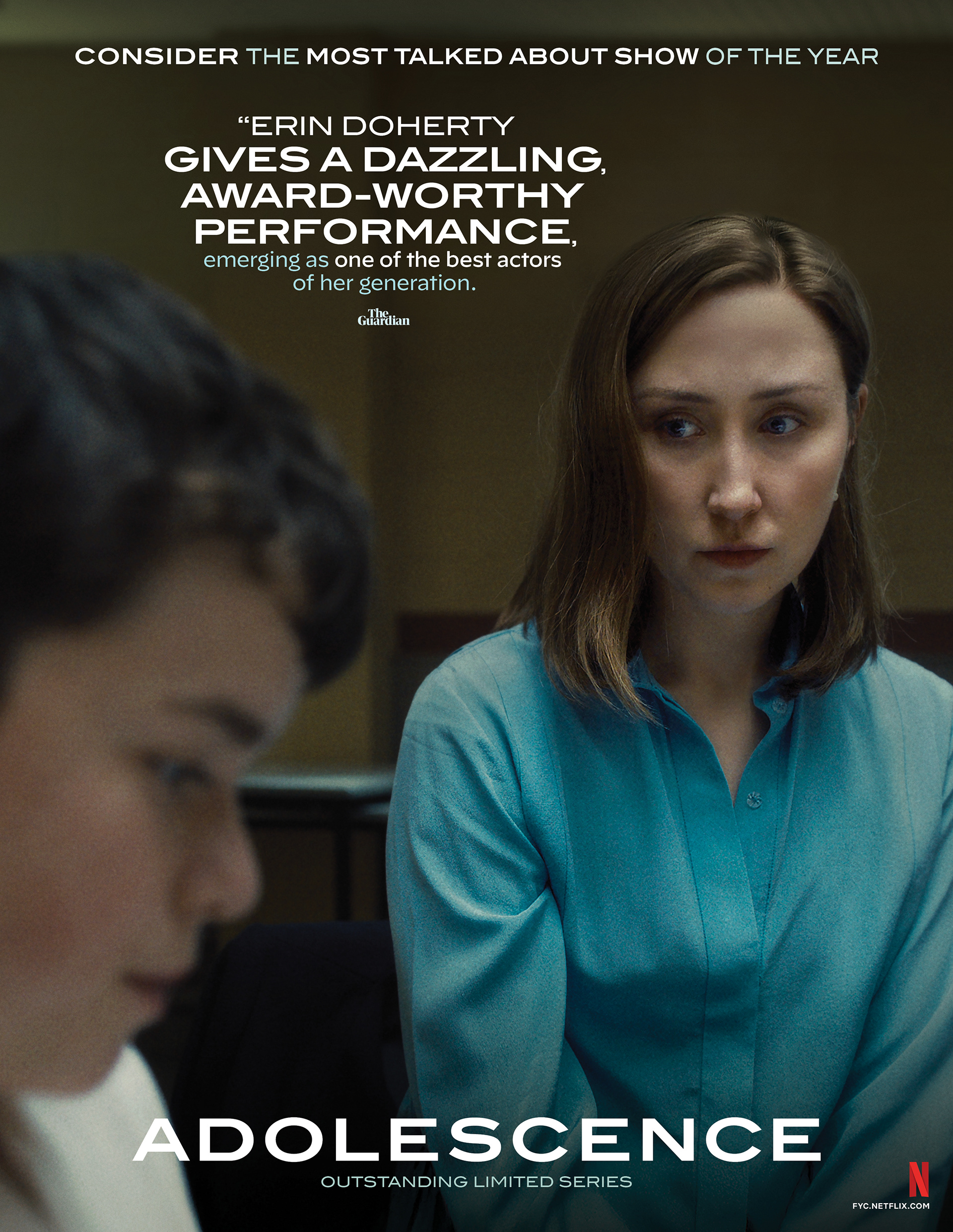
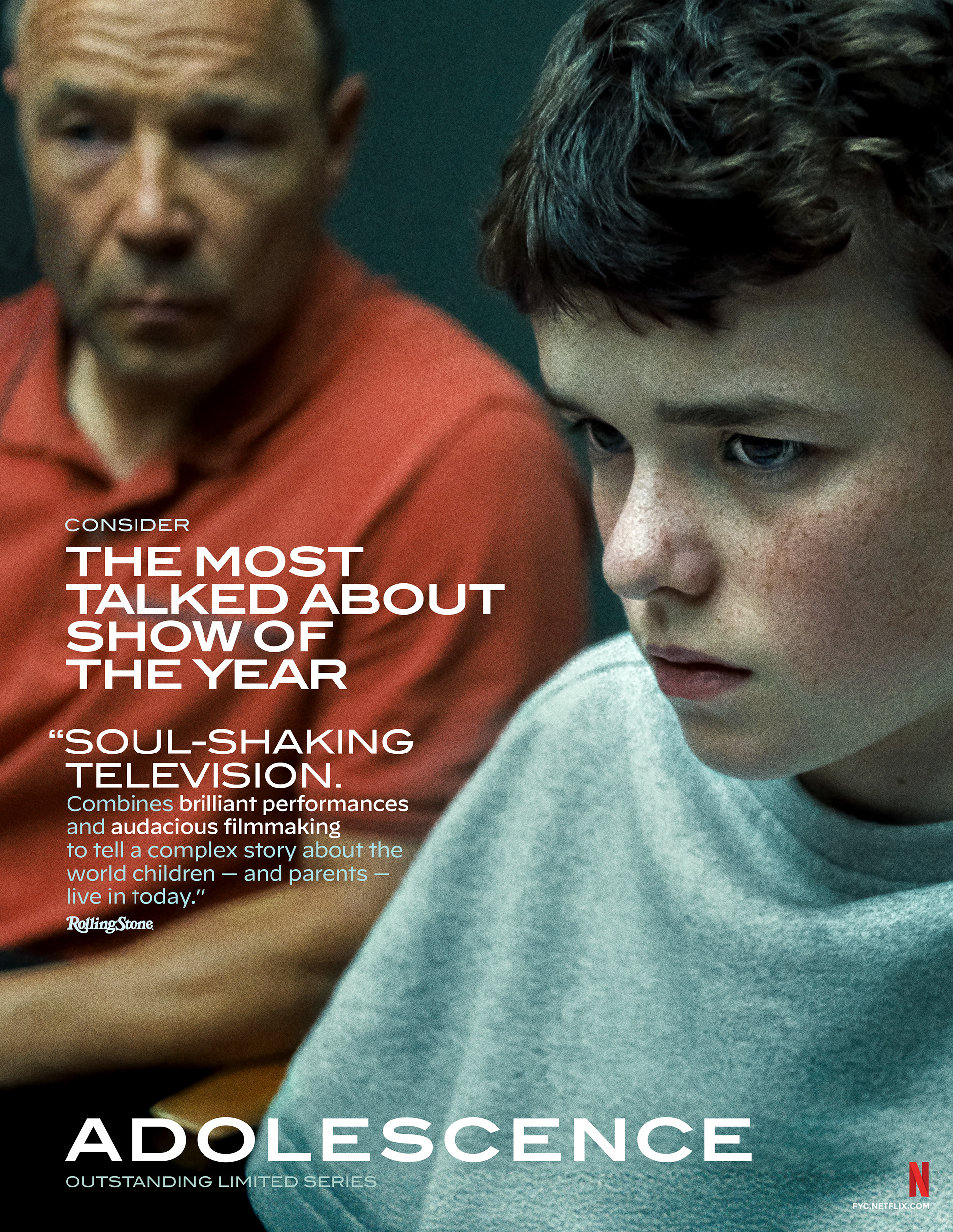
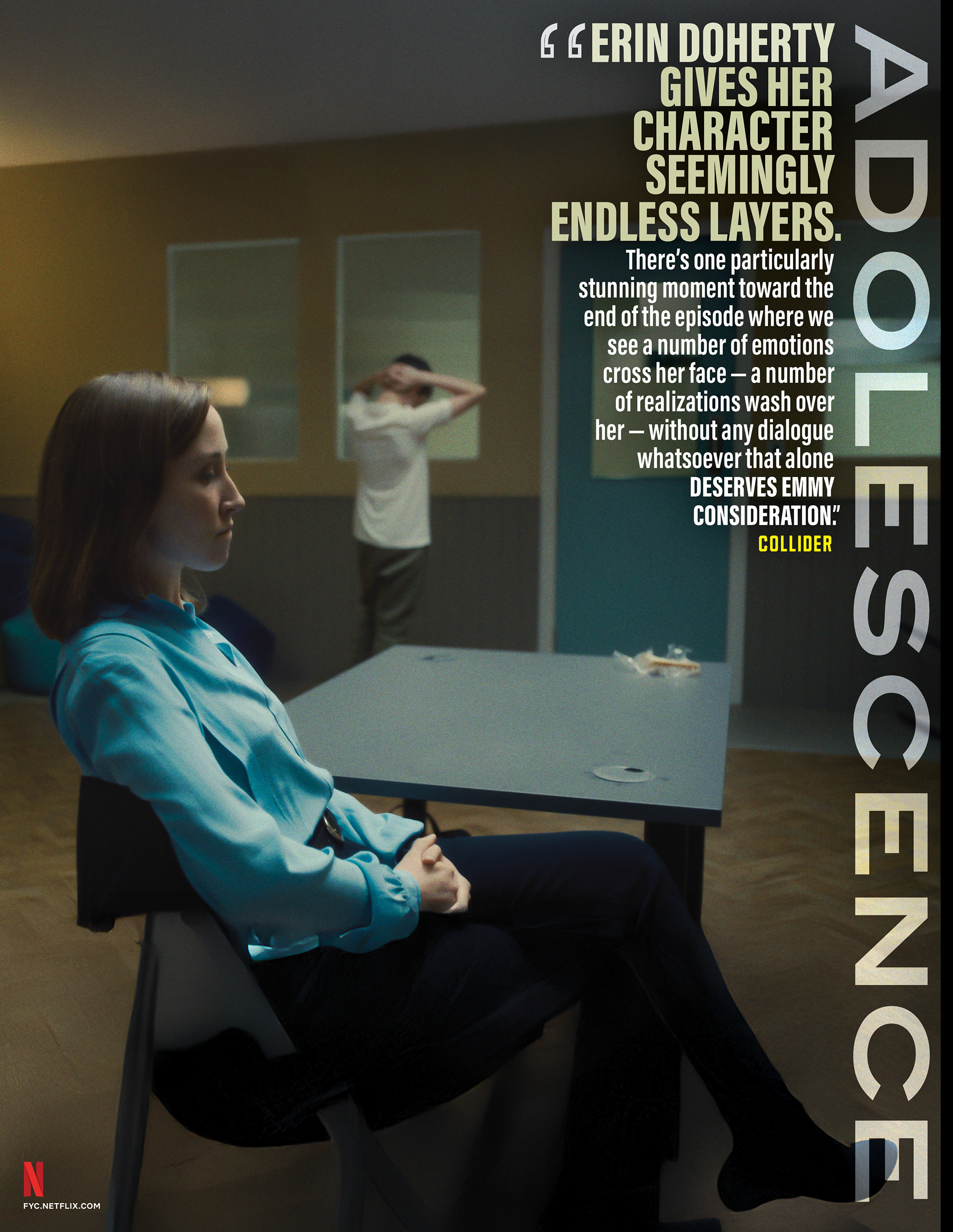
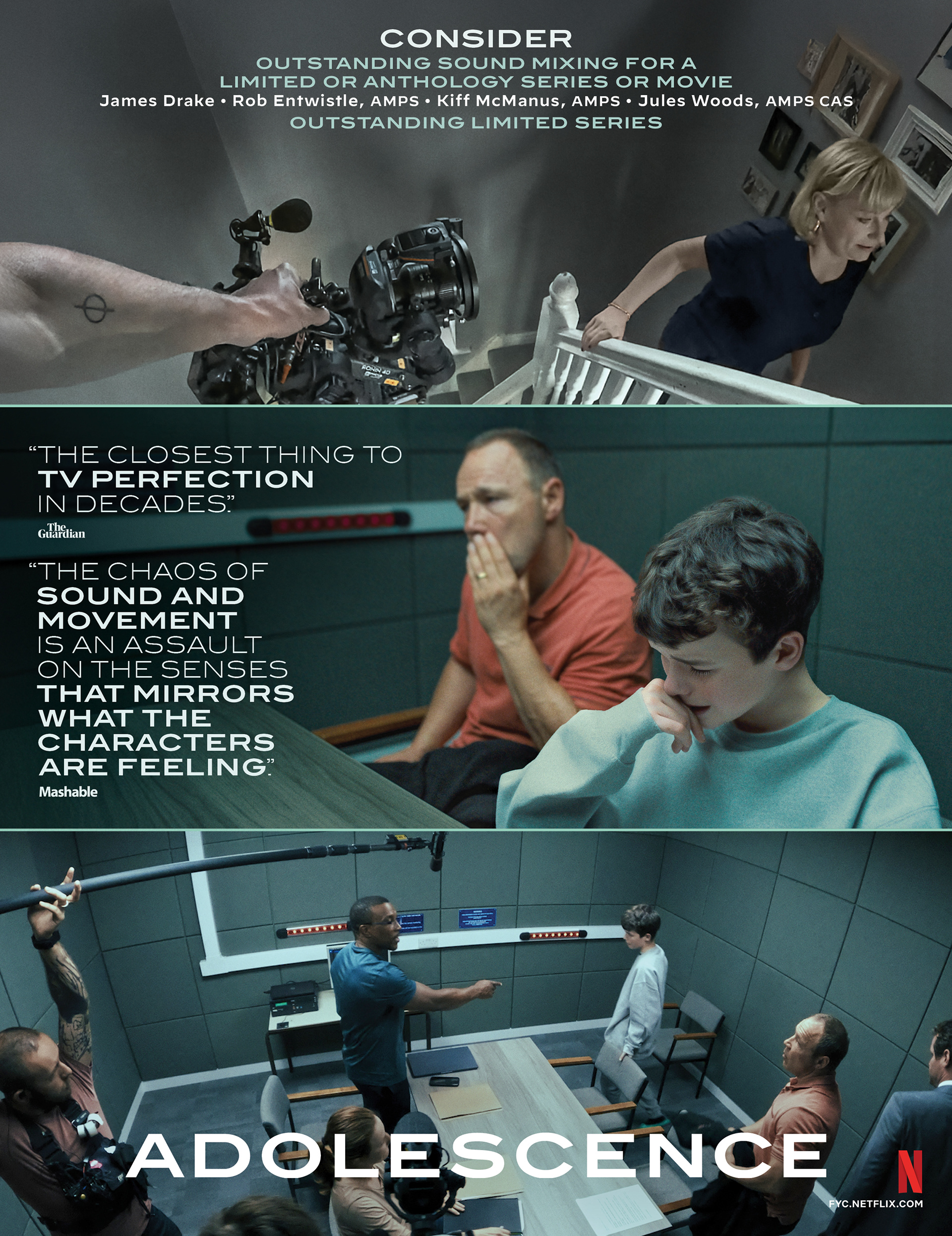
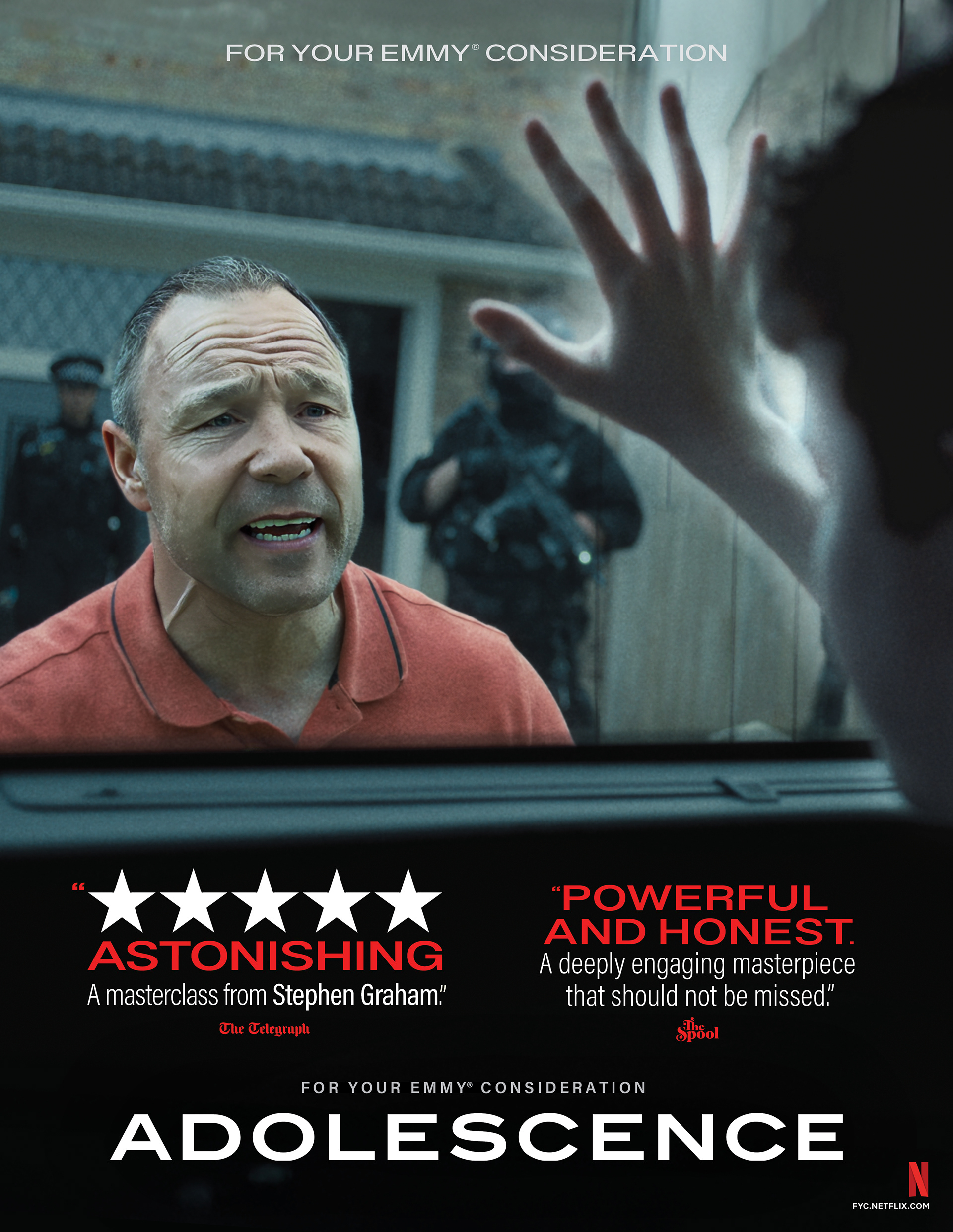
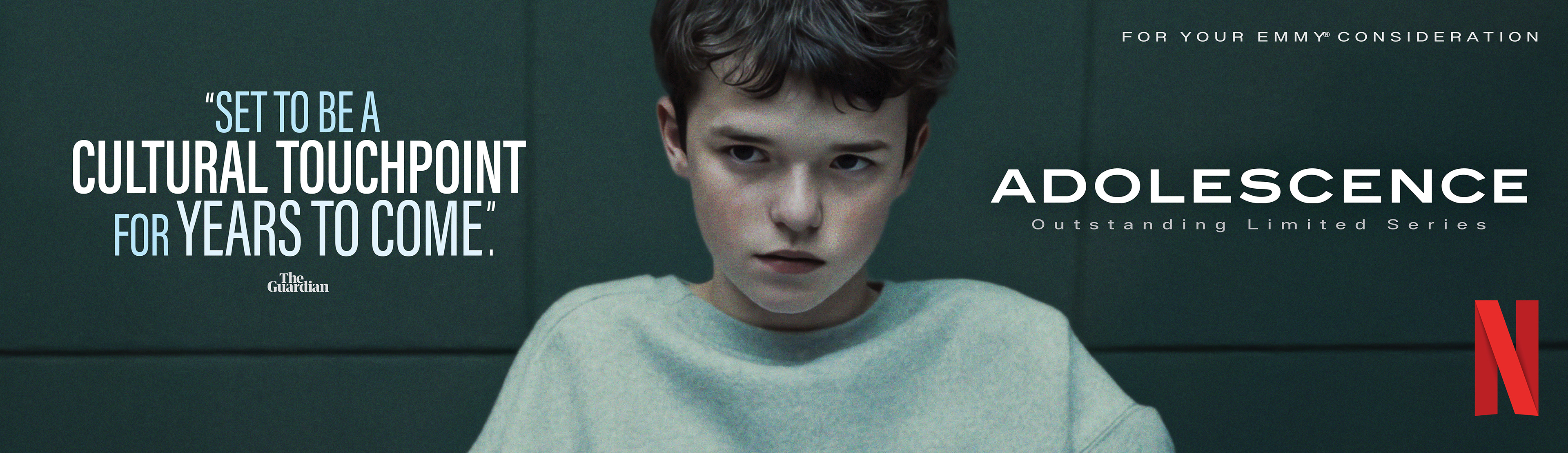
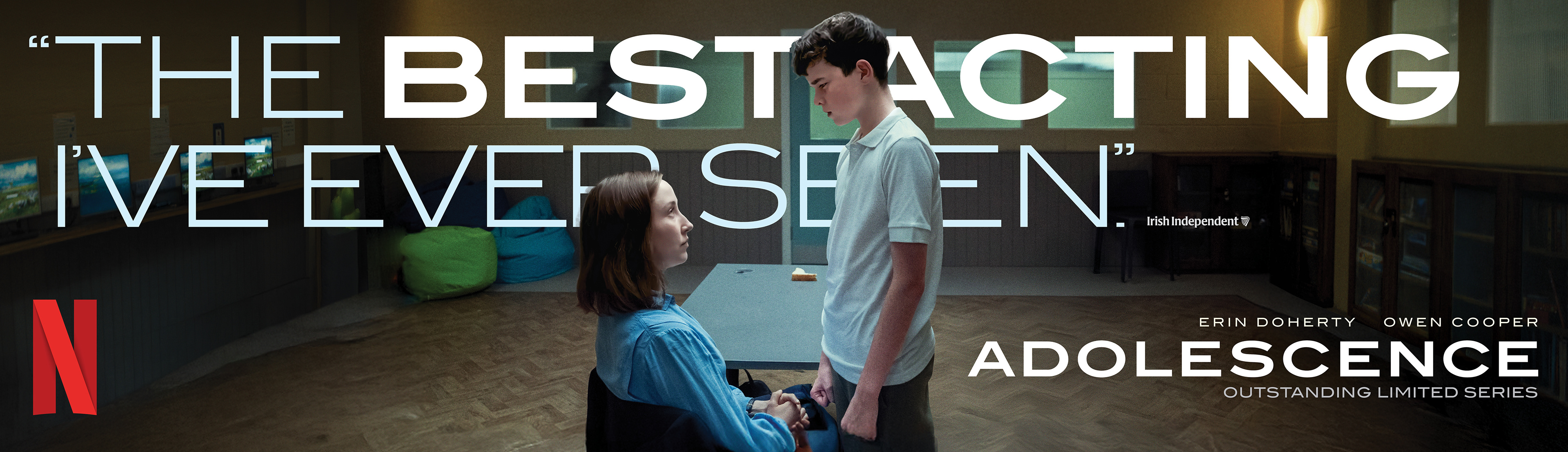
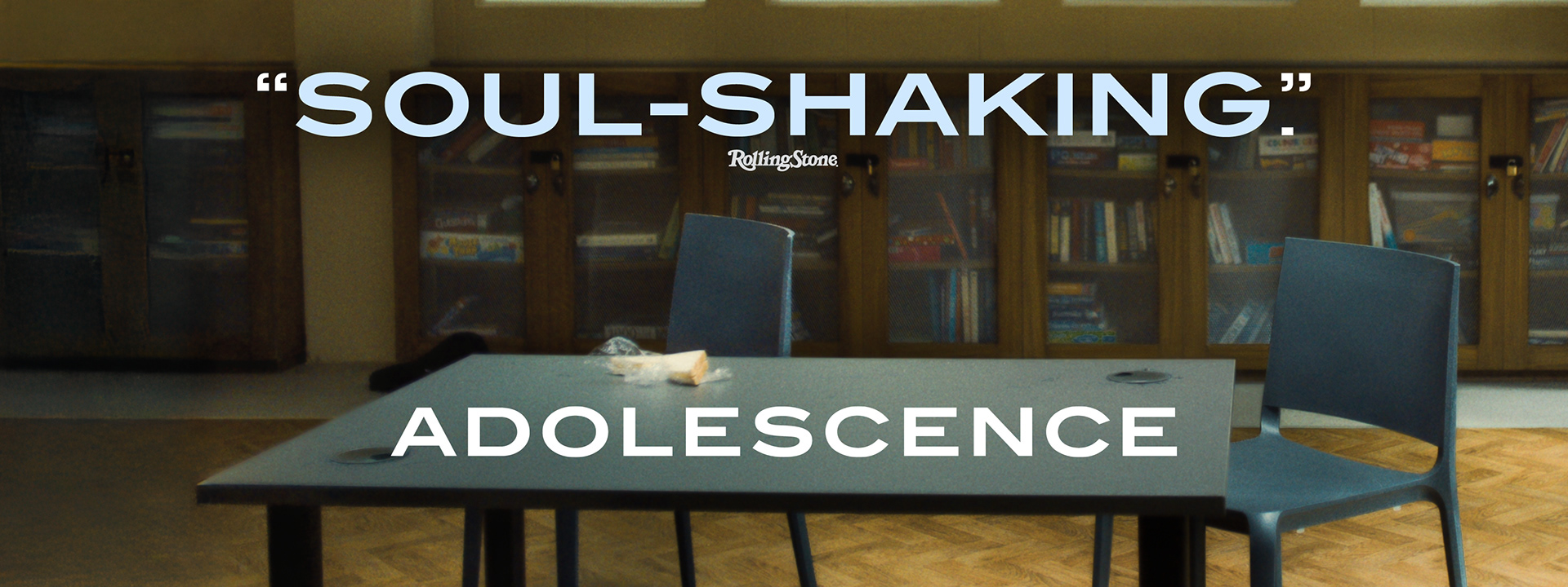
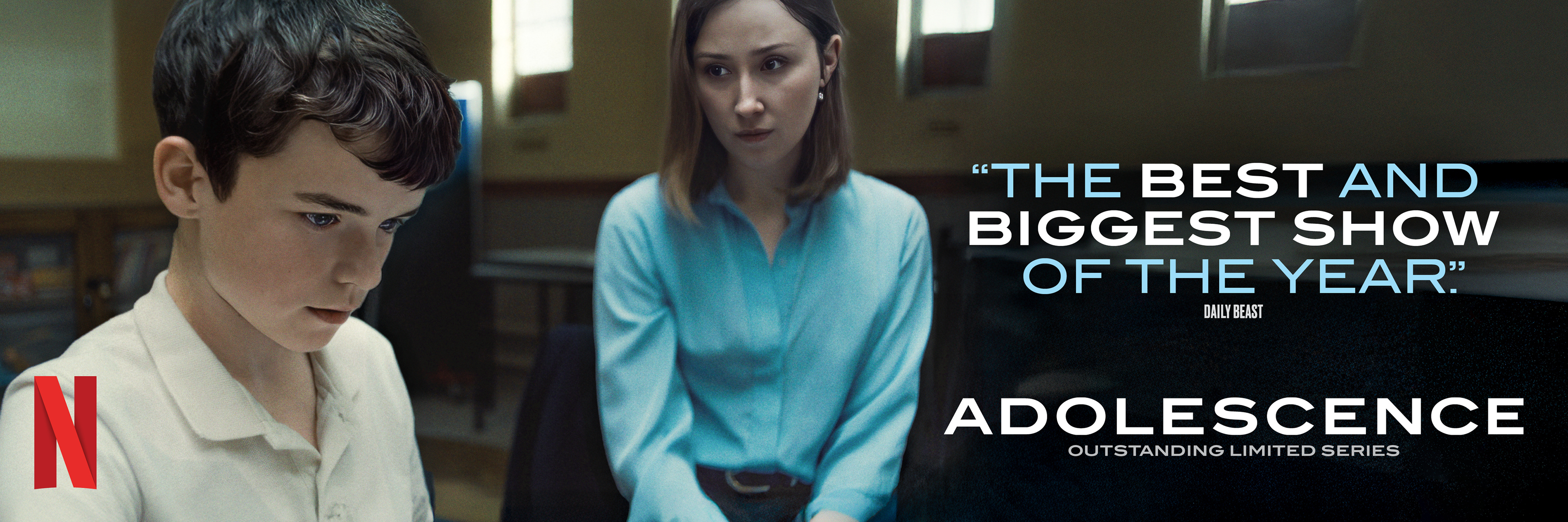
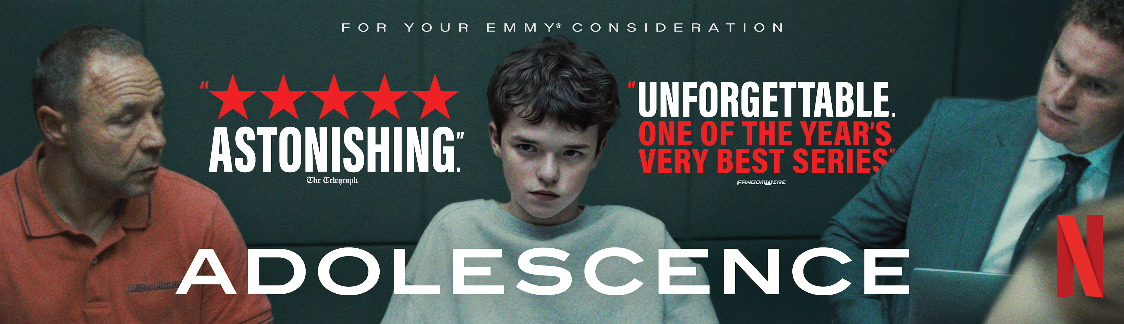
Netflix required an awards ecosystem for Adolescence mirroring its raw intensity. The challenge was translating the film’s gritty emotional weight into cohesive print and digital voter touchpoints.
STRATEGY
I utilized a clinical teal palette and claustrophobic framing to reflect the film’s tension. The system prioritized raw character portraits to highlight powerhouse performances across all media.
Industry Trade Print
Out Of Home Advertising

22 Nominations | 4 Wins
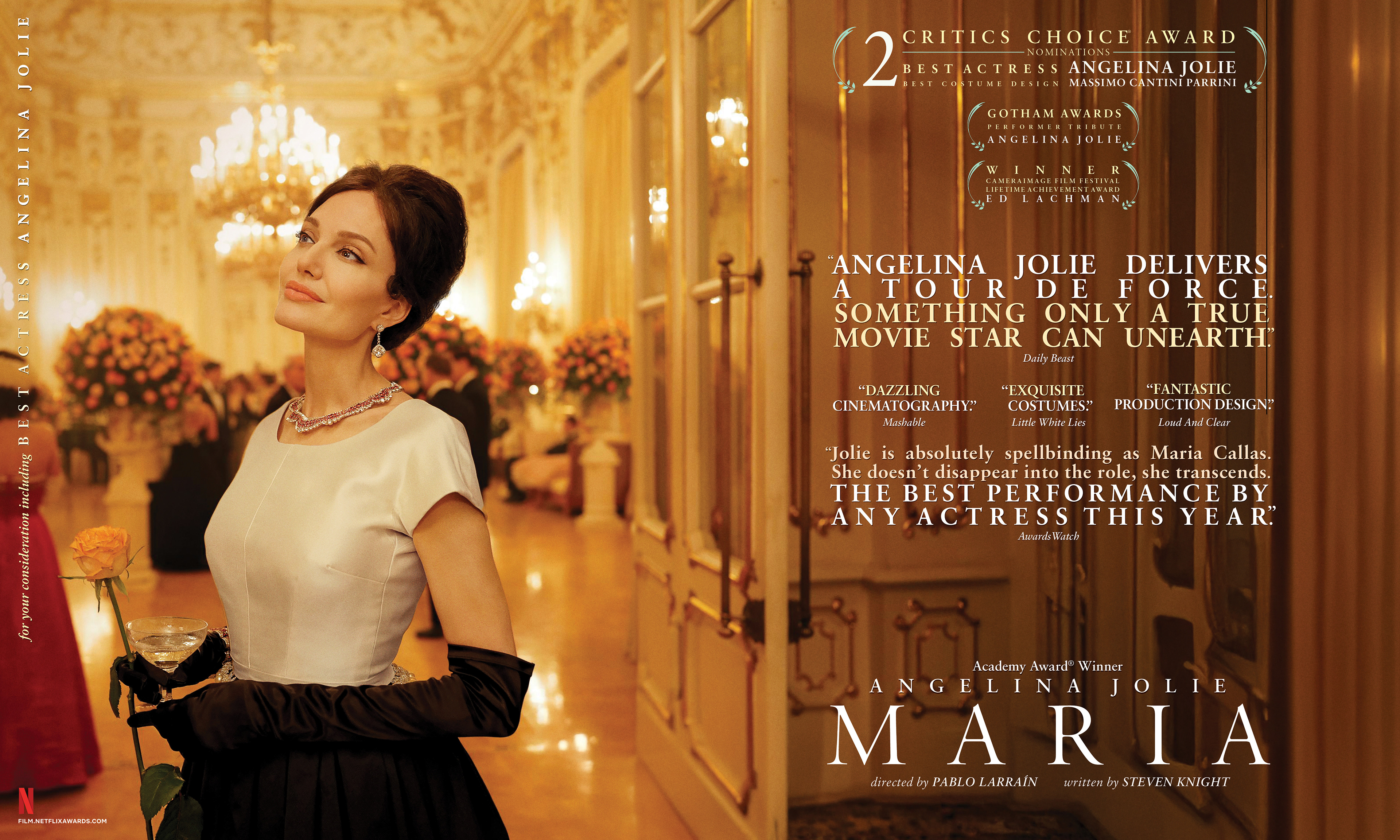
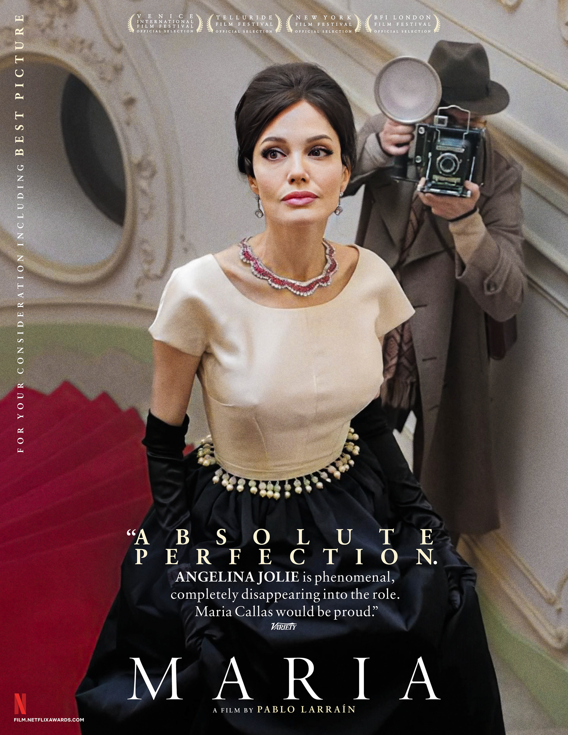
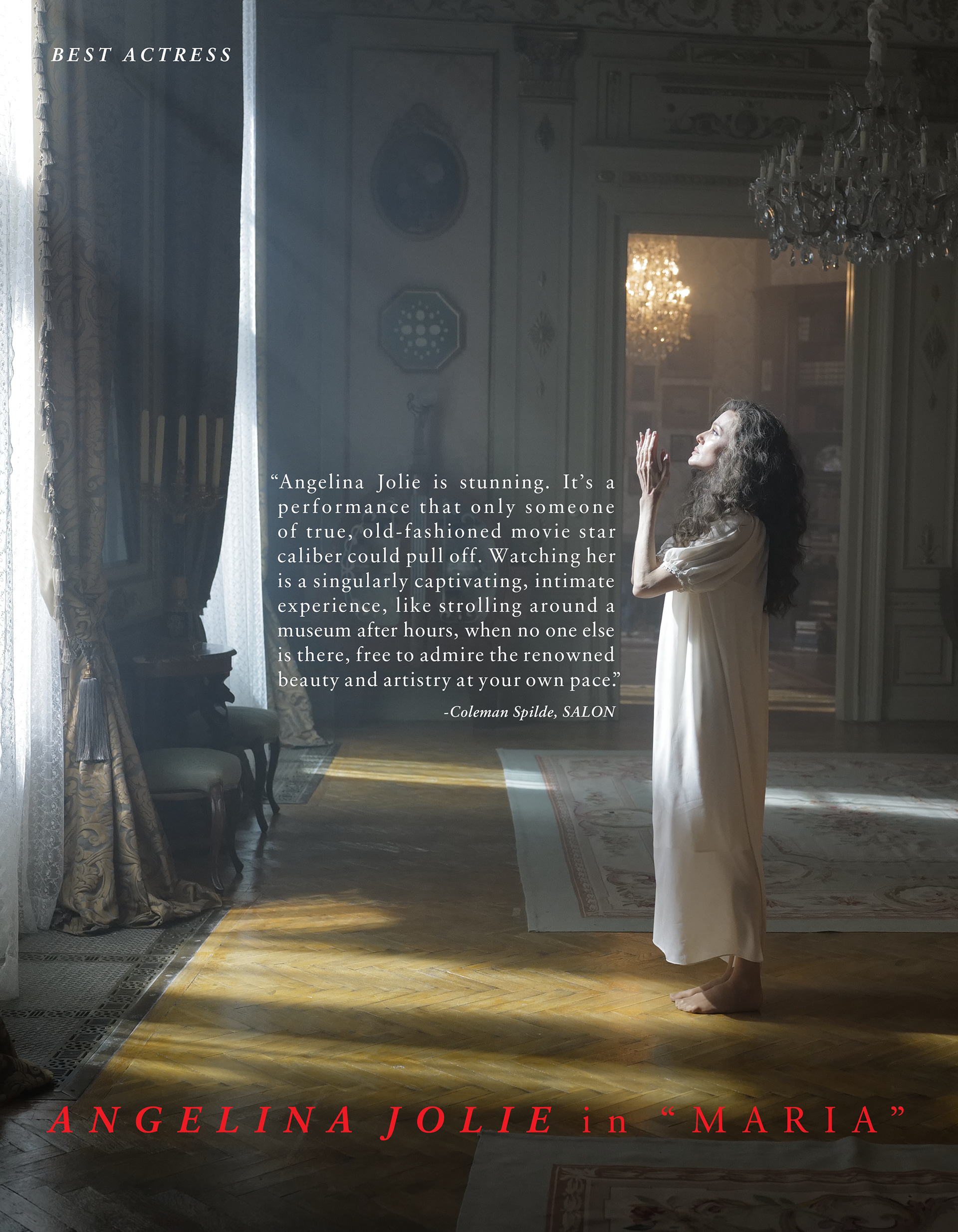
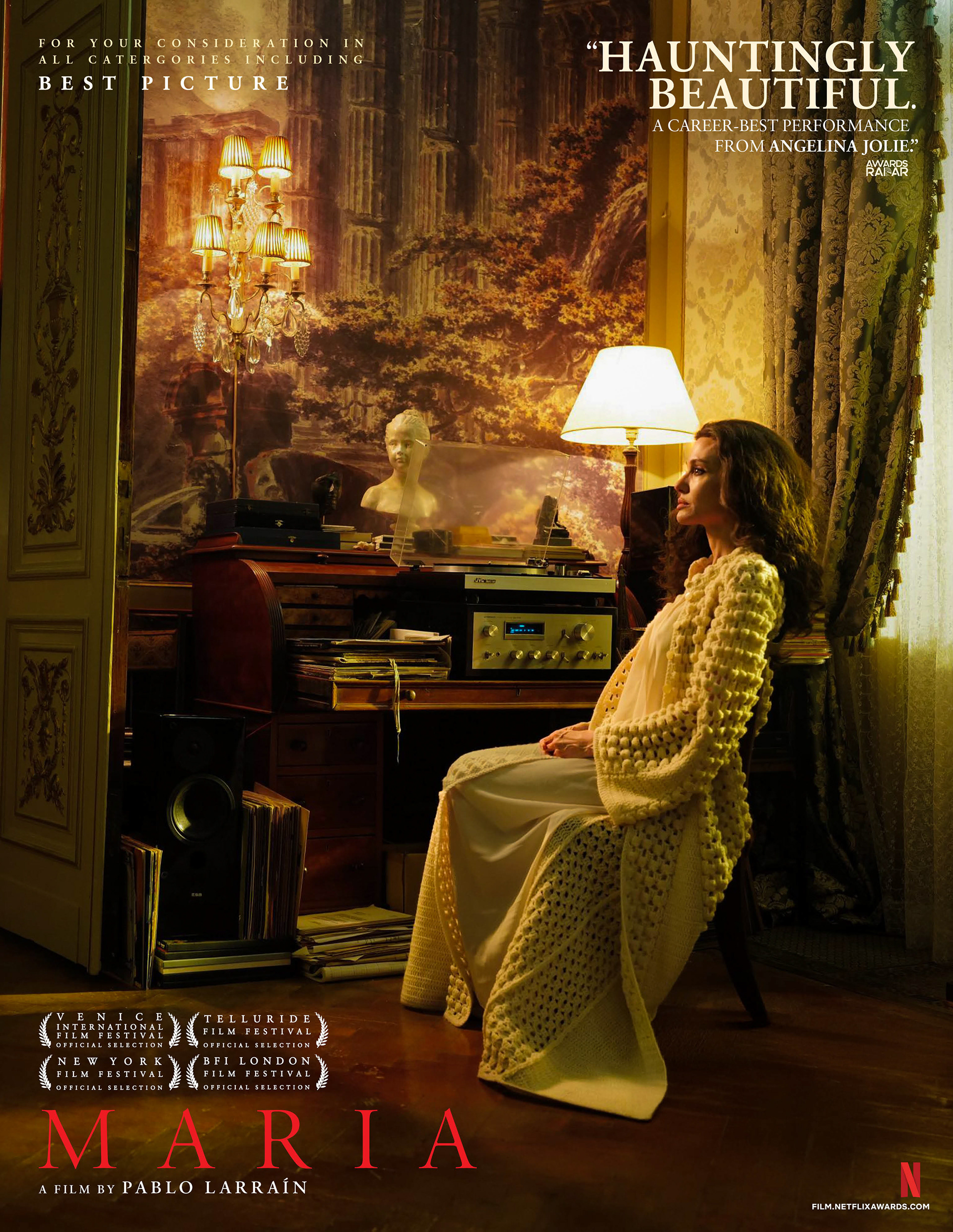
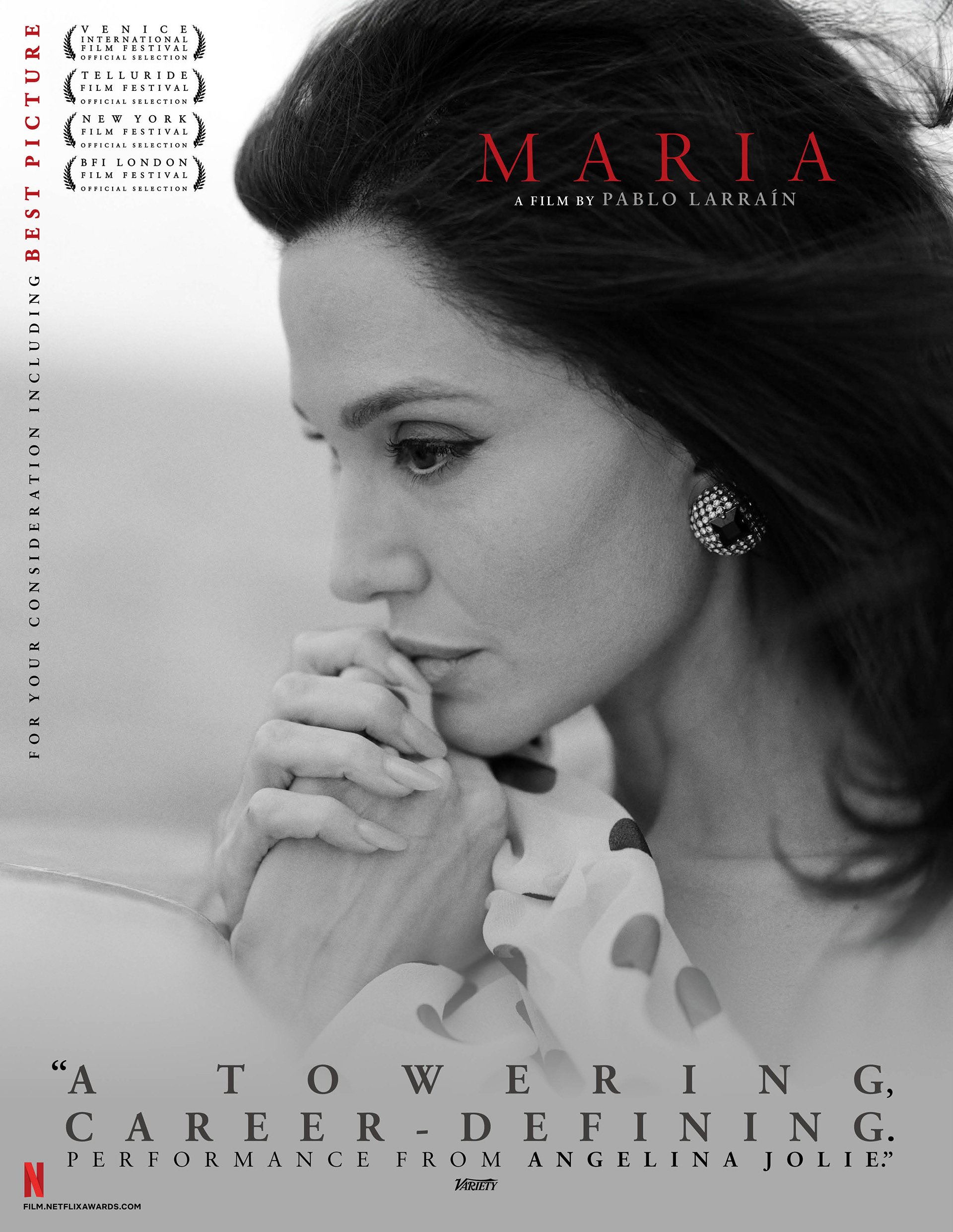
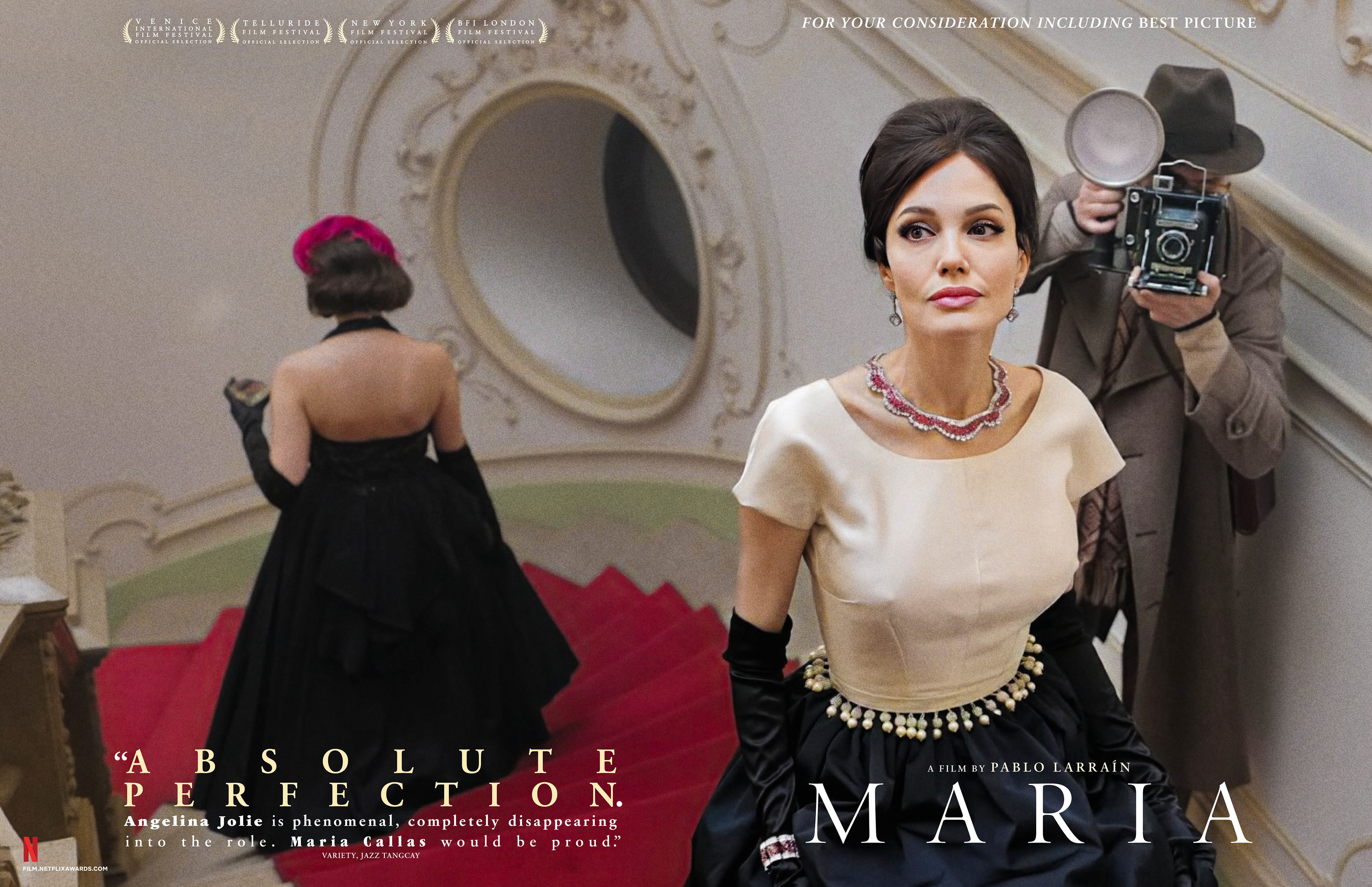
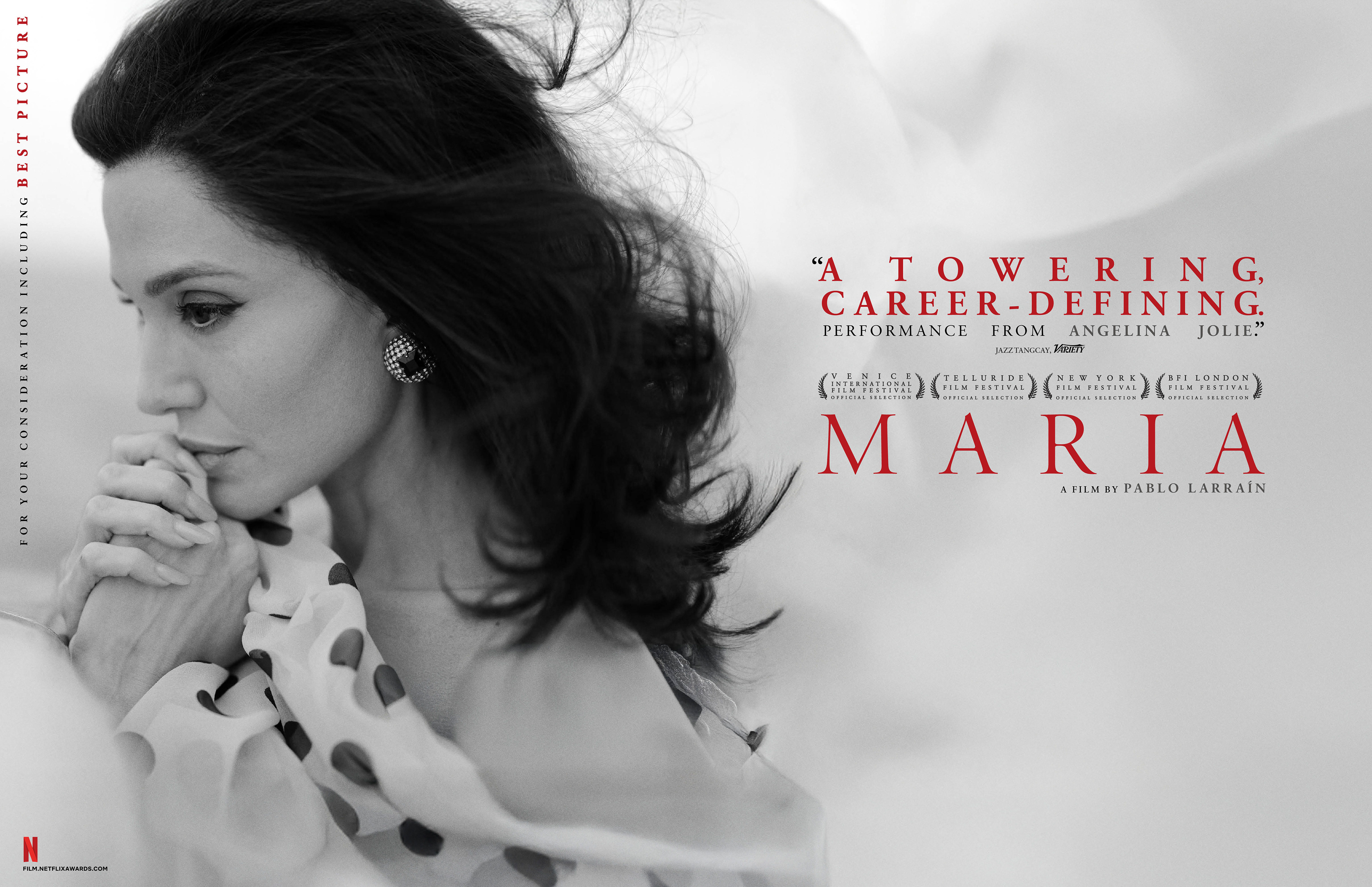
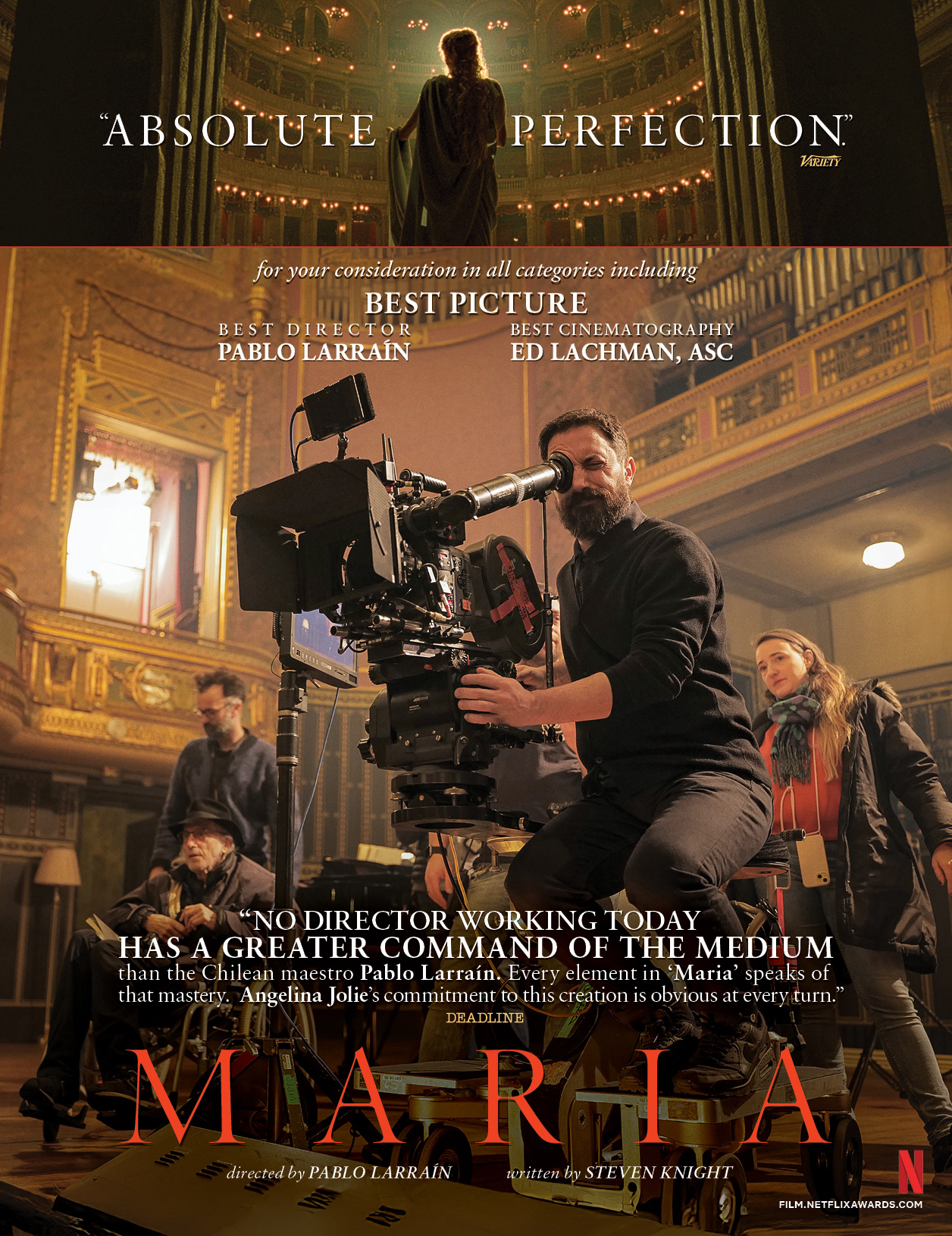
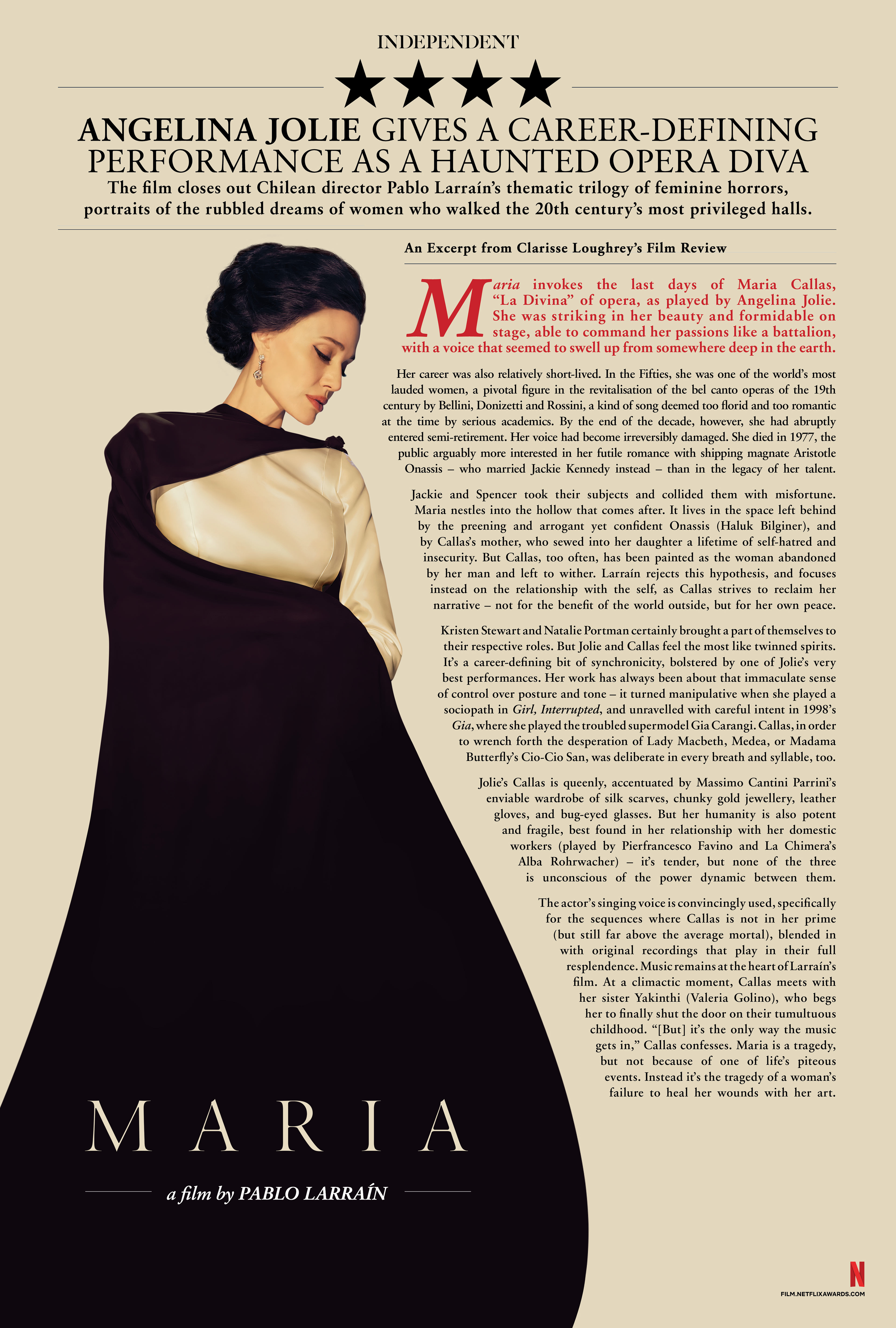
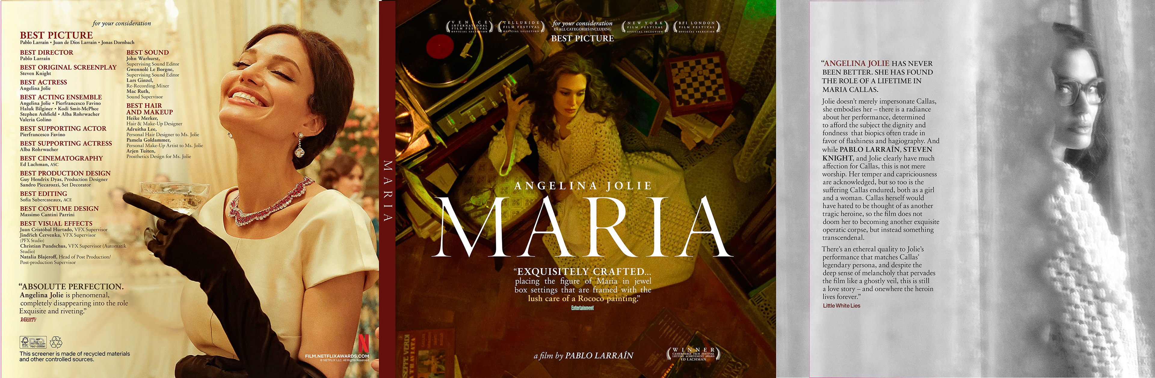
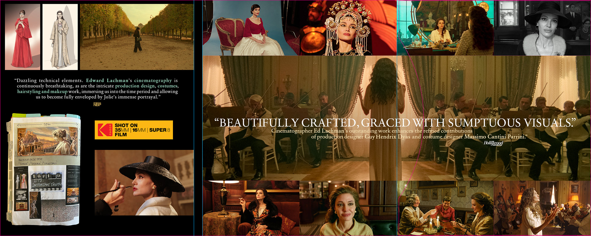
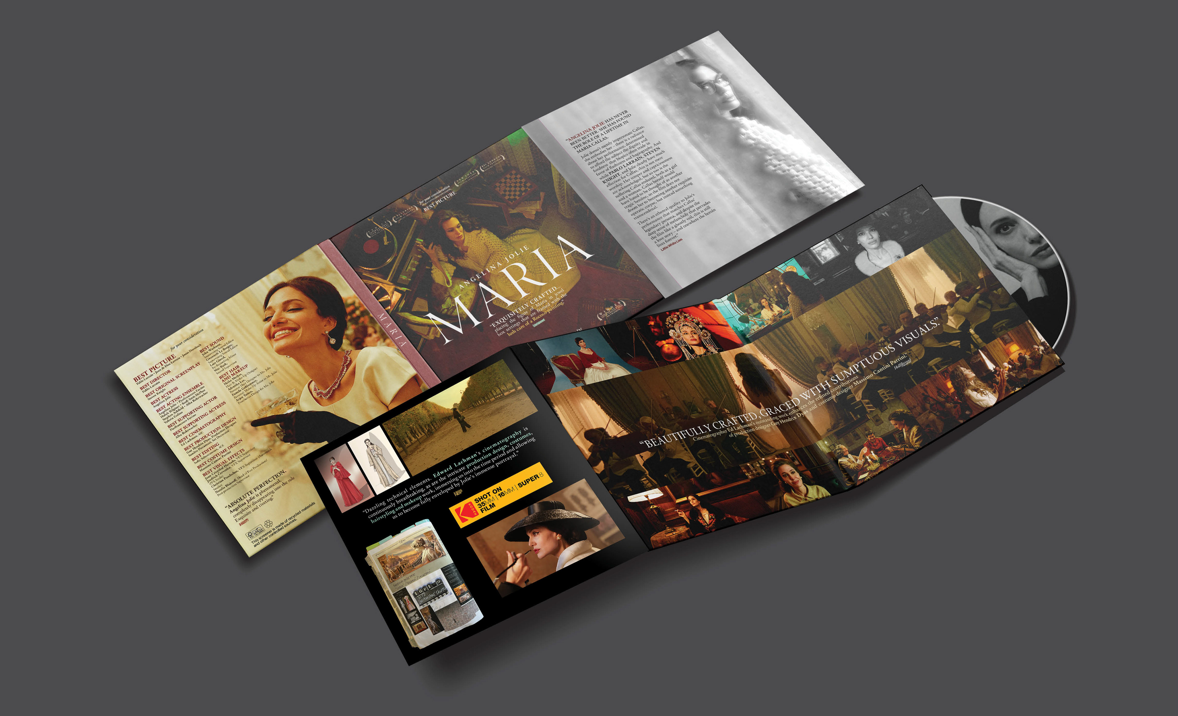
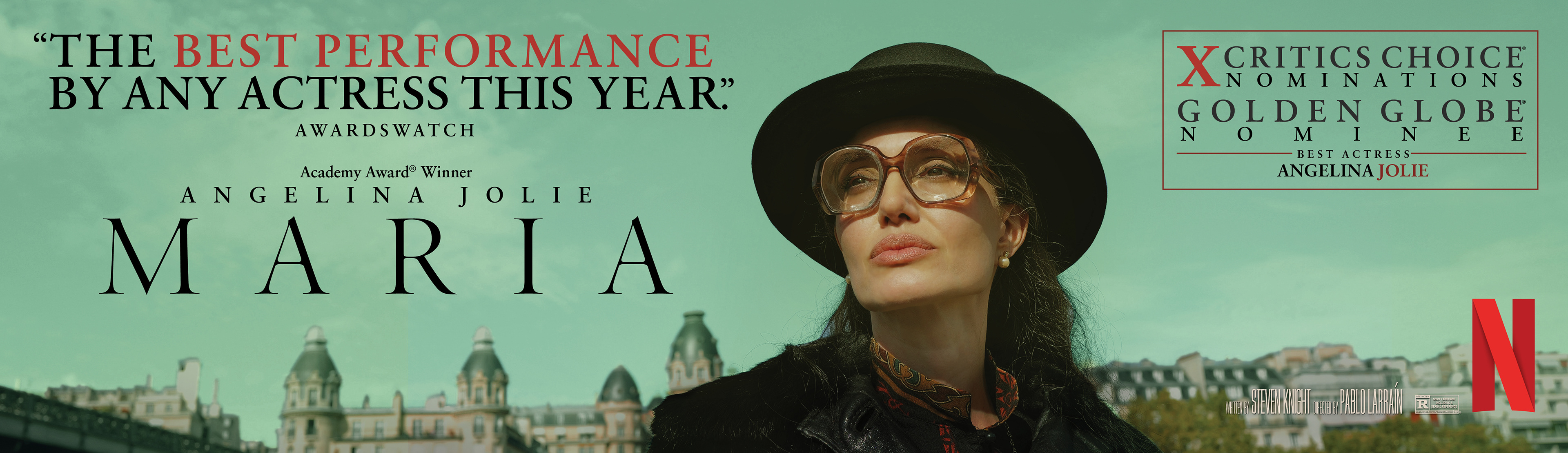
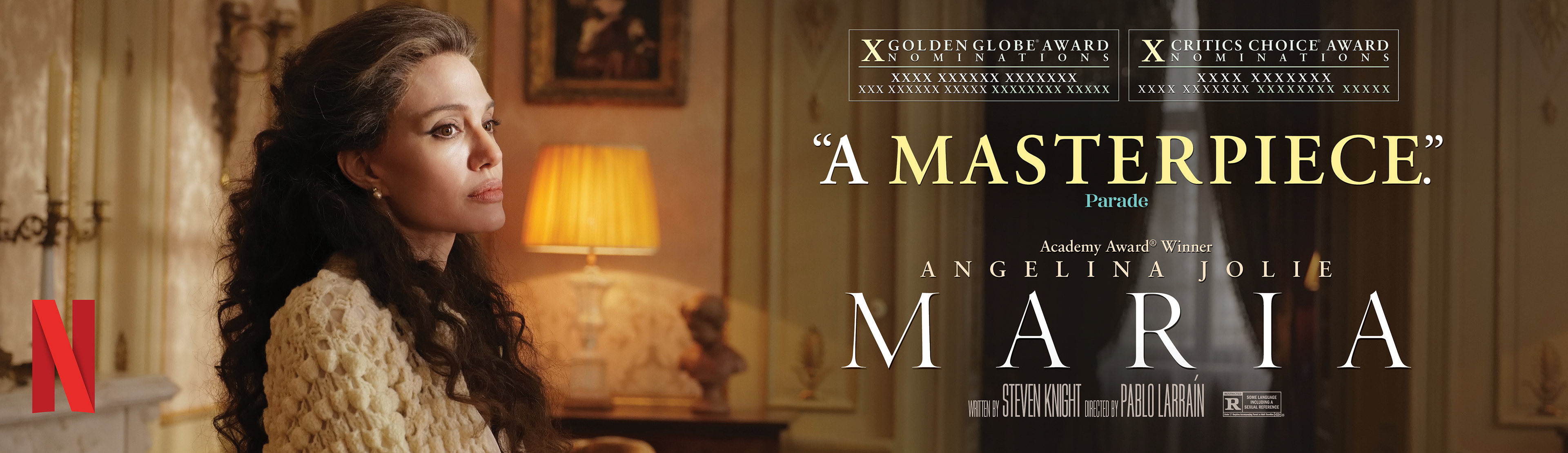
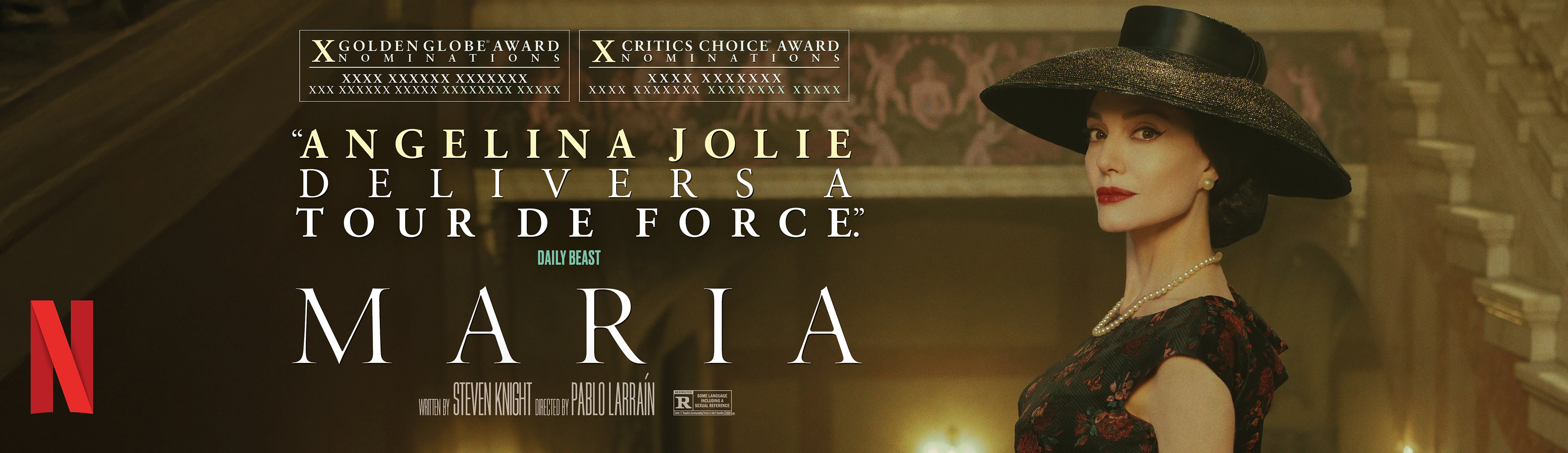
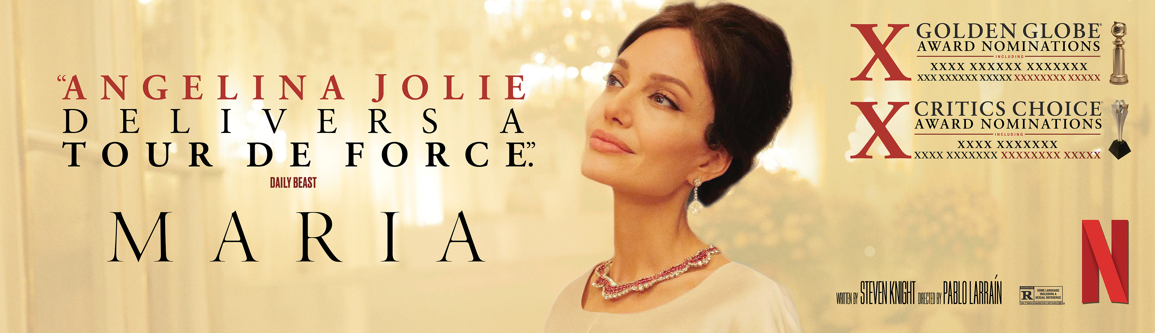
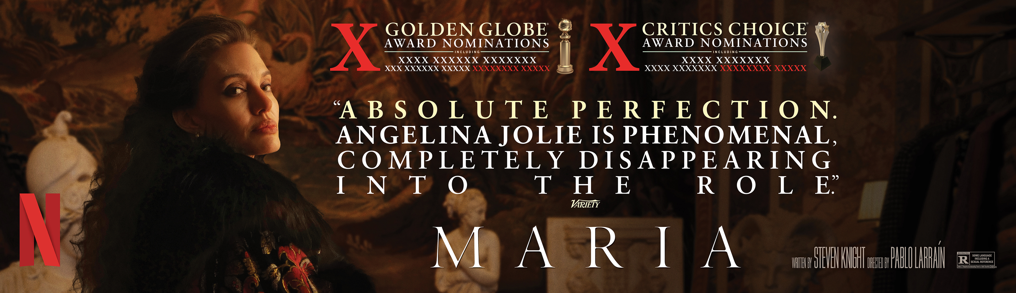
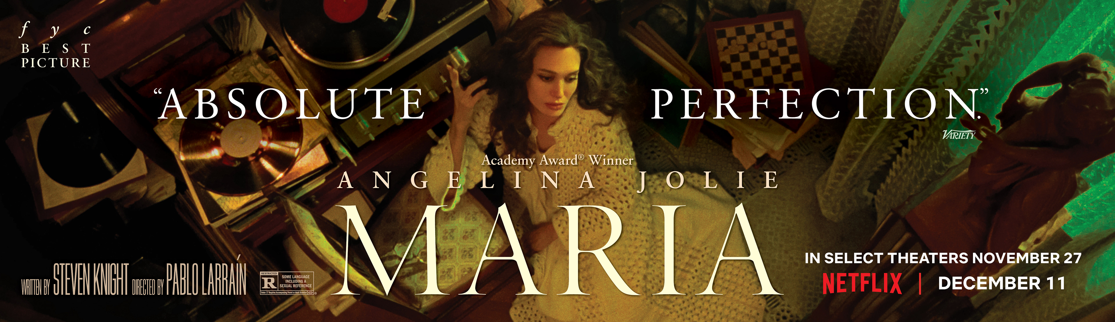
BRIEF
Design a multi-platform awards ecosystem for the Netflix feature film Maria to secure Academy Award and BAFTA nominations. The objective was to translate the film’s operatic scale and the tragic elegance of Maria Callas’s final days into a cohesive suite of high-end voter touchpoints, including specialized screener packaging, theatrical trade ads, and large-format outdoor advertising.
STRATEGY
I utilized a prestige editorial aesthetic that mirrors the film’s cinematic textures and historical setting. Prioritizing evocative portraiture and sophisticated serif typography, I created a sense of timelessness that highlighted the gravity of the central performance. This cohesive system ensured a premium, "event-level" feel across all media, from tactile screener booklets to massive out-of-home displays.
Industry Trade Print
Theater Review Board
Awards DVD Screener Packaging
Out Of Home Advertising
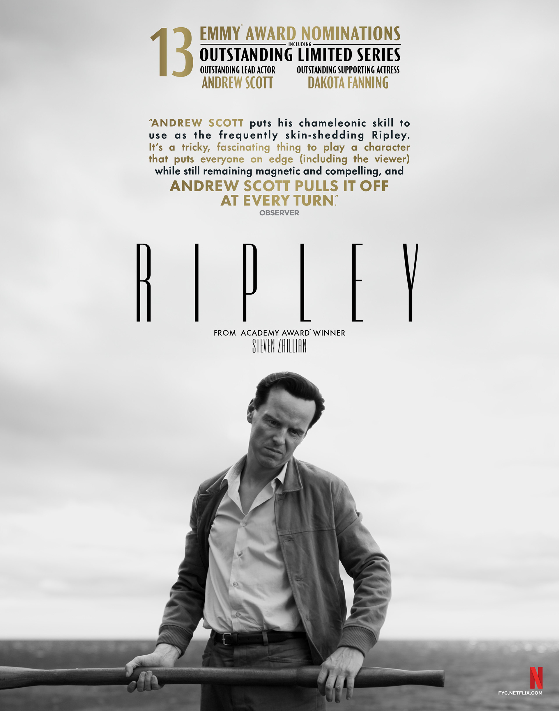
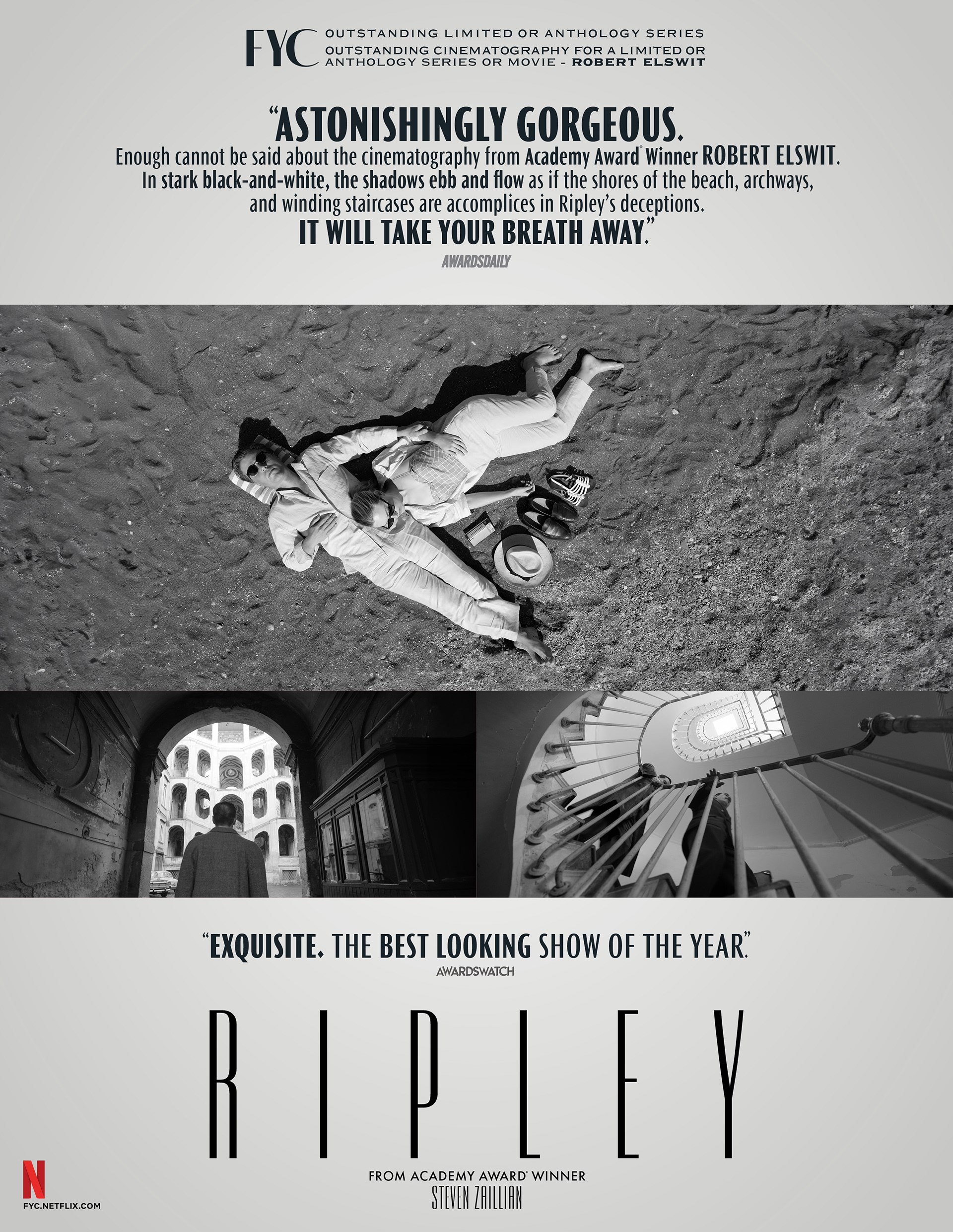
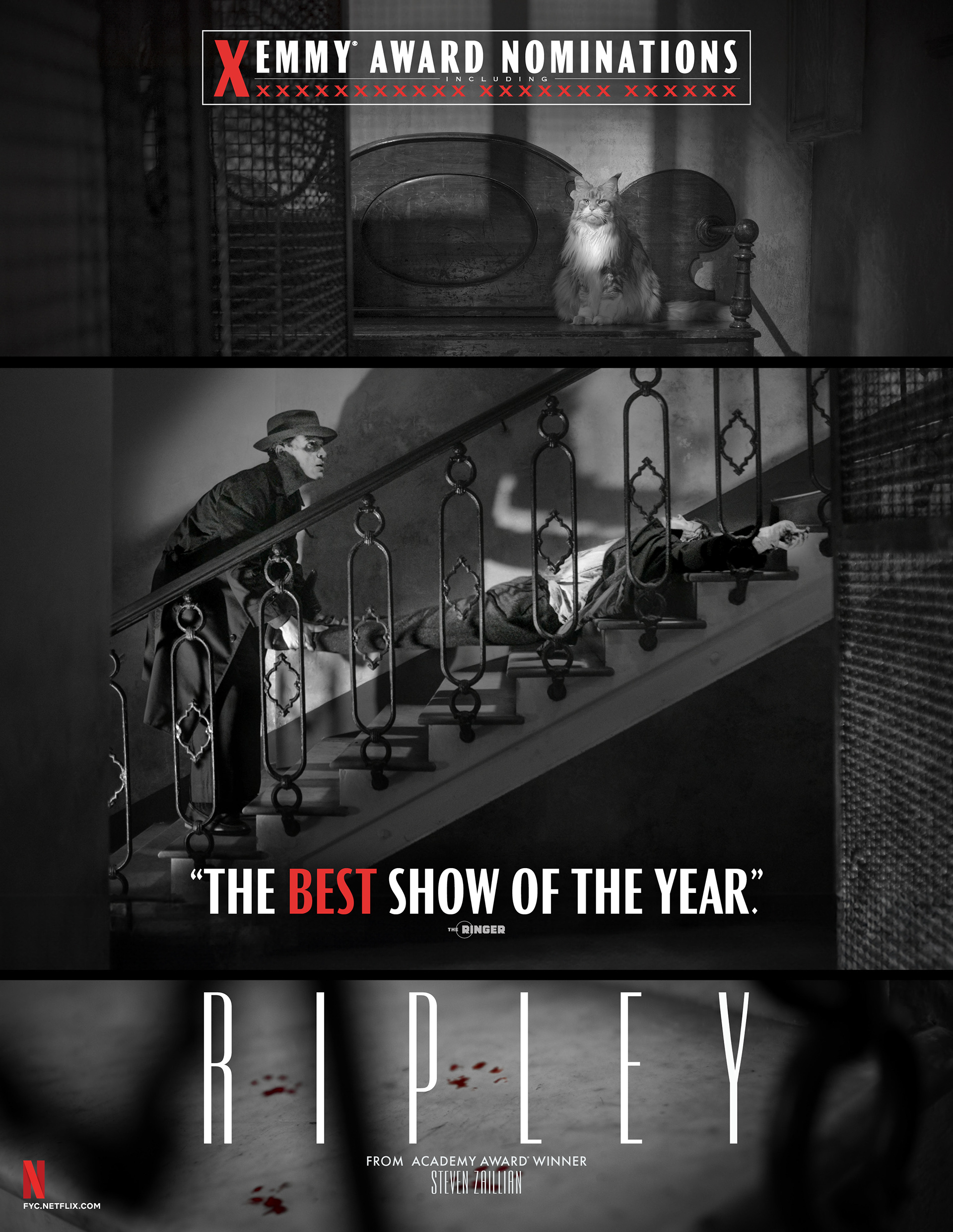
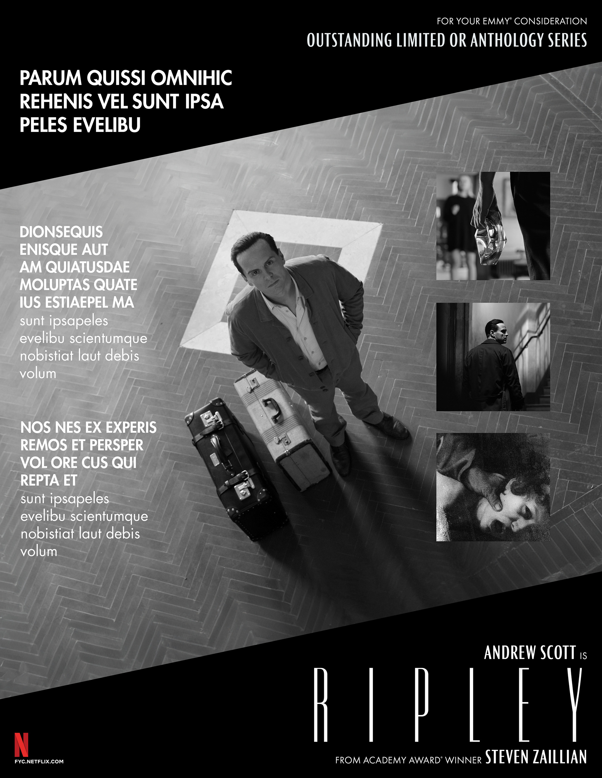
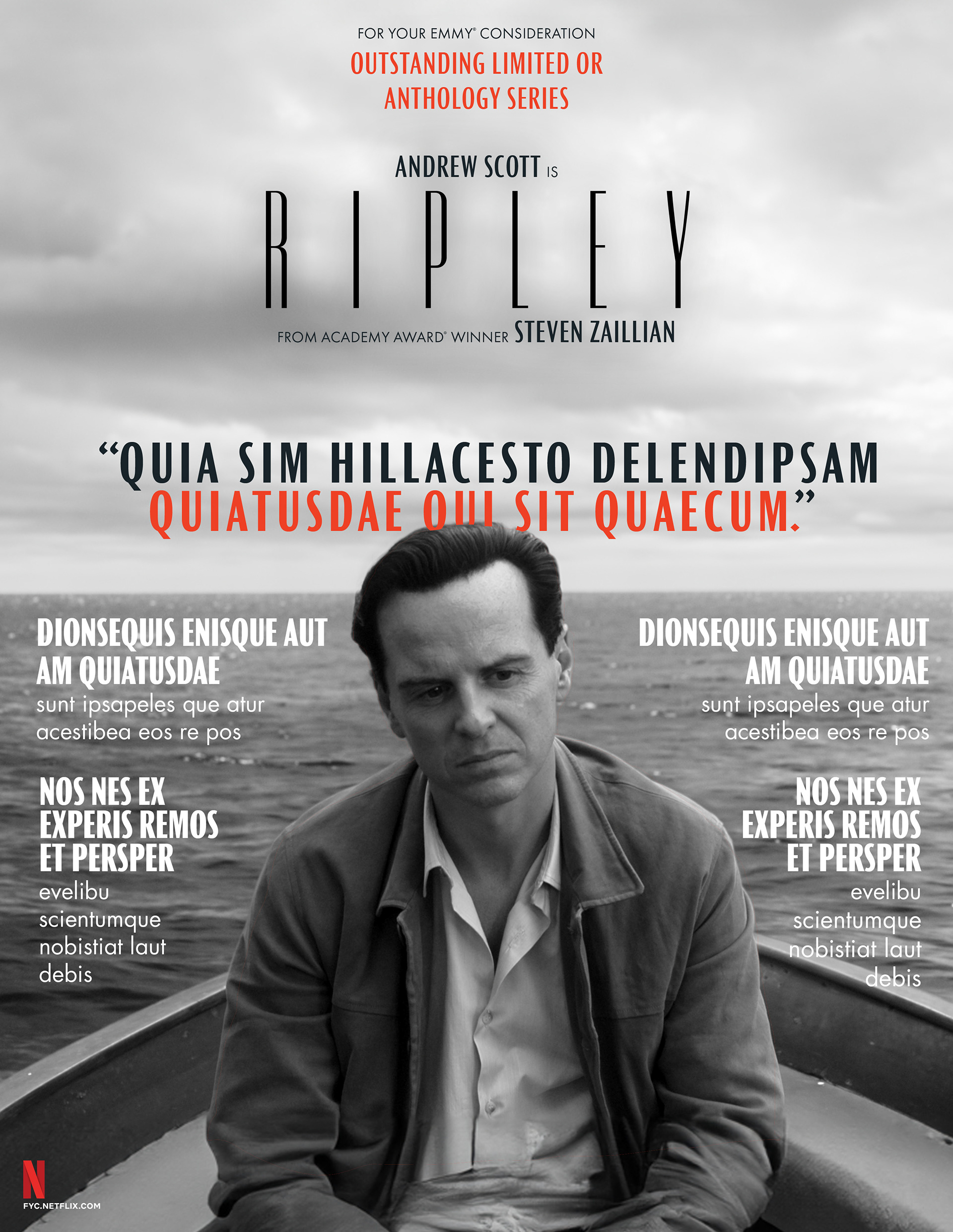
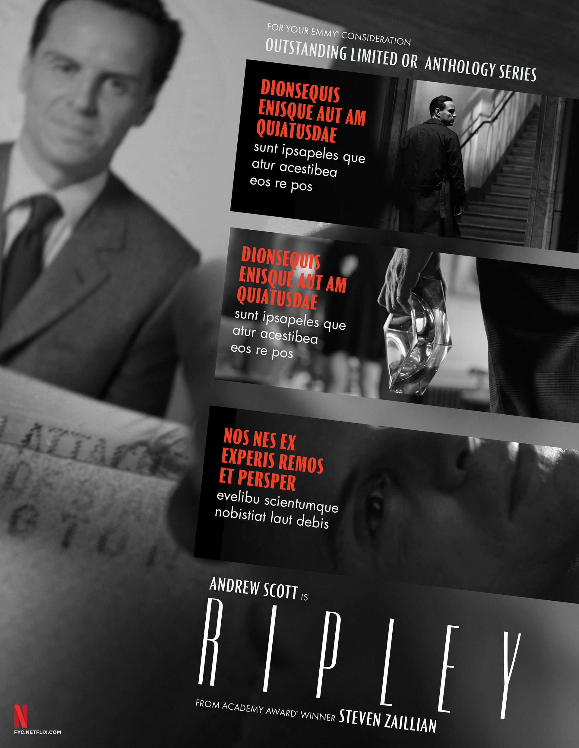
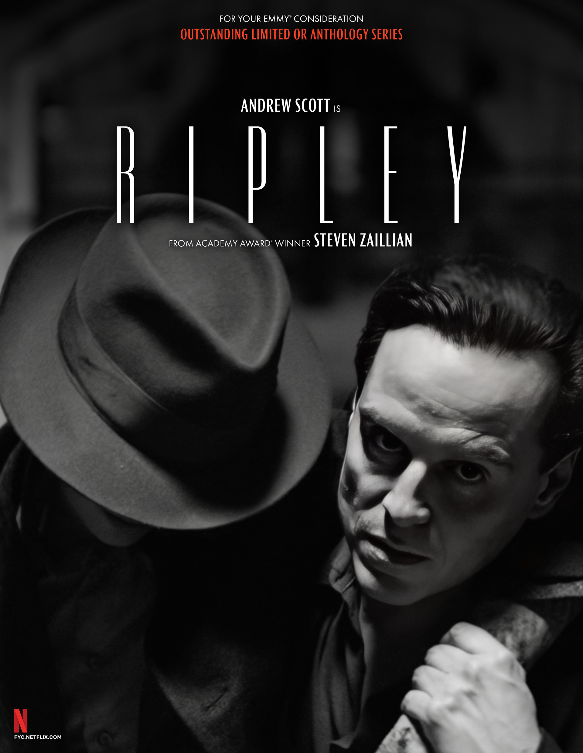
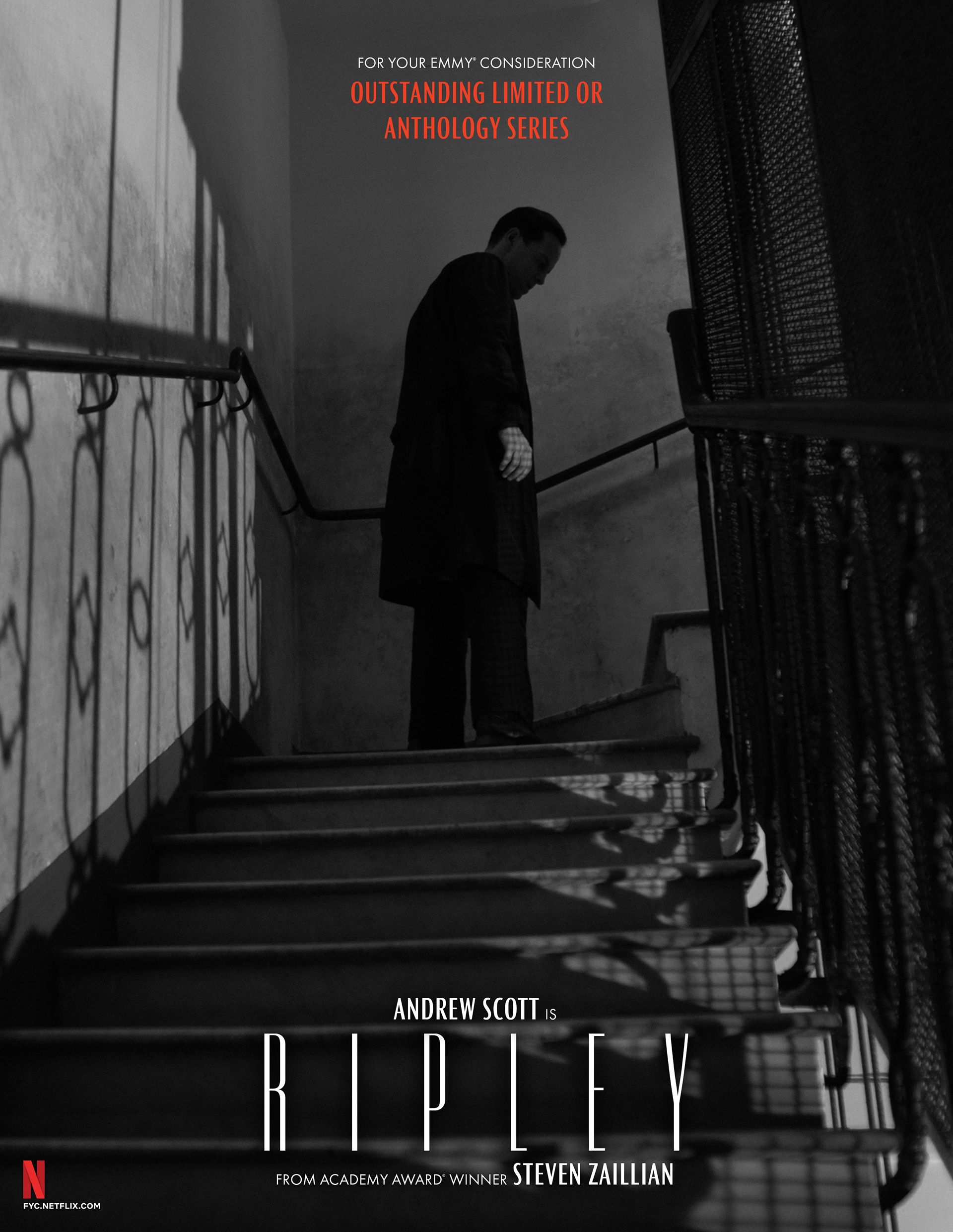
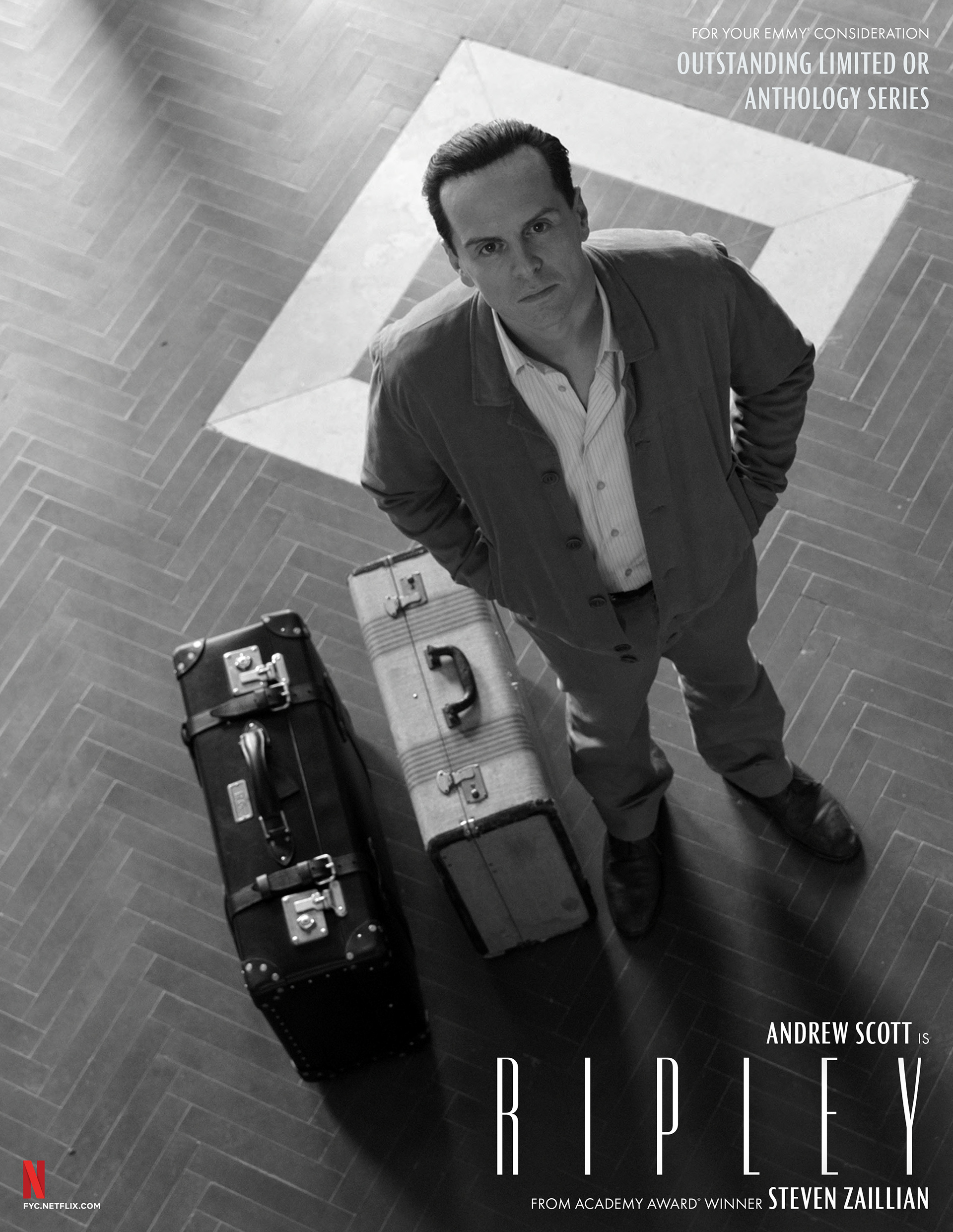
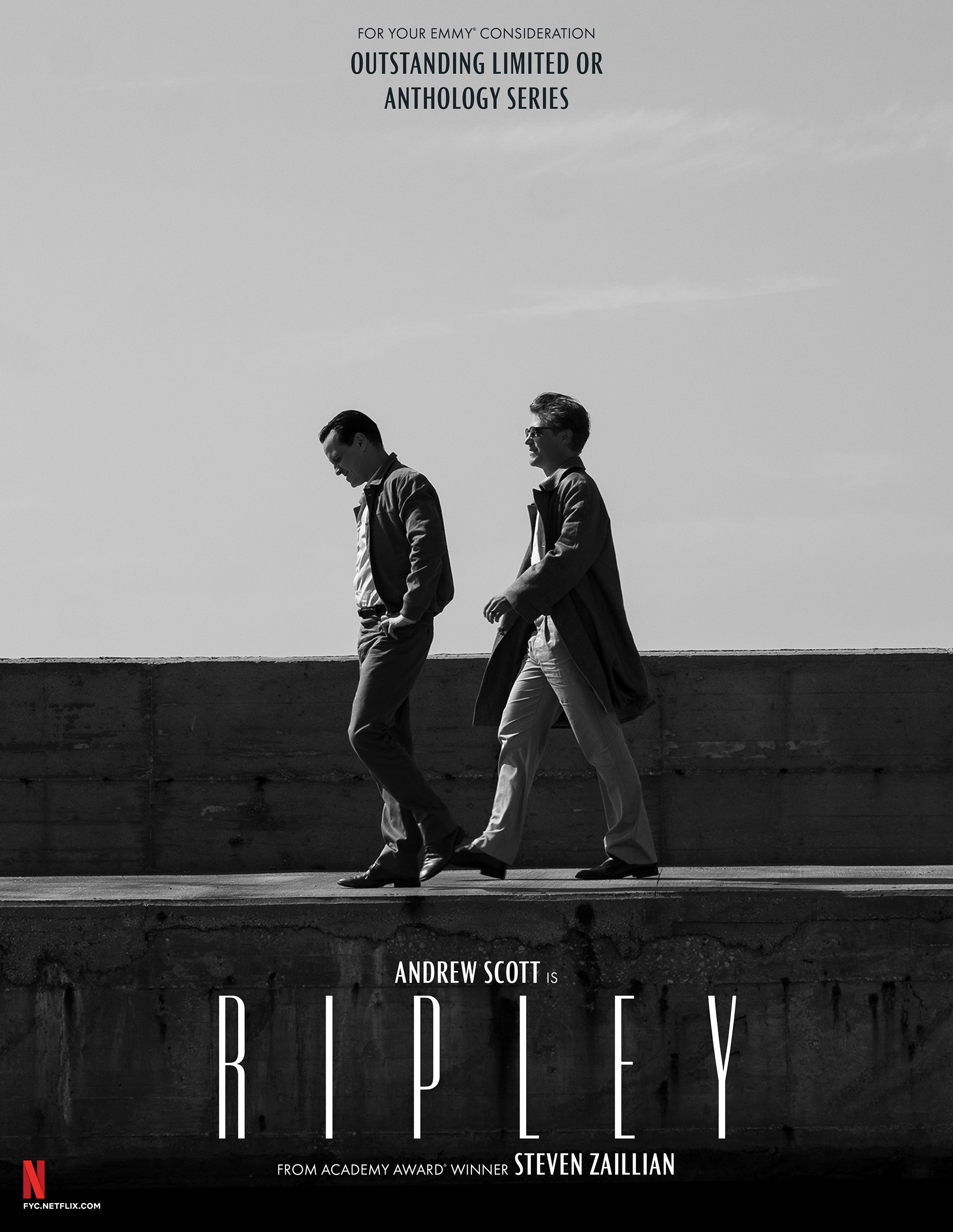
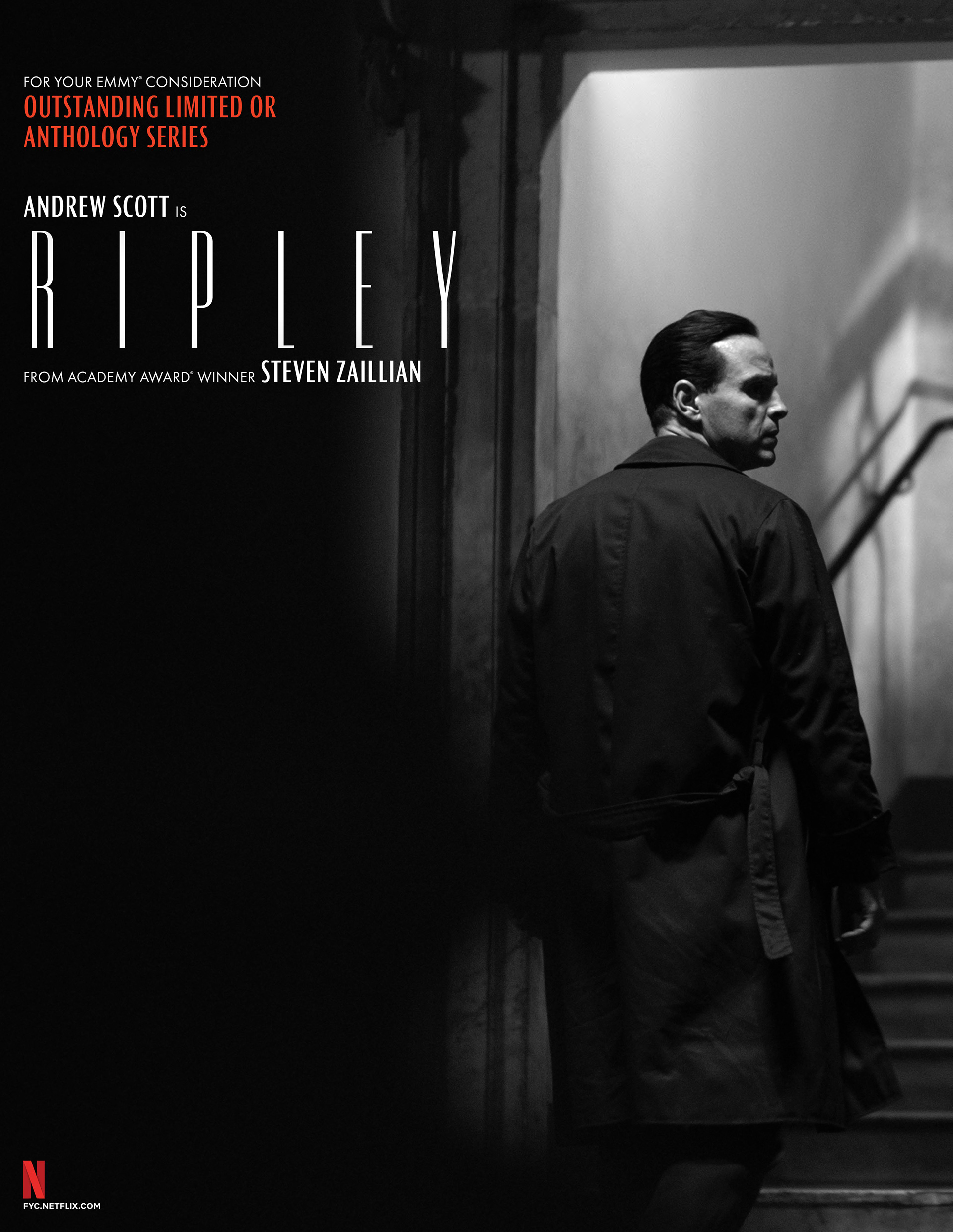
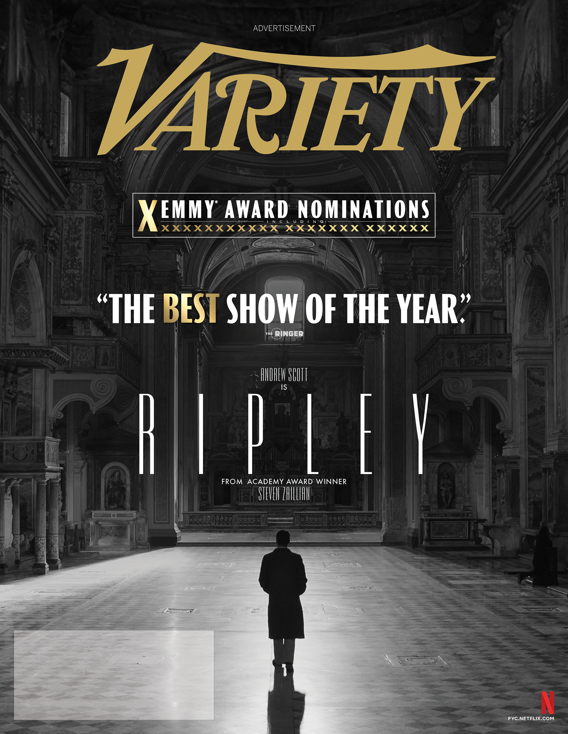
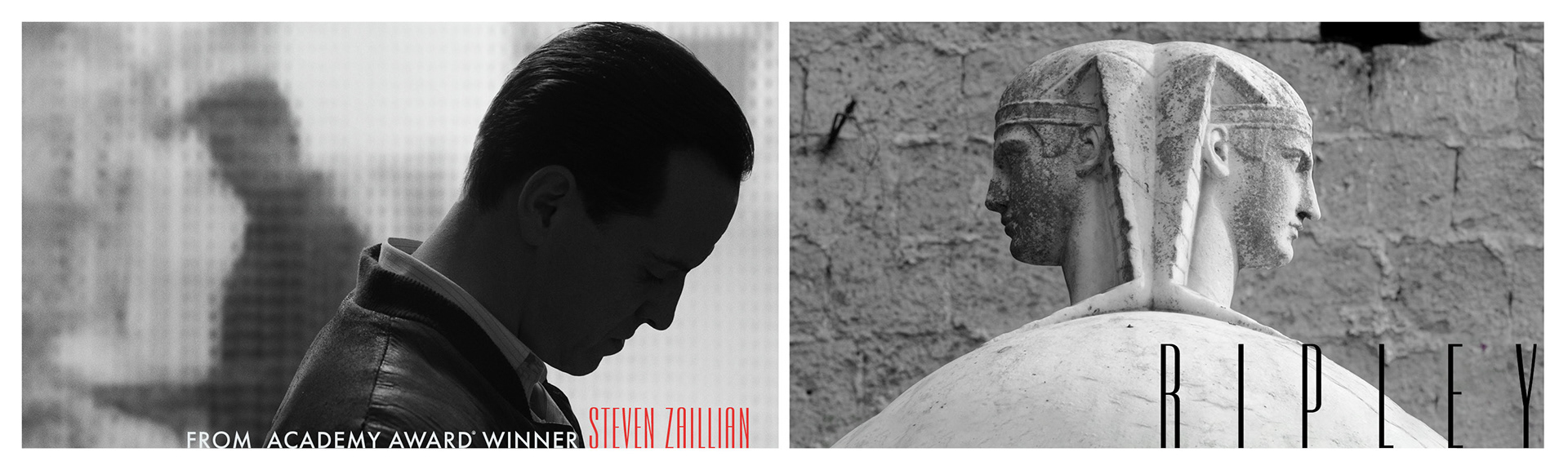
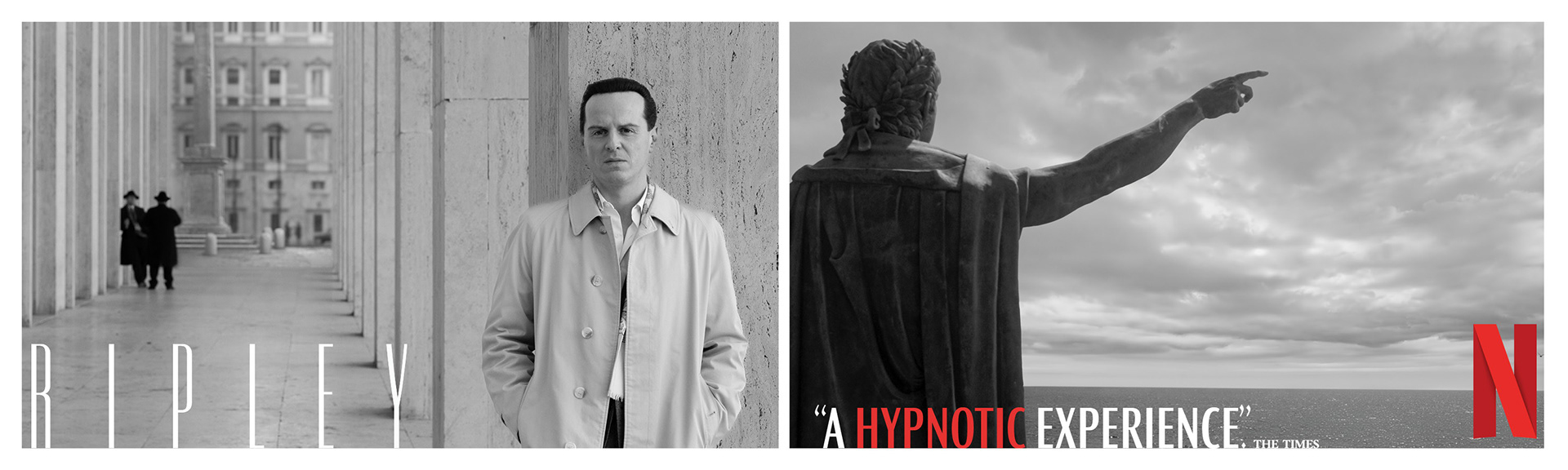
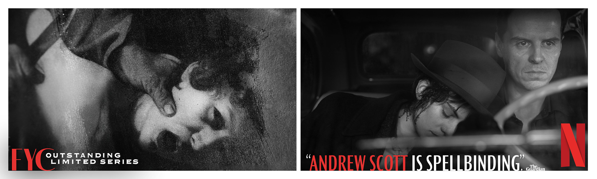
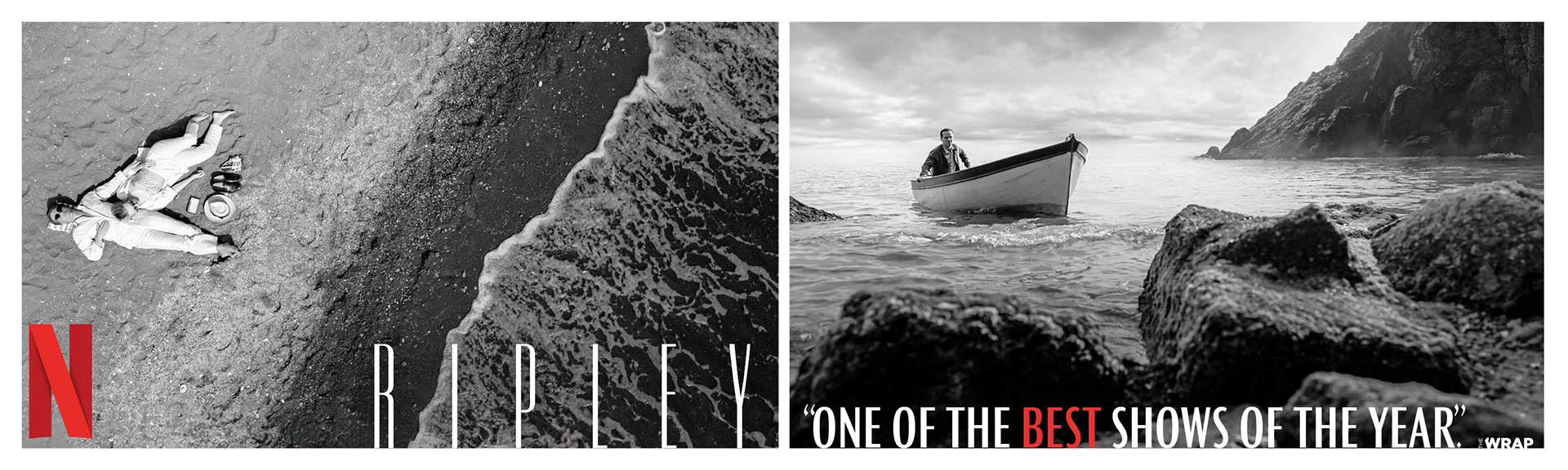
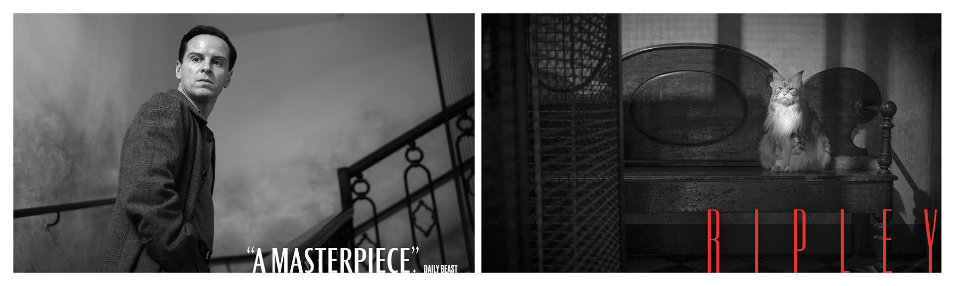
54 Nominations | 12 Wins | 4 Primetime Emmy® Wins
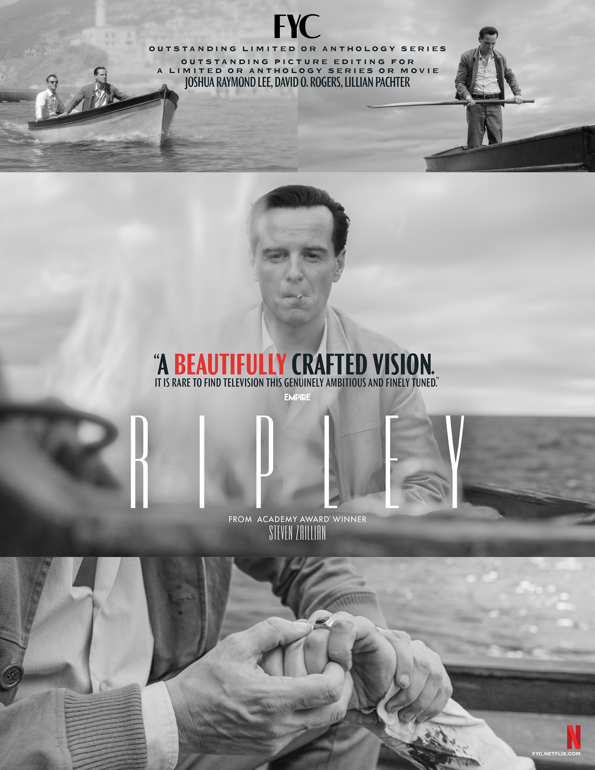
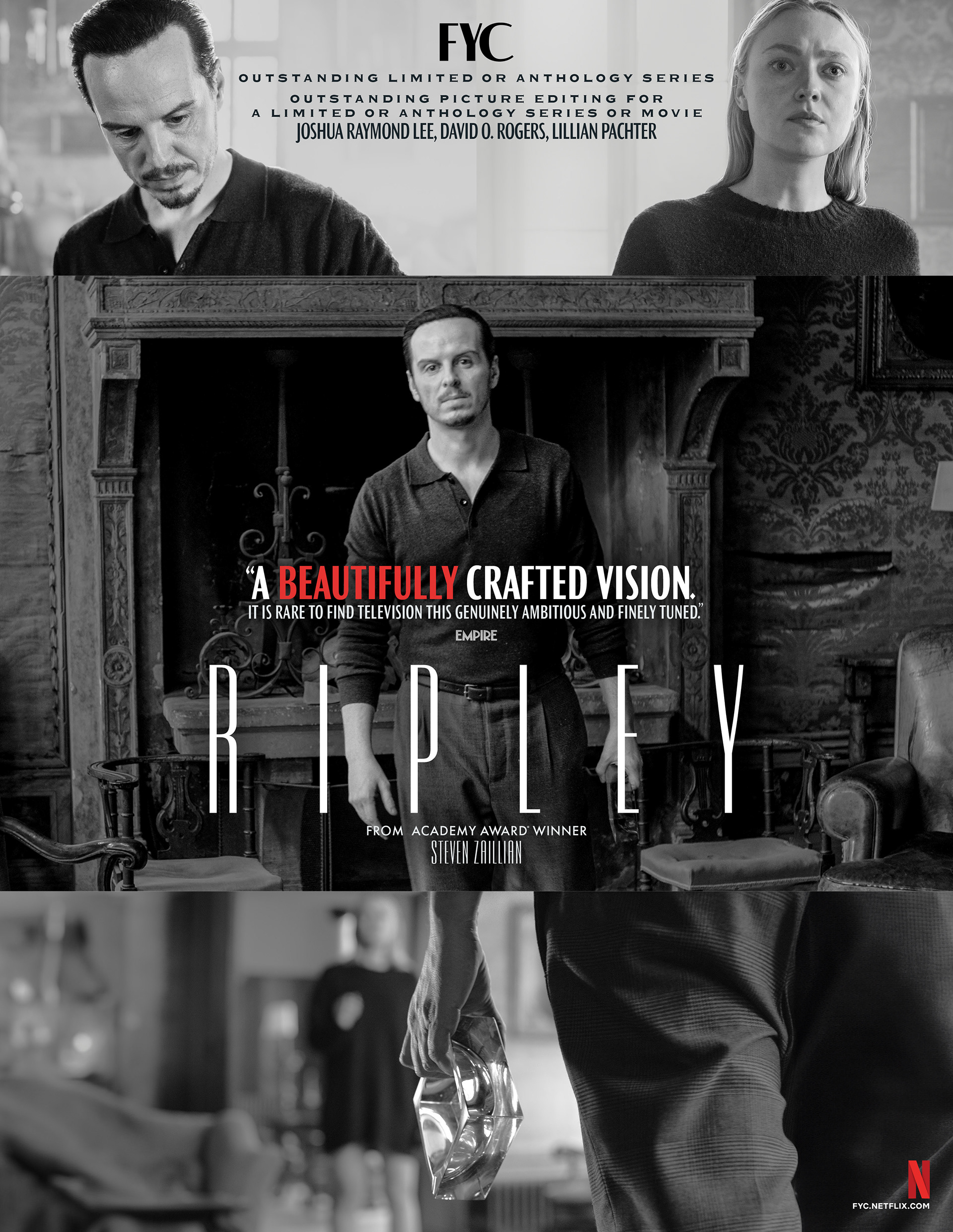
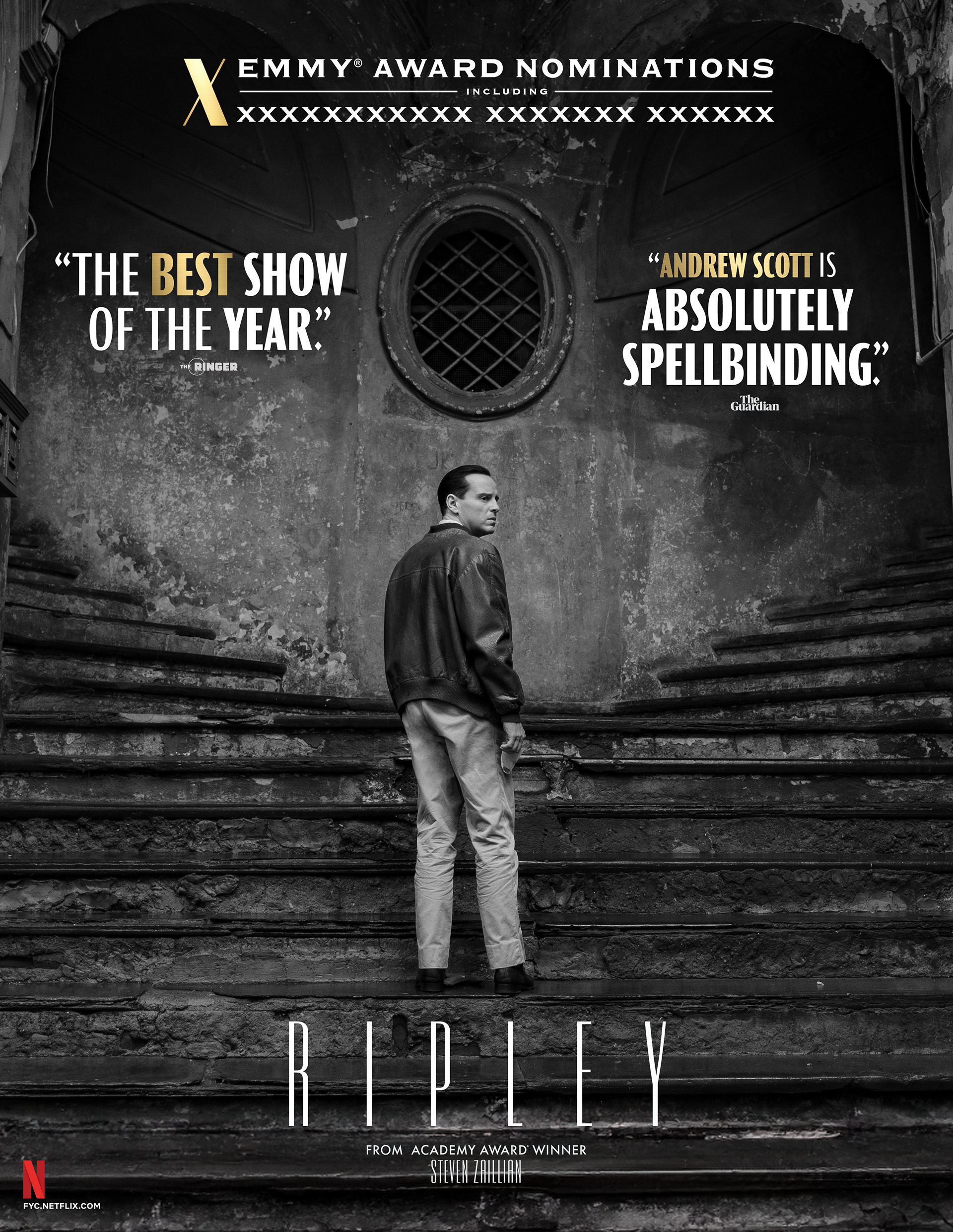
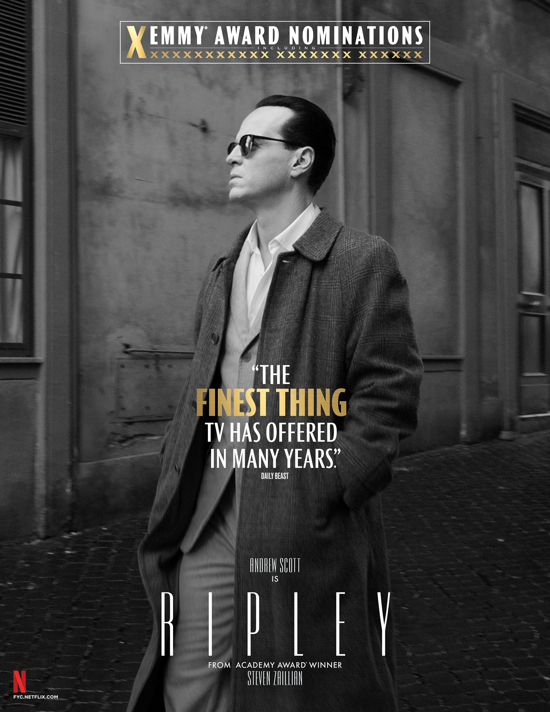
BRIEF
Netflix required a campaign for Ripley mirroring its stunning monochrome cinematography. The goal was translating high-contrast noir visuals into prestigious voter materials.
STRATEGY
I designed a stark black-and-white identity using dramatic lighting and architectural geometry. The visuals evoke the show’s suspenseful, Hitchcockian atmosphere across print and digital.
Industry Trade Print
Out of Home Advertising – Wildposting Barricades
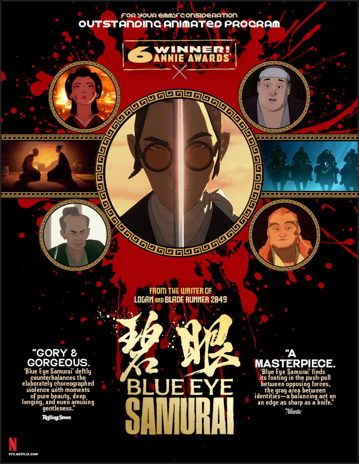
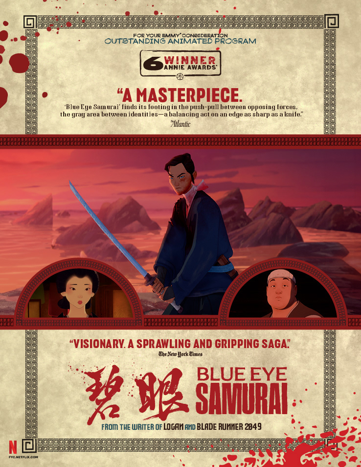
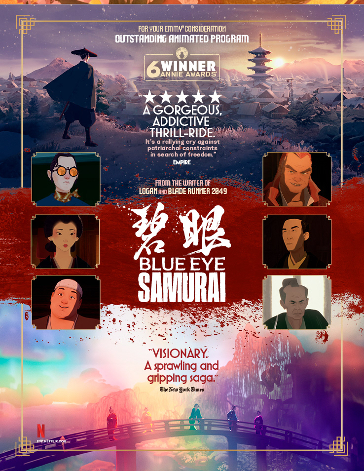
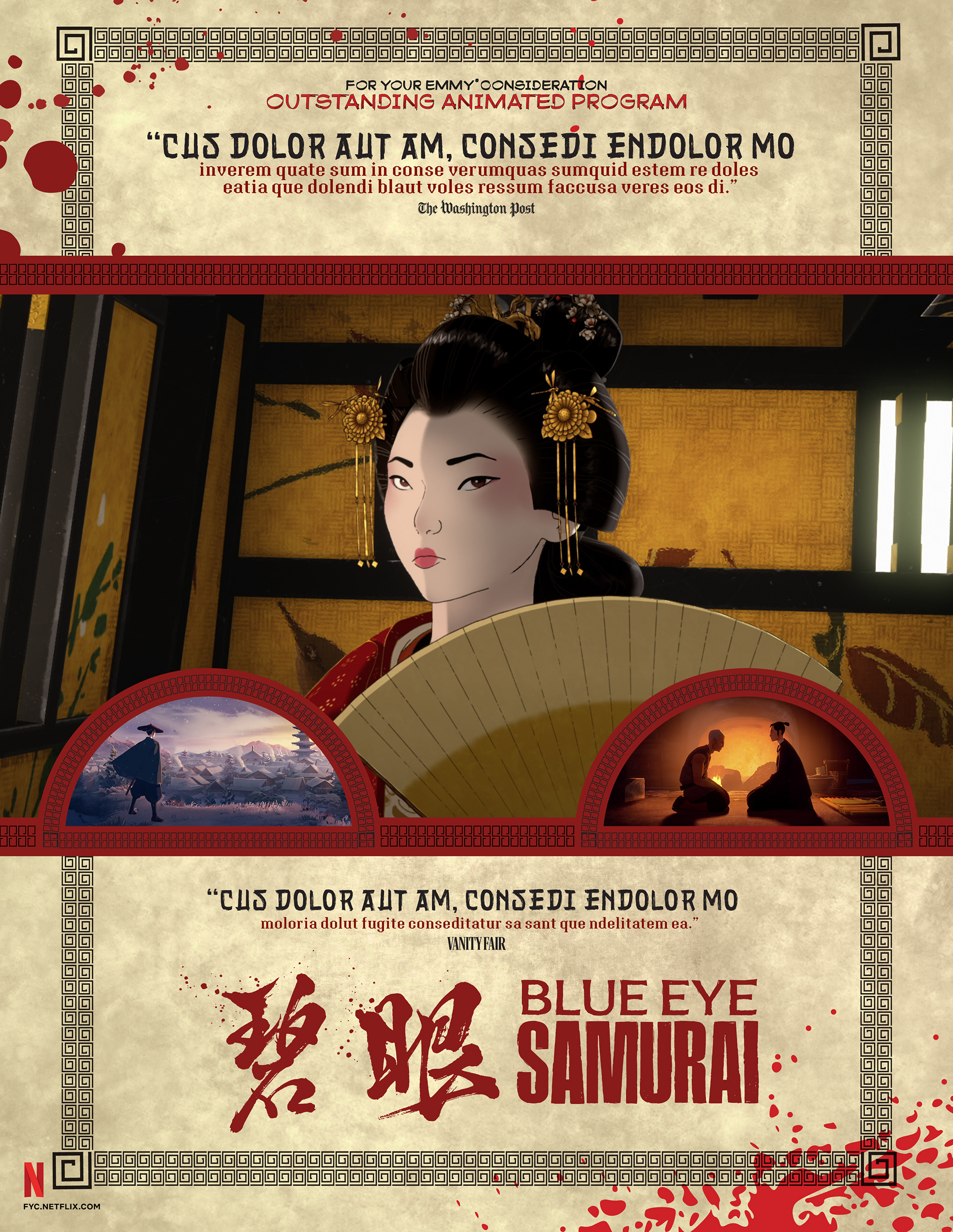
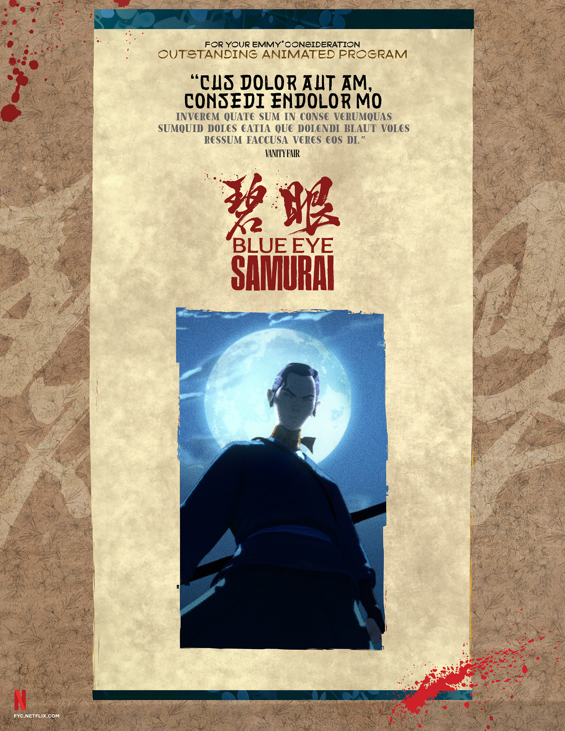
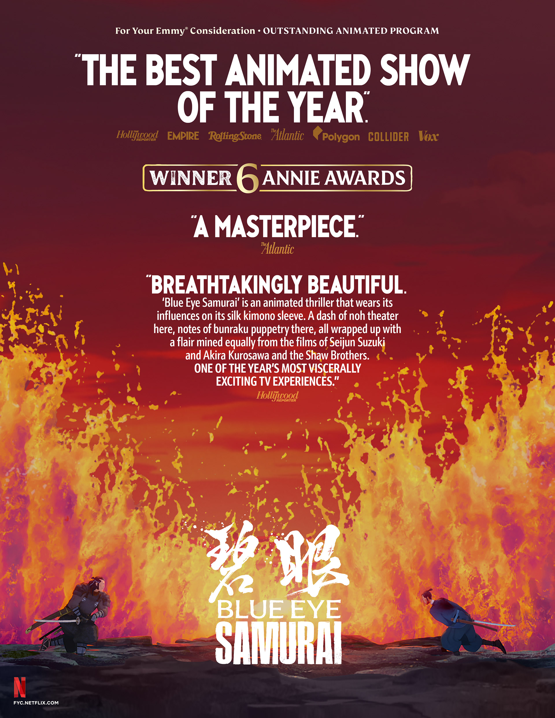
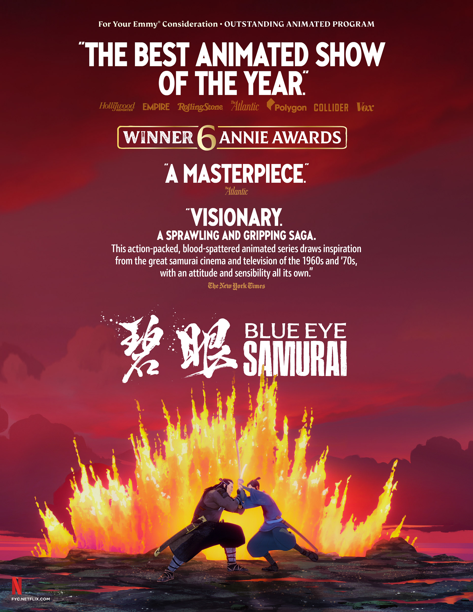
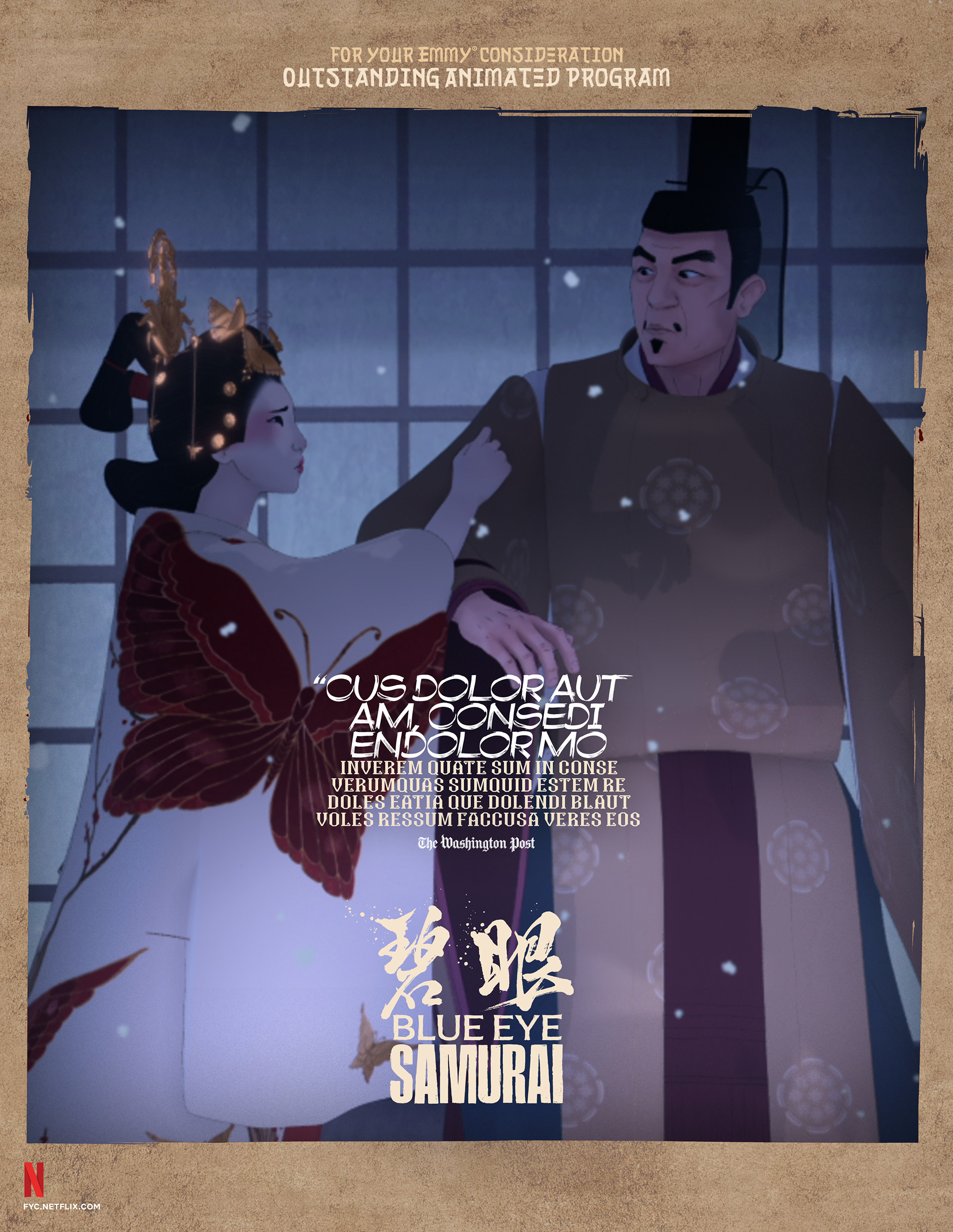
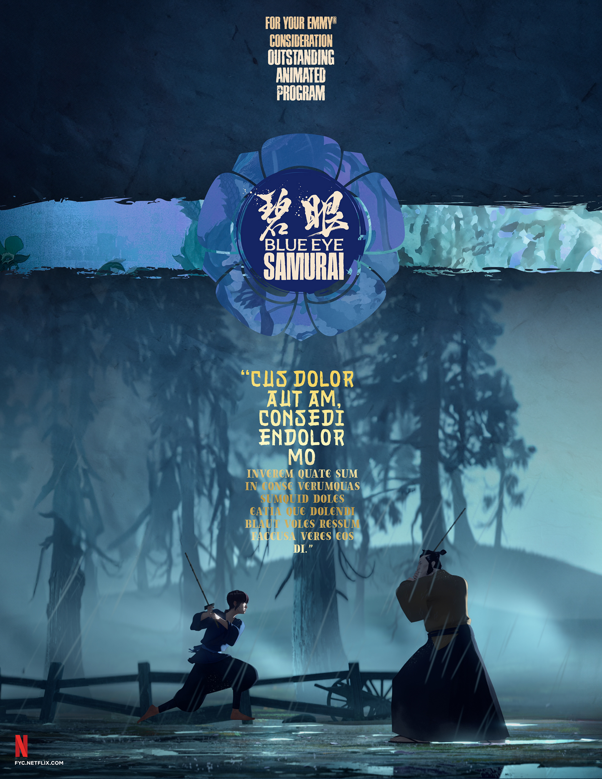
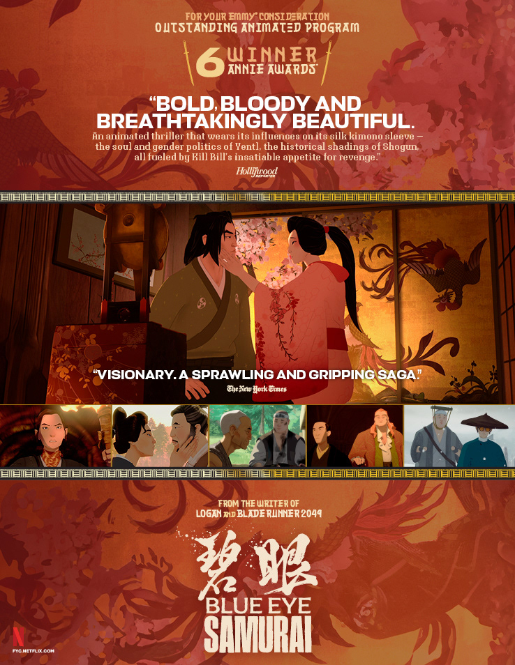
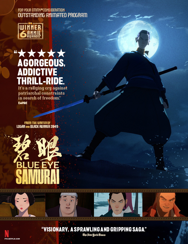
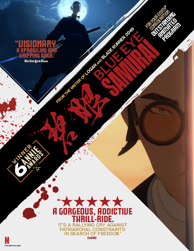
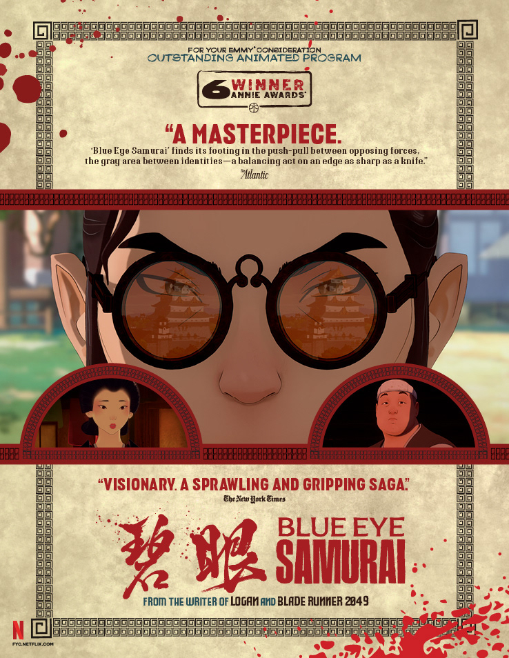
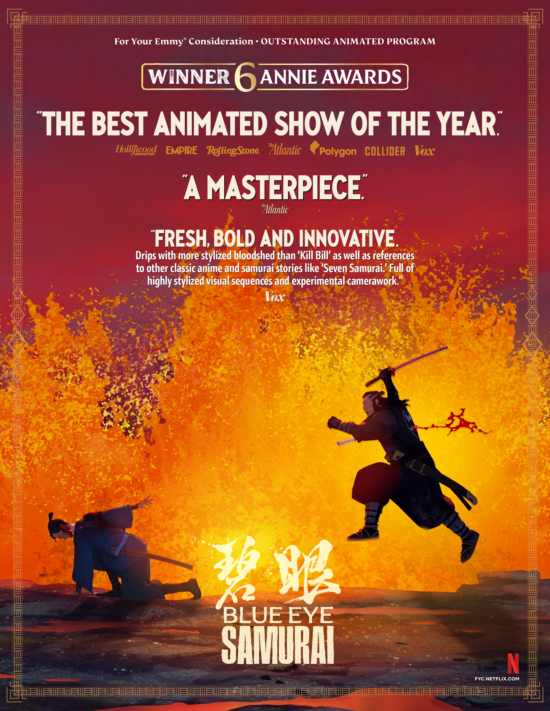
16 Nominations | 12 Wins | 5 Primetime Emmy® Wins
BRIEF
The agency sought to position Blue Eye Samurai as an animation masterpiece. The challenge was capturing its visceral violence and painterly beauty for voters.
STRATEGY
I developed a kinetic identity contrasting fiery oranges with icy blues. The design leverages striking silhouettes and parchment textures to highlight the series’ unique artistry.
Industry Trade Print
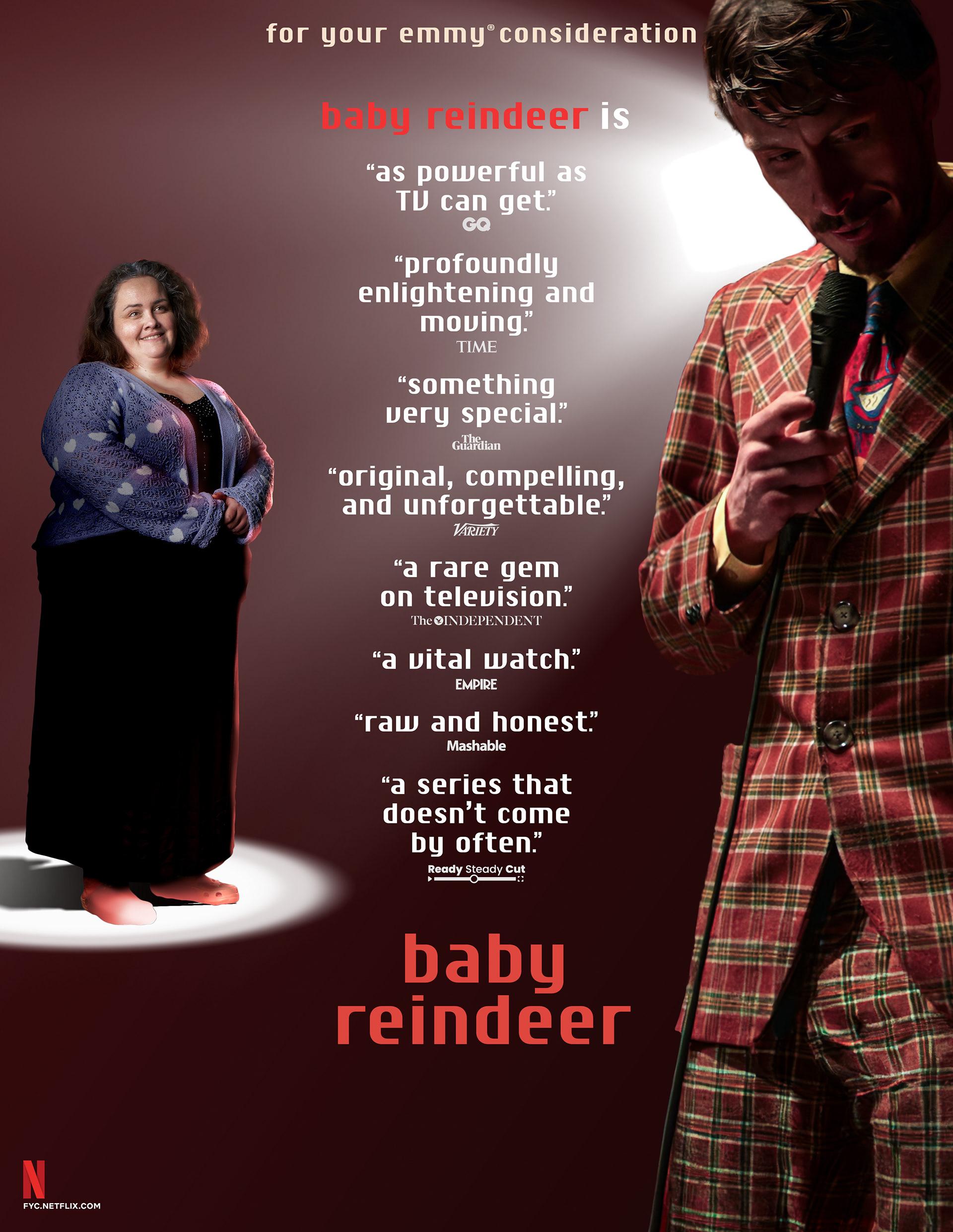
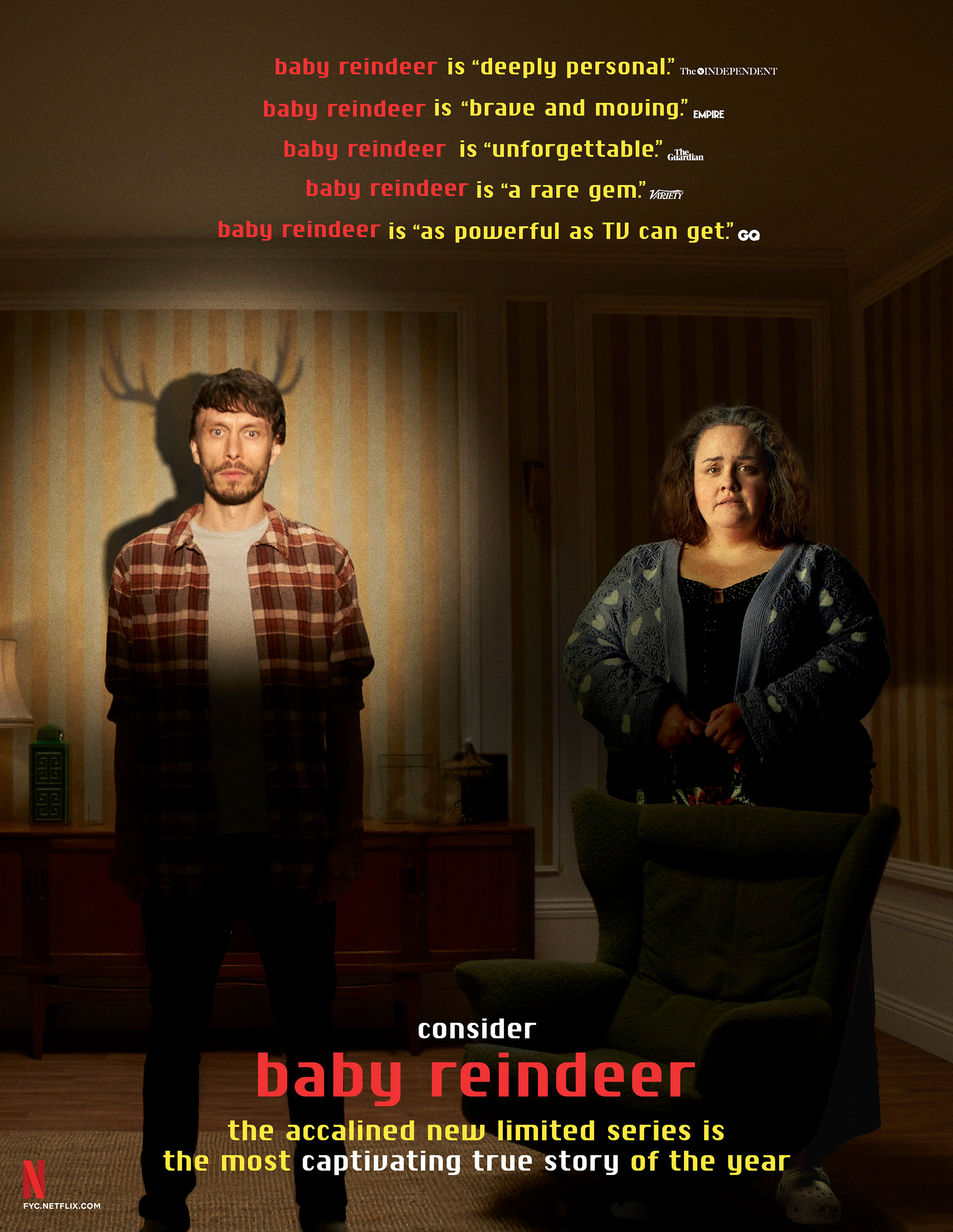
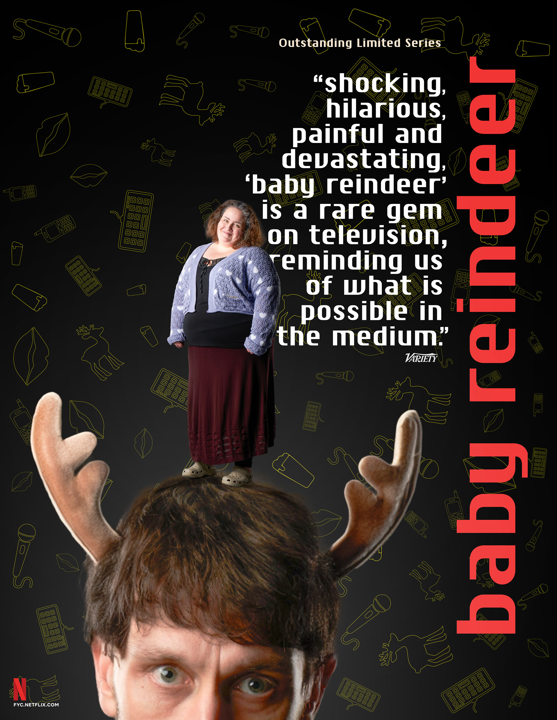
59 Nominations | 24 Wins | 6 Primetime Emmy® Wins
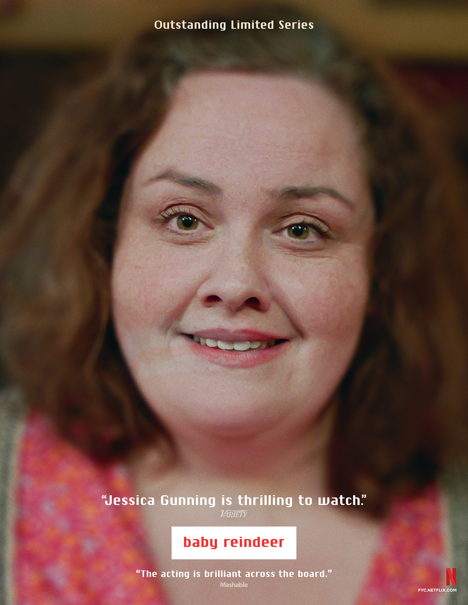
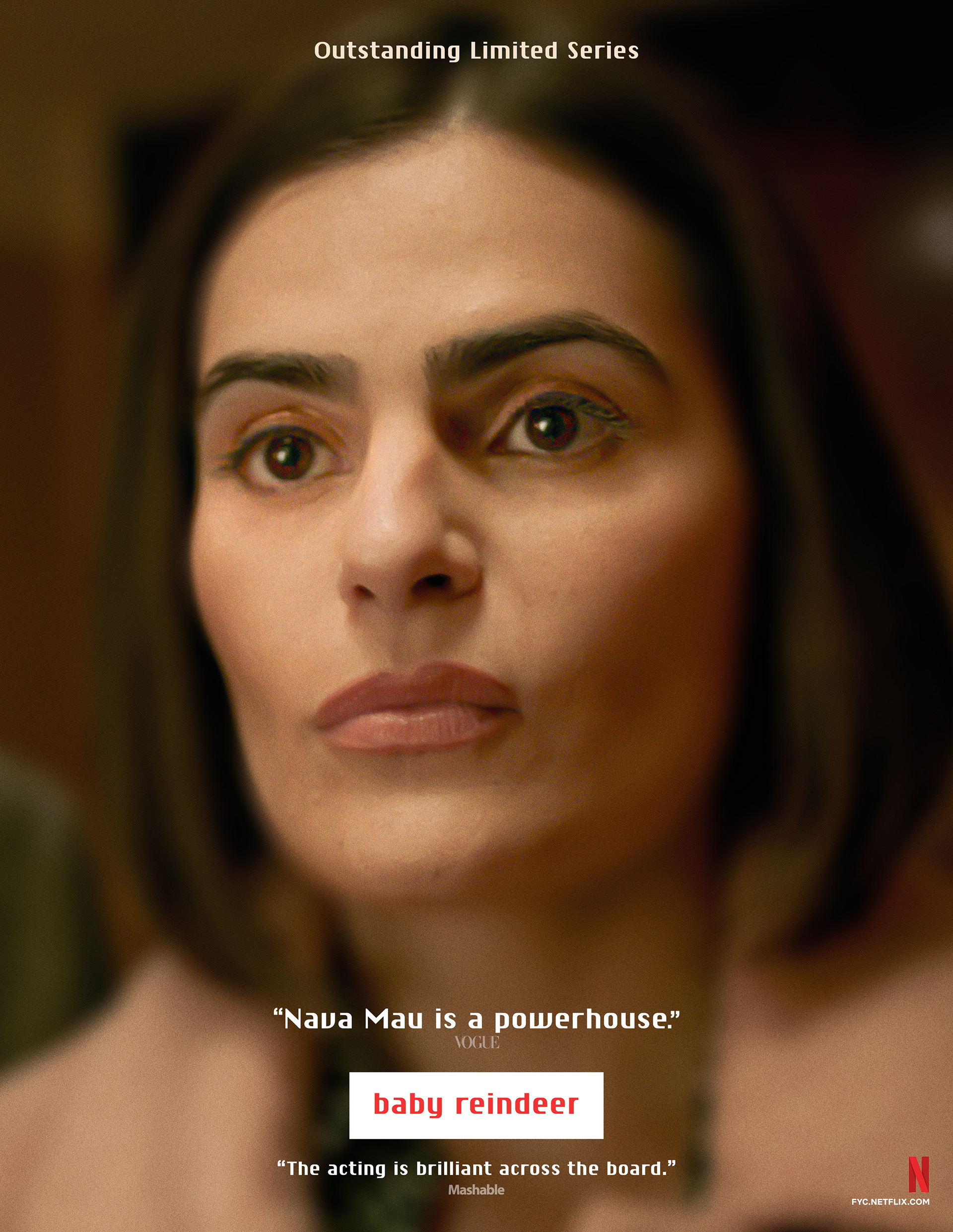
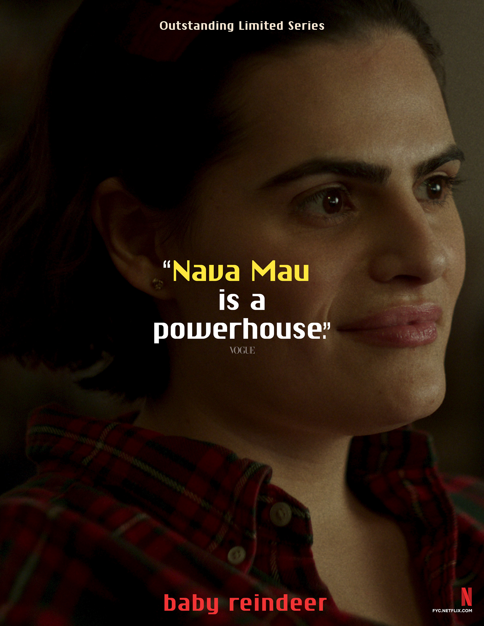
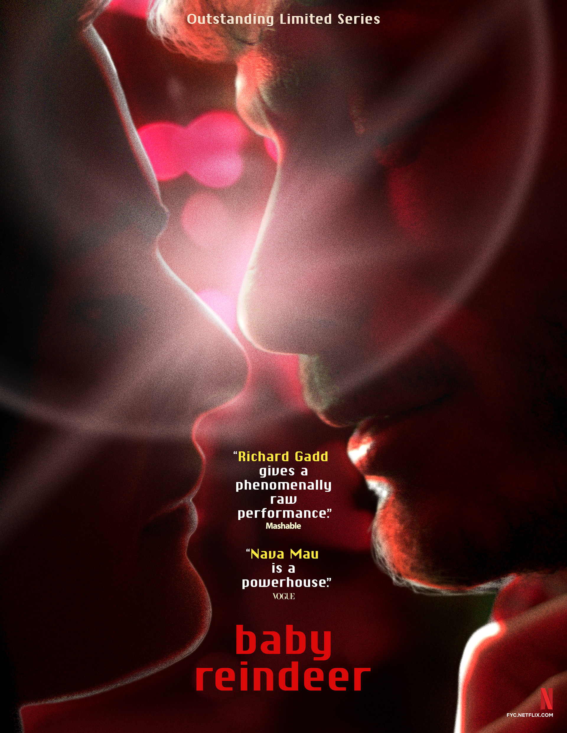
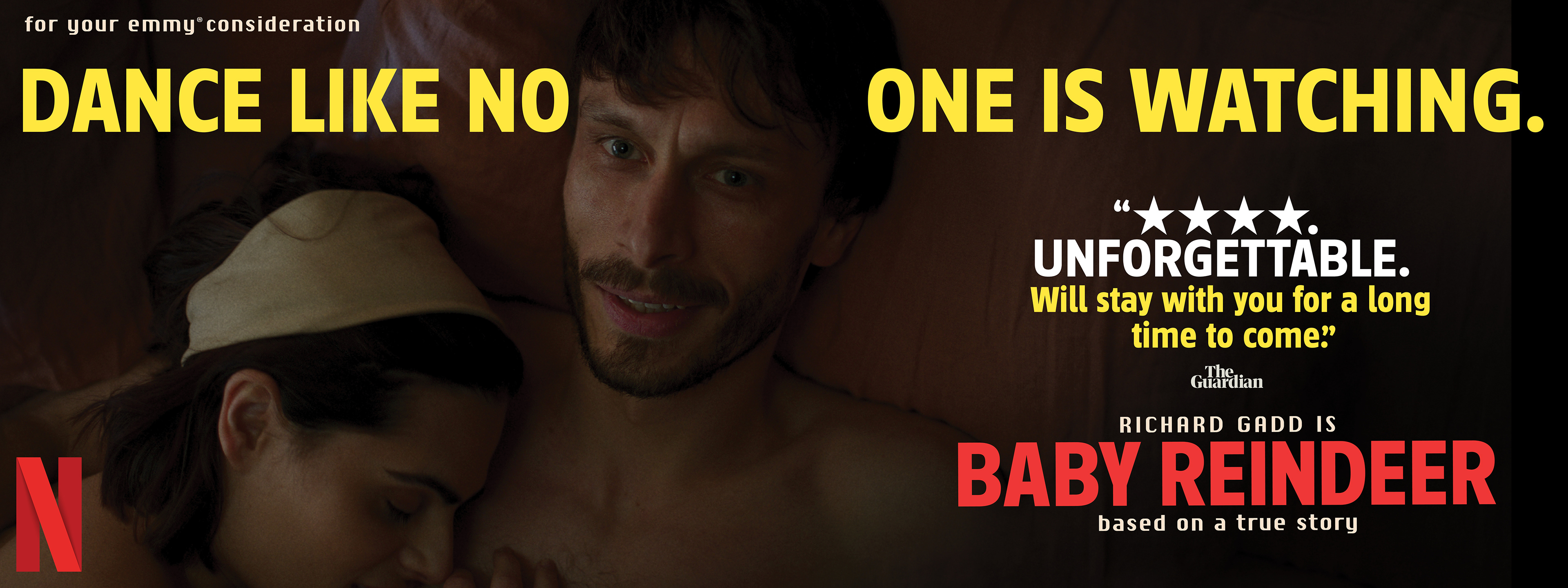
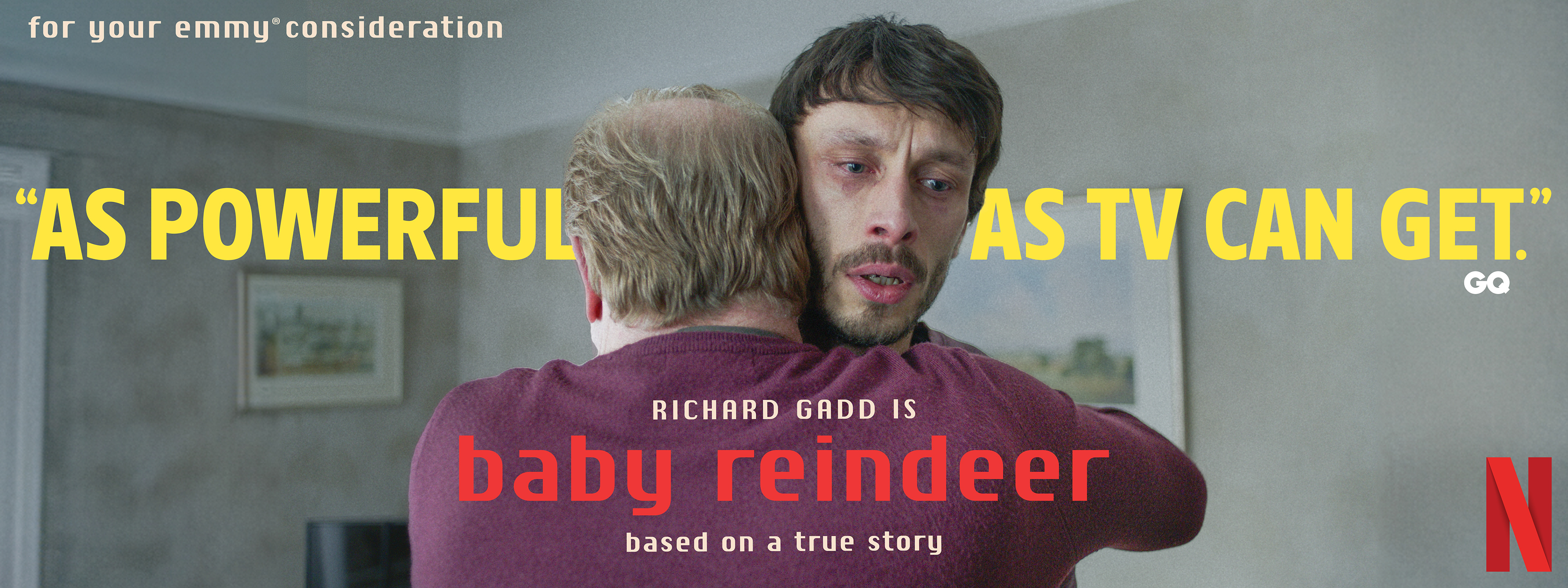
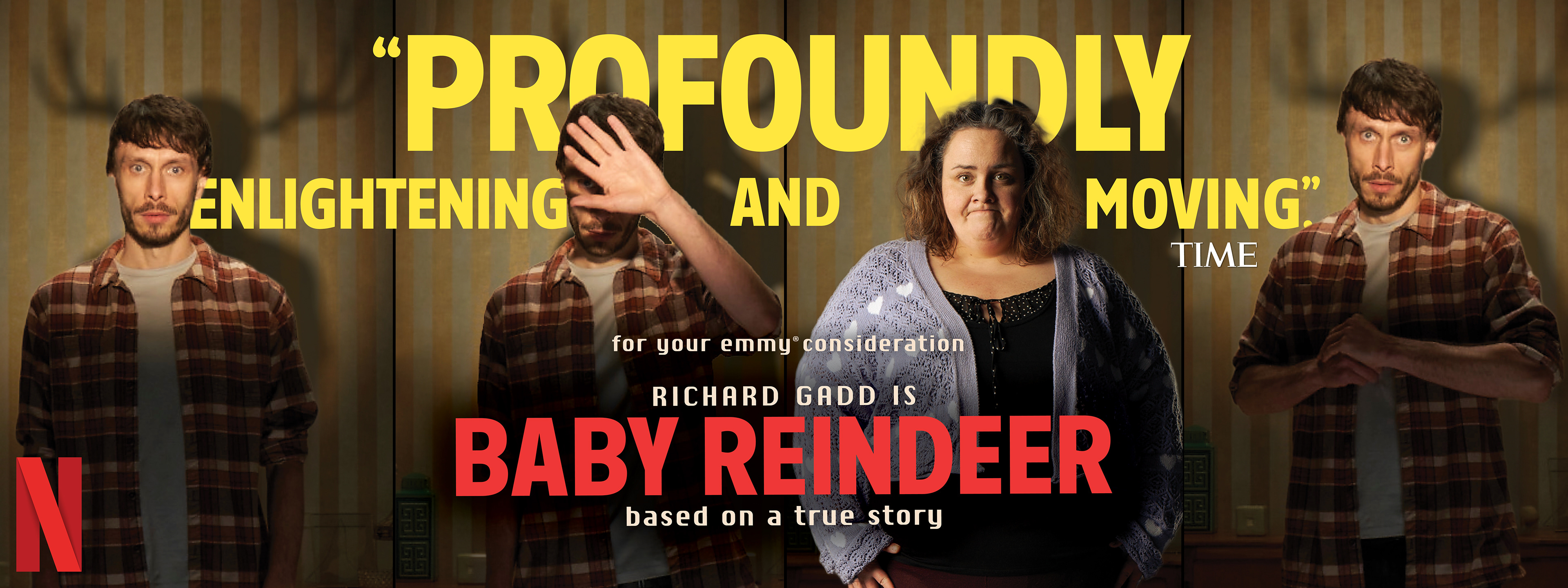
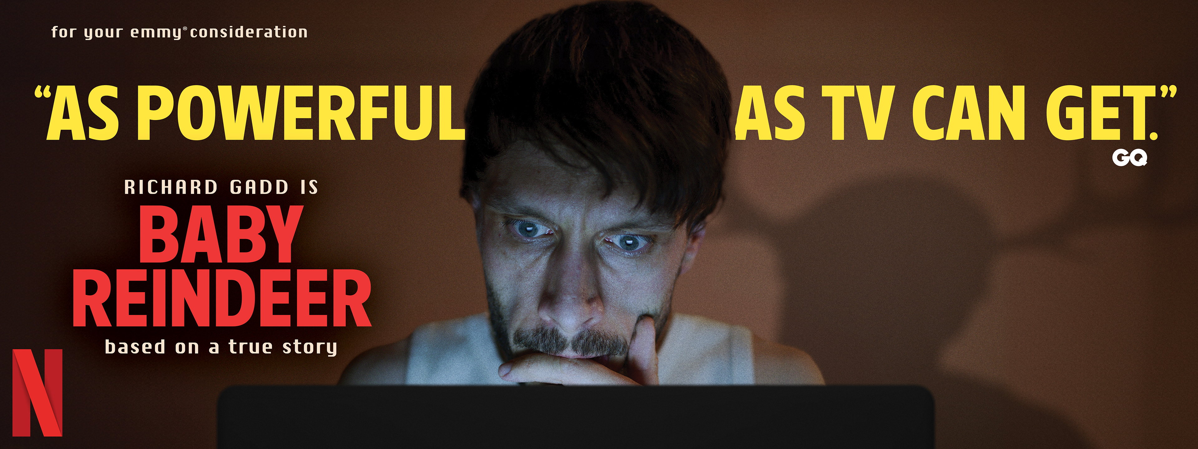
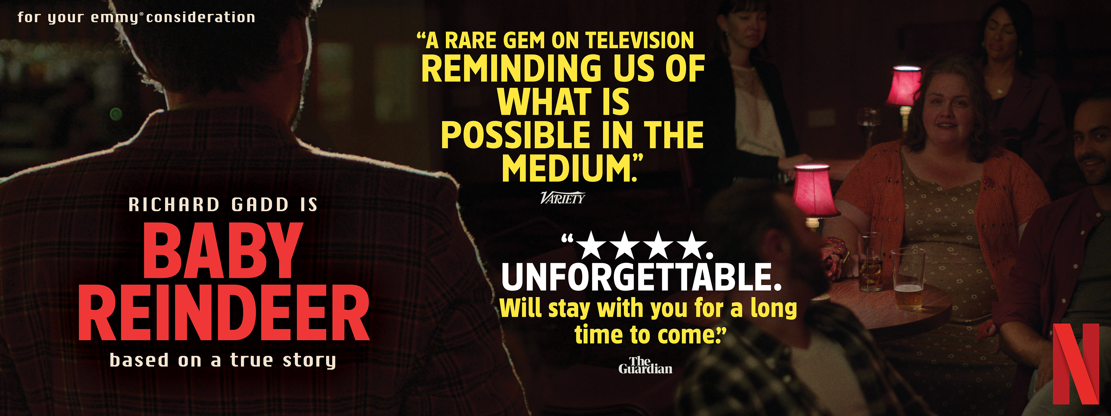
BRIEF
Netflix required a campaign for Baby Reindeer capturing its suffocating psychological intensity. The challenge was visualizing the chaotic dynamic between stalker and victim for voters.
STRATEGY
I developed a claustrophobic identity using extreme close-ups and erratic, stacked typography. This manic aesthetic creates a visceral sense of unease mirroring the protagonist’s unraveling.
Industry Trade Print
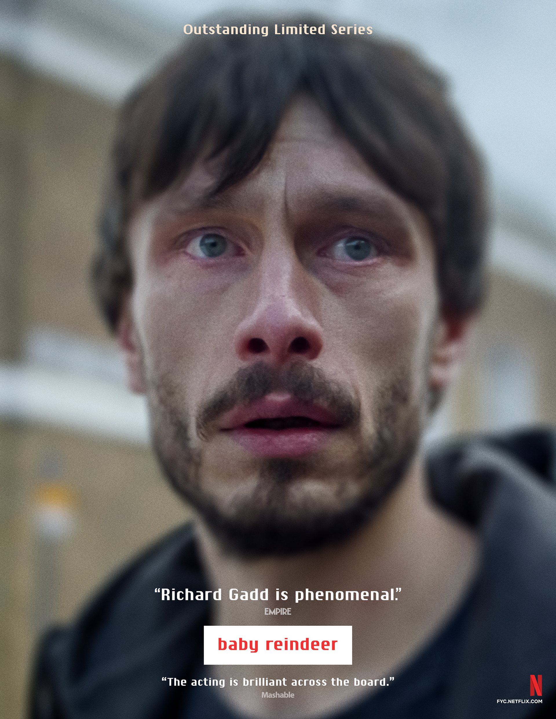
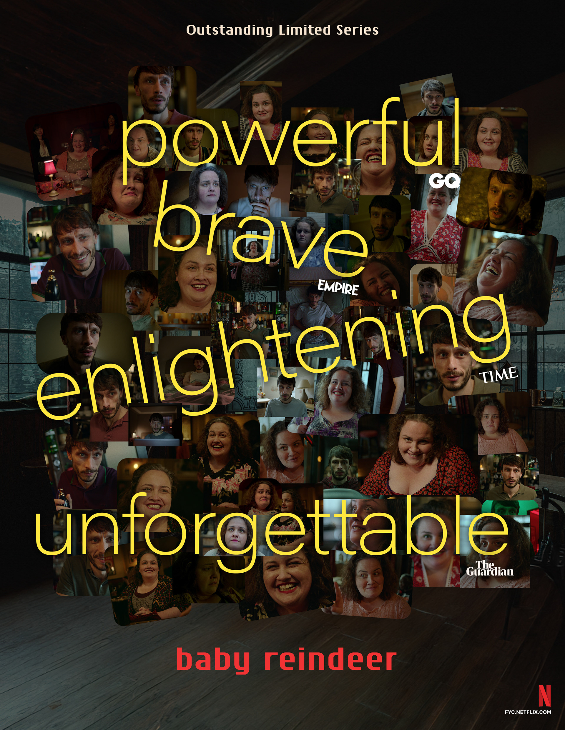
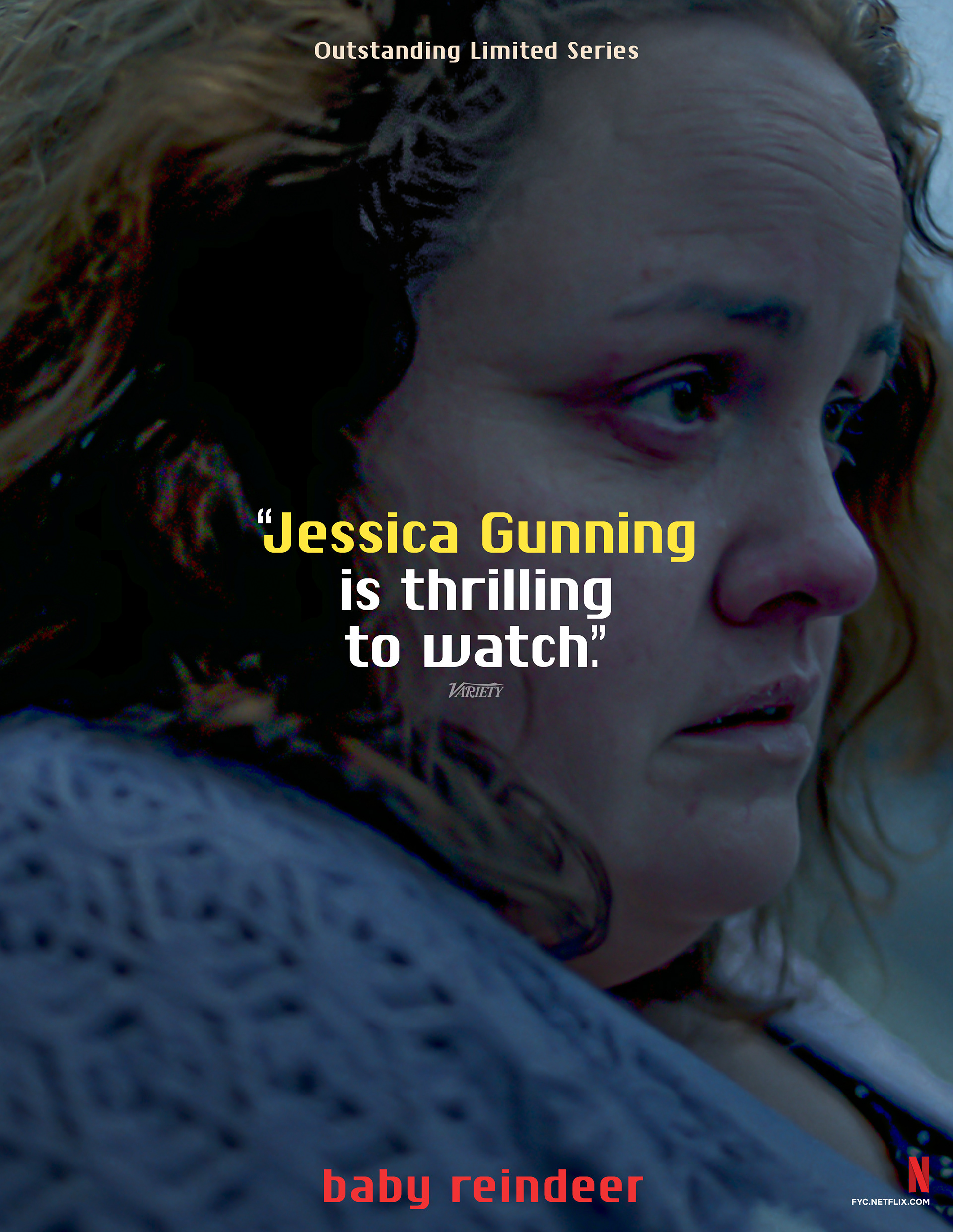
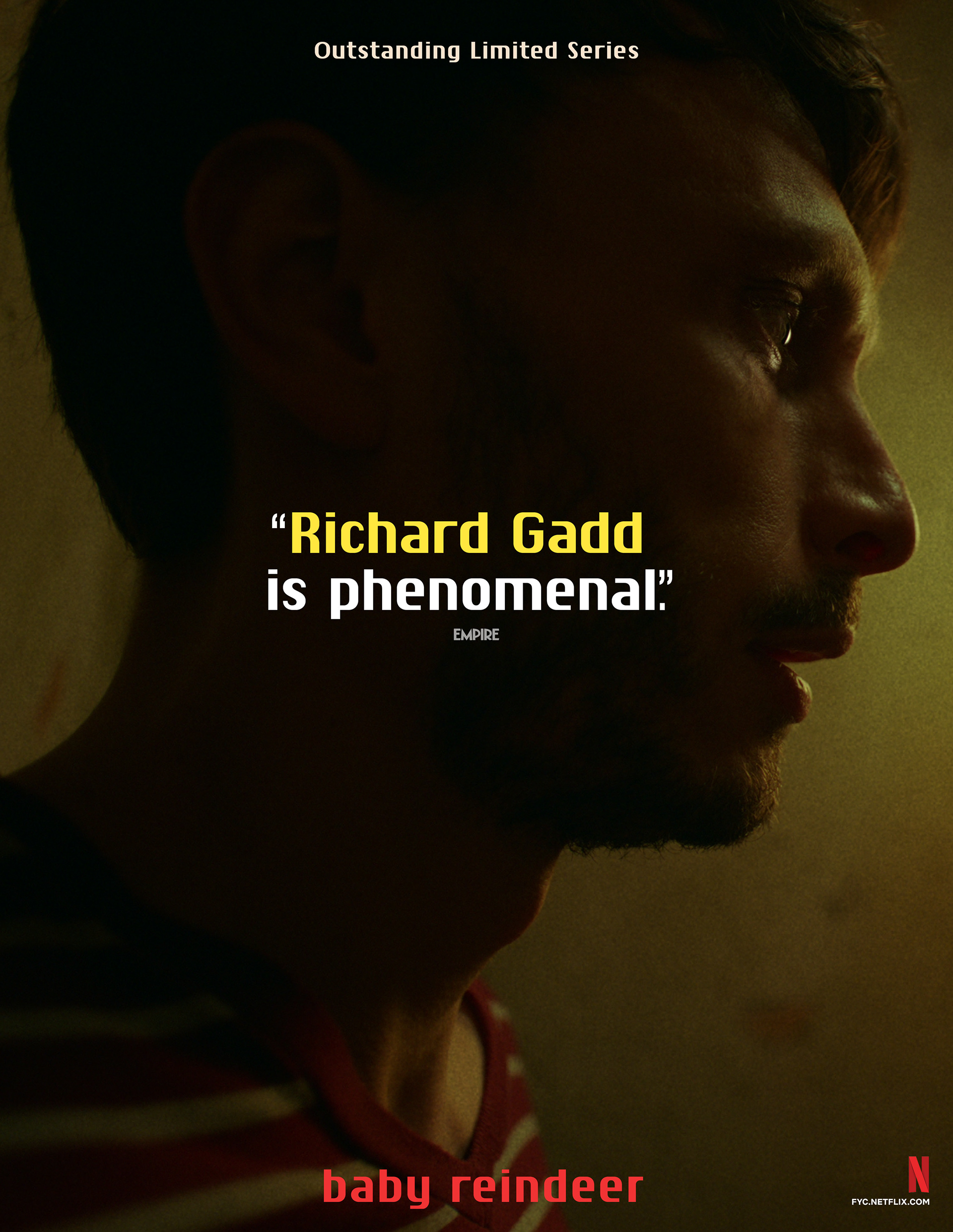
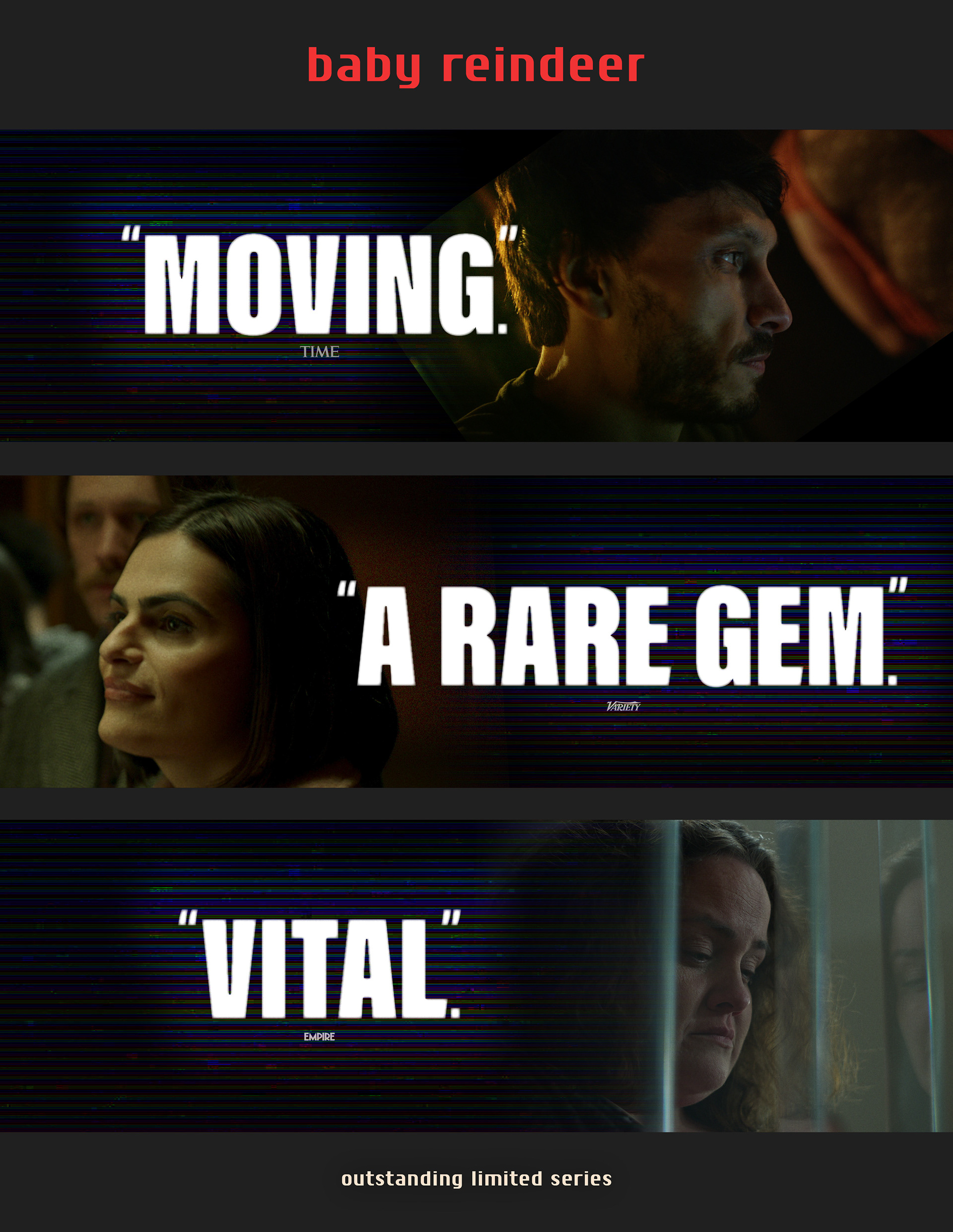
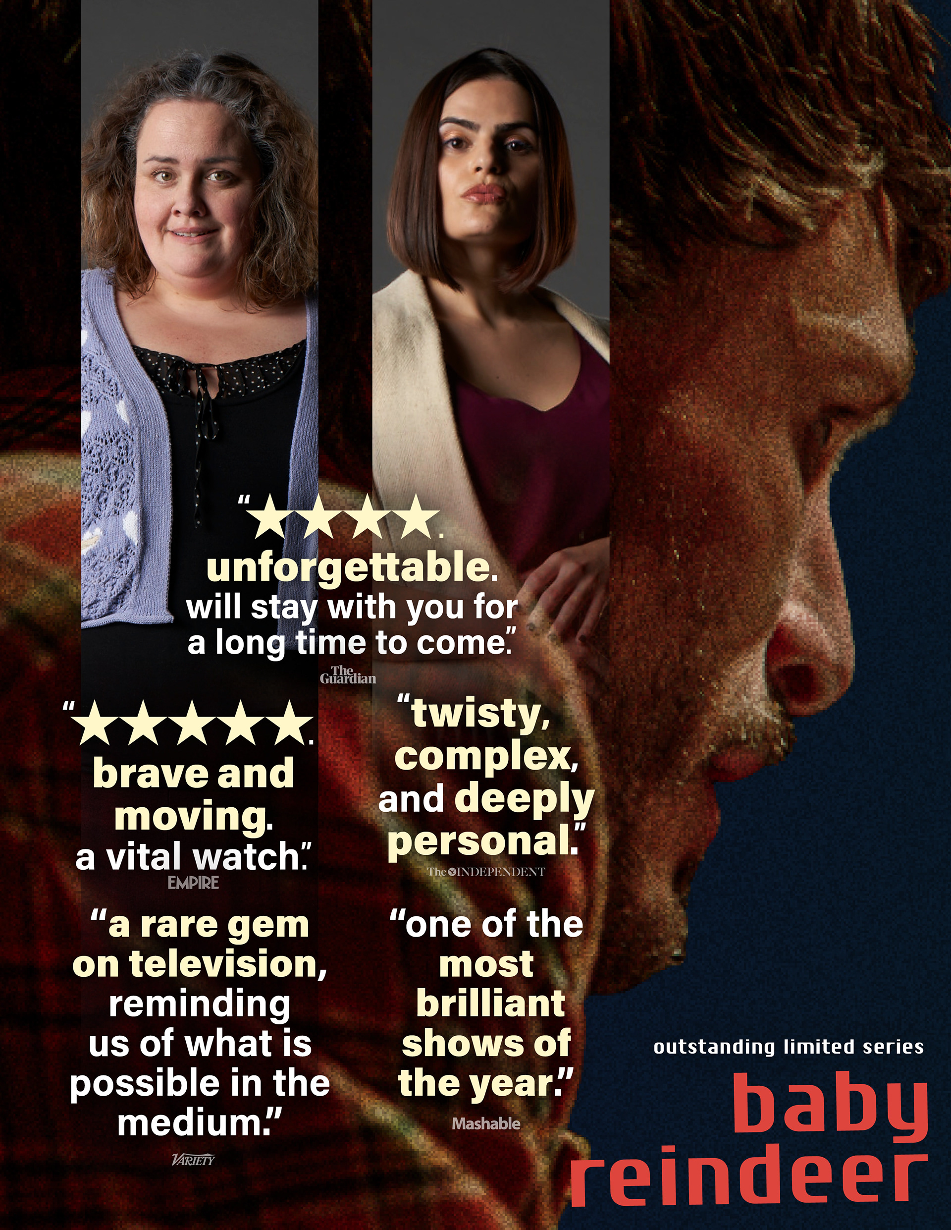
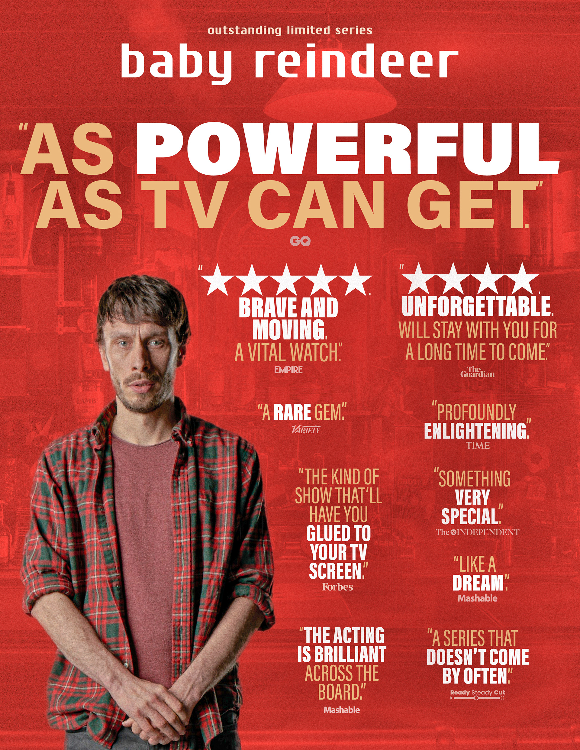
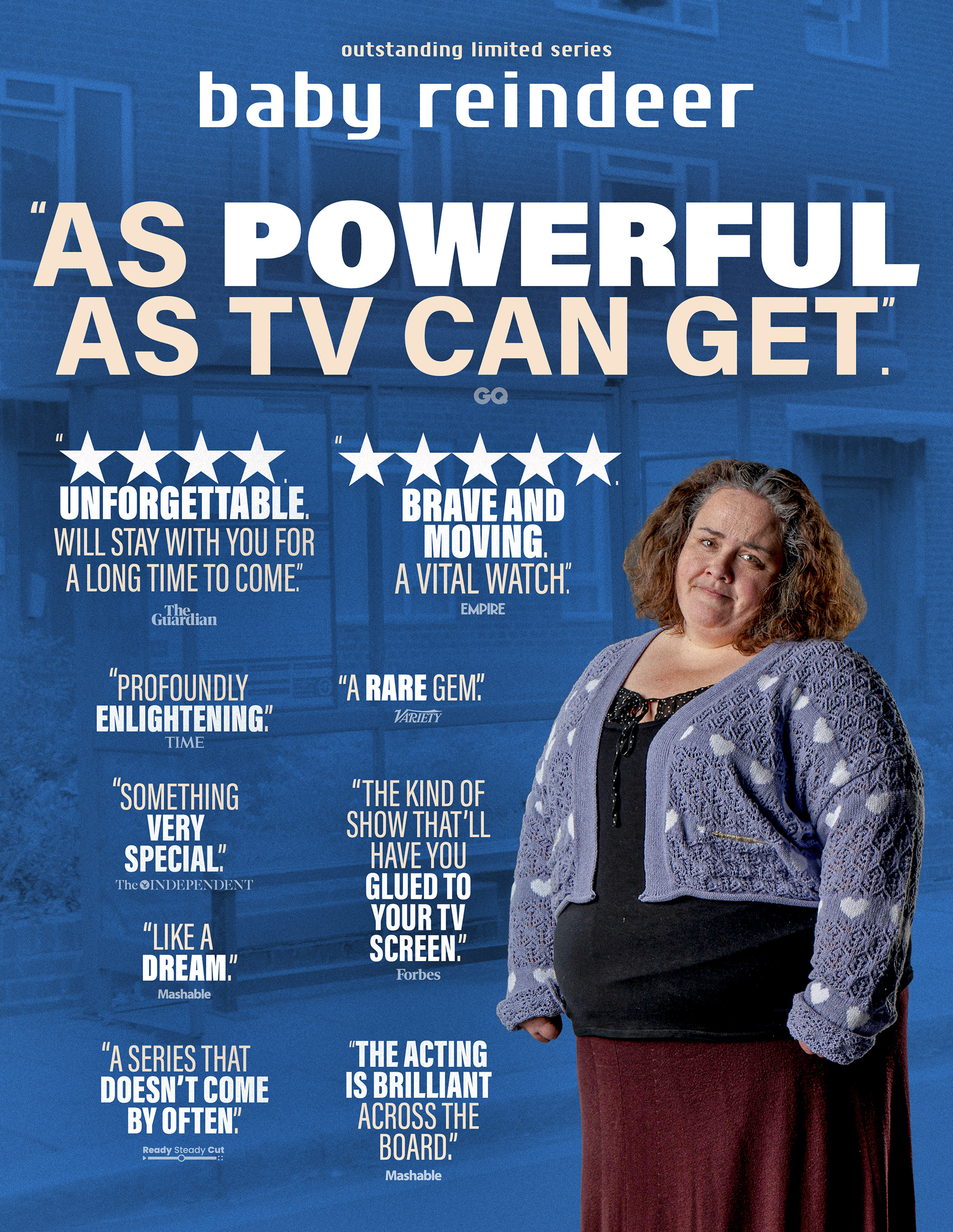
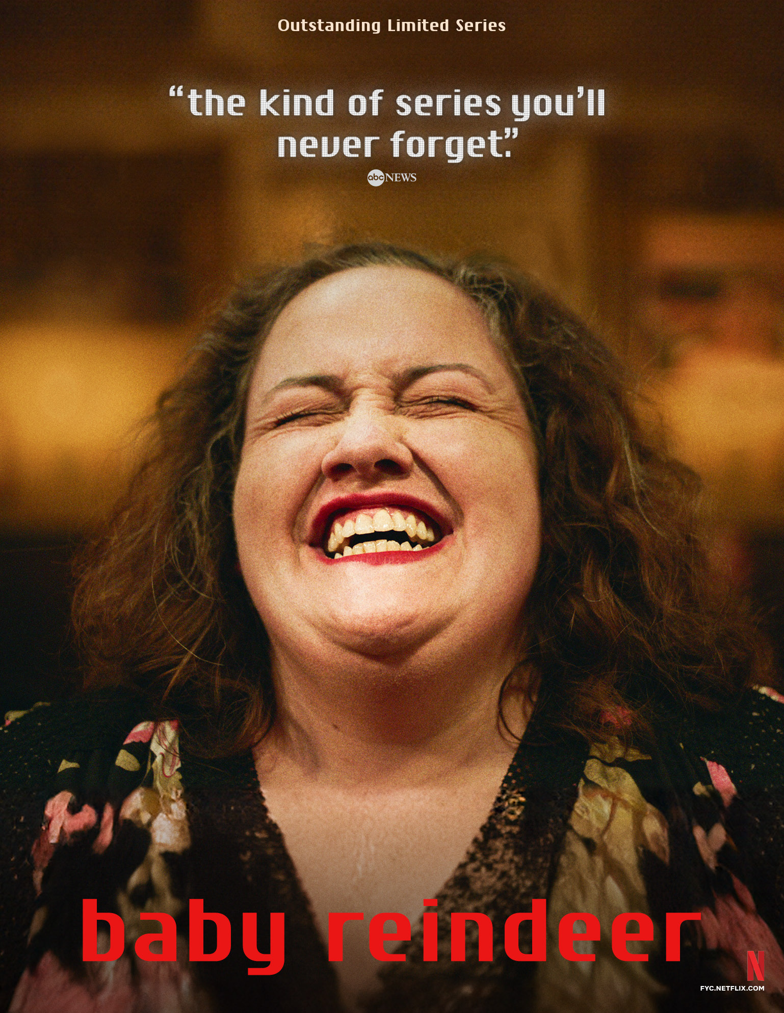
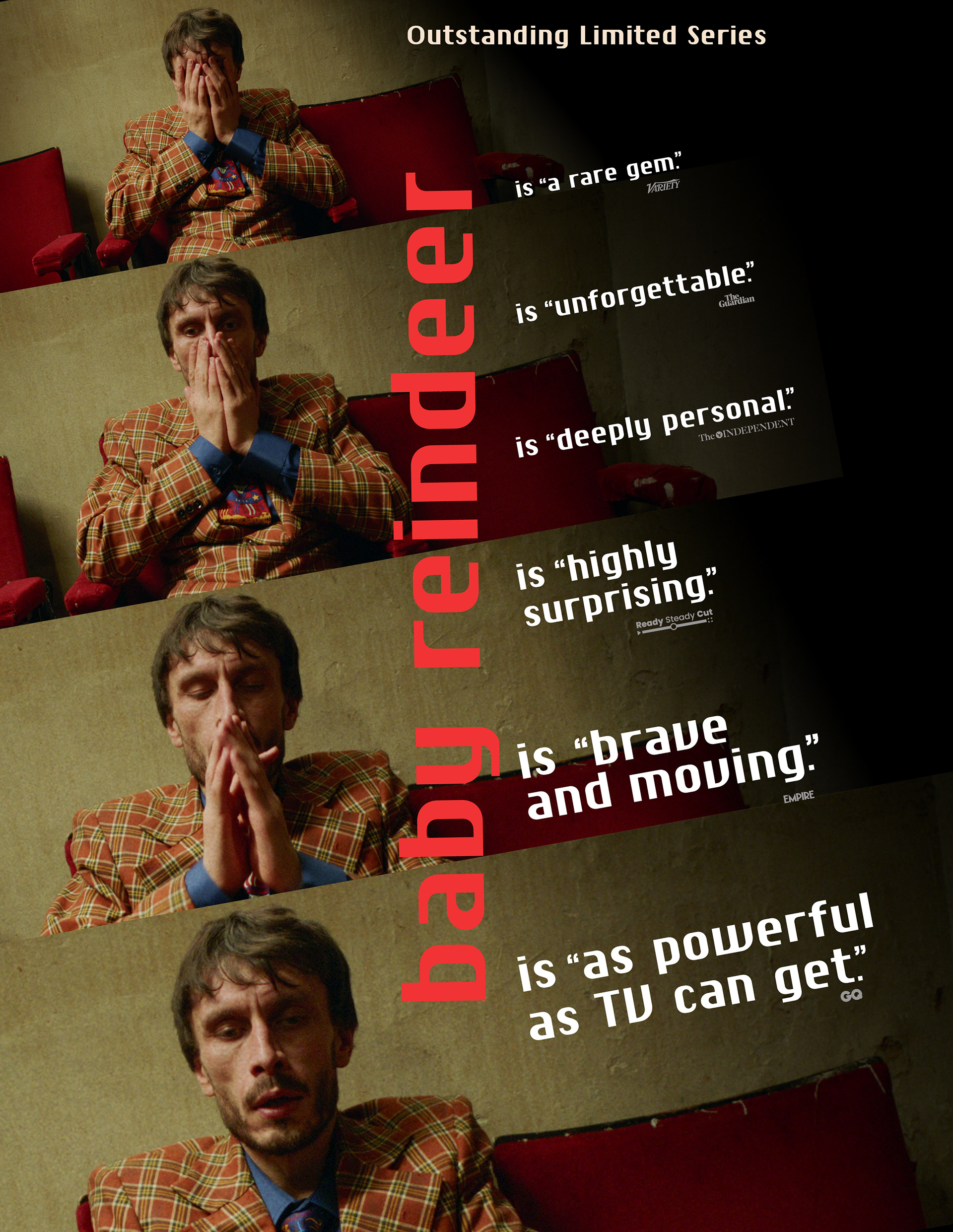
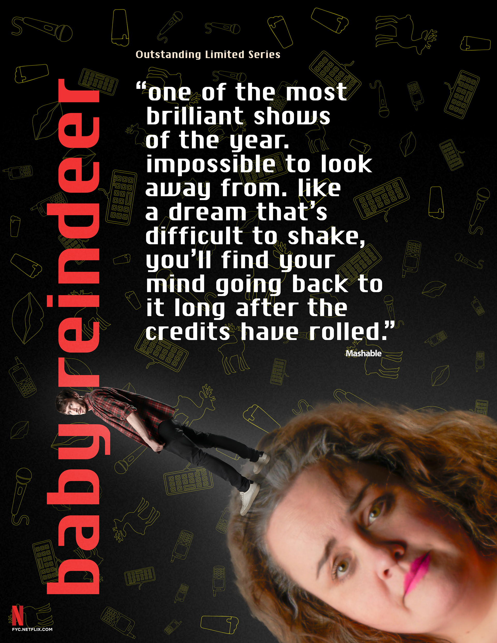
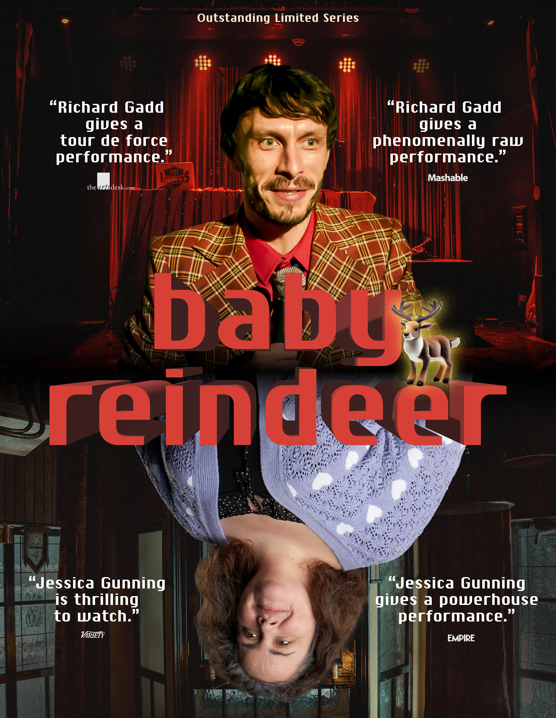
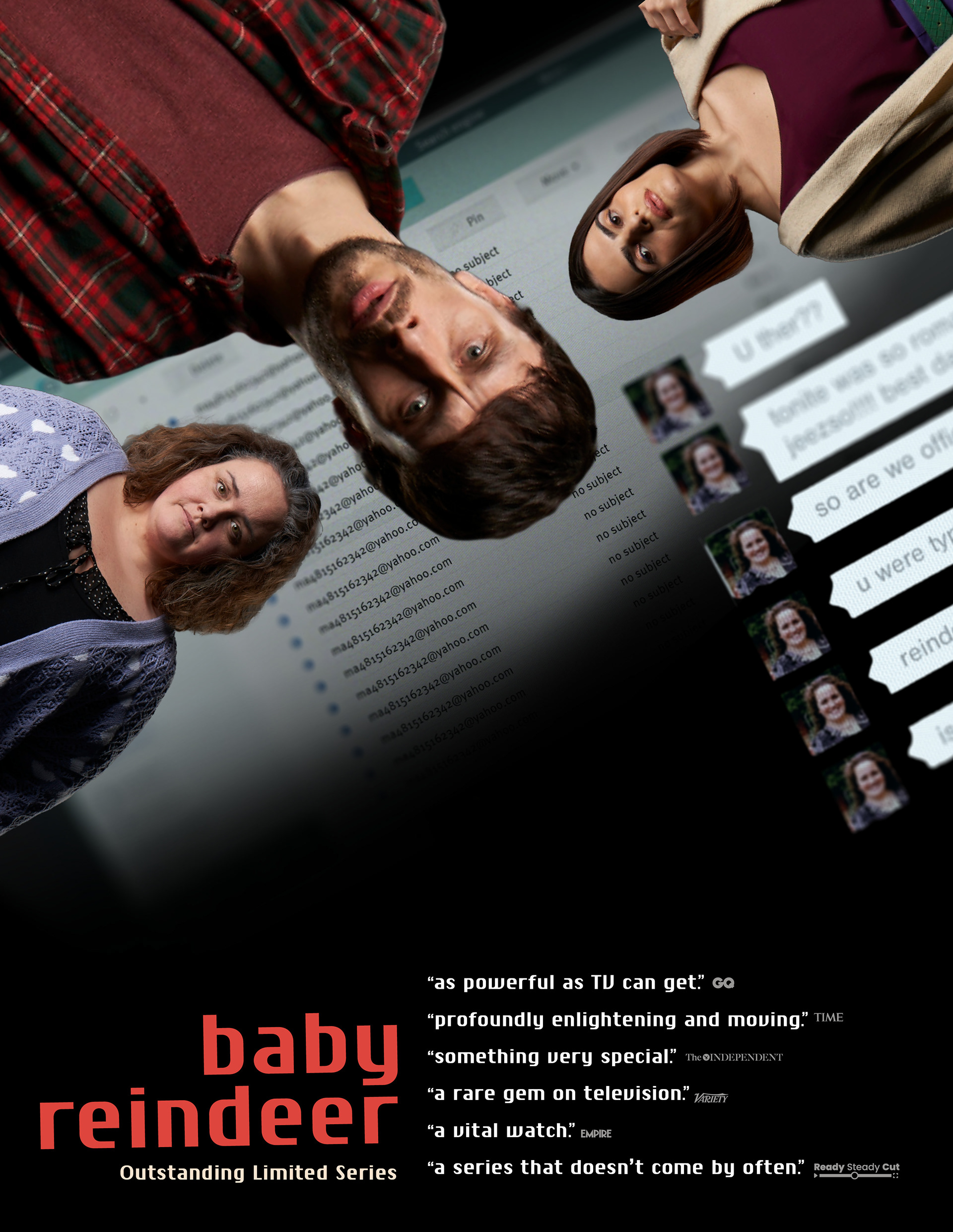
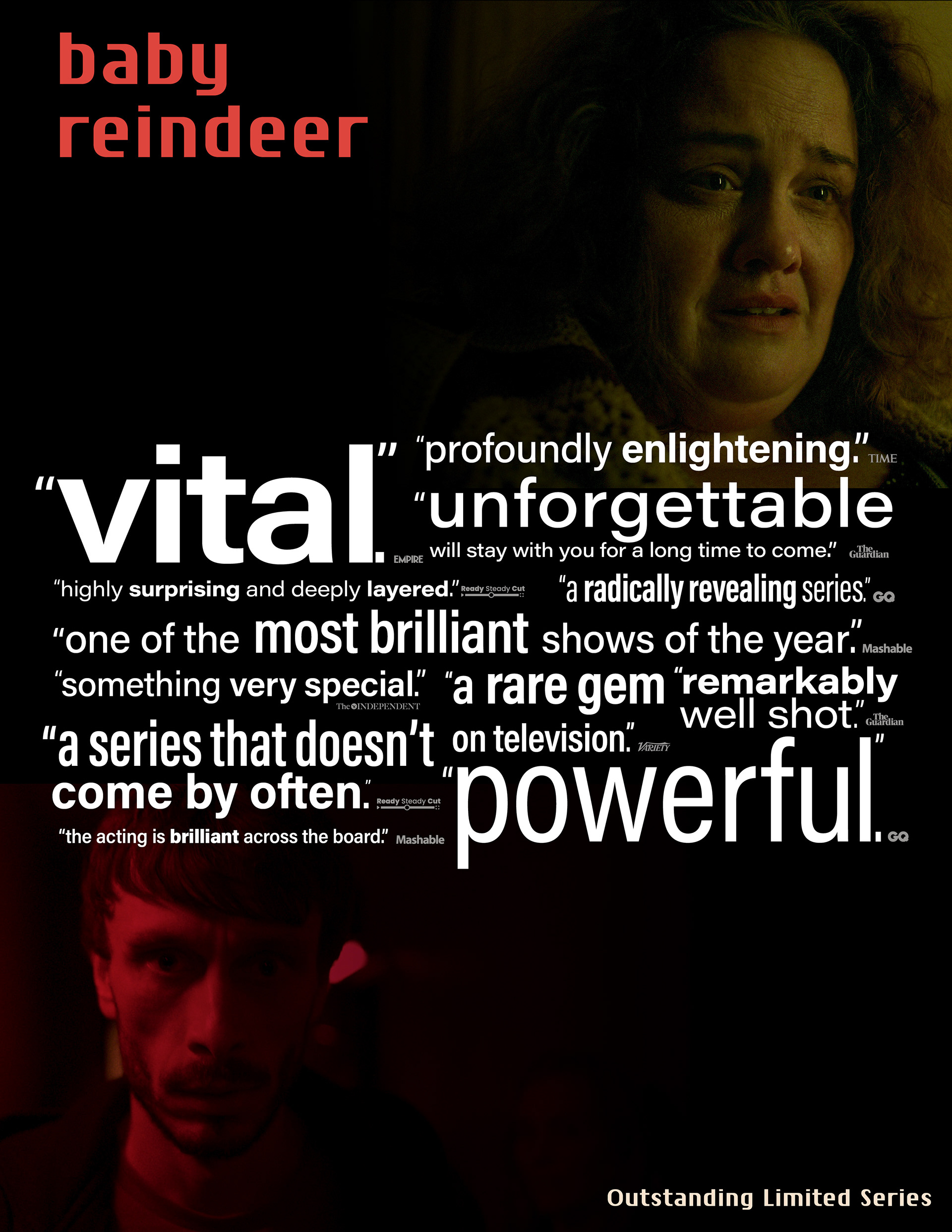
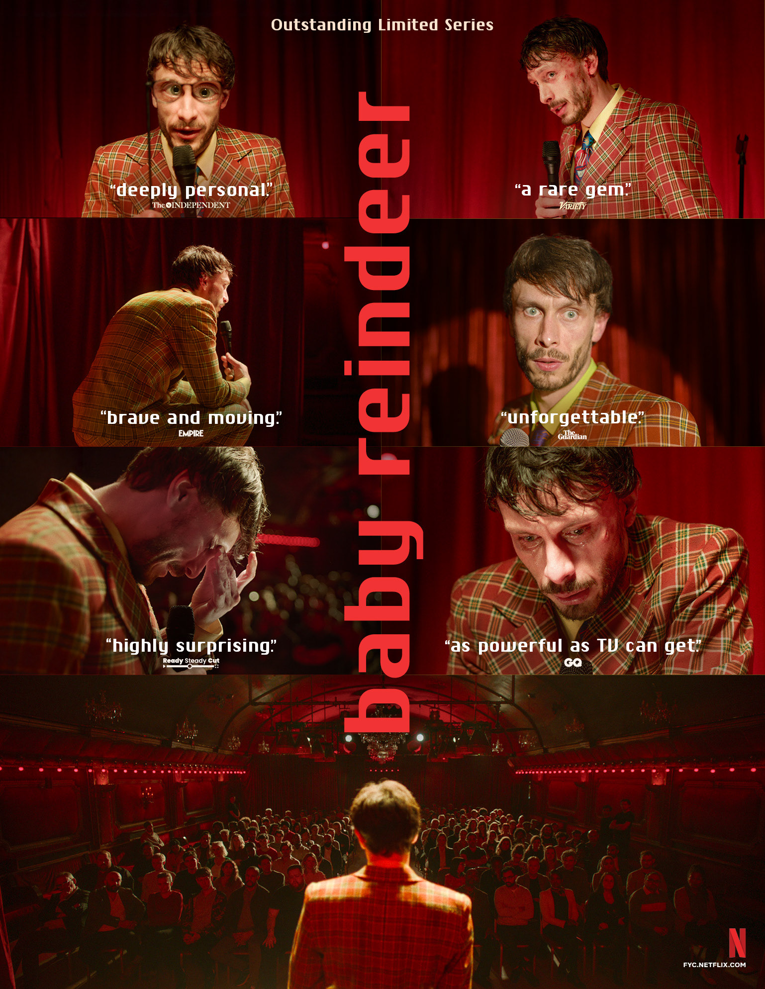
Out of Home Advertising – Wildposting Barricades


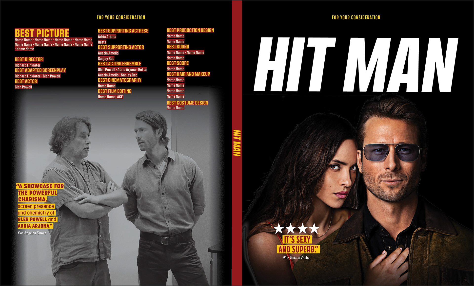
14 Nominations | 1 Win
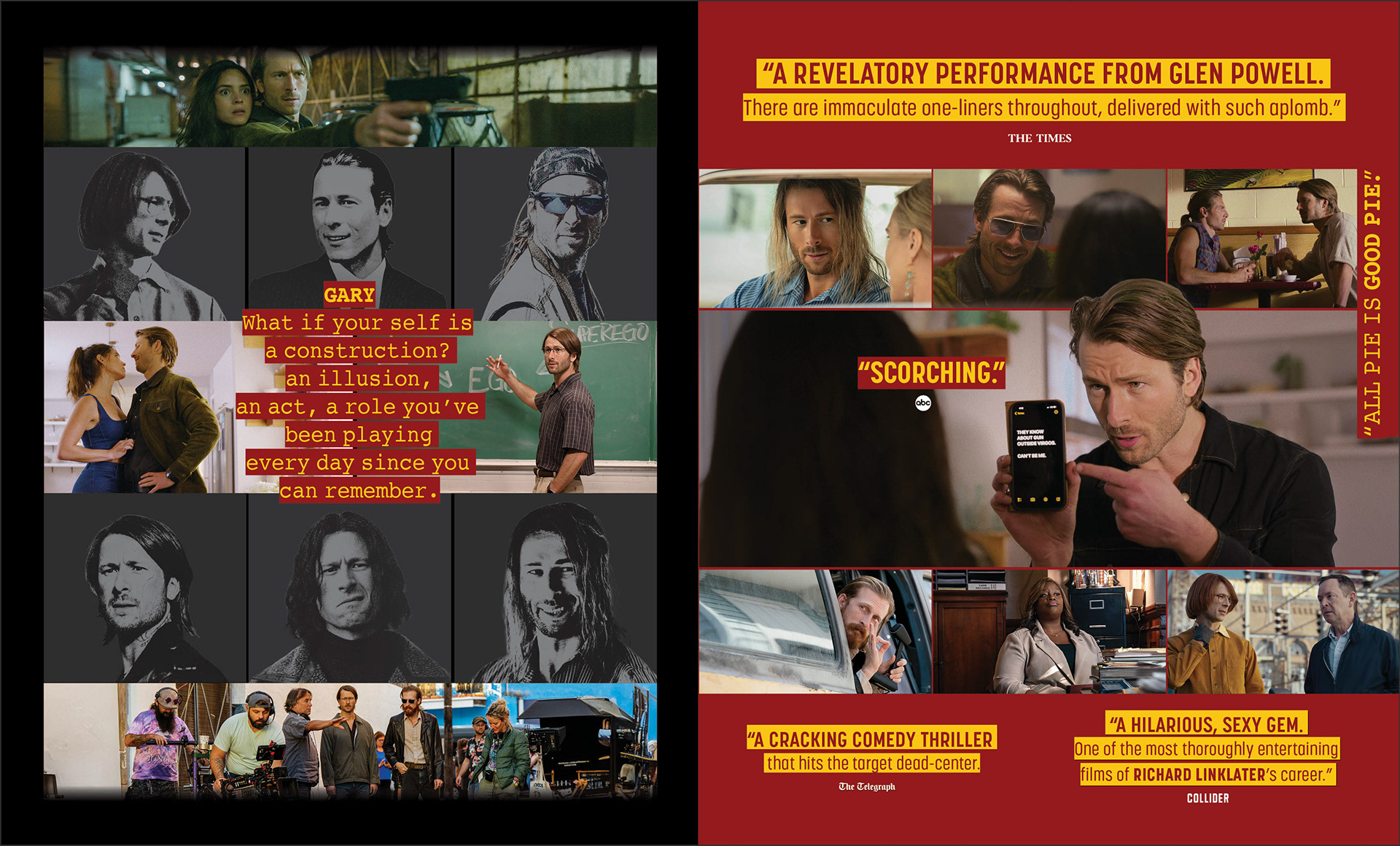
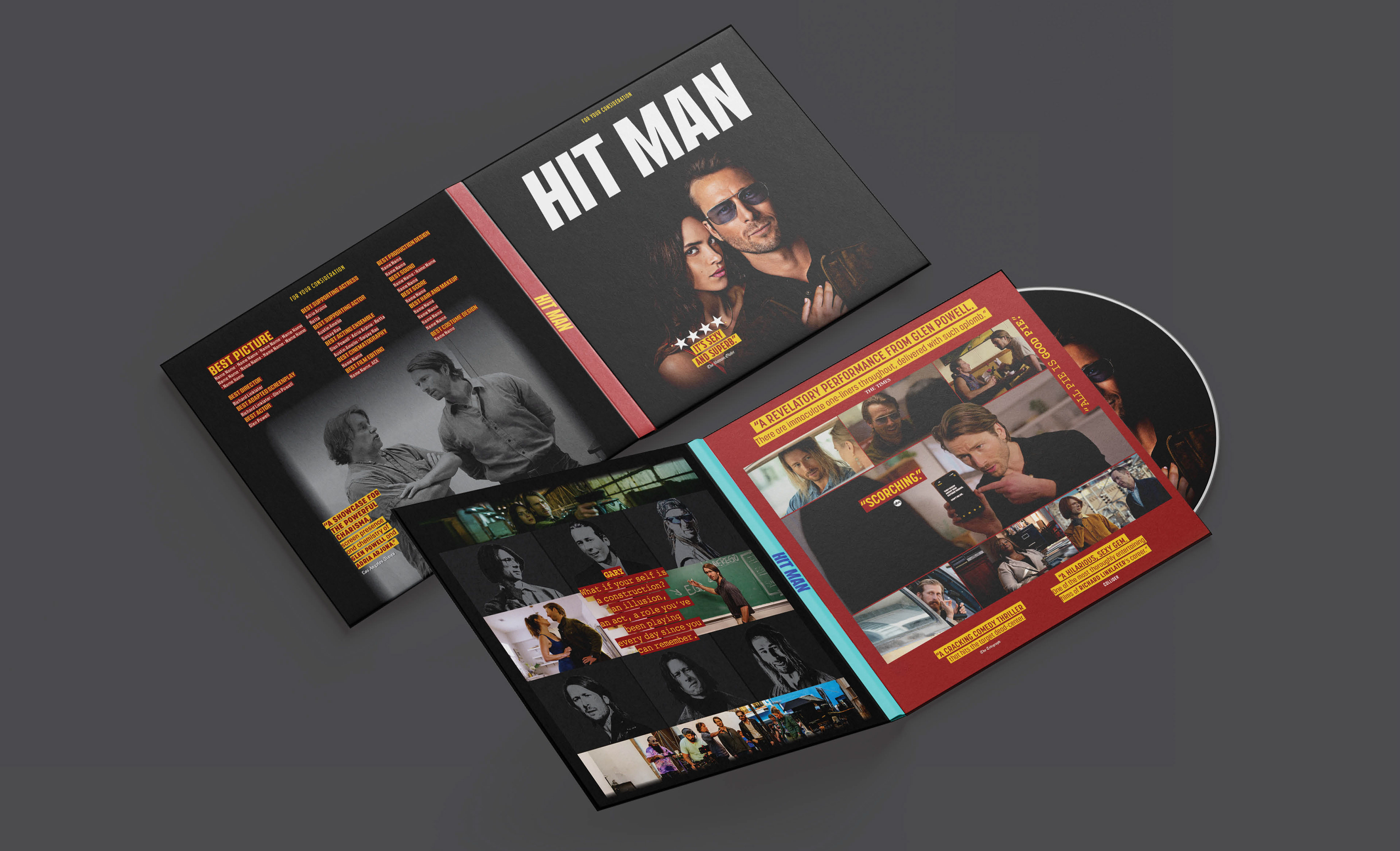
BRIEF
Netflix required a campaign for Hit Man balancing rom-com charm with thriller stakes. The challenge was showcasing the protagonist’s many disguises without confusing the audience.
STRATEGY
I designed a vibrant identity using bold yellow typography and character collages. This “chameleon” concept highlights Glen Powell’s versatility across print, social, and merchandise.
Industry Trade Print
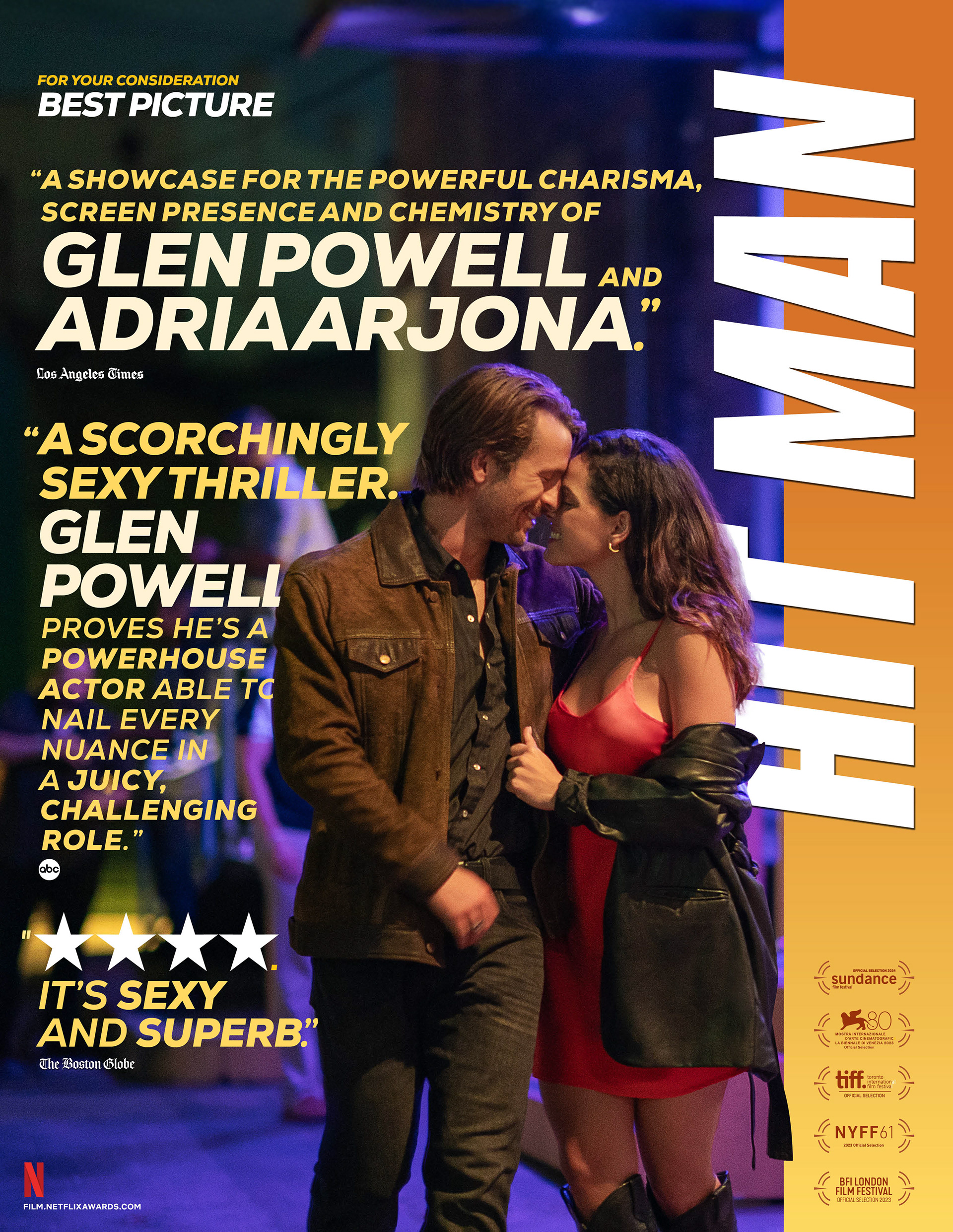

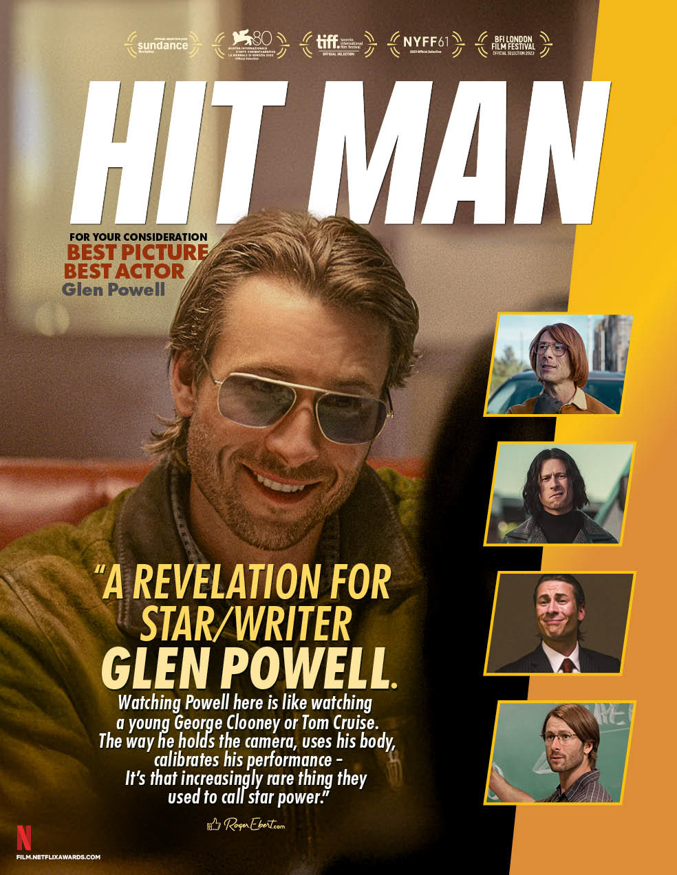
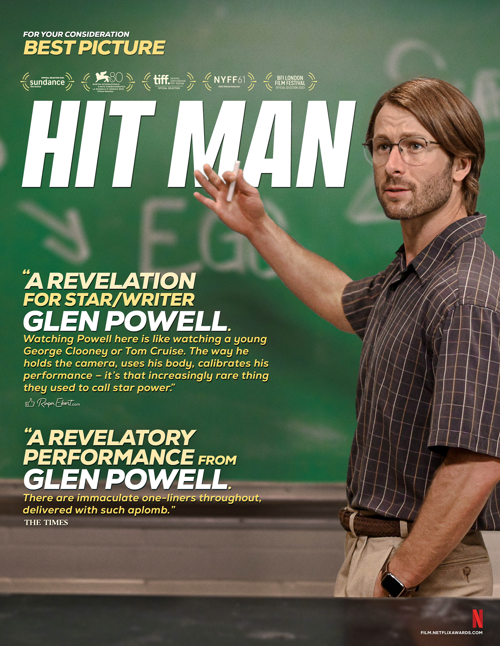
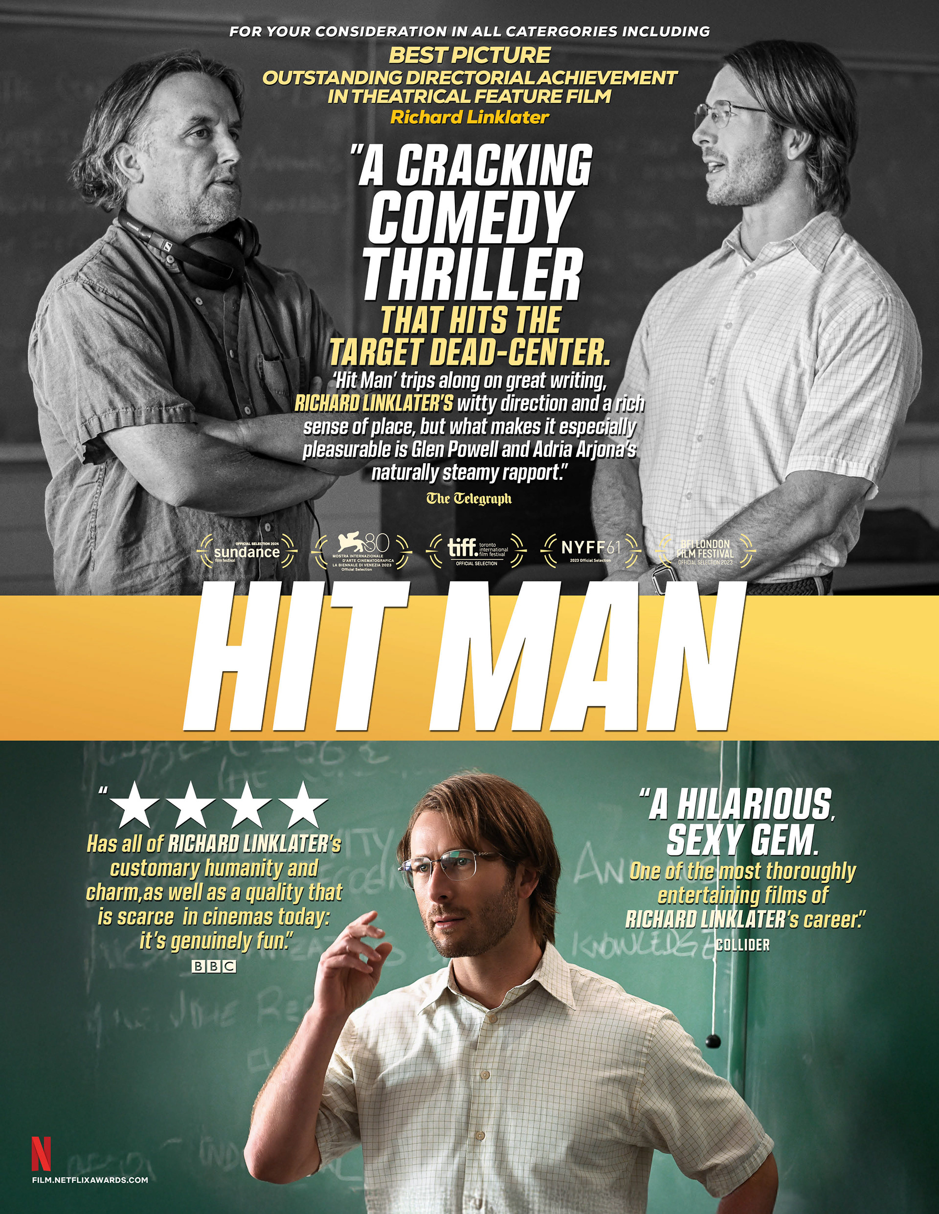
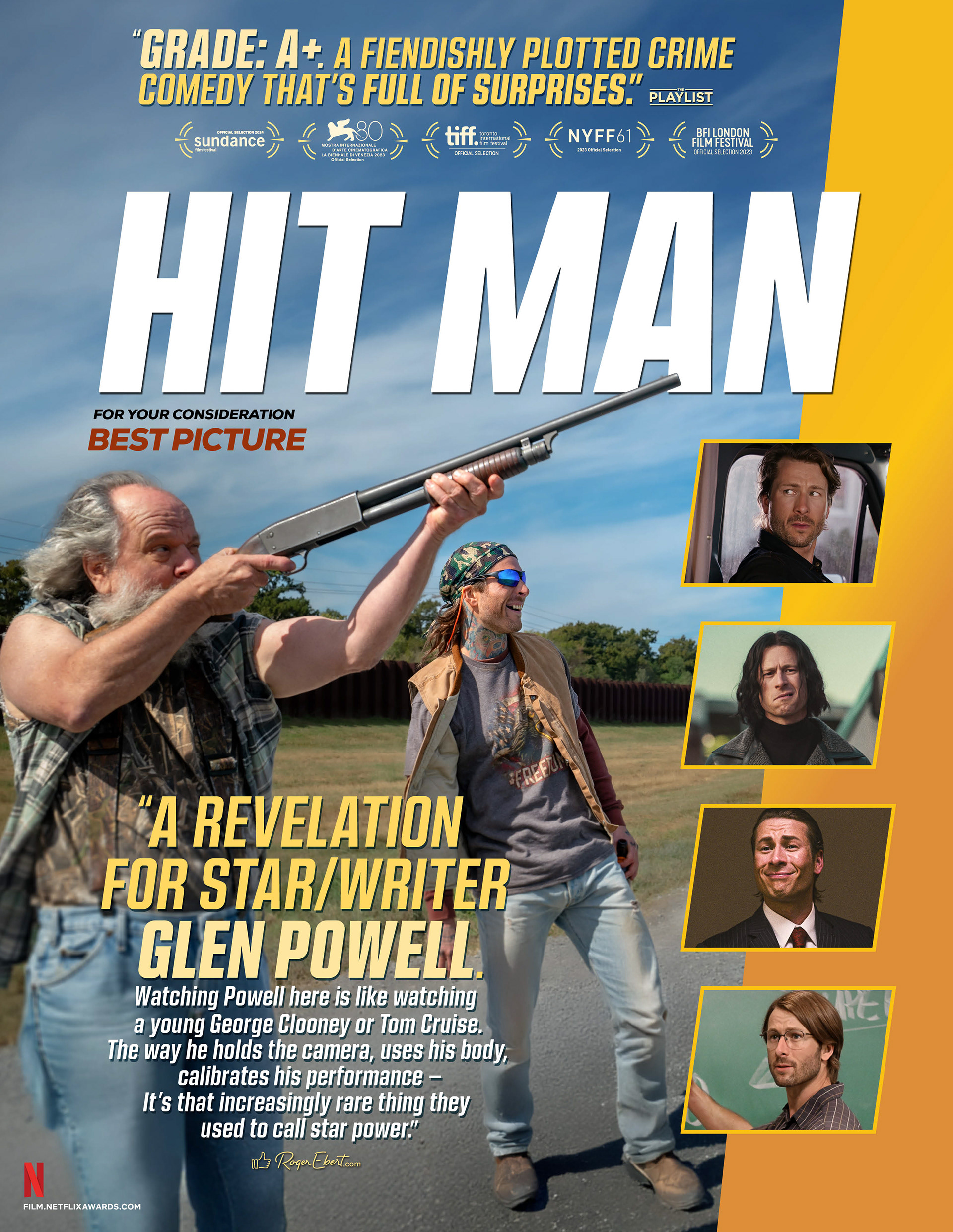
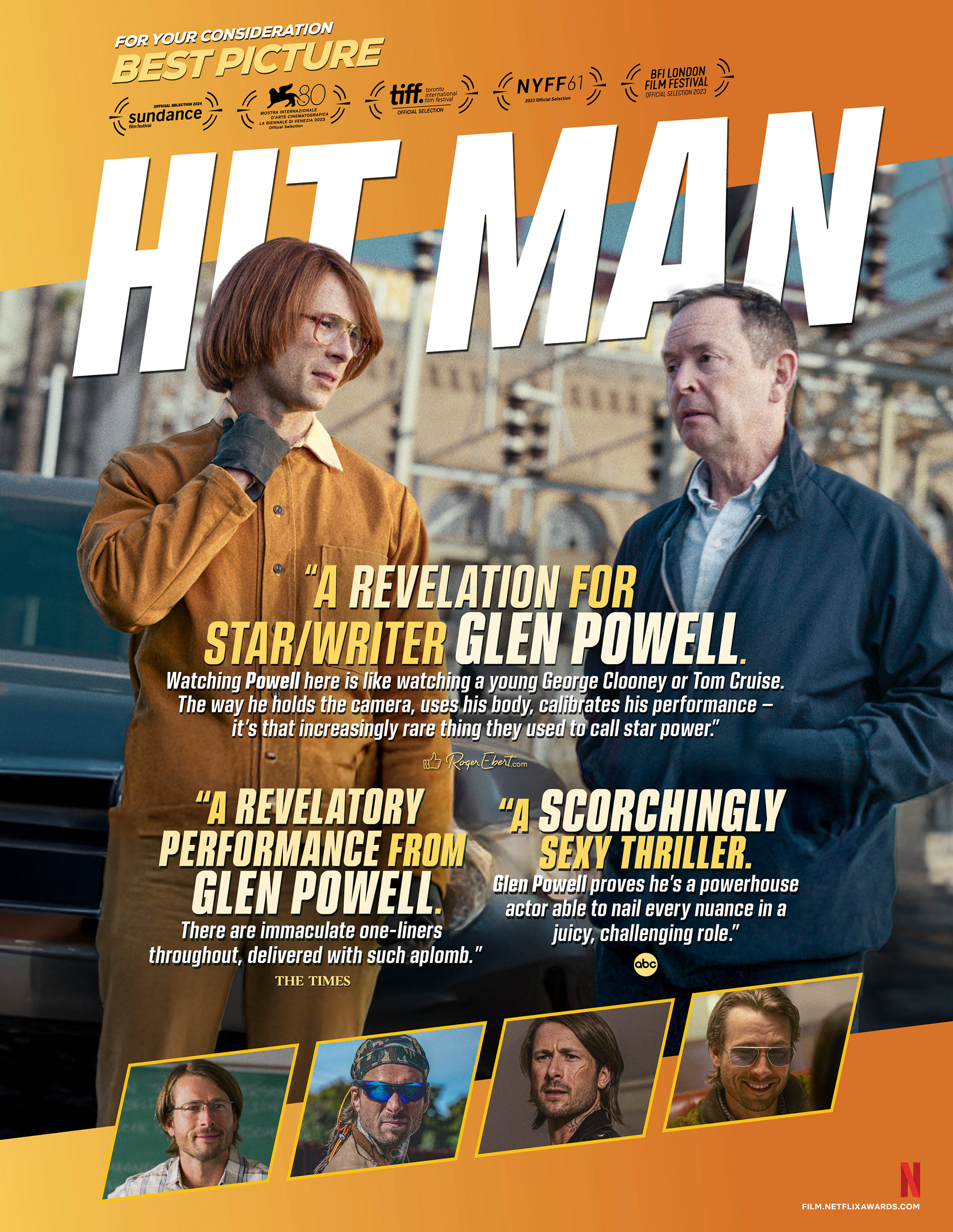
Out Of Home Advertising
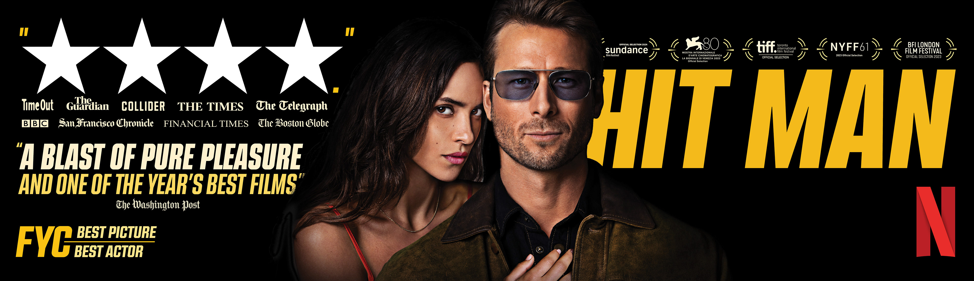
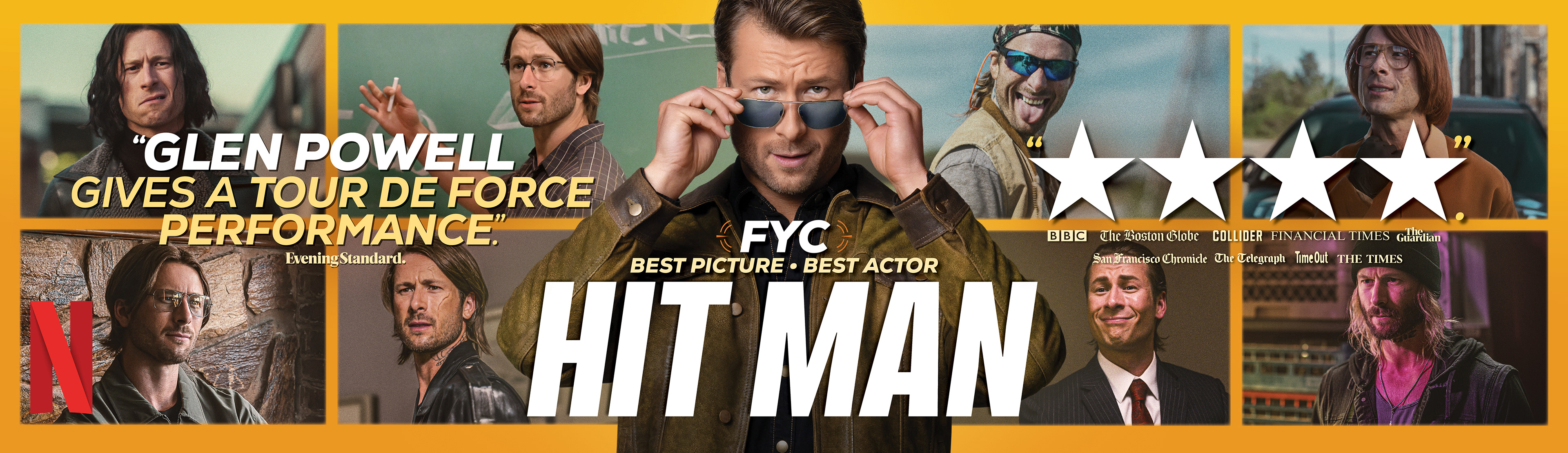
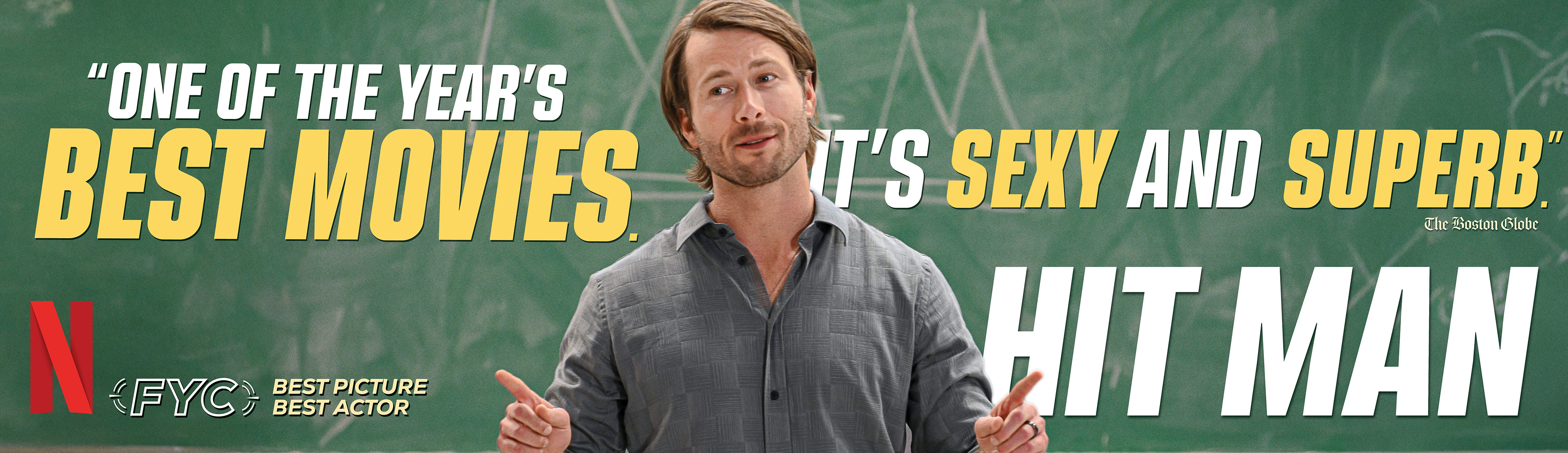
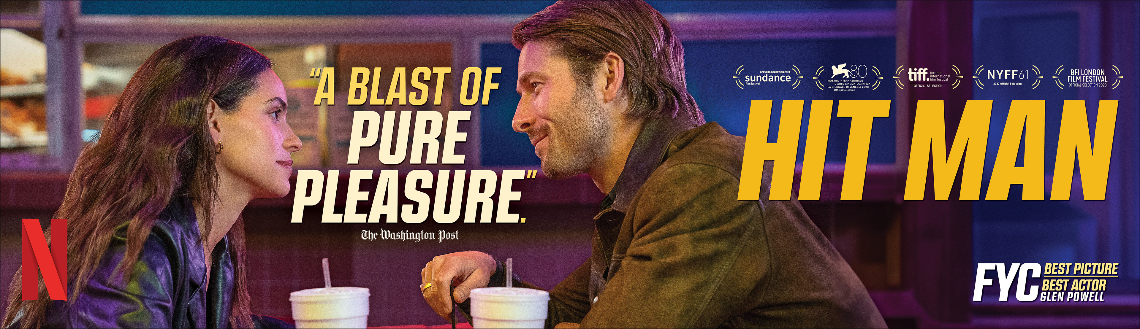
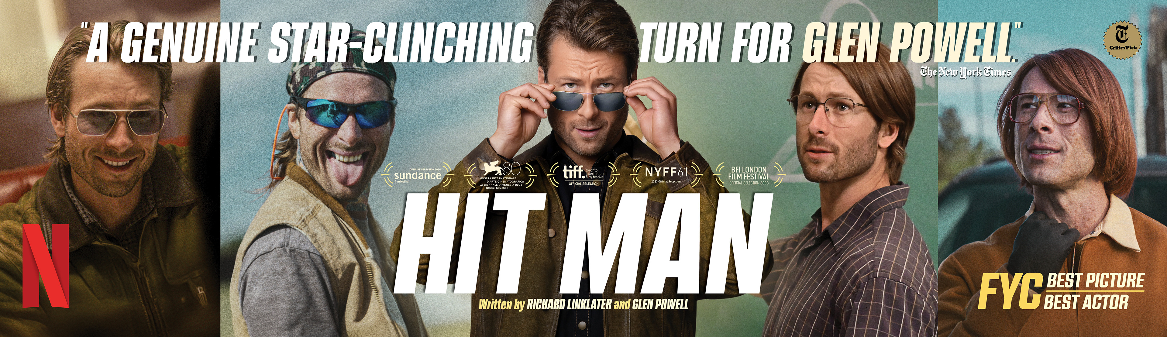
Promotional Custom Collage T-Shirts
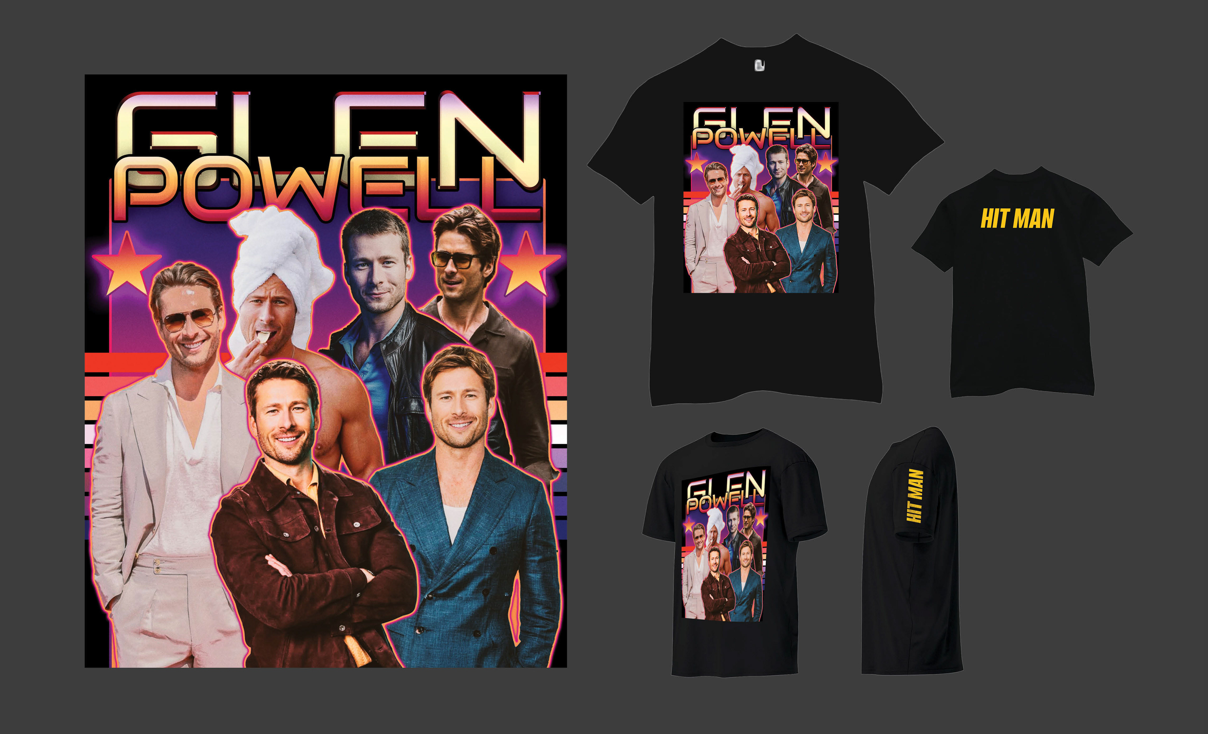
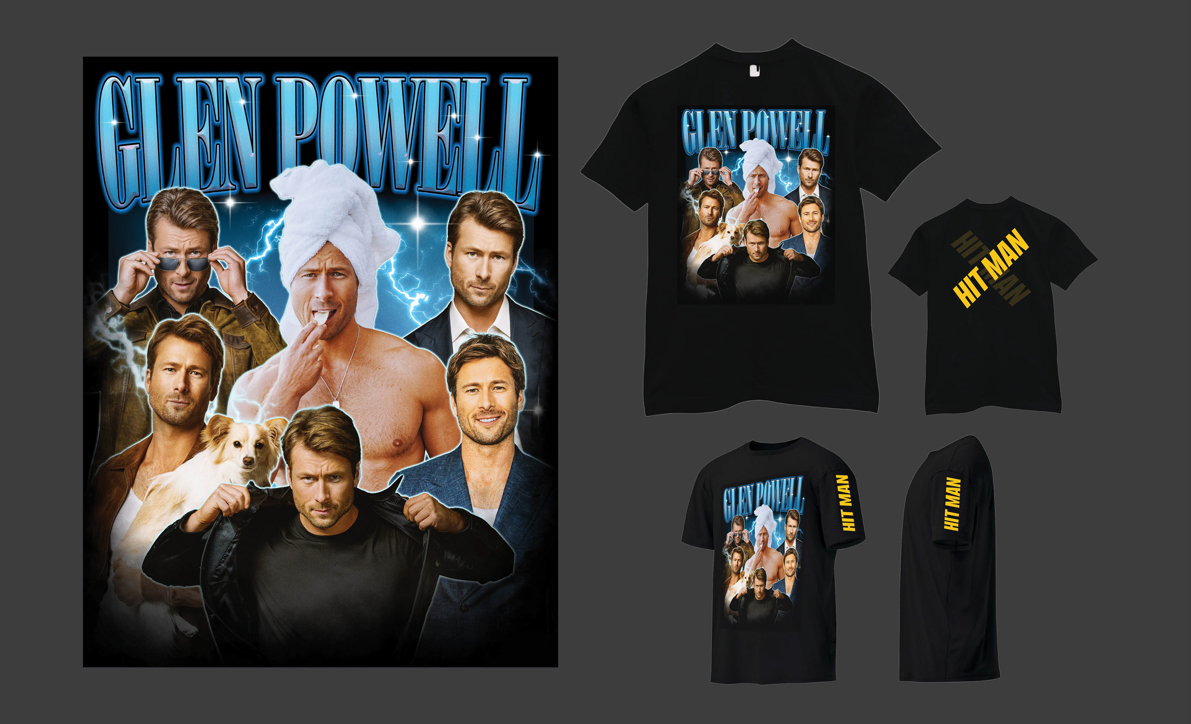
Awards DVD Screener Packaging
Cover
Inside
NEW BUSINESS DEVELOPMENT
MOTION GRAPHICS PITCH CONCEPTS
ANIMATED AWARD SEASON ADVERTISEMENTS
SOCIAL MEDIA VERTICALS
MOTION GRAPHICS PITCH CONCEPTS
ANIMATED AWARD SEASON ADVERTISEMENTS
SOCIAL MEDIA VERTICALS
CONCEPT, LAYOUT, TYPOGRAPHY, PHOTO
ILLUSTRATION, COMPOSITING AND ANIMATION
ILLUSTRATION, COMPOSITING AND ANIMATION
PROJECT DATE | 2024-2025
BRIEF
A high-concept motion graphics pitch to Netflix for their “For Your Consideration” awards campaign. The objective was to prove the agency could translate cinematic prestige into vertical social formats. The challenge was adapting a wide range of visually disparate contenders, including vintage biopics, rom coms, stylized anime, and digital thrillers into a unified showcase demonstrating they could handle premium IP across any genre.
STRATEGY
I rejected generic templates in favor of “cinematic mimicry,” creating bespoke motion identities that translate each title’s unique visual language into vertical formats. I ignited The Piano Lesson with atmospheric fire, replicated Maria’s vintage film stocks, and mirrored Adolescence’s anxiety through rapid editing. From Hit Man’s playful character loops to Blue Eye Samurai’s sword-slice transitions, this approach proved the agency could adapt diverse, premium IP to mobile screens without sacrificing their cinematic soul.
Adolescence, 2025
Maria, 2024
The Piano Lesson, 2024
Hit Man, 2024
Blue Eye Samurai, 2024
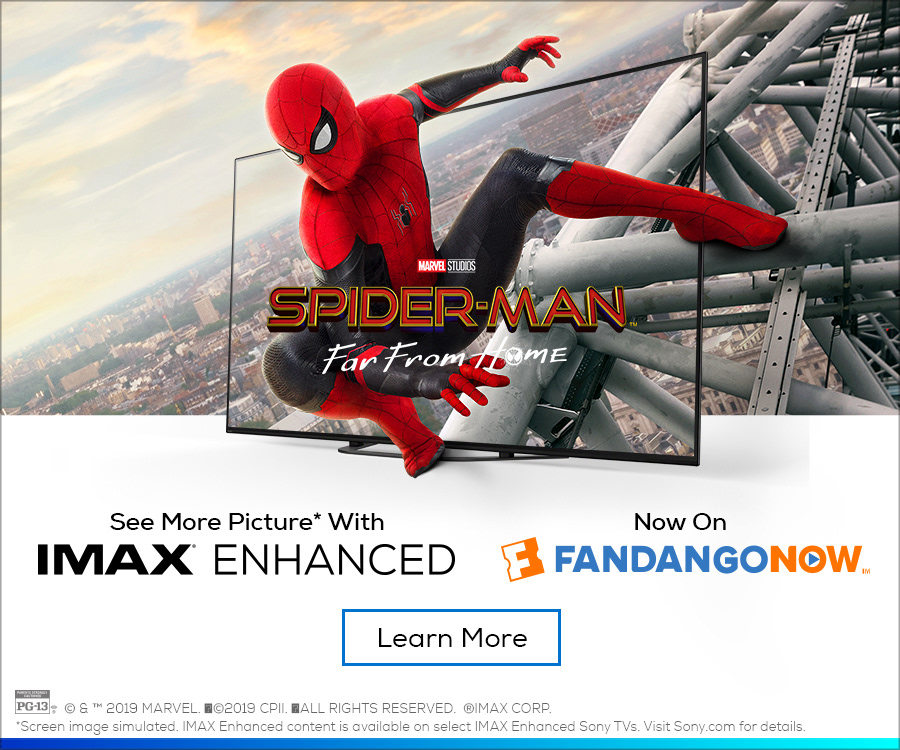
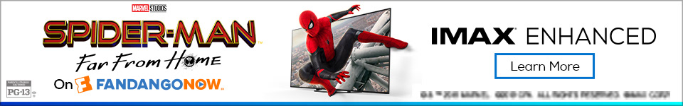
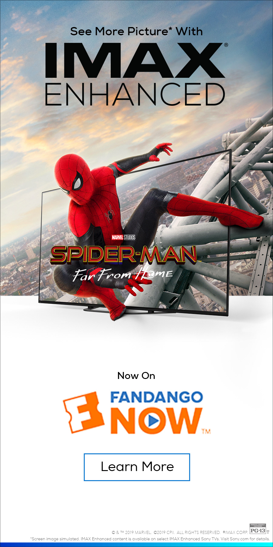
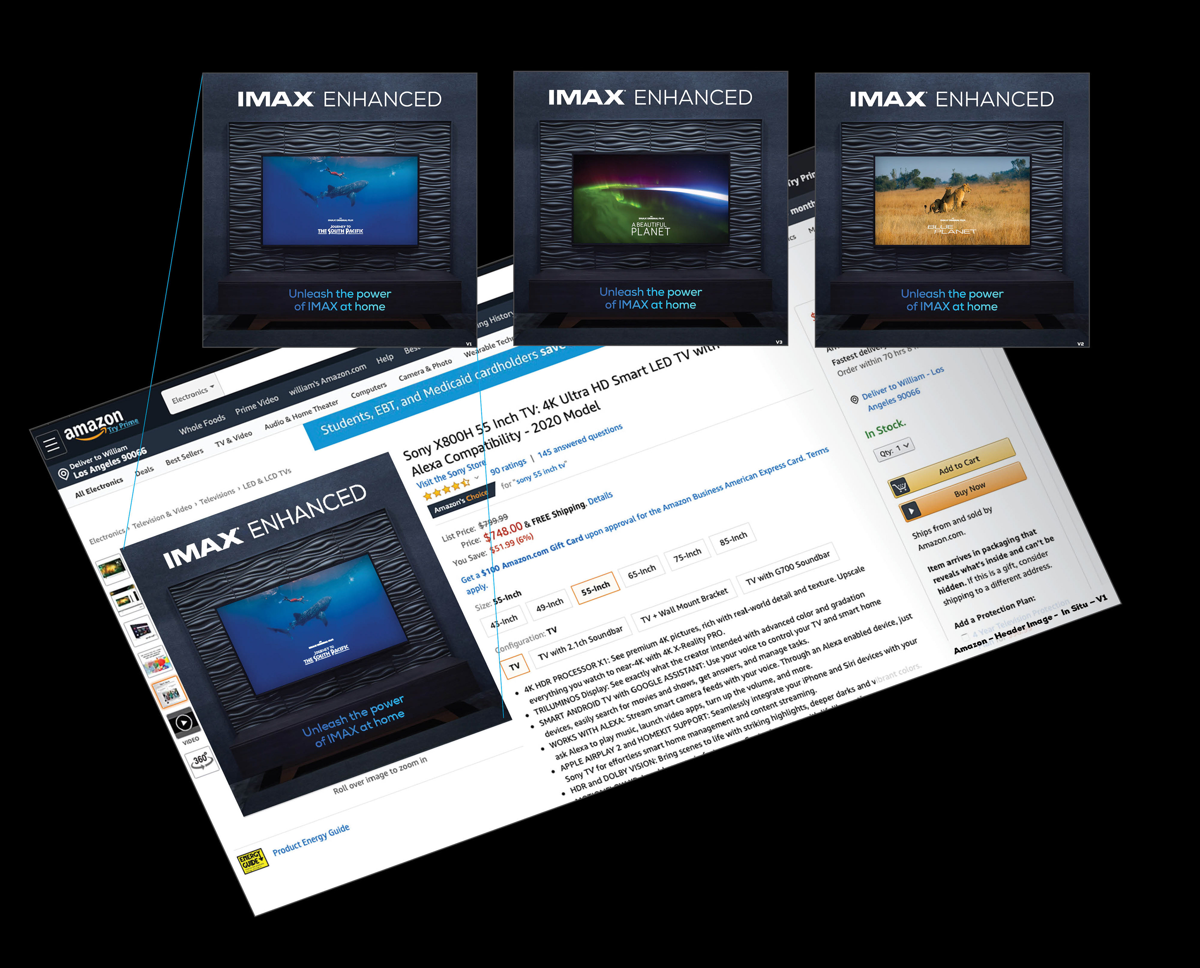
CLIENT

Helping Bring The Iconic Brand Into The Home
NEW BRAND LAUNCH
CONCEPT, LAYOUT, TYPOGRAPHY, PHOTO ILLUSTRATION, COMPOSITING AND FINISHING
PROJECT DATE | 2020
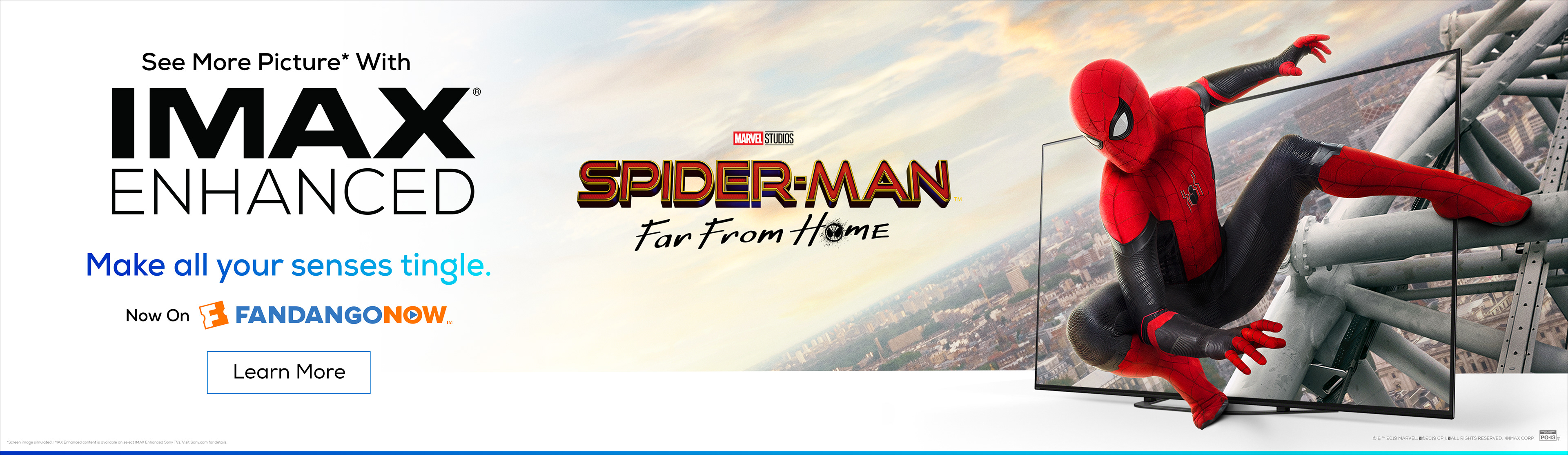
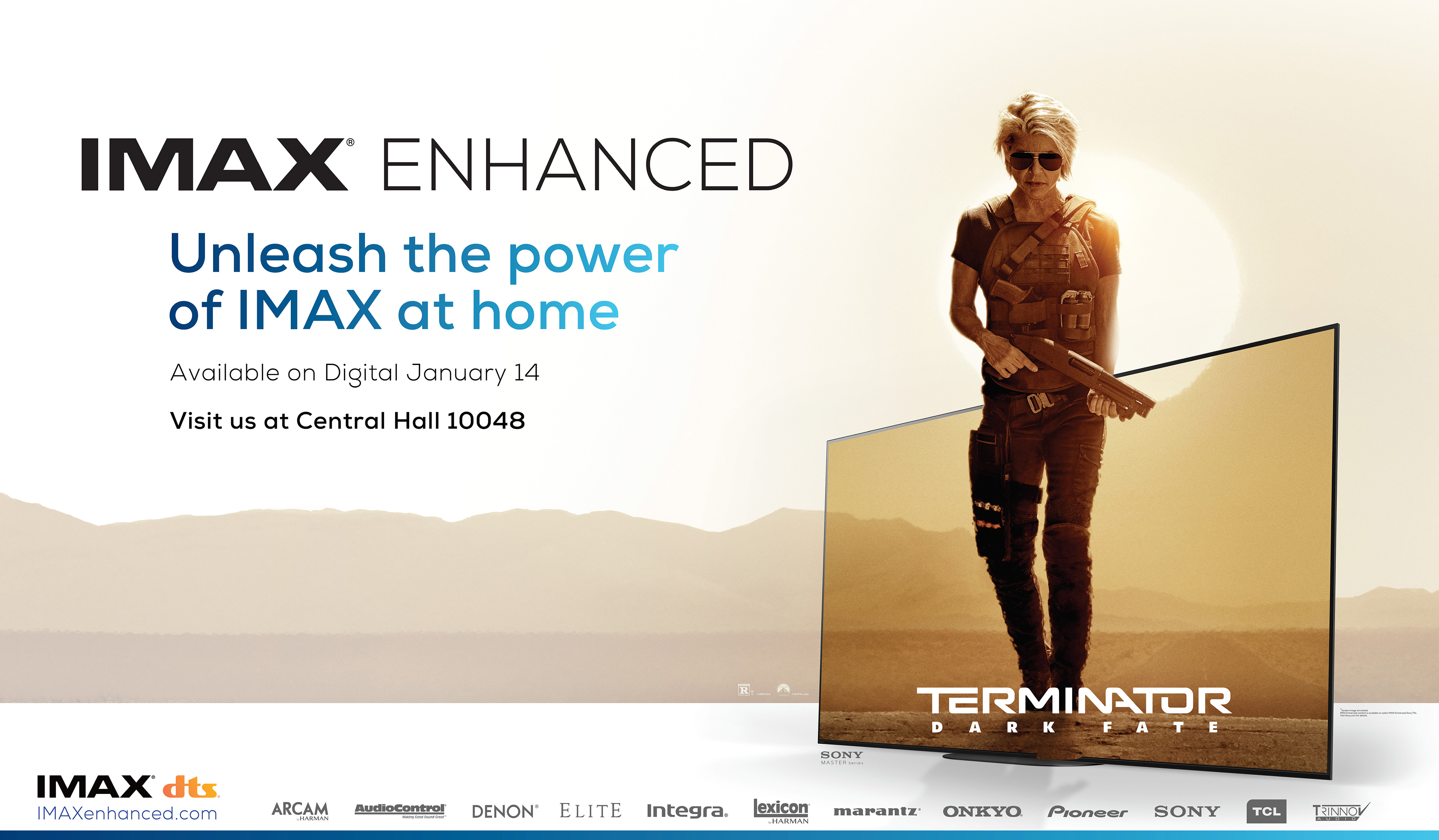
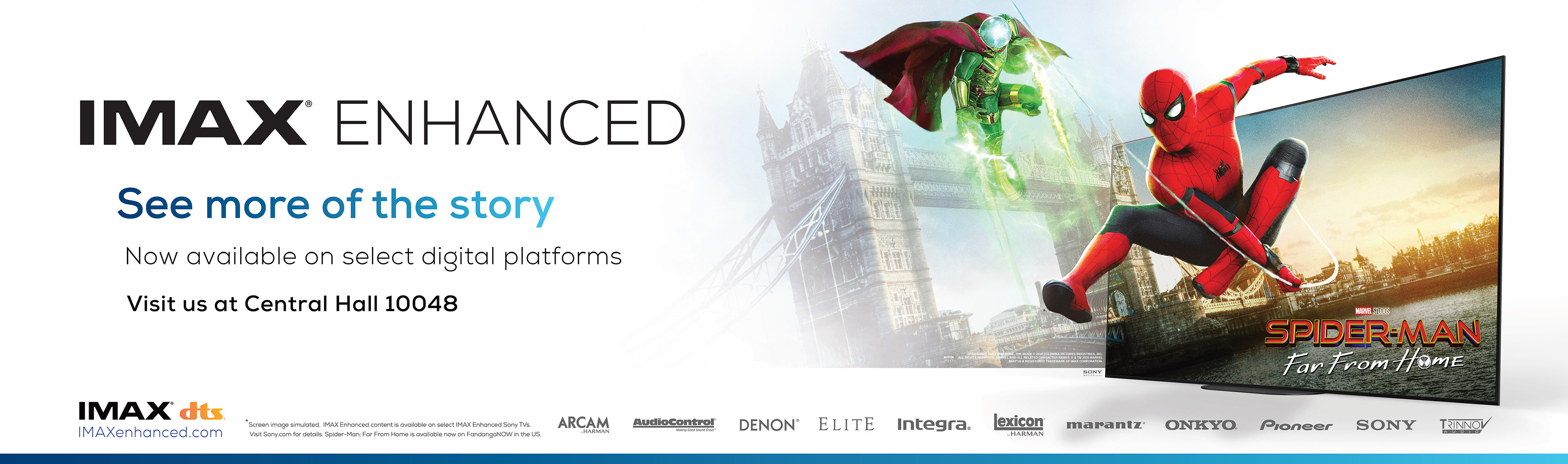
BRIEF
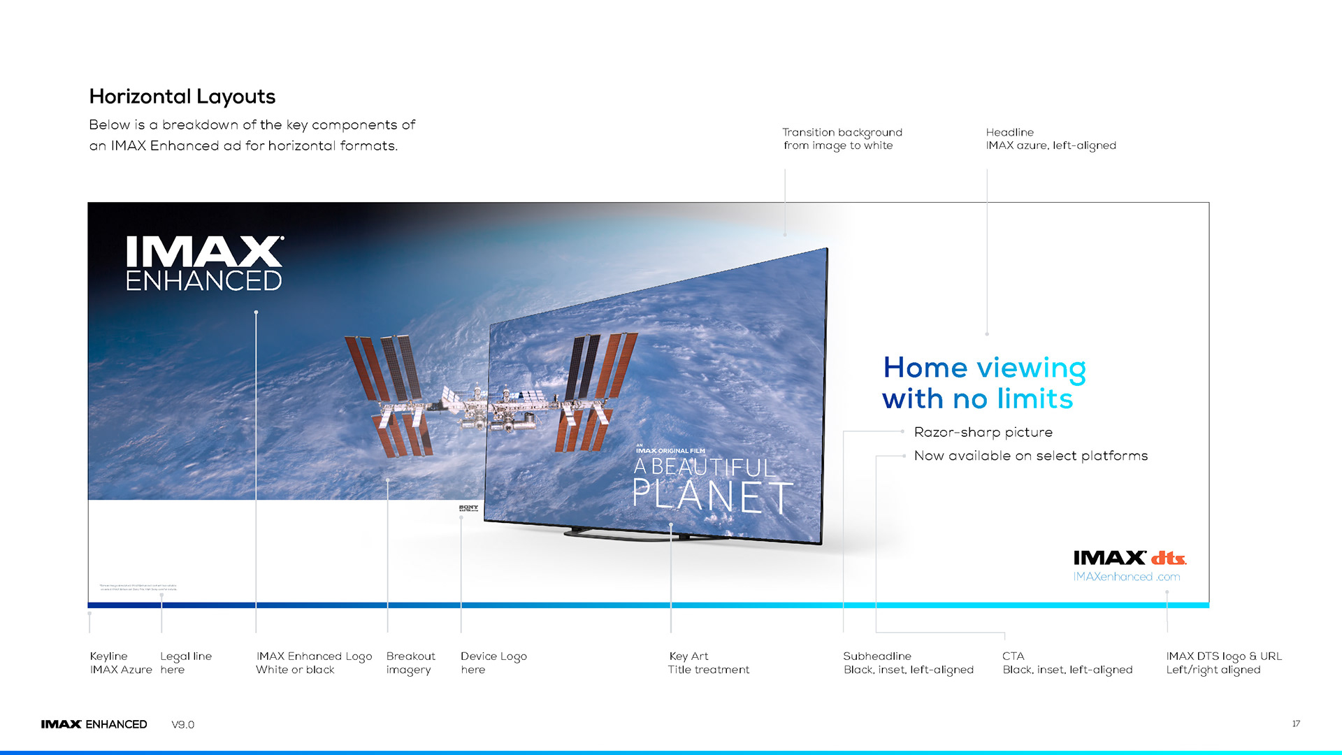
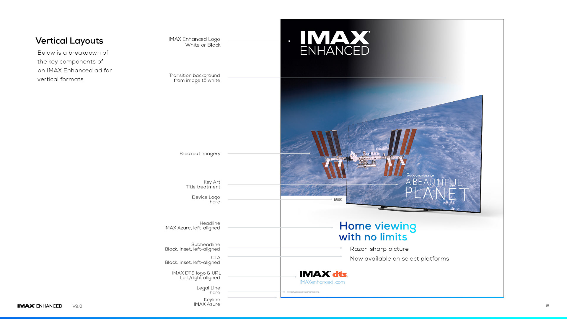
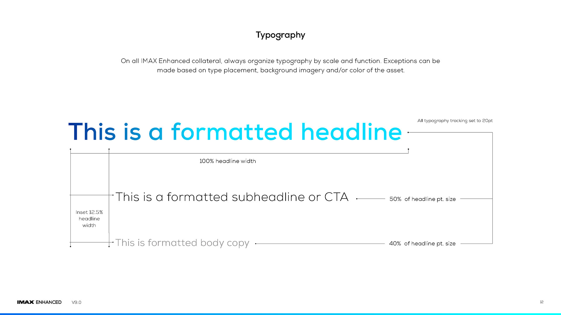
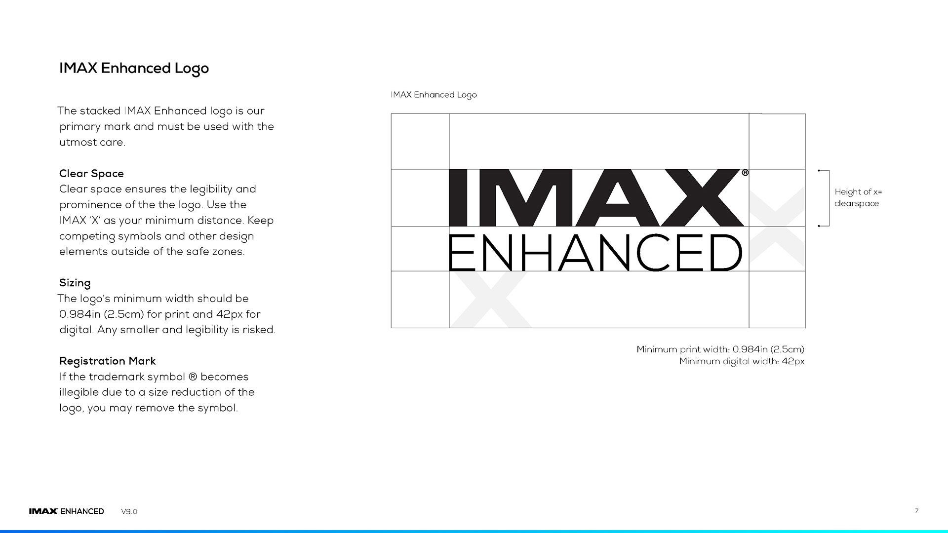
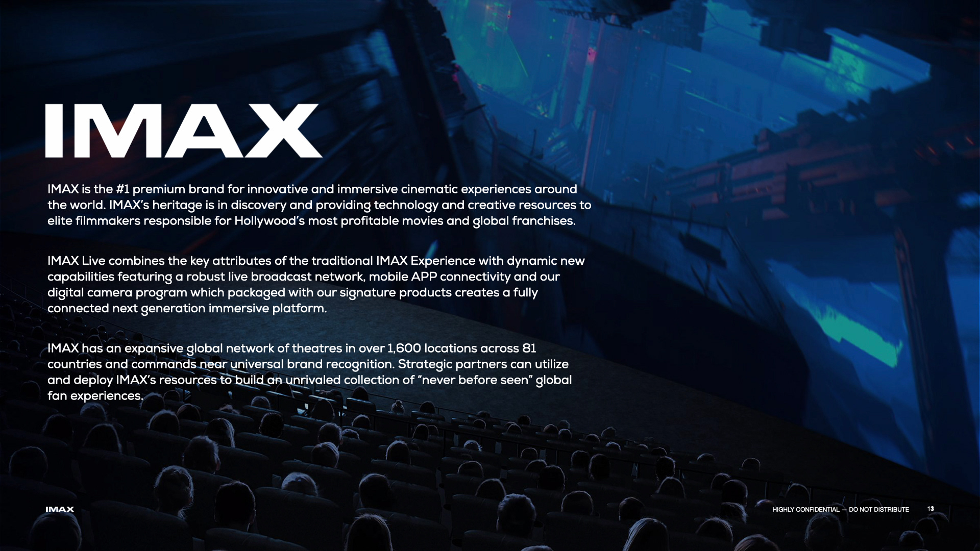
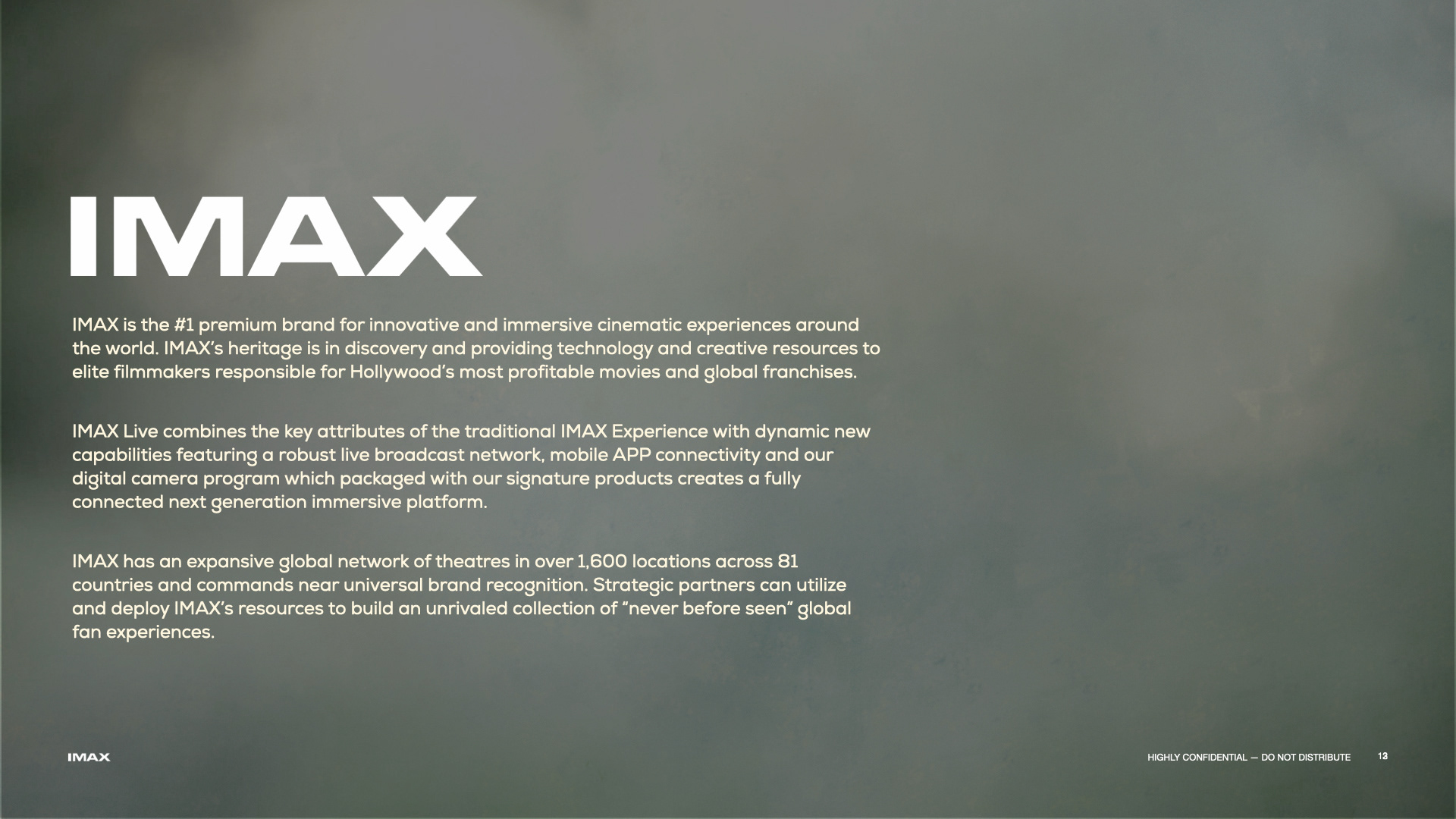
IMAX required a global launch identity for “IMAX Enhanced,” a new ecosystem bringing theatrical quality to home entertainment. The objective was to architect a unified visual language that seamlessly connected diverse hardware partners like Sony with content platforms like Amazon, ensuring the brand felt premium across web, print, and events.
STRATEGY
As Lead Creative, I directed a sleek, high-tech visual strategy designed to bridge the gap between cinema and consumer electronics. I authored a comprehensive brand style guide to enforce consistency across the product website, digital campaigns, and massive trade show activations like CES, successfully positioning the sub-brand as the gold standard for home viewing.

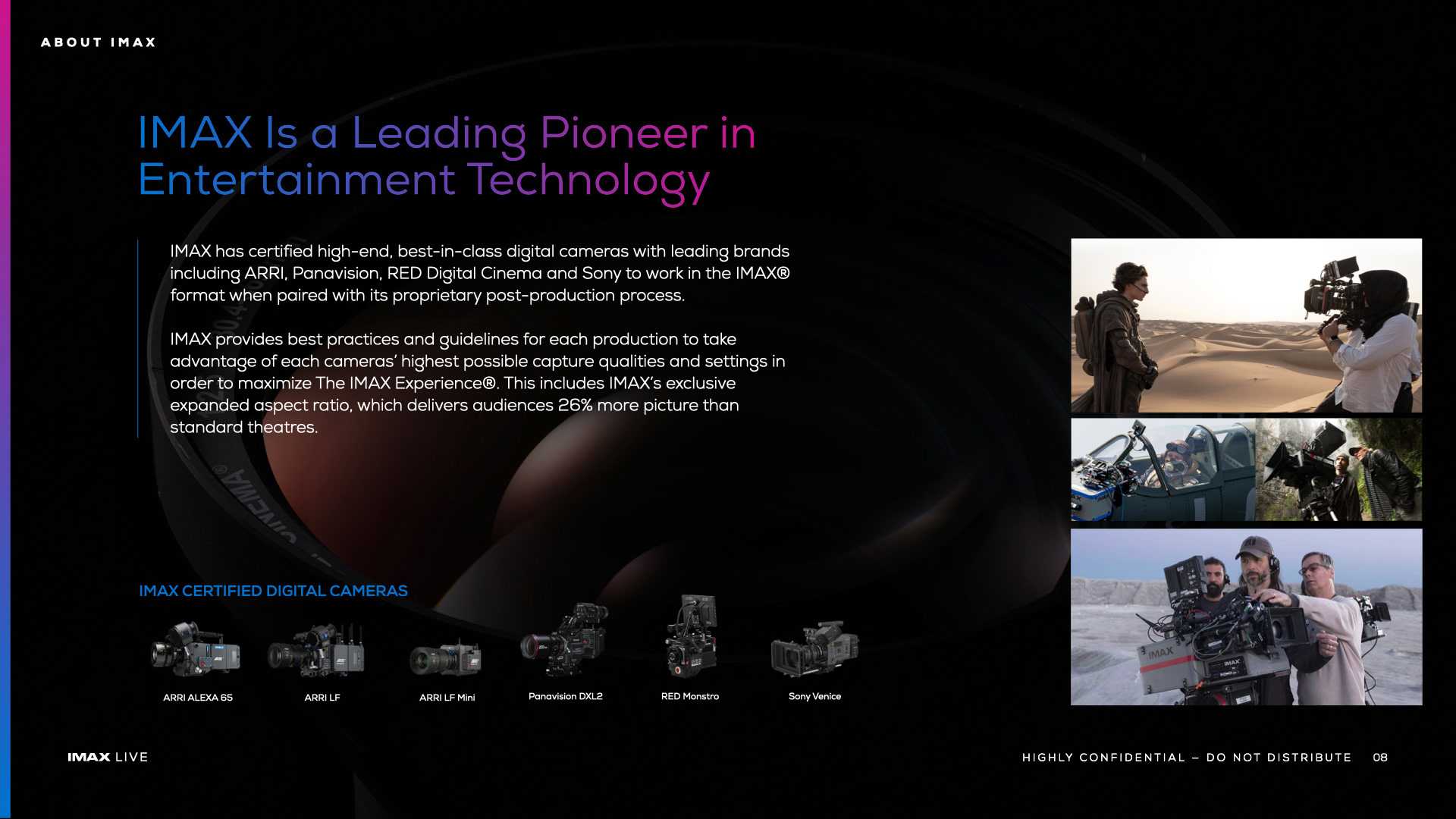
Brand Styleguidelines
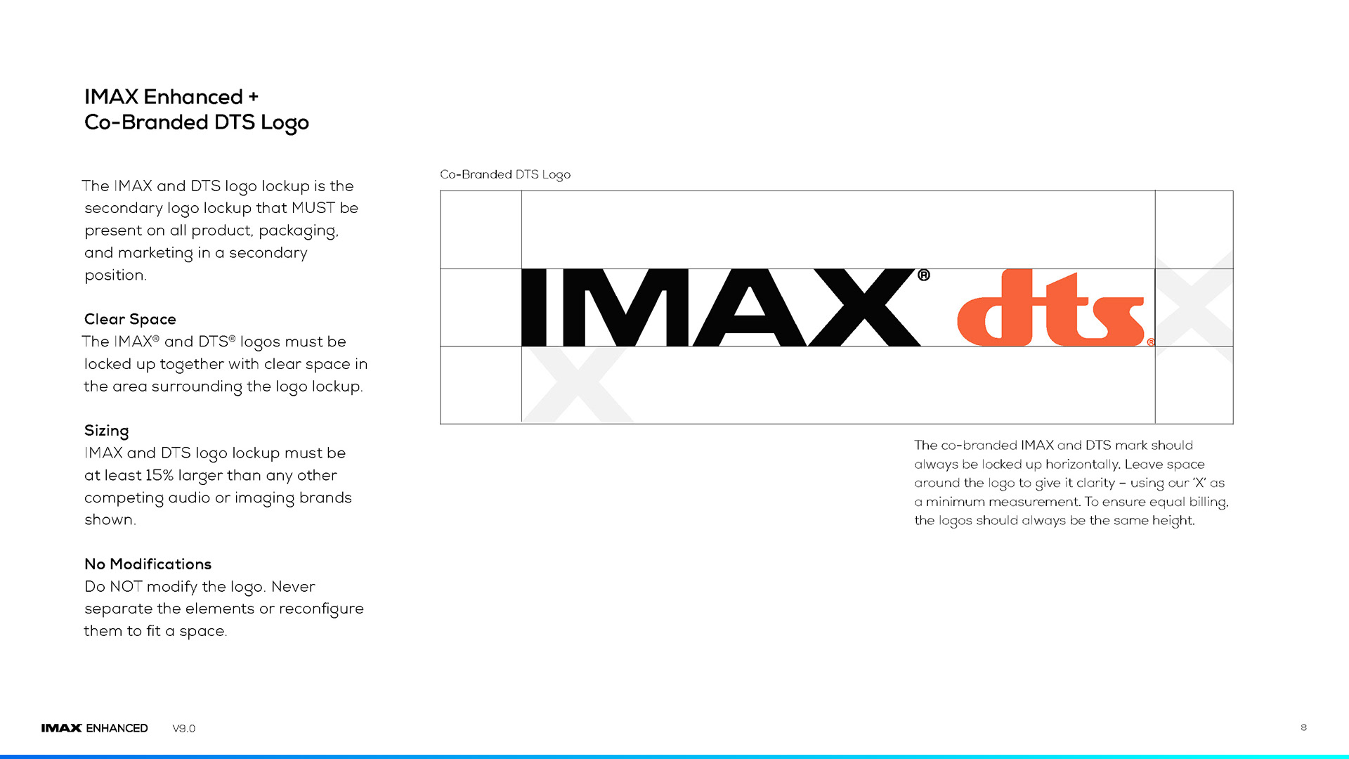
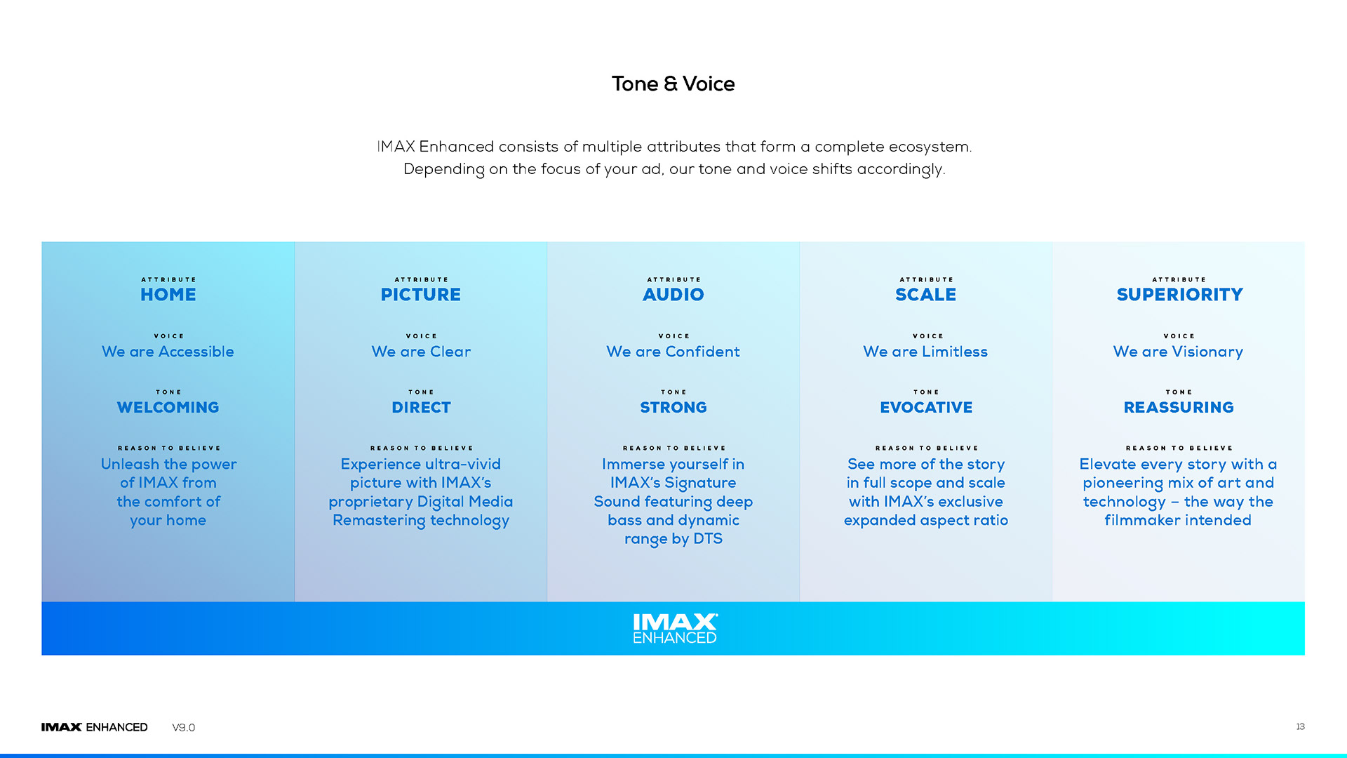

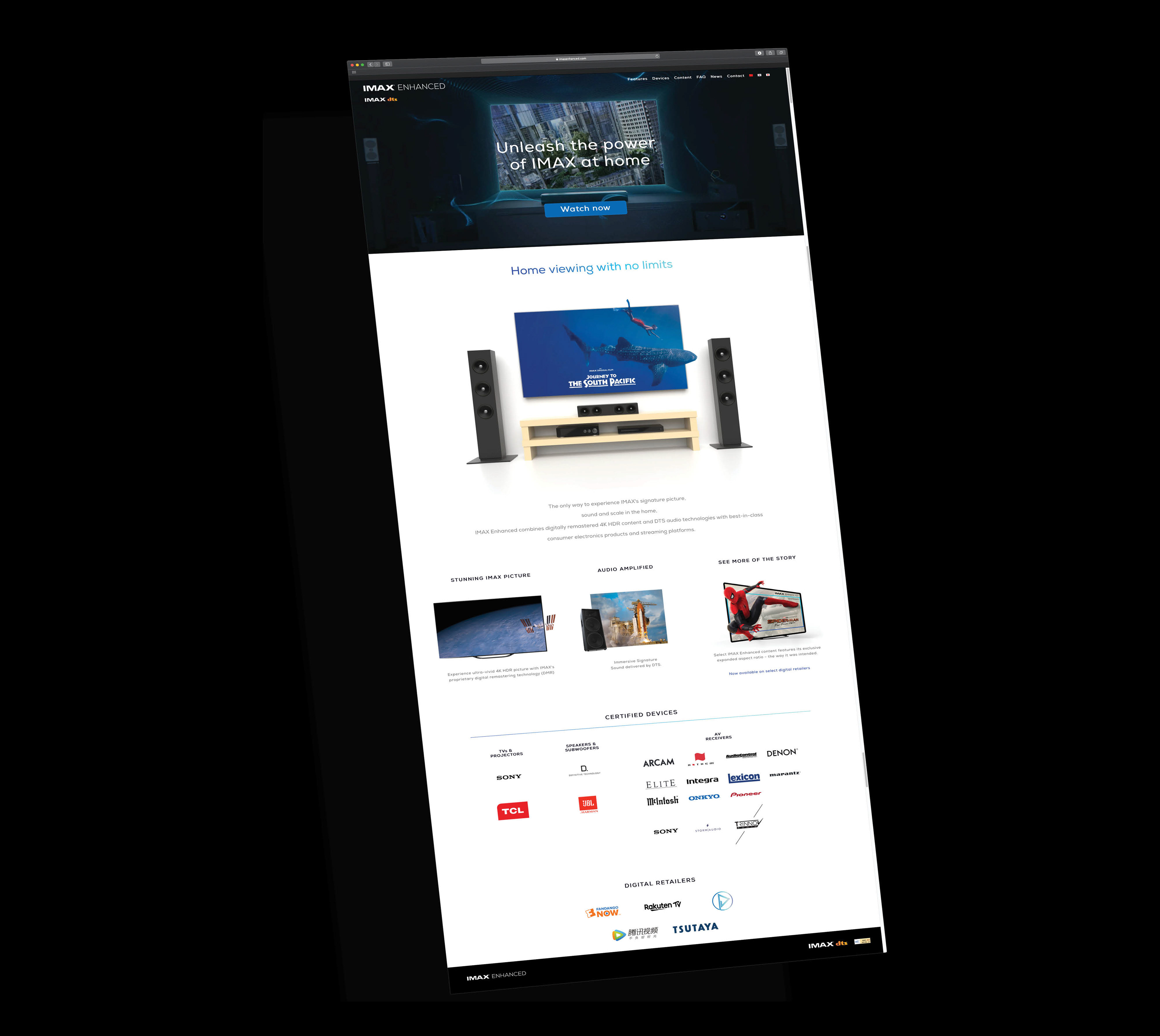
Launch Website
Partner Brochure
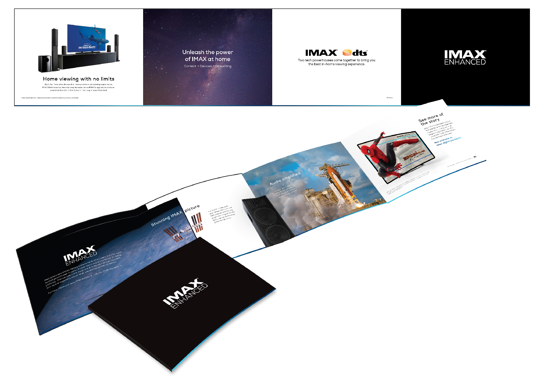


Large Format Hall Banners


Web Bananers for

CLIENT

NEW BUSINESS DEVELOPMENT
PRESENTATION DECK DESIGN
PRESENTATION DECK DESIGN
CONCEPT, LAYOUT, TYPOGRAPHY, DATA VISUALIZATION, IMAGE SELECTION, PHOTO MANIPULATION AND COMPOSITING
PROJECT DATE | 2022-2023
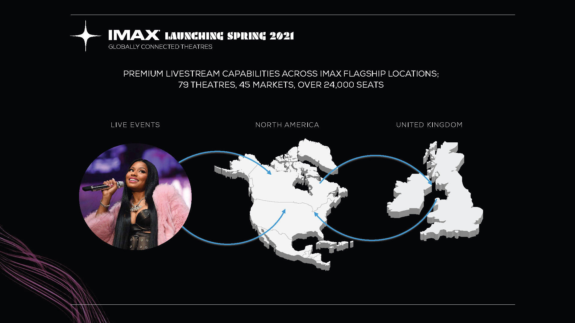
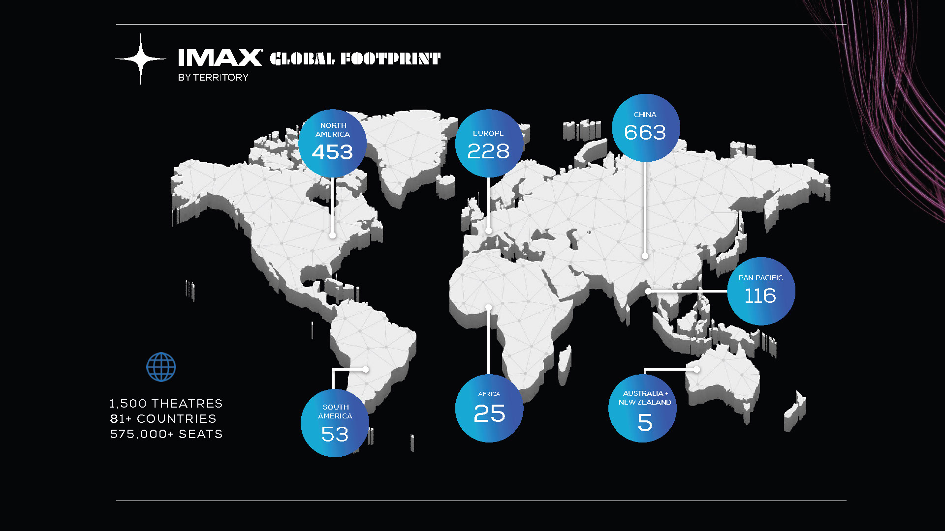
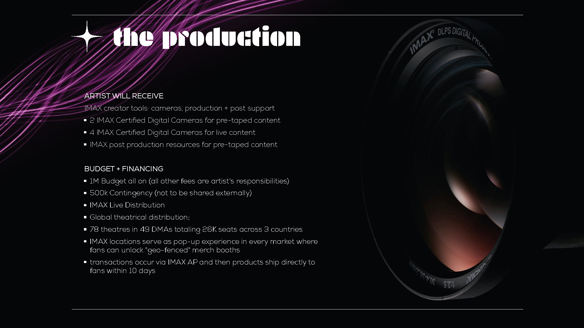
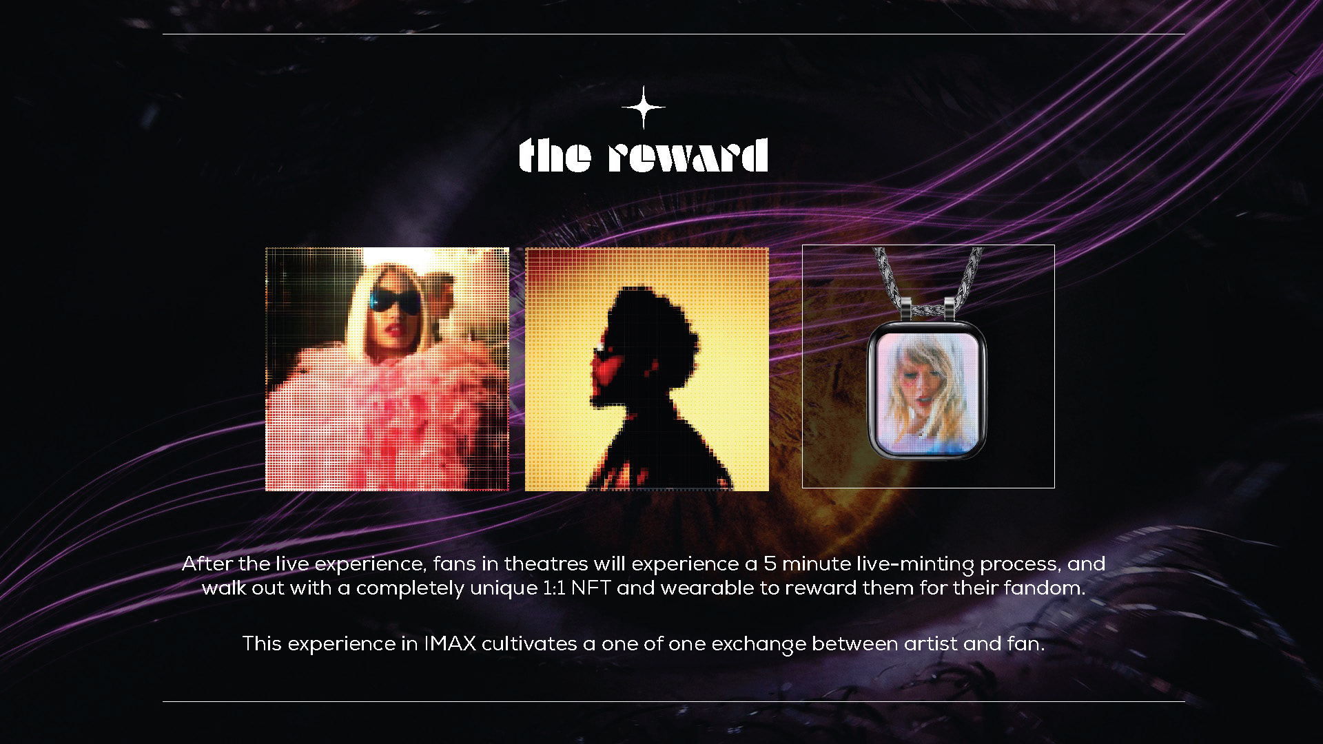
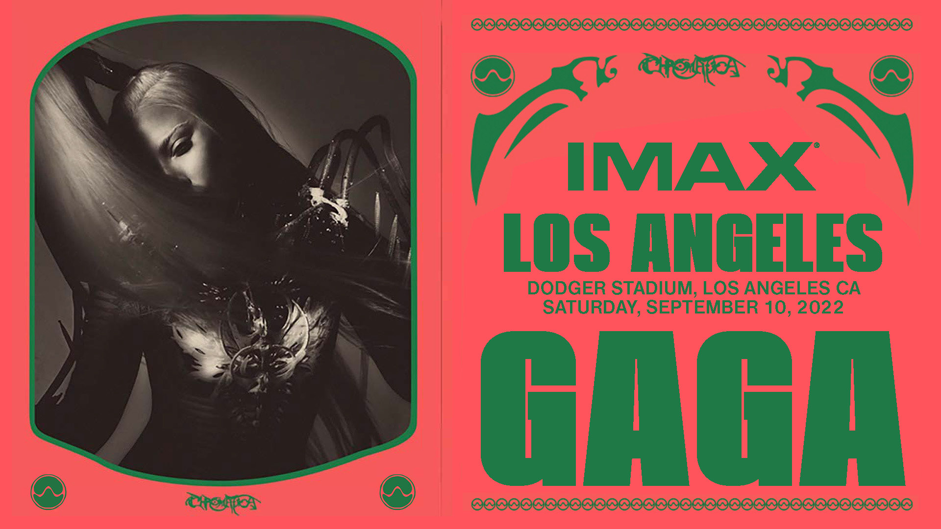
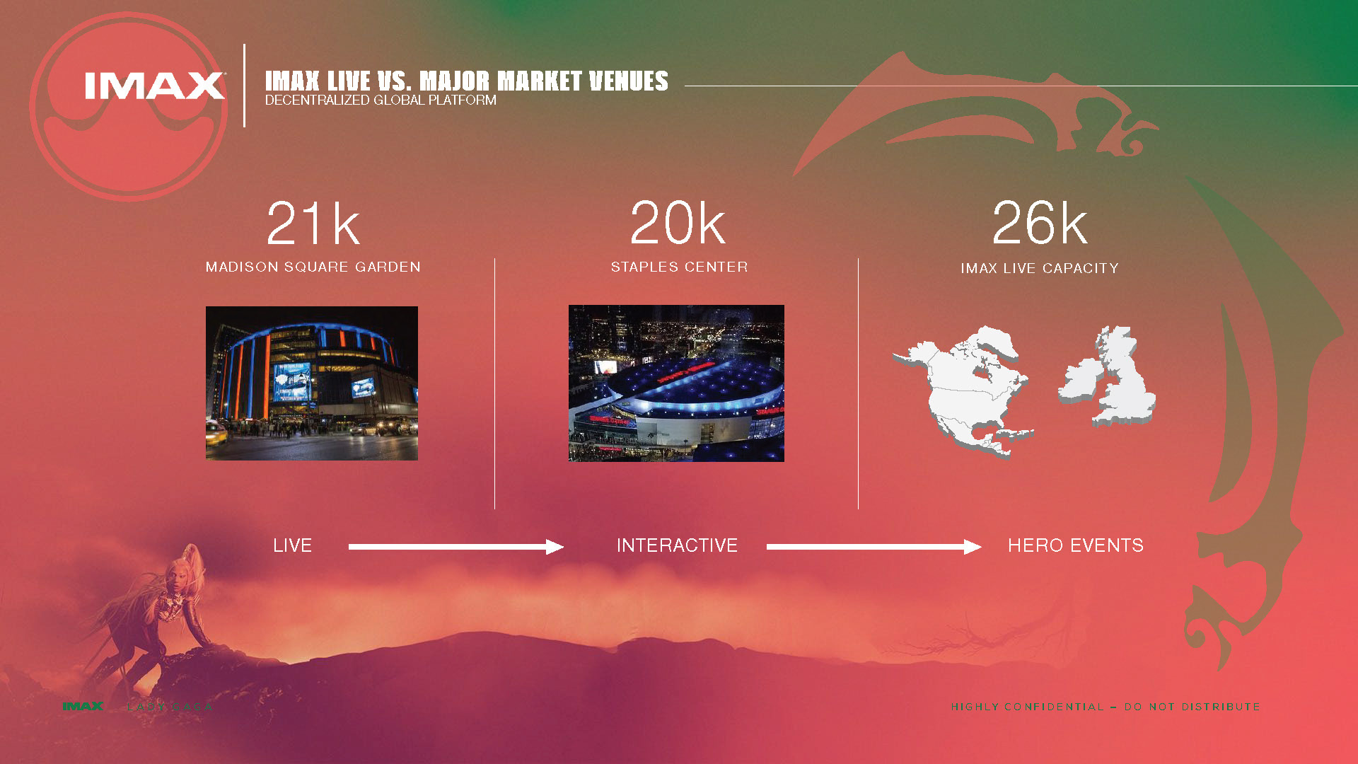
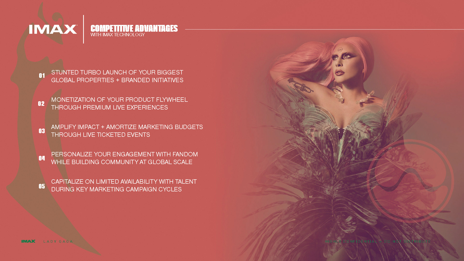
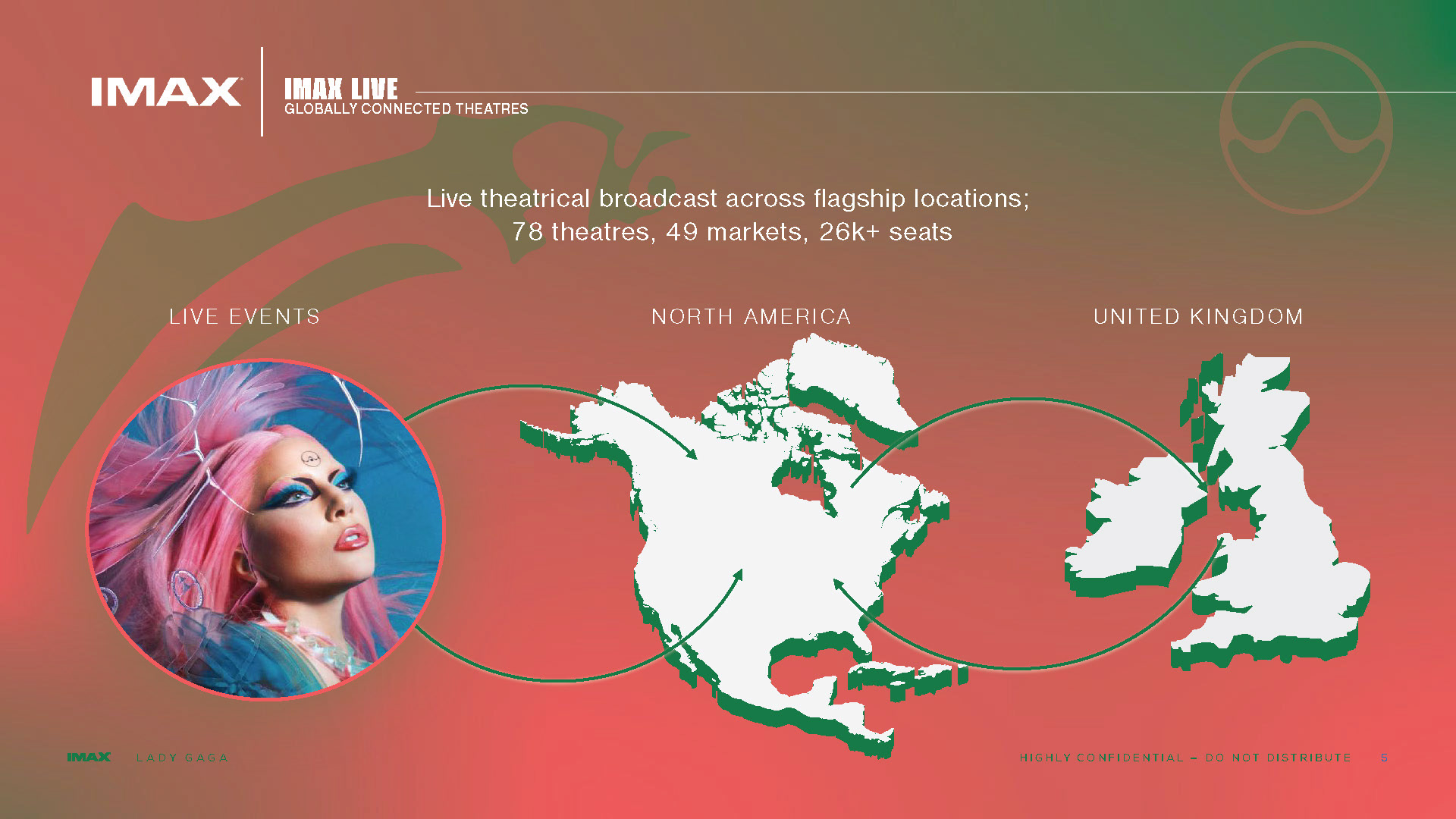
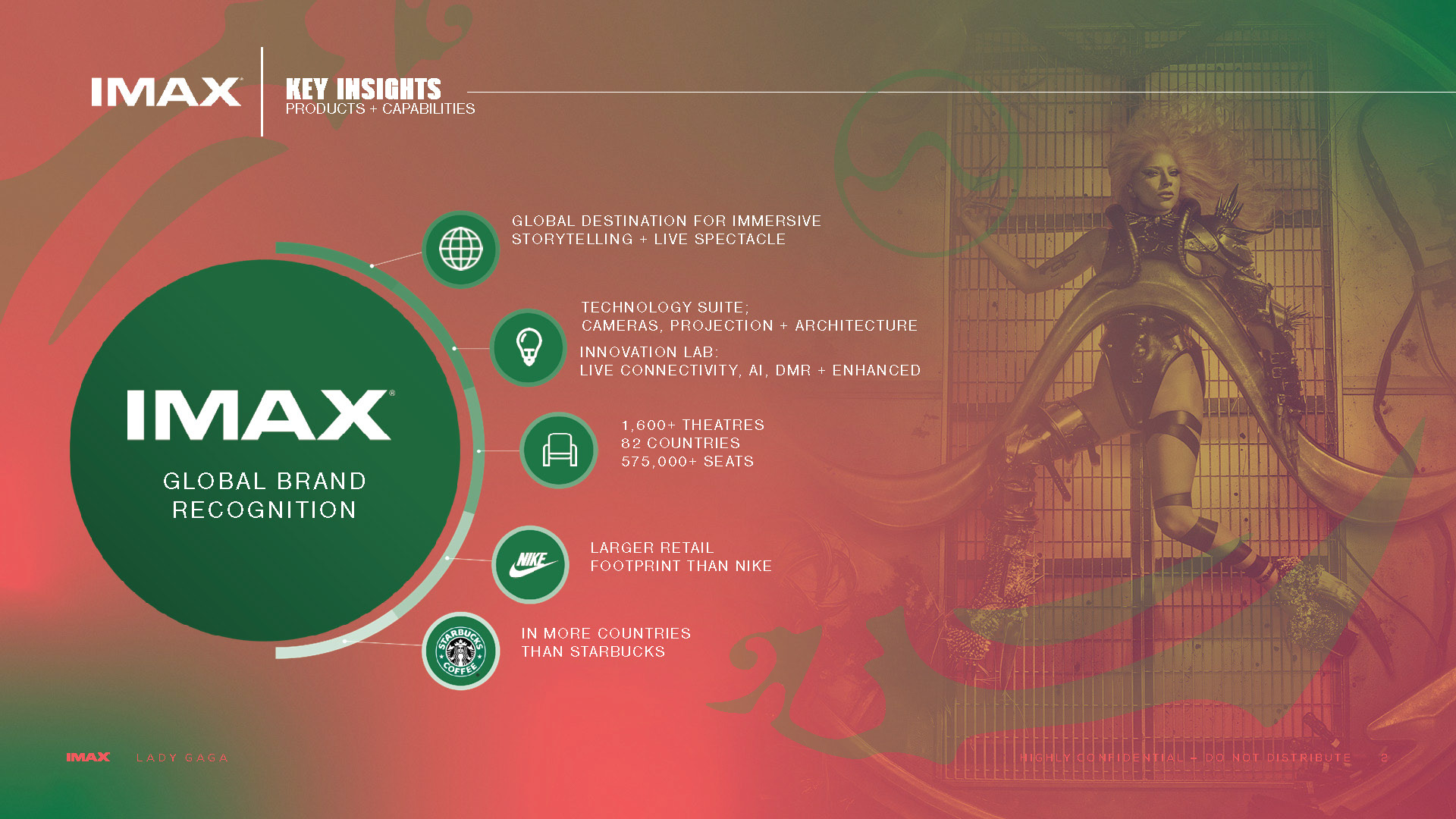
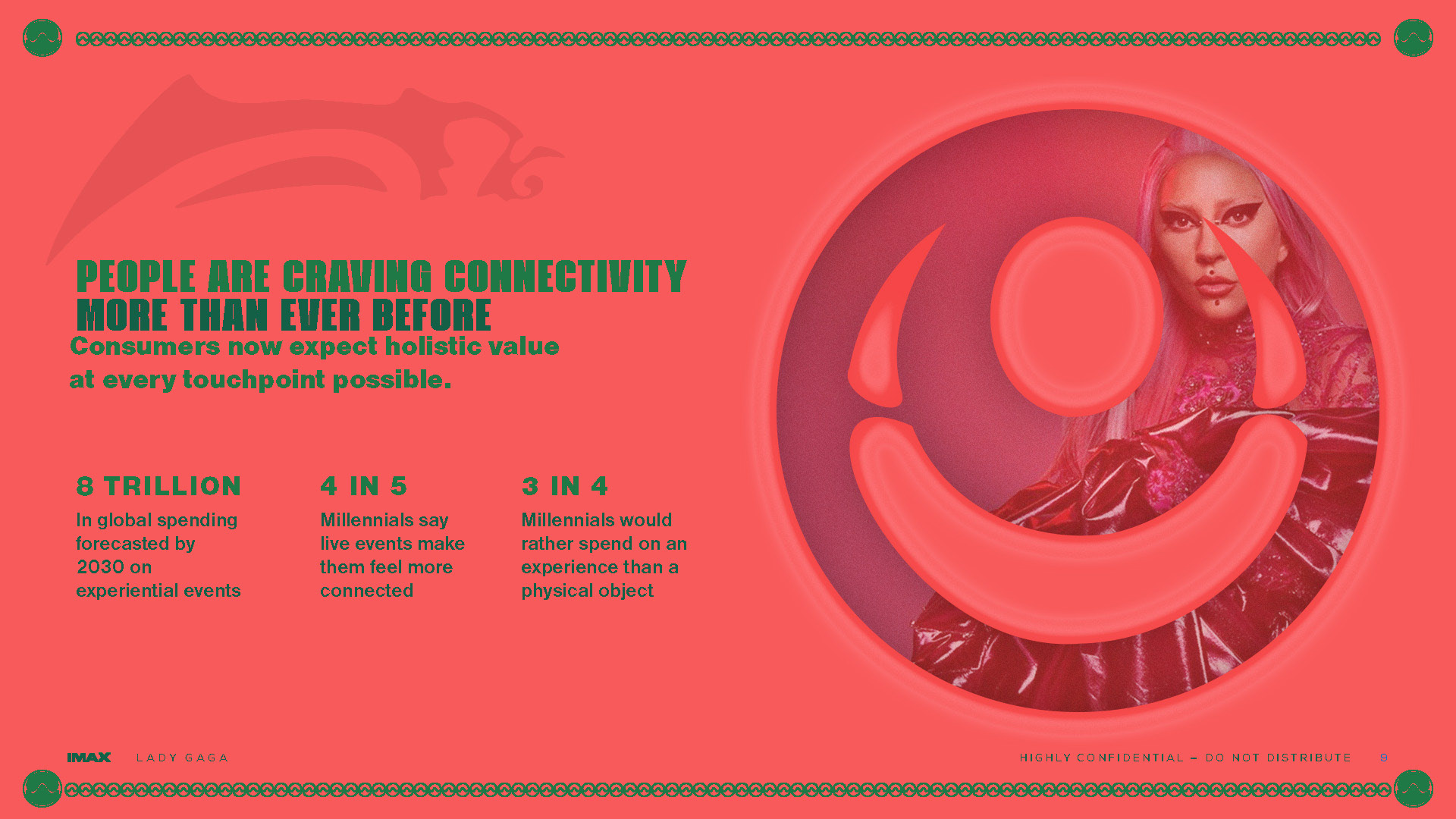
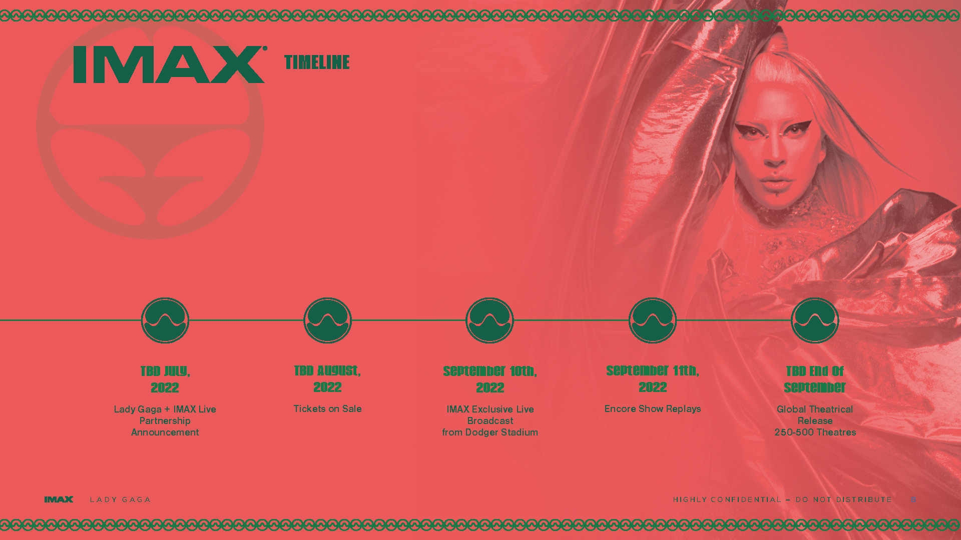
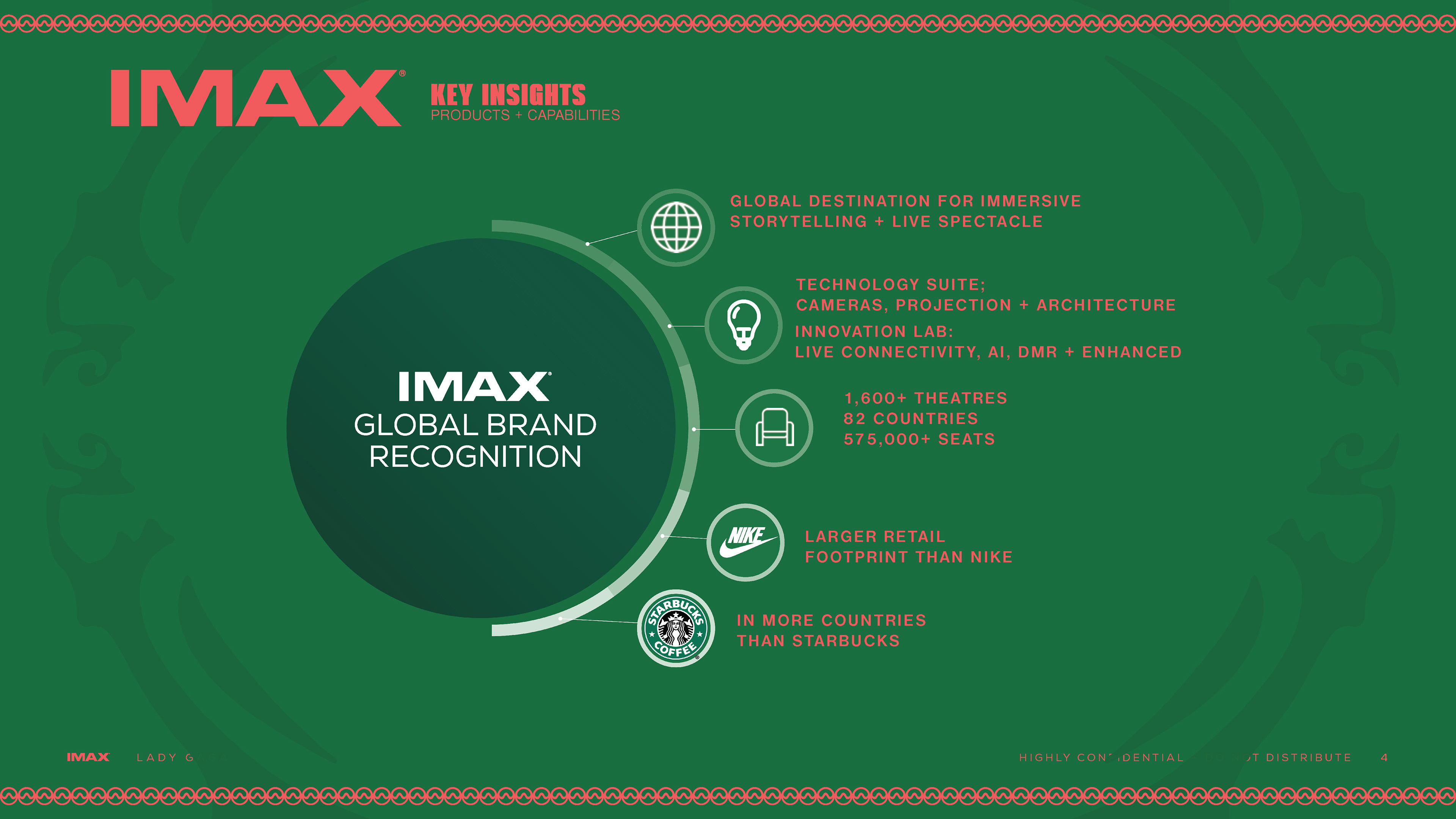
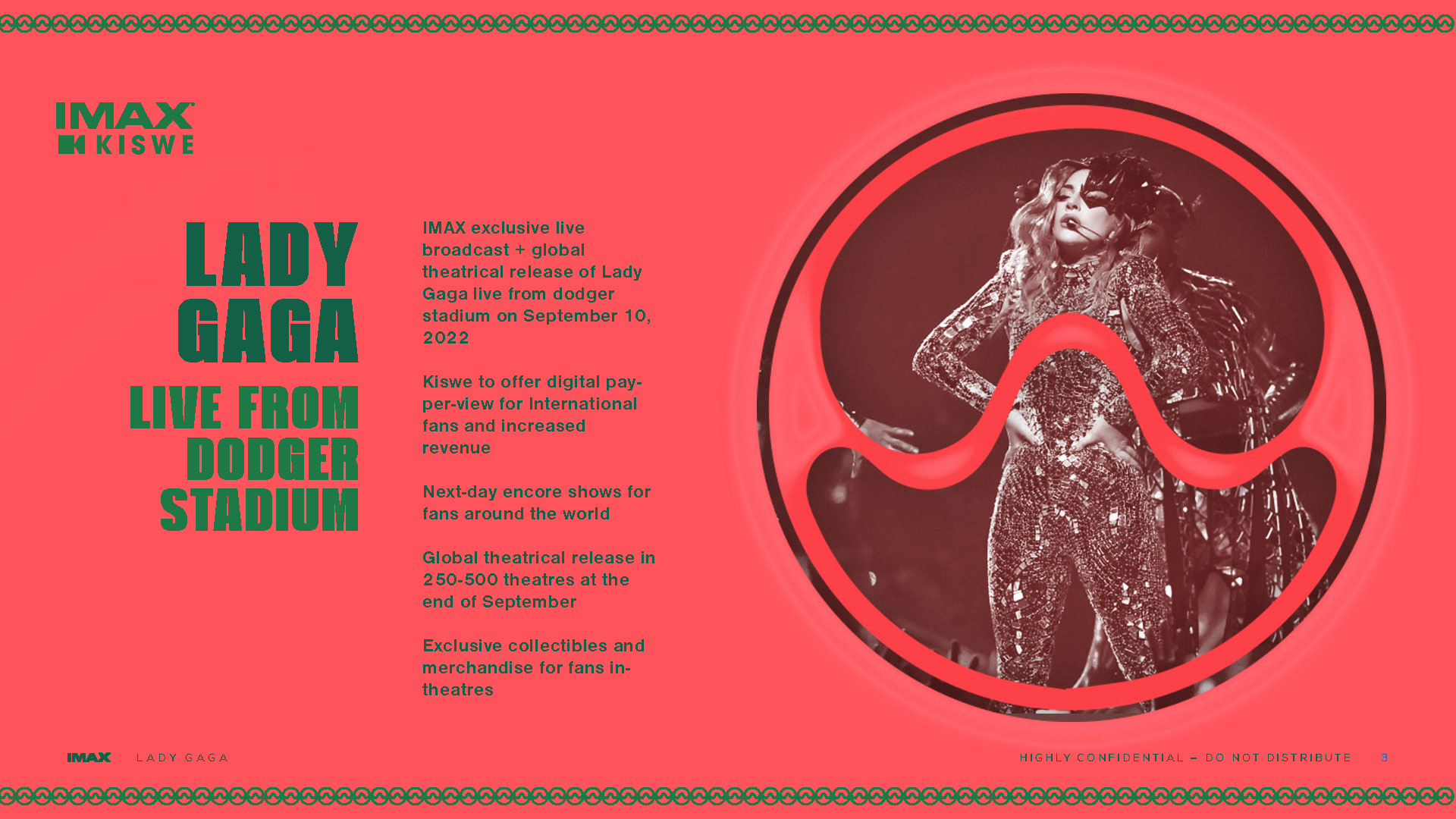
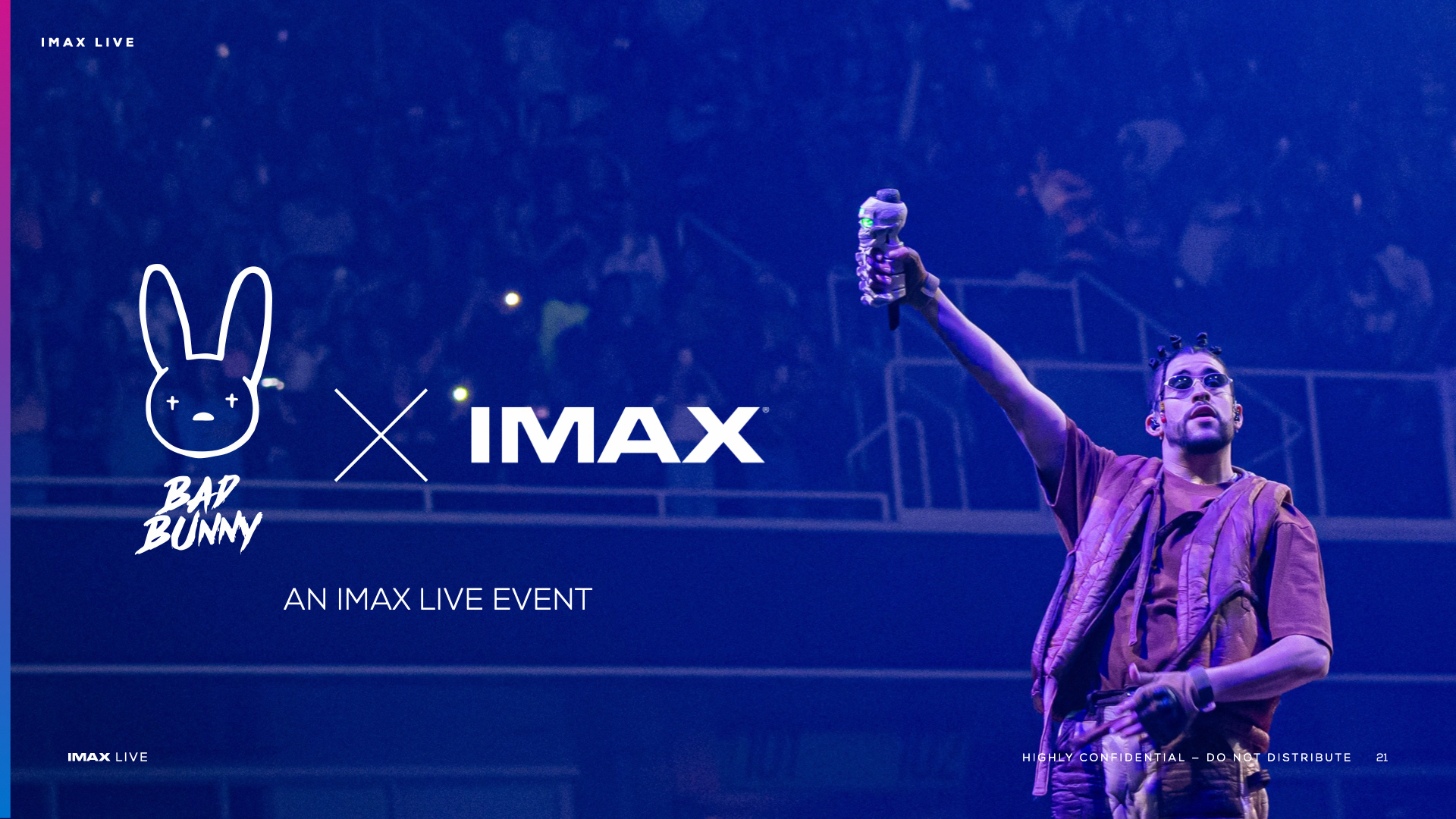
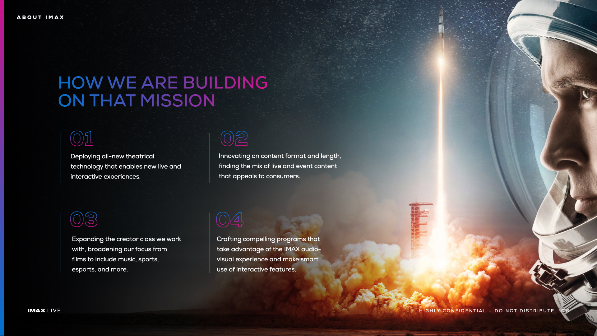
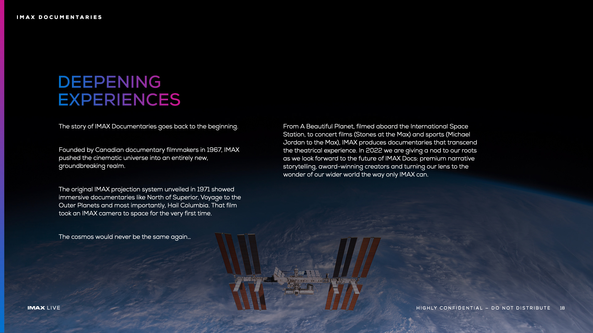
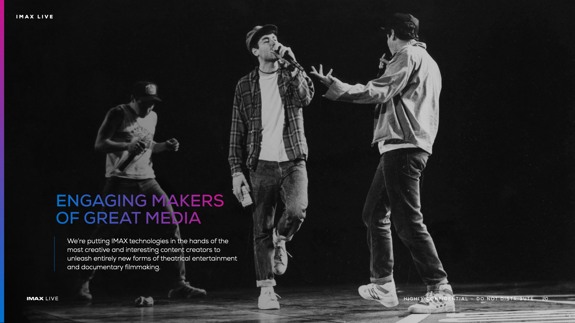
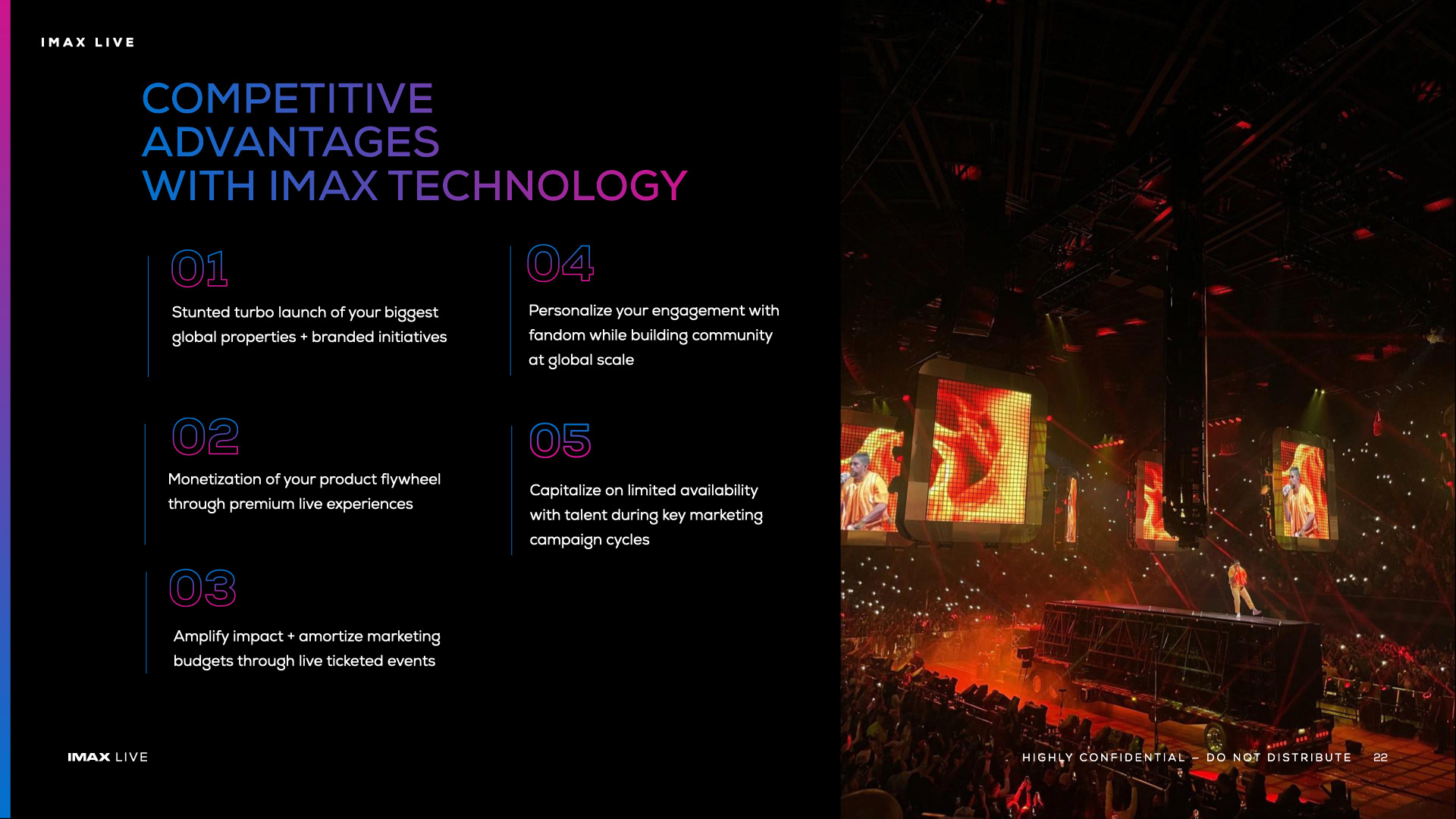
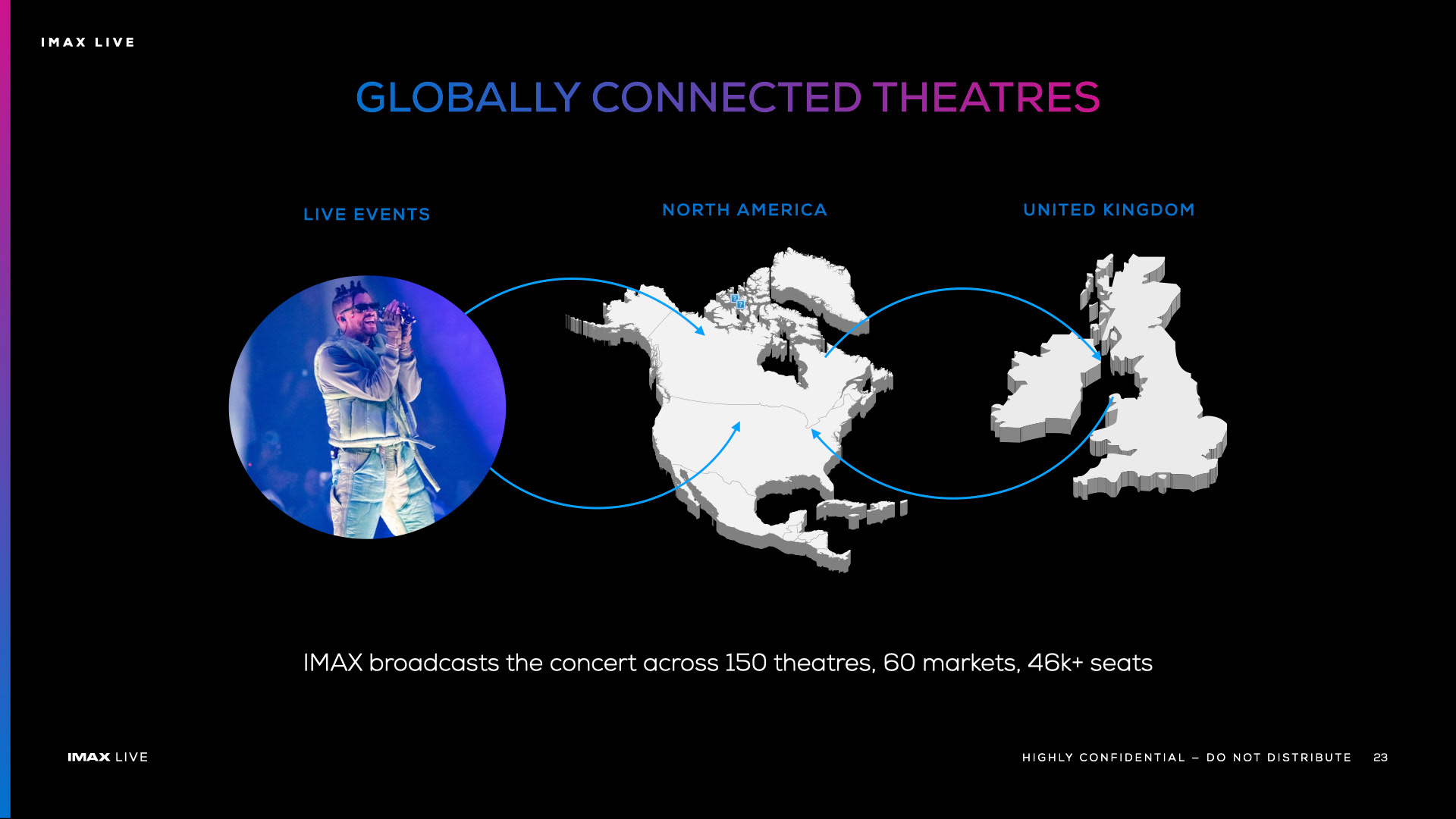
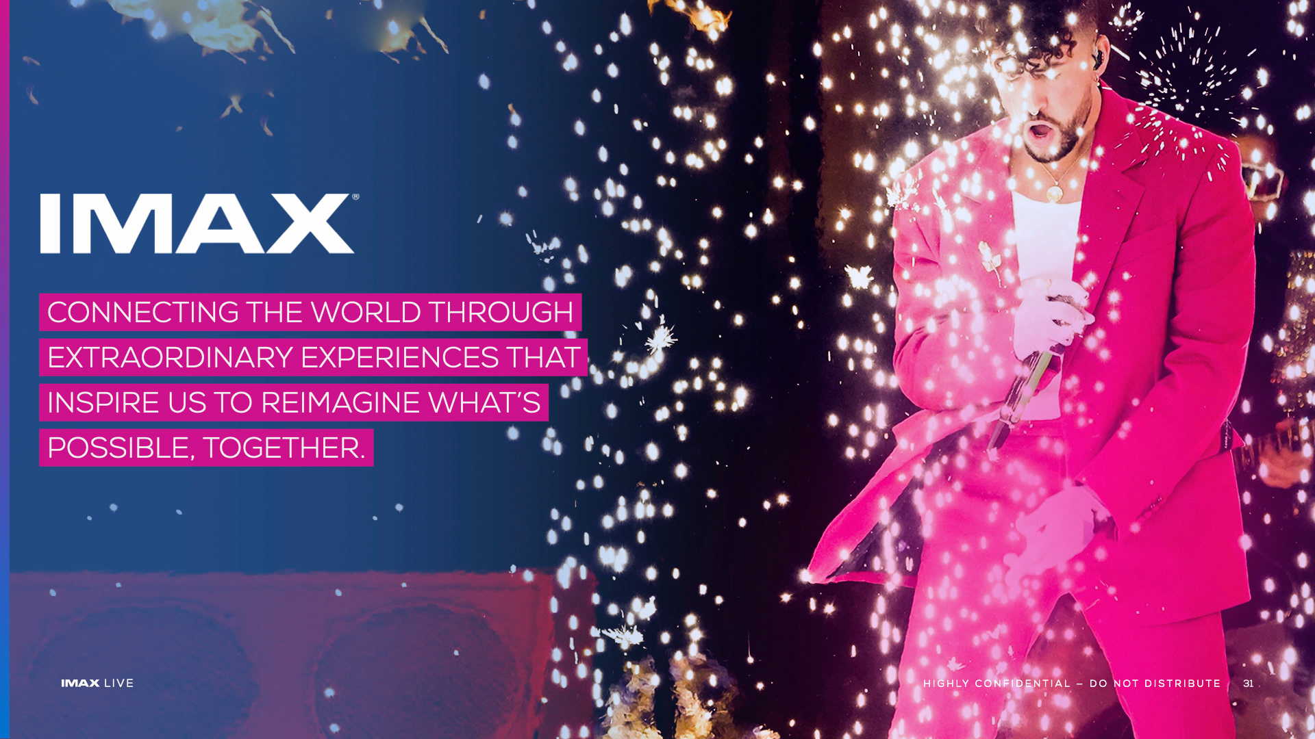
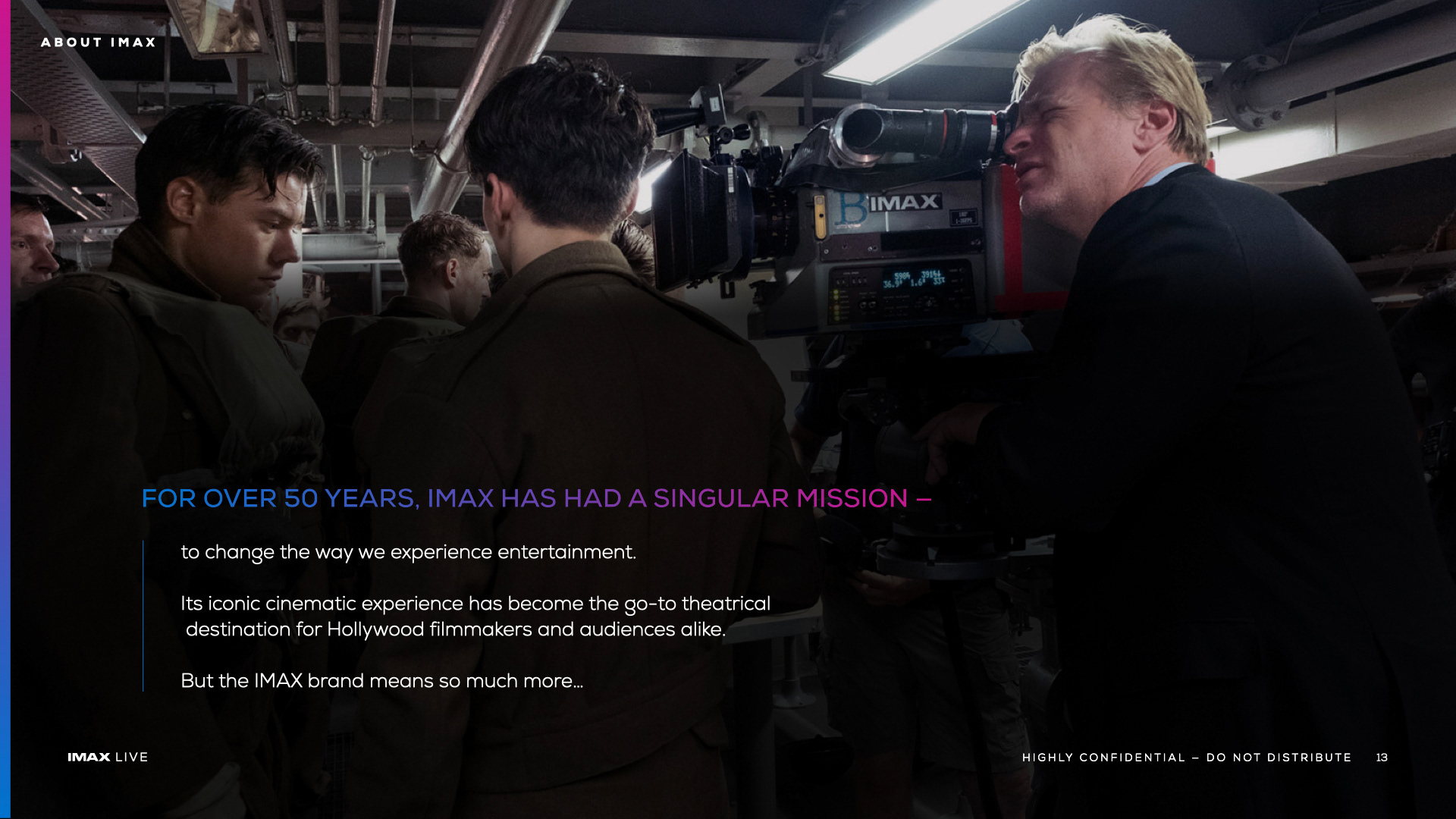
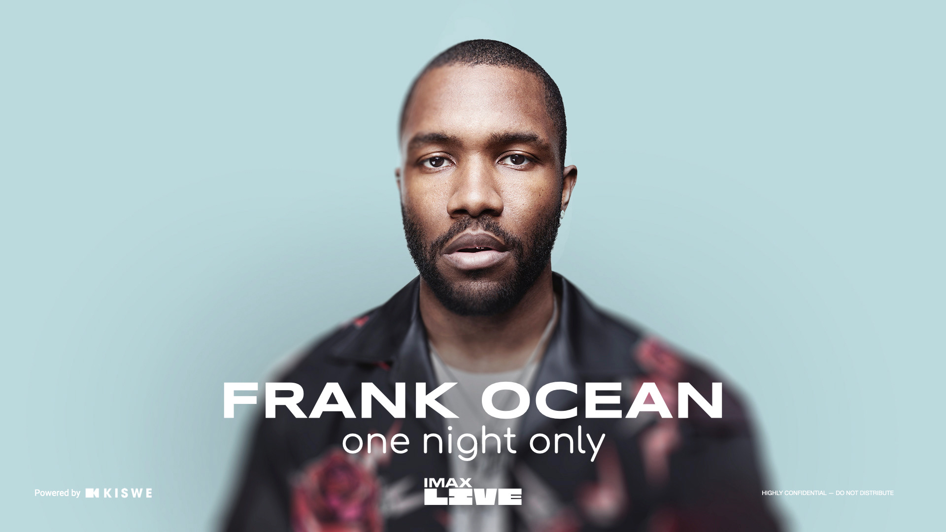
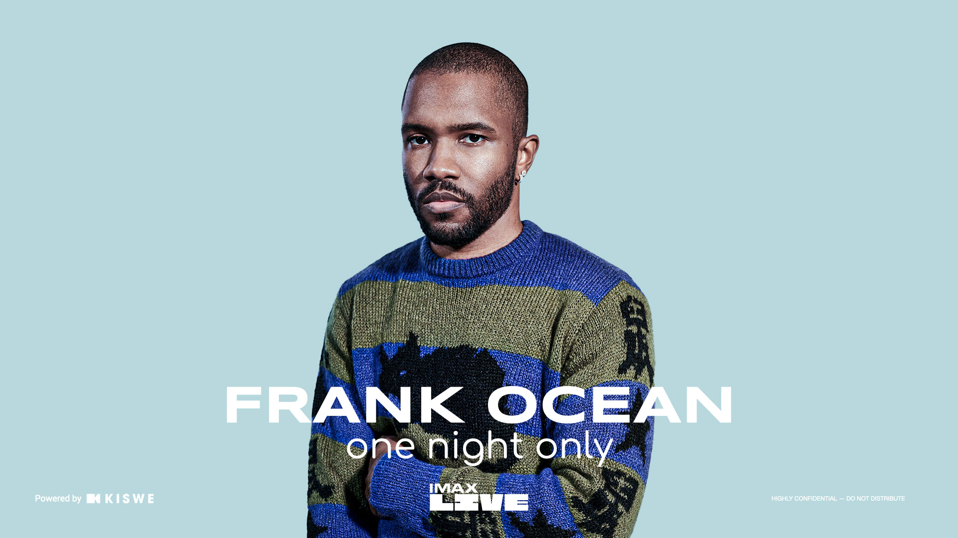
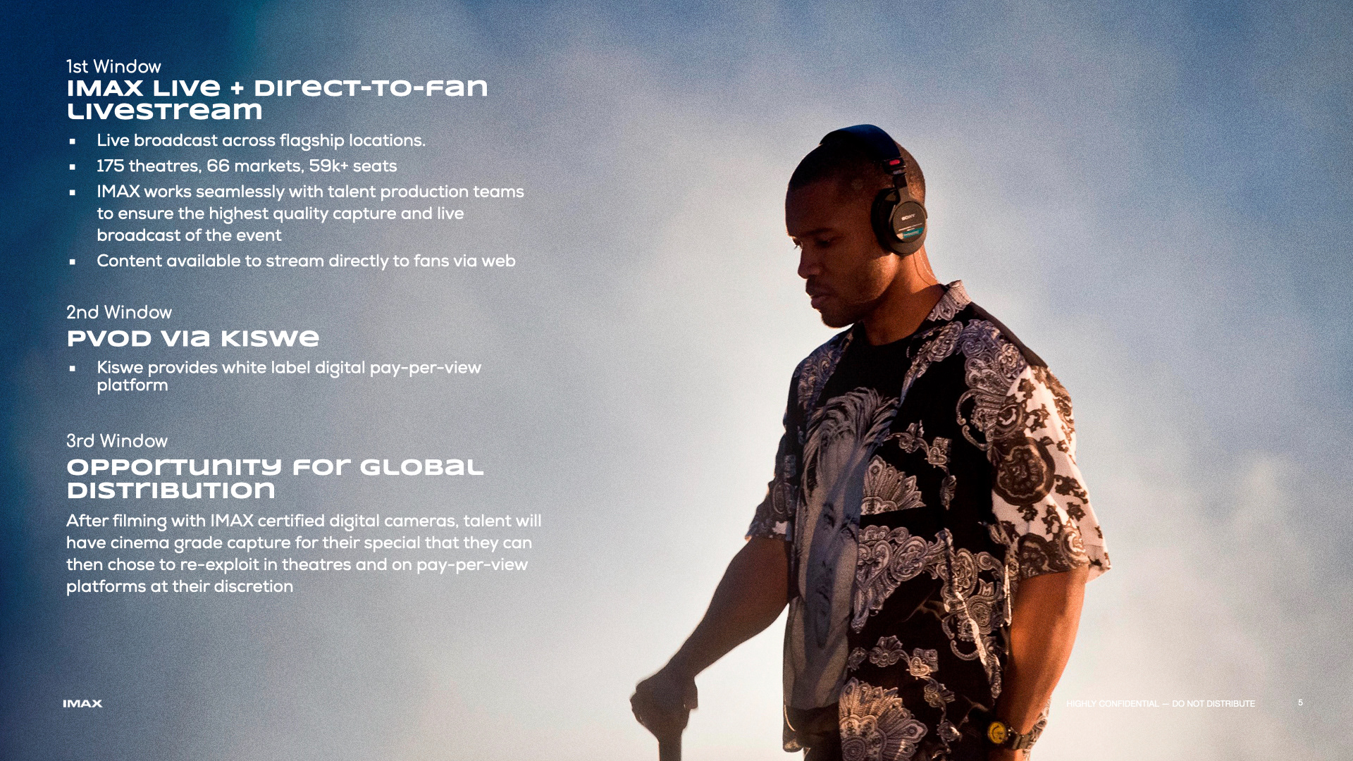
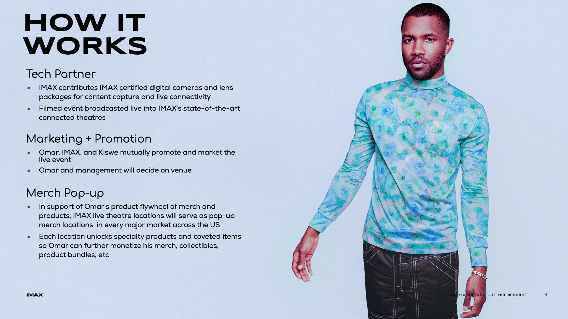
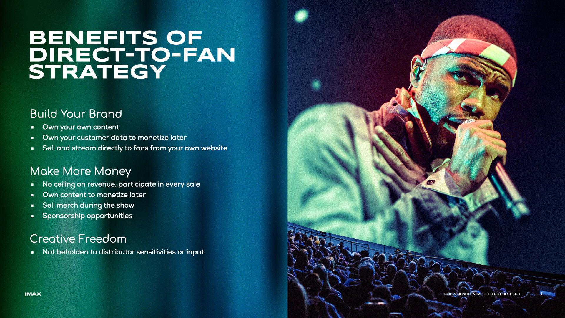
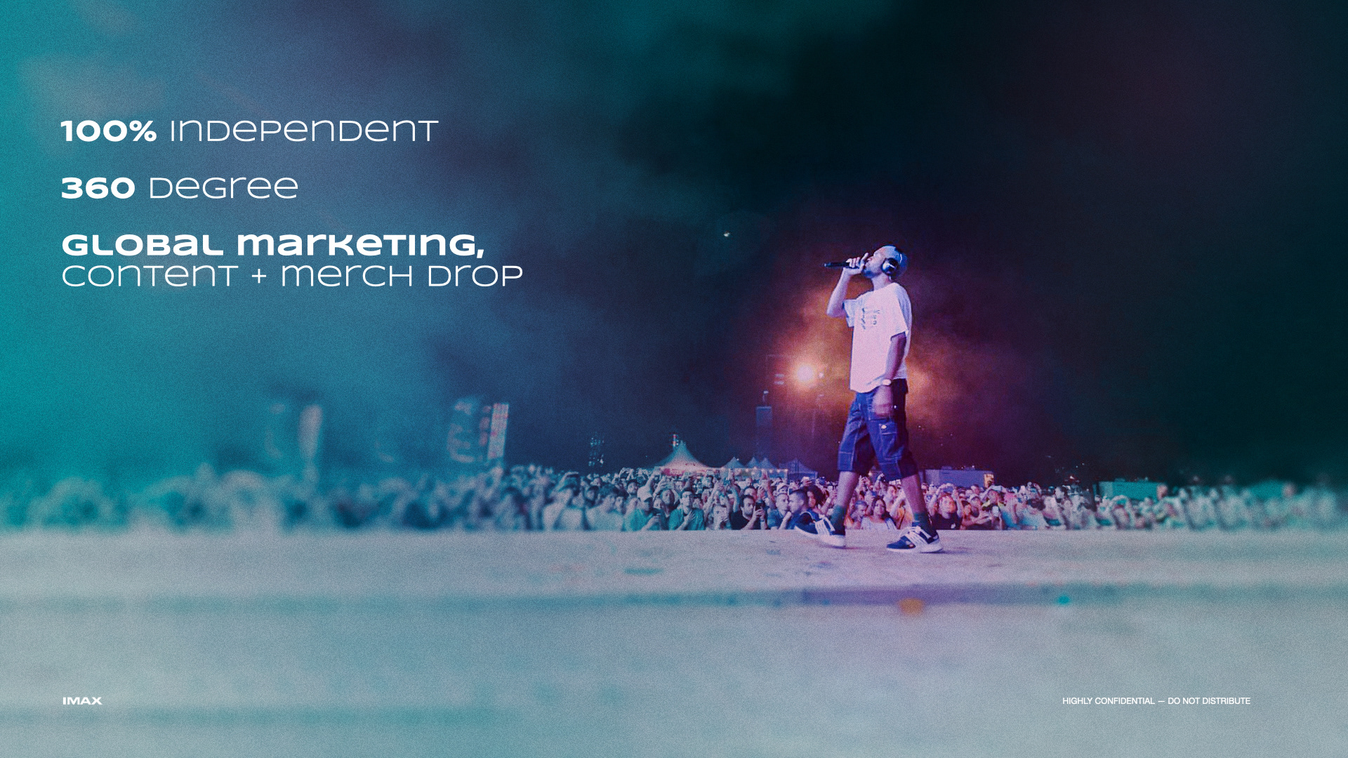
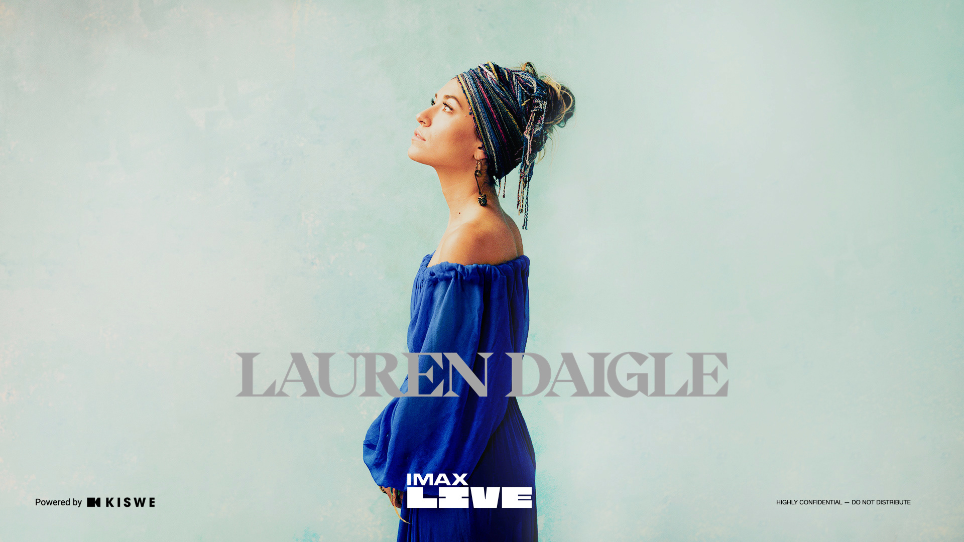
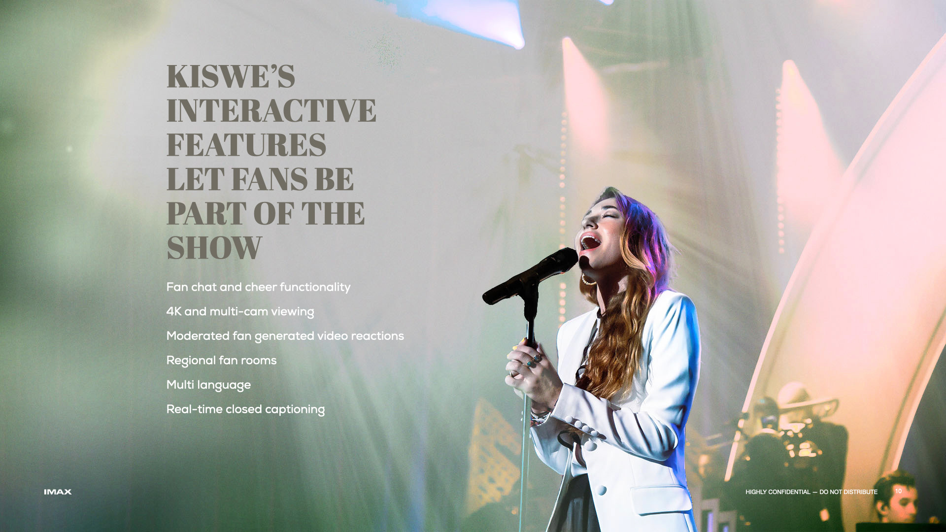
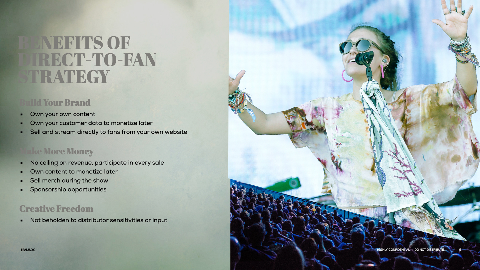
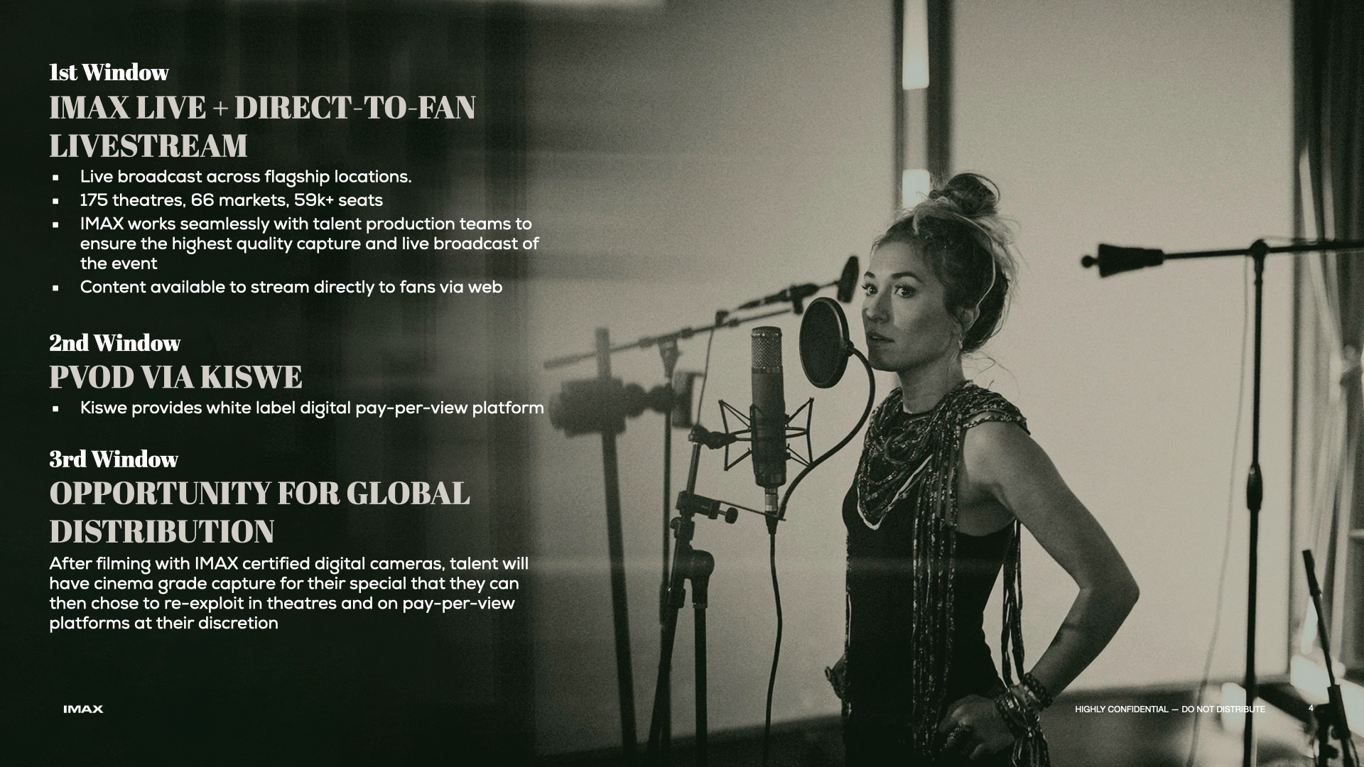
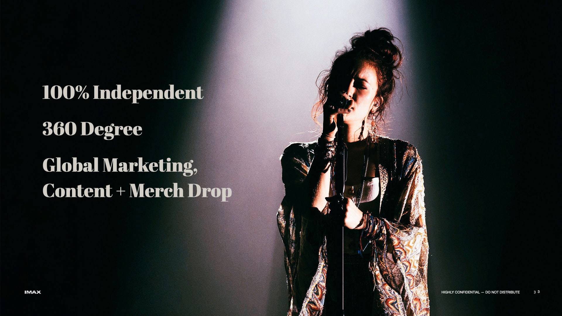
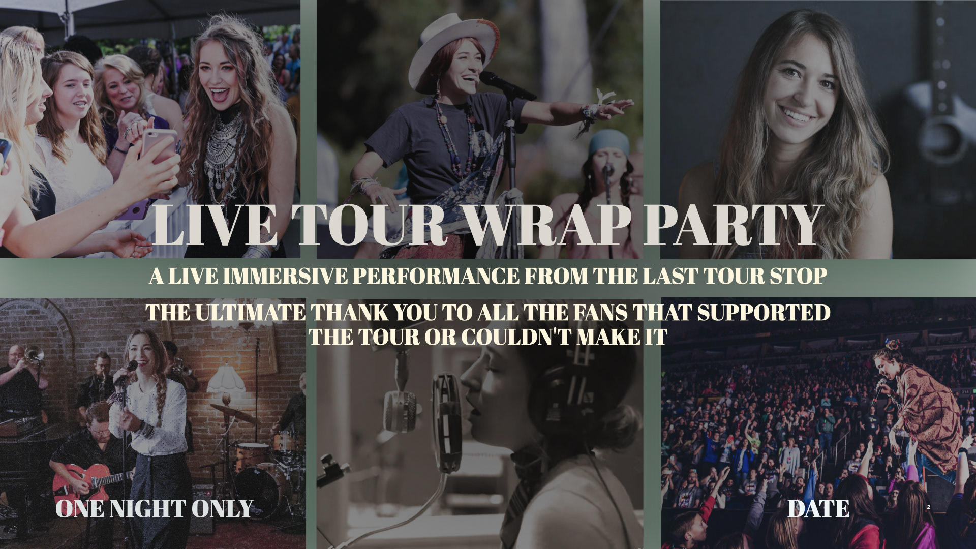
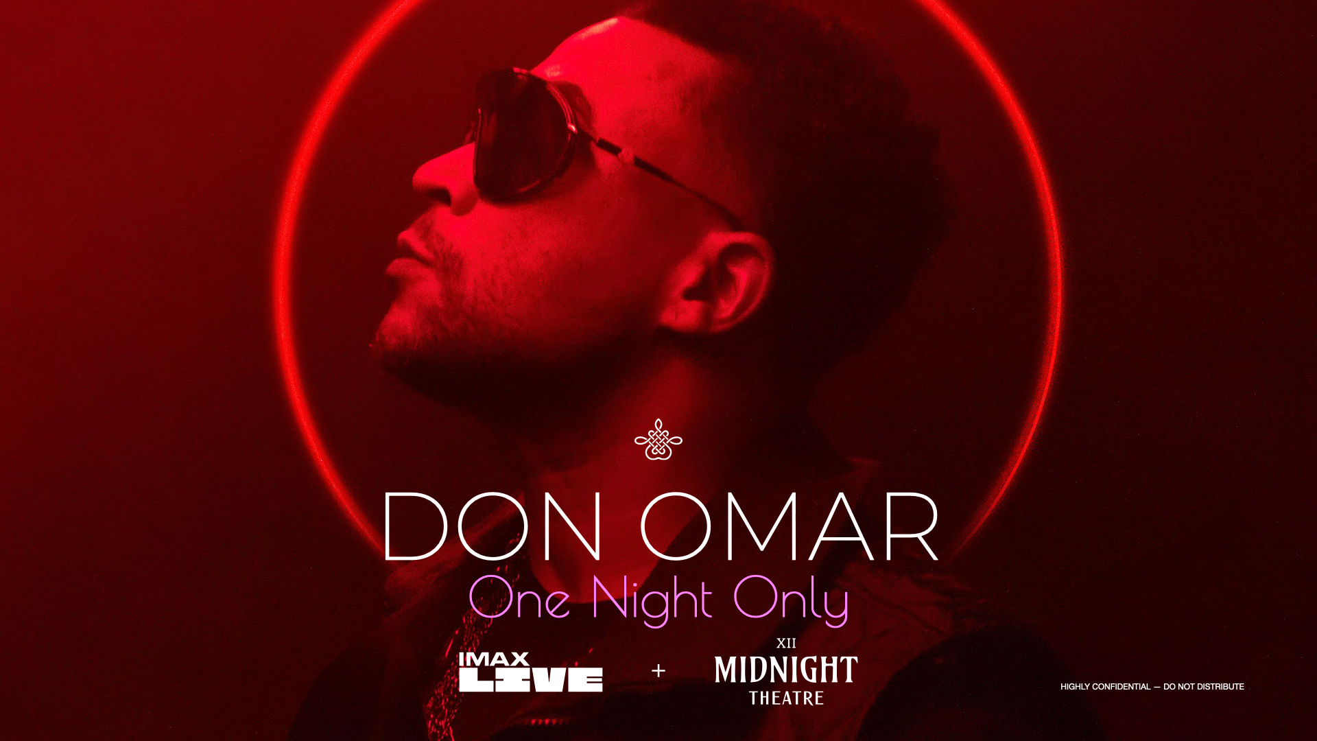
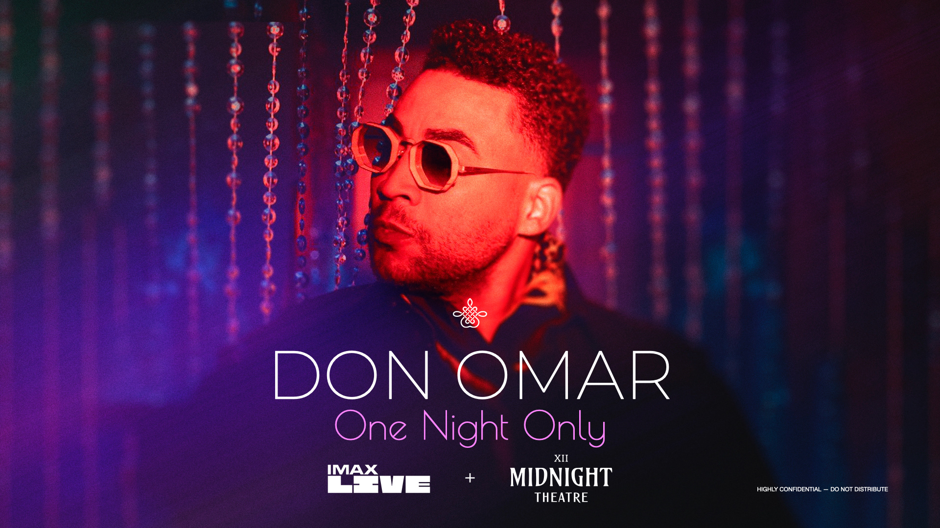
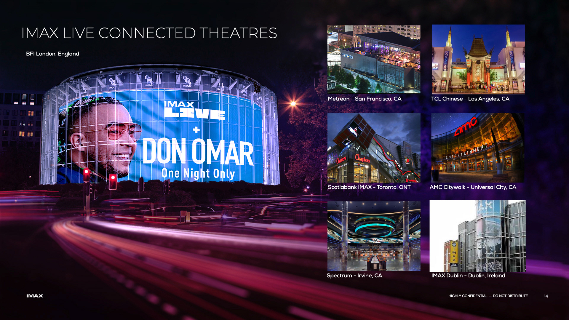
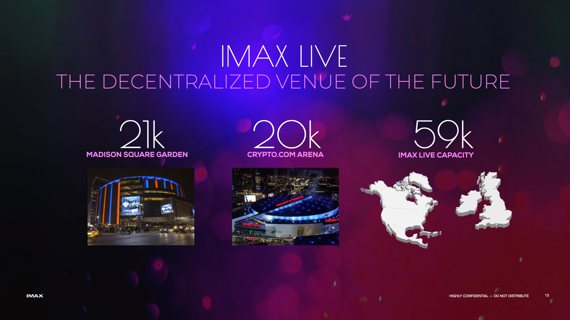
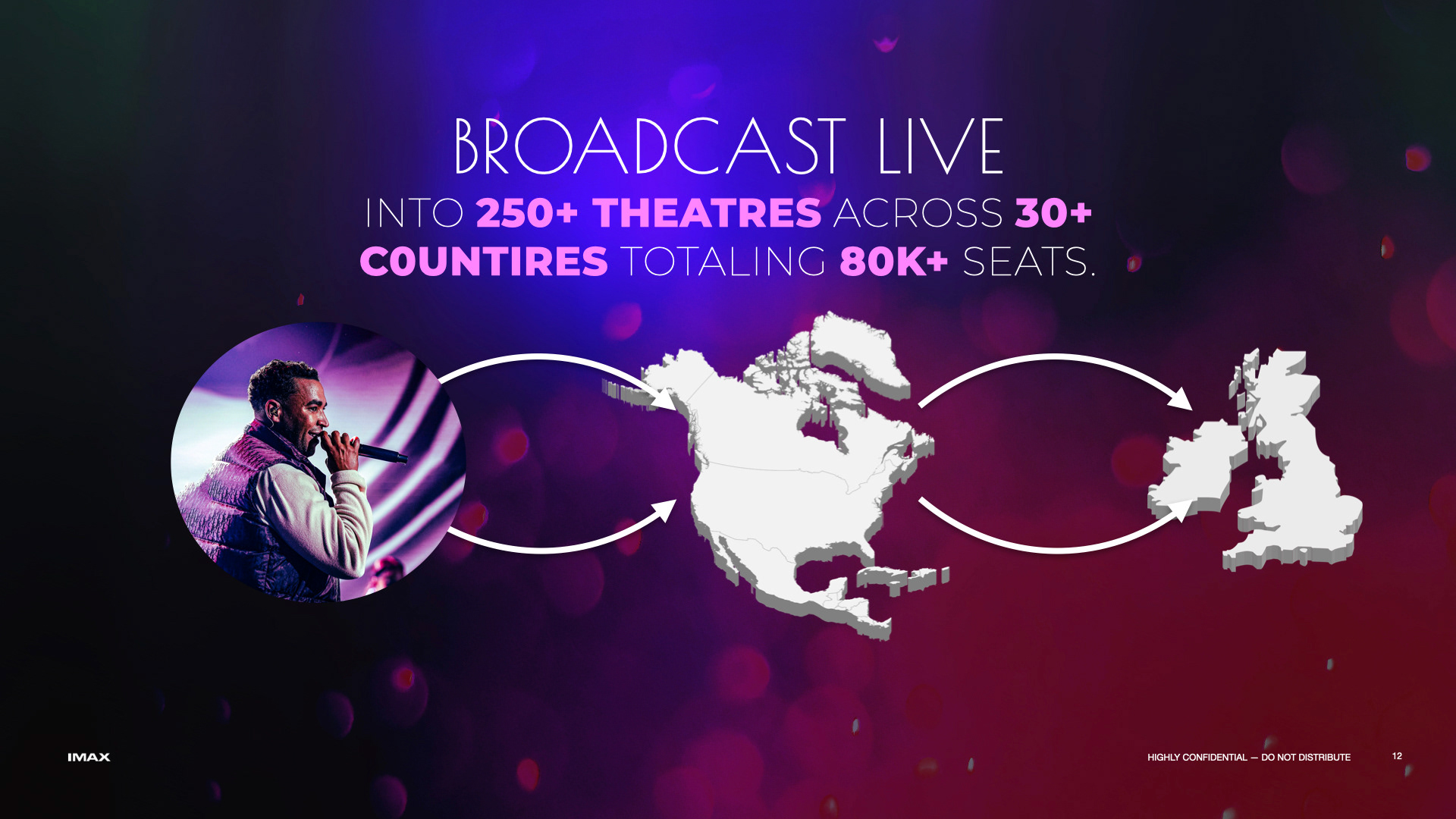
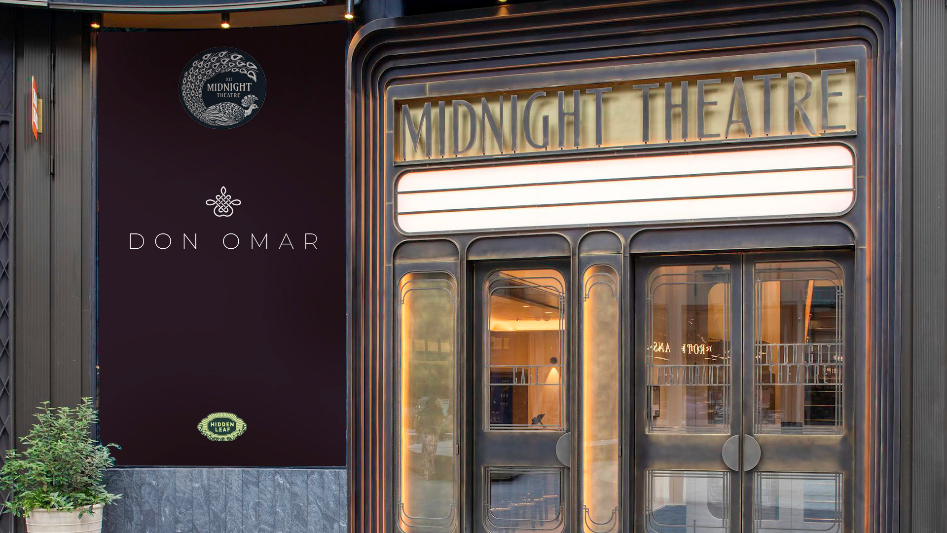
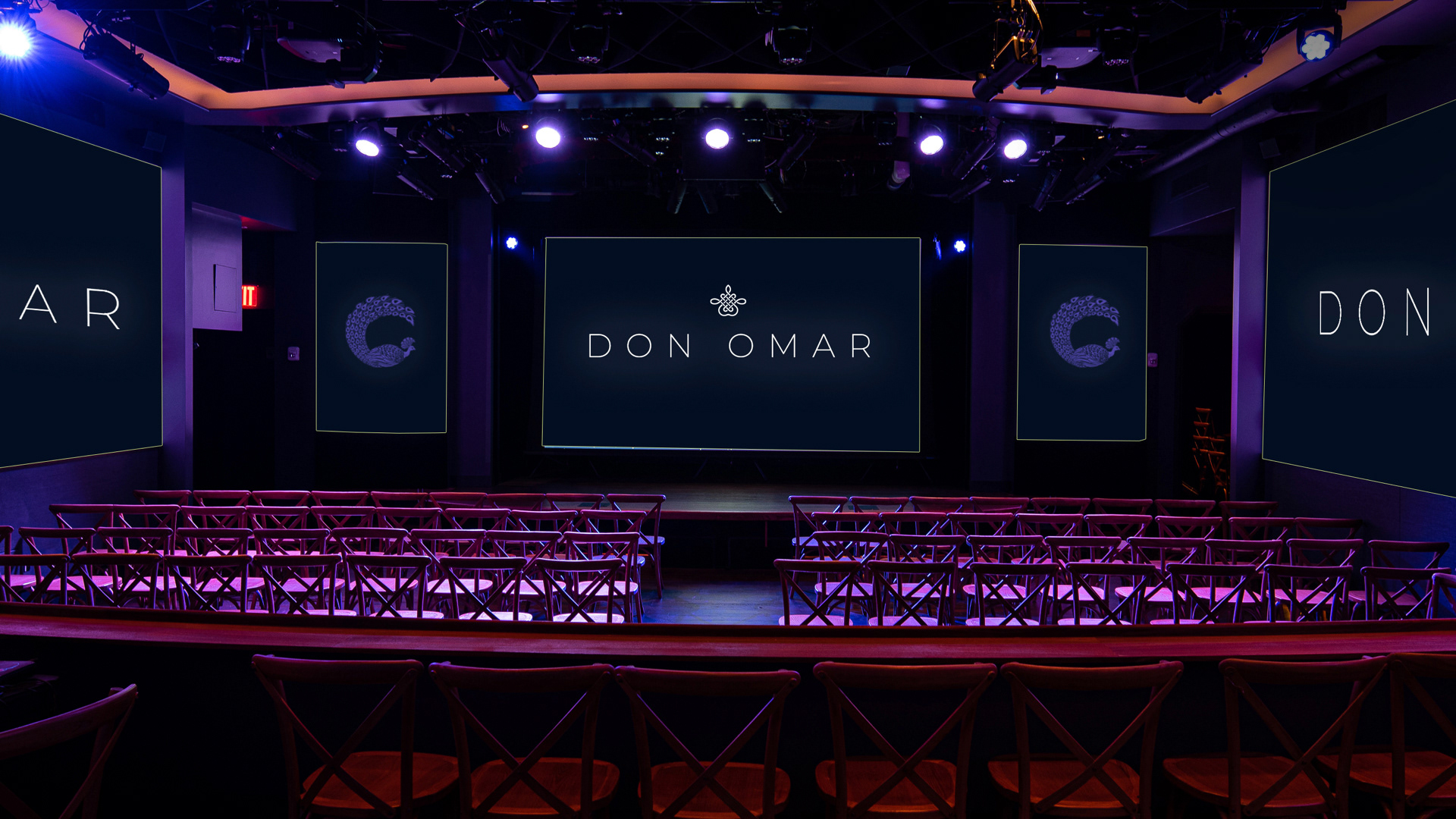
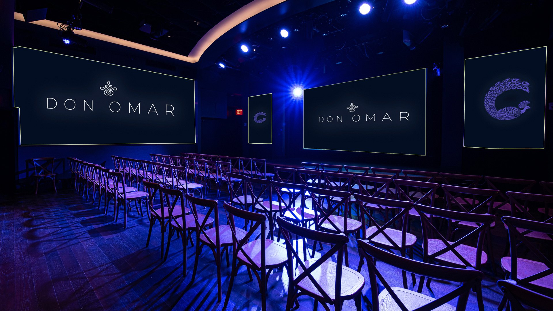
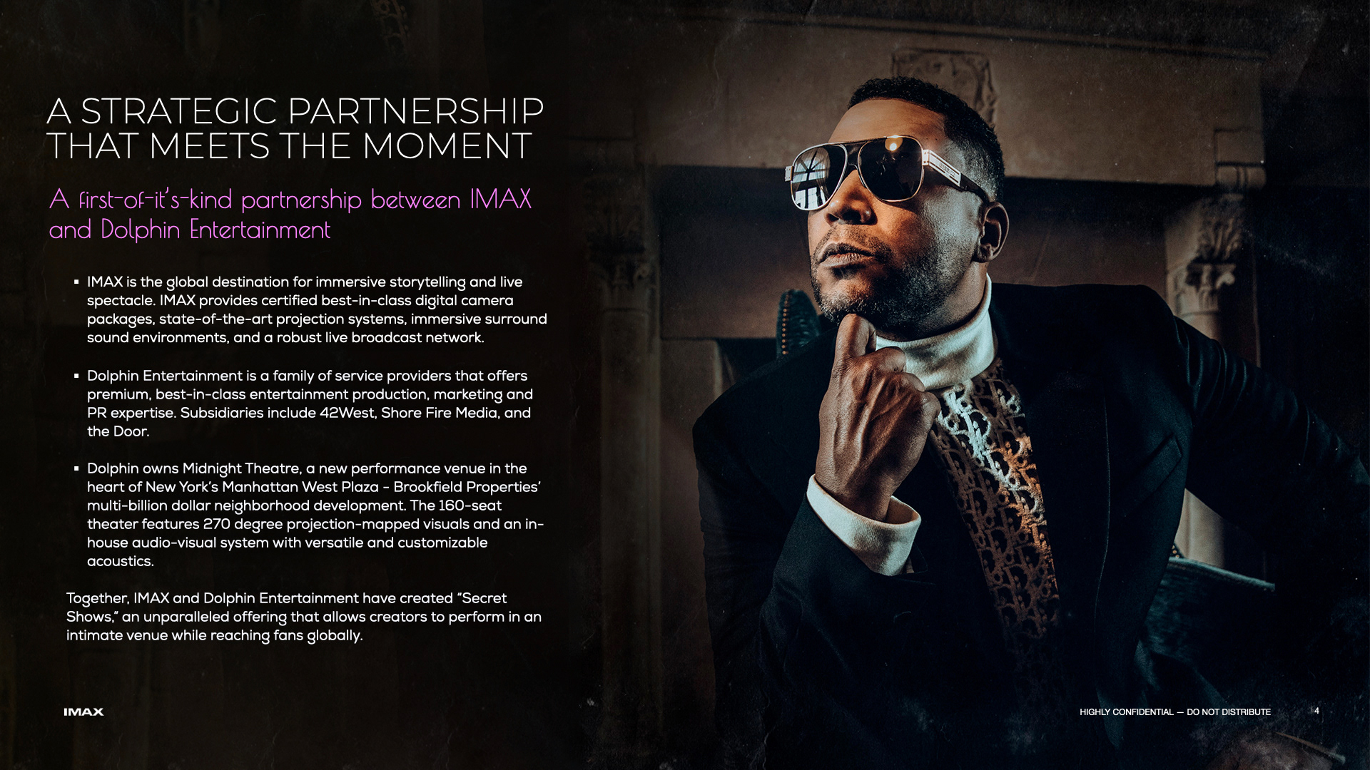
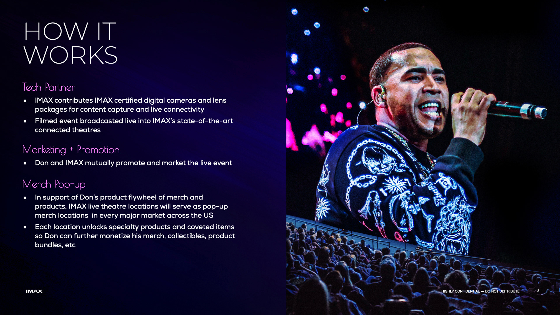
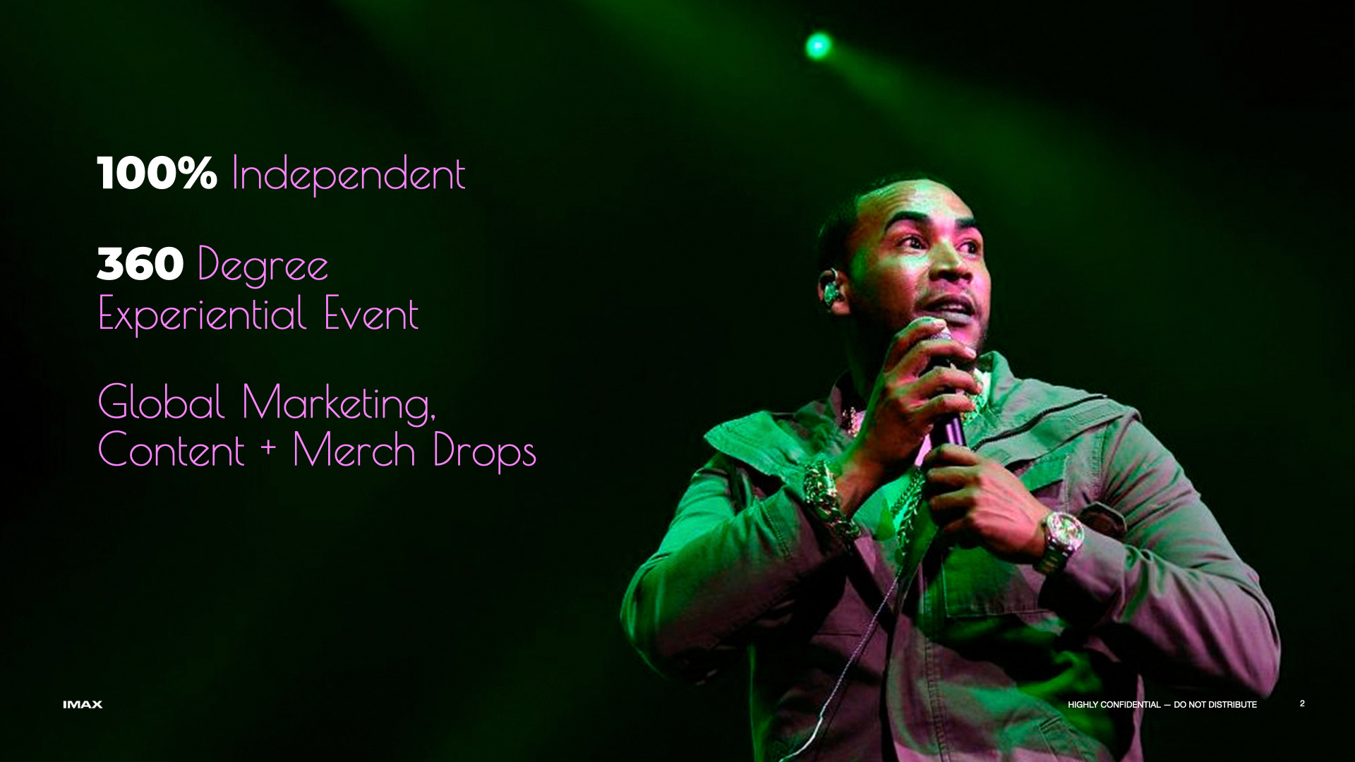
BRIEF
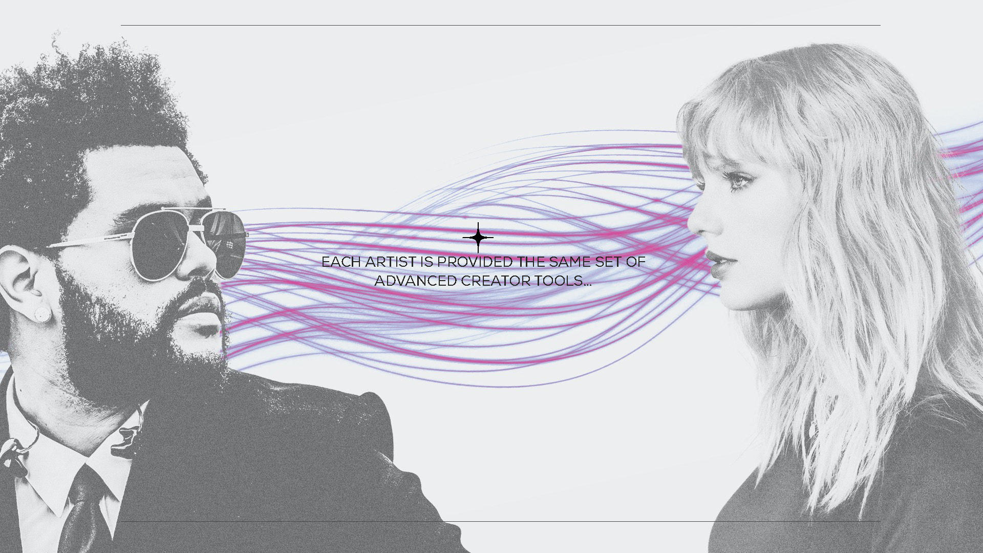
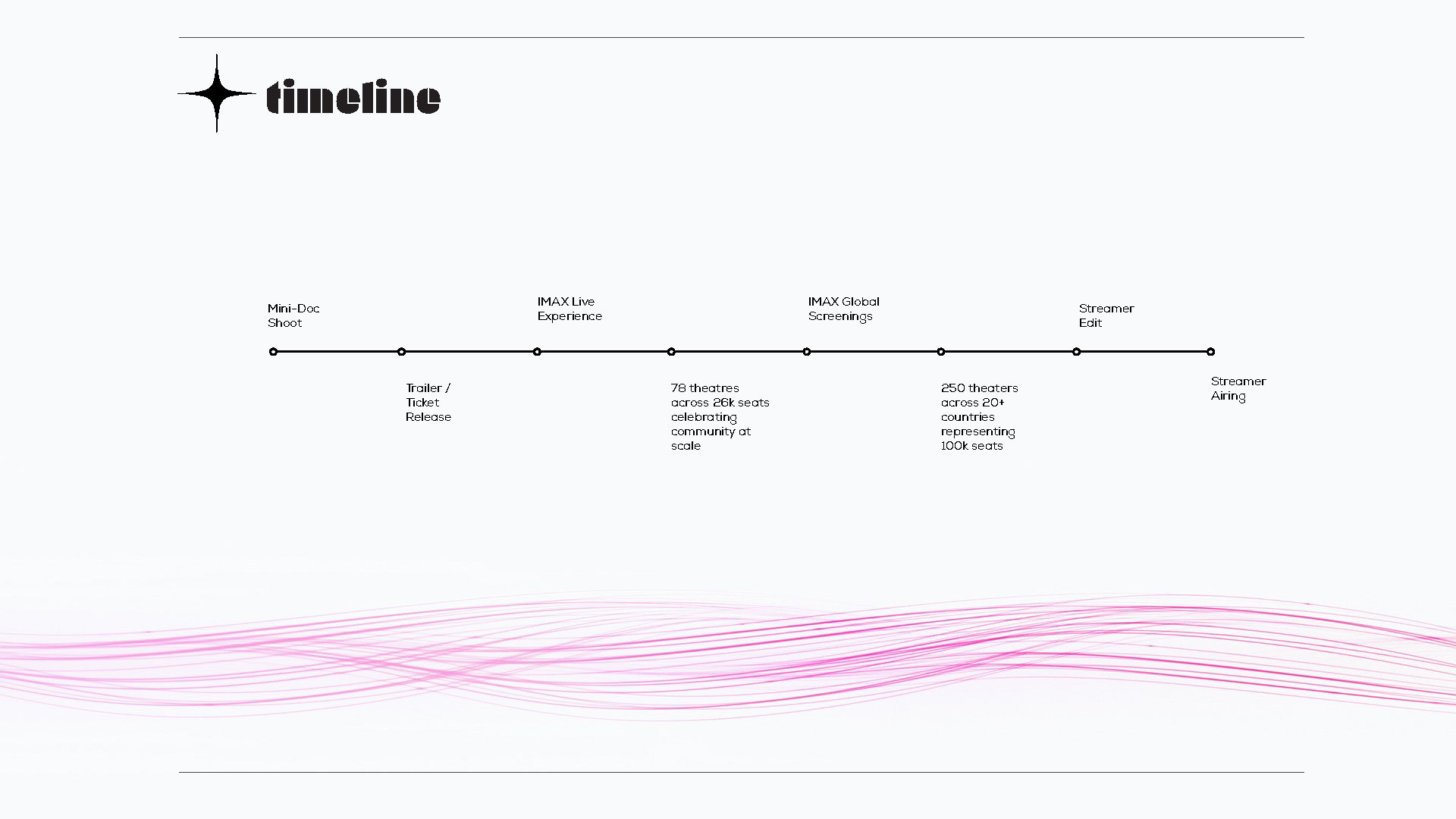
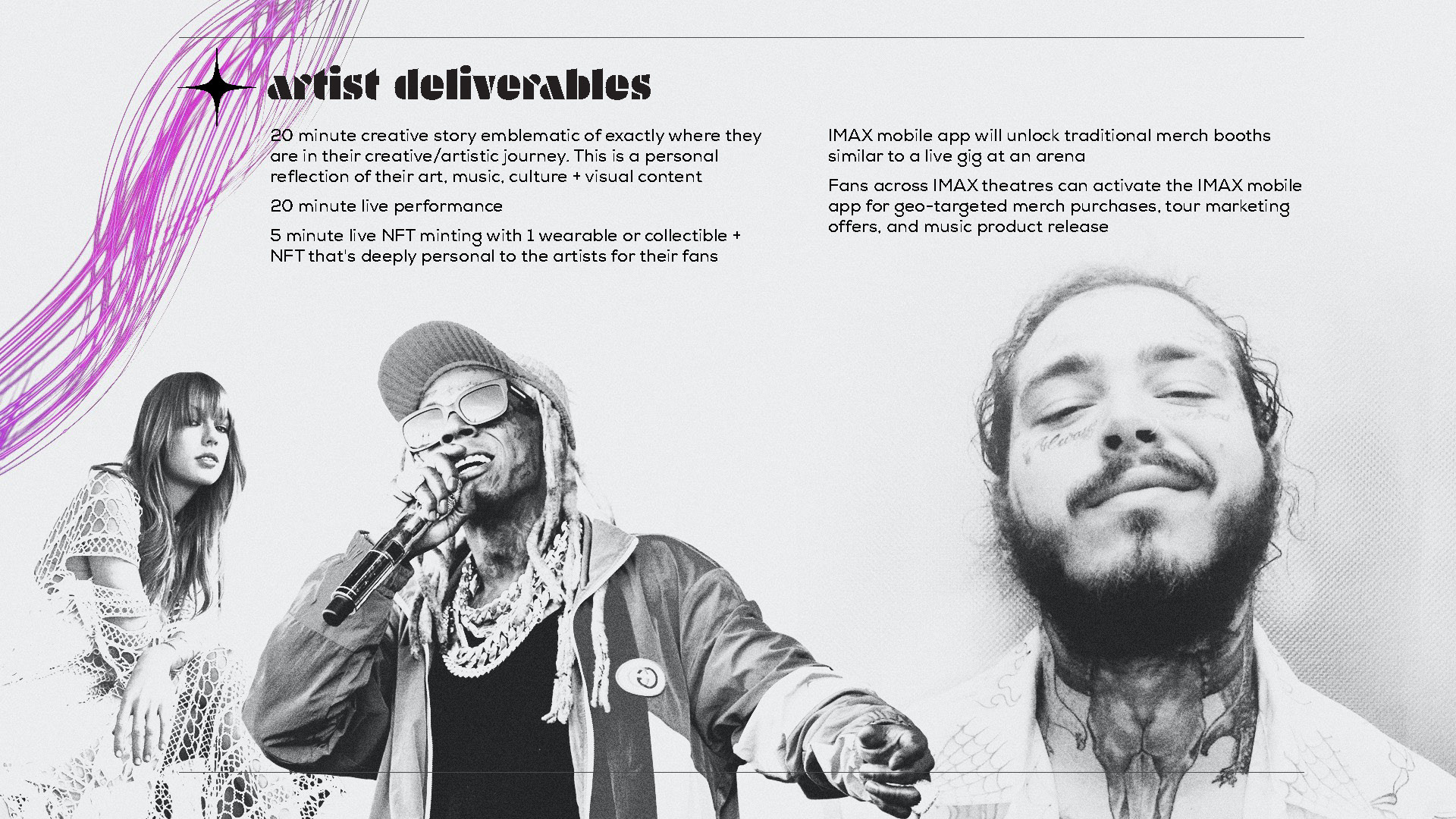
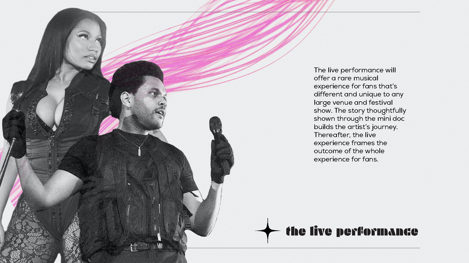
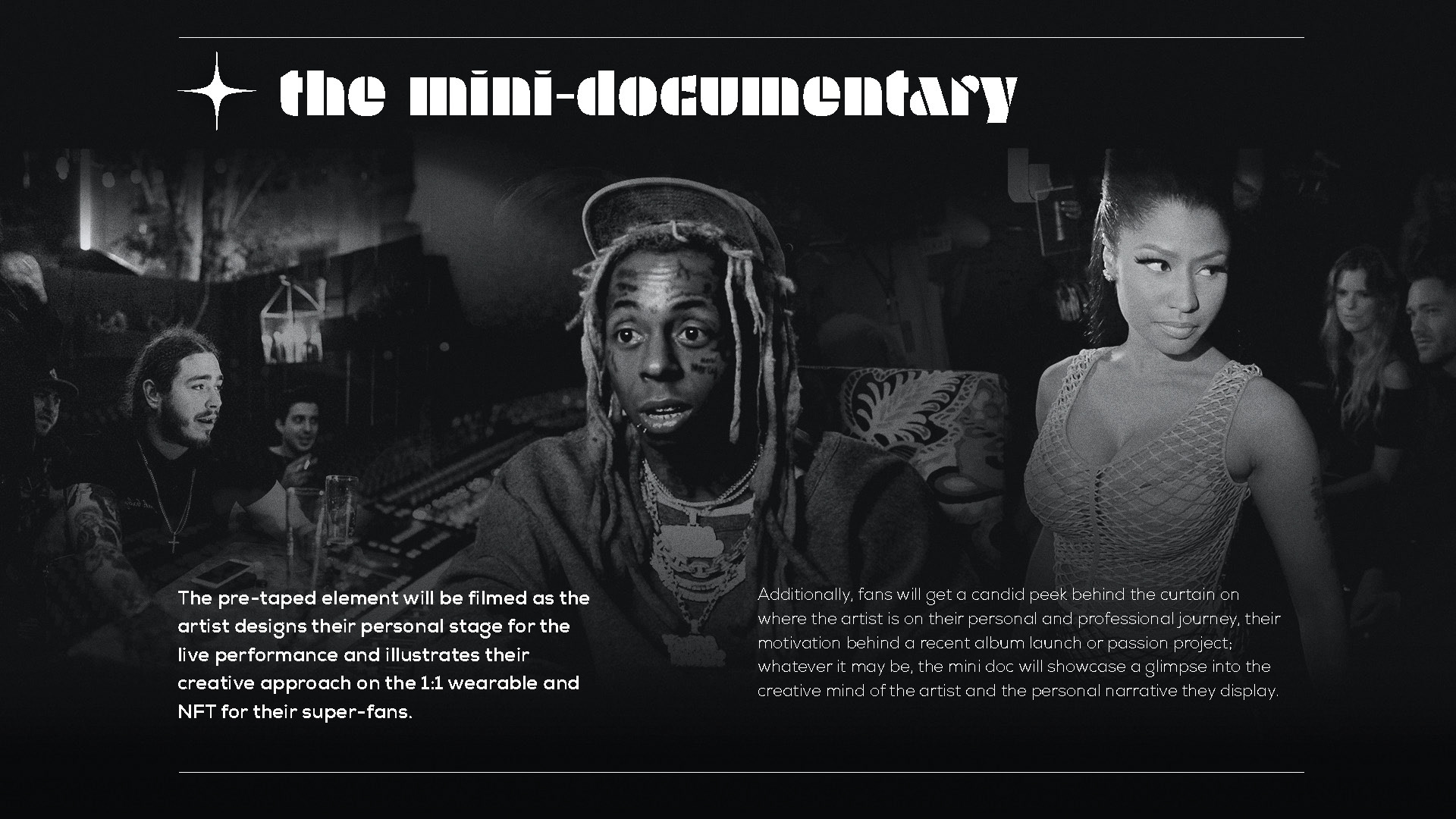
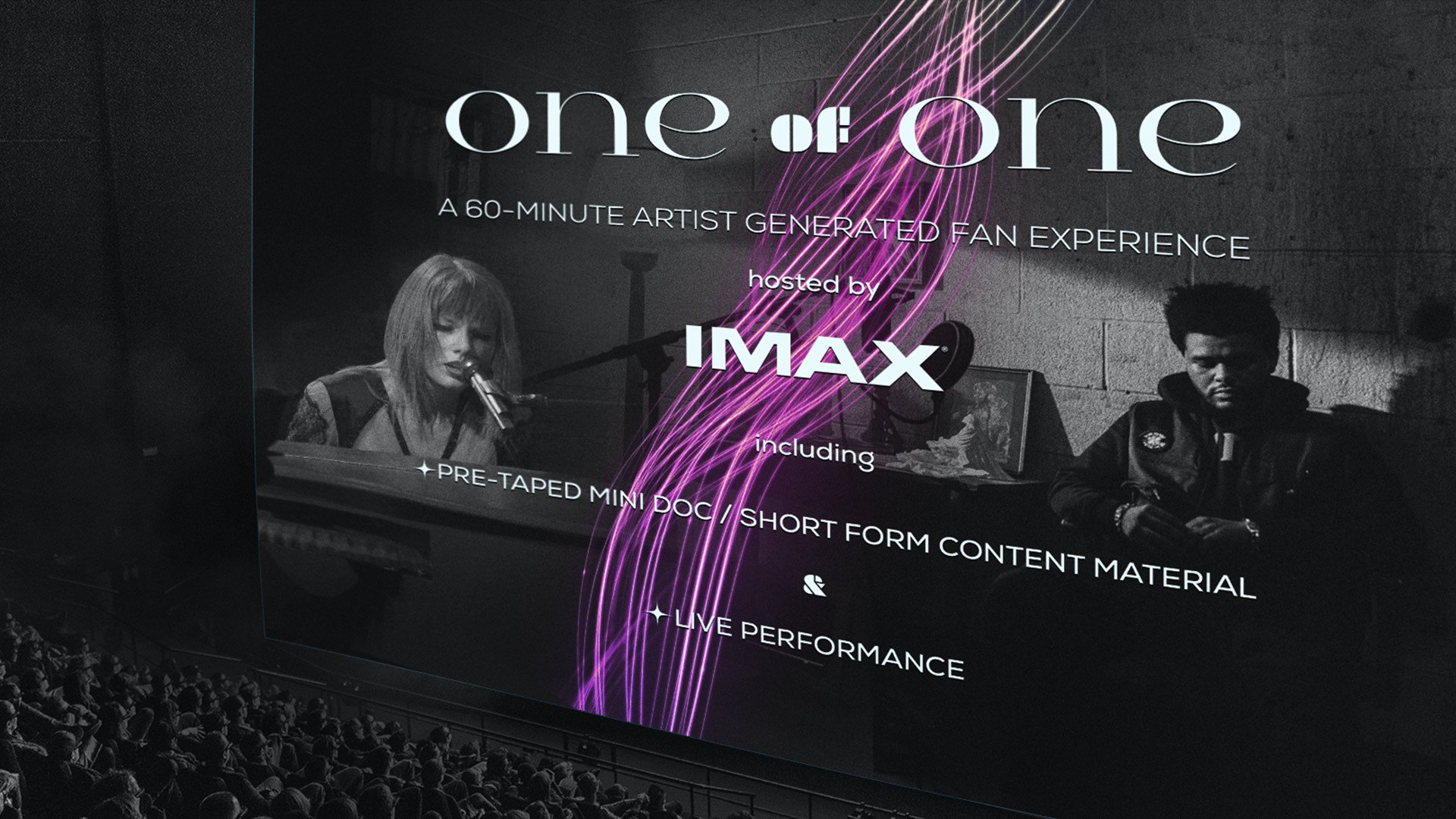
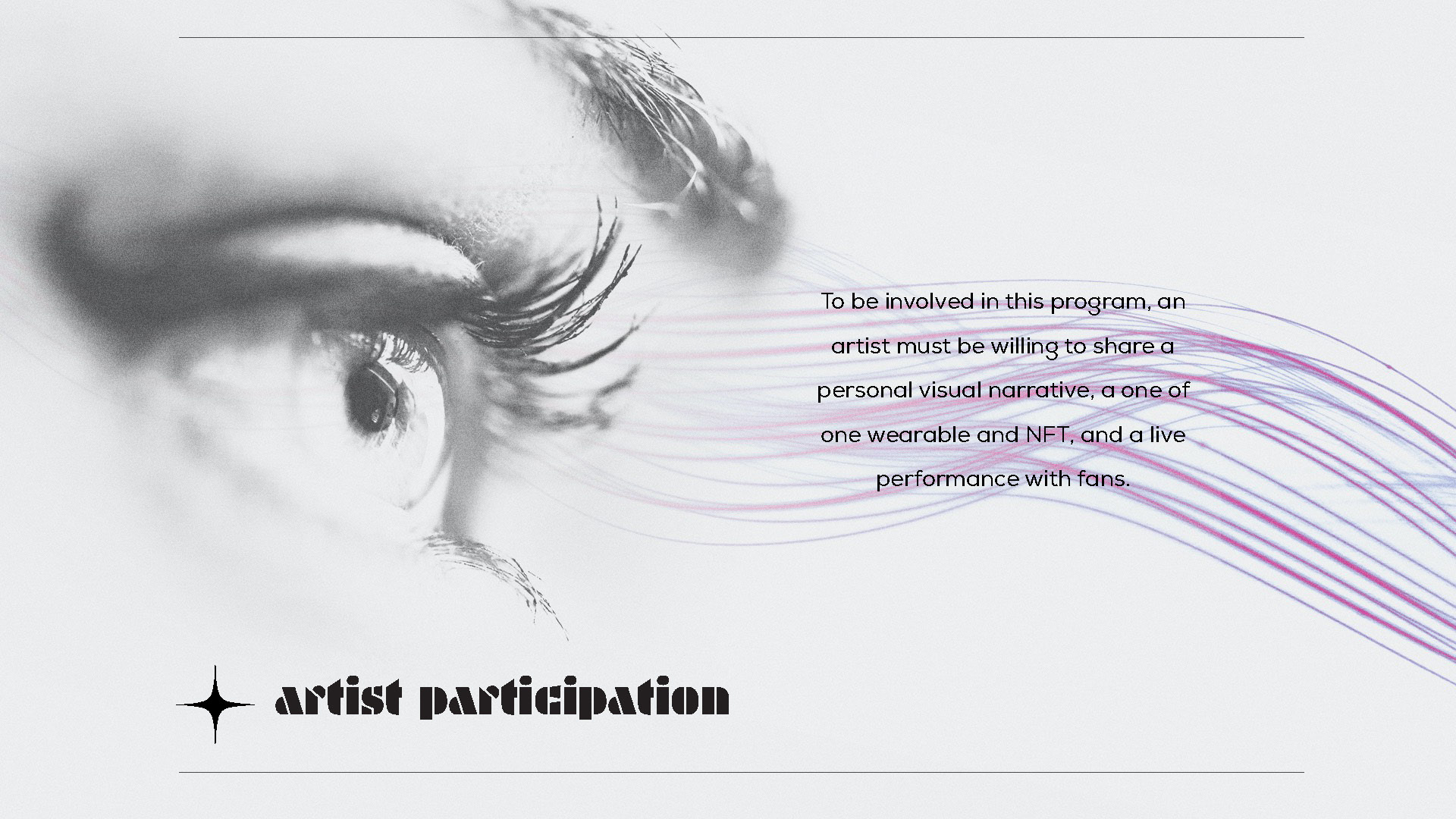
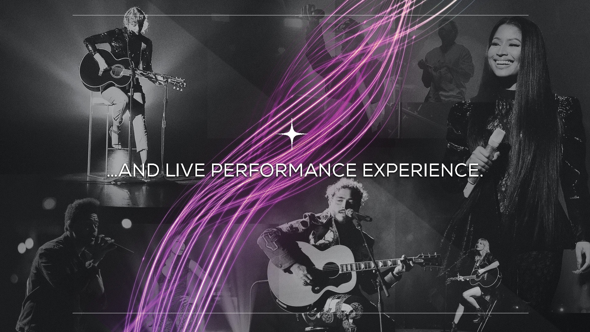
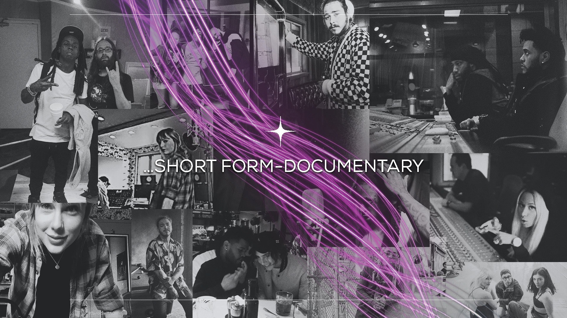
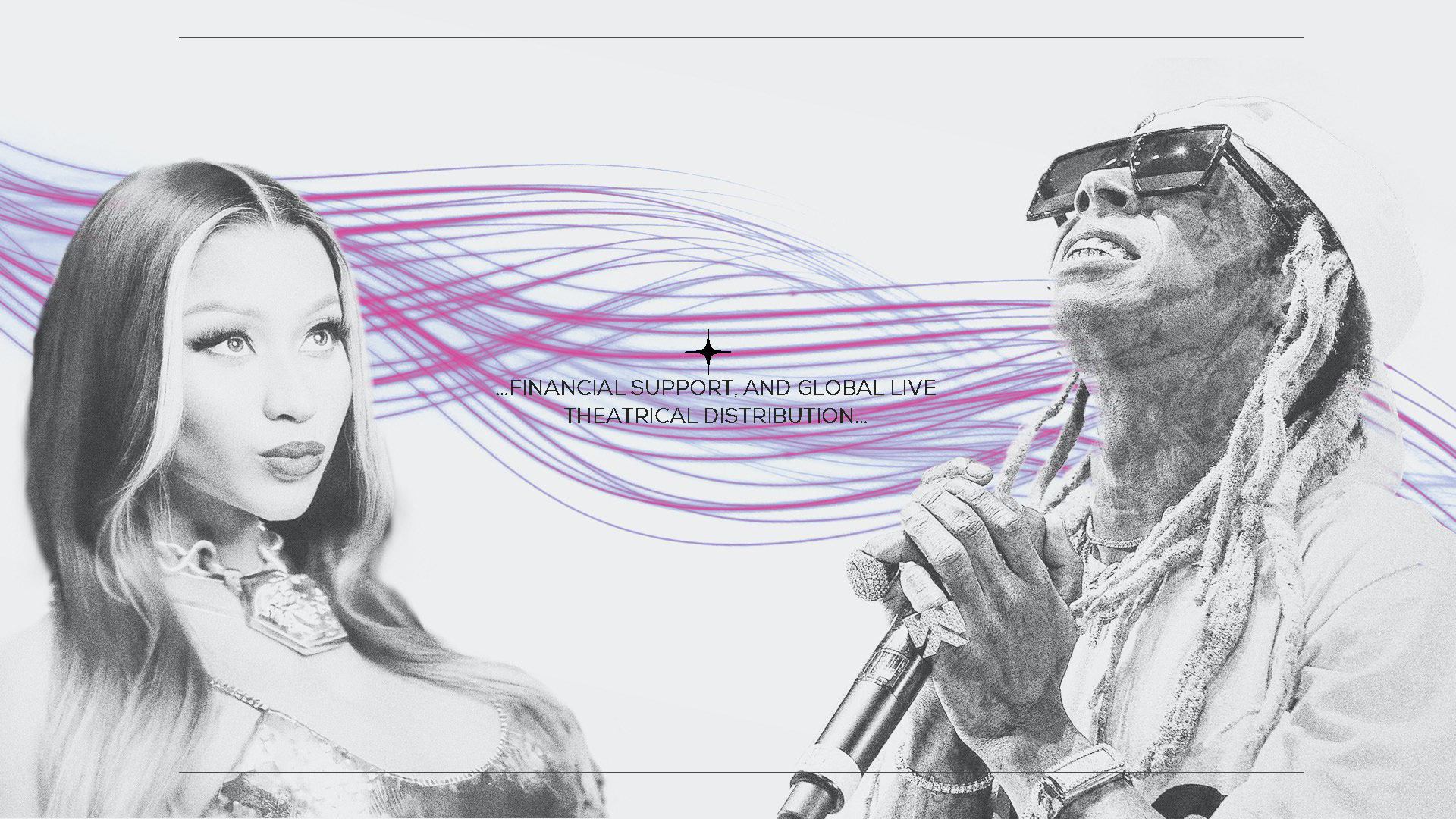
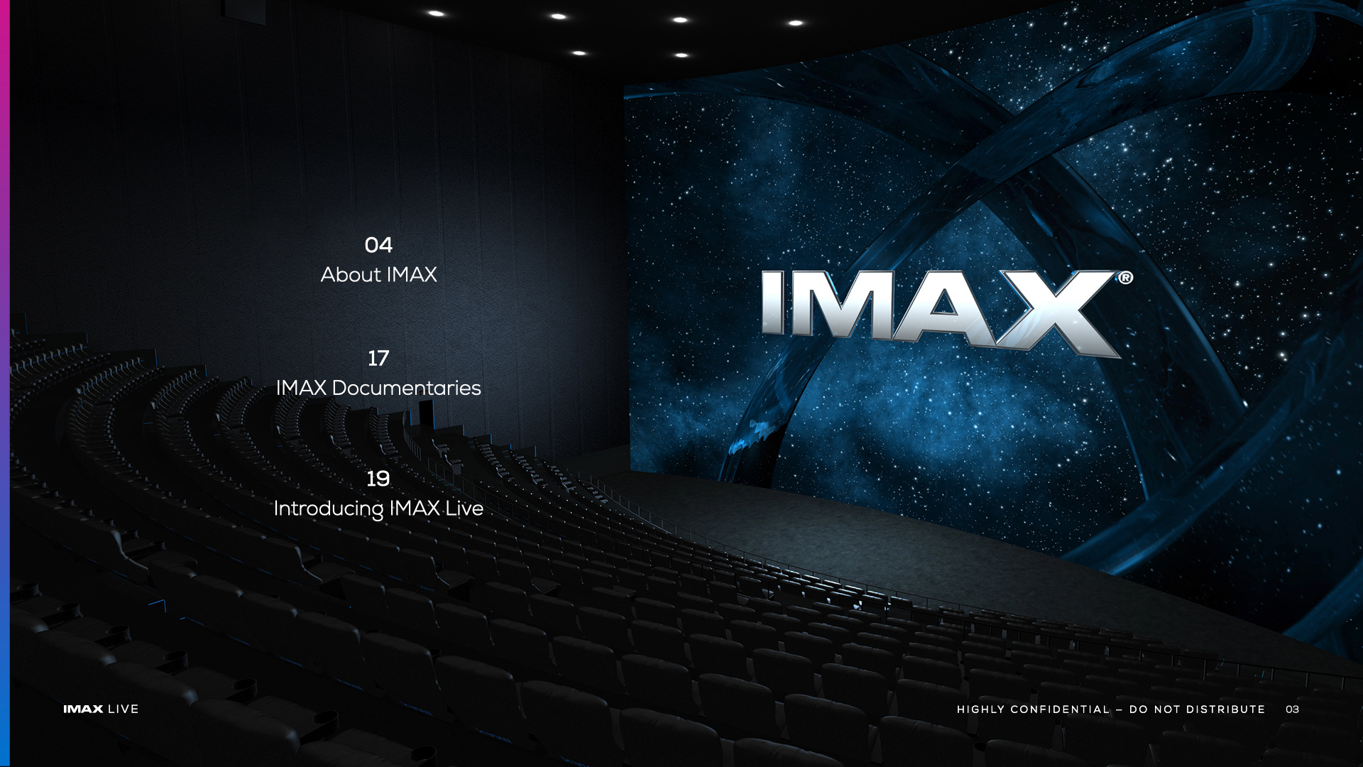
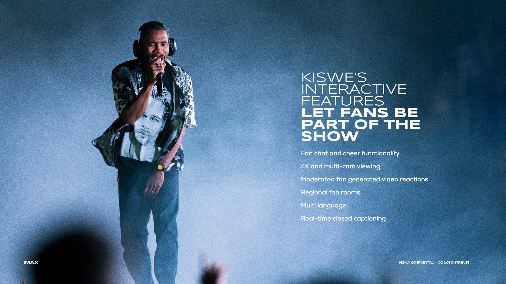
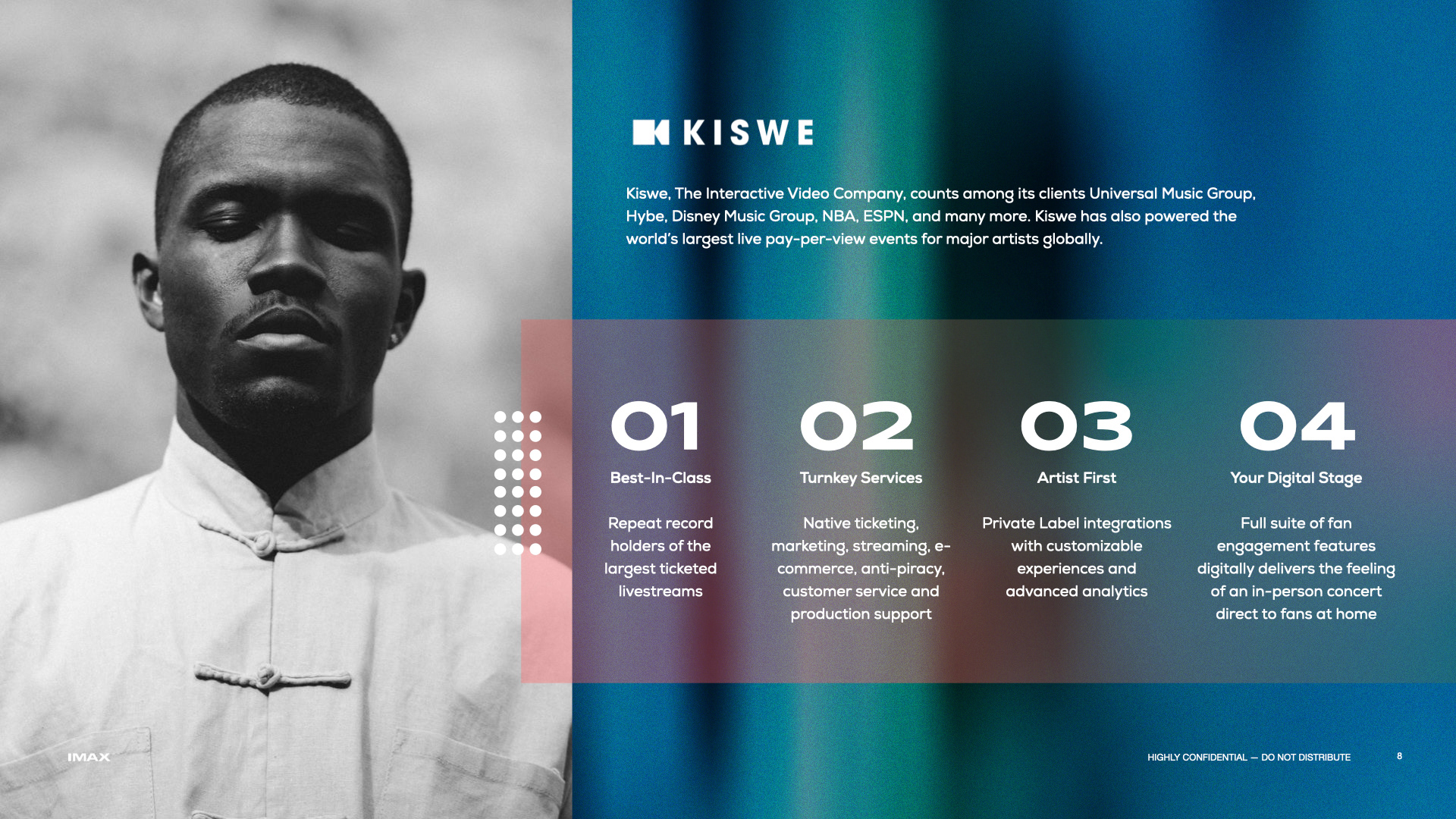
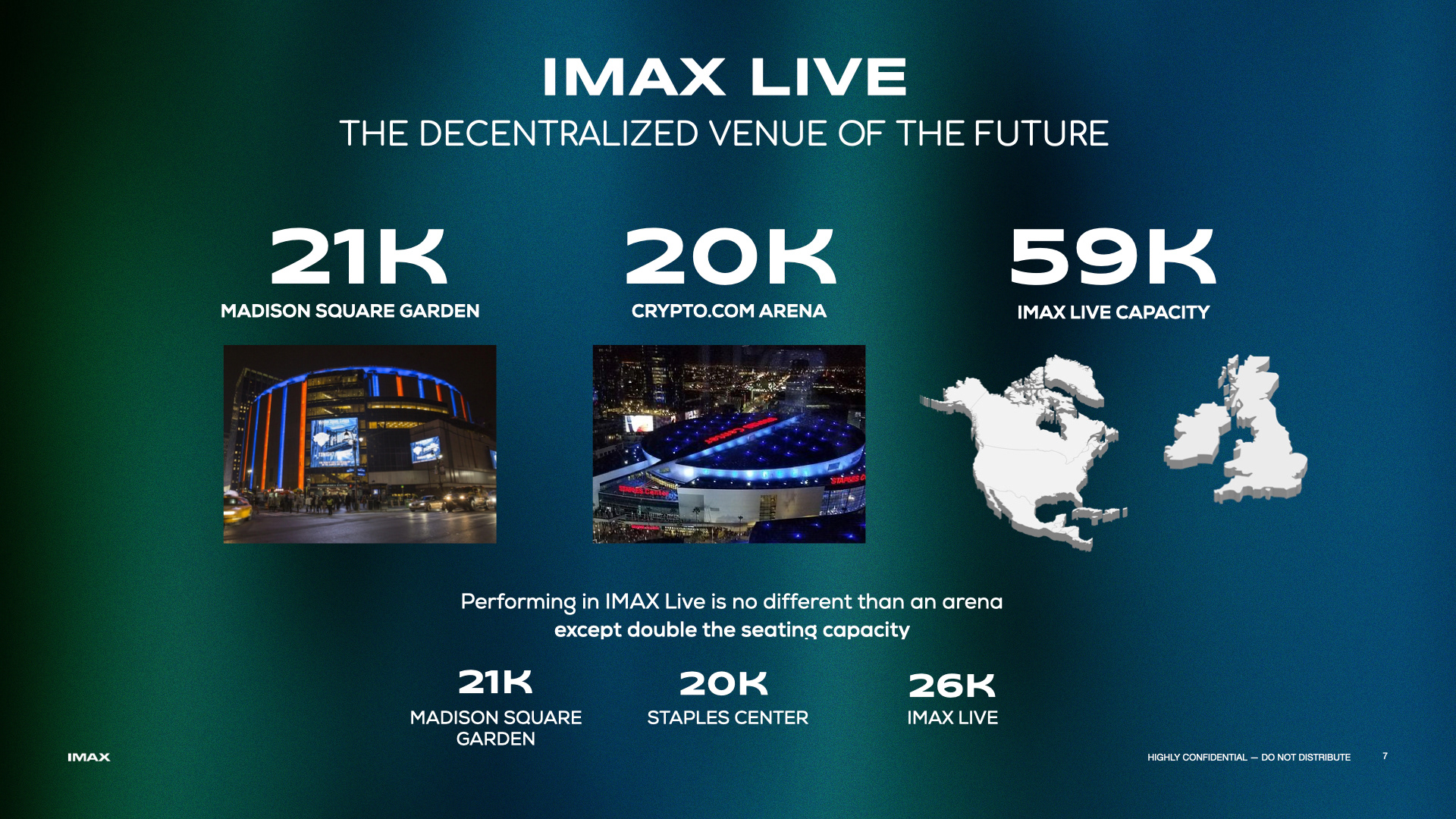
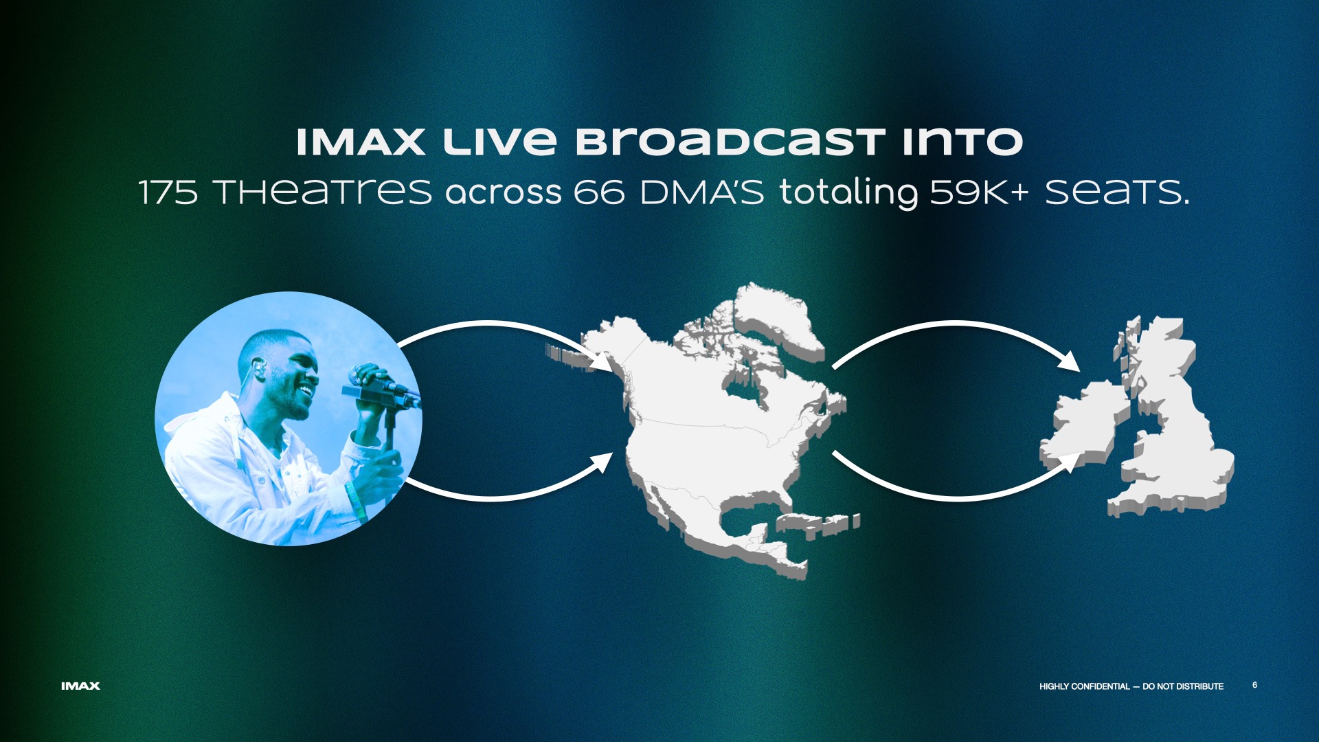
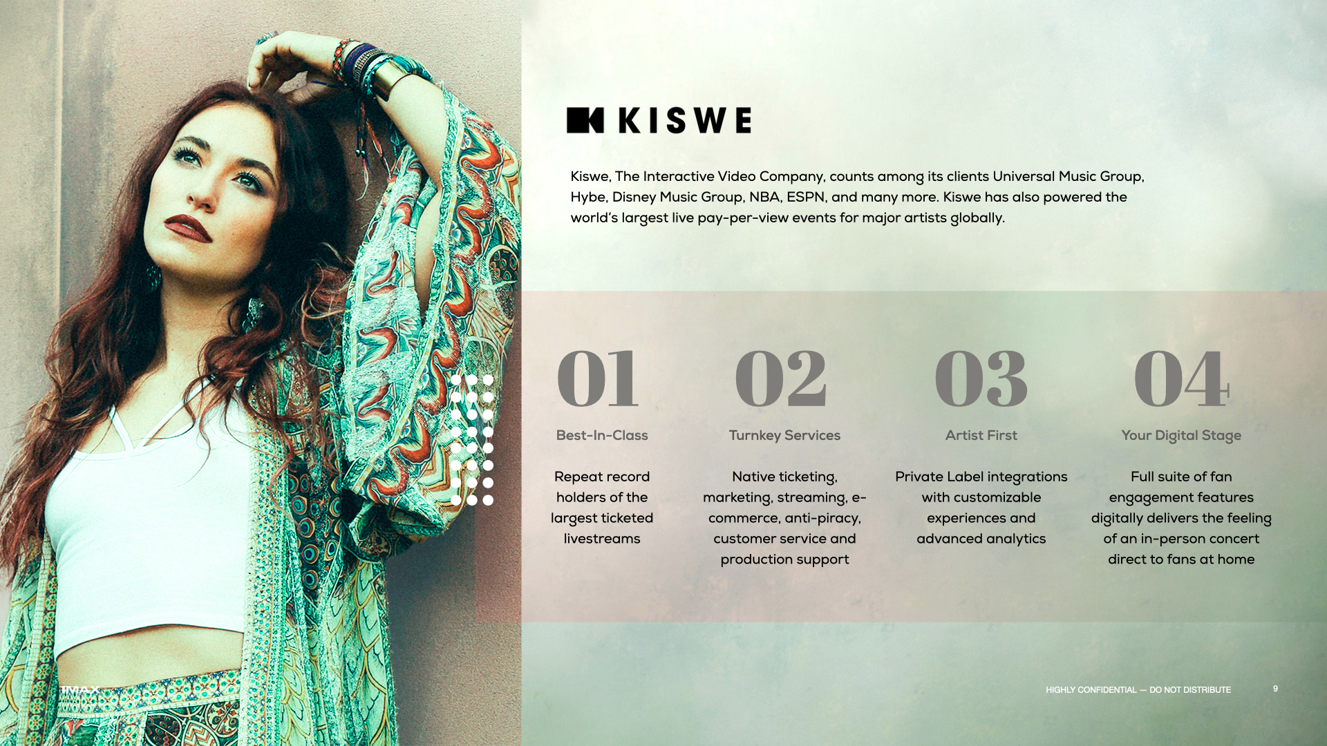
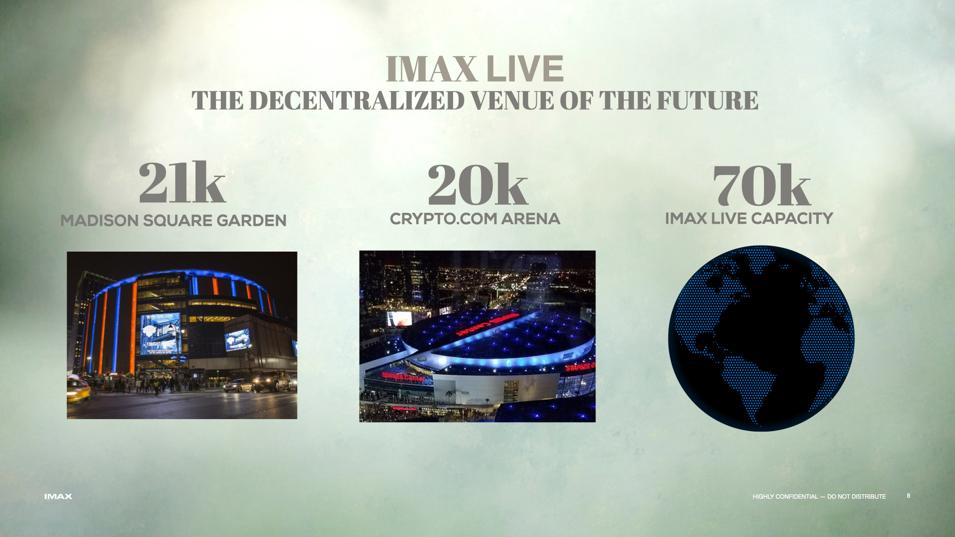
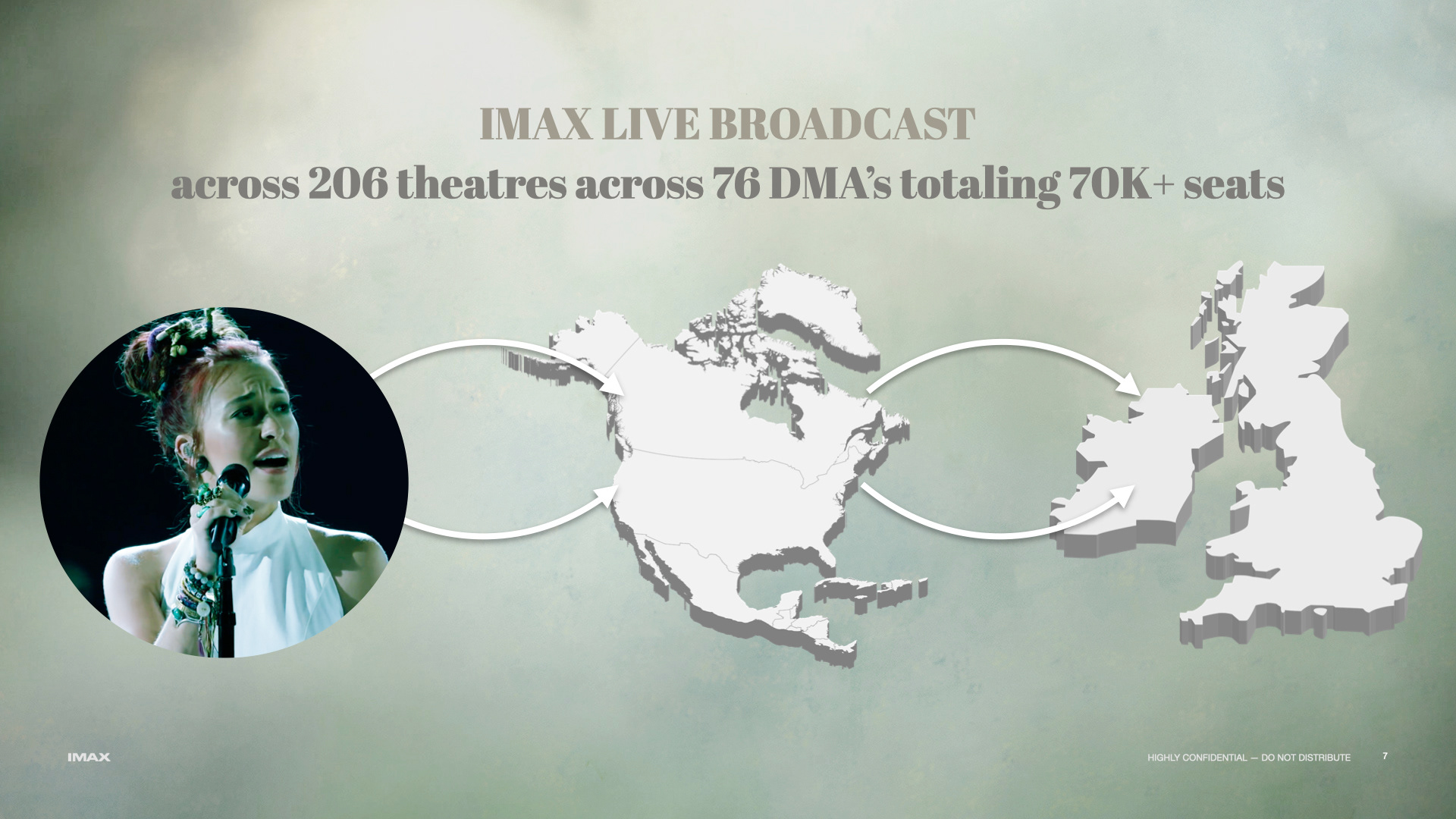
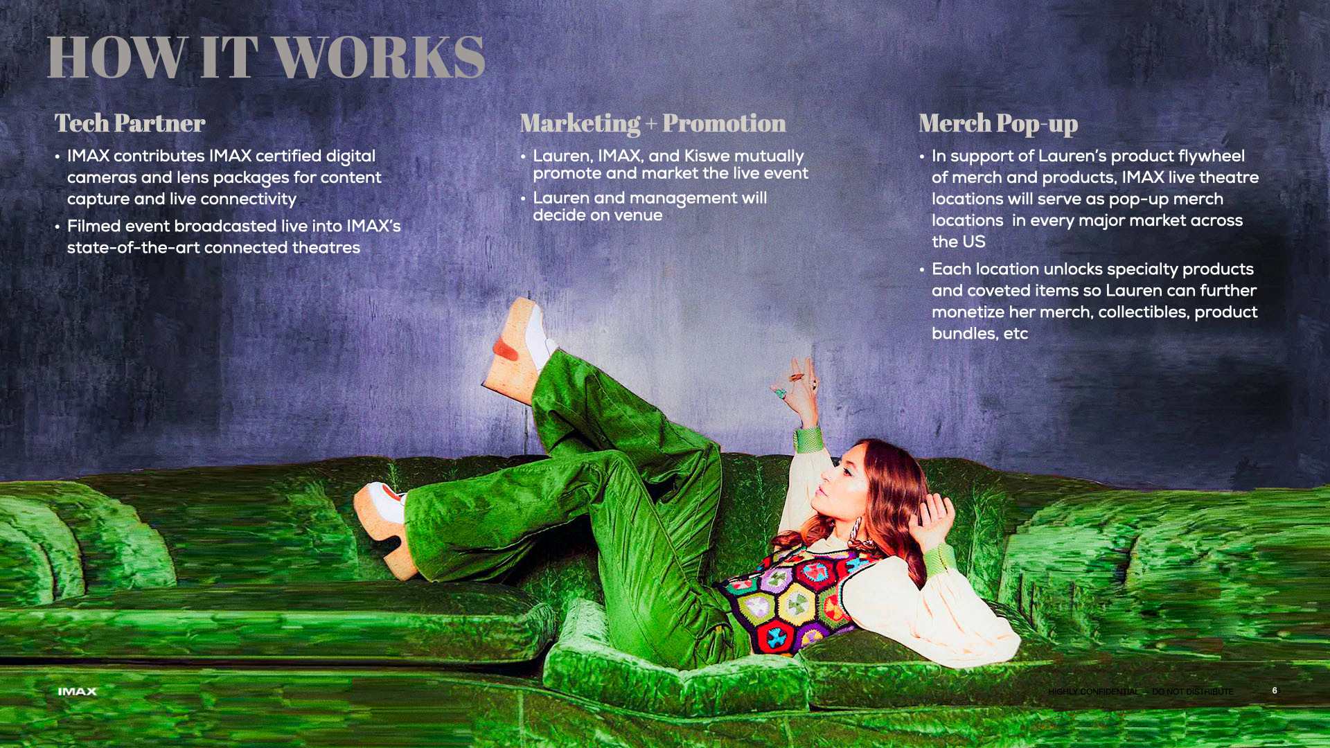
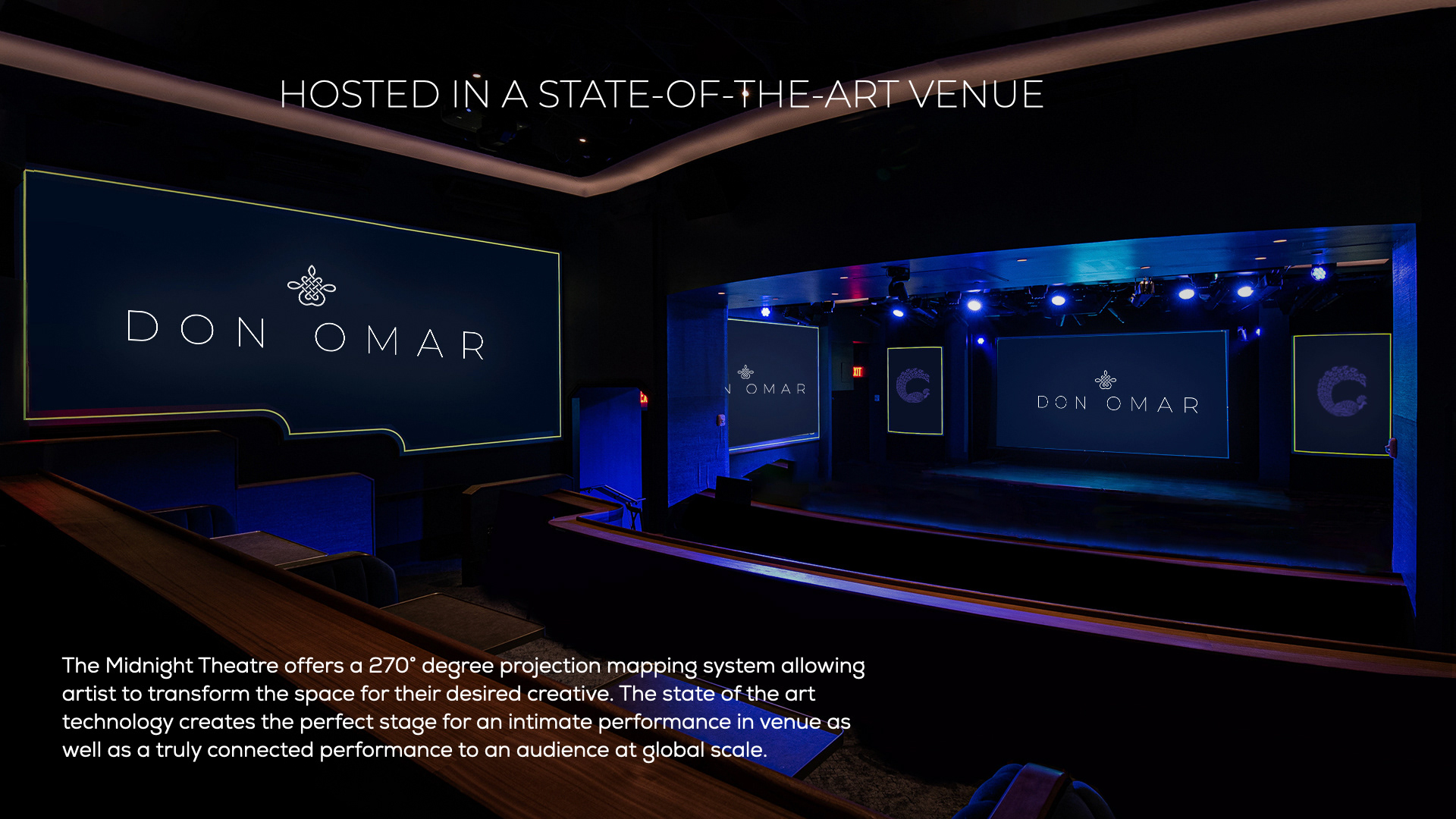
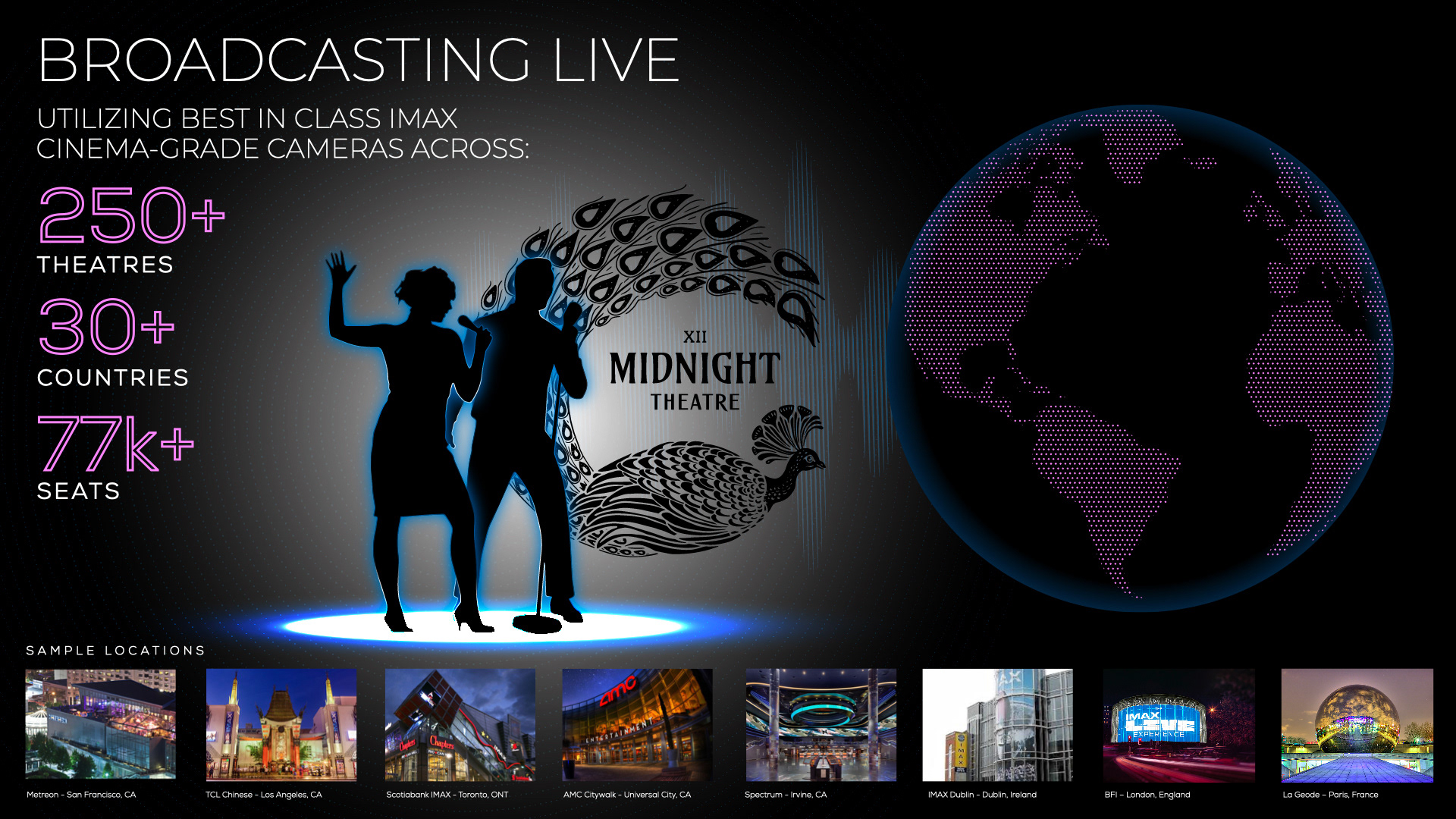
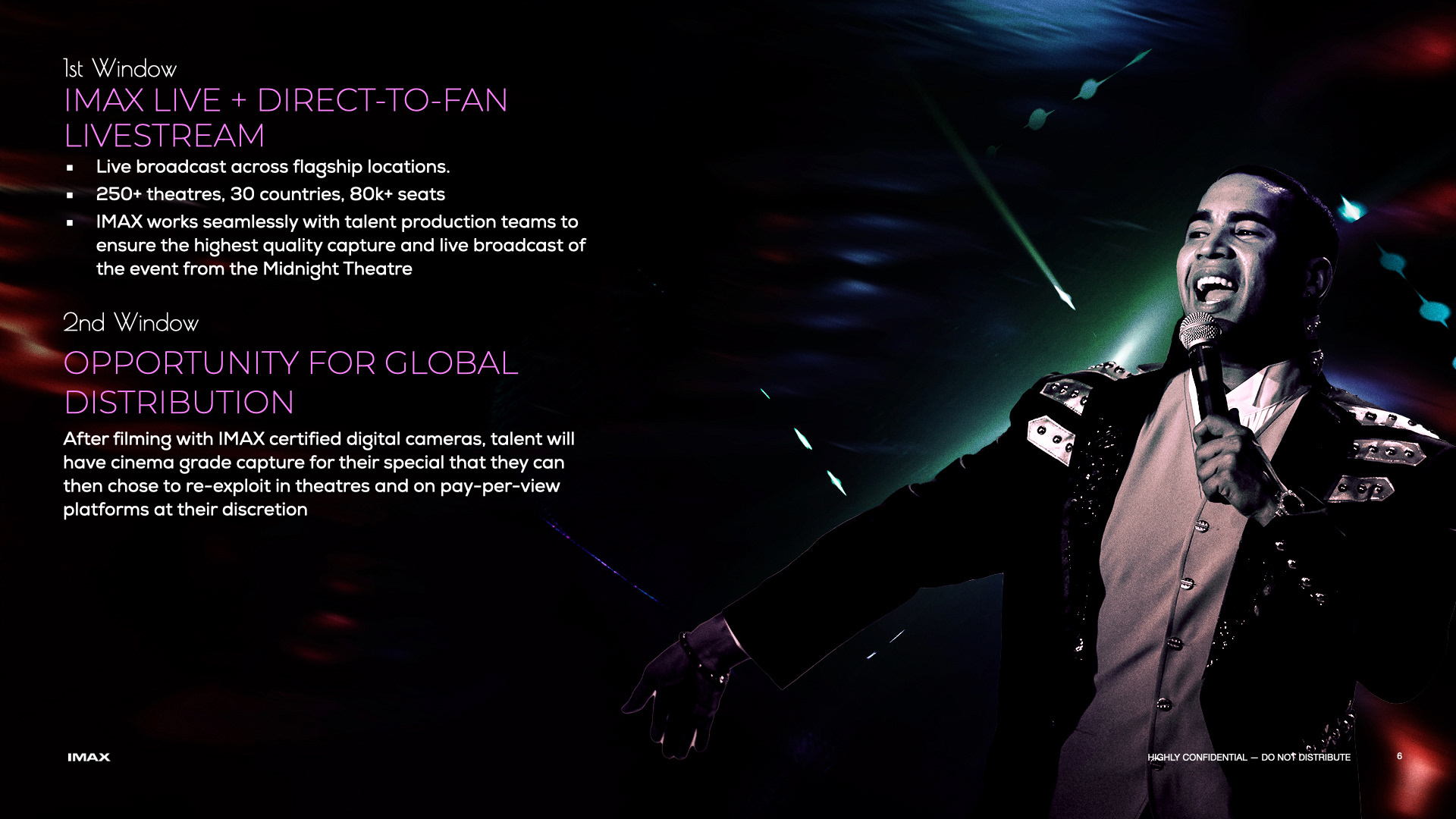
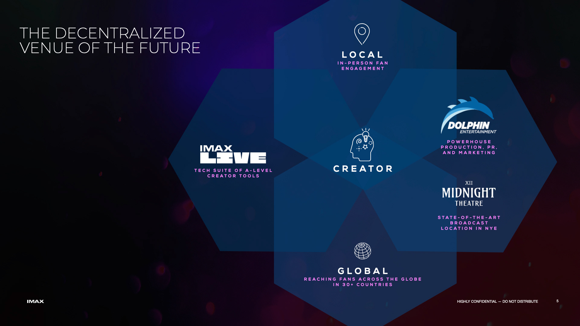
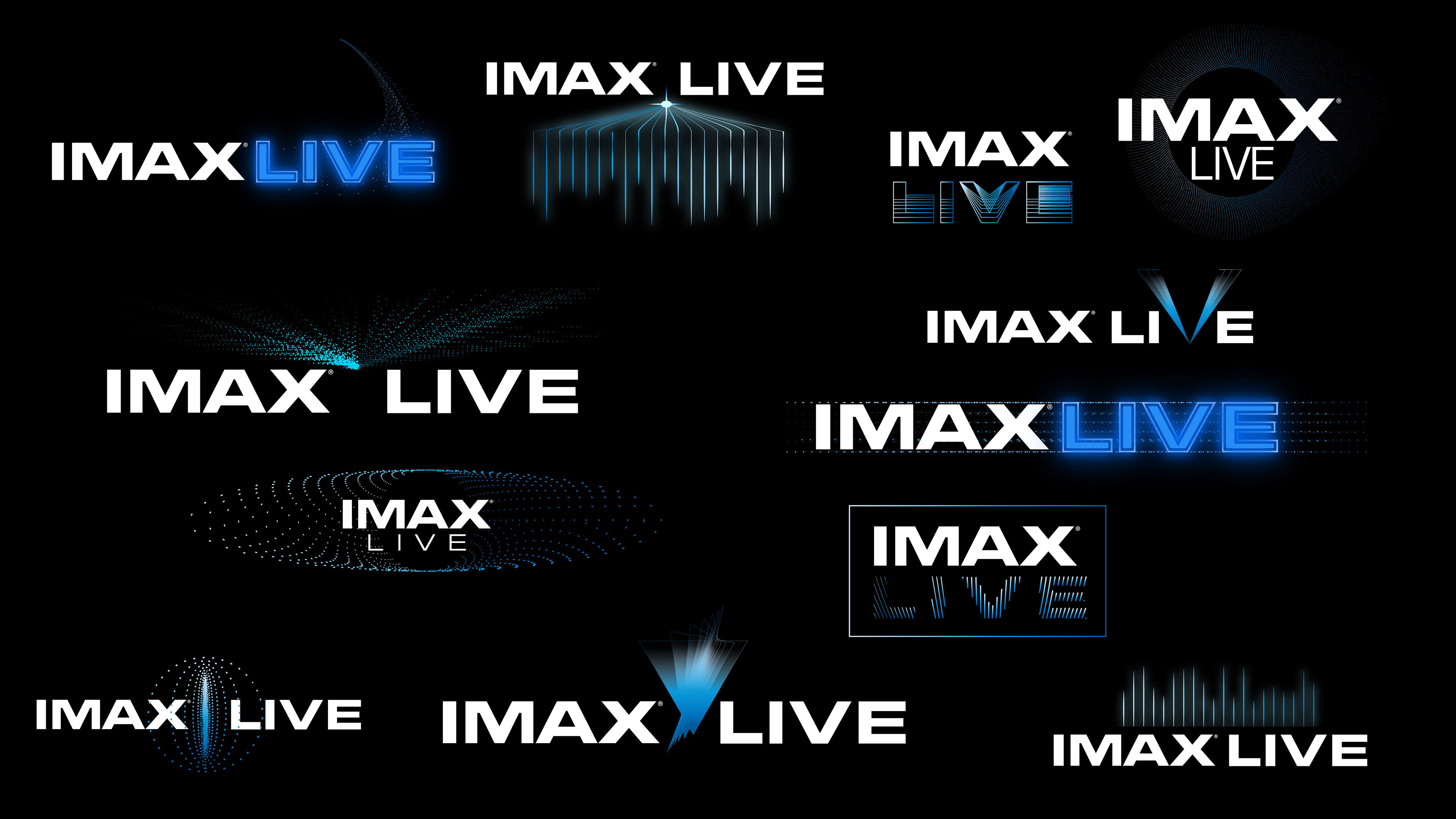
Develop a distinct visual identity for “IMAX Live,” a new sub-brand initiative designed to broadcast live music events on large-format screens. The objective was to create a logo system that retained the premium authority of the master brand while injecting the raw energy and immediacy of a live concert experience.
STRATEGY
Develop a distinct visual identity for “IMAX Live,” a new sub-brand initiative designed to broadcast live music events on large-format screens. The objective was to create a logo system that retained the premium authority of the master brand while injecting the raw energy and immediacy of a live concert experience.


CLIENT

BRAND AWARENESS CAMPAIGN
ONE SHEET POSTER CONCEPTS
ONE SHEET POSTER CONCEPTS
CONCEPT, LAYOUT, TYPOGRAPHY, PHOTO ILLUSTRATION,
COMPOSITING AND FINISHING
COMPOSITING AND FINISHING
PROJECT DATE | 2020
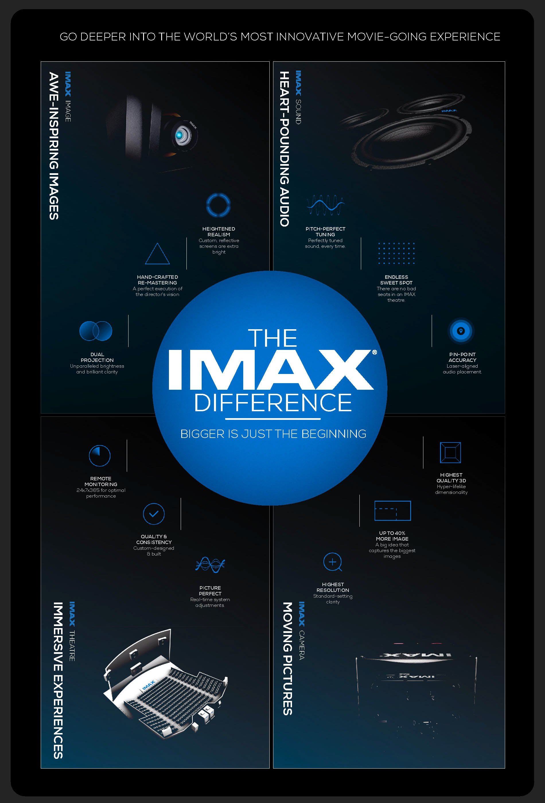
BRIEF
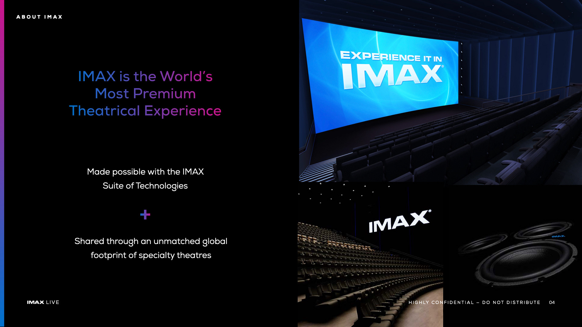
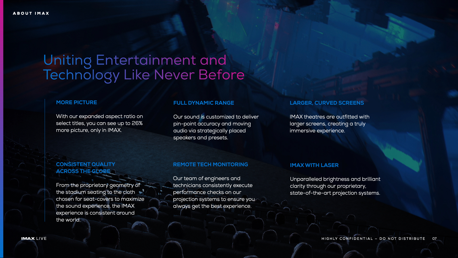
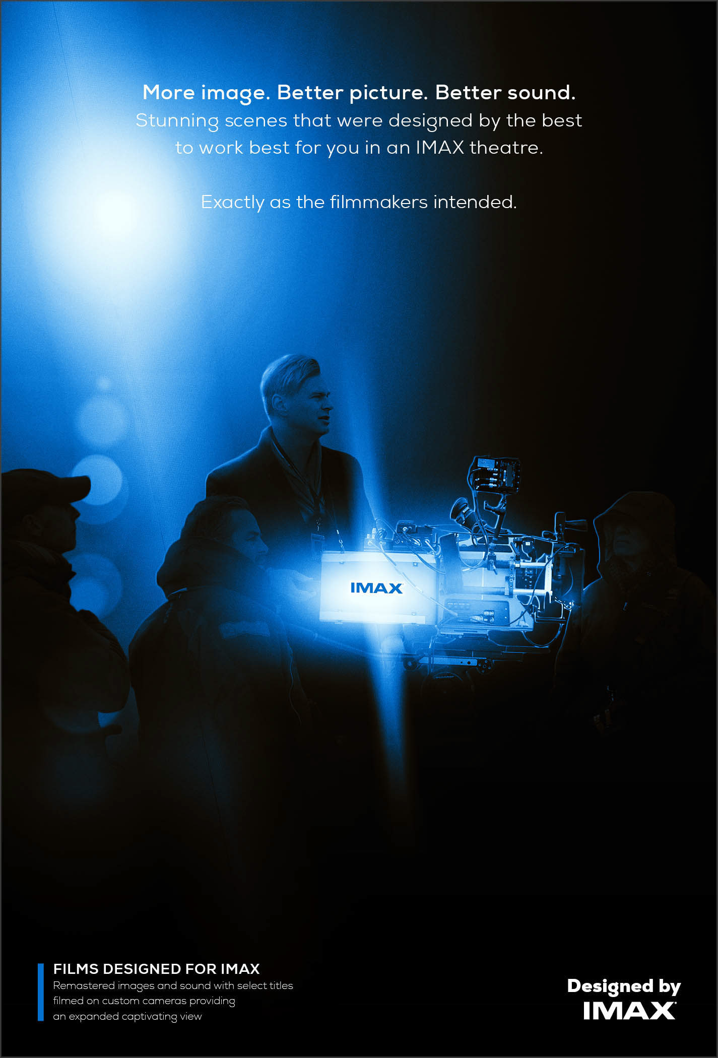
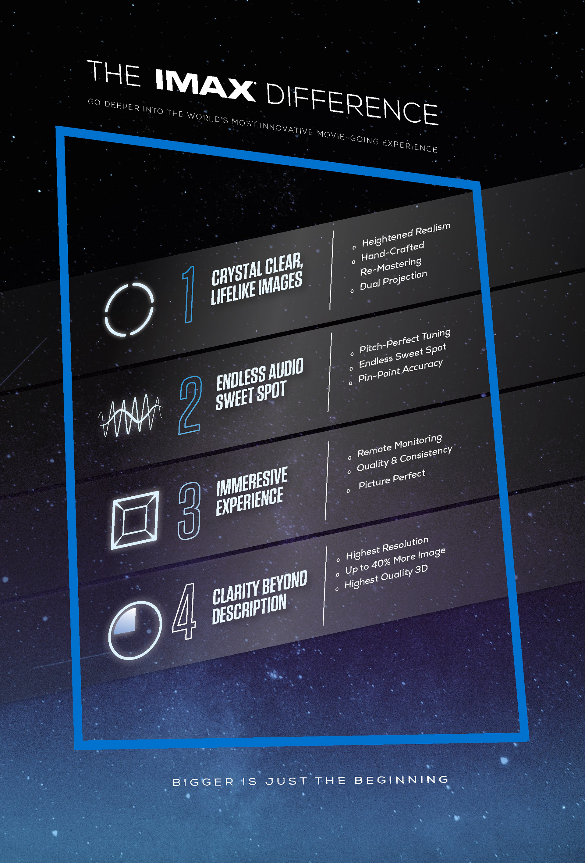
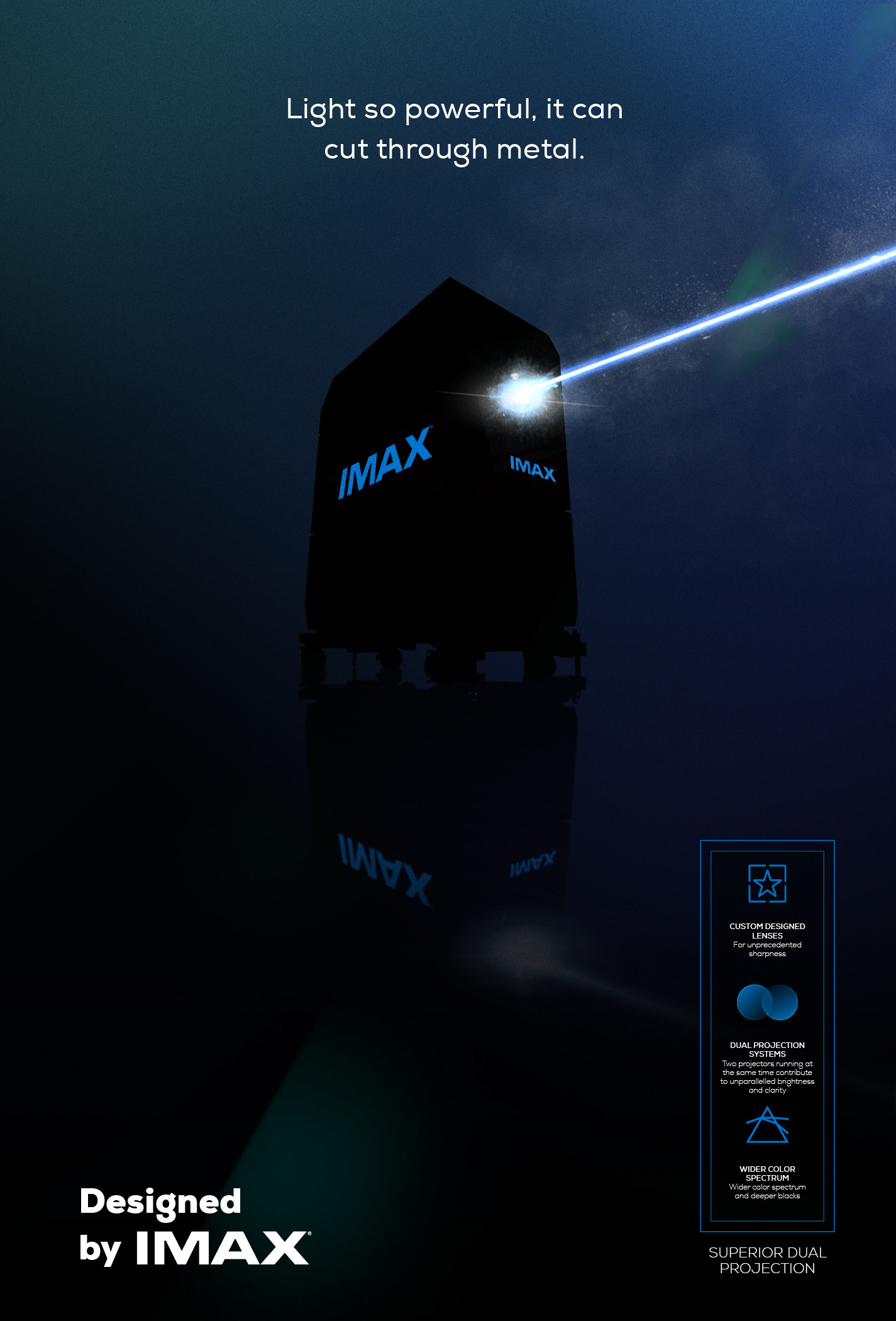
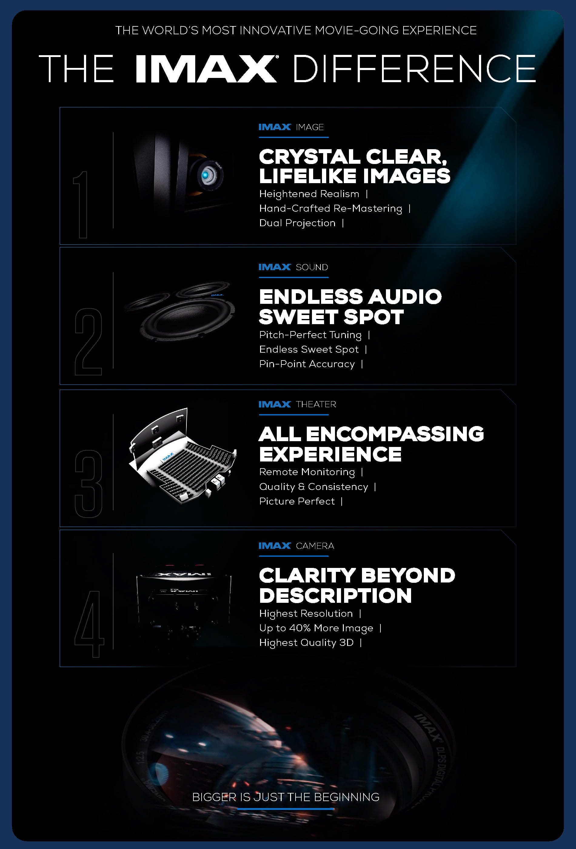
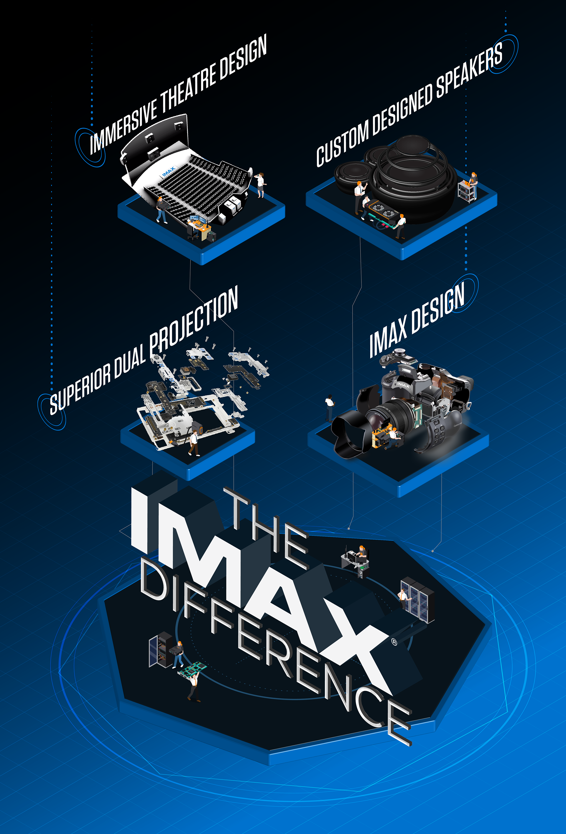
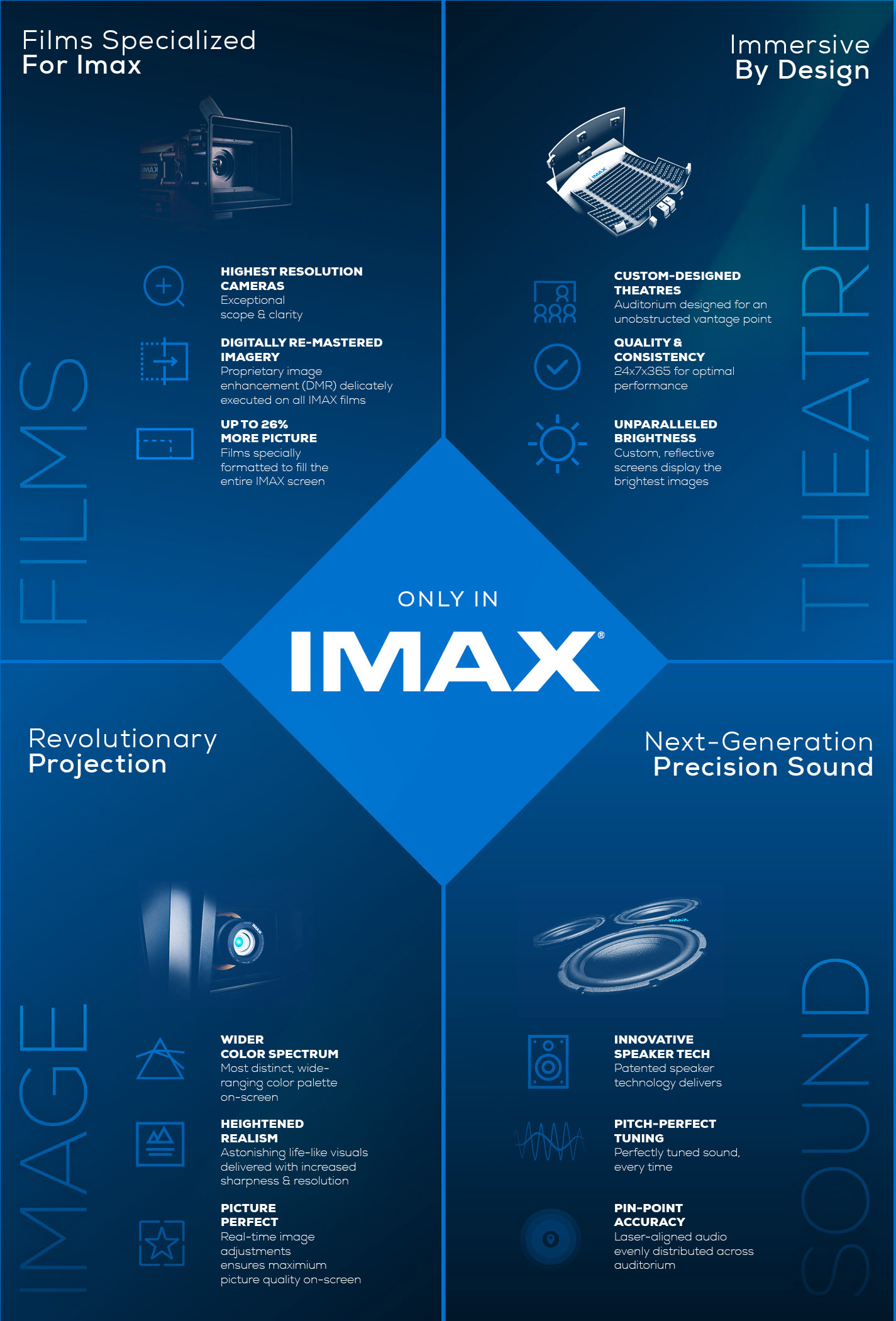
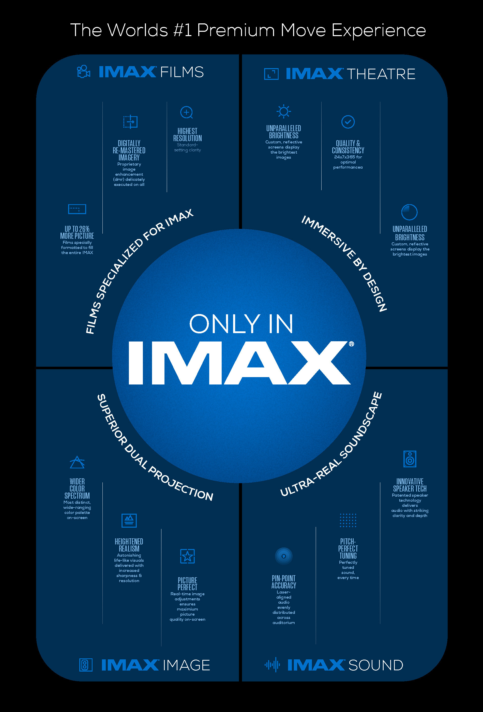
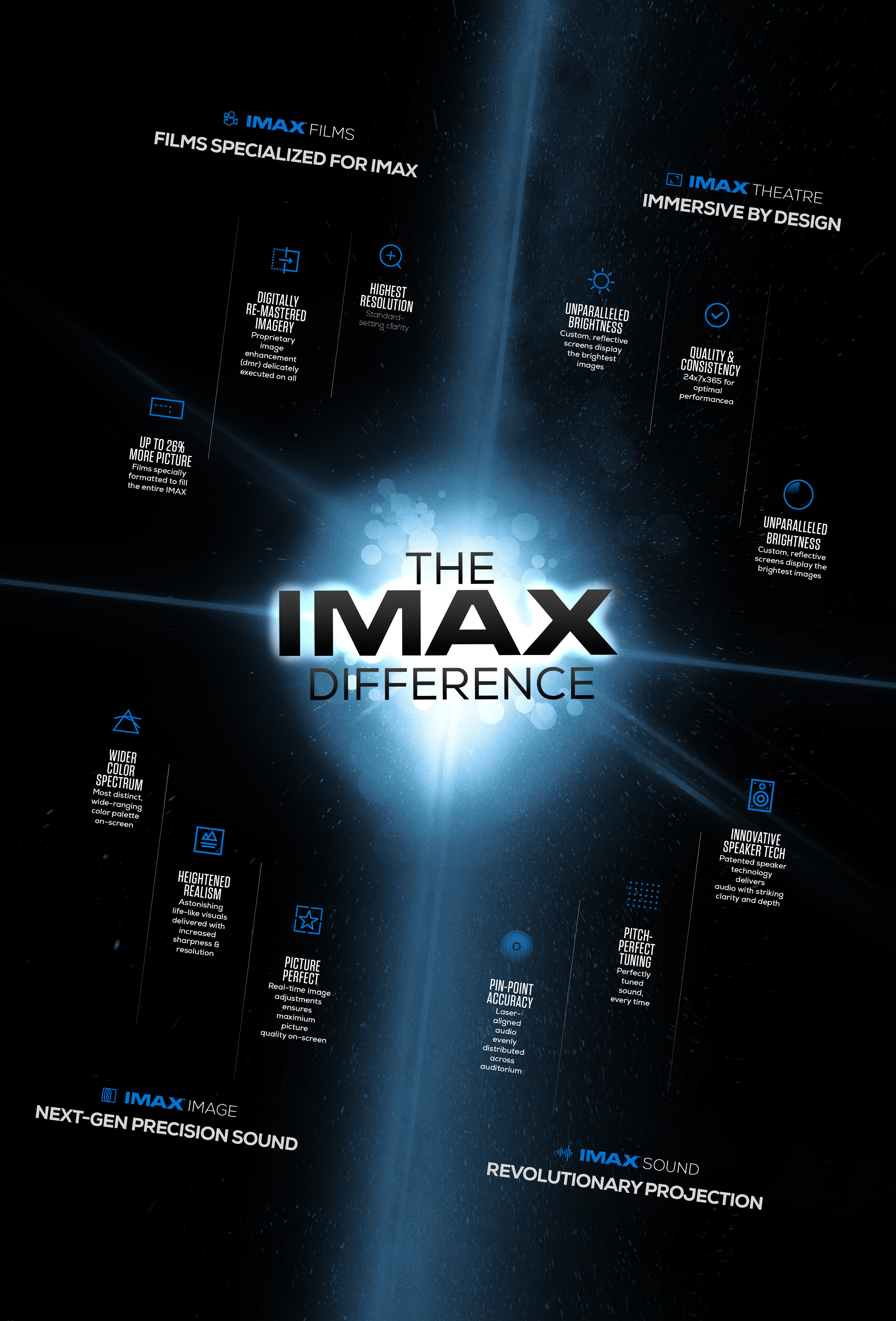
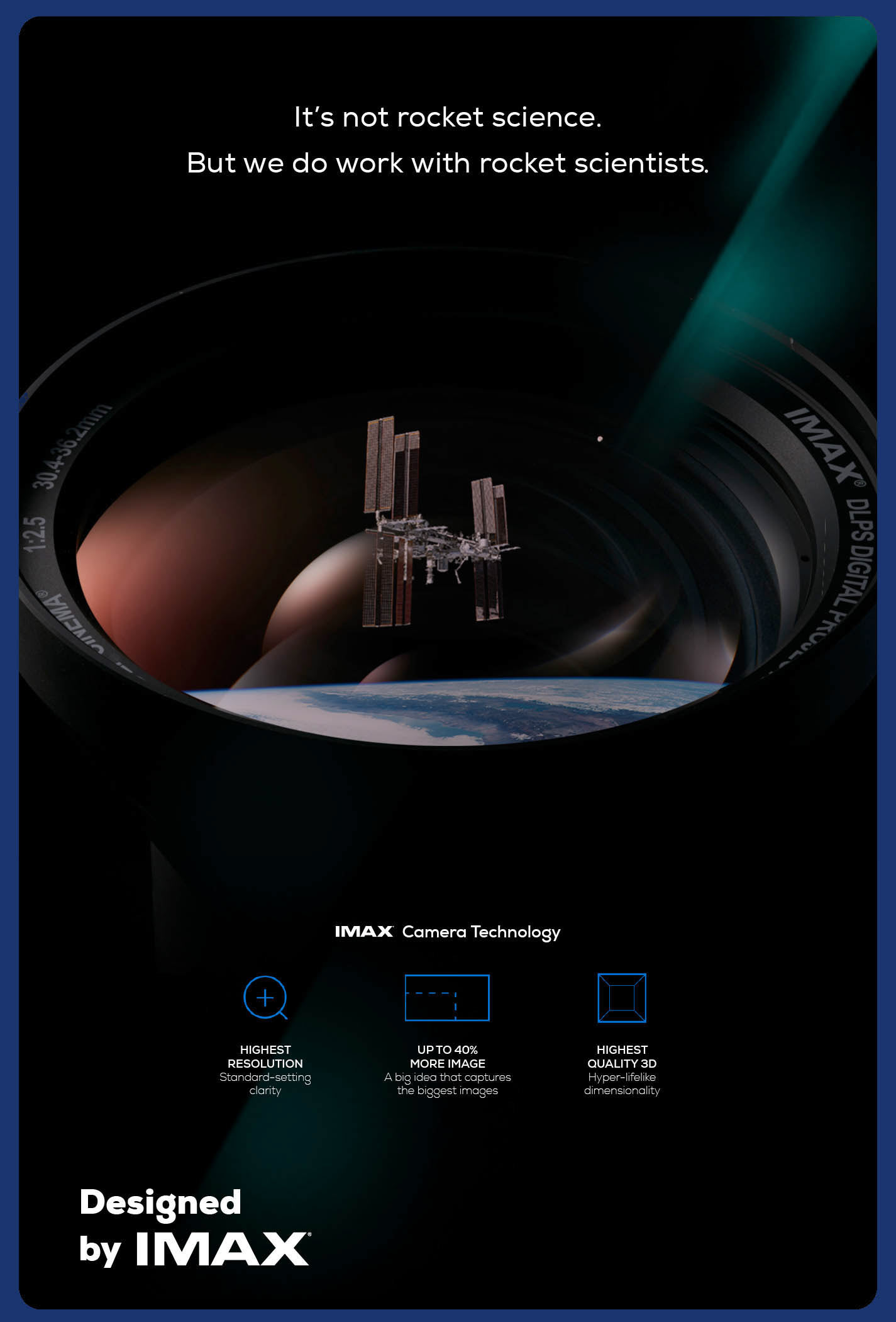
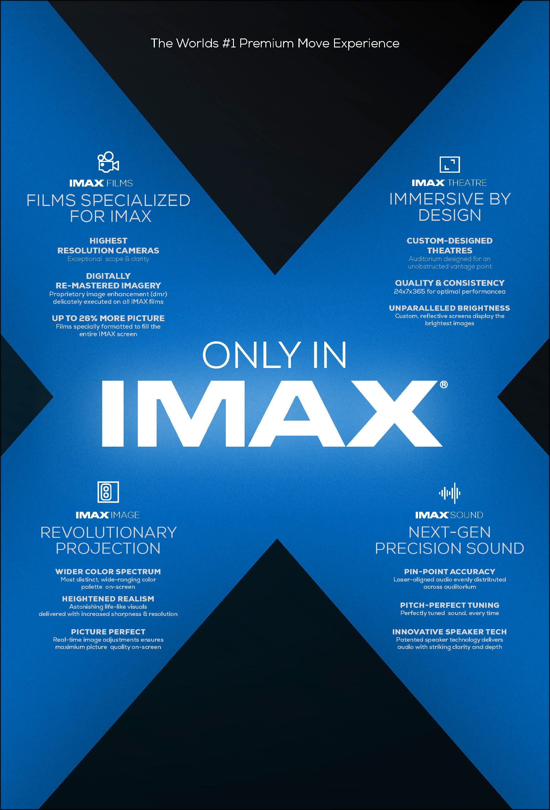
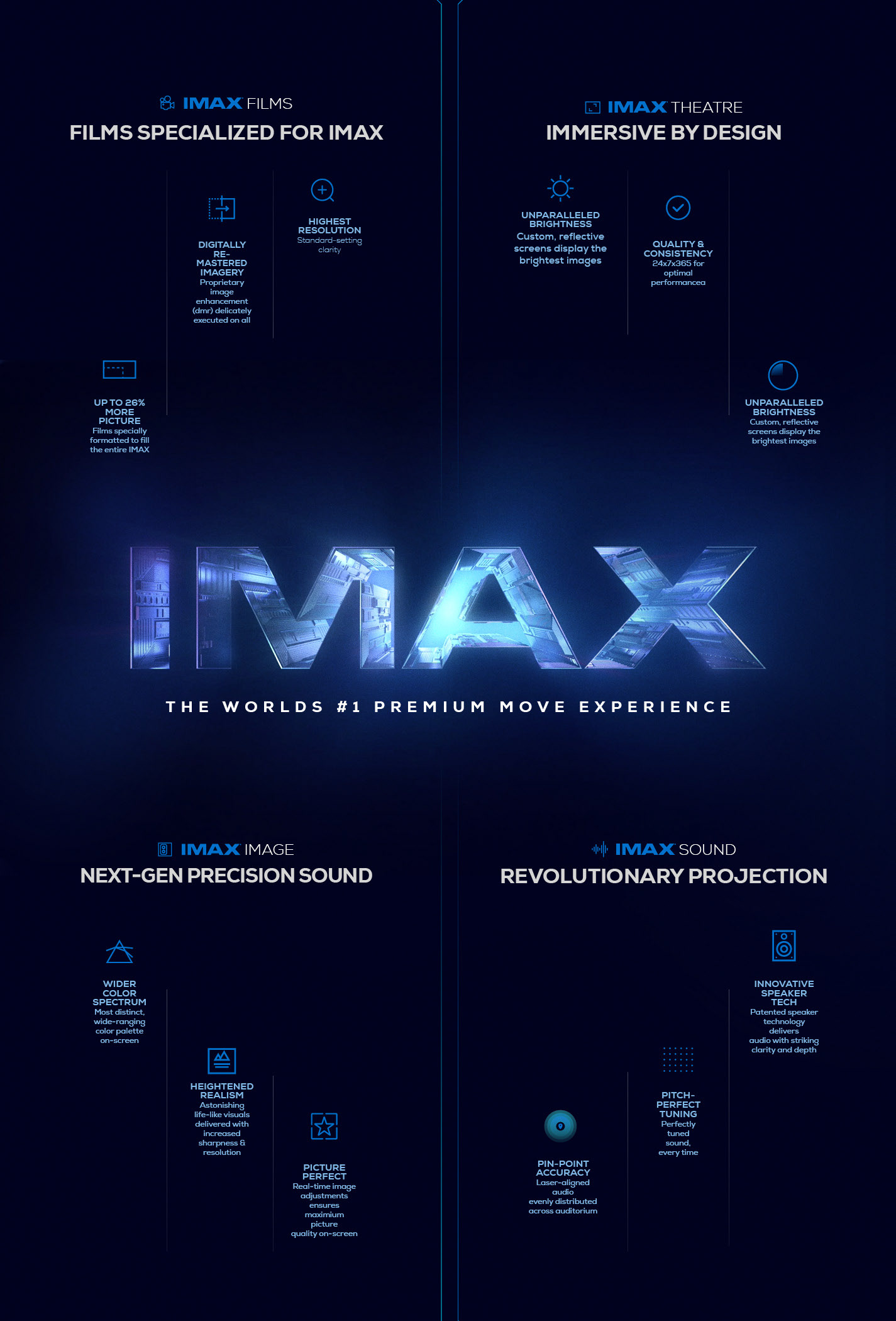
Design a compelling lobby poster for partner theater distributors to communicate the unique advantages of the IMAX experience over competing premium formats. The goal was to translate complex technical specifications such as projection, sound, and theatre geometry into digestible, visually impactful graphics that educate and convert moviegoers in high-traffic areas.
STRATEGY
The approach utilized a premium, dark aesthetic accented by IMAX’s signature electric blue to evoke cinematic immersion. Complex technical differentiators were distilled into sleek, futuristic infographics and diagrams. The visual hierarchy heavily emphasized “The IMAX Difference,” positioning the format not just as a bigger screen, but as the superior, unmissable cinematic choice.
CLIENT


NEW BRAND INITIATIVE
Logo Design Concepts
Logo Design Concepts
CONCEPT DESIGN, LAYOUT, AND ILLUSTRATION
PROJECT DATE | 2021
BRIEF
Create a distinct logo system for “IMAX Live,” a new sub-brand dedicated to simulcasting concerts in theaters. The objective was to fuse the established prestige of the IMAX master brand with the vibrancy of live entertainment, visually communicating a new era of immersive, real-time cinema.
STRATEGY
I explored visual metaphors that bridge cinema and live performance, utilizing motifs like sound waves, equalizer bars, and broadcast signals. By integrating these kinetic elements with the iconic IMAX typography and electric blue palette, the concepts aim to visualize the fusion of superior PROJECTion technology with the pulse of live entertainment.
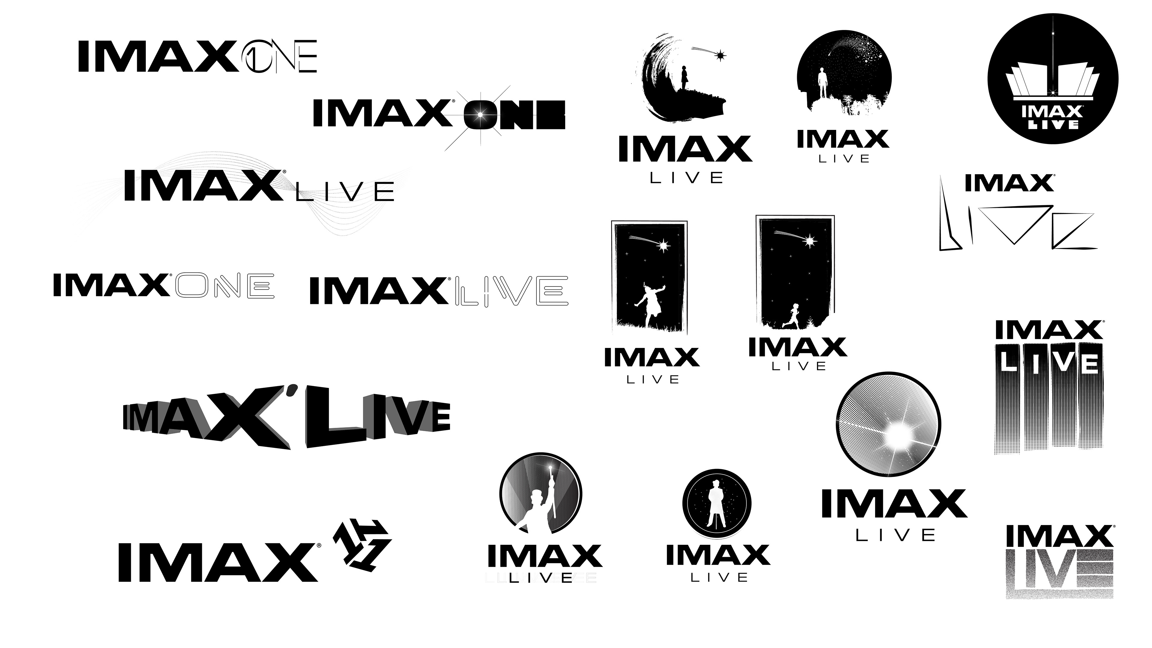
CLIENT

WWW.TBWA.COM

CORPORATE CONFERENCE
PRESENTATION DECK
PRESENTATION DECK
LAYOUT, TYPOGRAPHY, DATA VISUALIZATION, IMAGE SELECTION, PHOTO MANIPULATION, AND COMPOSITING
PROJECT DATE | 2022
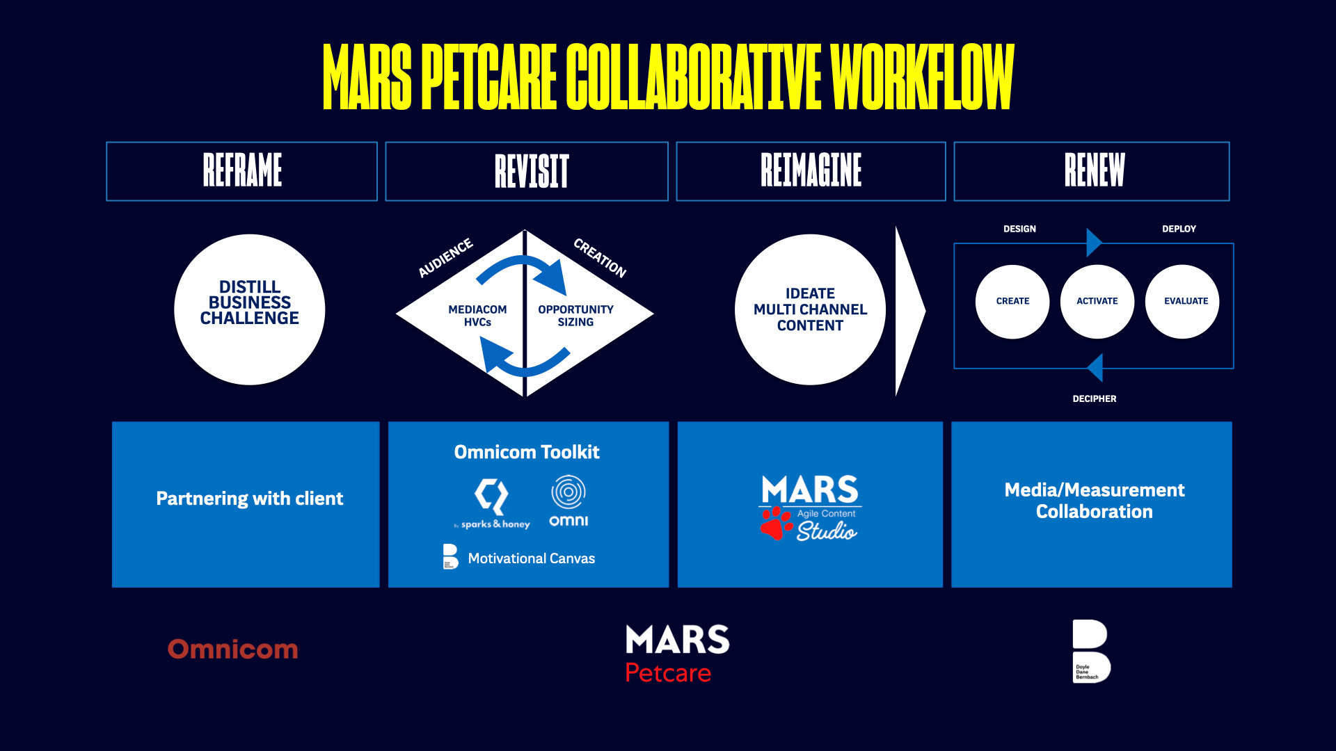
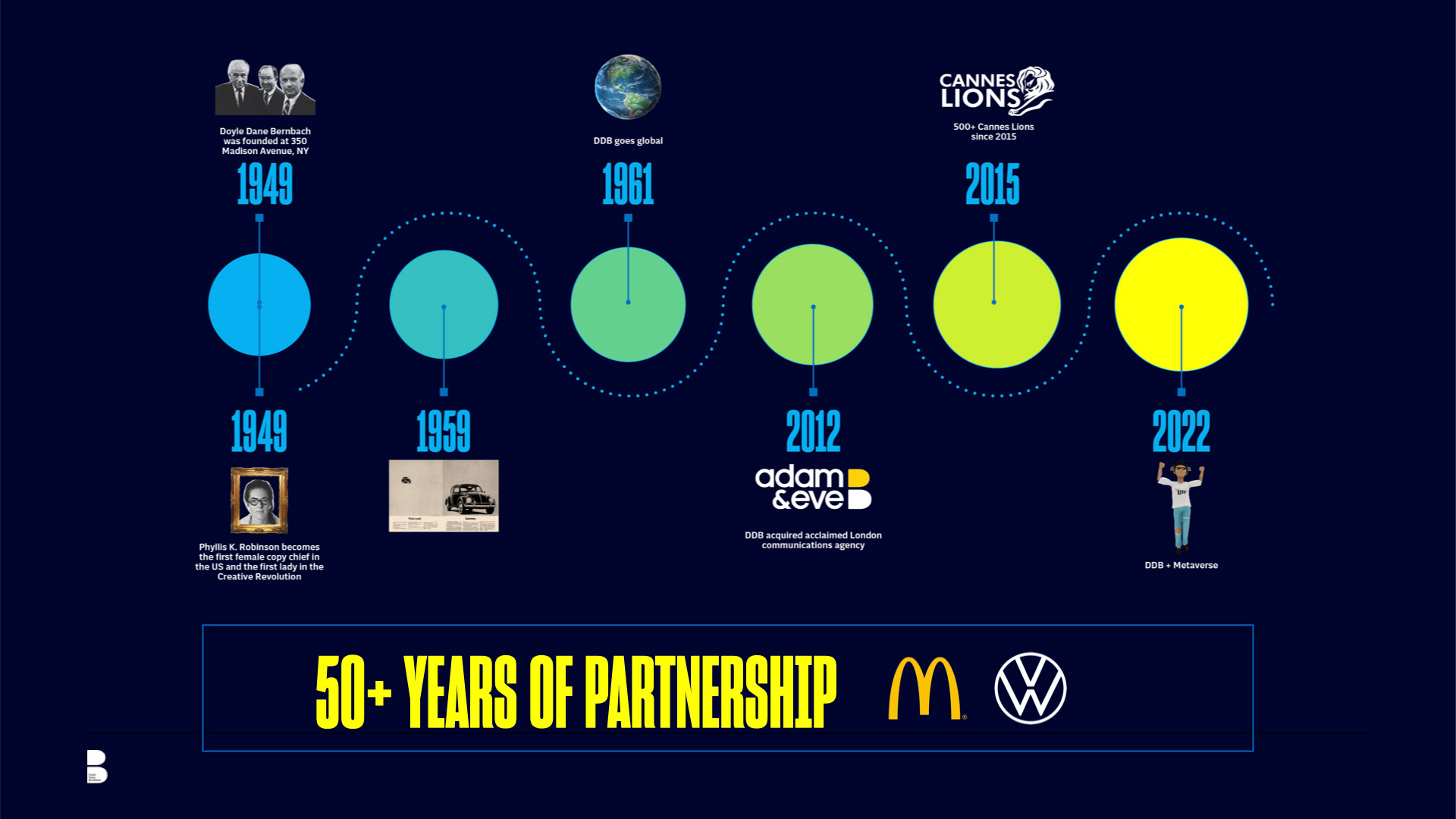
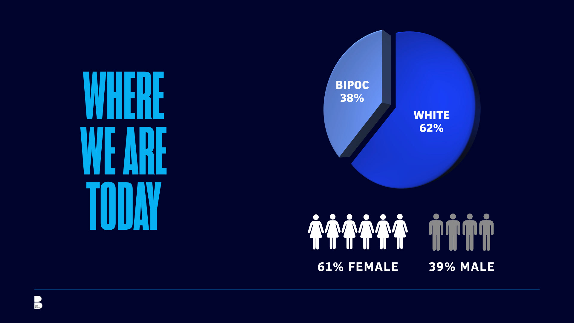
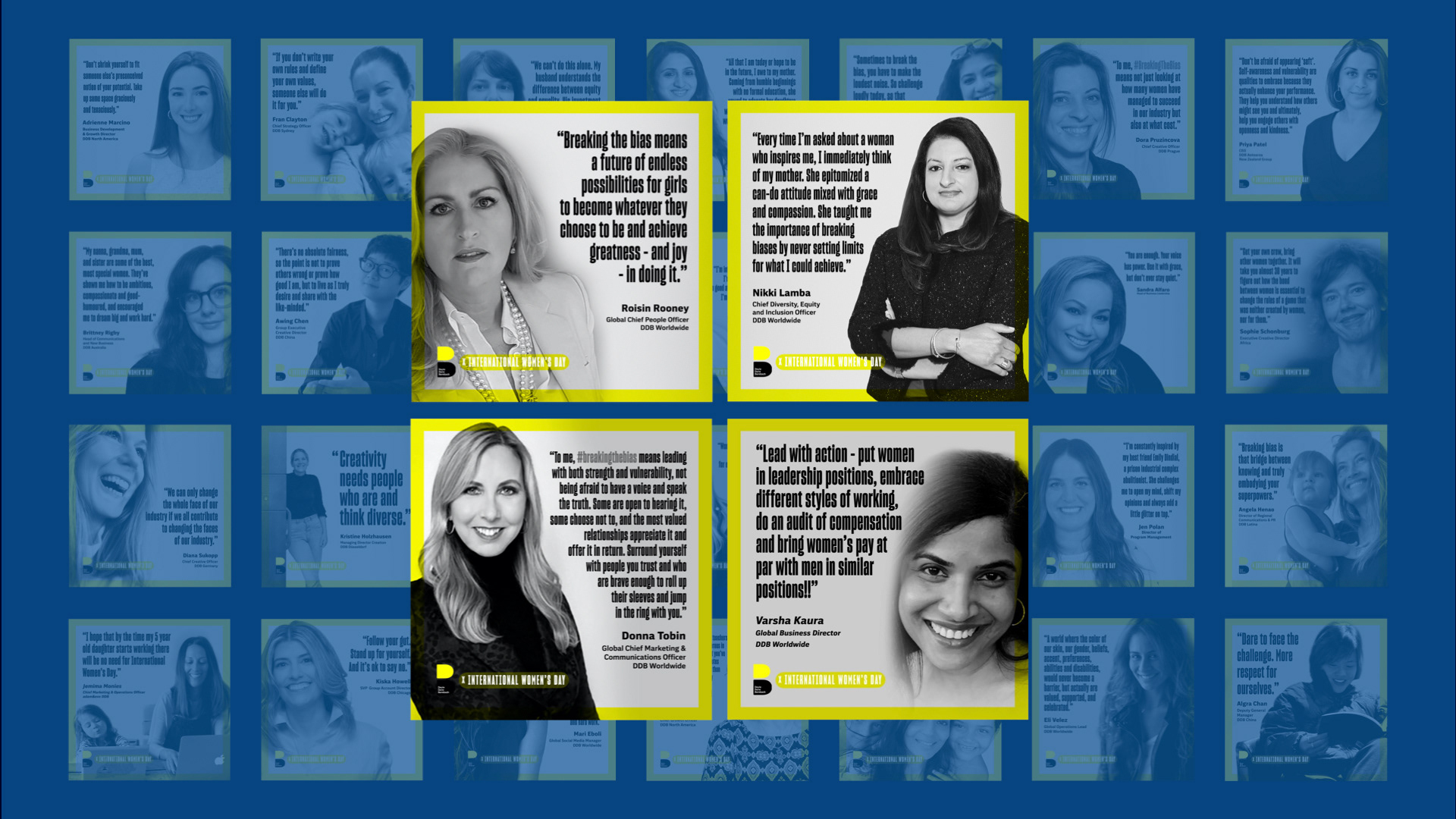
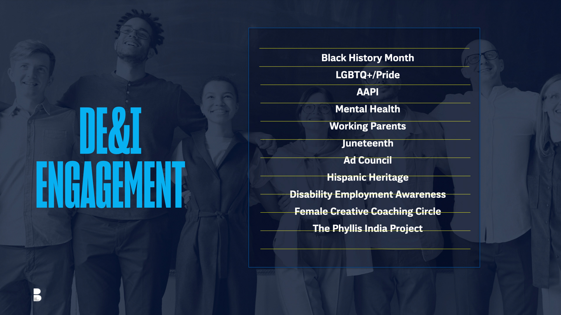
BRIEF
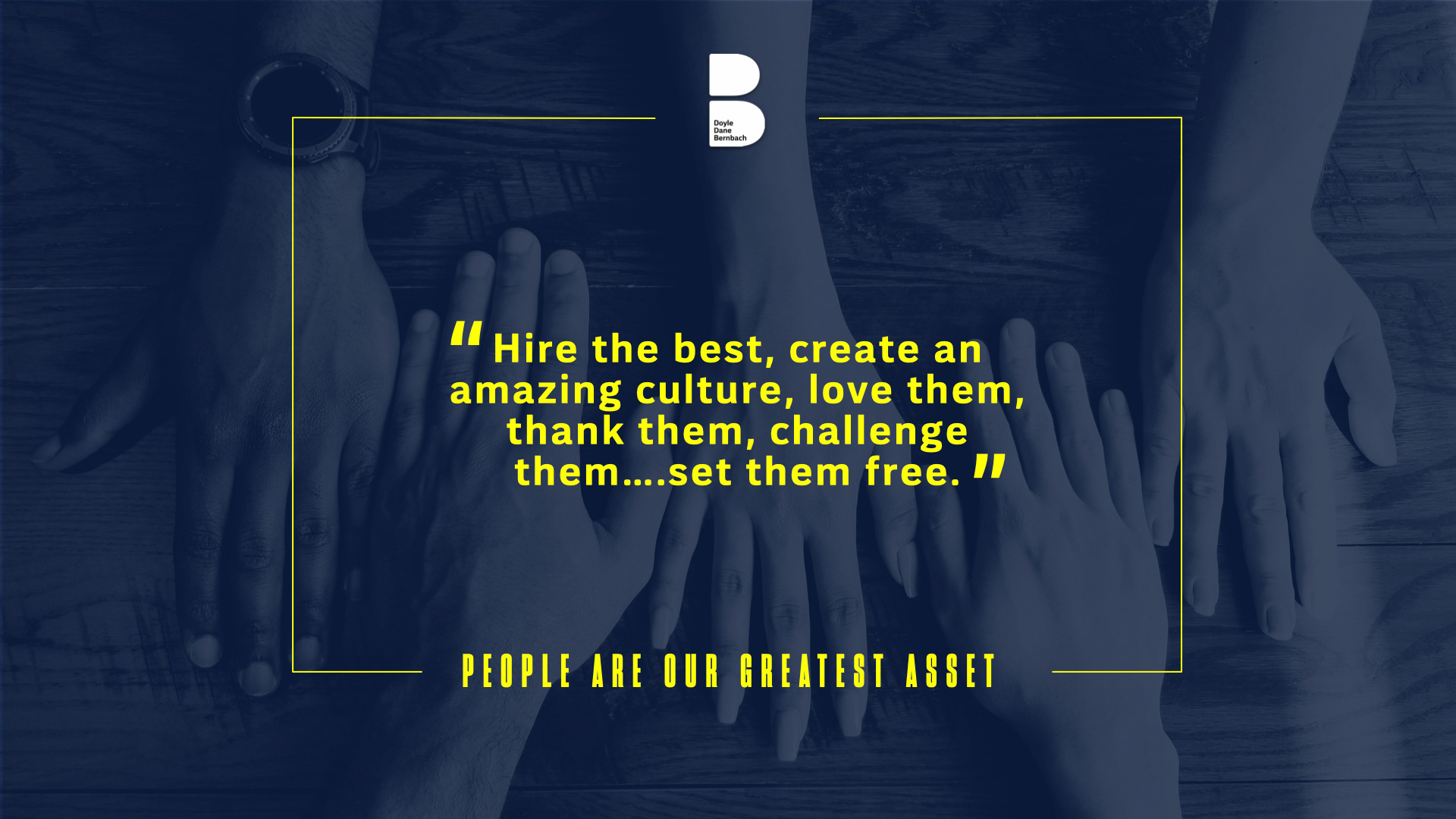
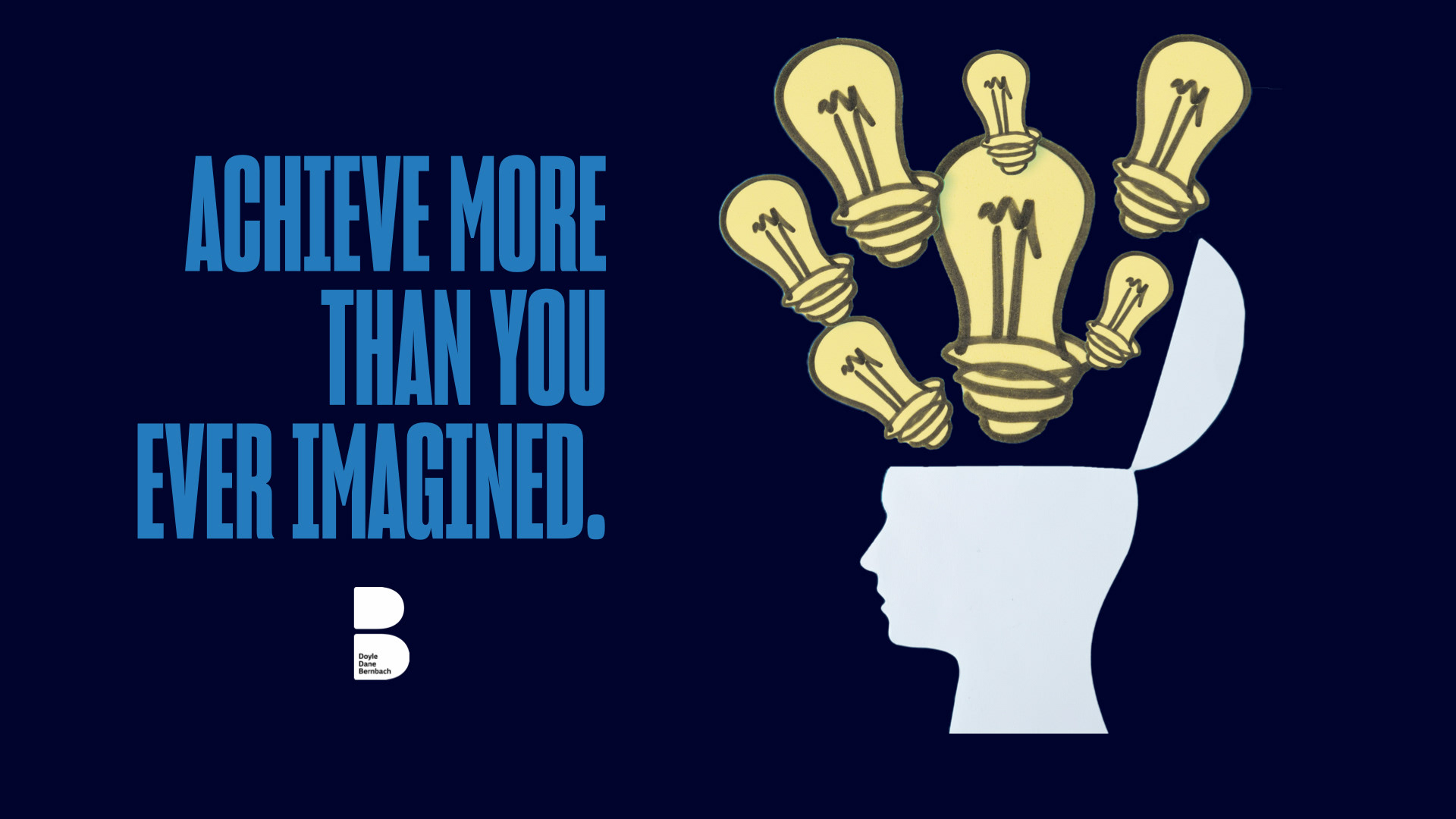
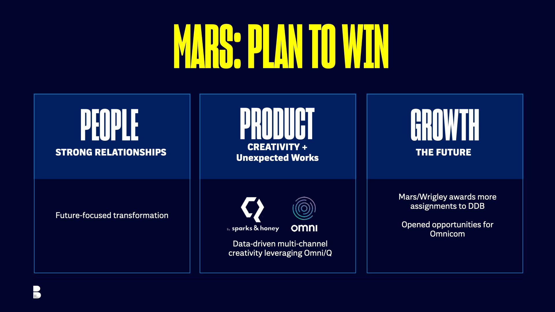
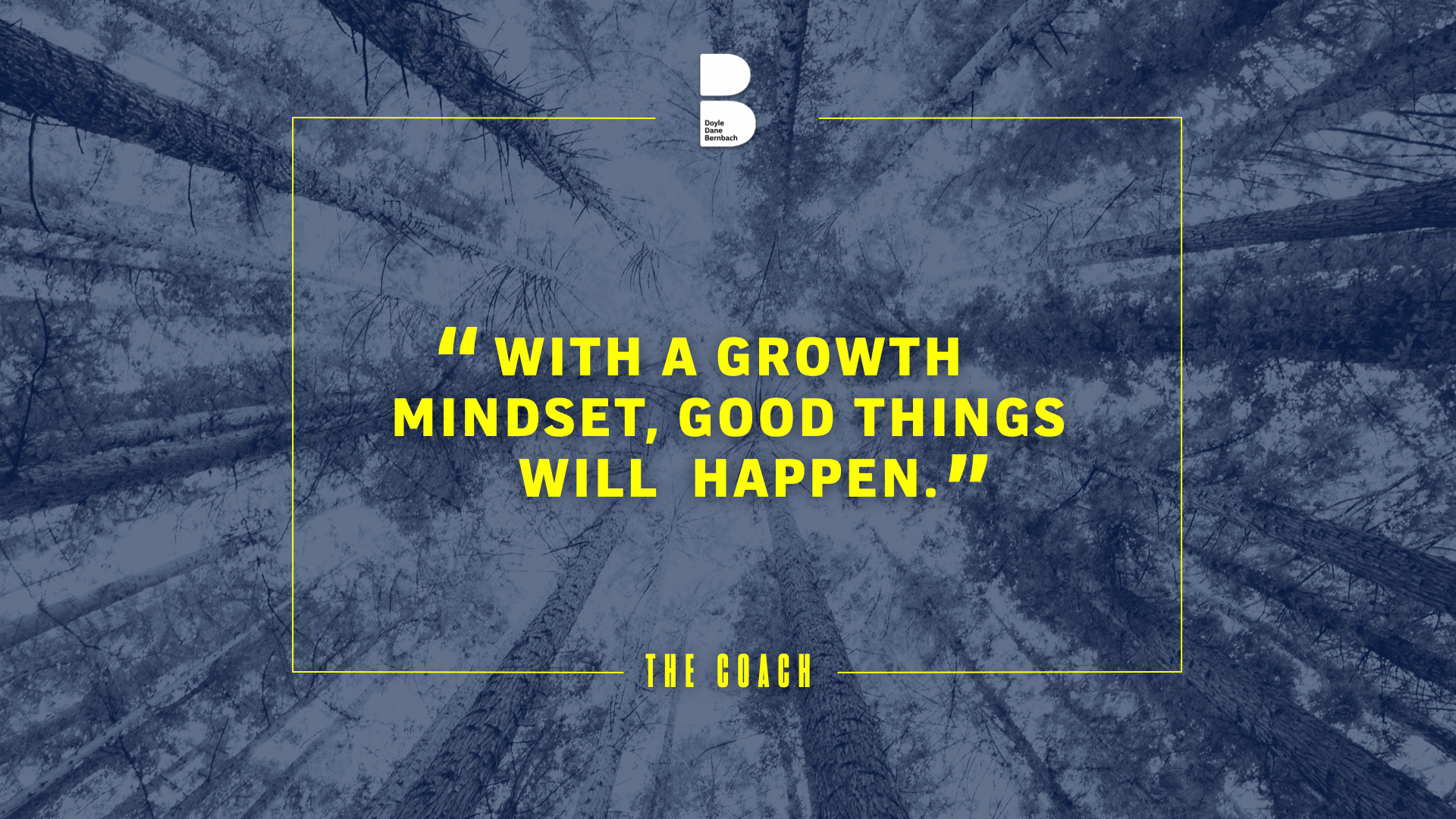
Doyle Dane Bernbach (DDB), now owned by TBWA, required a master presentation deck for a major corporate conference. The objective was to visually articulate their 50-year legacy and future roadmap, covering complex topics like DE&I engagement and client workflows, without resorting to dry, standard bullet points. The data needed to look as creative as the agency itself.
STRATEGY
I developed a bold, high-contrast visual identity using DDB’s signature navy and electric yellow. By turning complex metrics into digestible infographics and engaging photo-composites, I transformed a standard update into a compelling narrative. This cohesive system allowed leadership to present disparate topics, from diversity stats to “Plan to Win” strategies, with unified impact.

CLIENT
WWW.TRUEMEASUREMEDIA.LA
ANIMATED ADVERTISEMENT
MOTION GRAPHICS ANIMATION
MOTION GRAPHICS ANIMATION
CONCEPT, LAYOUT, TYPOGRAPHY, PHOTO AND ANIMATION
PROJECT DATE | 2022
BRIEF
Develop a series of punchy motion graphics for a new media buying startup, True Measure Media, for use on YouTube and LinkedIn. The objective was to clearly and quickly communicate their disruptive model: eliminating traditional agency layers and costs to offer clients a direct, efficient, and significantly more affordable media buying solution.
STRATEGY
I used a clean, high-contrast blue and black color scheme to convey professionalism and clarity. The animation strategy relied on kinetic typography to emphasize key value propositions like “No Middleman” and a “75% Reduction in Service Fees”. Visual metaphors like interlocking gears and connecting nodes were used to illustrate efficiency and the creation of a dedicated, integrated media buying team.
CLIENT

Website
CONCEPT & DESIGN, SITE WIREFRAME LAYOUT, TYPOGRAPHY, SITE PRODUCTION & CONSTRUCTION
PROJECT DATE | 2022
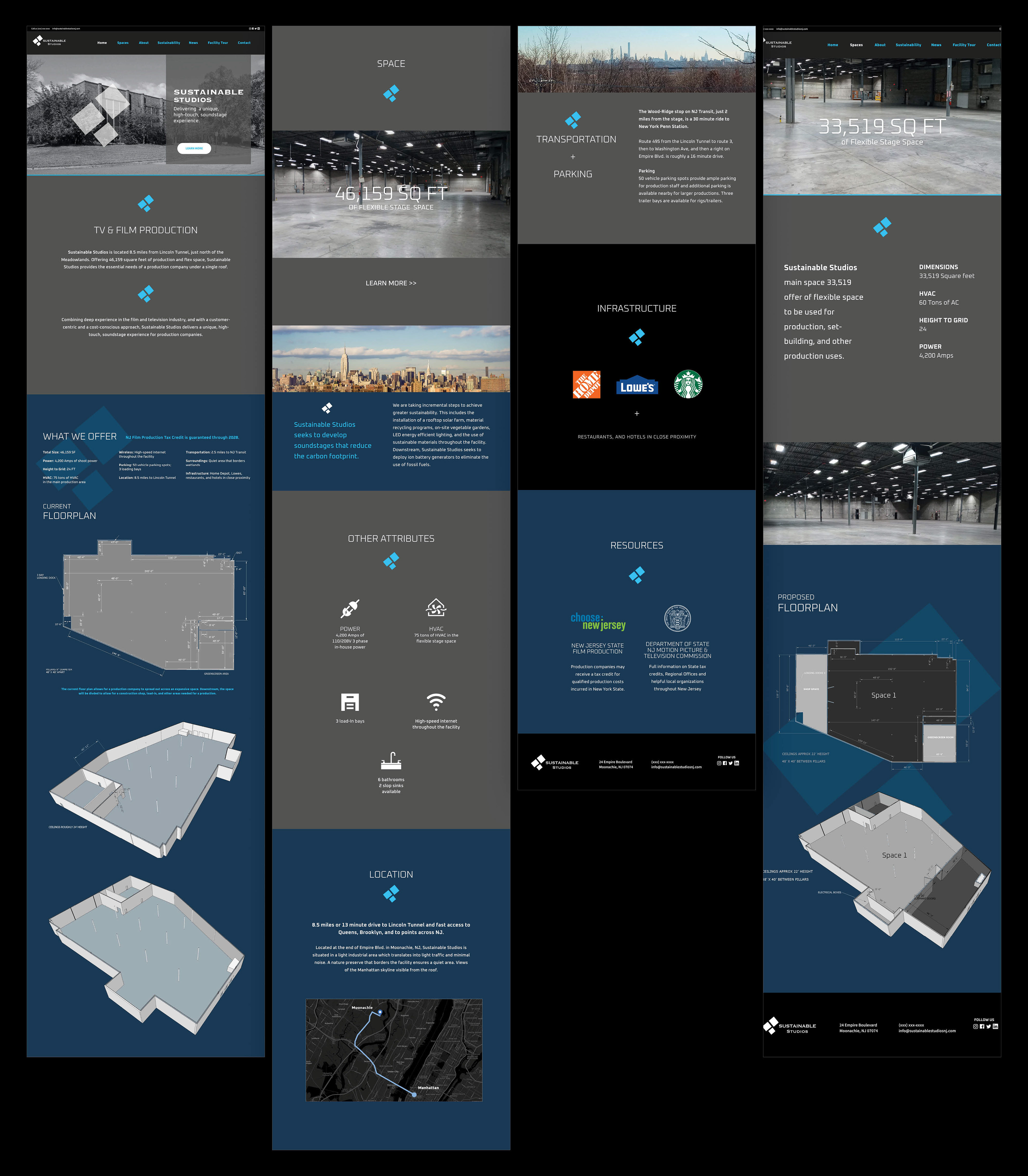
BRIEF
Design an intuitive, information-rich website for Sustainable Studios, a New Jersey-based film and TV production facility. The objective was to create a digital tool for location scouts and producers that clearly showcases the studio’s technical specifications, expansive floor plans, and logistical amenities to drive booking inquiries.
STRATEGY
I employed a sleek, dark-themed interface to align with the cinematic industry’s aesthetic while prioritizing utility. The user experience centers on high-fidelity 3D floor plans and digestible technical data, ensuring production teams can quickly visualize the space and assess its suitability for their specific project needs.
CLIENT

LOGO DESIGN
CONCEPT, LAYOUT, TYPOGRAPHY, AND ILLUSTRATION
PROJECT DATE | 2024
BRIEF
CT&Co required a distinct brand identity for their new experiential partner, Co.nfetti Squad. The objective was to visualize a niche service dedicated to “plussing-up” entertainment campaigns with budget-optimized, high-impact activations. The challenge was crafting a mark that felt professional enough for corporate studios yet playful enough to represent the “wow factor” of social-friendly fan events.
STRATEGY
I explored various iterations of kinetic energy, from starbursts to sparkles, before landing on a solution that balances corporate trust with creative whimsy. The final mark utilizes a classic serif typeface to ground the brand in professionalism, overlaid with translucent, colorful spheres. This visual metaphor represents the “extra layer” of excitement, the confetti, that the Squad adds to every campaign.
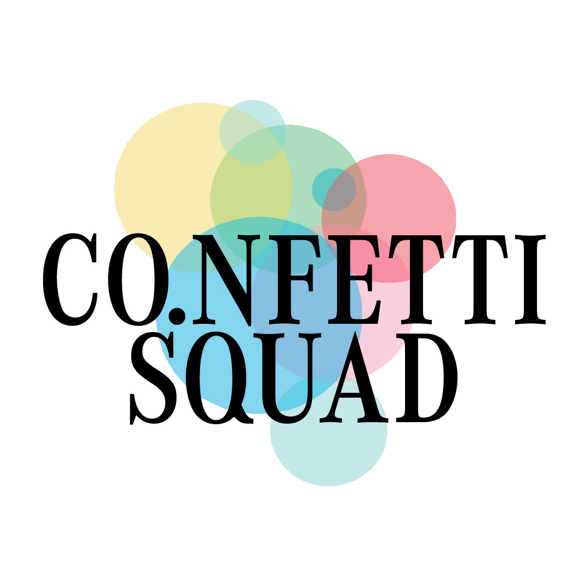
FINAL DESIGN
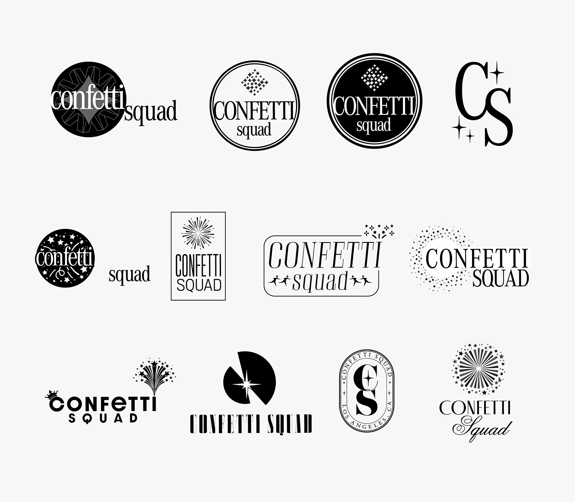
Concept Development
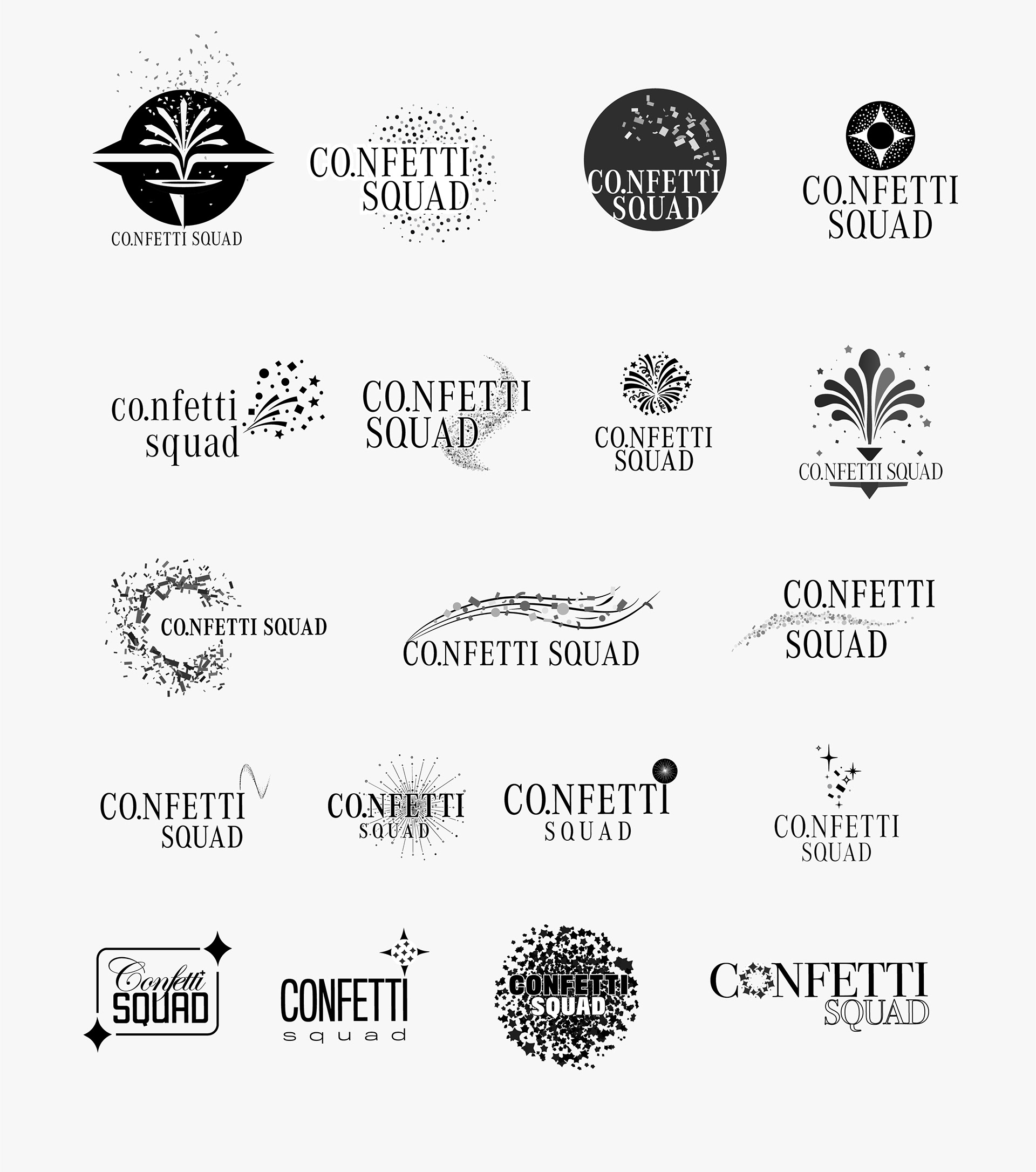
Concept Development
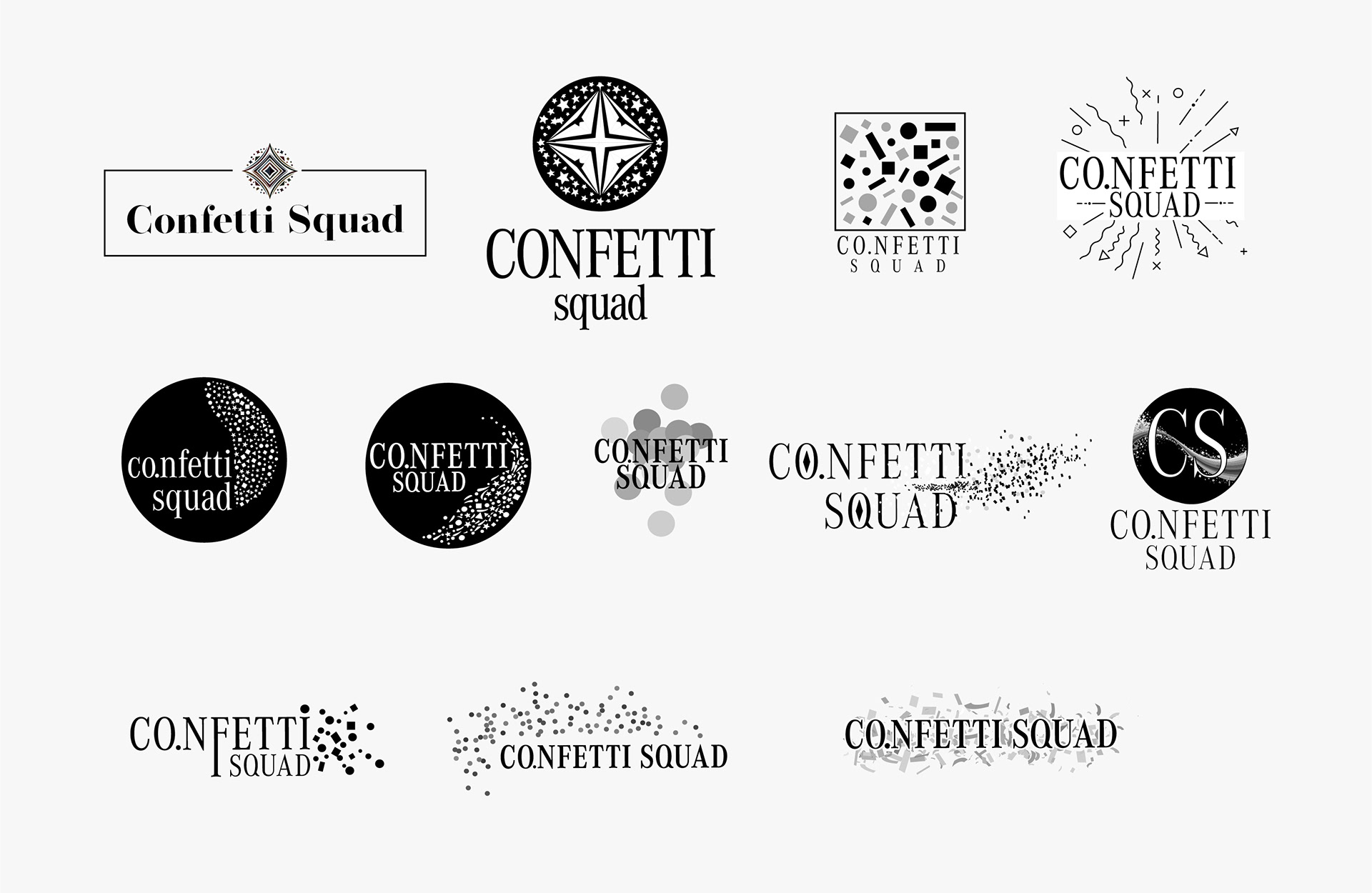
Concept Development
CLIENT
WWW.THEWONDERPROJECT.COM
FOR

FEATURE FILM
PITCH PRESENTATION DECK
PITCH PRESENTATION DECK
LAYOUT, TYPOGRAPHY, DATA VISUALIZATION, IMAGE SELECTION, PHOTO MANIPULATION, AND COMPOSITING
PROJECT DATE | 2025
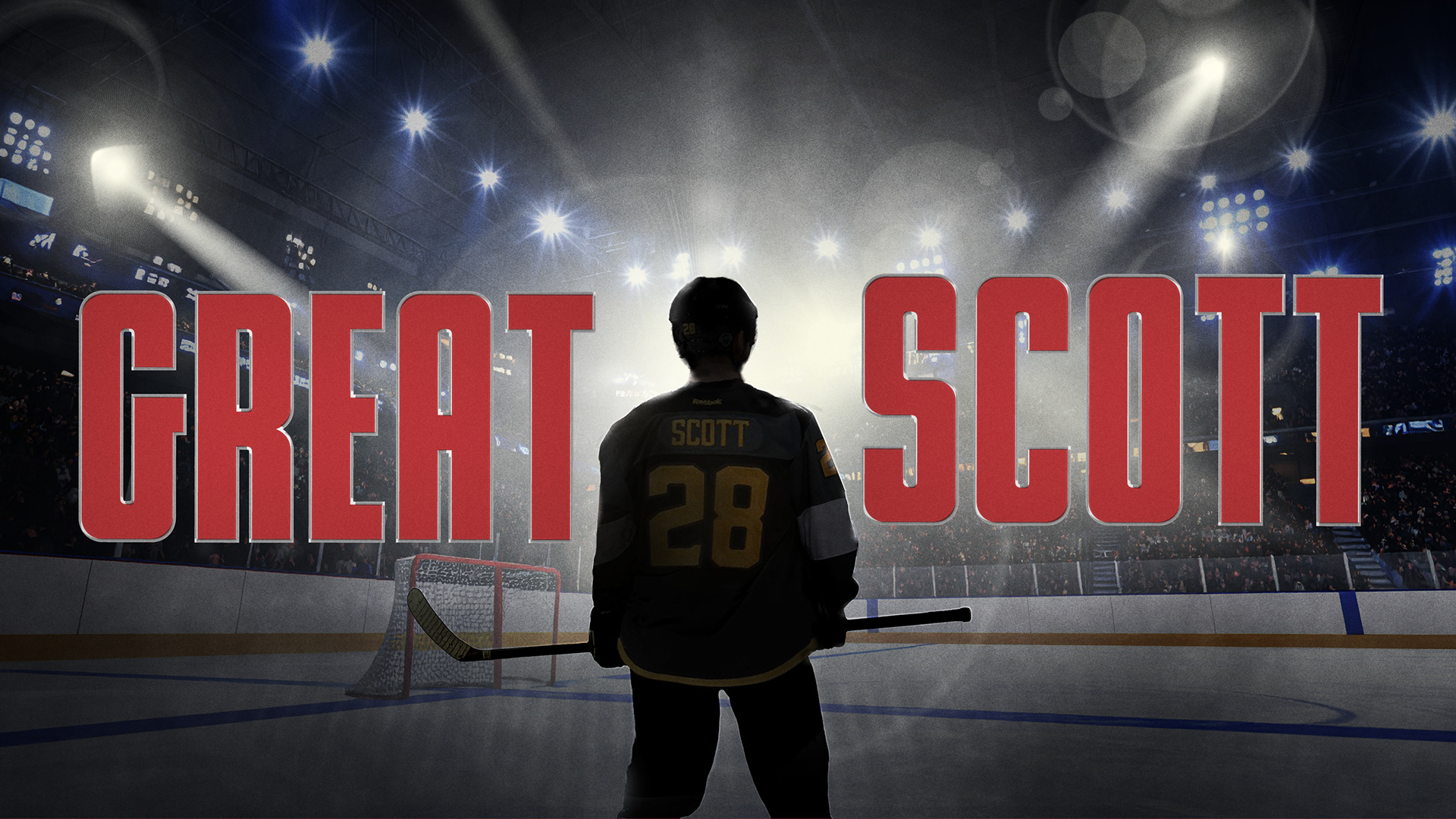
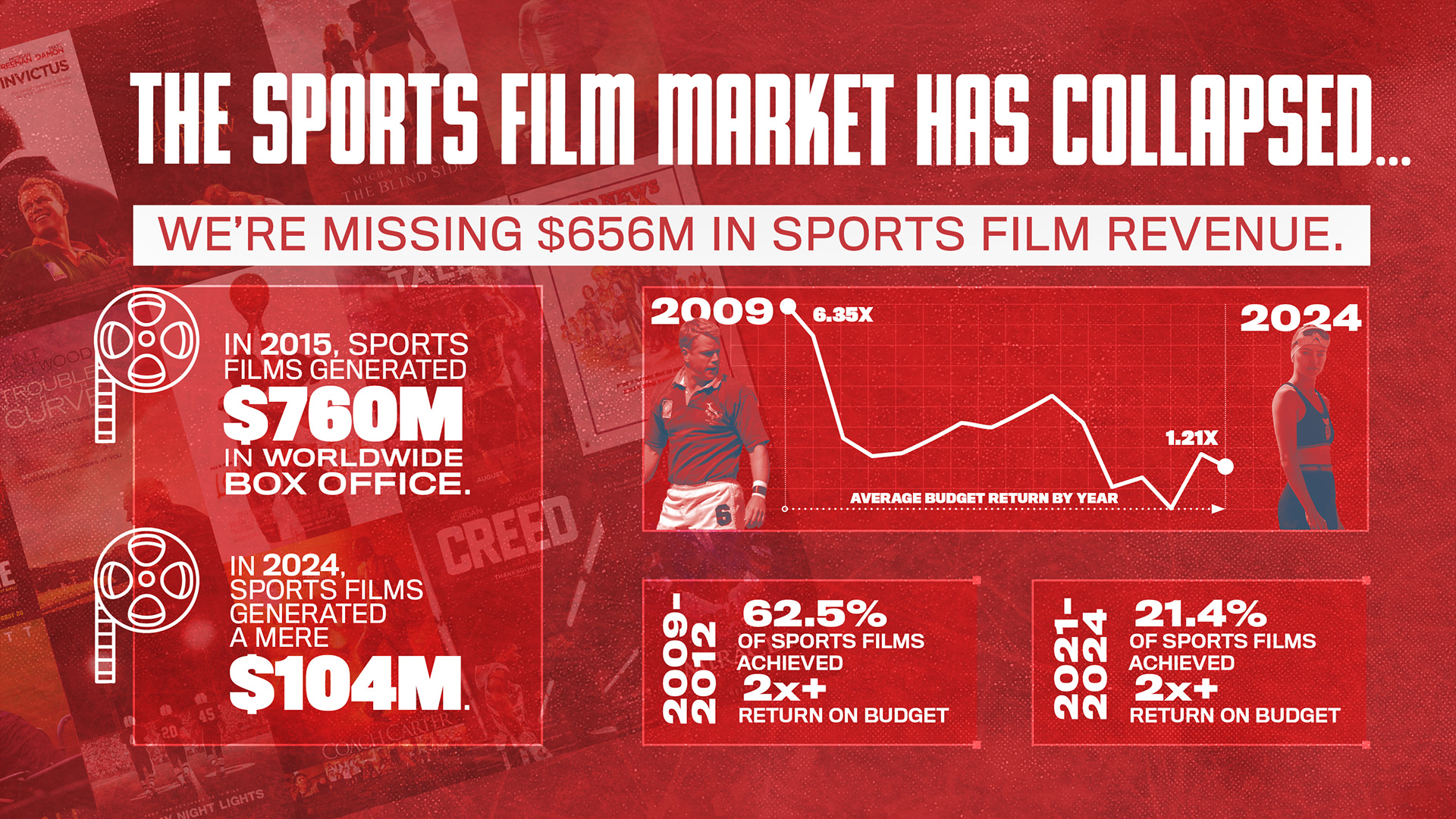
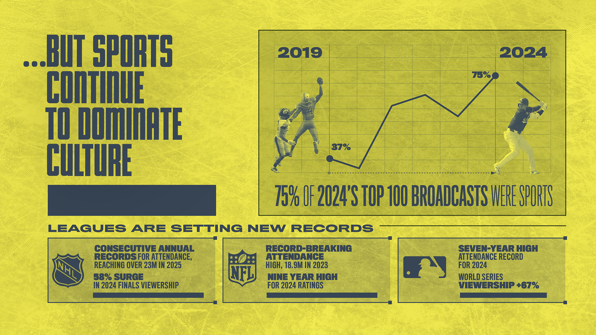
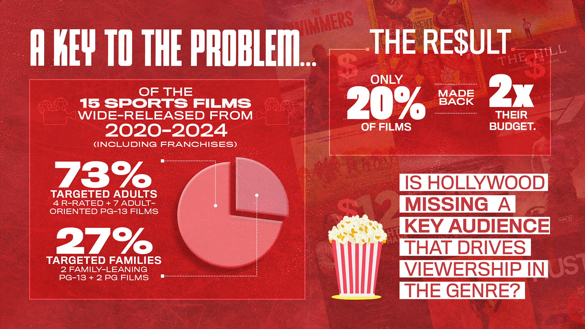
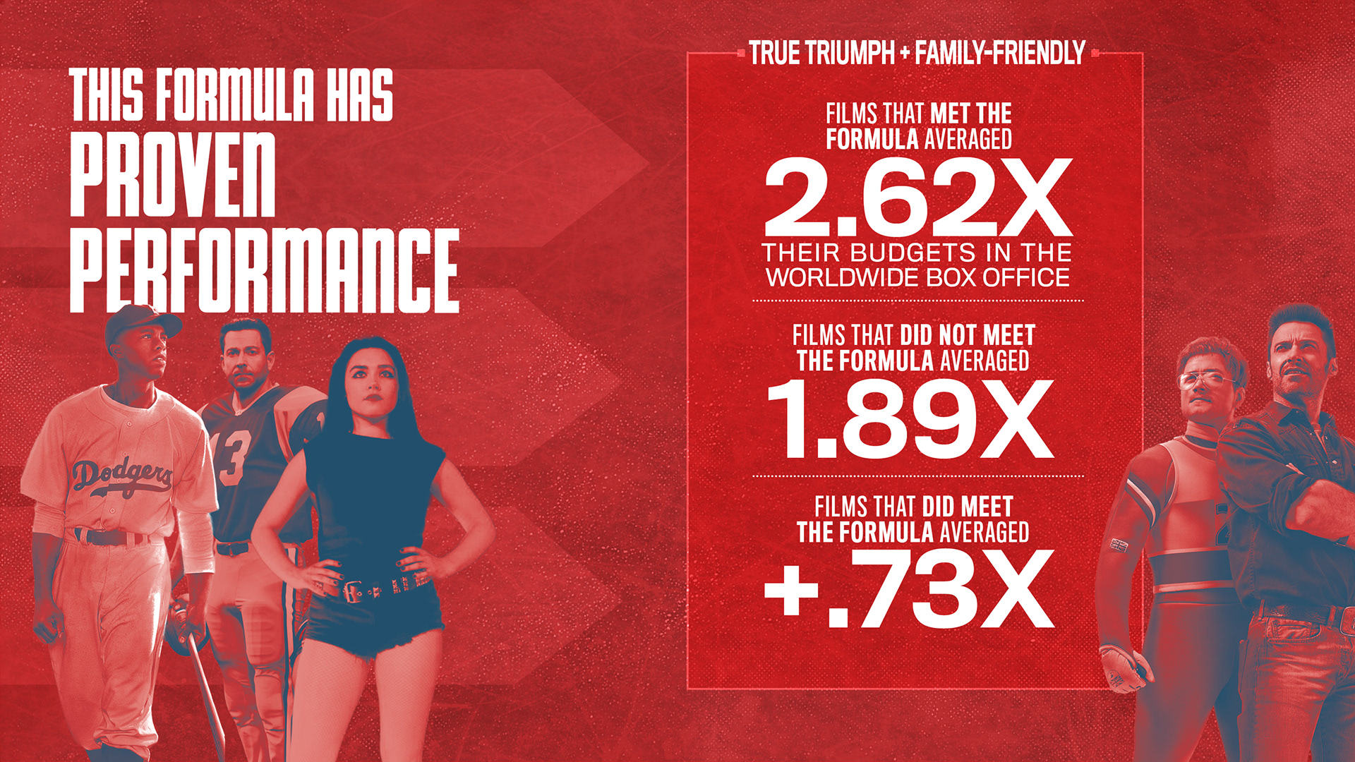
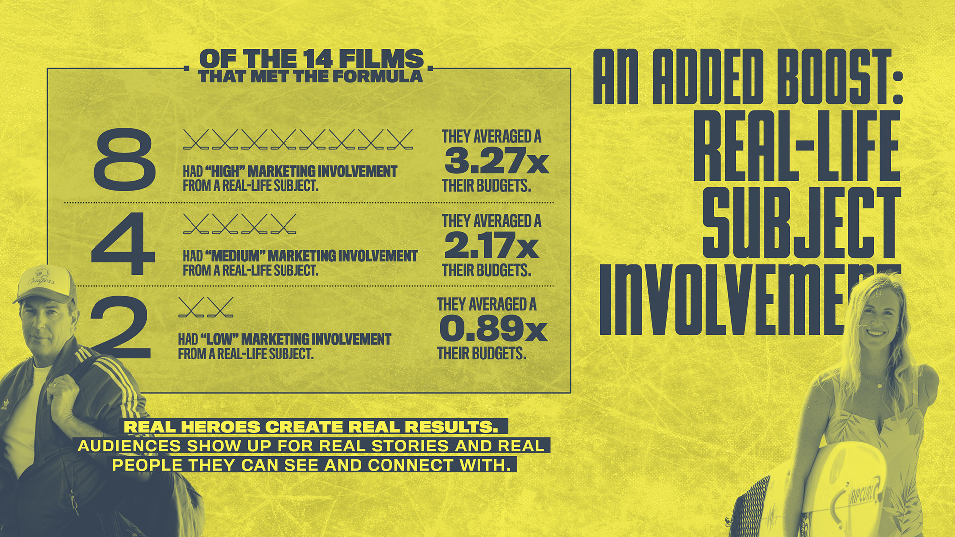
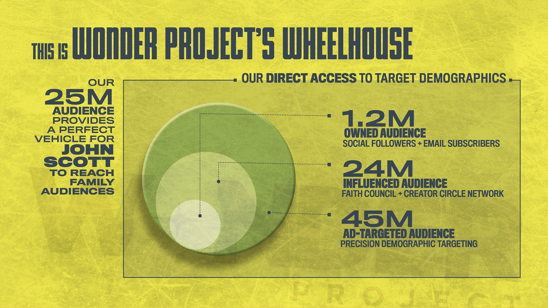
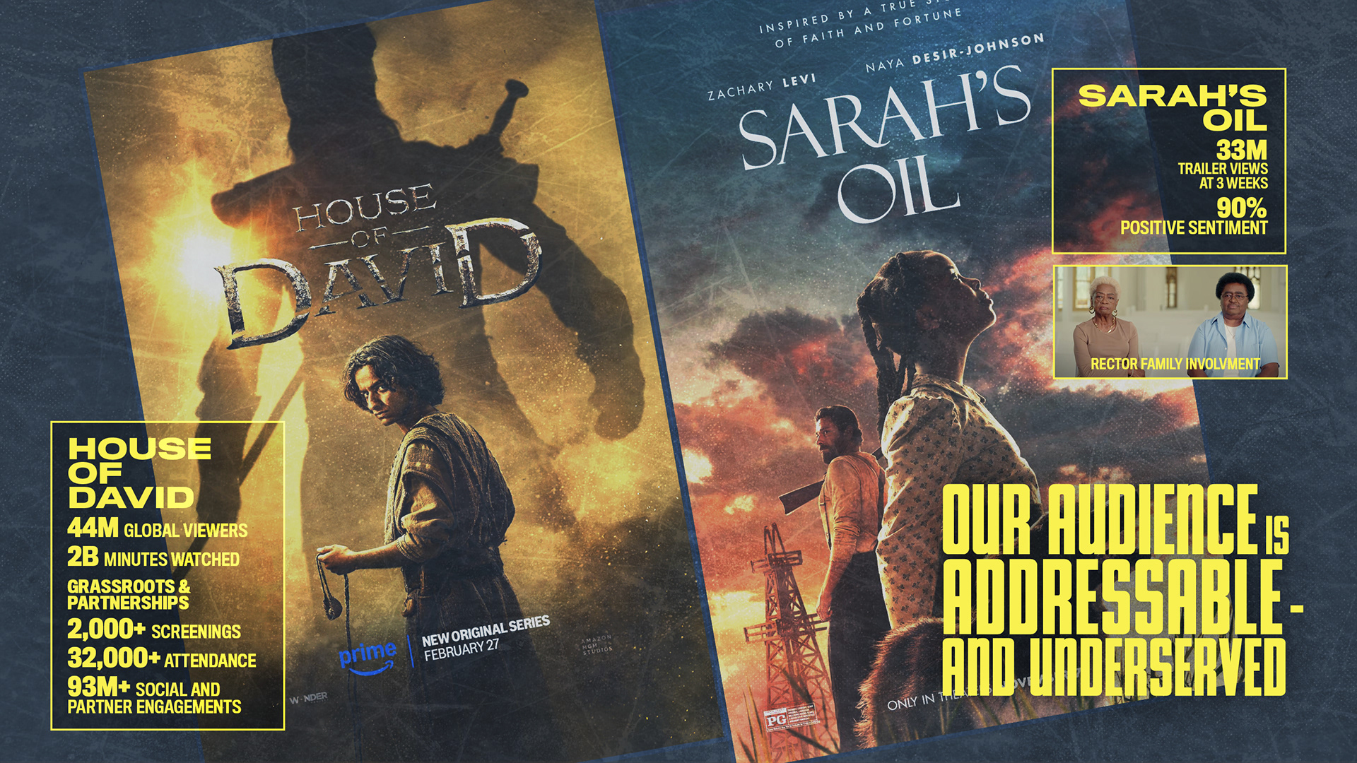
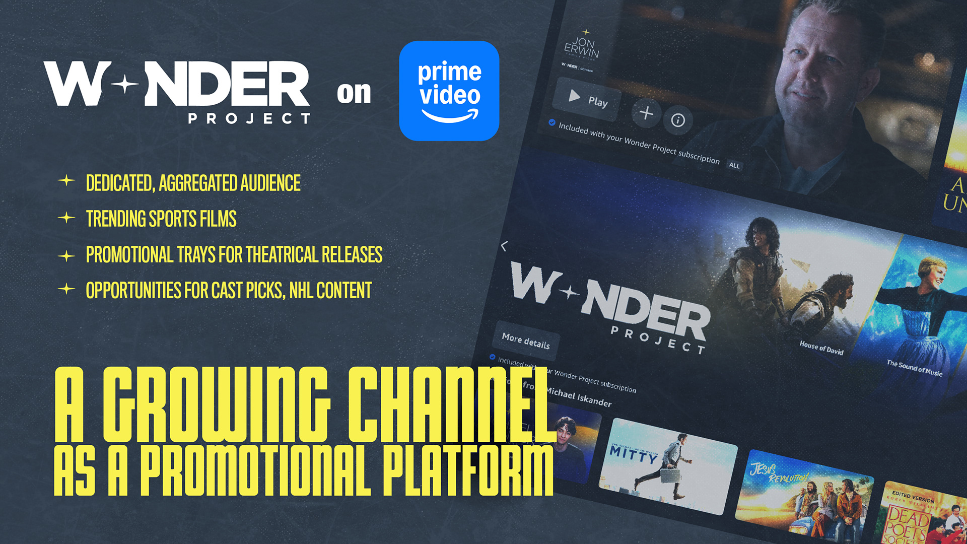
BRIEF
The Wonder Project needed a cinematic pitch deck to sell Great Scott, a feature biopic about NHL enforcer John Scott, to Amazon Studios. The challenge was twofold: visualize Scott’s viral underdog story while simultaneously proving the financial viability of a genre the market had largely abandoned. The objective was to make the business case as compelling as the script.
STRATEGY
I designed a high-impact aesthetic that merges the grit of the penalty box with the polish of a studio blockbuster. Using a bold red and gold palette, distressed typography, and aggressive data visualization, the deck highlights the “market gap” for family-friendly sports films. This approach positioned the project not just as a feel-good story, but as a calculated, high-return investment.
CLIENT
THE STRING REVOLUTION
MUSICAL BAND

Logo Design
CONCEPT, LAYOUT, TYPOGRAPHY, AND ILLUSTRATION
PROJECT DATE | 2024
BRIEF
The String Revolution, a Grammy-winning trio, required a brand identity reflecting their ability to generate a massive, full-band sound using only three guitars. The objective was to distill their virtuosity and eclectic blend of rock and jazz into a single, iconic mark suitable for global merchandising and digital platforms.
STRATEGY
I began by sketching a wide array of motifs, from vintage badges and guitar picks to abstract soundwaves, to find the right visual tone. The final solution strips away the noise, integrating three interconnected guitar silhouettes directly into custom typography to symbolize the trio’s seamless, unified performance style.
FINAL DESIGN
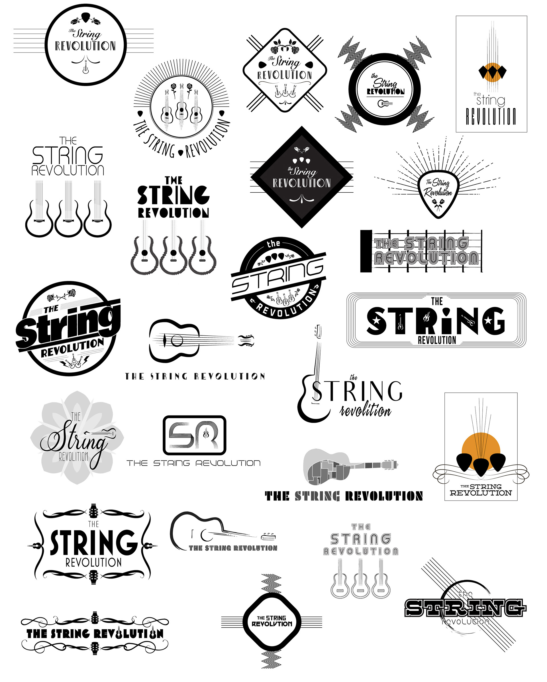
CONCEPT SKETCHES
CLIENT
Film KEY ART
ONE SHEET POSTER
ONE SHEET POSTER
CONCEPT, LAYOUT, TYPOGRAPHY, PHOTO ILLUSTRATION,
COMPOSITING AND FINISHING
COMPOSITING AND FINISHING
PROJECT DATE | | 2019
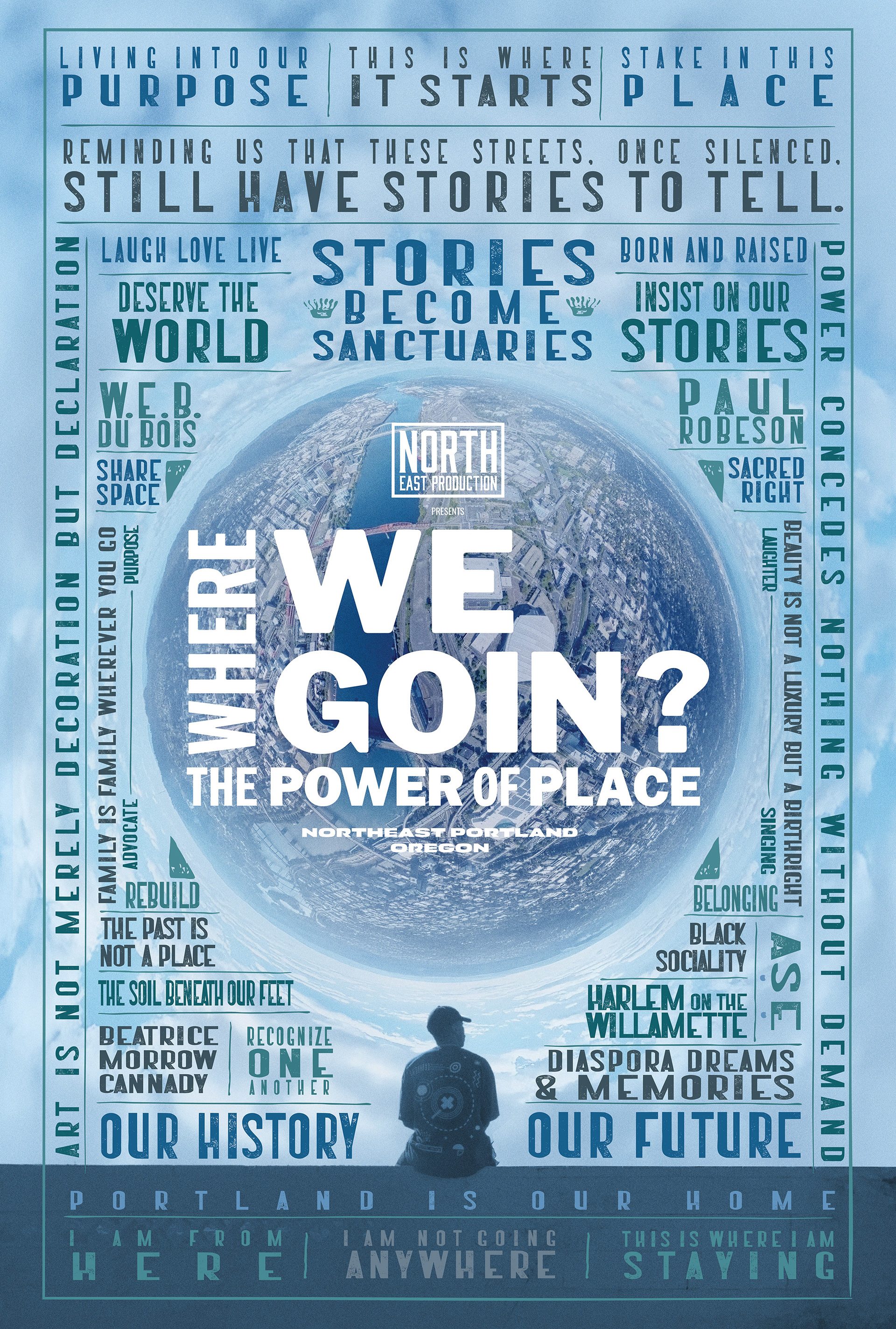
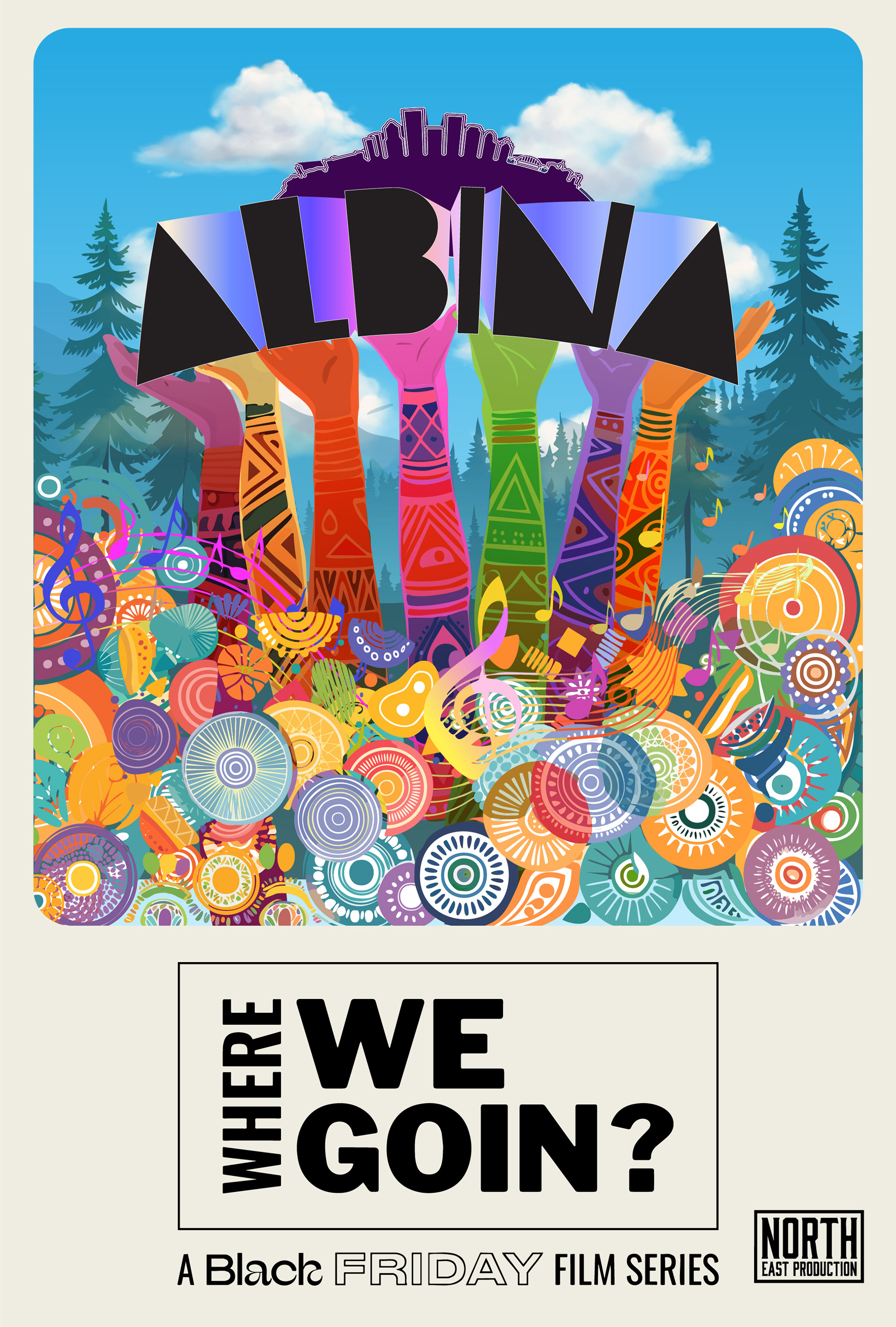
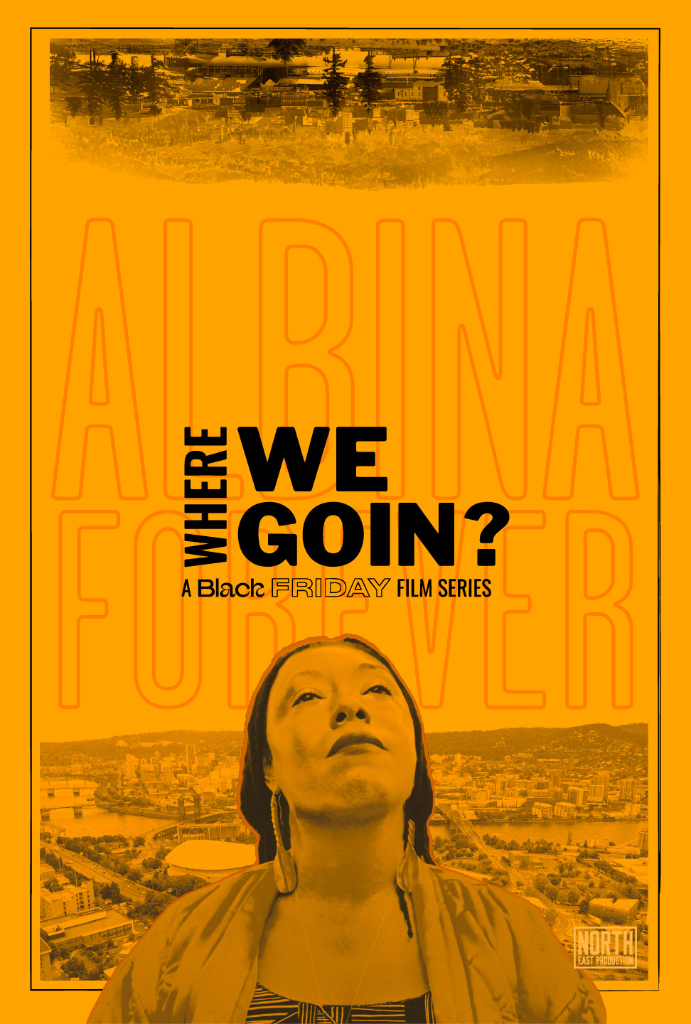
BRIEF
North East Productions needed key art for Devin Boss’s documentary series exploring Black displacement and gentrification in Portland. The challenge was to visually represent the city’s evolving identity, balancing the heavy history of loss with a hopeful narrative about Black entrepreneurs and the future possibilities of “place”.
STRATEGY
I centered the design around a “lens” looking into the city, framed by a grid of powerful affirmations like “Stories Become Sanctuaries.” This typographic structure visually rebuilds the narrative of Portland, moving away from displacement and toward a celebration of Black resilience and the specific “power of place”.
CLIENT

BRANDING PROMOTION
E-BLAST
E-BLAST
CONCEPT, LAYOUT, TYPOGRAPHY, PHOTO ILLUSTRATION, COMPOSITING AND FINISHING
PROJECT DATE | 2025
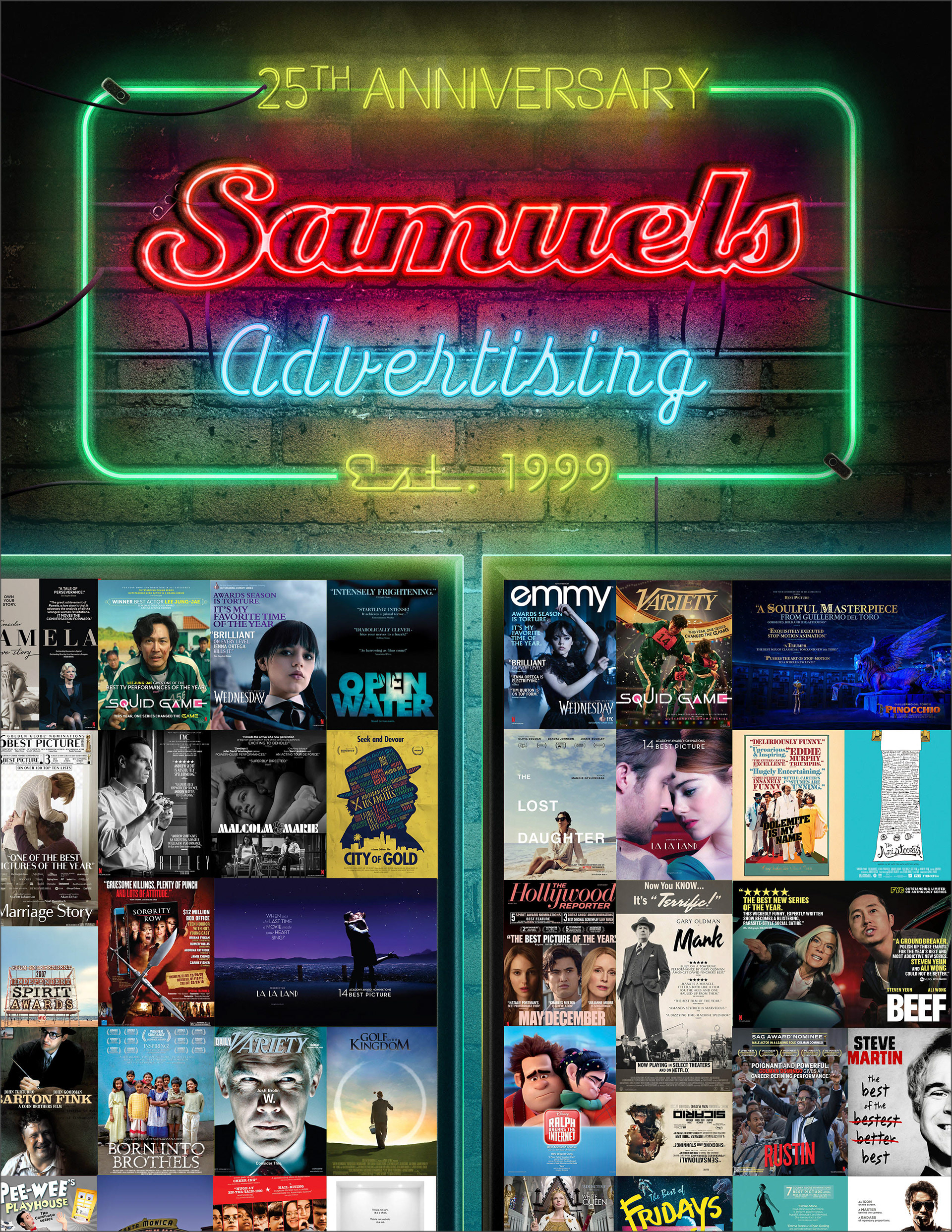
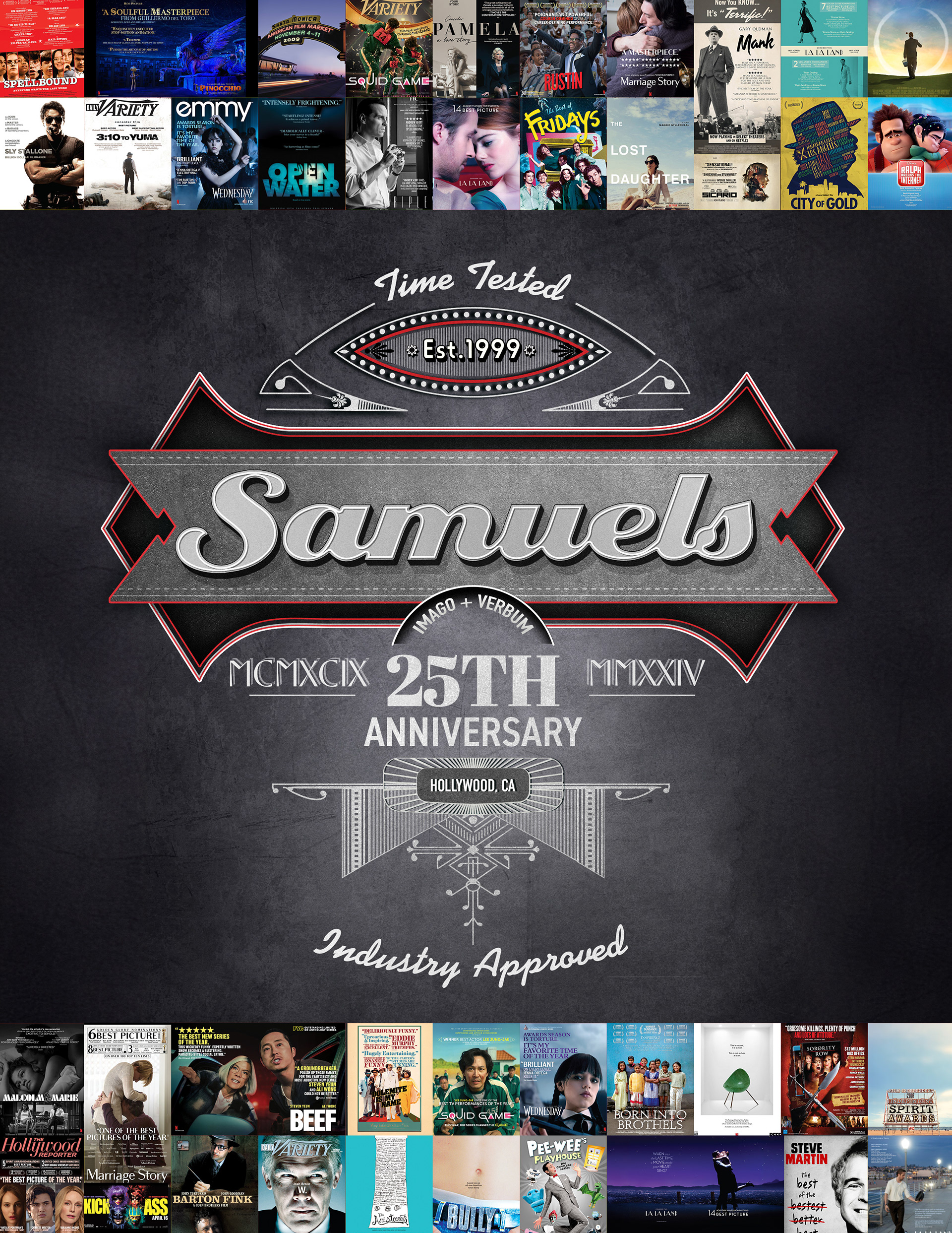
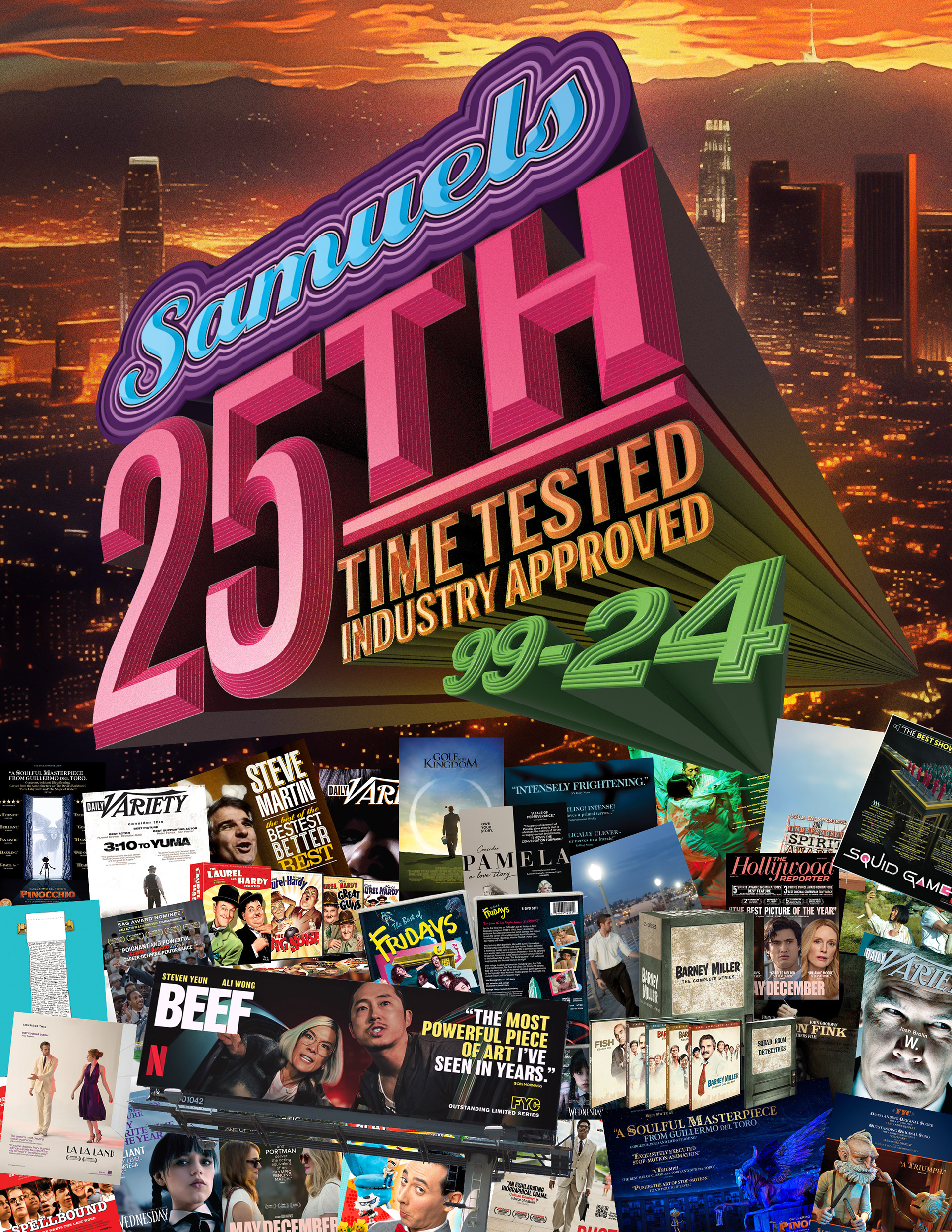
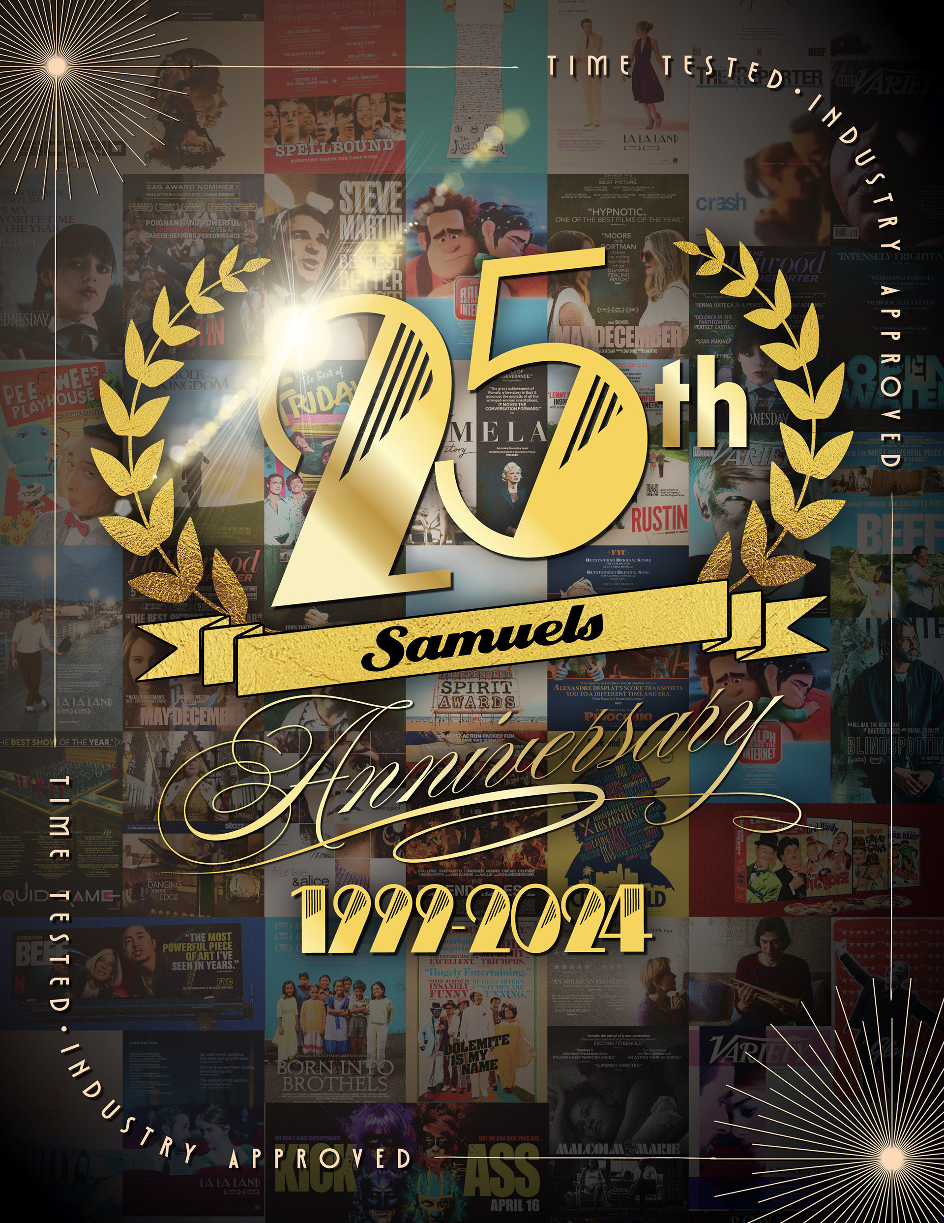
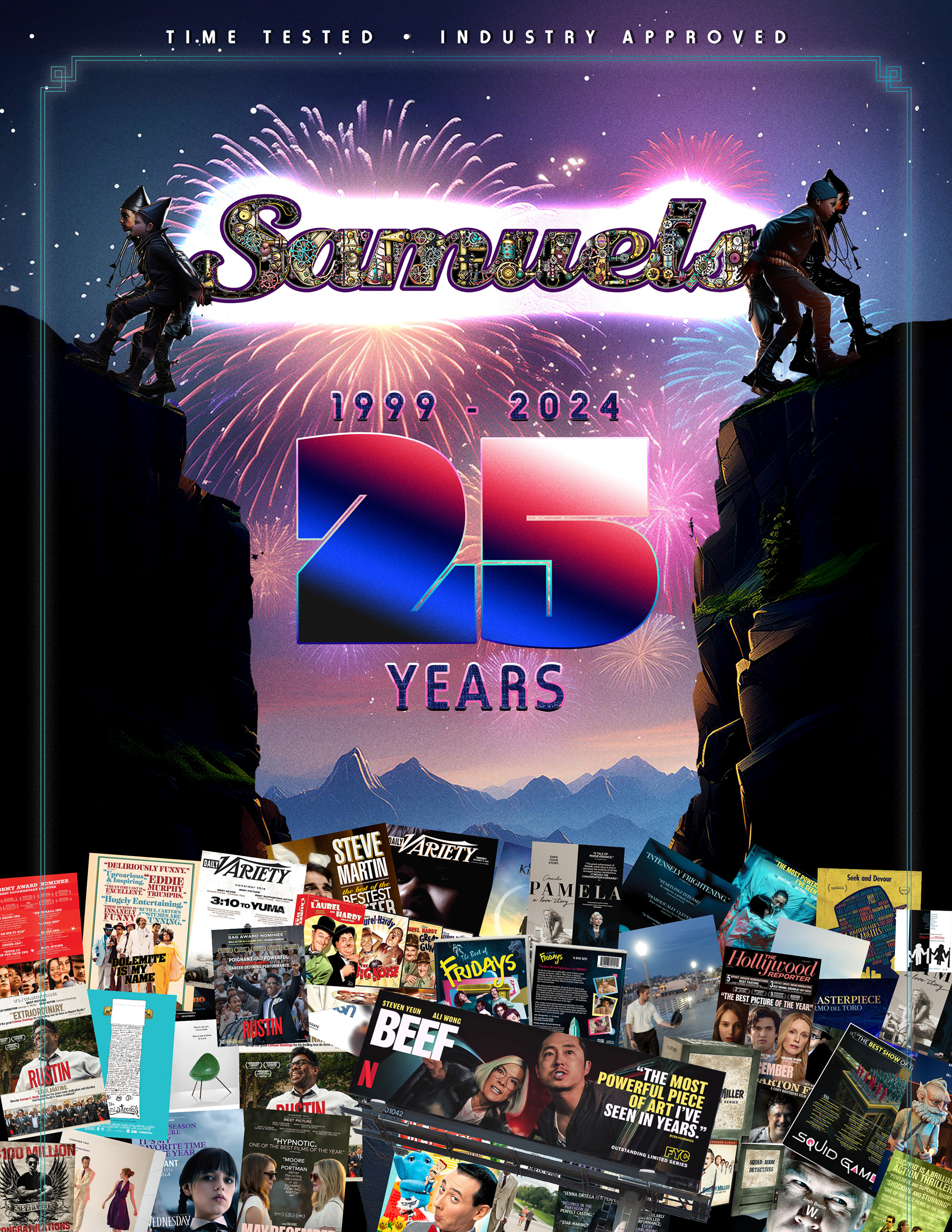
BRIEF
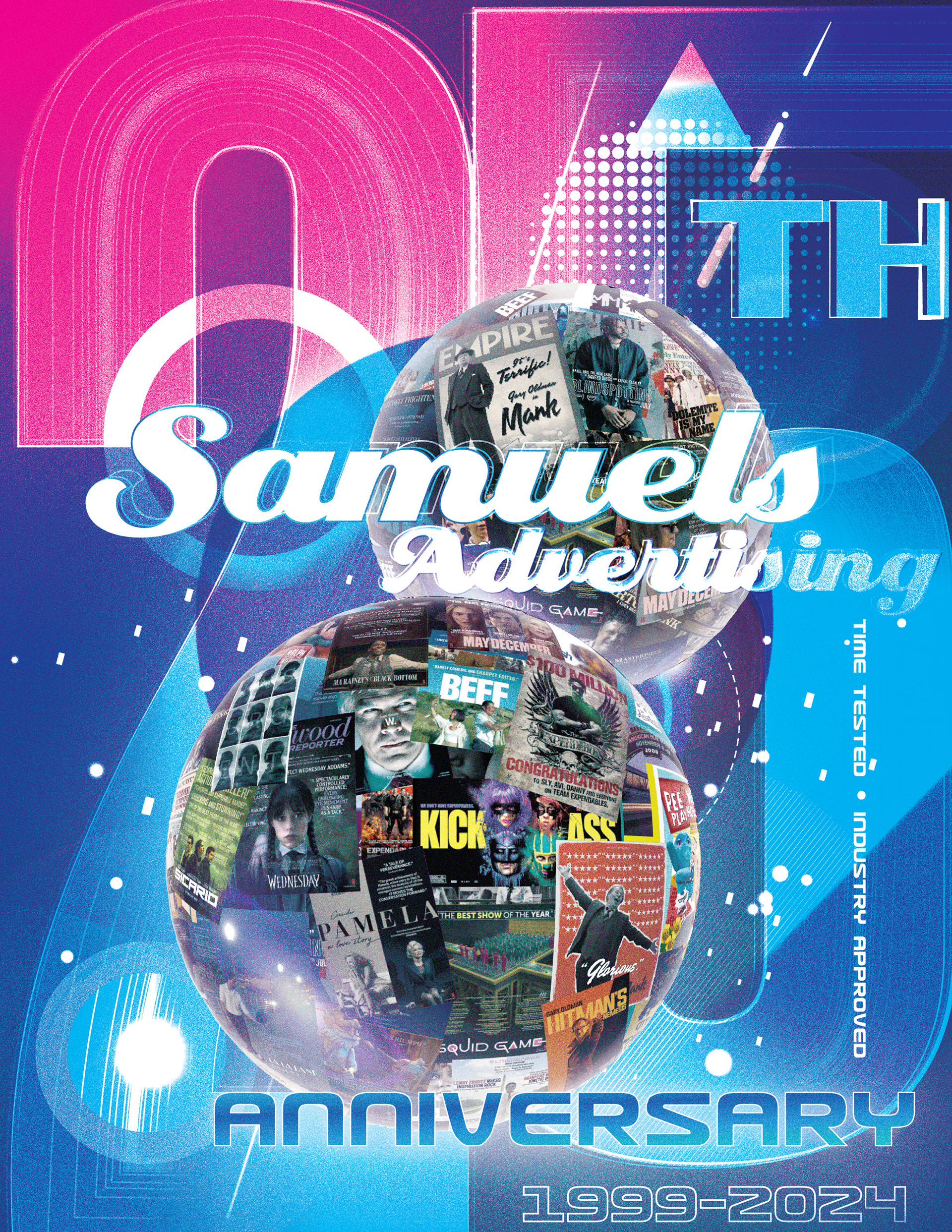
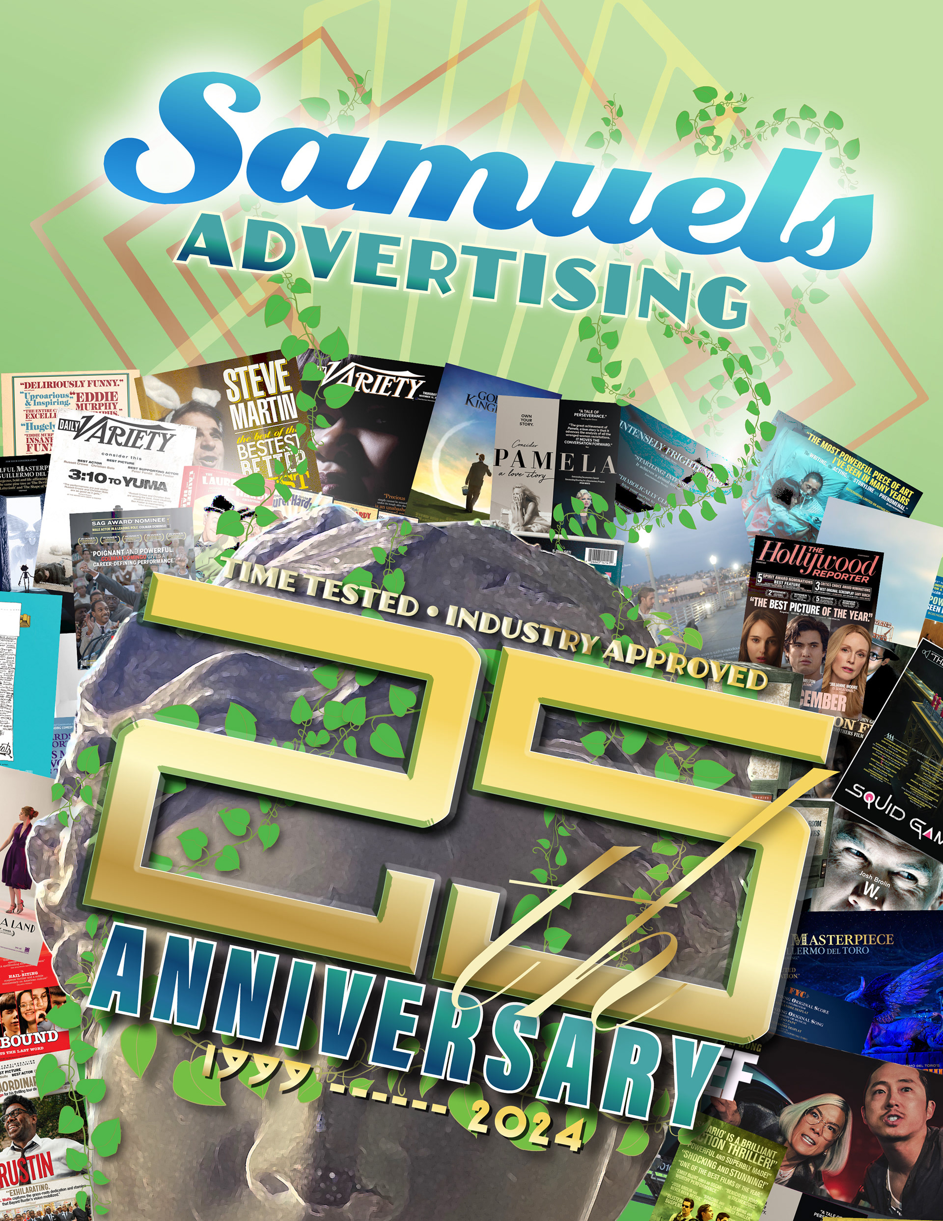
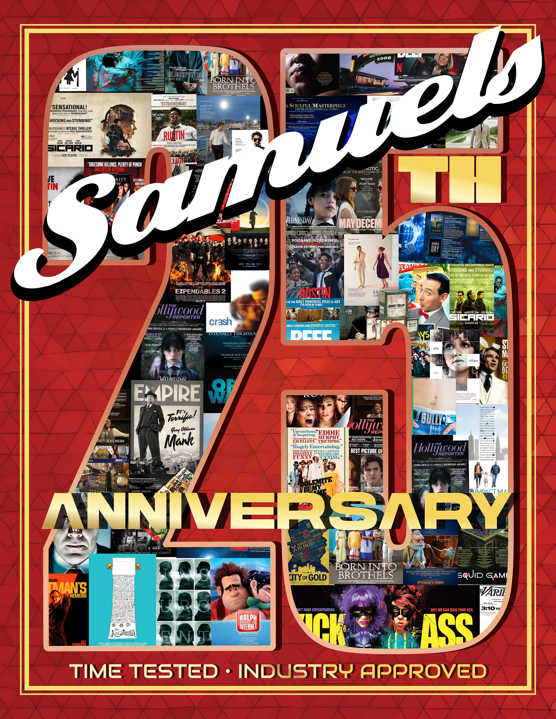
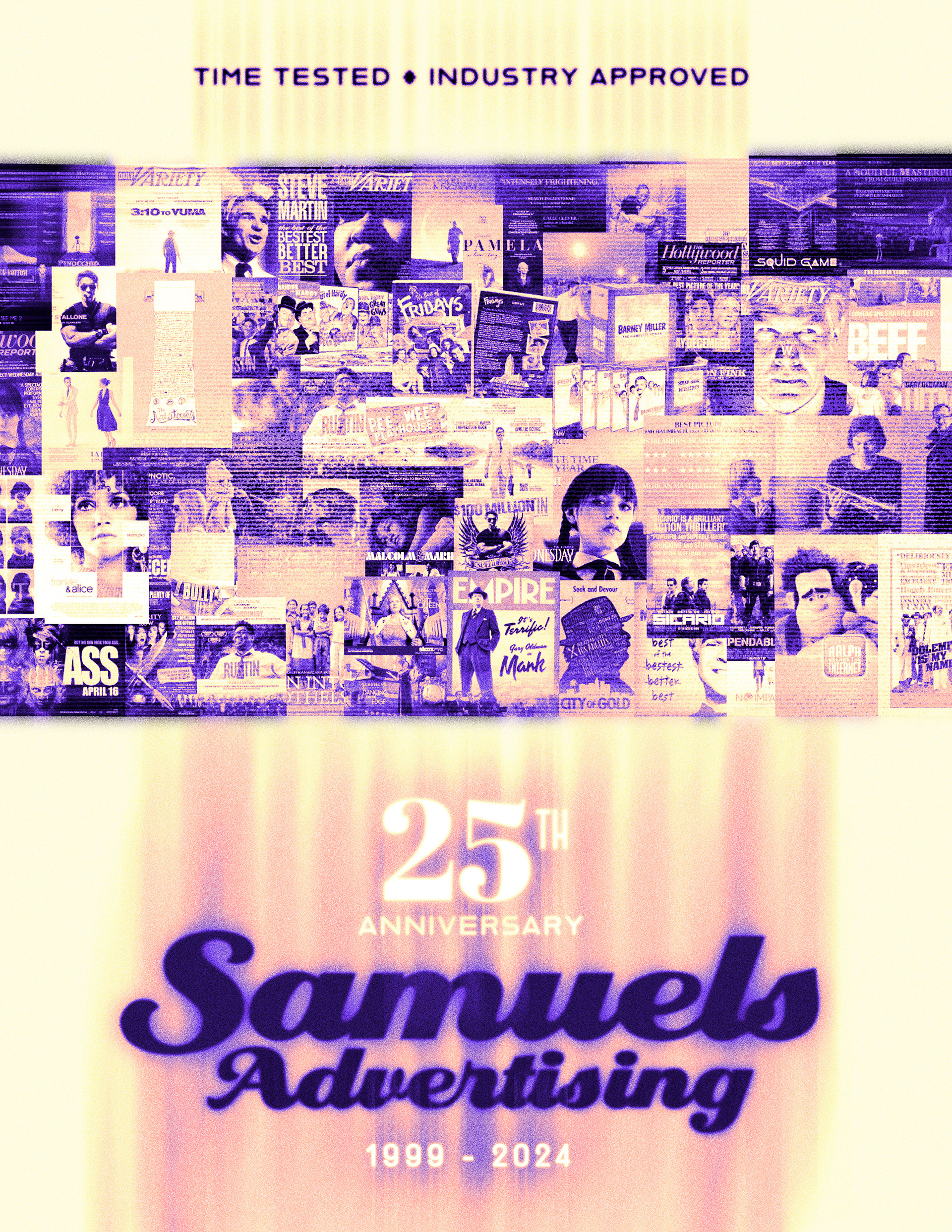
Design a celebratory visual campaign for Samuels Advertising’s 25th Anniversary to honor their legacy as a premier agency for awards season marketing. The objective was to create a nostalgic yet premium aesthetic that showcases their extensive portfolio of Academy Award and Emmy-winning campaigns while reinforcing their industry dominance since 1999.
STRATEGY
I centered the design around a classic neon marquee aesthetic to evoke the glamour of Hollywood and the “silver screen”. The composition features a collage of their most iconic movie and TV posters, framed by glowing neon signage. This juxtaposition of retro cinematic style with a modern portfolio montage bridges their historic roots with their current industry relevance. For the digital campaign, I expanded this into a motion graphics asset, animating the neon flicker and environmental elements to bring the “silver screen” nostalgia to life for online audiences.
Final Design
Concept Sketches
CLIENT

MARKETING BOOKLET MAILER
CONCEPT, LAYOUT, TYPOGRAPHY, DATA VISUALIZATION, PHOTO MANIPULATION AND COMPOSITING
PROJECT DATE | 2022
BRIEF
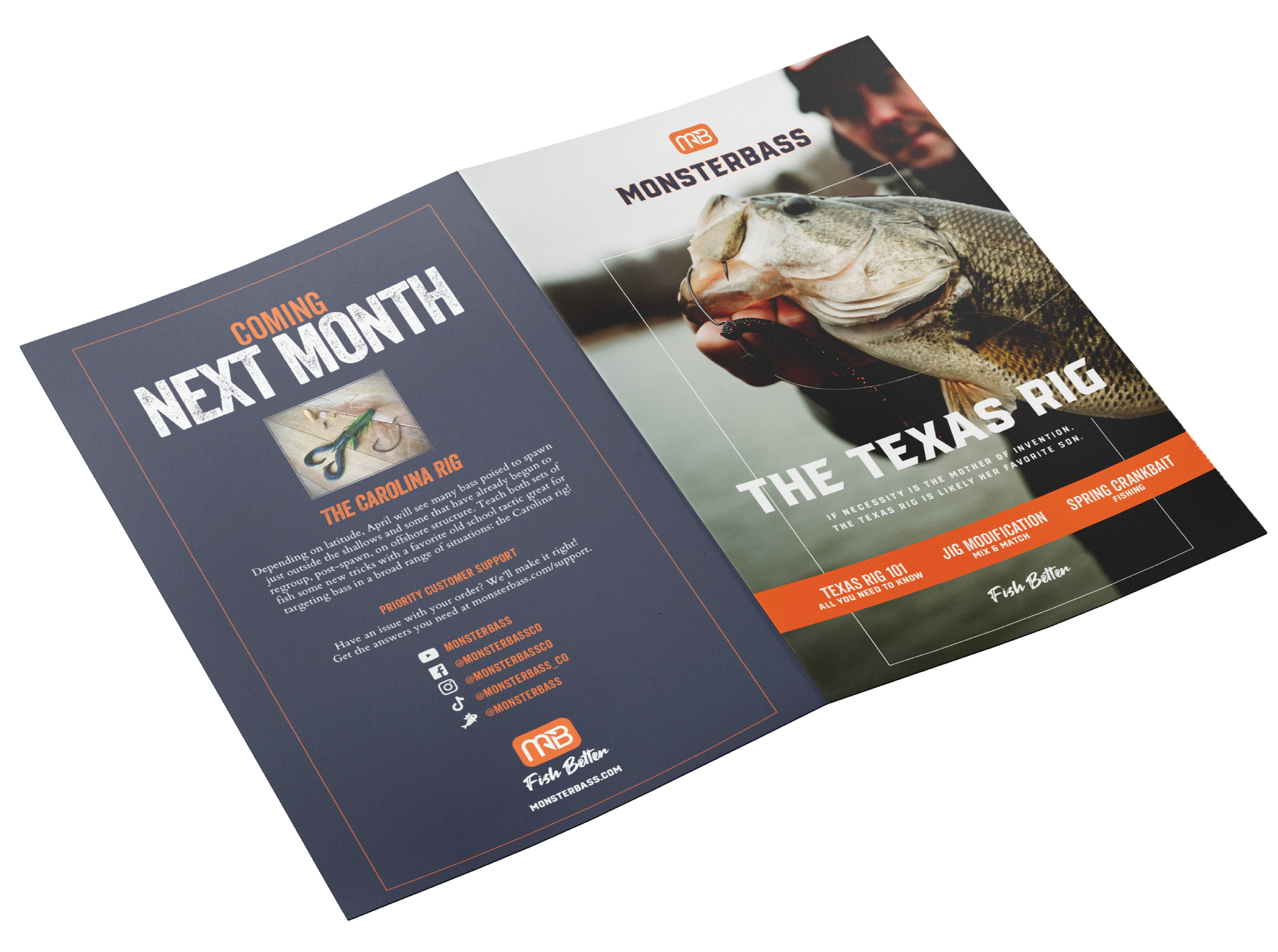
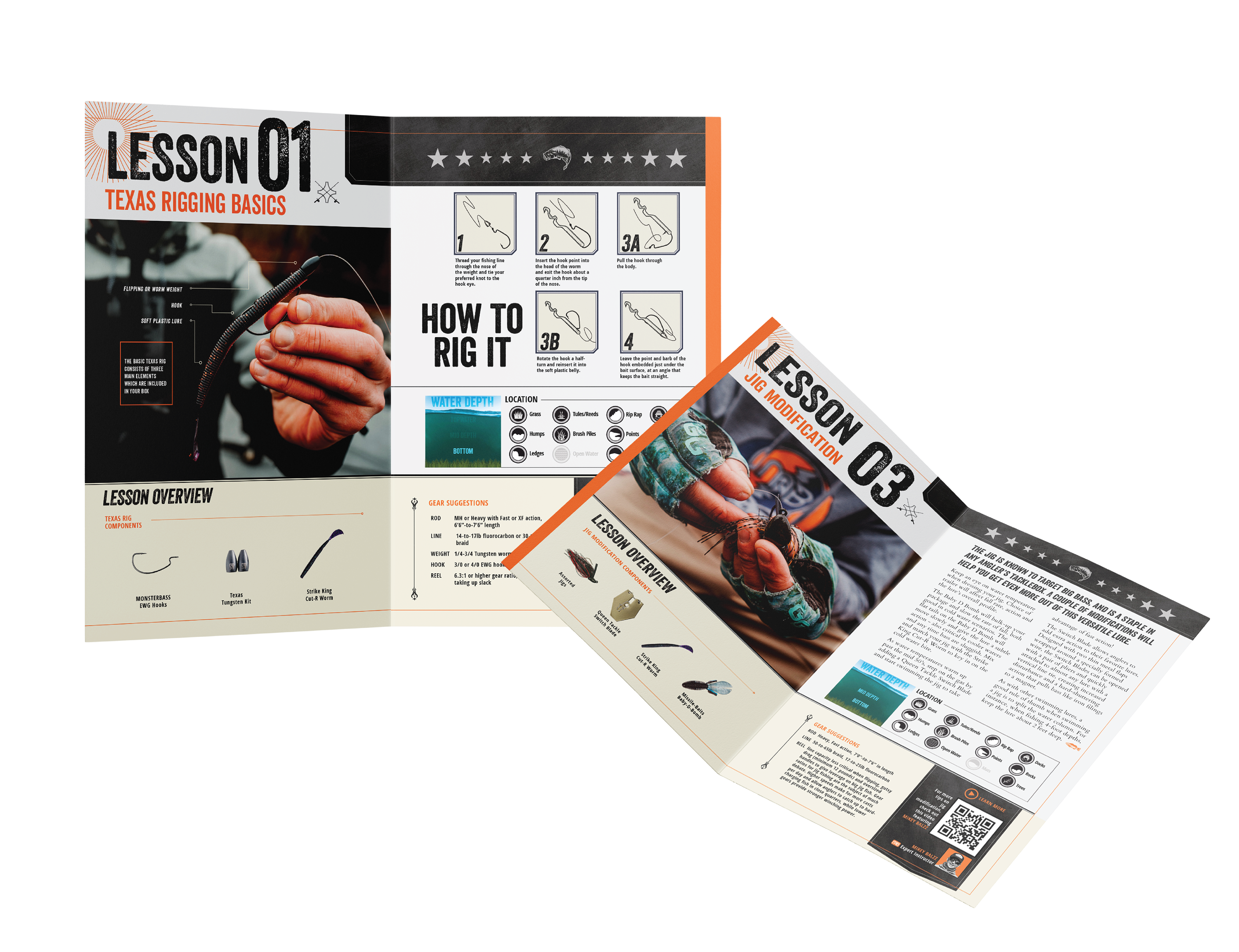
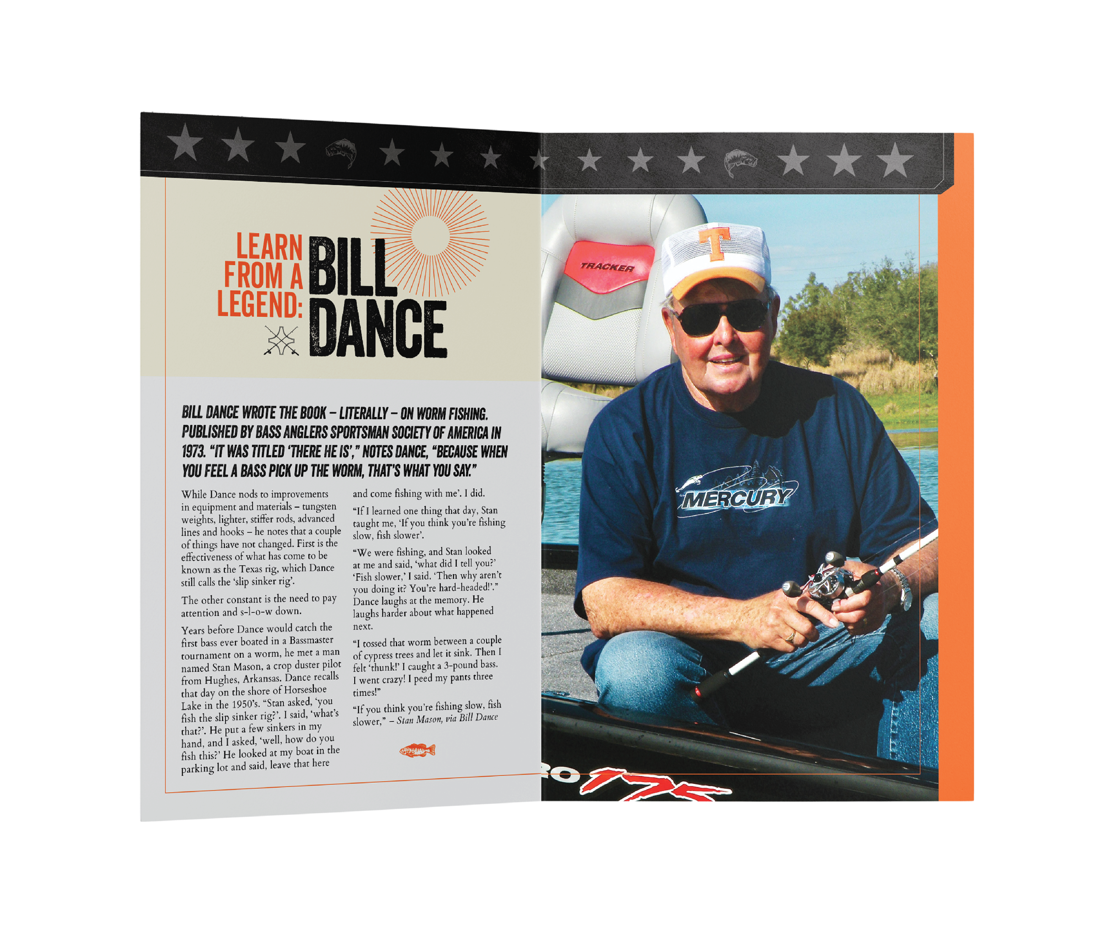
Design a comprehensive monthly educational booklet for Monsterbass subscribers to accompany their curated tackle boxes. The objective was to transform technical fishing advice and complex rigging instructions into an accessible, visually engaging guide that empowers anglers of all skill levels to effectively use their new gear and improve their catch rate.
STRATEGY
I utilized a rugged, texture-rich aesthetic aligned with the outdoor lifestyle, balanced by clean, instructional data visualization. By breaking down complex rigging techniques, like the Texas Rig, into step-by-step illustrated diagrams and bold typography, the layout ensures the content is not just informative, but immediately actionable on the water.